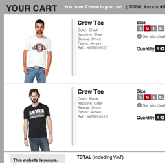
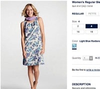
On e-commerce sites that sell visually-driven products like apparel, home decoration, and to some extend consumer electronics – we find that up to 12% of all users’ search queries include a color keyword.
While our search usability study and benchmark reveals that 78% of e-commerce sites have a search engine capable of returning relevant products for a color search, it also shows that how “color” search results are presented to users is critical. And here more than half of e-commerce sites (54% to be precise) display their “color” search results in a way that severely impede their users’ ability to both find and decide on a product – with site abandonments as a direct result.
More specifically, our testing showed that dynamically switching each list items’ product thumbnail to reflect the color variation searched for is absolutely vital to the usability and performance of color searches. In other words, for search results of your product listing thumbnails shouldn’t be static – as they currently are at 54% of major e-commerce sites.
In this article we’ll dive into how users perform color searches, and outline two presentational methods that the tests revealed to be optimal for search UX performance.
Users Perform Color Searches
When testing how users locate products on e-commerce sites – during our large-scale studies on Search, Category Navigation, and Product Lists & Filtering – the majority of subjects at one point or another while browsing an apparel and other visually-driven vertical wanted to see only the products available in a specific color or color combination.
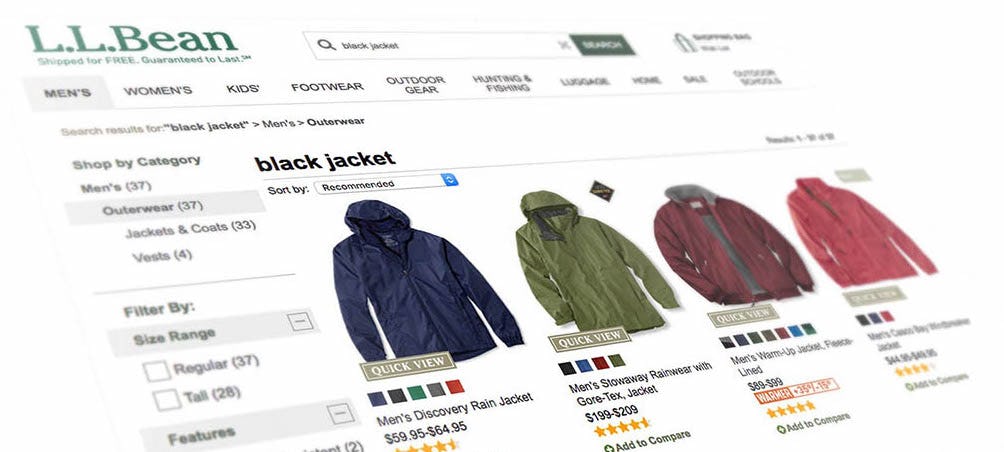
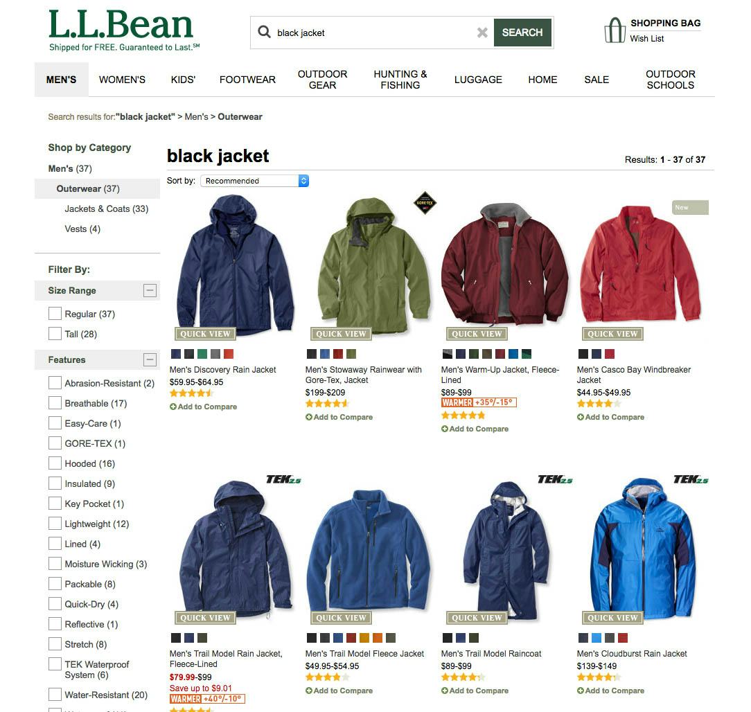
L.L. Bean is just one of the 54% of sites that return relevant results when users include a color in the search query (note how all jackets are available in black) – yet make it needlessly difficult for users to understand and use the color search results because the product thumbnails don’t dynamically switch to match the color variation searched for.
While some subjects applied a color filter, others simply included the name of the color as part of their search query. Indeed, when performing search audits for leading e-commerce sites within visually-driven product verticals we see that searches including a color constitute 5-12% of all search queries, which align well with the behavior observed in our qualitative studies.
A color search falls within the search type ‘Feature Queries’, and is particularly important to fully support in visually-driven industries (see full article on the 12 Query Types in e-commerce). Yet, even though our search usability benchmark reveals that 78% of search engines support Feature Queries and yield relevant products for the color, we also find that how “color” search results are presented to users plays a crucial role in how successful users are in their overall ability to actually locate and decide upon a product they want to purchase.
1) Dynamically Updating Thumbnails to Match the Color Searched For
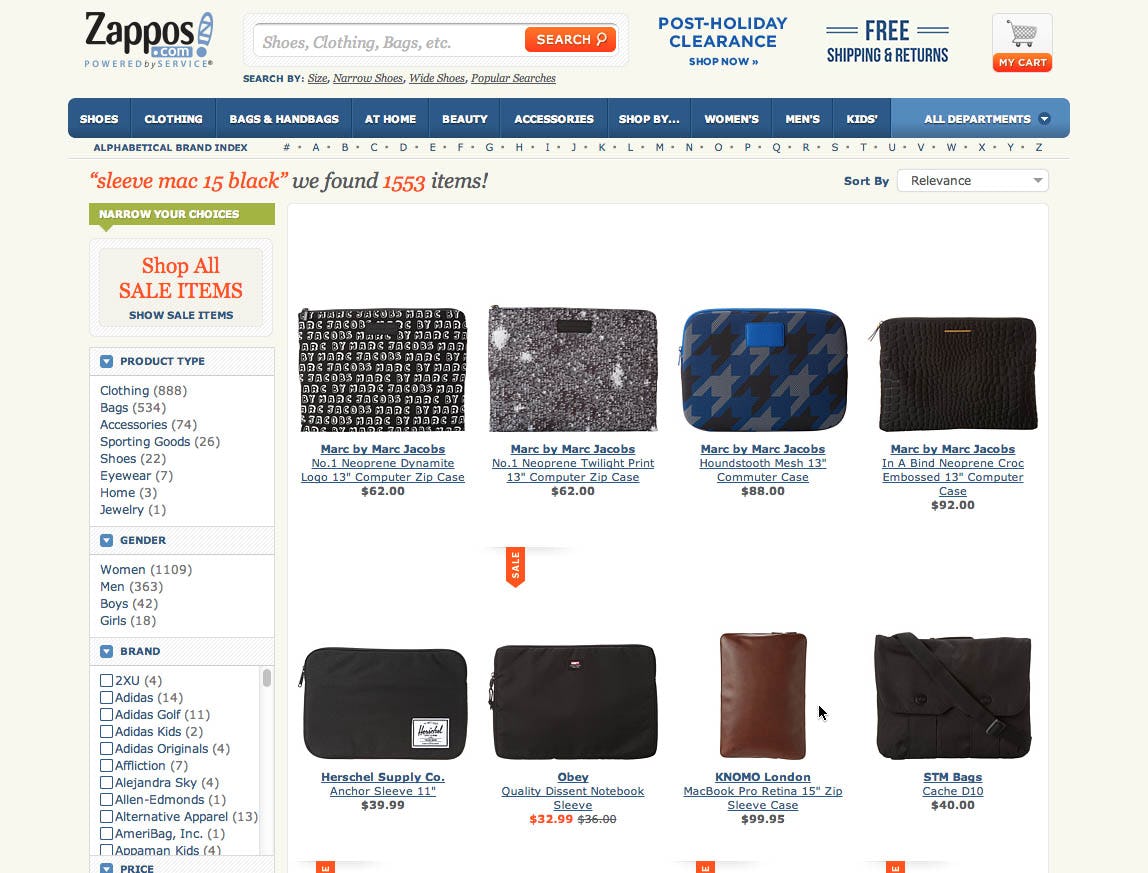
At Zappos, a test subject refined her search query from “sleeve mac 15” to “sleeve mac 15 black”, expecting to only get black sleeves. Yet, in the results list, several of the thumbnails displayed weren’t showing a black sleeve. Most of these items did exist in a black version, but the product thumbnail displayed didn’t reflect this – making it unclear why and how the products were relevant as well as difficult to compare the sleeves to one another.
When a user explicitly denotes a product variation in their search query, they often expect to literally see that variation if it has meaningful aesthetic implications on the product (such as color, patterns, material, etc). Many users are therefore left bewildered by why and how certain search results are relevant to their query if the same default thumbnail is used even though a specific product variation was included in the search query because the returned products look irrelevant to the user.
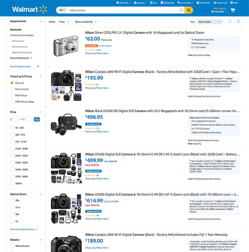
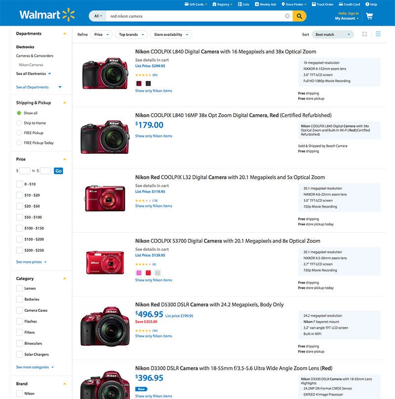
At Walmart, product thumbnails dynamically switch to match the searched-for product variation. (Here two searches, one for ‘nikon camera’ and another for ‘red nikon camera’.) This is a crucial detail to get right when combining product variations into a single list item to ensure optimal discoverability.
To fully support Feature Queries for product variations, you should therefore dynamically change the product thumbnails to match the user’s query. For example, the thumbnail should switch to the leather variation when the user searches for “leather jacket”, and a search for “red sofas” should display all the red variations rather than the default product thumbnail of those sofas. This makes it immediately obvious to the user that the product variation they are interested in is indeed available, and it saves the user a trip to the product page to confirm this.
Note: our findings on having dynamic thumbnails for color search results applies only when product variations are implemented as a combined single list item. If product variations are instead treated as separate products in the product list, any non-matching variations should instead be excluded from the results. (When product variations should be a single combined or multiple separate list items is a complex topic with many nuances, covered in our Product List & Filtering study, which we’ll save for a future article).
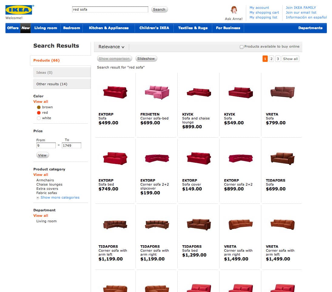
On IKEA, a search for “red sofa” returns all the sofas available in red and the thumbnails dynamically change to the appropriate product variation. This enable users to compare the nuances of the variation searched for.
An equally important aspect of dynamic list item thumbnails is that it enables the user to compare the aesthetic of all the search results. When thumbnails don’t dynamically switch to the product variation searched for, the user is unable to compare the shown products as they do not look alike, or resemble the color attribute that the user has shown an explicit interest in. For example, it’s not enough to know that a sofa is available in a red variation since there are numerous shades of red.
Therefore, in order to meaningfully compare a list of products, the user must be able to see those products in the variation they are interested in and have searched for. When dynamic thumbnails aren’t provided users are forced into extensive pogo-sticking – where they have to open each and every search result just to see the product variation of interest.
2) Auto-Applying Relevant Filters
Implementation-wise a slightly better performing variation of just displaying dynamically updating thumbnails is to also link the color search queries to the site’s color filter. So in case the search engine detects a direct correlation between a search query including a color keyword and the site’s available color filters, it auto-applies that as a filter to the search results.
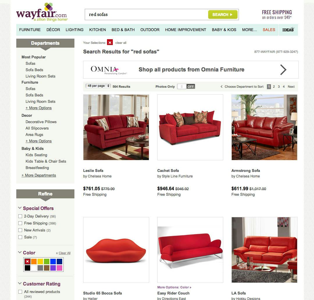
On Wayfair the support for color search queries is taken one notch further as they are linked to the color filter. When users search for e.g. “red sofa” Wayfair returns “sofa” results with the color filter “red” auto-applied.
The product thumbnails should of course still switch to match the variation search for / filtered by, but by explicitly applying the product variation as a filter helps users in two additional ways:
- It adds significant transparency to the search logic, helping users understand how the site interpreted their search query. There’s a direct visual connection between the search query and the pre-applied color filtering selection, explicating to the user that e.g. the inclusion of the keyword “red” was interpreted by the site to mean that they wanted to see red products only.
- Having the color search query matched to a color filter gives users the ability to easily adapt their color filtering. This is particular beneficial for filters where color shading doesn’t have well-know naming conventions, hence making it difficult for users to search for them by name (compared to clicking a color swatch). Furthermore it can also encourage users to broaden their queries to include other color shadings.
Note though, that expanding color search support with this auto-applied filtering technique is only recommended on sites where the product tagging is close to 100% accurate at any given time, as relevant products otherwise may be excluded by the auto-applied filter. If color filter tagging accuracy is slightly incomplete or not frequently updated, we recommend sticking to “just” dynamically matching the thumbnails to the variation searched for.
Contextualizing Search Results
The overall concept of dynamically adapting the search result thumbnails is another form of Contextual Search Query Snippets – another search usability aspect we’ve found critical to users’ ability to understand how the returned products relate to their search query (and when not implemented can force users into extensive pogo-sticking, causing them to abandon the site in the product selection process).
If prioritizing the two, then dynamic thumbnails is the most important for sites with visually-driven products, whereas sites with mainly spec-driven products will often see a larger ROI from implementing Contextual Search Snippets. Ideally site have both, in particular sites selling consumer electronics (which often are both visually- and spec-driven) and mass-merchants that typically sell both types of products.
This article presents the research findings from just 1 of the 650+ UX guidelines in Baymard – get full access to learn how to create a “State of the Art” ecommerce user experience.

