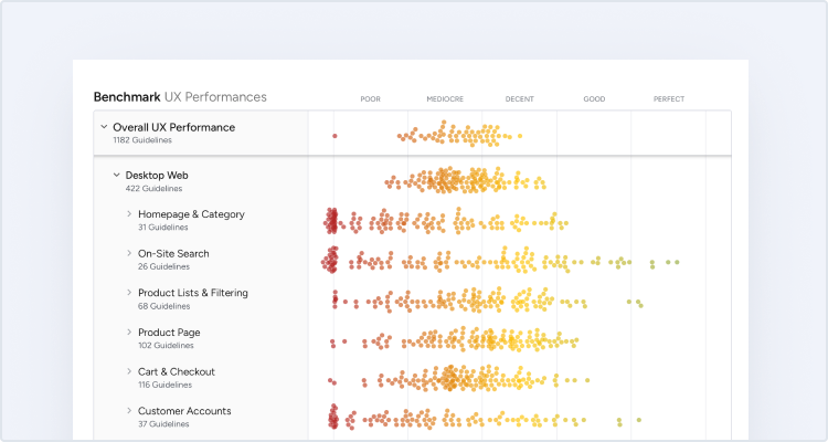
At Baymard our research team has just spent 1,440 hours usability testing and researching “digital subscriptions” (SaaS) website features, layouts, content, and designs — leading to our new research study on Digital Subscription Services UX.
The research is based on more than 253 qualitative user/site usability test sessions following the “Think Aloud” protocol (1:1 remote moderated testing).
The test sites spanned B2B digital Software as a Service including video conferencing (Zoom, GoToMeeting, Webex, and BlueJeans by Verizon), communication/chat (Slack, Microsoft Teams, Chanty, and Flock) and cloud storage (Box, Sync, Microsoft OneDrive, and Egynte).
Moreover, the test subjects recruited were all in the target audience — people with responsibility or a direct say in the research or purchasing decisions of such services at their respective jobs.
Yet despite testing multimillion-dollar sites, throughout the test sessions, the users would repeatedly abandon digital subscription services sites due to issues with the layout, content types, or sales page features.
Indeed, during testing the users encountered 850+ medium-to-severe usability issues.
These issues have subsequently been analyzed and distilled into the 196 UX guidelines found within our Digital Subscription UX research. The 196 guidelines cover most aspects of the digital subscriptions experience, at both a high level of general user behavior as well as at a more granular level of specific issues users are likely to encounter.
In this article we’ll introduce high-level findings for digital subscription services sites, as well as discuss two aspects in particular — “Page Types and Designs” and the “Plan Matrix” — as these are especially important to the performance of digital subscription sites.
How Digital Subscription Sites Differ from General B2C Sites
In contrast to users on B2C e-commerce sites, users considering primarily B2B digital subscription services tend to need to get a holistic view of a service before deciding to sign up.
Indeed, almost no users on Walmart or Amazon need to “learn about the brand” or what the site is or offers; rather, they’re in much more of a product-focused mindset (e.g., “I need a bike that has these features and costs around this much”).
A user at Egnyte, unfamiliar with the service, scrolled the “Solutions” page, seeking to get a sense of the service’s user interface and features.
On the other hand, a user new to or only somewhat familiar with Egnyte, Slack, Webex, or another primarily B2B digital subscription services site will need to first learn what are the services the site is selling, and how those services relate to their business needs, before getting into the nitty-gritty of plans and pricing information.
Therefore, users shopping for digital subscription services need quite a lot of information about a service before they feel confident enough to give it a trial — let alone make a subscription decision.
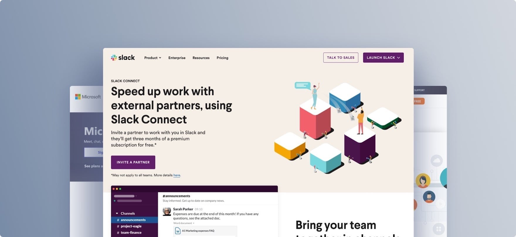
“I kind of wish I could click ‘Learn More’ on these things because I’m seeing things that are interesting to me.” A user at Webex was intrigued by various features that appeared in a vertically scrolling list on the homepage. However he couldn’t find an easy way to get more information about the various features.
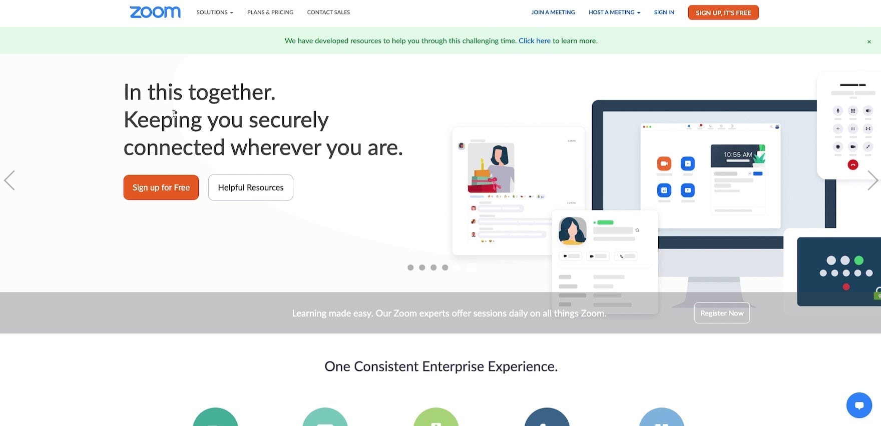
“I’m fairly disappointed with Zoom’s website. It feels like they’re riding on their laurels…they’re not doing a great job of explaining what these other things [features] are…I’d probably just move on.” A user on Zoom’s homepage felt like the site didn’t do a good job explaining their basic value proposition, and had many features in the carousel that didn’t make sense. Consequently, he said he’d leave the site to look at a similar service.
Indeed, this digital subscription services study revealed that users are quite “information hungry” when it comes to digital subscription services: they spend much more time reading content and exploring “brand” pages compared to users on B2C e-commerce sites.
It’s striking that only on a few occasions did users feel like the amount of information they were getting was too much; rather, many of the issues users had resulted from not having enough information provided to them — or not being able to find the information on the site.
In particular, 2 general areas were identified where users were observed to struggle the most: not having the necessary pages provided to meet their information needs, and underperforming plan matrix pages.
Page Types and Designs
Despite users’ need to get a holistic view of what a digital subscription services site is and what it offers, our testing revealed that many sites fail to provide this crucial information at a level sufficient for end users.
“Where is their list of customers?…Unless I’m missing it I don’t see a list of customers that are using the tool, which would be a yellow flag for me.” A user was discontented with Chanty, after looking in the main navigation and in the footer for their customer list but not finding it. Note that, despite seeing the testimonials on the homepage, they weren’t enough information for this user, who abandoned the site after 5 minutes. Many users will need more when it comes to getting information on a service’s customers than short testimonials.
Instead, a key issue with many digital subscription sites is that they provide glimpses of what the service is and what features it has, but they don’t offer enough information for users to gain a comprehensive understanding of the features provided by the service.
Users therefore often abandon, feeling like the service “isn’t mature” or won’t meet their needs or the needs of their work teams.
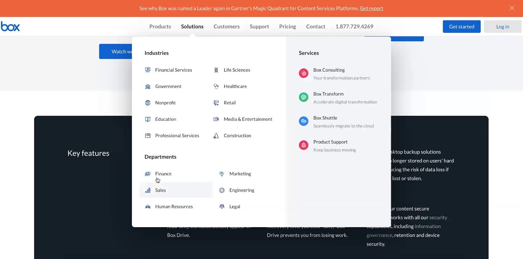
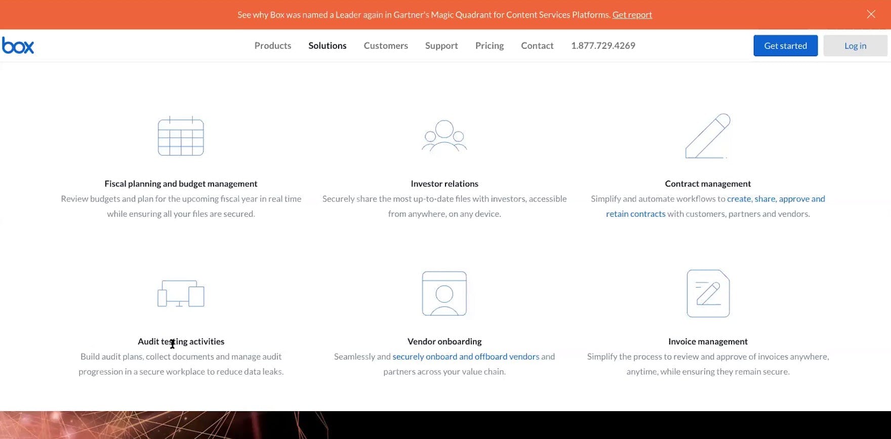
“They have these targeted departmental pages where they show you exactly how this could benefit me in finance…The fact that they hit on all these different areas kind of sells me in trying it out”. A user at Box found the industry-specific pages to offer compelling information.
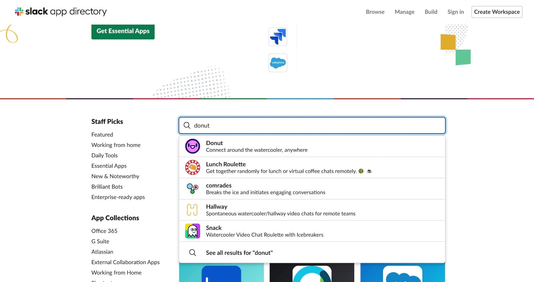
A user used search on Slack’s “App Integrations” page to confirm that apps of interest could be integrated with Slack’s service.
Therefore, testing revealed that, for digital subscription sites, it’s critical to always provide enough detail to fully describe the service.
In fact, it’s a similar challenge traditional B2C e-commerce sites face, when it comes to describing products on product pages.
Yet on digital subscription services sites, the issue is sitewide and also more severe: whereas users on B2C e-commerce sites, unsatisfied with the level of detail provided for a particular product, may find another suitable item elsewhere on the site, if a user on a digital subscription services site finds that there isn’t enough information to make a purchase decision they’ll often abandon — and eliminate from consideration the site as a potential service provider.
In particular, pages dedicated to the service’s features, customers, industries, and app integrations are critical to providing users with enough information to make a subscription decision.
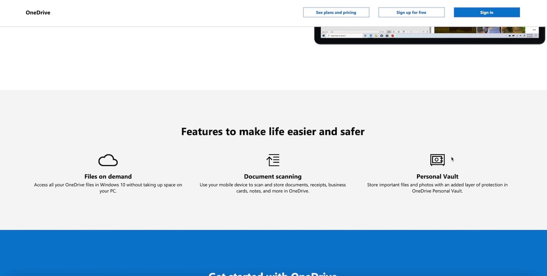
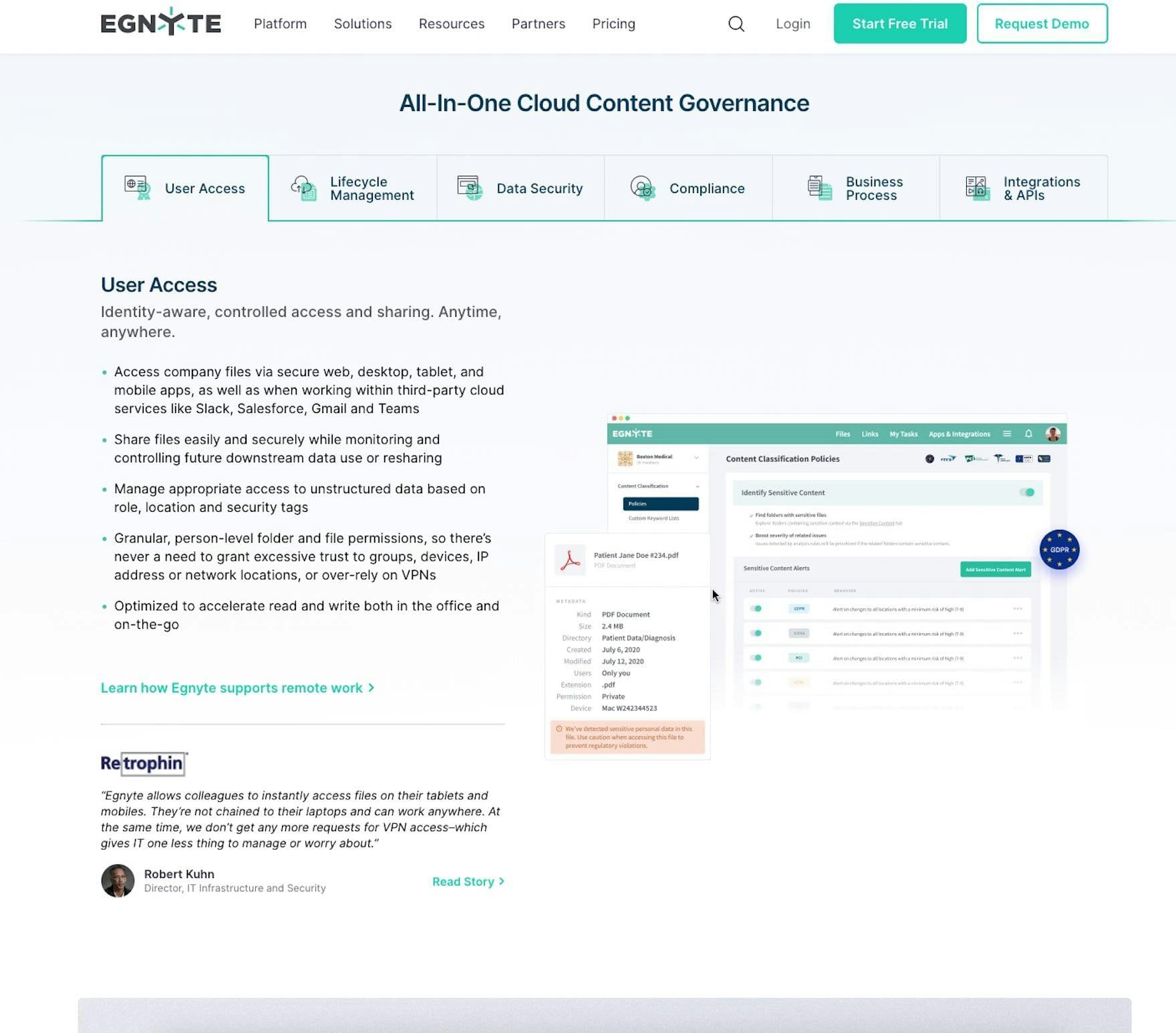
“I’m surprised I can’t click on it”. A user was intrigued by the “Personal Vault” feature called out on Microsoft OneDrive’s homepage. However she never found the page dedicated to describing this feature, which was accessible via a link in the main navigation, and thus missed out on learning about a potentially important feature.
Moreover, some digital subscription services sites do provide information users need on specific “page types” — but make it unnecessarily difficult for users to find or understand it.
Indeed, it’s a shame to spend the resources to develop a rich “Feature” page for a key service feature (e.g., “File Sharing”, “Video Conferencing”, or “Security” for a communication/chat service) — but then fail to make it accessible from where it’s highlighted.
Therefore, not only must the core page types be provided, but they must also be highly accessible. This means of course including links from the main navigation and sometimes the footer as well, but also ensuring that the in-depth information can be accessed when calling out features, case studies, or customers on, for example, the homepage.
The Plan Matrix
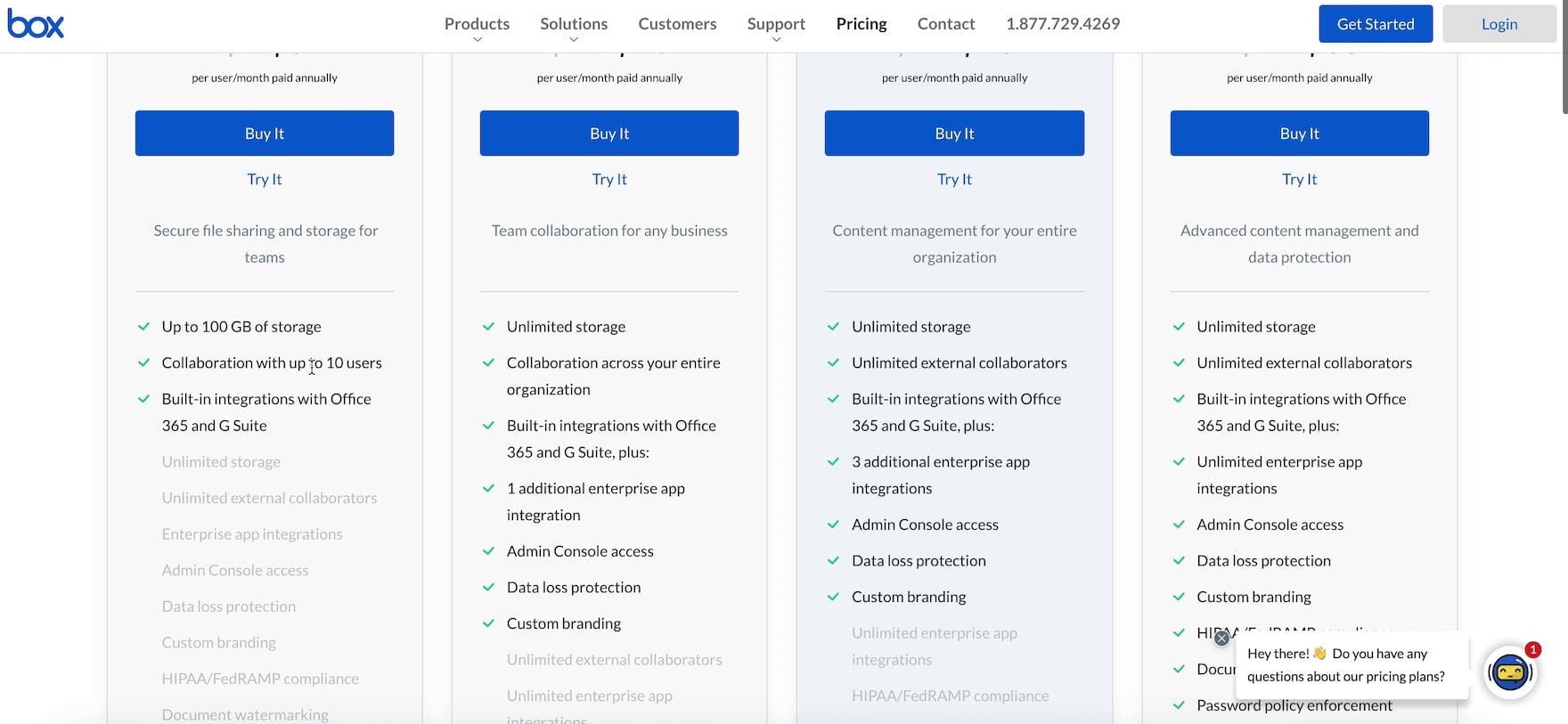
“This is a very easy comparison model when they put everything side-by-side.” A user at Box found the plan matrix’s layout made it easy to compare the 4 available plans.
The plan matrix page is a primary destination for users considering a digital services subscription, as it allows for a side-by-side comparison of plan pricing and features.
Accordingly, the plan matrix layout, design, and features greatly impact users’ ability to identify the most suitable plan for their specific business needs and, therefore, their purchase decision.
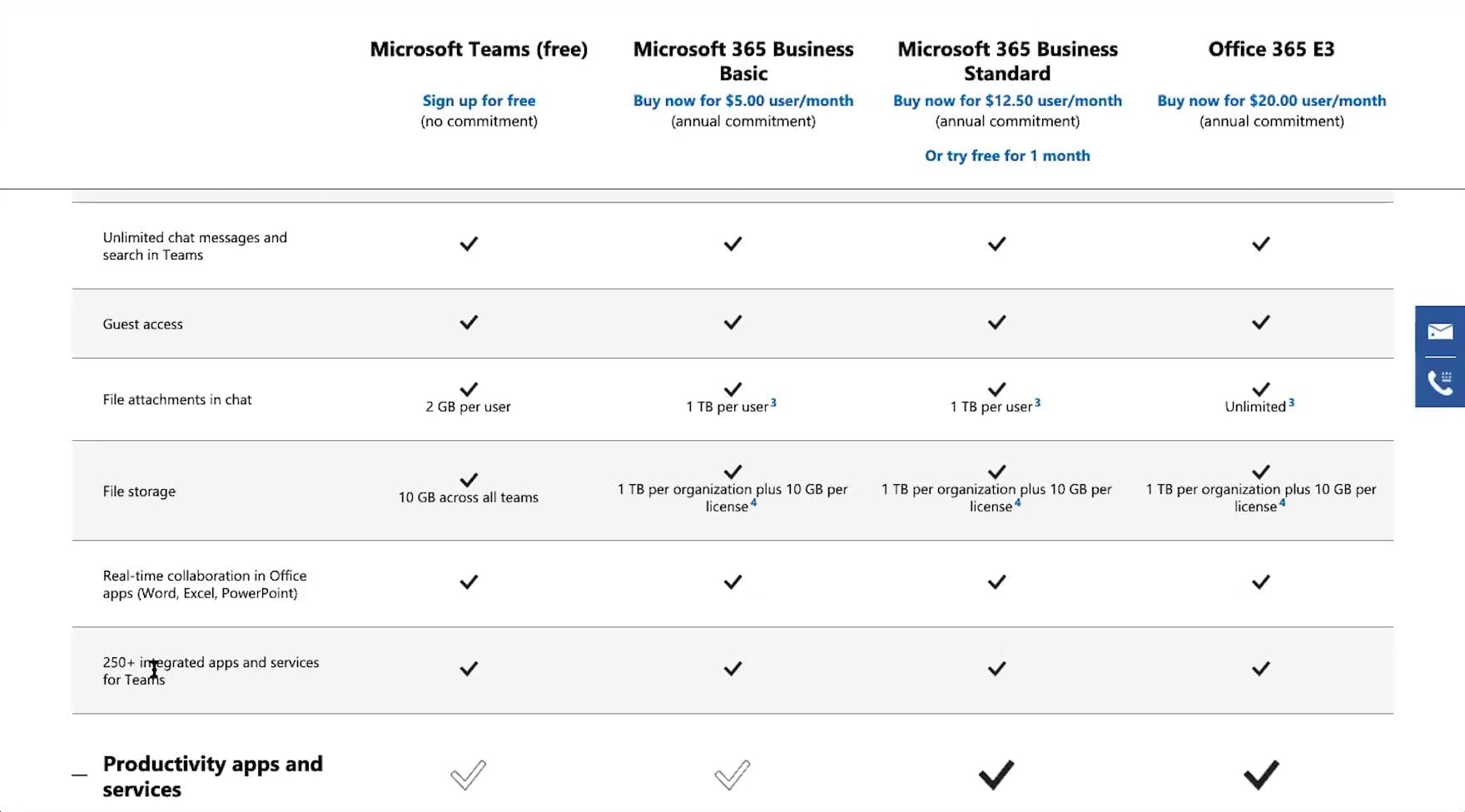
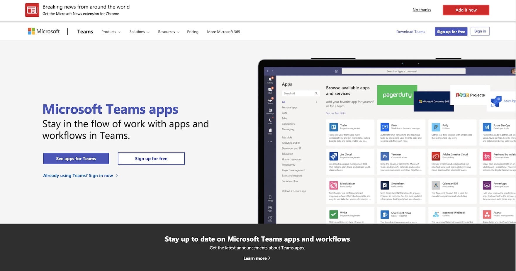
“I would want to see what the integrated apps and services are — I wish that linked to something”, a user viewing the Microsoft Teams plan matrix page remarked (first image). She, like many users, was unaware the content she sought was available elsewhere on the site (second image; taken after testing concluded by researcher).
For example, some users need a plan that will accommodate a minimum number of users or support particular app integrations.
For these users, being unable to quickly target and interpret the specific features they’re interested in makes it difficult to efficiently glean or confirm key details and thus move forward with their plan comparison.
However, users who cannot quickly and easily locate specific features that are critical to their business needs will be more likely to conclude those features are not offered with any of the plans and drop the site’s service from consideration altogether.
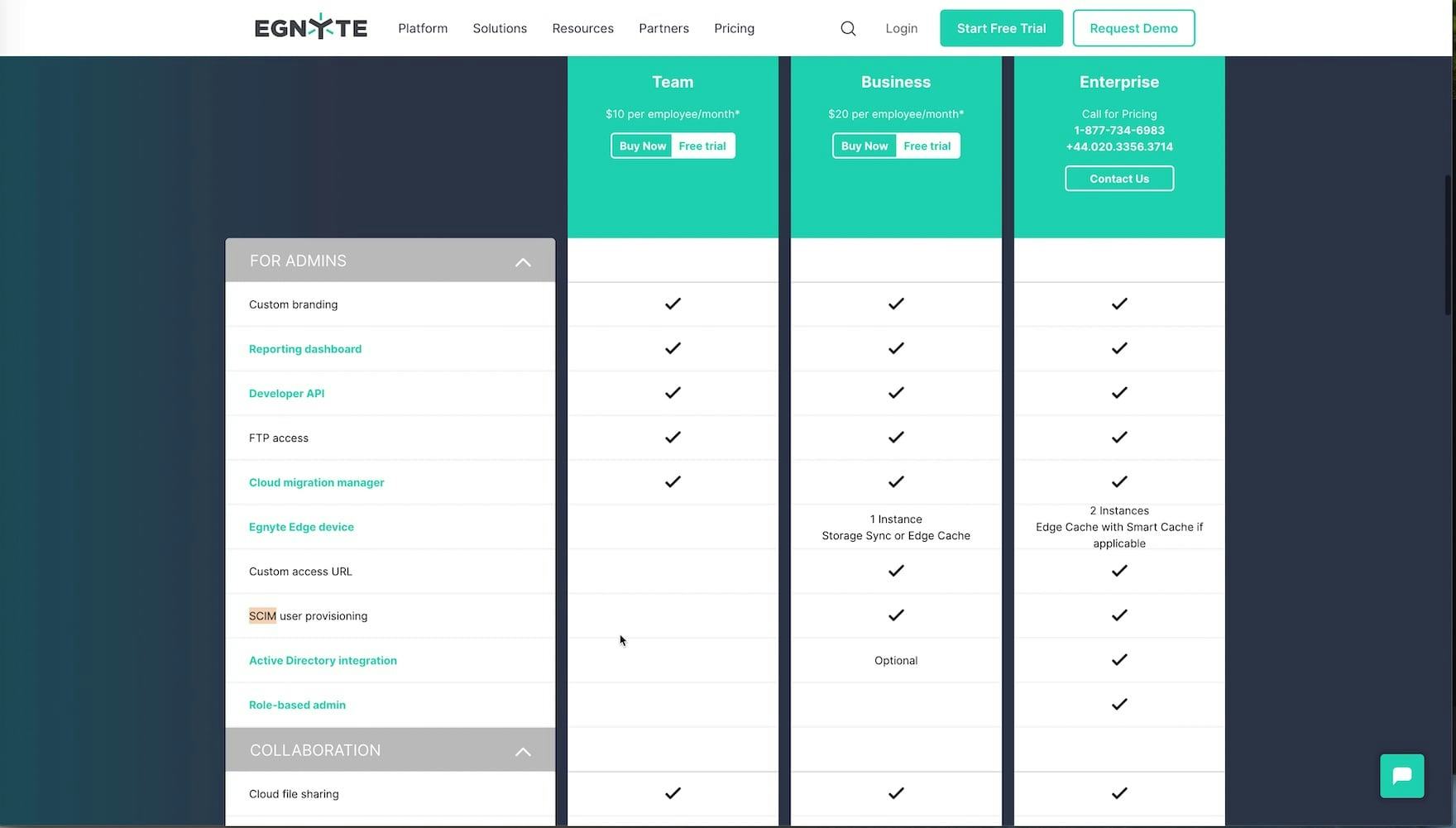
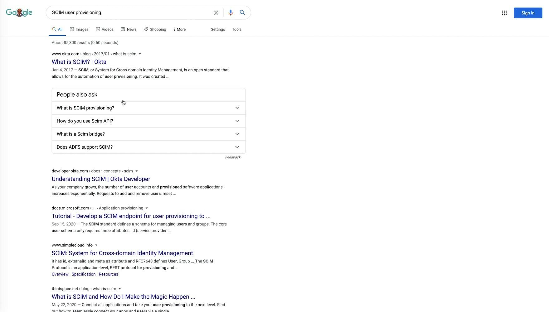
“‘SCIM user provisioning’ — I don’t know what that is. I don’t know…I’d have to do more research about that — look that up on the web.” Most of the users researching cloud storage and sharing plans struggled to recognize one or more of the undefined features on Egnyte’s plan matrix page (first image). This user resorted to a google search to learn the meaning of “SCIM user provisioning” (second image).
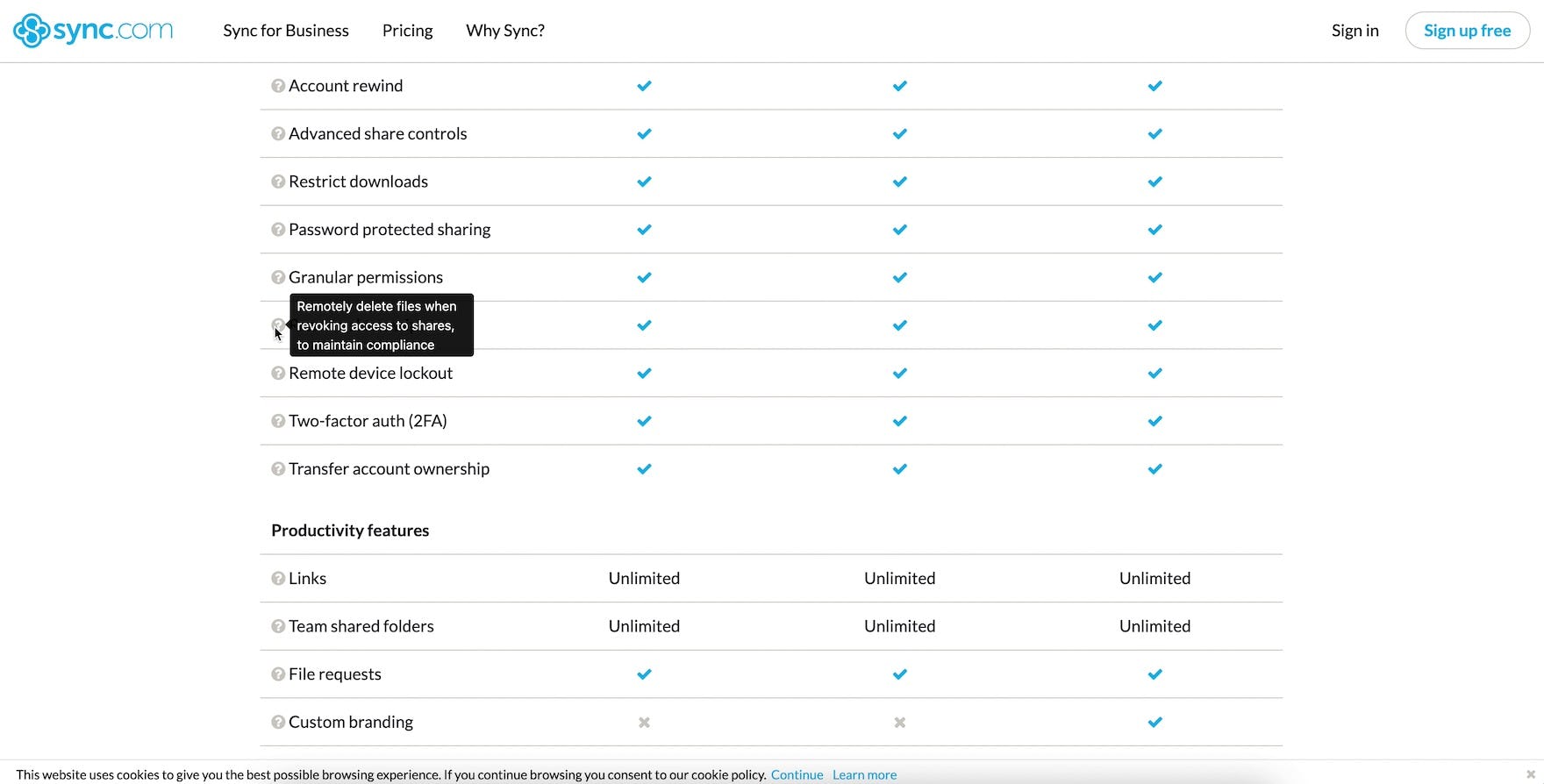

“‘Account Rewind’ I think that just means — I like that they have this question mark here. [Reads definition]. Okay, that’s nice.” A user quickly accessed a brief explanation for a couple of unfamiliar features on the Sync plan matrix page using tooltips that triggered on hover. Notably, Sync provides tooltips for all of the features listed on its plan matrix page, streamlining the plan-comparison process.
Likewise, if users cannot easily decipher or, minimally, confirm the meaning of any one of the plan matrix page features, they will ultimately lack the necessary information to make a fully informed and confident decision about which plan will best meet their needs.
It’s therefore important that, at this critical juncture when users are deciding whether or not to purchase a subscription, the plan matrix provides all necessary information and is designed to facilitate comparison; in particular, by ensuring that it’s easy to get an overview of all the plans, that all features are defined, and that the plan matrix page offers ways for users to get help if they need it.
Ensure Your Digital Subscriptions Site Meets Users’ Needs
In addition to issues with the information missing from digital subscription sites and issues that occur on the plan matrix page, testing revealed that digital subscription sites also have some of the same issues that drag down the user experience at general B2C e-commerce sites.
For example, issues with providing a high-performing account creation and management, homepage, navigation, and checkout experience.
Our research therefore also details the ways in which digital subscription sites can fail to meet the mark in these more commonly encountered e-commerce areas, and what to do to ensure that users can efficiently learn about a service and proceed with making a purchasing subscription.
Getting access: all 196 digital subscription UX guidelines are available today via Baymard Premium access. (If you already have an account open the Digital Subscription study.)
