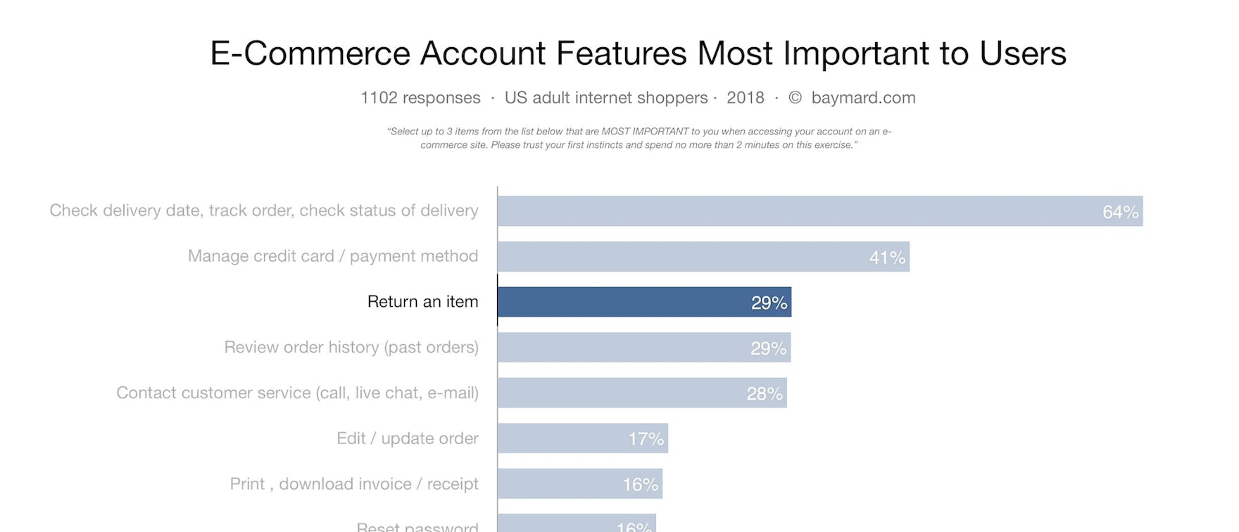
Like traditional brick-and-mortar stores, returning a purchased item will always be a part of the e-commerce user experience — in fact, often more so with online shopping because the products are so often purchased without being physically seen and handled first. Indeed, our quantitative study found that 29% of users said that returning an item were among the most important reasons for accessing their e-commerce accounts.
Despite the importance of returns, during our large-scale usability testing of Accounts & Self-Service experiences at e-commerce sites, the return processes and interfaces caused the most usability issues for users during testing.
In addition, our UX performance benchmark also reveal that 54% of sites have significant usability issues within their returns flow.
In this article we’ll cover select findings on the online Order Return experiences from our research studies, specifically:
- The Importance of Return Experiences and How Much They Can Impact Customer Retention.
- The Current UX Performance of ‘Order Returns’: 54% of Sites Have Significant Usability Issues.
- 5 Commonly ‘Missed Opportunities’ for Online Return Experiences and Interfaces.
(For a beginner’s introduction to UX, start with our primer, UI vs UX.)
The Importance of Return Experiences and How Much They Can Impact Customer Retention
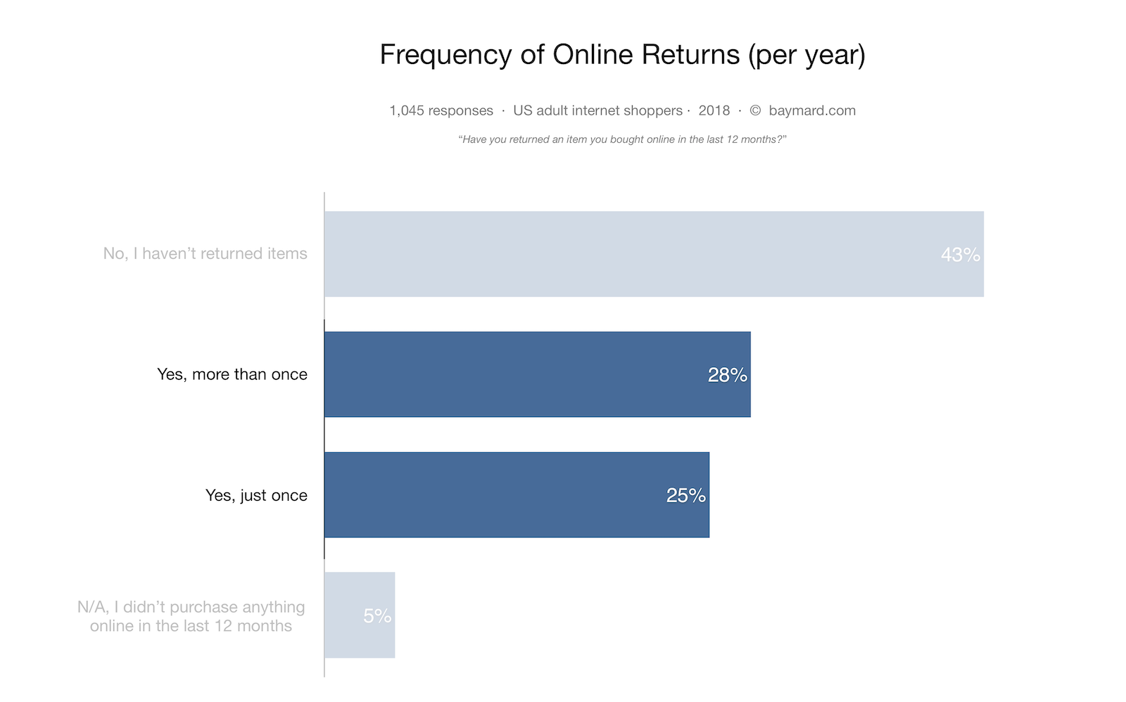
In addition to 29% of users who deem the returns feature as one of the most important reasons for signing into their e-commerce account, our quantitative research also shows that 53% of online shoppers returned at least one item in the past year to an e-commerce site and that 7% of users deliberately buy variants of an item with the upfront intention of returning the items that are not suitable.
In our Checkout study we found that 11% of users have abandoned at least one order in the past quarter solely due to an unsatisfactory returns policy at the site.
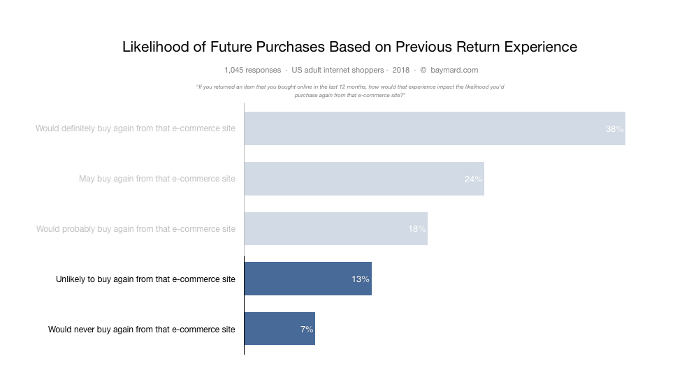
We’ve also found that users base part of their perception of a site — and their decision of whether they’ll make another purchase — on their returns experience. In fact, our quantitative study found that 7% of users would never again purchase from the last site they returned an item to, solely due to the site’s returns experience, while an additional 13% of users would be unlikely to purchase from that site again.
Clearly, the returns process and experience is crucial to a site’s ability to attract, convert, and especially to retain customers. Despite this, according to our UX statistics we find that 54% of sites have significant usability issues within their returns flow.
The UX Performance of ‘Order Returns’: 54% of Sites Have Significant Usability Issues
Analyzing the 660 manually assigned UX performance ratings our research team have set when benchmarking the entire returns flows at the 42 largest e-commerce sites in the world reveals that 54% of e-commerce sites have significant UX performance issues within their ‘Order Returns’ flow. A small group of sites (21%) mitigate the overall poor picture with decent to good performances, along with a small handful of sites even having a “State-of-the-Art” implementation.
When analyzing this dataset and from our usability testing, it’s clear that the reasons for poor ‘Order Return’ experiences are numerous and very much interwoven. Often a handful of UX issues, in various degrees of severity, occur in sequence. Combined they often cause users to face direct roadblocks, where some users will have to contact customer service.
5 Commonly ‘Missed Opportunities’ for Online Return Experiences and Interfaces
Our benchmark reveal that the following five aspects of the return UI and flow are often missed by e-commerce sites:
- 30% of sites don’t have an online return feature
- 21% of sites outsource the return functionalities to third-party courier sites
- 65% of sites do not provide users an easy way to save the return label at the end of the return flow
- 50% of sites don’t promote in-store returns alongside mailed return options
- 55% of sites don’t update the order status after a return is initiated
1) 30% of Sites Don’t Have an Online Return Feature
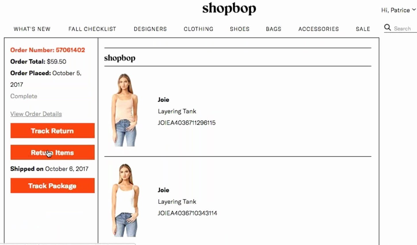
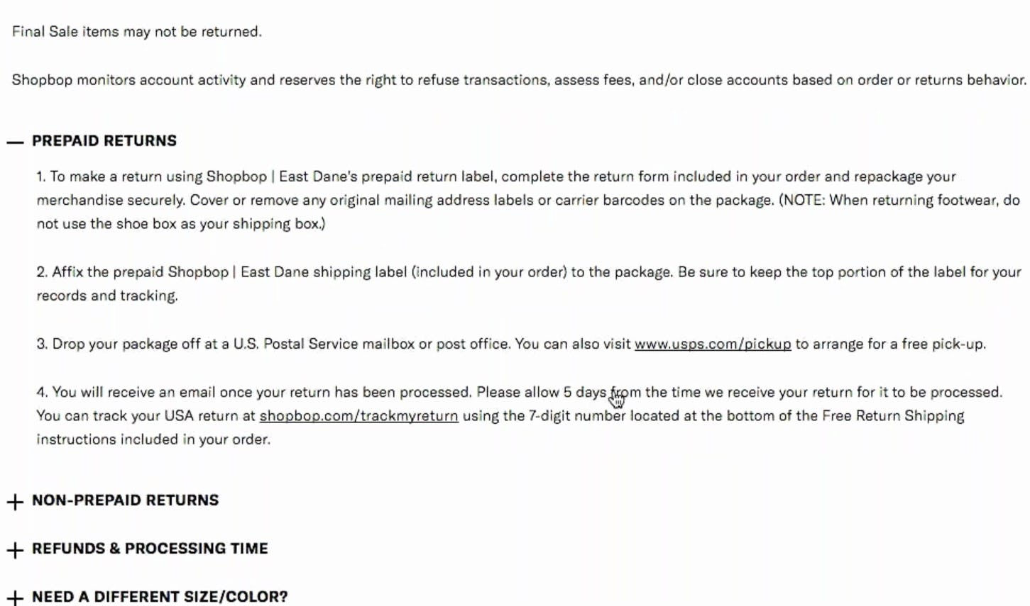
After a user during testing indicated that she wanted to return an item (first image), she was directed to the returns page where the return policy was outlined (second image). “I would prefer it if there was a way I could indicate on this website right now that I am returning this item. It is the only thing making me uneasy. It seems easy, as long as things don’t get lost in the mail.” Shopbop included a returns label in the box, but otherwise offered no online returns process.
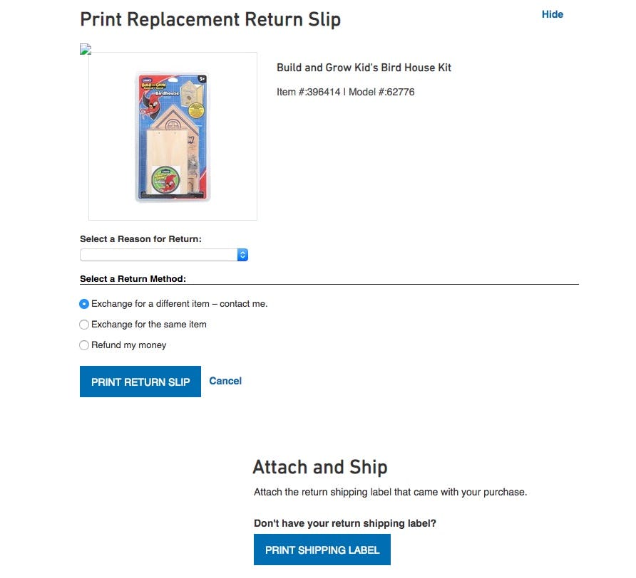
30% of sites don’t have an online order return feature at all but instead rely on including a pre-printed return label with the order. While pre-printed return labels were observed in testing to often be a good thing, as it can significantly reduce the return friction, it should always be supplemented with an online order return flow. In addition to the obvious issues with lost return labels, even when a return shipping label is provided, in testing it was shown that a subset of users are uncomfortable with simply “sending an item back” without first alerting the site that the item is on the way. (Premium users: for more implementation details see guideline #894)
2) 21% of Sites Outsource the Return Functionalities to Third-Party Courier Sites
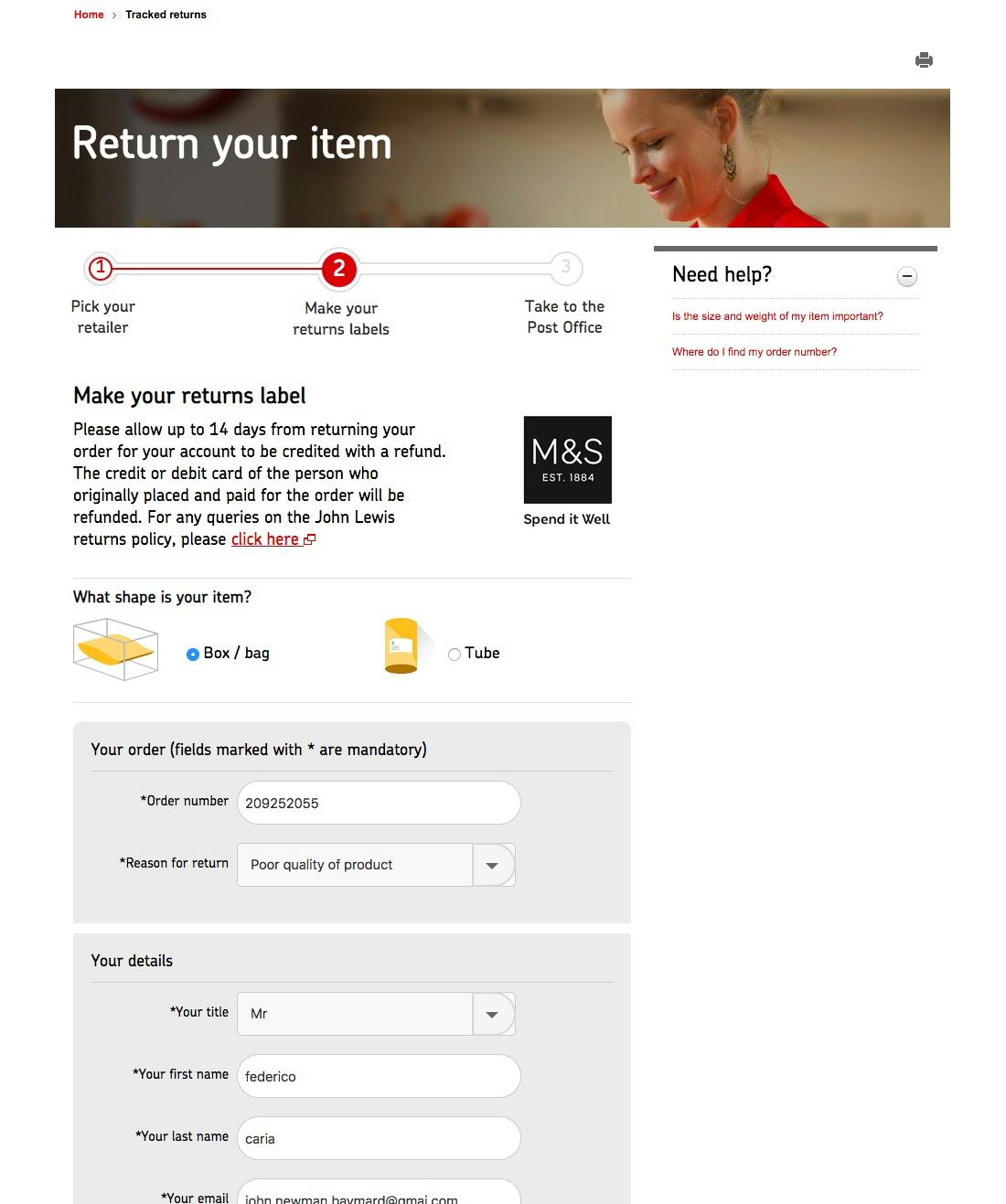
21% of sites outsource their order returns UI or entire experience to a third-party vendor (e.g. Narvar, FedEx, UPS, Royal Mail, etc.). While this is probably good in terms of internal resources the site has to spend on creating a returns flow and process, it causes a complete lack of control over the end-customer’s return experience.
As we’ve detailed in our recent article Self-Service UX: Integrate All Order Tracking Info and Events Within the E-Commerce Site Itself, outsourcing order tracking and order events to third-party vendors — rather than being integrated within the e-commerce site itself — during testing caused it to be harder to access, understand, and navigate for end-users. Even the handful of third-party vendors who have clearly made an effort in trying to provide a good flow and UI, the lack of a coherent experience and lack of complete account data and features (only available at the e-commerce site) still cause usability issues, and are a limitation of this approach.
3) 65% of Sites Do Not Provide Users an Easy Way to Save the Return Label at the End of the Return Flow
Printing the return shipping label is frequently the last step in the return flow. However, our testing revealed that many users will not print the label when they complete the return shipping process. This was observed to be the case for 67% of users during our remote in-home testing, who cited printer issues or the lack of a printer as reasons for having to postpone printing the return label to a later time.
During our remote in-home testing 67% of users wanted to postpone printing the returns label generated at the last step of the returns flow. It resulted in great frustration when the sites didn’t address this issue directly via the features and microcopy provided in the return UI.
Our benchmark reveal that it’s 65% of sites that do not provide users with an easy way to save the return label at the end of the return flow. If printing a shipping label appears to be the only option, it can in many cases lead to users being anxious about their ability to eventually print the label and complete the return process. This in turn can escalate to a phone call to customer service or live chat initiation, and delay a user’s ability to ship the item back.
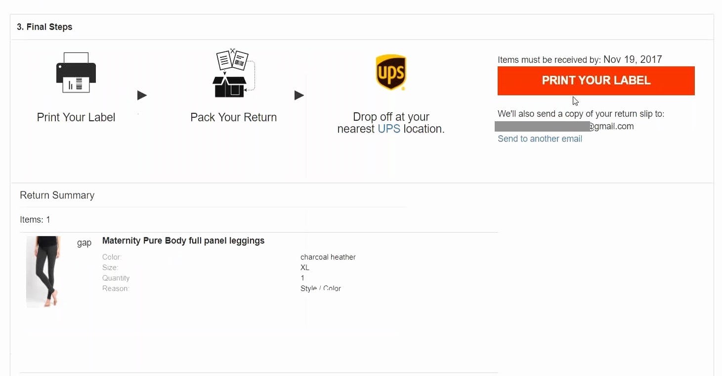
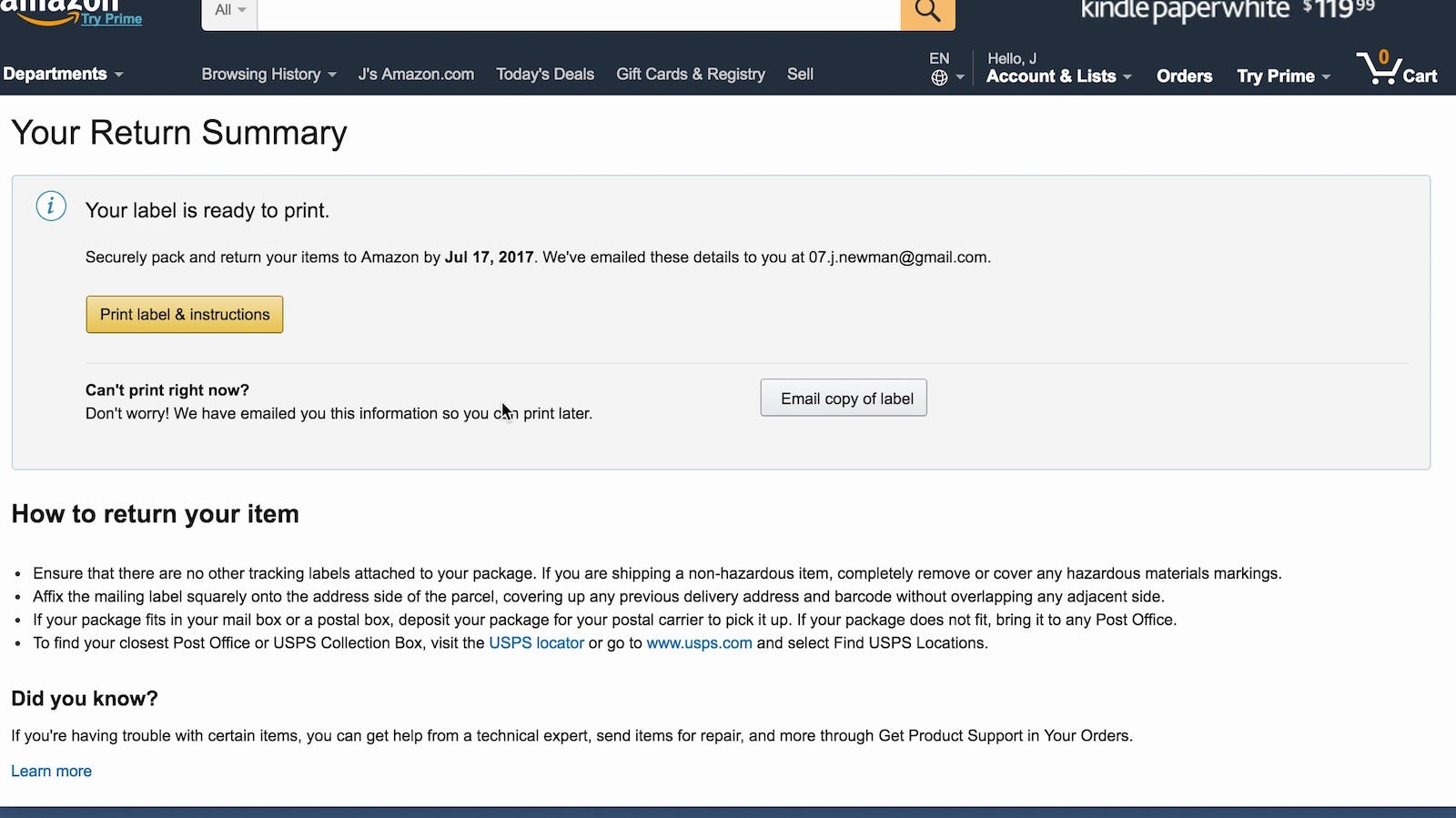
Automatically emailing the shipping label to the user (regardless of whether or not the user prints the label after concluding the return flow) will address the needs of those who desire to postpone printing the shipping label.
However, it is not enough to silently email the label. The fact that an email has been sent with the return label should be stated clearly once users complete the return flow, so that they are not left guessing what their options are if they do not have a printer immediately accessible. (Premium users: for more implementation details see #867)
4) 50% of Sites Don’t Promote In-Store Returns Alongside Mailed Return Options
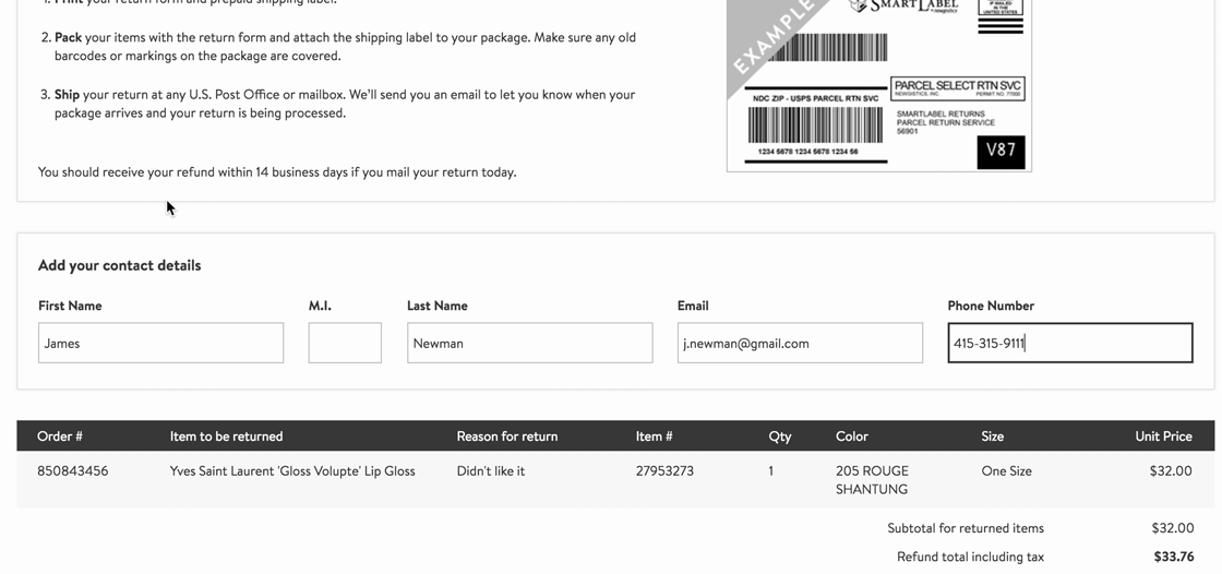
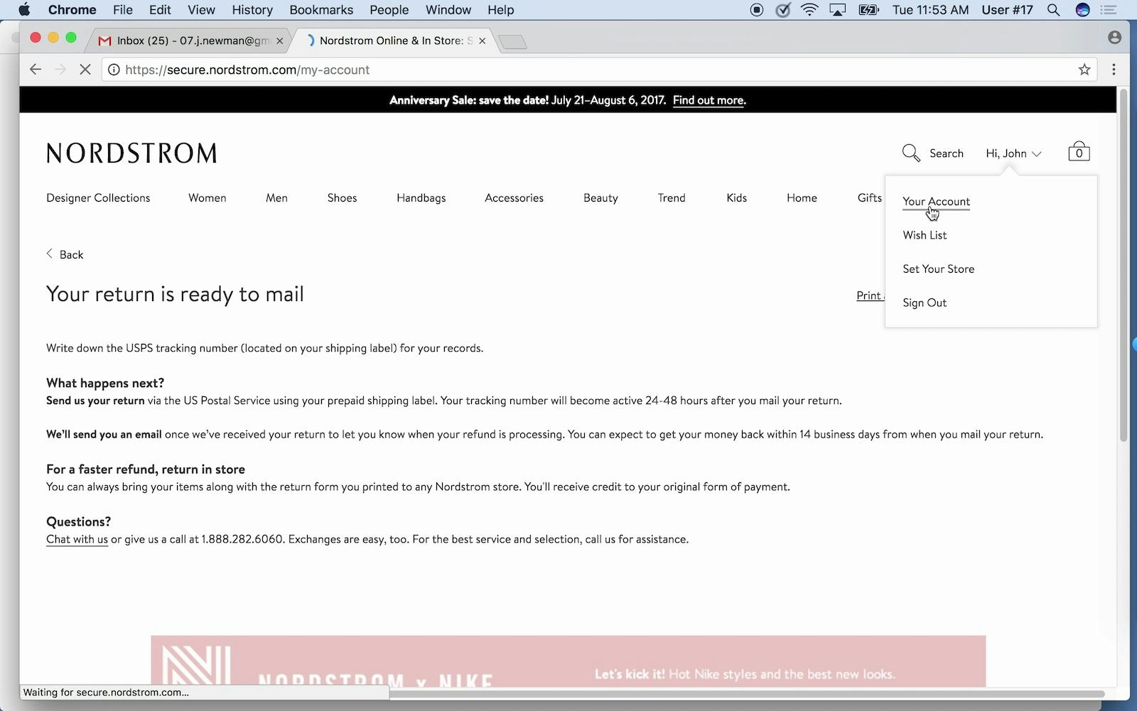
On Nordstrom, the information on returning products in-store is a small text blurb at the end of the return page, well out of view, making it highly secondary to the return shipping option that the first two full viewports of the page are dedicated to (depicted above).
Our testing revealed that failing to present in-store returns directly within the UI for, and as an equal alternative to, the return-by-mail options, makes it needlessly difficult for users to notice the free and same-day in-store return option, and consequently makes it less likely that they’ll take advantage of it. (Identical to our other checkout-related findings on how Users Overlook ‘Store Pickup’ When Not Presented as a Shipping Option.)
This is a missed opportunity, as this is not only an advantage gained through a competitive analysis of UX, but a clear subgroup of users are observed to prefer in-store returns for reasons such as cost, convenience, faster refunds, and easier exchanges — as further explored in our article Promote In-Store Returns Alongside Mailed Return Options.
5) 55% of Sites Don’t Update the Order Status After a Return is Initiated
The progress of the order return process can be as important to users as the progress of the order itself, as users will be intensely focused on the status of their refund or exchange.
A successful return and a refund can be of great importance to users and to their perception of the e-commerce site. The goal for users is to get a refund, which, depending on the cost of the order, can involve a significant amount of money.
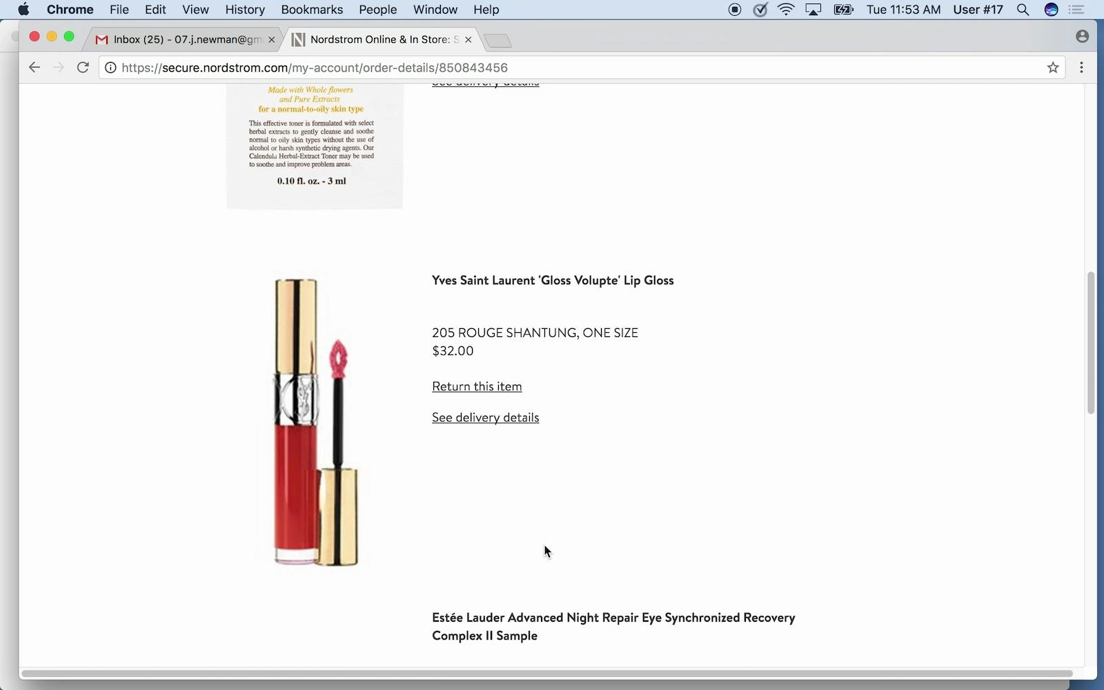
Also on Nordstrom, once another user had completed the initiation of the return process (first image), she looked for an updated status on the website (second image). The item she was returning still had the “Return this item” link visible. As a result, she was unsure whether the return process had initiated successfully. If the order status does not update quickly after the return has been initiated, users could assume that the return was not successfully started.
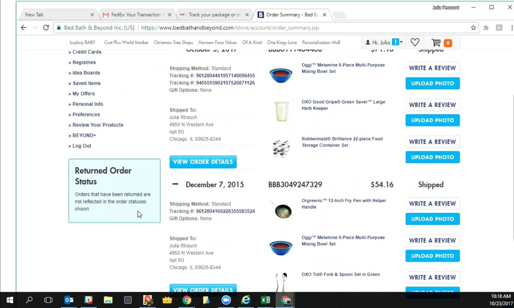
“Okay, but it doesn’t 100% tell me where I could find that information [return status, ed.].” On Bed Bath & Beyond, there was a message on the order overview page that stated that “Orders that have been returned are not reflected in the order statuses shown”. This messaging, though clear, would not help users who needed to find out at what stage their return was at.
The combination of the importance of getting a refund and likely lack of knowledge of the return process makes it critical for e-commerce sites to keep users updated on the progress of returns in ways that keeps users informed and matches their expectations.
However, during testing it was observed that users on some e-commerce sites were unsure about whether specific stages of the returns process were successfully completed and were not clear when the refund might be issued. In many ways the doubts, confusion, and anxiety are identical to the ones we observe users to exhibit on sites that don’t have an “order cancellation pending” status — further detailed in our article “Have a ‘Cancellation Requested’ Order State”.
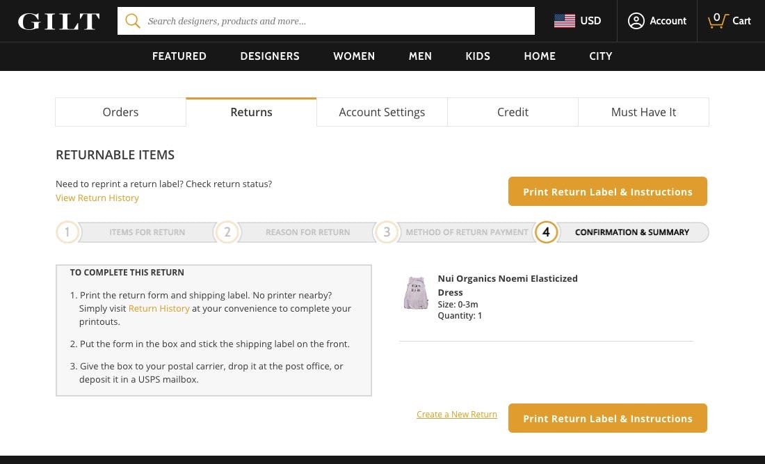
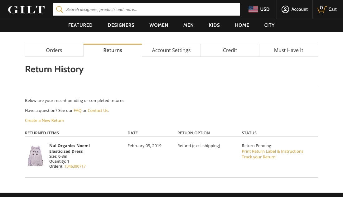
As users proceed from the last step of the return process at Gilt (see first image), the order status updates to “Return Pending” immediately (second image) and the normal order history links update to “Print Return Label” and “Track Your Return”.
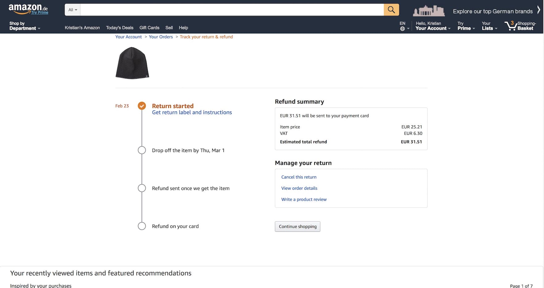
On Amazon, users were able to see a concise summary of the refund process that included a timeline showing the key milestones. Such clear information set clear expectations and makes it much less likely that users will need to reach out for help from a customer service agent about the returns process.
Without timely and accurate updates on the progress of a return, users who are concerned about whether and when a refund will be received are likely to seek assistance from a customer service representative. As one user stated during testing, “After drop off [of the returned item, ed.], I would check my credit card for a reverse charge a week later, and check the site. Another week later I would call customer service”. Users should be able to see what the stages of the return process are, work out when each stage is likely to be completed, and receive status updates when the item has been received by the website and the refund has been made. It is in the interest of both users and e-commerce sites to update the status of returns quickly and transparently. (Premium users: for more implementation details see guideline #922.)
Focussing on the Return Experience
Considering how many returning customers can easily be lost in the returns experience (up to 20% of customers), we observe surprisingly many severe UX issues at even larger sites. In particular considering many of these issues are relatively simple to address as they relate to “just” the returns user interface, the returns flow, and the information presented along it (as opposed to the return policy itself, which is obviously a business strategy decision).
While the benchmark dataset clearly reveal that sites have an even higher number of specific usability issues to resolve in their returns flow, most will be able to use the five commonly missed opportunities address in this article, as a starting point for improving their return experience:
- 30% of sites don’t have an online return feature
- 21% of sites outsource the return functionalities to third-party courier sites
- 65% of sites do not provide users an easy way to save the return label at the end of the return flow
- 50% of sites don’t promote in-store returns alongside mailed return options
- 55% of sites don’t update the order status after a return is initiated
Lastly, for inspiration on return flows, consider taking a closer look at Amazon, Best Buy, Apple, and Wayfair who all perform quite well. In our Page Designs tool you can also see 52 design examples of Order Return UIs.
This article presents the research findings from just 1 of the 700+ UX guidelines in Baymard Premium — get full access to learn how to create a “State of the Art” Accounts & Self-Service user experience.

