In business we often look at the Return on Investment (ROI) to gauge if an investment will be worthwhile, and later on evaluate if the investment proved to be a good or a bad one. In the 250+ usability test sessions we’ve conducted so far we’ve often observed that users keep a similar score when deciding what to click on a website. We call it Return on Click Investment (ROCI).
A click, or a tap in the case of mobile, is an active user decision. It’s a choice about a desired path or action as well as a physical interaction. A click often also means committing to a page load, quite possibly followed by new UI elements to interpret. As such, when users click something on your site they are making an investment of both time and mental effort, and it’s therefore extremely important that you deliver a return on that investment.
Just like in business, it’s clear when there’s a poor return on click investment – users will often (unsolicited) express their disappointment with the content they receive after clicking an element. And just like in business, after a few investments that yield an inadequate return, few new investments will be made in the same area (i.e. users abandon their browsing strategy or the site altogether).
In this article we’ll demonstrate cases of both good and poor ROCI, including examples from multi-million dollar brands. While the concept may appear simple at first, ensuring the proper ROCI throughout your entire site is no easy task and takes a concerted effort that even major sites frequently fail to execute.
Ensuring a Proper Return on Click Investment (ROCI)
The key to delivering a positive ROCI is setting the right expectations before the user clicks and then living up to those expectations at the resulting page. If the pay-off of the new page is lower than the effort required to get to it, the user will consider it a poor “Return on Click Investment”.
ROCI equation: Investment (mental and time) < Return (value of content)
This type of “scorekeeping” was observed extensively during our mobile e-commerce study, and it was confirmed again during our most recent usability study on category navigation. Every time a user got a poor return on their click investment they grew a little less confident in the site. On mobile, users tend to grow jaded particularly fast because load times and device performance is inferior to desktop browsing making the investment comparatively larger – mobile users are therefore even more sensitive to the ROCI equation.
While the pay-off of a click is in large part determined by the resulting content, setting the right expectations for that content can be equally important (if users expect A but get B they are likely to find the value of the result diminishing). Therefore, the first part of achieving a good ROCI on your site is setting the right expectations. The second part is then making good on that promise by meeting those expectations.
In the next two sections we’ll go over some examples from our prior usability studies, showcasing what it means to set the right (or wrong) expectations and giving a good (or bad) return.
Setting the Right Expectations
Users expectations can be shaped by good information scent. When sites fail to align the user’s expectations a link’s destination with where it actually takes them, it’s typically because of either 1) a lack of information scent, 2) ambiguous information scent, or 3) purposeful deception.
Purposeful deception is when a site intentionally over promises to lure users into a certain action or page only to (knowingly) come up short on that promise. Obviously this is a short-sighted strategy that alienates users and we won’t be spending anymore time on it in this article. The two other cases, lack of and ambiguous information scent, are often unintentional oversights but they can prove just as damaging to the user experience.
Lack of Information Scent: Best Buy fails to provide proper information scent for their “Deal of the Day”, with users having to click the banner without any idea of even the product type or theme of the deal. Ideally, Best Buy would give a hint as to what the deal is so users at least have an idea of what to expect when clicking the banner. The banner could for example say ‘Deal of the Day: Asus 15” Laptop’ so that users wouldn’t have to click it in order to find out that today’s offer is for a laptop. During testing, many subjects clicked the “Deal of the Day” banner but nearly all of them left the resulting page immediately as the day’s offer wasn’t of interest to them.
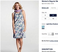
On GAP, every single product page has a “Reviews” tab regardless of whether there are actually any reviews available. This obviously leads to many fruitless click investments as users have no way of knowing this before clicking the section. Adding a review count to the section label or hiding / disabling the section altogether would be sufficient information scent to avoid these needless clicks to a content dead-end. Sections with user-generated content are a typical pitfall for lack of proper information scent because the “empty” state is often not experienced (that is, whenever the product has user-generated content available), making it easy to overlook this state when initially designing the page and when later reviewing the site.
Ambiguous Information Scent: During our latest usability study the subjects consistently praised Pottery Barn for their beautiful imagery, however, sometimes these images would actually mislead the subjects. In the above example a subject clicked the center image because she was intrigued by the table in it, however, instead of getting to a product page for the table she was sent to a “Rug Sale” category page. Lifestyle and usage inspiration images can often mislead users as they tend to focus on the items they are looking for instead of reading the image label. Of course it doesn’t help when the image label is ambiguous too, which is the case for two of the three top images at Pottery Barn (“naturally beautiful” could refer to both a table and rugs, and “celebrate mom” could similarly refer to any of the items shown in the image).
Toys’R’Us provides another example of ambiguous information scent. Below the “Add to cart button” on their product page, there are two tabs, “Description” and “Additional Info”, with the “Description” tab opened by default, revealing a short product description. Multiple subjects clicked the “Additional Info” tab expecting to find a longer description or additional product specifications such as the materials it was made of and perhaps the product dimensions. Alas, the site instead returned a set of internal references such as a product ID and a UPC code. Good, context-independent copywriting is key to avoiding ambiguous information scent.
Lack of Return
Setting the wrong expectations will often leave the user feeling they got a poor return on their click investment as they wanted one thing but got another. Yet, sometimes it’s not that the content doesn’t match the user’s expectations but rather that the return is practically non-existent (that is, the content is relevant but there’s not enough of it).
Too little new information: “Irrelevant. I thought I’d see some different offers,” a subject explains at Enterprise after clicking through the ‘Current Specials’, continuing: “it sounded like there would be something to choose, and then it was just a bit of info, it could have been written any other place.” The ‘Current Specials’ attracted many clicks from the subjects during our mobile study, however, it only revealed a 3-line description and a “Learn More” button, which when clicked provided very little additional information (only one additional line saying “Includes 100 miles per day”).
Users often feel they are getting a poor return on their click investment when little new information is presented to them as they click to learn more about an option. The problem is not that the content isn’t relevant but rather that it’s insufficient or that there are simply redundant steps between content and action (e.g. from reading about a deal to actually booking it).
No information before further click-investments: On Best Buy a “Click to View Price” label is displayed in bold red letters for some of the product list items. As the depicted subject tapped one of the products, the product page loaded but the price was nowhere to be found on the page. It turns out that you won’t see the price even after adding the product to the cart and passing through a cross-sell page (it’s only displayed during the checkout process).
Users understandably grow frustrated when they are asked to click through numerous screens just to see the price of a product – they are essentially getting no return on their click investment, and then on top of that zero-return slam in their face they are asked to make further click investments! In fact, the “Click to View Price” promise is flat out broken – the user is not shown the price upon click.
Users Keep Score
Each time a site fails to deliver an adequate return on the user’s click investment, a dent is made in the user’s confidence and experience of the site. Throughout our usability studies it has become evident that users are obviously keeping score (subconsciously of course), and to they aren’t forgiving: negative returns make more of a mental impact than positive ones. It only takes a few negative click investments to outshine numerous positive ones.
Given that the ROCI calculation is applied to the entire site (and not just a particular area or process of the user’s browsing session), it’s crucial to ensure that all links and buttons throughout your site deliver on their promise by setting the right expectations and then returning an adequate amount of relevant content upon click. This is of course easier said than done, as is evident from the earlier (negative) examples of multi-million dollar brands.
As a rule of thumb, if little or zero new information is presented upon a click, you’ll want to reevaluate the step – is it necessary? Can more information be delivered?
Spotting if the wrong expectations are set is often a little more tricky to determine, especially for the people working on the site as they know what to expect from their own site and are therefore rarely mislead by its copy. It’s therefore often good to observe “outside” users going through your site to spot these types of ambiguity. Low-key qualitative think-aloud usability tests can be a cheap way to do this.
A consistently positive return on click investment can make the difference between a seamless shopping experience and a site that is perceived as cumbersome and convoluted. Therefore, whenever you’re designing links and page flows, closely consider the user’s ROCI – are you setting the right expectations? And are you delivering on those promises?


