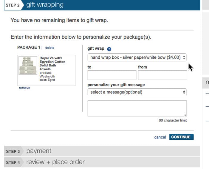
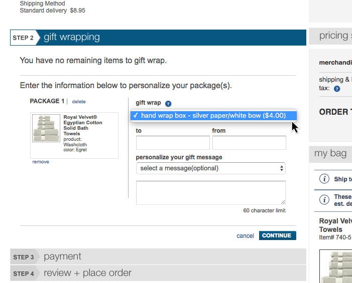
Presenting users with drop-down, radio button, or other selectors, when there’s no selection to be made, leads to unnecessary clicks and user frustration.
Our large-scale Checkout usability testing reveals that 14% of e-commerce sites, at some point in the checkout process, present users with what appears to be a selectable option, only to disappoint users when it turns out there’s only one option, or the option displayed isn’t selectable after all.
Our testing revealed that, for most users, this results in confusion over why they’re being presented with a selection that can’t actually be made, which slows them down as they stop their progress in the checkout to puzzle over the option.
This user hesitation can result in simply mild annoyance at being offered a choice when one doesn’t exist, but is also observed to cause more serious user frustration, as some users attempt to make unavailable selections. Yet our benchmark data show that 14% of sites don’t remove “Select” features when there’s only one option left.
In this article, we’ll discuss the test findings from our checkout usability study related to “Select” features (like a drop-down or radio buttons) with only one option available, and provide a solution that testing revealed performs well with users.
Showing a Selection Interface Is Confusing When There’s Only One Option
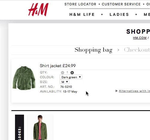
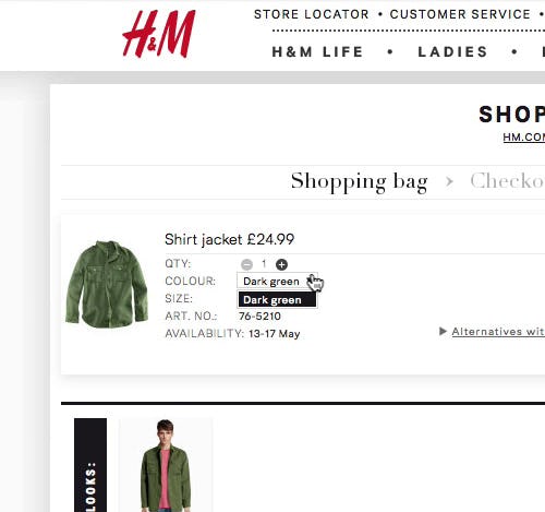
“And then I can select the color,” a subject says in the cart at H&M (first image), and clicks the drop-down, only to disappointedly realize that “there’s only green. Okay” (second image). Presenting users with what seems like a choice will result in unnecessary clicks and frustration.
At RueLala, users are presented with a drop-down containing a preselected shipping option, but when they click the drop-down to see the expected alternatives, none are available.
Issues also occurred when testing radio-button interfaces with only a single choice, as seen here at Blue Nile, where users doubted whether there were choices to make (there weren’t).
“Why are you asking me to choose something when I have no choice?” one test subject pondered after opening a drop-down only to find it contained just a single preselected value.
When presented with a selection interface, like a drop-down or a set of radio buttons, users tap into their prior experience, which tells them that these interfaces clearly communicate that a selection either can or must be made.
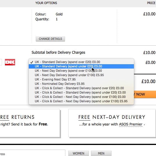
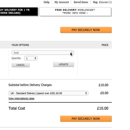
At ASOS, 33% of the test subjects were confused about invalid options included in the shipping selector drop-down at the cart step. Several tried to pick invalid options, saying, “When they give me the option it just might work” or “I’ll choose this one anyways [‘Spend over £20’, ed.] and see if it figures that out itself.”
“Okay you can’t select anything. There’s only this one,” a test subject concluded after attempting to open the color drop-down. When faced with disabled drop-downs, users often clicked multiple times (as many as 4) before concluding the drop-down couldn’t be opened.
The issue often occurs on sites when the select values are dynamically removed as they become invalid or unavailable — for example, removing those shipping options that are not available for the address the user has typed. This is in itself a good idea — that is, only showing options that are relevant to users based on their current context. However, in cases where there’s only a single option left, it shouldn’t be presented as a selectable option anymore since it’s no longer a choice.
When There’s Only One Option Available, Use Static Text
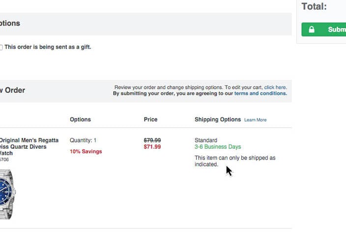
Notice how Overstock.com dynamically changes the radio button interface for their shipping options (first image) to static text when there’s only a single option available (second image).
While selection interfaces should dynamically remove options as they are no longer available to users, the selection interface needs to take into account the stage where there’s only 1 (or 0) options left. Instead of displaying a selection interface (a drop-down, radio buttons, etc.) with a single option, we’ve found in testing that this single option should instead be displayed as plain text on the page. This way the same information is conveyed without confusing users by indicating a selection is to be made (otherwise indicated by the selection interface). As an additional bonus, there will also be fewer form elements on the page, making it seem less intimidating.
Note that the single option should be displayed as text, instead of simply “disabling” the selection interface (i.e., greying it out). Simply disabling the interface element was observed to perform poorly during all of our checkout and mobile usability studies, as users seldom noticed the interface was disabled or understood the concept — consequently, users were just as confused by the disabled interface as the selection interface with just a single option.
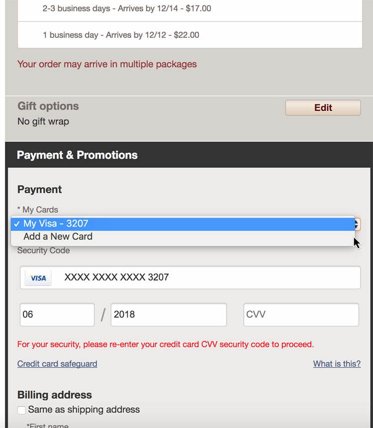
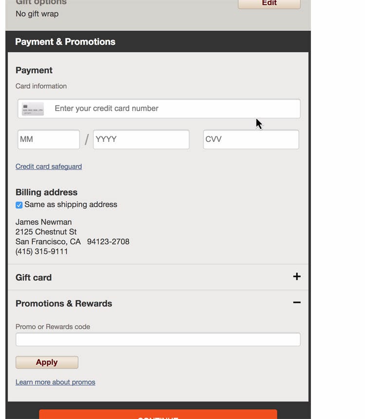
At GAP, registered users with saved credit cards are asked to either select an existing credit card or add a new card during checkout (first image). However, for registered users without saved payment methods the drop-down is removed (second image), which is also what is displayed to guest users. Therefore only users for whom making a selection makes sense (i.e., registered users with one saved credit card) are shown the selection drop-down.
Again, it’s 14% of the top-grossing US e-commerce sites that do dynamically remove the options within selection interface as they become unavailable based on the user’s context, but then neglect to consider the stage where there’s only one option left for users to “choose” – here the entire selection interface should be dynamically removed.
This article presents the research findings from just 1 of the 650+ UX guidelines in Baymard – get full access to learn how to create a “State of the Art” ecommerce user experience.

