This is the 2nd in a series of 8 articles on checkout usability that combine findings from our checkout usability study and benchmark of the 100 largest e-commerce sites.
Updated article available: we have a never version of this article based on subsequent large-scale checkout usability testing: Always Explain Why the ‘Phone’ Field Is Required - 58% of Sites Don’t
During our checkout usability research study we found that customers feel their privacy is invaded when they’re required to submit seemingly unnecessary personal information. E.g. a required phone number field, without any further explanation or help. In our benchmark we found that 61% of the largest e-commerce sites in the US required such “seemingly unnecessary” information during their checkout process.

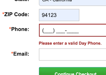
Build.com’s payment and billing step is just one example of the 61% of the top 100 grossing e-commerce sites that require their customers to submit a phone number without explaining why.
The “seemingly unnecessary” part is noteworthy because the issue is largely one of perception. The e-commerce site may have a valid reason to ask for this information, but that reason must then either be 1) self-evident to the customer, or 2) explicitly communicated (the site must state why this seemingly unnecessary information is in fact necessary). However, let’s first dig a little deeper into the underlying issue as seen from the customer’s viewpoint.
Consumers are Suspicious: Explain ‘Why’
During user testing at Apple.com one test subject refused to give up her phone number, anxiously clamoring: “Look, why do they need my phone number? What do they need that for? They don’t need it!” During the checkout usability study every single test subject at one point or another complained about a website that asked for too much personal information.
Most test subjects subscribed to a simple logic: if the store already has one way of contacting me (e.g. e-mail), why do they need another (e.g. phone)?
What surprised us during testing was that the test subjects were quite forgiving as long as the website explained why the information was needed. In fact, the anxious test subject quoted in the beginning of this section provided her phone number to another website without any complaints because the store clearly explained that the phone number was needed in case of delivery problems.
Both Target (top) and Victoria’s Secret provide decent explanations of why the phone number is required to place an order.
If the information is truly necessary for your e-commerce business then at least explain why you require it. What is obvious to you may not be obvious to the customer. Most have learned to expect the worst when submitting personal details online (usually spam e-mails and machine phone calls).
A decent explanation for a phone number field that was generally accepted by the test subjects went something along the lines of: Only used to contact you in case of problems with your order or delivery. The best way of explaining “why” is by stating it directly in the field’s description, and not hiding it behind a link or a tooltip (although a tooltip is much better than not explaining it at all).
The Business Aspect
Of course one might suspect that the reason more than half of the e-commerce sites don’t offer such an explanation is because they don’t feel comfortable promising that they will never use the data for marketing purposes too. Our study and subsequent benchmark unfortunately didn’t go as far to actually uncover what percentage of these stores used e.g. a provided phone number for marketing purposes after the purchase.

Crate & Barrel doesn’t explain why they require a phone number – do they intend to “spam call” me? Is it an oversimplification? Or did they simply not think of it?
Those e-commerce sites that don’t explain why they require fields such as a phone number, are hurting their checkout experience unnecessarily because a great deal of their potential customers will assume the worst. (Given that they have no intention of “spam-calling” their customer afterwards). A handful of top 100 grossing e-commerce sites might have the brand leverage to get away with it unbruised, but do you have the same kind of brand power?
We did notice one exception in the behavior of the test subjects: the more expensive the order was, the more tolerant the subjects were. When buying an expensive laptop, customers want you to be able to contact them easily and reliably. Less so for an impulse apparel purchase.
All of this of course only applies if you require the information in order to complete the purchase. On websites where the field was optional, the subjects that weren’t comfortable giving their phone number simply left the field blank without any hiccups at all. (This of course increase the importance of clearly distinguishing between required and optional fields, or some customers will misinterpret the field’s qualifications anyway).
Make It Optional or Explain It
In summary, you have two options:
- Make “seemingly unnecessary” form fields optional.
- Explain why the information is necessary, either next to or below the form field.
The first option fully alleviates the issue – people who don’t want to hand over their information don’t have to. The second option is an effective way to soothe the privacy concerns of most customers when you need (or badly desire) certain customer information that is seemingly unnecessary (in the eye’s of your customer).


