Key Takeaways
- When users can’t select multiple options, they have to redo the filtering process for each option — an even more difficult process on mobile
- 15% of sites in our benchmark don’t let users select multiple filter options, causing them to abandon products
- Allowing users to combine multiple filtering options within the same filter type ensures that they can find suitable items
Video Summary
Despite the ubiquity of filters in e-commerce, Baymard’s large-scale UX testing of Product Lists & Filtering reveals that the underlying filtering logic at some e-commerce sites misaligns with how users expect filters to work.
Multiple rounds of testing have shown that when users can’t select multiple options for a filter type they have to redo the filtering process for each separate filter option they are interested in — a process rendered even more difficult and tedious on mobile.
To enable users to easily apply all the filter options they want so they can get a product list composed of only items that satisfy their requirements, sites should allow users to combine multiple filtering options within the same filter type.
However, our e-commerce UX benchmark shows that a surprising 15% of sites don’t let users select multiple filter options — causing some users to abandon suitable products as a result.
In fact, our usability testing shows that filters are sometimes wrongly implemented as mutually exclusive — meaning users can only select one filter value (e.g., “Blue”) at a time for a given filter type (e.g., “Color”), thus making it difficult for users to narrow product lists in order to focus on items they actually want to purchase.
This article will discuss our latest Premium research findings on how users select filters and the underlying required filtering logic, including:
-
How not allowing users to combine filter values makes it quasi-impossible to use filters to narrow product lists
- How allowing users to combine filter values enables them to adapt the product list to their specific needs
- Why it’s important to understand the difference between “AND” and “OR” logic for filters
Why Users Have Difficulty Applying Multiple Filter Values When Filter Values Are Mutually Exclusive
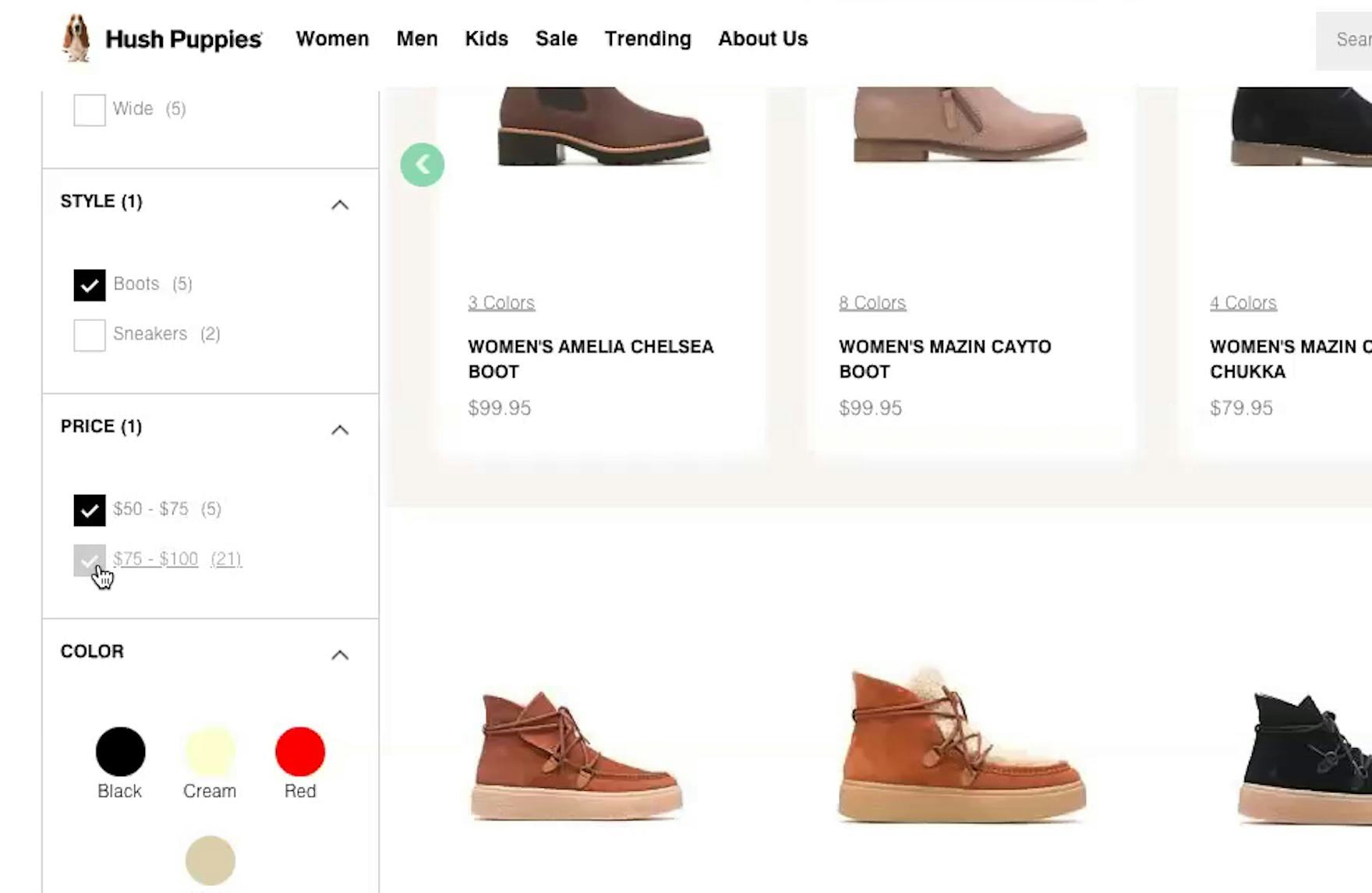
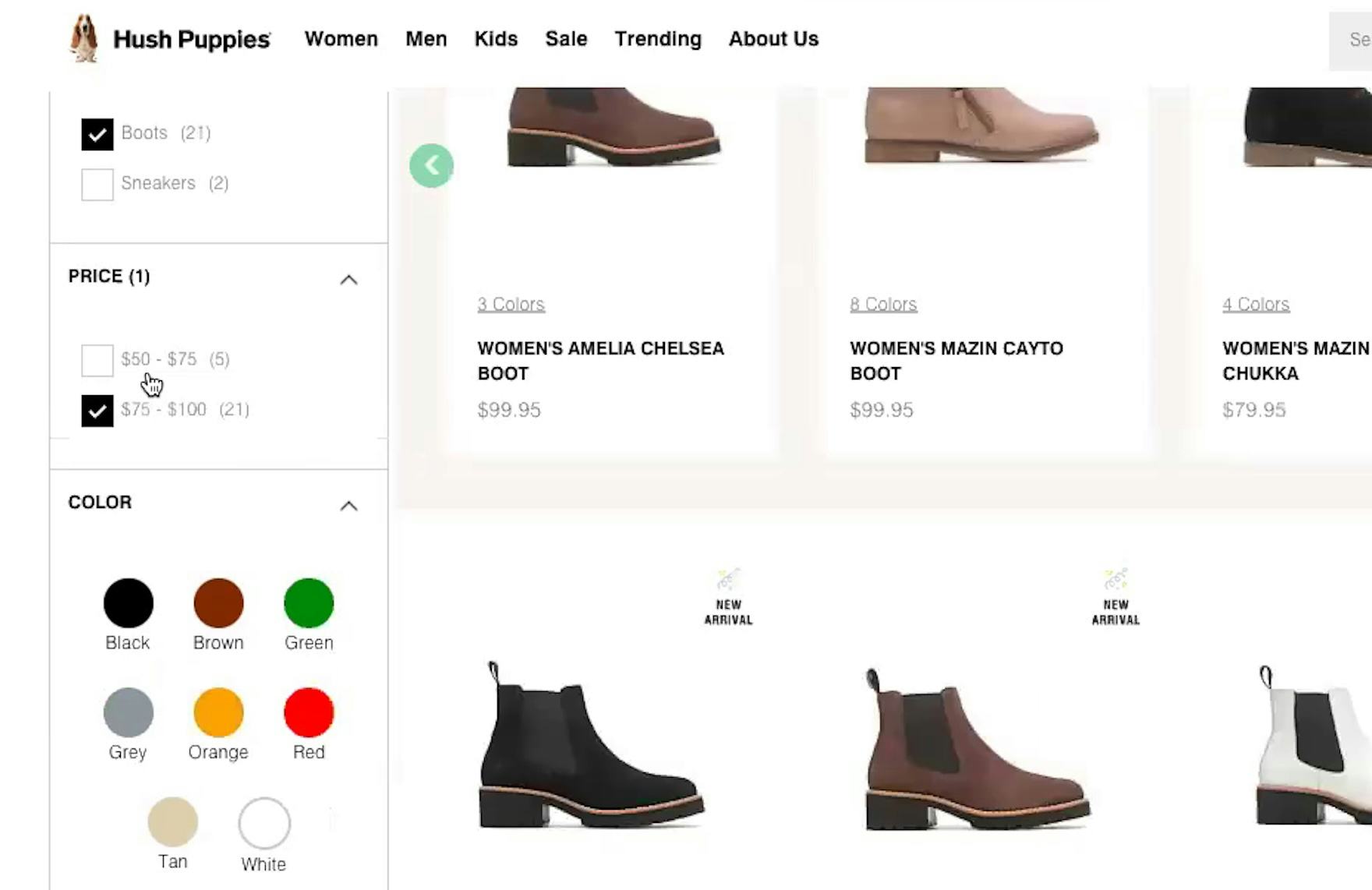
“Let’s say I have a budget of $100 for boots, so I’ll do about both of those [price options]. Oh, it looks like you have to pick one or the other.” This participant at Hush Puppies was unable to see all boots priced under $100 in one list because she could only choose one option in the “Price” filter. Without being able to see all suitable items in one list, comparing products becomes needlessly tedious.
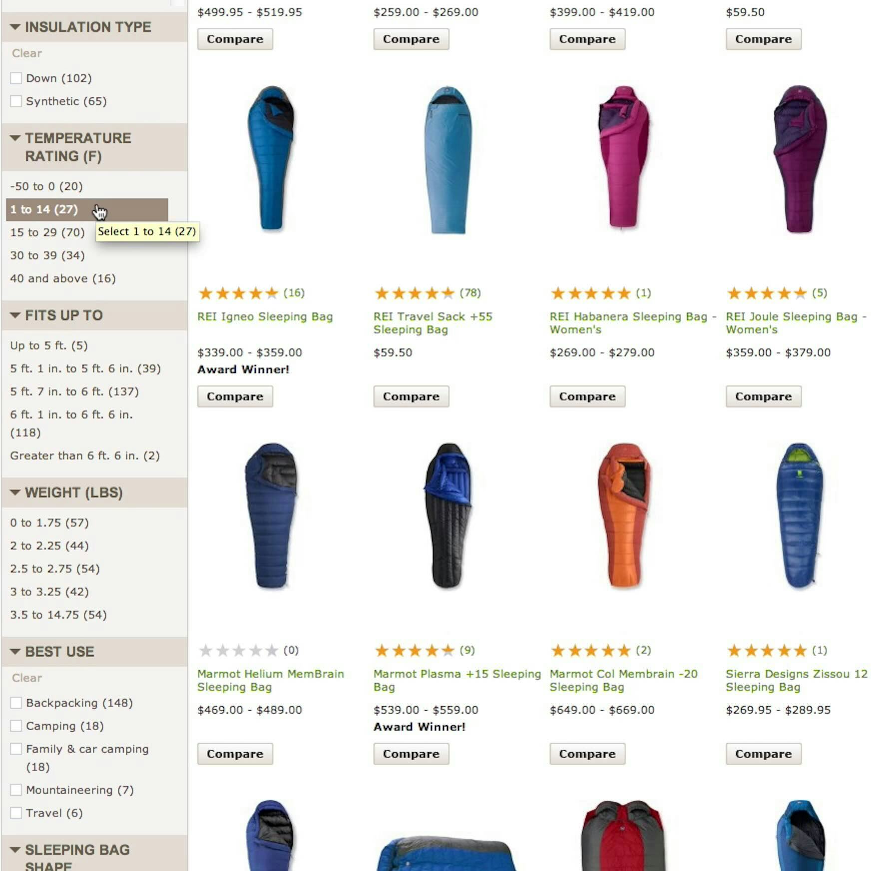
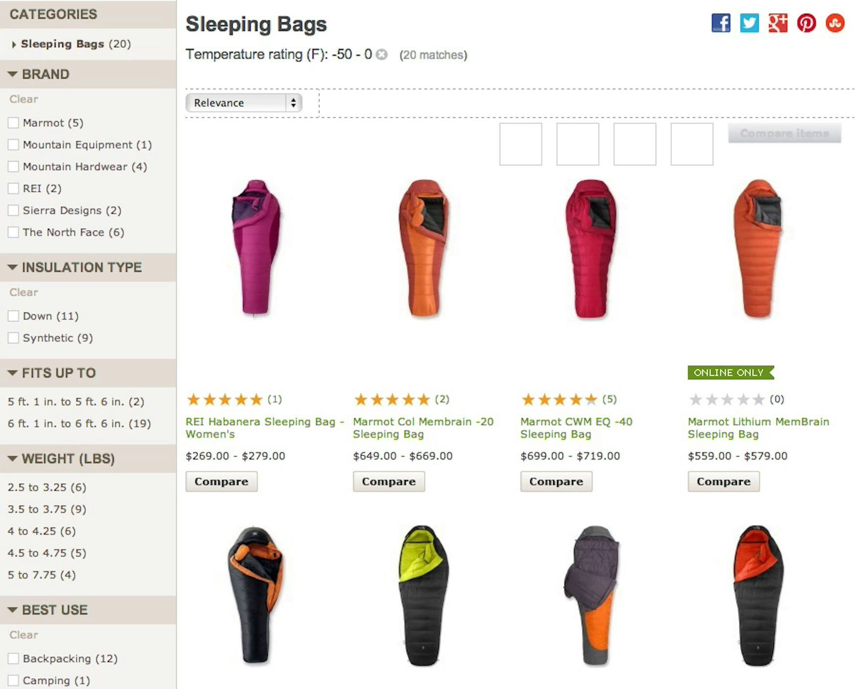
A participant in an earlier round of testing at REI wanted to apply 2 different temperature filtering options (first image). But as soon as he selected “-50 to 0” the entire “Temperature” filter type disappeared (second image), making it impossible to apply multiple filtering options within the same filter type. This issue caused many participants much frustration as they applied filters.
To understand how negative an impact mutually exclusive filter values can have on the end user, it’s worth considering the process a user must go through when trying to use a filtering implementation that doesn’t allow filter options to be combined.
“I wouldn’t mind paying up to ‘$100,’ but if I select that option I don’t get to see any of the ‘$50–$74’ training shoes…In fact, I would like to tick these 3 price options so I don’t miss out on any good deals.”
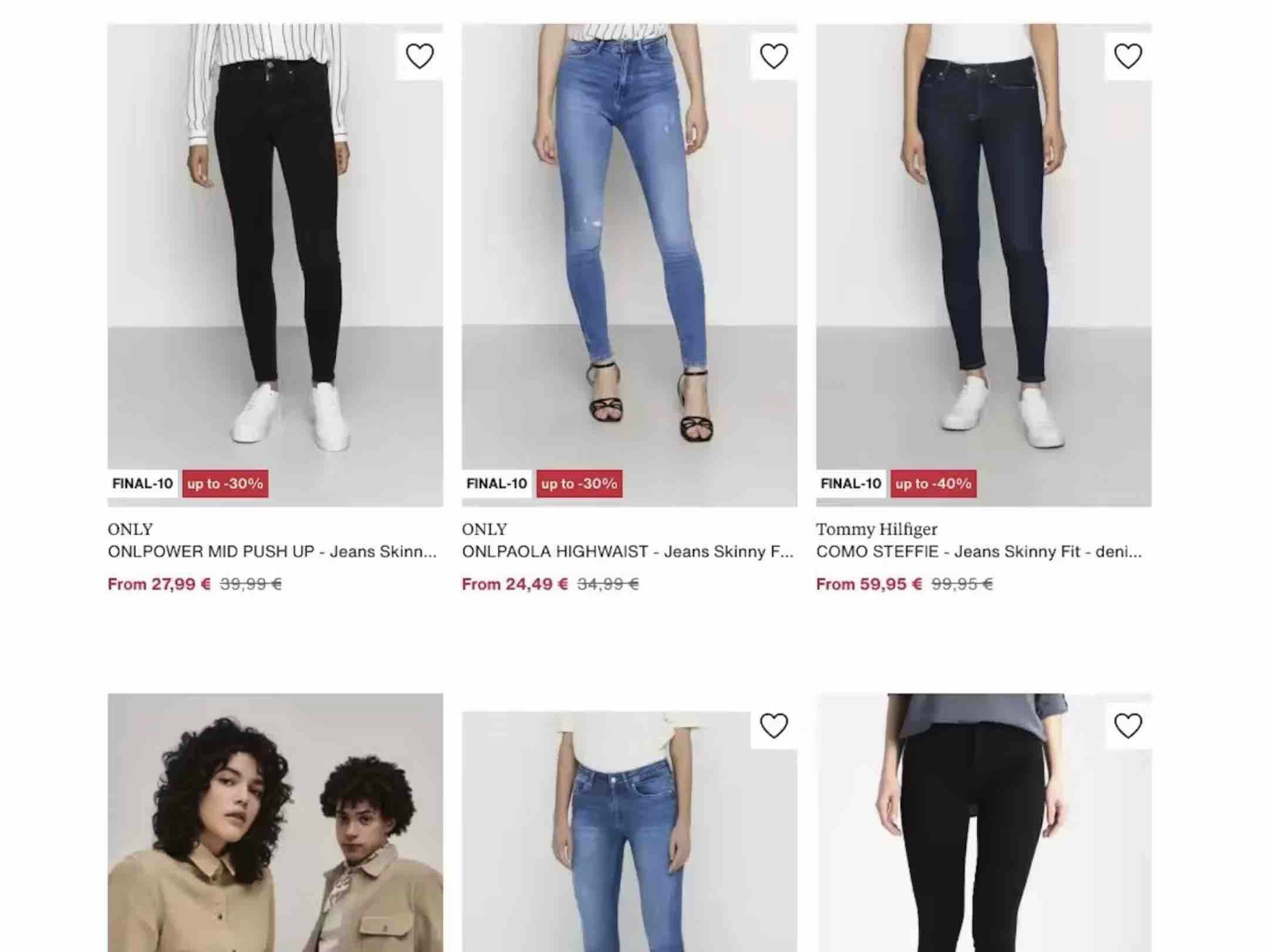
When selecting filter options, users frequently need to choose more than one option from each filter type — for example, users in a product list of jeans may want to see both “Blue” or “Black” jeans.
Indeed, during testing, it was commonplace for participants to try to select more than one filter option in a single filter type.
When they were unable to do so, participants couldn’t establish an overview of all the products matching their unique set of requirements and some had to abandon their efforts to find a suitable product.
So when users cannot select more than one filter option in the same filter type it is both unexpected and problematic — and sites that don’t allow multiple selections are very much the exception.
At sites where the filtering options within a filter type cannot be combined, users who are interested in, for instance, either “Blue” or “Black” jeans must go through the following process to access a set of suitable products:
-
Apply the first filtering option (“Blue”)
-
Look through the products in the filtered list
-
Memorize the interesting products for “Jeans: Blue”
-
Deselect the “Blue” filtering option and wait for the page to reload to see the prior product list without any filters applied
-
Apply the second filtering option (“Black”) at the now unfiltered product list
-
Look through the products in this new filtered list
-
Memorize the interesting products for “Jeans: Black”
-
Deselect the “Black” filtering option and again wait for the page to reload to see the prior product list without any filters applied
-
Finally, users must now — from memory — locate all the wanted options in the now unfiltered product list and compare them
Users will have to go through these multiple steps just to see the results across 2 filtering options if they are mutually exclusive.
And as more filters are needed, the process gets both increasingly tedious and increasingly impractical because the user has to memorize more and more products across the product list — until they can’t realistically remember all of the options anymore (during testing it was not uncommon for test participants to apply 5 or 6 filters, with some applying up to 10).
When filter options cannot be combined, users are effectively prevented from seeing all relevant products matching their needs.
In fact, during testing, when filter options were mutually exclusive, participants were far less likely to use filters, or to use them effectively — and therefore were less likely to find suitable products.
Mutually Exclusive Filter Options Are Worse on Mobile
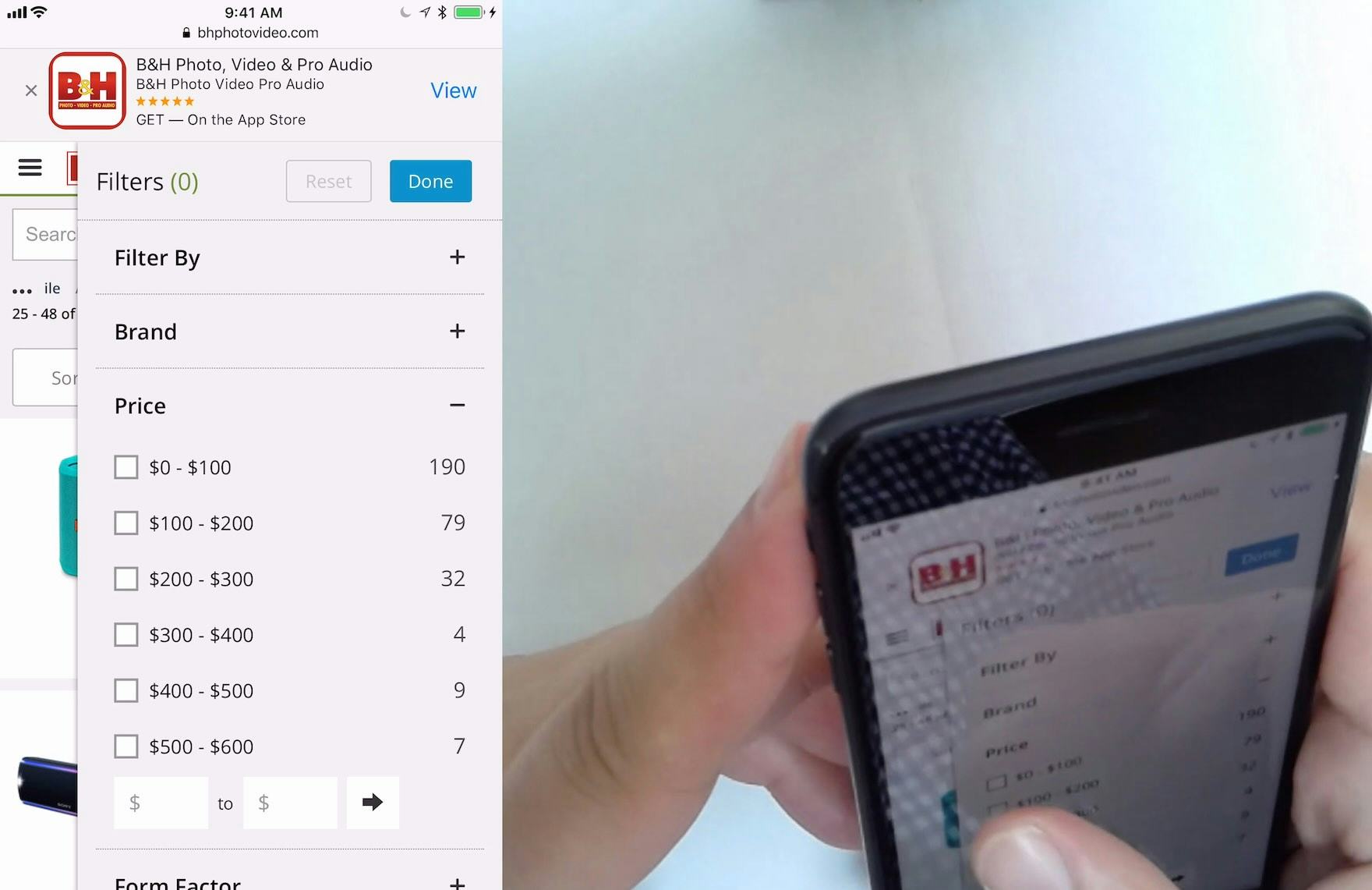
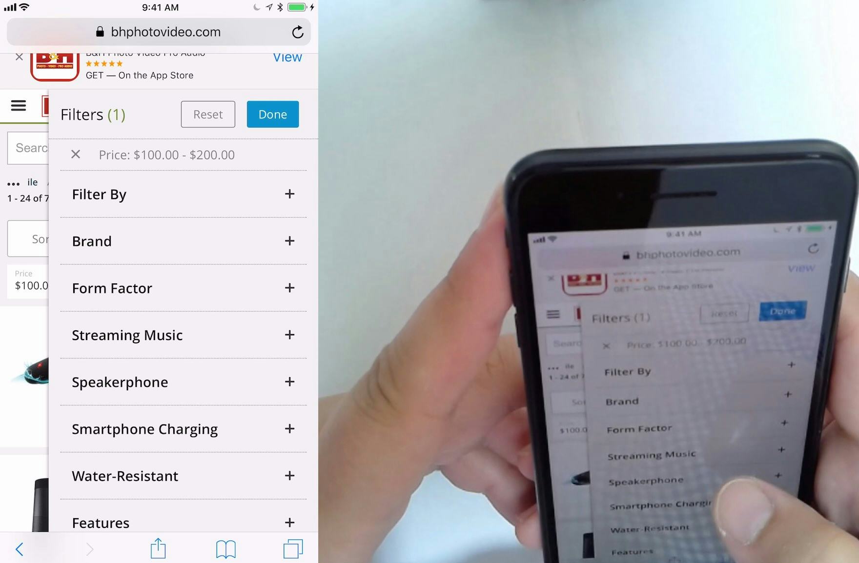
At B&H Photo, this participant wanted to select more than one price range for headphones. However, when she selected the “$100 – $200” range (first image), the “Price” filter type was removed (second image), making it impossible to select another price range. While “Price” was the only filter on B&H Photo that allowed only one option to be selected, price is a key factor for users, particularly when there are many products available in more than one price range.
On mobile, not being able to select multiple filter options within one filter type makes it even more difficult to apply more than one filter.
Indeed, memorizing products (as outlined in the 9 steps above) is harder on mobile, because users have to take the extra step of opening and looking at the filter interface each time they apply a filter option.
And if filter choices are autosubmitted and there is no overview of applied filters, mobile users will have to open the filter interface yet again to remove the last option they applied.
Each additional action needed to remove one filter and apply another makes it more likely that users will forget the details of the previous filtered product list.
All in all, applying multiple filters on mobile is practically unworkable for some product types if users can only select one option in each filter type.
How Allowing Multiple Filtering Options Helps Users Find Relevant Product Variations
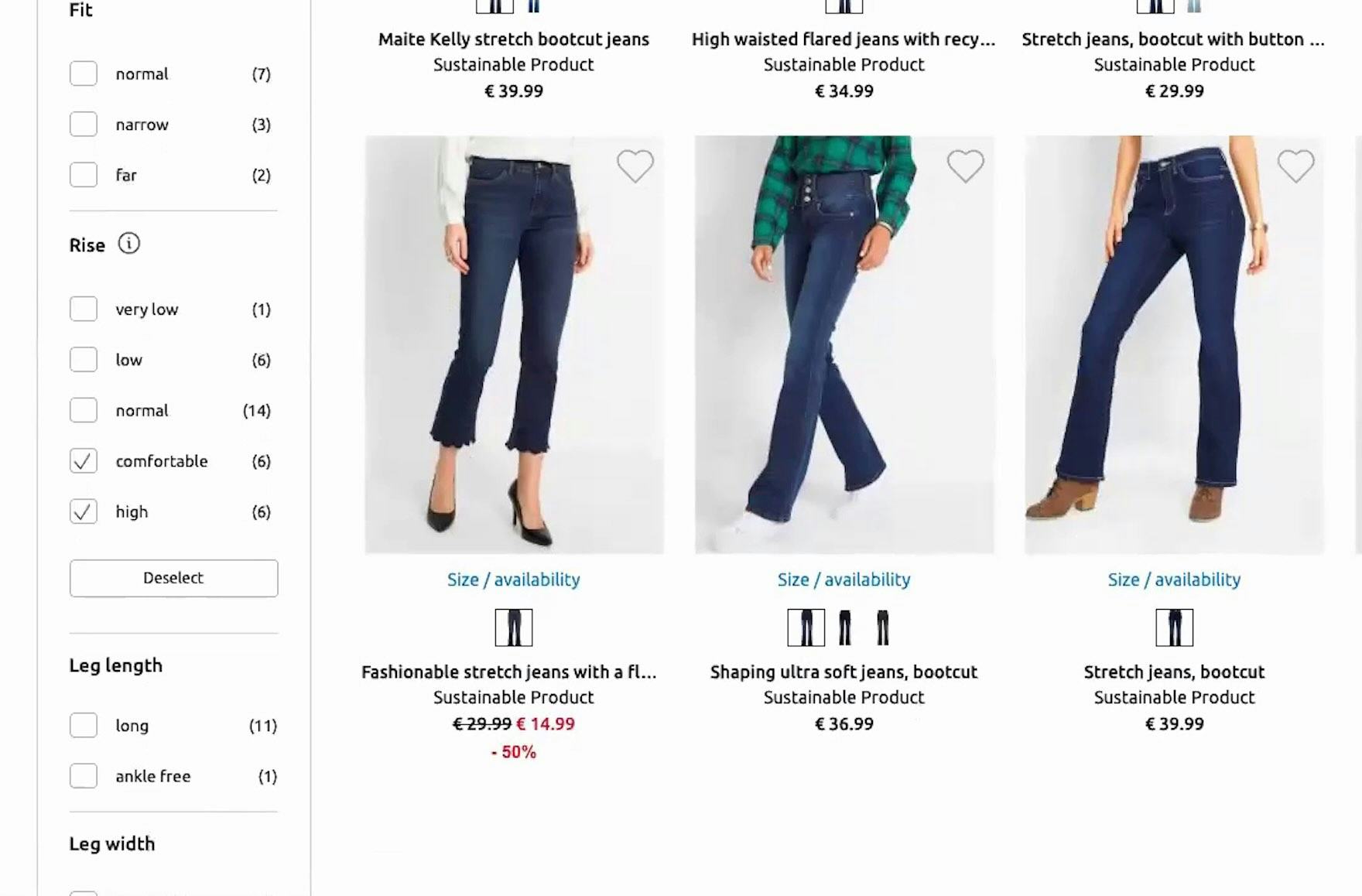
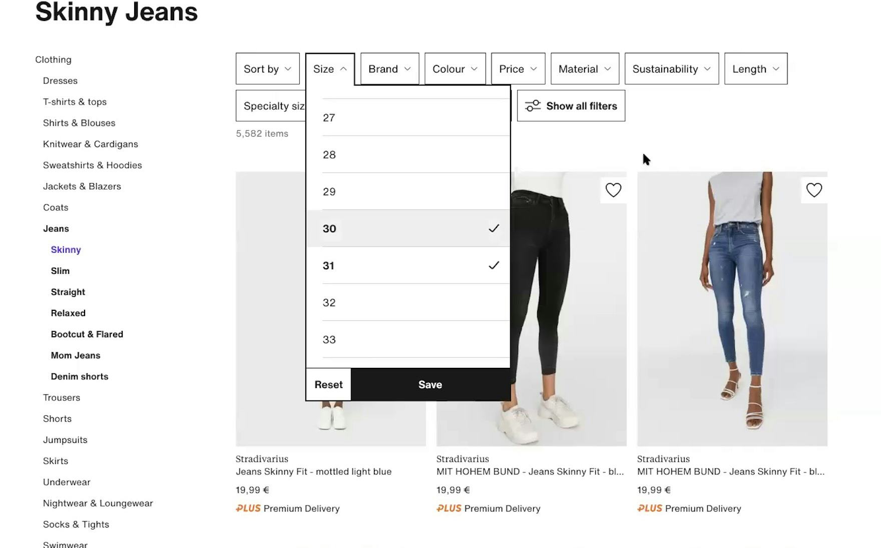
“I wanna select both. Does it let me do that? It does, so now I’ve 12 pairs to look at. It really lets you narrow it down.” Bonprix (Germany) allows users to select more than one filter option in the “Rise” filter type, which was very helpful to this participant during large-scale European testing.
“See if I can select multiple [filter options], yep! Especially with jeans, because sometimes two are very similar, and sometimes I don’t know what size I’m in, so I would like to try two [filter options] for one pair of jeans, if they’re quite similar sizes.” Likewise, this test participant at Zalando (Germany) found the ability to select more than one size helpful.
To avoid these difficulties, allow users to combine multiple filter options within the same filter type.
The process of applying multiple filter options when they aren’t mutually exclusive is much simpler:
-
In the unfiltered product list or in the separate filter interface on mobile, apply the desired filtering options
-
Look through the products in the filtered list
And this straightforward process is applicable regardless of how many filtering options the user is interested in.
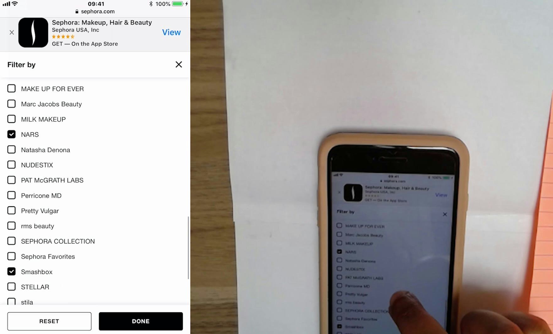
When filtering options can be combined within the same type — such as applying “Blue”, “Black”, and “Red” for a “Jackets” category, or applying 3 different brand filters in a product list of cosmetics — users can easily create a tailored product list.
Furthermore, allowing multiple filtering options of the same filter type to be applied also lets users remove irrelevant product variations by applying all filter options except those for the variations they’re not interested in.
Finally, note that, as a first step, it’s critical to ensure the categorization of the product catalog is appropriate — otherwise, users will struggle with filtering the product list, even if they can select multiple filter options from the same filter type.
‘AND’ Logic for Filter Types and ‘OR’ Logic for Filter Options
It’s worth noting additional user expectations regarding the logic underlying filter types versus filtering options.
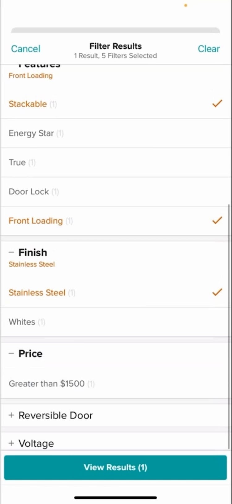
When values from multiple filter types (or filter “groups”) are applied, users expect the resultant products to match all selected values from the different filter types — for example, a user in an “Espresso Machine” category who applies the “Finish: Stainless steel” and “Brand: DeLonghi” filters would expect the results to show DeLonghi brand items in a stainless steel finish.
Moreover, if multiple filtering options are selected within the same filter type, users expect the resultant products to reflect any one of those options — for instance, if the user in the “Espresso Machine” category had also chosen “Brand: Keurig” (in addition to “Brand: DeLonghi”), they would expect to see stainless steel espresso machines from either DeLonghi or Keurig.
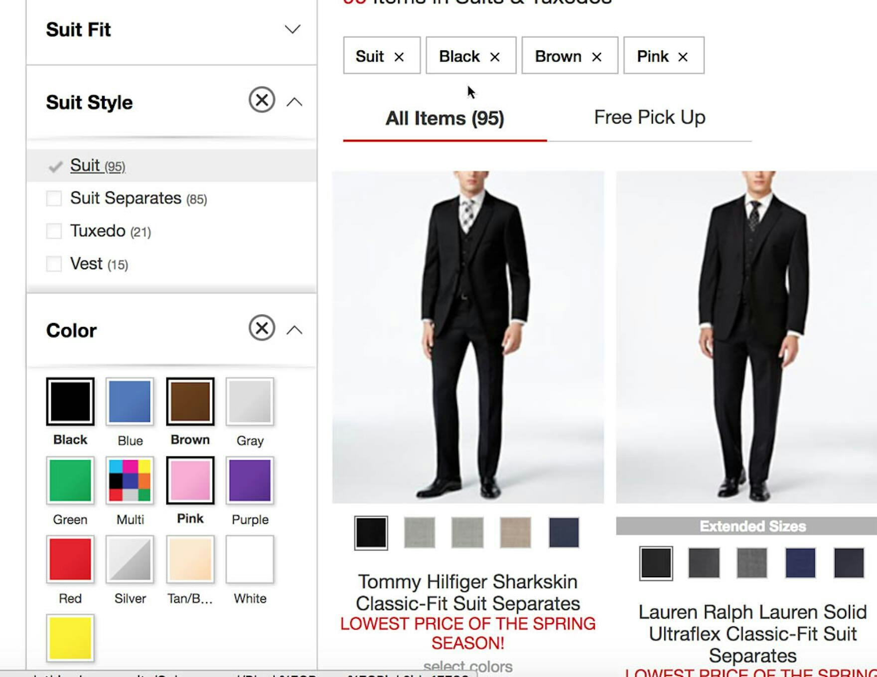
At Macy’s, a participant selected 4 filter options (“Suit”, “Black”, “Brown”, and “Pink” ) from 2 filter types (“Suit Style” and “Color” ), resulting in a very refined product list.
The logic is therefore that filter types should follow an “AND” logic when multiple filter types are selected, whereas the selected filtering options within any of those types should follow an “OR” logic.
Furthermore, “AND” logic for filtering types and “OR” logic for filtering options are well-established e-commerce conventions.
Finally, to communicate to users the logic that filter options are inclusive, style filter values as checkboxes to visually indicate that multiple values can be selected.
Help Users Quickly Find Relevant Matches in the Product List
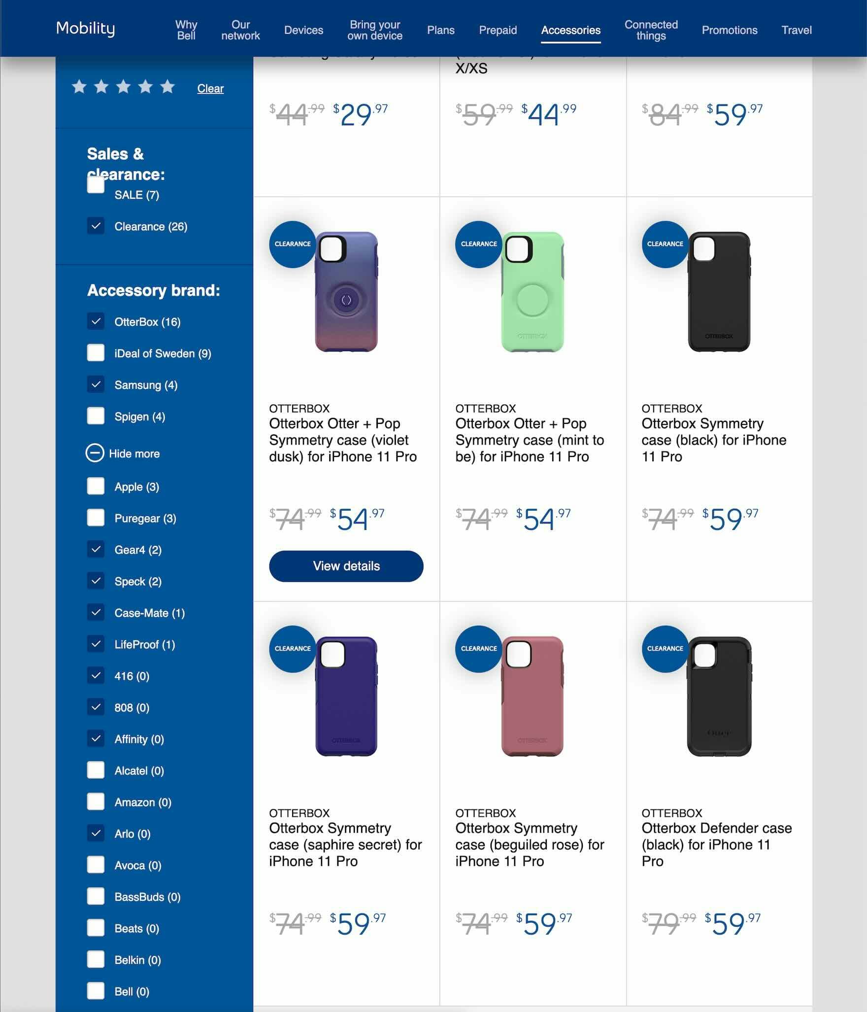
During large-scale UX research of Telco sites, Bell allowed users to combine filters within the same “Brand” filter type to customize their product list.
As our research has shown, browsing e-commerce product lists can be challenging for users.
Thus it’s important to reduce any friction so that users can easily establish an overview of suitable products to explore; in particular, by using an “AND” logic for filter types and an “OR” logic for filter options.
Yet 15% of sites don’t allow users to combine 2 or more filter options in the product list — both forcing users to tediously repeat the filtering process in order to find suitable items, and breaking with users’ expectations of how filters should work in general.
This article presents the research findings from just a few of the 650+ UX guidelines in Baymard – get full access to learn how to create a “State of the Art” ecommerce user experience.
If you want to know how your desktop site, mobile site, or app performs and compares, then learn more about getting Baymard to conduct a UX Audit of your site or app.

