Key Takeaways
- Promoting popular filters in the product list can serve as a shortcut for many users trying to narrow down the list
- Yet 61% of sites don’t promote filters
- Promoted filters must remain in their “original” position as well
Video Summary
During Baymard’s large-scale testing, the first action of the majority of participants arriving on product lists was to look for suitable filters to make the list more manageable and relevant to their needs.
Often, the most popular filters are price, size, and color (for apparel and other visually driven products).
However, there are other filter types that, if applied, eliminate a lot of items and leave only a type or style that is preferred.
For example, many users will gravitate towards certain styles of jeans, or particular sofa shapes. If such filters are available at the top of the product list as well as in the normal filtering interface, most users will immediately see them and, if they apply one, the list quickly becomes much more tailored to their needs.
Yet our e-commerce UX benchmark shows that 61% of sites don’t promote filters in the product list.
In this article we’ll discuss our Premium research findings and the core UX opportunity of promoting important filters, and discuss 1 implementation detail to be aware of.
UX Opportunity: Promoted Filters Can Greatly Speed up Product Finding
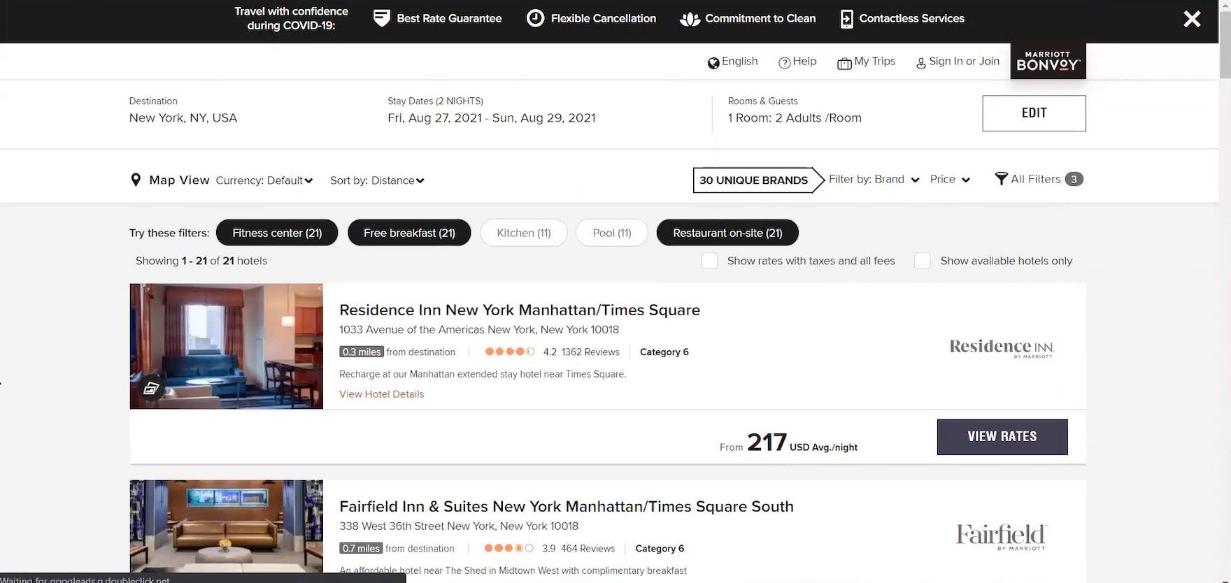
“So, I’d probably do ‘fitness center’, ‘free breakfast’, and then ‘restaurant on site’ [clicks each filter]. So then it shows me that there’s only 21 hotels with those amenities.” A participant shopping for hotels at Marriott easily filtered the 217 search results by popular amenities that were important to her because they were conveniently located at the top of the property listings. During large-scale Travel Accommodations testing, participants at online travel agency (OTA), large-brand hotel chain, and whole property rental sites routinely leveraged popular filters as a starting point for narrowing long lists of search results.
When important filters are only displayed in the filtering interface, whether on desktop in a sidebar or in the separate filtering interface on mobile, they could be overlooked for a number of reasons.
In particular, they could be “lost” among many filter types and values, and users just don’t realize their importance.
Furthermore, lists of filter types and options can become quite long, depending on the product type, and, while providing many filters is useful, it can quickly become overwhelming for end users.
In addition, users who are not familiar with a particular domain may not know what product attributes are important, and may not be able to discern them in the regular filter interface.
For example, not every user buying a new laptop will know that “Chromebook” is a technology worth considering.
Therefore, to give users a slight nudge toward filters considered to be more useful than others, important filters should be promoted so that they are more highly visible than other filters.
Promoted Filters Can Be Especially Helpful on Mobile
Promoted filters can be especially helpful to mobile users.
One reason is that, because most filters on mobile are hidden until users access the filter interface, it may not be immediately clear on landing on a product list how to begin to narrow the scope of the list or what filters have already been applied — unlike on desktop where filters are often visible in the left sidebar or in a horizontal filtering bar.
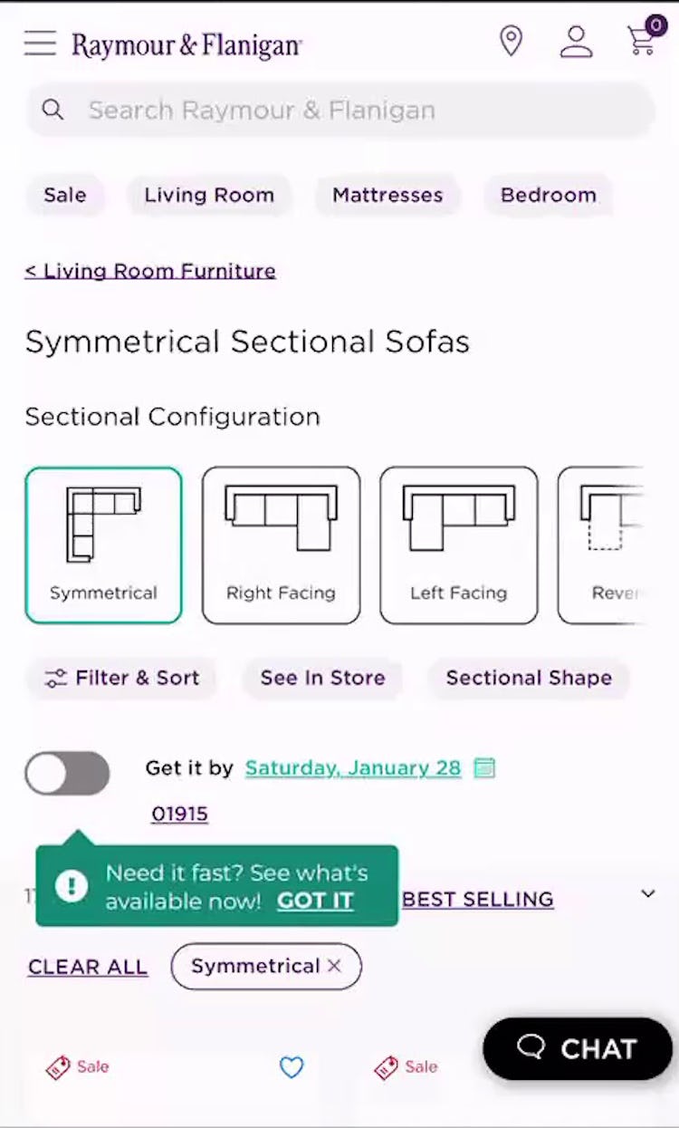
For example, in a mobile product list of sofas, if there are promoted filters for each sofa shape and configuration, users can immediately start to narrow the list to products of particular interest to them without having to open the filtering interface.
Furthermore, the fact that filters are typically in a separate interface on mobile means that users may need to make multiple trips back and forth between the product list and the filtering interface to tailor the list to their needs.
Suitable promoted filters could reduce the time and effort needed to apply the first filter, and get users quickly into the process of narrowing down the list.
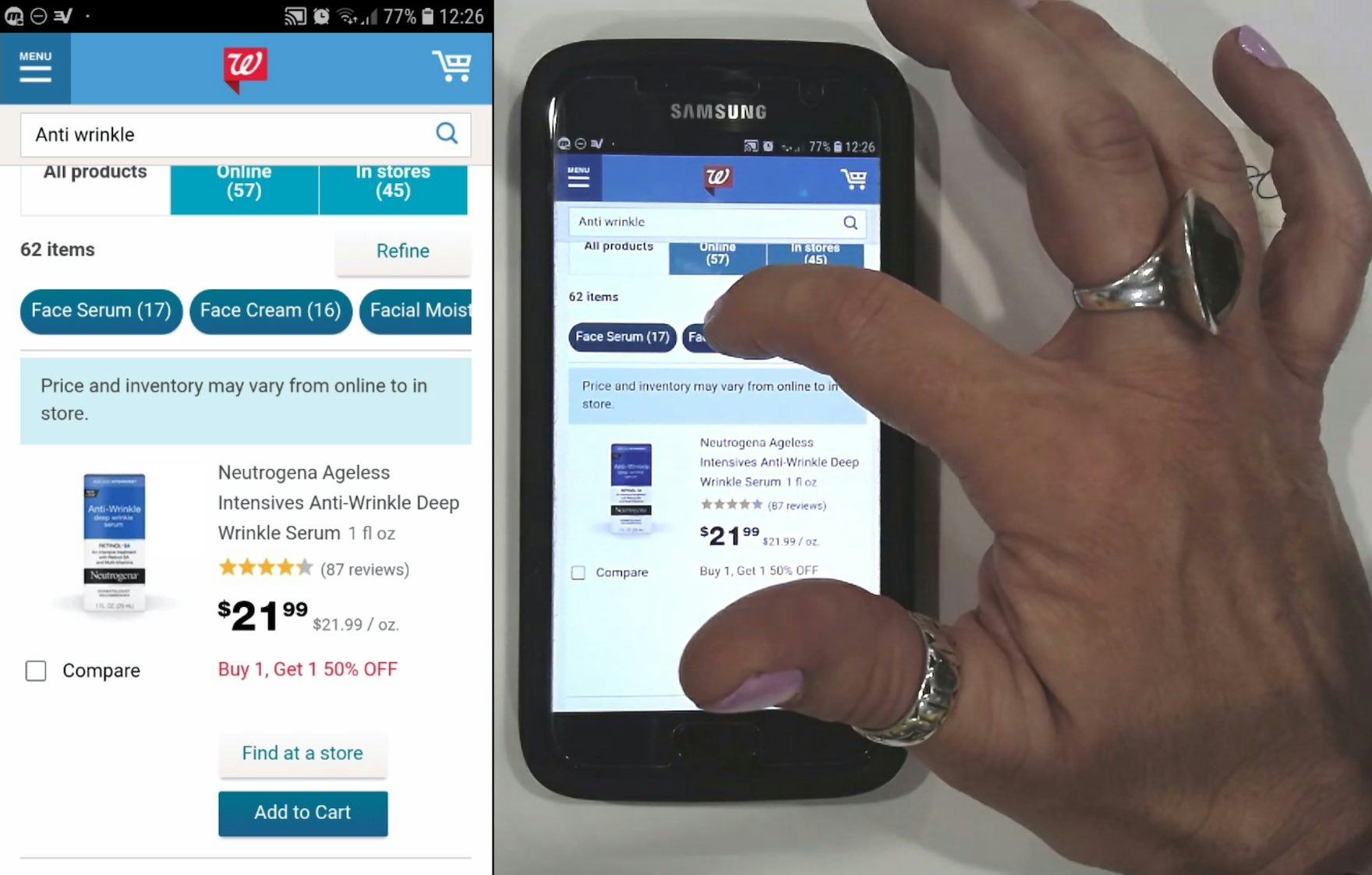
“I like that it has broken down: ‘Face Cream’, ‘Face Serum’.” Promoted filters can be particularly helpful on mobile, especially since the filter interface is hidden until users tap into it.
Additionally, on mobile, the limited viewport affects how promoted filters are displayed, as typically only 2 or 3 will fit on one line.
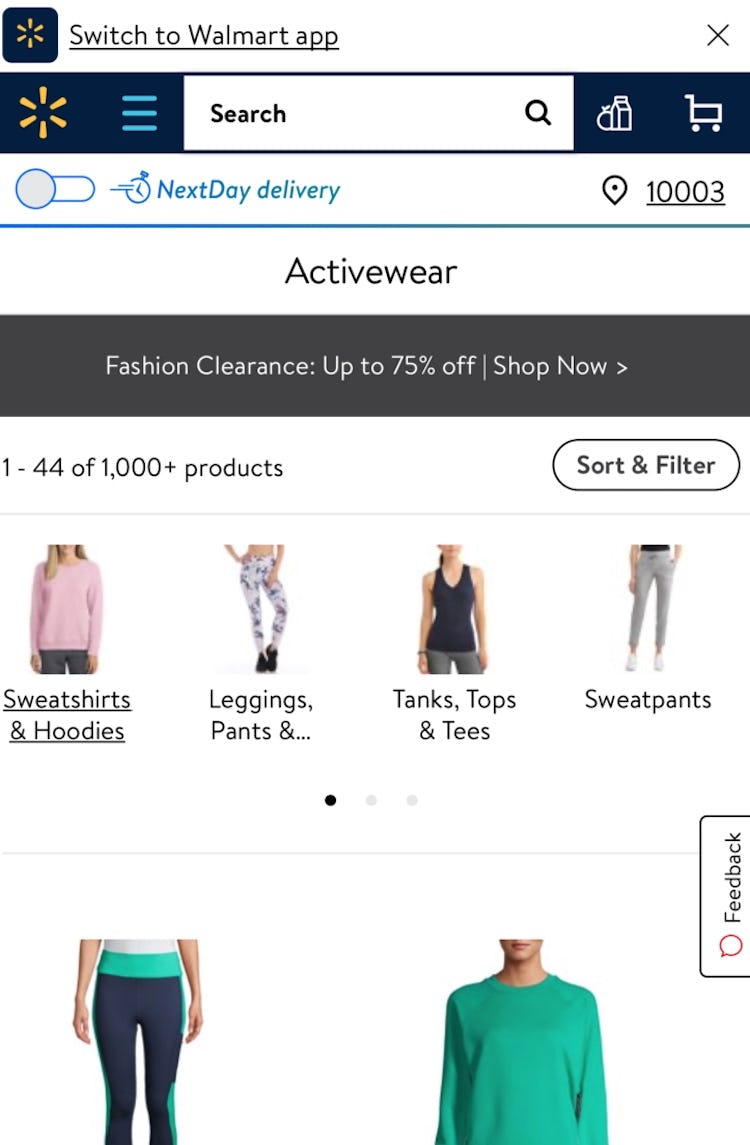
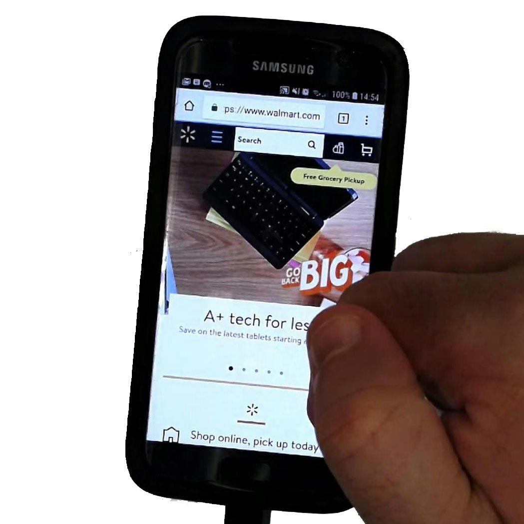
If a site offers more than 2 or 3 promoted filters, one option is to display them as horizontally scrollable lists, either with truncation (as in the Walgreens example above) or with scroll indicators (as in the Walmart example).
Promoted Filters Are Not a Substitute for a Solid Category Taxonomy
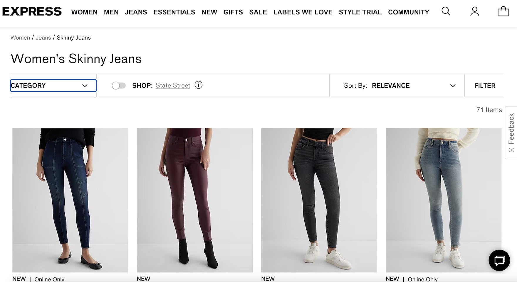
At Express, Women’s jeans styles are implemented as separate categories, rather than as filters. This can silo users unnecessarily. A well-structured category taxonomy should take precedence over promoting filters.
Individual sites should carefully select filters to promote that will be helpful for the majority of their users.
However, it’s important that tapping or clicking on a promoted filter does indeed lead to a filtered product list rather than a siloed subcategory.
Indeed, while promoted filters can be very useful on both desktop and mobile, they don’t compensate for a poor taxonomy.
While some shortcomings of the taxonomy can be corrected by allowing users to avoid using category navigation by selecting promoted filters, many users will still have difficulty finding what they need.
For example, promoted filters won’t allow all users to access suitable items, since not all users will find the promoted filters helpful in their product browsing.
These users will have to browse without the help of promoted filters, and if the taxonomy is not optimized they will likely encounter issues.
Category taxonomy issues that will still hamper product finding despite the availability of promoted filters include, in particular, product types with shared attributes implemented as categories, category scopes that are too broad or too narrow, and redundant or overlapping categories.
Promoted Filters to Consider Implementing by Industry
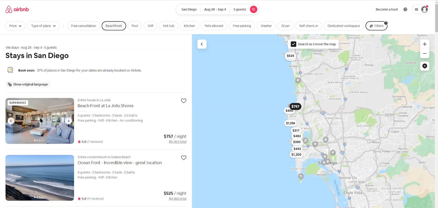
“I know to press ‘Beachfront’ because I saw that, so that eliminated a lot of other things.” An older participant shopping for rental properties generally didn’t interact with the filters or interactive maps. However, at Airbnb she realized she could filter the property listings to only beachfront properties because popular filters were promoted directly on the page, at the top of the search results.
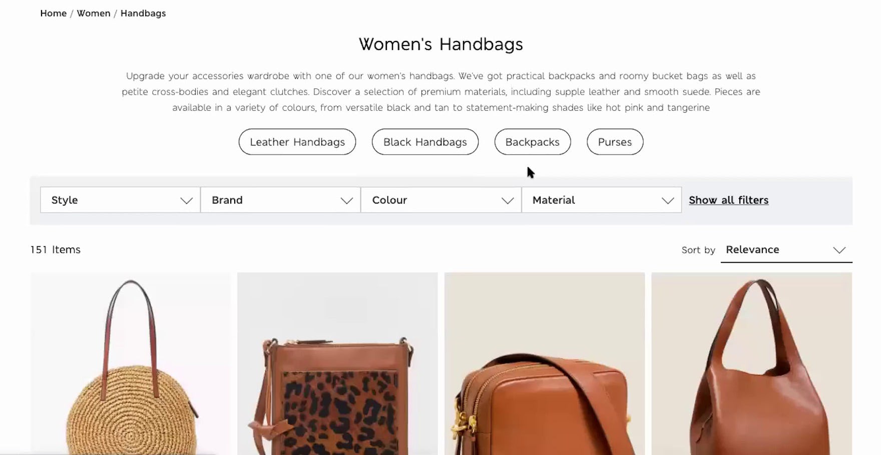
“Okay, I like that it offers me at the top some propositions…black handbags, leather handbags…” Promoted filters can be very helpful as a starting point for narrowing long product lists, as this test participant on Marks & Spencer (UK) found during large-scale European testing.
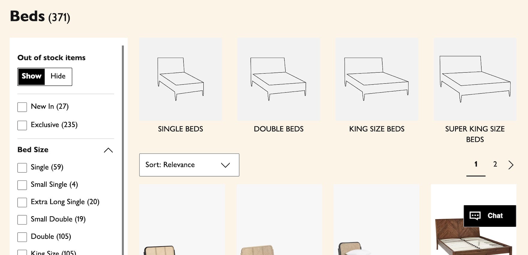
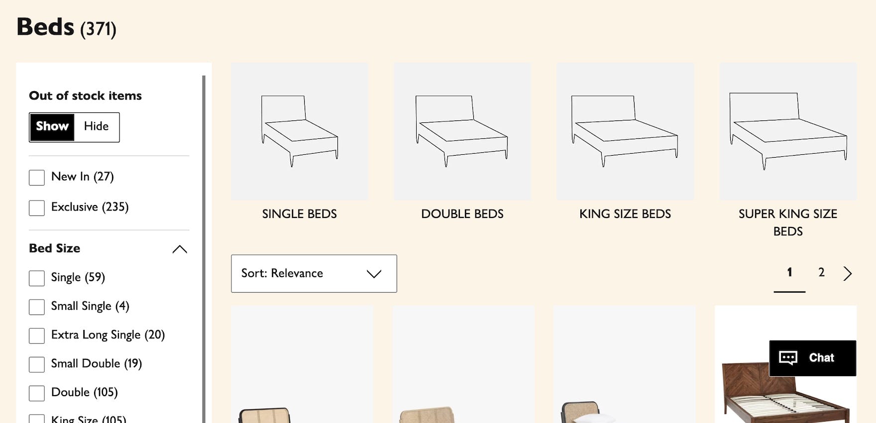
Likewise, these promoted filters on John Lewis allow users to easily filter the list according to their preferences for bed size before scrolling the list or looking at other filter types.
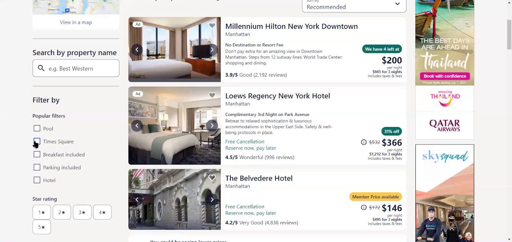
“Okay, so ‘Millennium Hilton New York Downtown’. What if I, can I tell it? Can I tell it? I see, it’s letting me pick ‘Times Square’. The popular filter comes straight up with ‘Times Square’.” A participant shopping for hotel rooms at Expedia appreciated the opportunity to immediately eliminate results outside her preferred neighborhood. Note that in this implementation, promoted filters are at the top of the sidebar, which may attract less attention from users (while still making them more visible compared to other filters).
The choice of which filters to promote will vary by industry, depending on the type of product and what’s most important to users.
As a starting point — important filters could vary considerably even between sites in the same industry — examples of filters that could be promoted in different industries might include the following:
- Apparel: “size”, “material”, “price range”
- Electronics & Office: “screen size” (for TVs, monitors), “resolution” (for smartphones, monitors), “recommended usage” (e.g., laptops for home or office use, camera lenses for sports photography or portraits)
- Home & Hardware: “style” (e.g., refrigerator doors), “fuel type” for cookers, “corded or cordless” for tools
- Furniture & Home Decor: “room type” (e.g., bedroom, kitchen), “dimensions” (for beds and bedding), “indoor or outdoor use”, “sofa type”
- Health & Beauty: “brand”, “skin type” (e.g., dry, oily), “area of use” (e.g., face, hair, body)
- Sports, Toys, & Hobbies: “wheel size” (bikes), “temperature rating” (sleeping bags), “game type” (e.g, strategy, action, sport)
However, there is no “one size fits all” filter or combination of filters that would be helpful on all sites.
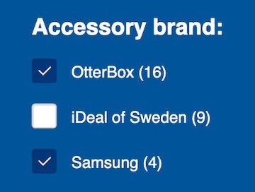
Regardless of the specific filters promoted, showing the number of matching products for each “Promoted Filter would also help users decide on whether it was worthwhile to apply them or not.
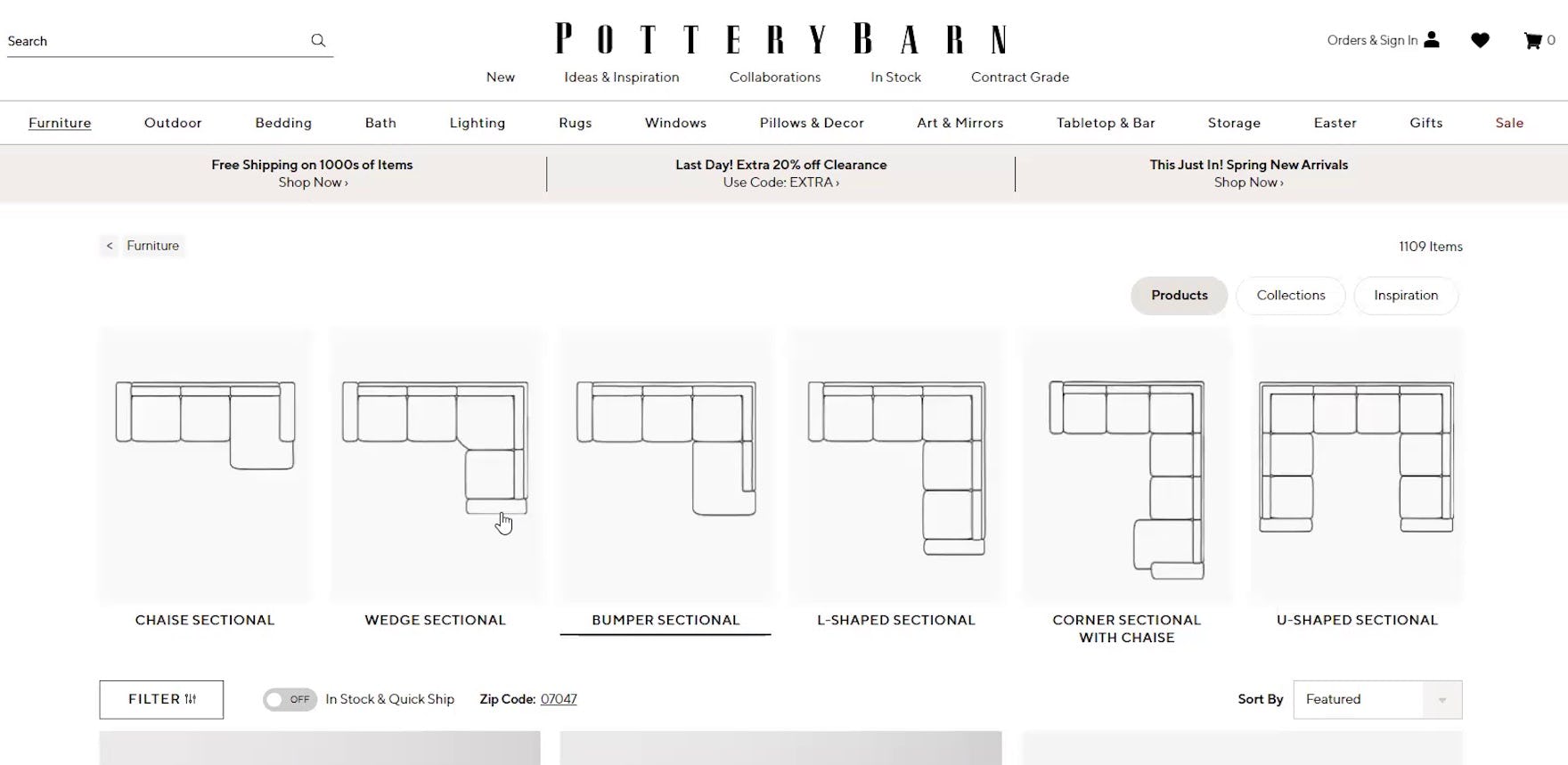
“I guess it depends on if I want an arm seat or a ‘Bumper Sectional’. I guess I’ll look at the bigger one to start…or ‘L-shaped’, let’s do ‘L-Shaped’…Okay so these, it doesn’t look like it has that storage underneath. So I’m probably going to go back to [‘Bumper Sectional’].” Shopping for sofas on Pottery Barn, this test participant made use of the promoted filters that allowed users to specify a particular shape before she scrolled the list or considered other filters. When carefully chosen promoted filters can be very helpful, especially when there are visuals depicting each filter option.
Furthermore, the placement of promoted filters at the top of product list pages allows sites the space to add visuals that both attracts attention and depicts the differences between the options shown.
Visual depictions of filter options can be especially useful for those who are not completely familiar with the items in the category.
For example, users might be in the market for sofas only once every 10 years or more, and may need help understanding the visual differences between the products currently offered. Or, filters for laptops suitable for particular uses like “Home Office” or “Gaming” could be promoted with accompanying visuals depicting the devices being used in those specific ways.
Implementation Detail: Don’t Remove Promoted Filters from Their “Normal” Position
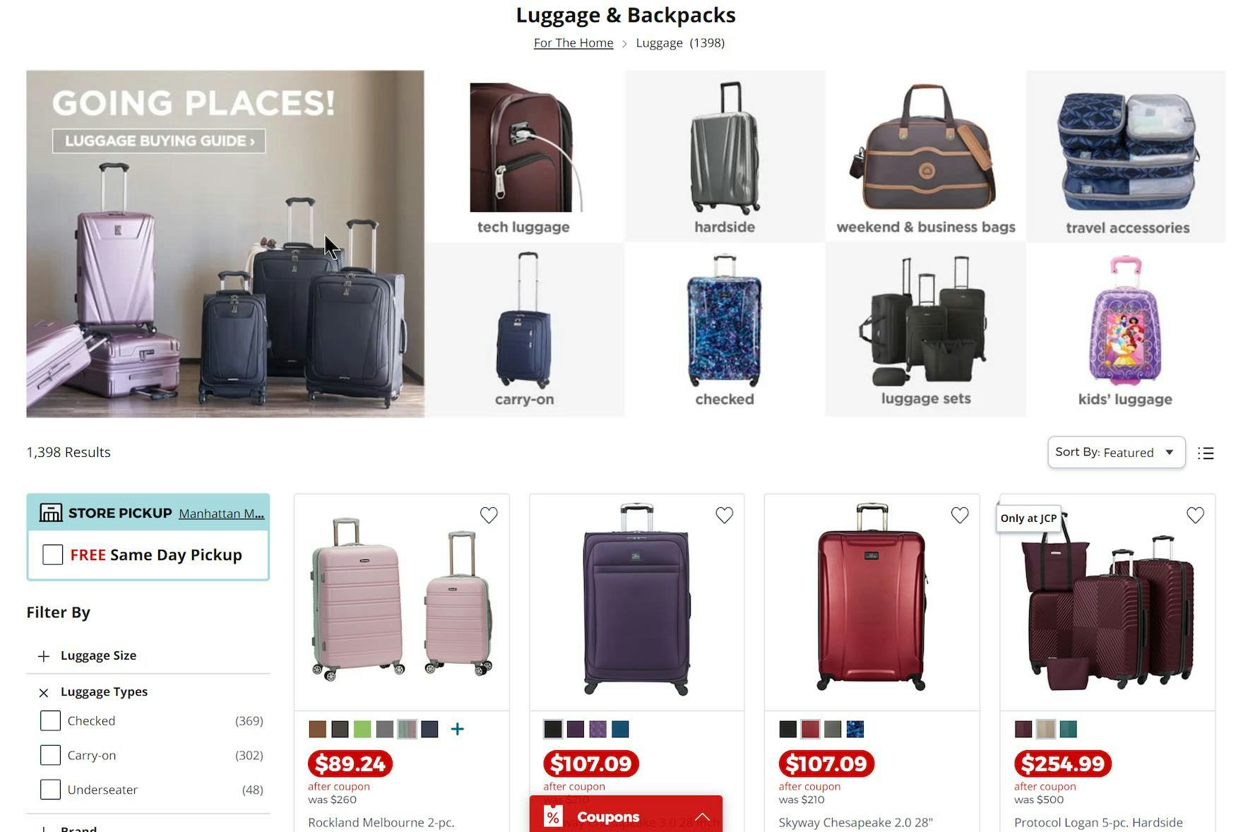
Note how the promoted filters for “Luggage Types” remain in the filtering sidebar on J.C. Penney. Users will be able to find filters where they normally expect them to be in the sidebar if they overlook the area where they are promoted.
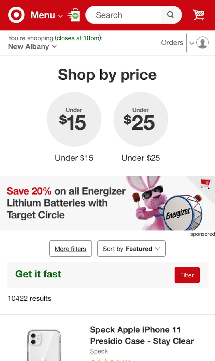
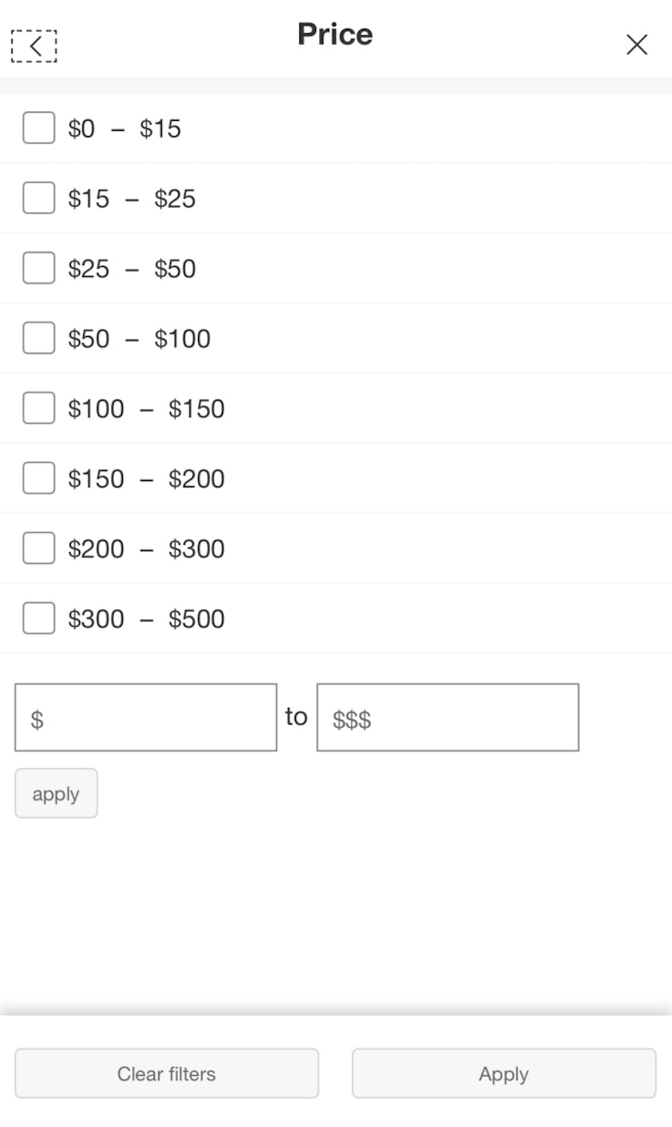
Target keeps promoted filtering values in the mobile filtering interface so users who may overlook the “Price” filters (first image) above the product list can find them where they expect them to be (second image).
Users expect that a filtering sidebar or interface contains all the available filters and most users will look for important filters there, even if they’re also available above the product list.
Users who focus on the filtering sidebar or interface when the page loads may overlook promoted filters if their learned behavior is to go directly to the interface when starting to narrow down the product list.
Thus, these users would fail to find the filters they’re looking for if promoted filters have been removed from their normal position alongside other filter types and options.
Failing to find an important filter where they expect to could result in users being unable to reduce the scope of a large list.
Therefore, promoted filters should appear twice: once in their promoted location and once in their “regular” location.
(Note: in addition to their “regular” location, filters that are applied should also appear in an overview.)
Help Users Quickly Get Started with Product Finding
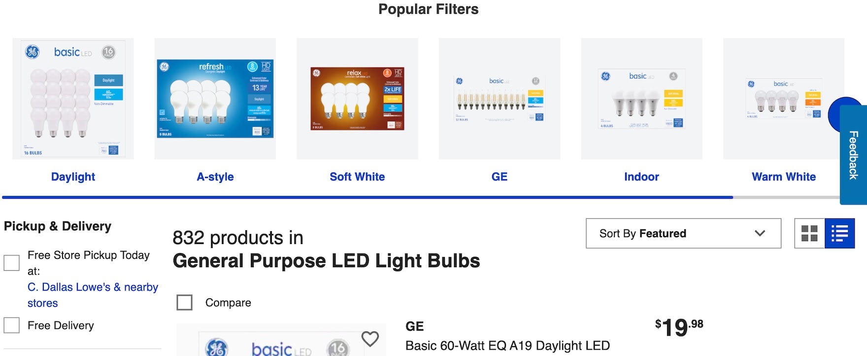
At Lowe’s, lightbulb types are promoted above the product list for LED bulbs. Users interested in a particular style of bulb can quickly select that style and get a much-reduced list of products to consider.
While promoted filters can serve as a shortcut for many users, the technique should be used intelligently and sparingly, to avoid luring users into lists that are too narrowly filtered.
For example, the technique shouldn’t simply be used sitewide for whatever is the most popular filter in each category.
Instead, the use of promoted filters should be carefully managed to ensure that they are always helpful when selected.
Note also that filters should only be promoted when the product list is so large that the vast majority of users are better off applying a filter before devoting any attention to the actual product list.
That said, for many users, smartly selected filters promoted above the product list can quickly provide them with a much more relevant list of products to consider — yet 61% of sites in our e-commerce UX benchmark don’t promote filters at all.
This article presents the research findings from just 1 of the 650+ UX guidelines in Baymard – get full access to learn how to create a “State of the Art” ecommerce user experience.
If you want to know how your desktop site, mobile site, or app performs and compares, then learn more about getting Baymard to conduct a UX Audit of your site or app.

