Key Takeaways
- Overusing categories can force users into overly narrow product scopes, leading to users struggling to find suitable products
- Despite the issues caused by overcategorization, 75% of our benchmark sites fail to get this right
- Avoiding subcategories in favor of filters for products with shared attributes resolves the issue for most users
Product types with shared attributes can be presented in two ways:
- Place the product types in separate categories
- Include them all in one product list with the types implemented as filters
For example, differently fitting jeans might be presented in a “Jeans” product list with “Skinny” and “Slim” as options for a “Fit” filter.
Alternatively, the jeans might be included in separate categories (i.e., “Skinny Jeans” and “Slim Jeans”).
During testing, participants had significant issues with the latter implementation because they were unable to view all products with shared attributes together.
As a result, some users will never find a suitable product — simply due to overcategorization.
Yet 75% of sites in our e-commerce UX benchmark fall victim to overcategorization and thereby limit users’ ability to find relevant products.
In this article we’ll discuss our Premium research findings related to appropriate categorizing of product types:
- How overcategorization harms users’ ability to navigate the product catalog
- How using filters instead for product types with shared attributes alleviates this issue
- How to get started evaluating the site catalog for overcategorization issues
How Overcategorization Harms Users’ Ability to Navigate the Product Catalog
During multiple rounds of testing, product finding was unnecessarily troublesome for test participants who were unable to get complete lists of all items that shared many attributes.
This is primarily because if products with shared attributes are presented in siloed categories, users can’t easily compare those products.
In fact, products with multiple shared attributes implemented as categories results in some users abandoning sites, typically for 1 of 2 reasons:
- It’s too difficult to compare similar products across categories
- It’s assumed that a product is unavailable because a category in which users expected to find didn’t contain it
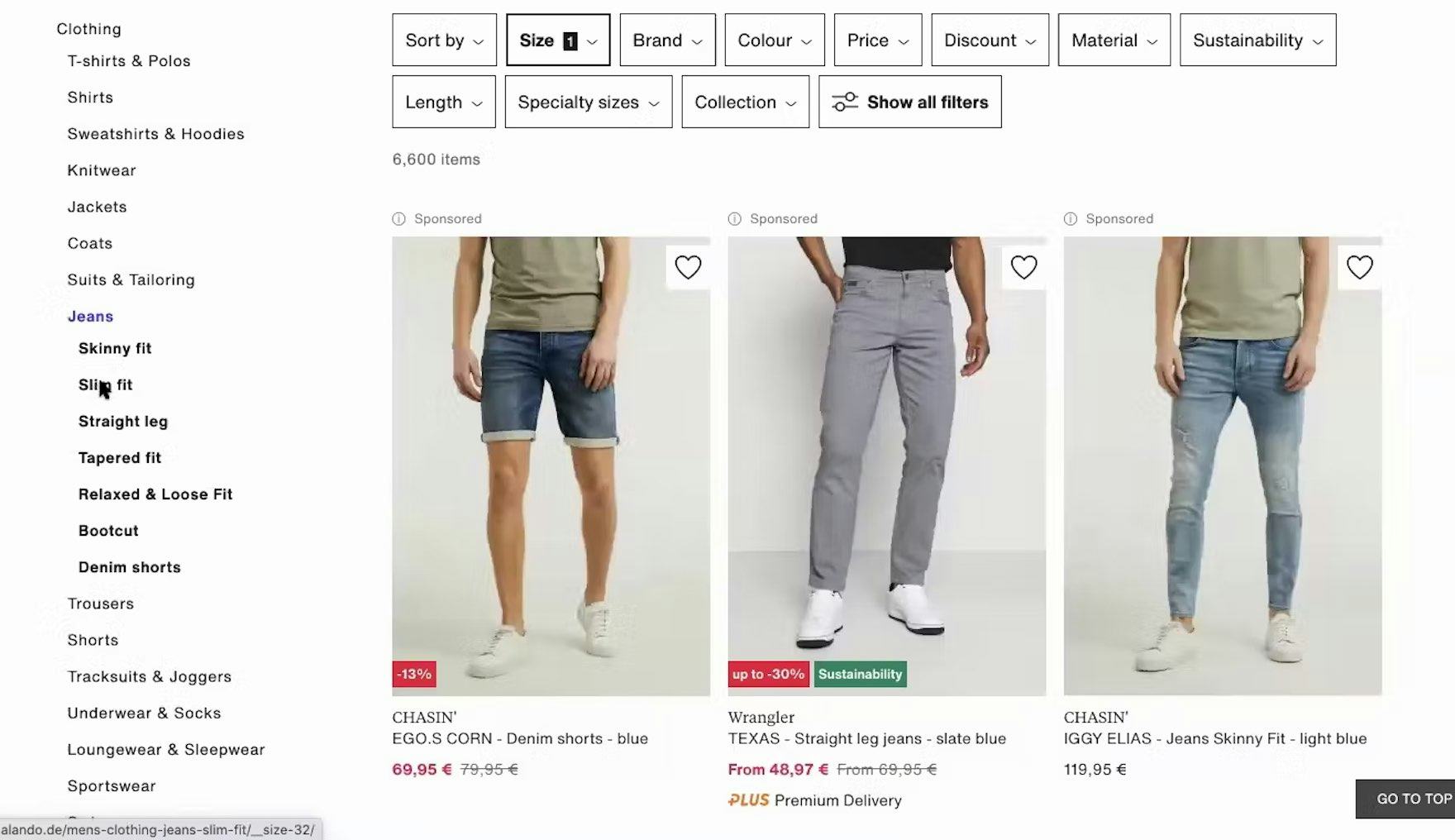
During large-scale user testing on European sites, a test participant on Zalando.de selected the “Slim fit” category while viewing “Skinny fit” jeans because he wasn’t sure which style would best fit him. Because he couldn’t view both styles at the same time, he had to reselect his size when he went to the other category. Implementing product types with shared attributes as categories makes getting an overview of all potentially suitable items needlessly tedious.
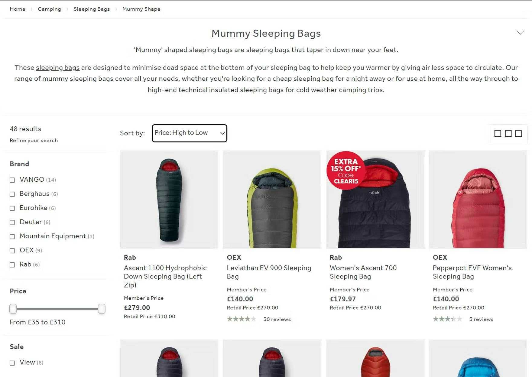
At Go Outdoors, products with shared attributes are presented as categories. This means that, when users are viewing the “Mummy”-shaped sleeping bag category, they can’t see other shapes like “Square”. So even though many attributes like color, brand, and filling are shared between the shapes, users can’t compare, say, “Red, Down-filled” bags of both shapes without jumping between categories.
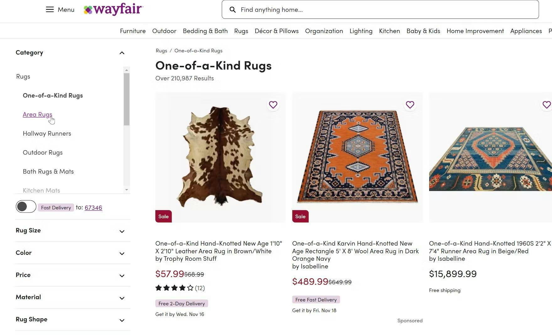
Likewise, “One-of-a-Kind Rugs” and “Area Rugs” are separated into distinct categories at Wayfair, even though their attributes are identical. As a result, users won’t be able to easily compare all rugs that might be suitable.
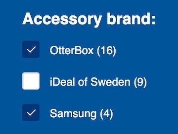
For example, if users are looking for trainers, and individual brands are implemented as categories, they’ll have to look at several categories to get an overview of what’s available and to narrow down the lists to match their needs.
So, if brands like “Nike” and “Converse” are implemented as categories, if users filter the “Nike” category by size, color, and style, they’d then have to go through the same process in the “Converse” category to tailor the list to their preferences.
Furthermore if they then decided to change filter options to get different selections, they’d have to do it twice — once in each category.
Finally, if they couldn’t find a suitable shoe, and if they had the patience, they’d have to start all over again with, say, the “Adidas” category.
On Mobile the Issue Is Even Worse
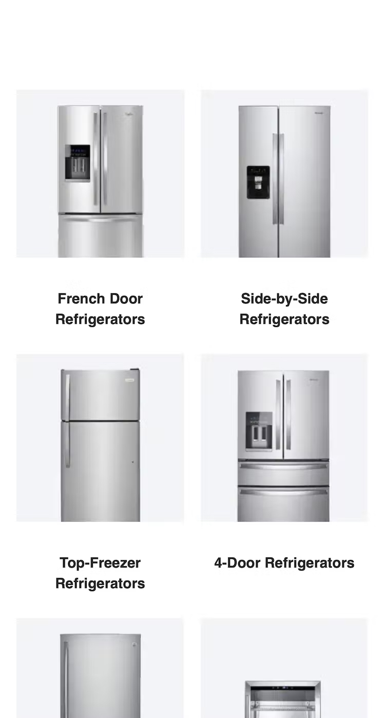
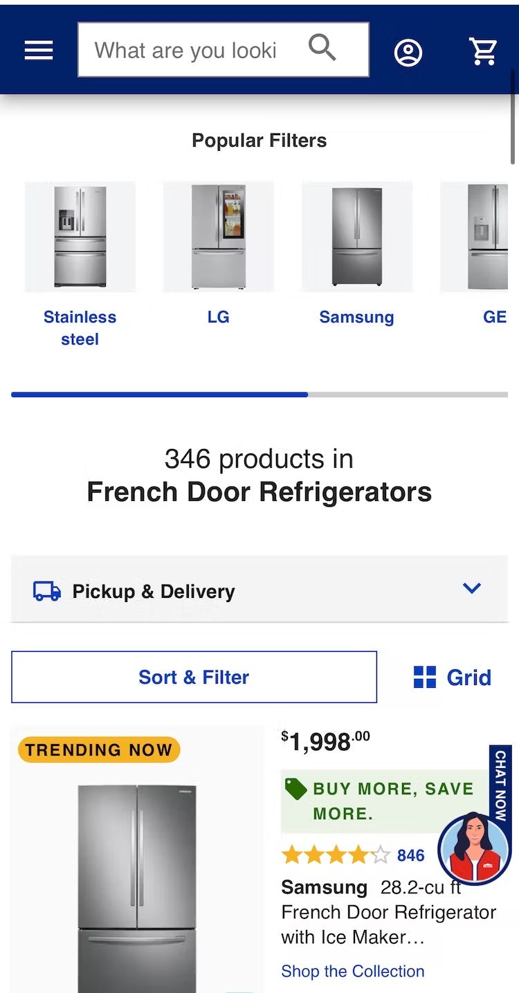
Because different types of refrigerators on Lowe’s are implemented as categories (first image), users who don’t have a preference between, say, “French Door Refrigerators” and “Side-by-Side Refrigerators” will find it extremely difficult to compare and evaluate their features because they can’t be viewed together in one list (second image).
On mobile, the issue of products with shared attributes implemented as categories is even more challenging.
Users can’t view separate tabs at the same time — no participant tried opening multiple tabs to compare items during testing on mobile — so comparing products in different categories will be very difficult.
To compare products with shared attributes across different categories would require users to swap between open tabs, apply filters to both lists, then memorize features of potentially suitable items.
Even if users persisted with this process it would take an inordinate amount of time to find a suitable product.
How Using Filters Instead for Product Types with Shared Attributes Alleviates These Issues
In general, product types with shared attributes should be implemented as filters rather than as categories.
This allows users to view all similar products in one list and they won’t need to visit multiple categories to get an overview of all products of one type.
Not only is this implementation a time saver for users — in that they can see all similar products in one list — it also means that they can be exposed to a broader range of related products that may not have initially been of interest.
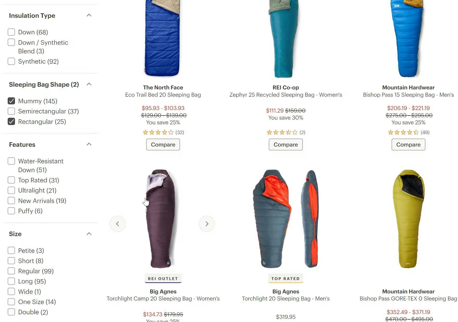
Because attributes such as “Sleeping Bag Shape” and “Insulation Type” are implemented as filters rather than separate categories, users on REI can view all similar products together, and explore filter options until they find a suitable product.
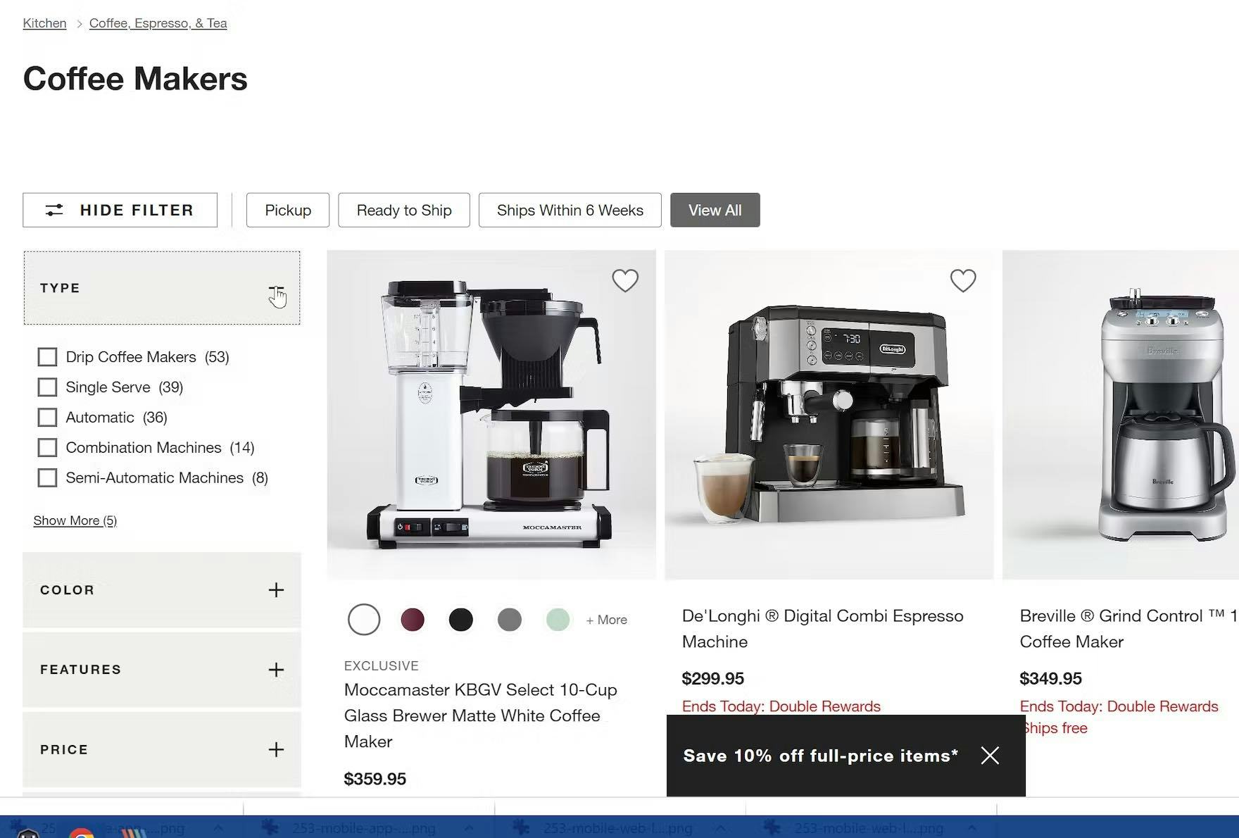
Because all coffee makers on Crate & Barrel are on one product list, users can apply filters such as “Drip Coffee Makers” or “Automatic” to narrow the type down to a tailored list, before applying other common options from filter types such as “Color” and “Price”.
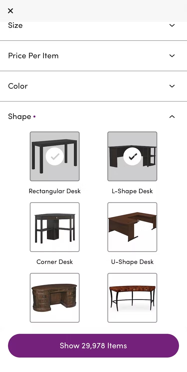
For example, when users are looking for home office desks and feel initially that an “L-Shape Desk” would be ideal, seeing thumbnails of “Corner Desks” in a product list might trigger an idea that might lead to a more suitable product.
If these desk shapes were instead implemented as categories, they might never consider these potentially unfamiliar alternatives.
Filters Can Help Users Get a Better Overview of the Product Catalog
Moreover, implementing products with shared attributes as filters has a further benefit.
If some users don’t understand all industry terms used to describe shared attributes, implementing them as filters can help them understand the product range more clearly.
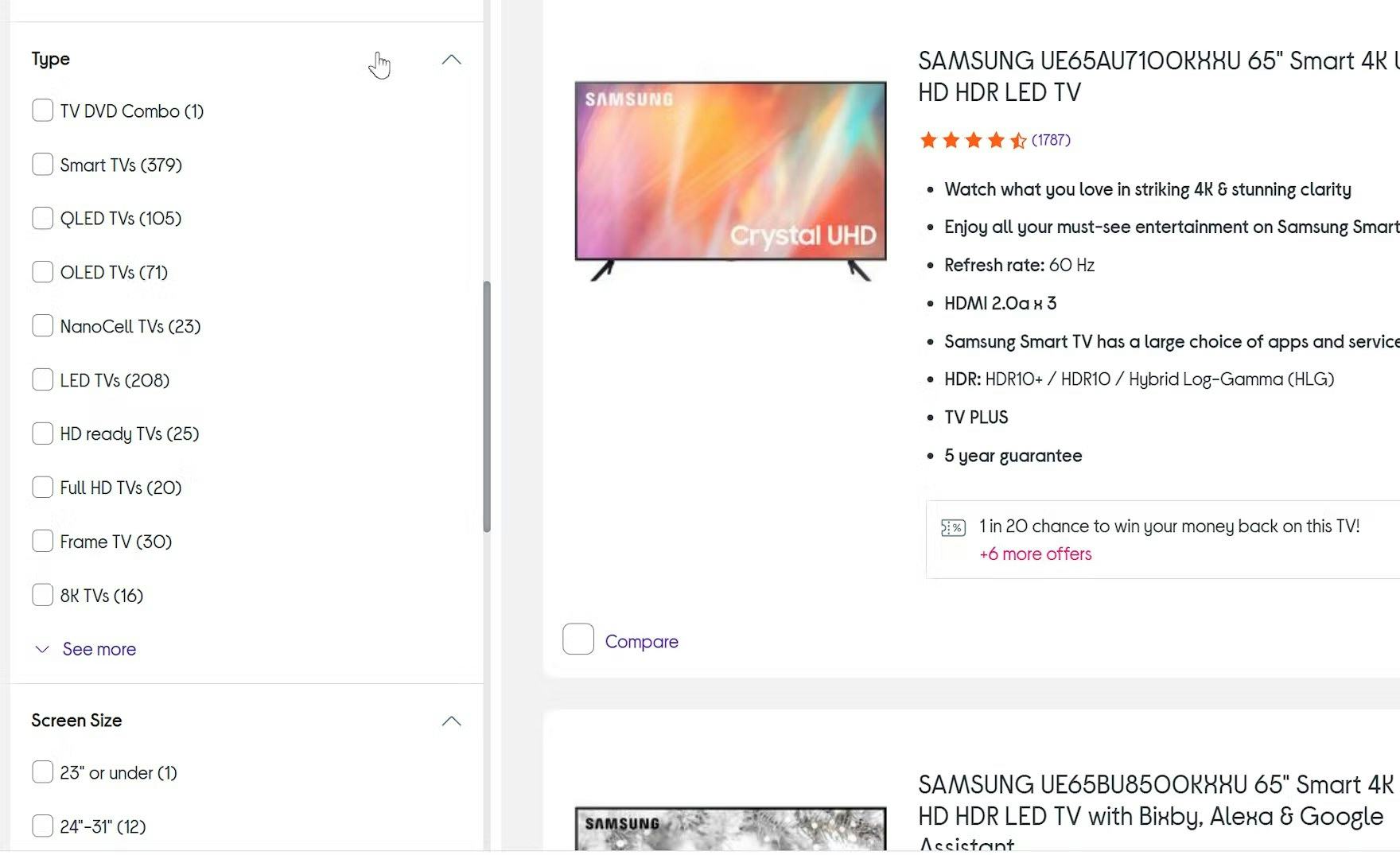
Not all users will understand all of the “Type” choices for TVs shown here on Currys. If each type of TV had its own category, users might avoid those that they didn’t immediately understand. Instead, when “Type” is a filter with options (such as “Frame TV”), users can explore all types by applying and deselecting filters and glean useful product details from the list item info. This means that they are more likely to find a product that they may never have seen if a category with an unfamiliar name was overlooked.
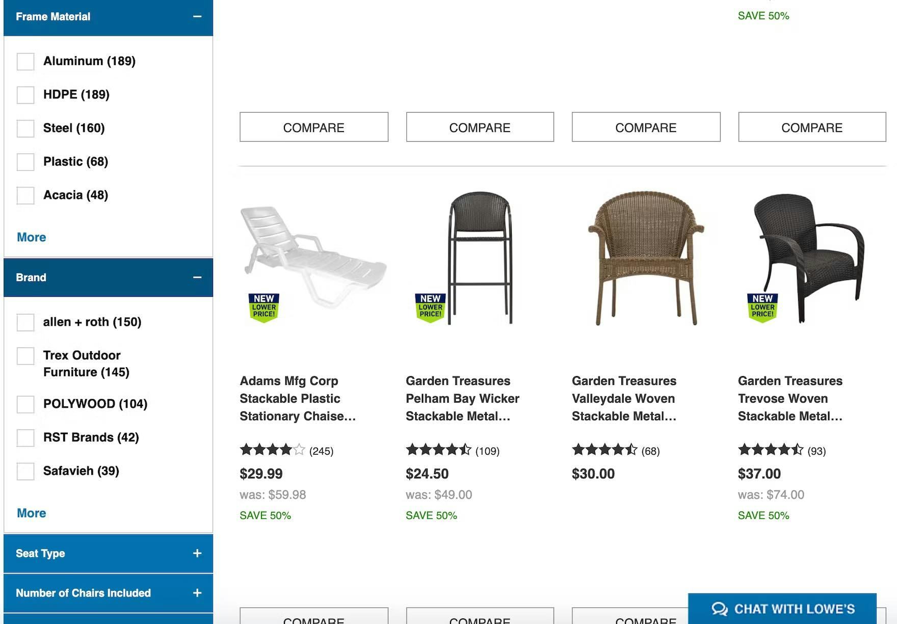
Lowe’s implements “Frame Material” and “Brand” as filters within the “Patio Furniture” category. This allows users to apply a combination of these product type attributes — or not apply them, if they aren’t relevant for or understood by a particular user. This wouldn’t have been possible had these product attributes been implemented as subcategories.
For example, not all users browsing TVs will understand what a “Frame TV” or an “8k TV” is.
If these product types were implemented as categories, users who didn’t understand the terms could be put off from visiting the categories and could overlook potentially suitable items.
On the other hand, when these product types are implemented as filters, users will be able to see their thumbnails and list item info together in a single list, making it much easier to compare and consider different TVs.
Filter-Based Categories Can Be Promoted as Categories (But Implemented as Filters)
Now there may be some concern that some product types might get overlooked by users if they aren’t implemented as categories, as categories tend to be more heavily promoted and attract more user attention than filters.
But implementing products with shared attributes as filters instead of categories doesn’t mean these products can’t be promoted to users.
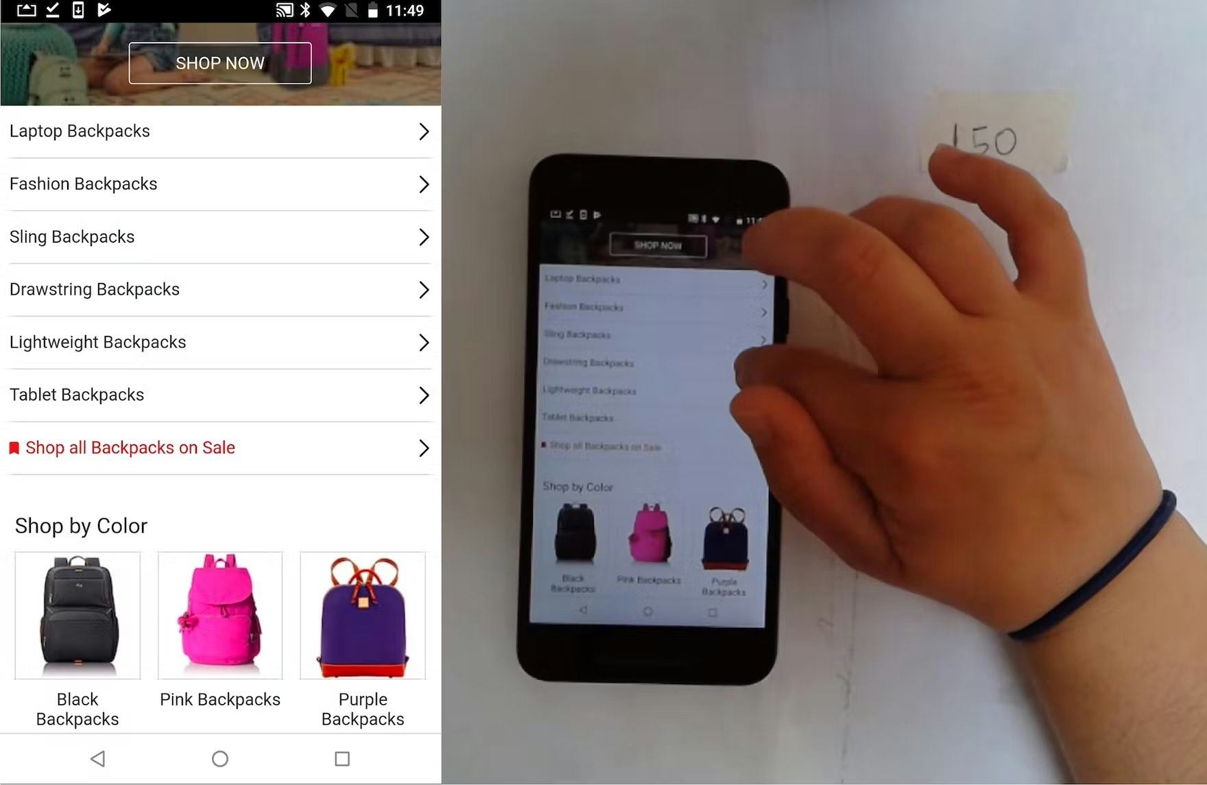
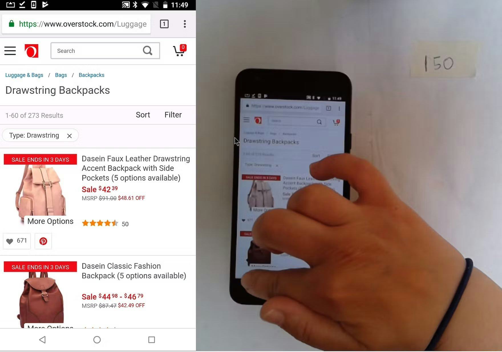
At Overstock, the “Backpacks” intermediary category page promotes various backpack types (first image). When this participant selected “Drawstring Backpacks” she arrived at a “Backpacks” product list with the “Type: Drawstring” filter preselected (second image). Such an implementation allows for promoting certain types of products as if they were categories, while they are really implemented as filters within a category.
Indeed, popular filters can be displayed as “categories” in the main navigation and on intermediate category pages.
However, clicking on these links should bring users to suitably prefiltered lists so that they can easily adjust filters rather than subcategories for each type (e.g., as is recommended for “Sales” or “Deals” scopes).
Determining Whether to Implement Product Subtypes as Categories or Filters Can Be Site Specific
Now there are some instances where determining whether to implement a product subtype as a filter isn’t so clear-cut.
Indeed, sometimes a product type would be best implemented as a category on one site but as filters on another — which is likely a factor in why 75% of sites get this wrong.
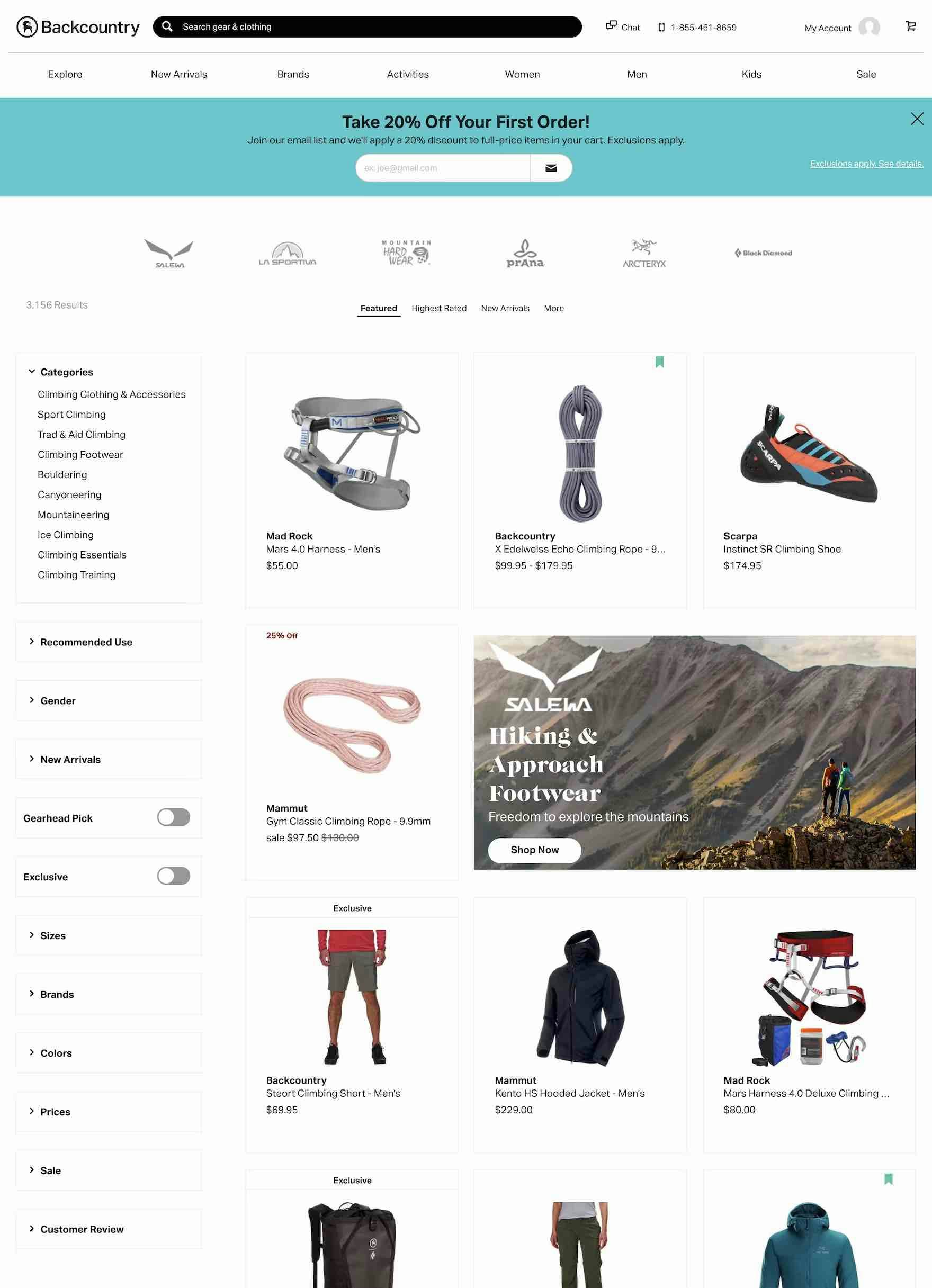
At Backcountry, with over 3,000 diverse products in the “Climb” category, it makes sense to subdivide “Climb” into subcategories. The number of products hints at the need to create subcategories, but also the diversity of the products, as, for example, “Climbing Footwear” and “Climbing Clothes & Accessories” are likely to have many different product attributes.
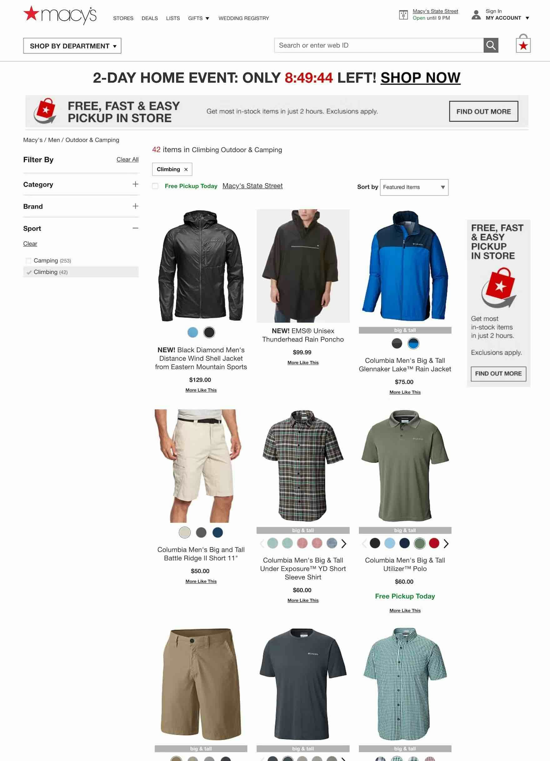
On the other hand, at a mass merchant site like Macy’s, there’s only need for a single “Climbing” filter in “Men: Outdoor & Camping”. Only 42 products are available, and while the products are diverse (e.g., shoes and clothing are both included), users interested in climbing products would likely prefer to scan one list of 42 products, rather than several lists that each contain few products.
For example, a specialist sports and outdoors site is likely to have many product types with very different attributes (e.g., “Climbing Footwear” and “Climbing Clothes & Accessories”), each of which would be best implemented as separate categories.
On the other hand, a mass merchant site might have a “Climbing” filter in an “Outdoor” subcategory in “Clothing” because there will likely be fewer products because they are unlikely to carry lots of different types of climbing-related products.
Because the selection would likely be relatively small on a mass merchant site for such a specialist range, users could easily scan the shorter list and would be less likely to have issues due to, for example, a lack of a “Size” filter that would apply to all products in the list.
In the end, it’s important to note that determining whether a group of product types should be filters or categories is site specific and directly related to the amount of information available for the different product types.
How to Get Started Evaluating the Site Catalog
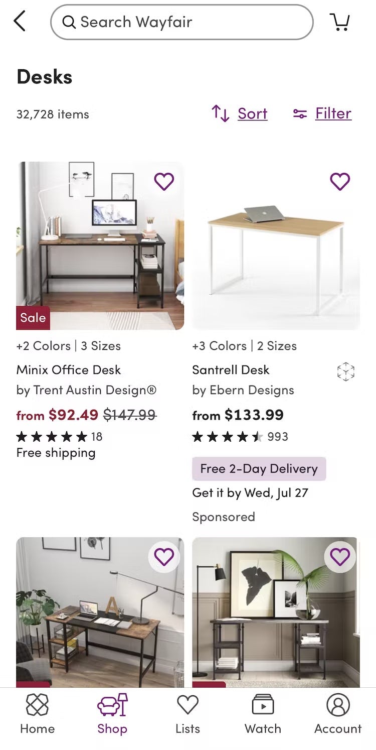
On Wayfair’s mobile site, all types of desks are shown in a product list (first image), with filters such as “Shape” available (second image) to narrow the list by relevant criteria. As a result, users can get an overview of the different types before applying filters to narrow the list.
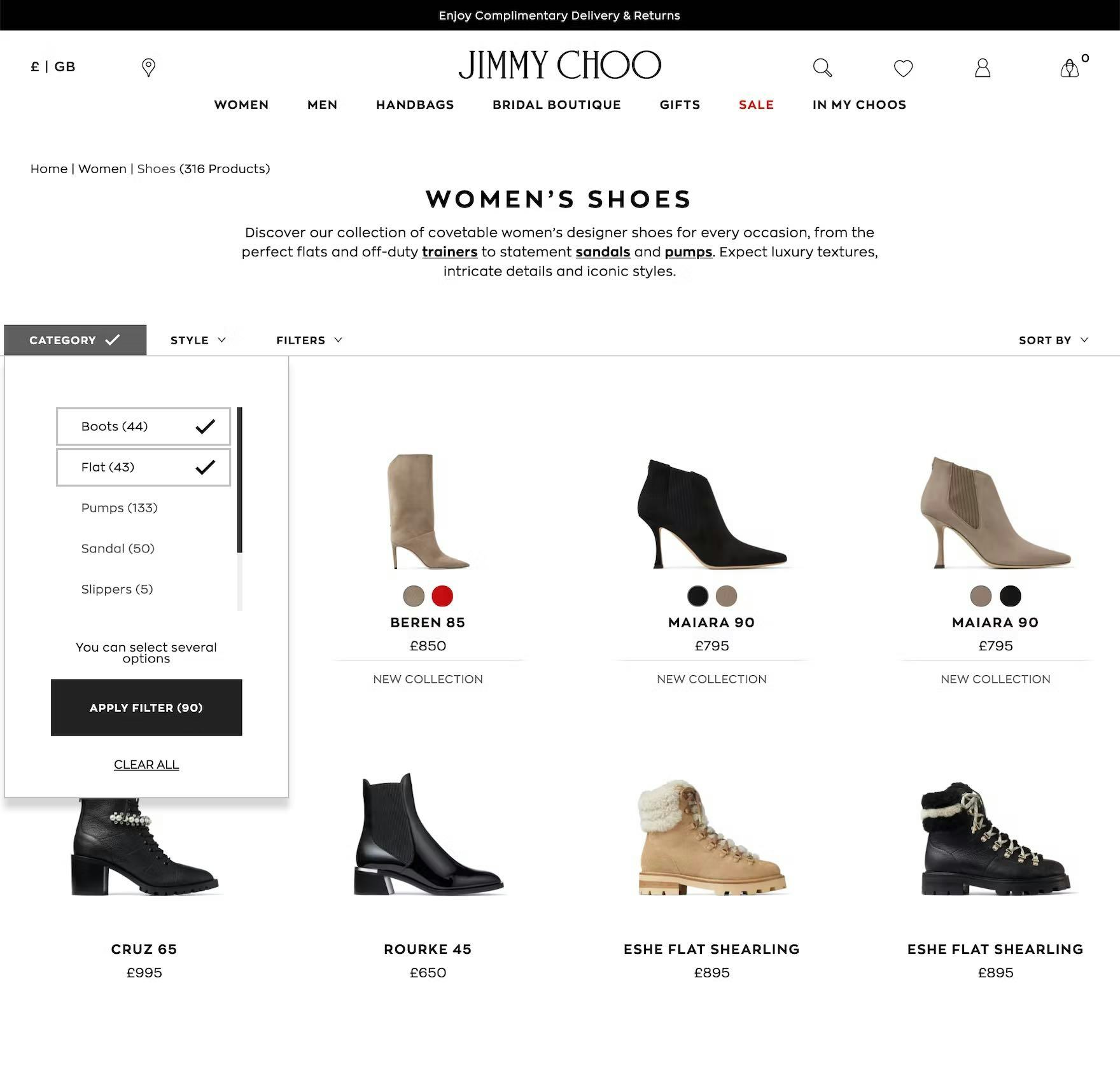
Jimmy Choo implements product types as combinable filters, allowing users to see the exact combination of product types they’re interested in (e.g., both boots and flats) within a single product list.
Our large-scale testing and e-commerce UX benchmark reveal that some of the most common instances of product types incorrectly implemented as categories include the following:
- Brands (e.g., separate subcategories for “Nike Running Shoes”, “New Balance Running Shoes”)
- Styles (e.g., “Midi Dresses”, “Big & Tall Jackets”, “Mid-Century Modern”, “Skinny Fit” or “Slim Fit” jeans)
- Product subtypes (e.g., “Corner Desks”, “L-Shaped Desks”, “Mirrorless Cameras”)
While these 3 attributes frequently occur during our testing, benchmarking, and auditing, there are many others that can also be troublesome, depending on the specific site industry or context.
A decent way to programmatically scan an entire product catalog for categories that may be more appropriately implemented as filters is to sum the number of matching products within each category and subcategory on the site.
Often (but not always), categories with very few products (typically 10–30 items, depending on the industry) will be a sign of an overly narrow scope, which indicates a possible candidate for a product-type filter (especially as filtering a category with only a few products will be largely pointless since the user can just scan all of them.)
Avoid Siloing Users in Overly Narrow Scopes
Our large-scale testing, e-commerce ux benchmarking, and UX audit work has consistently shown that, in the vast majority of cases, product catalogs have been overcategorized and filters have been underused — leaving users to pogostick between subcategories of similar product types as they hunt for a suitable product.
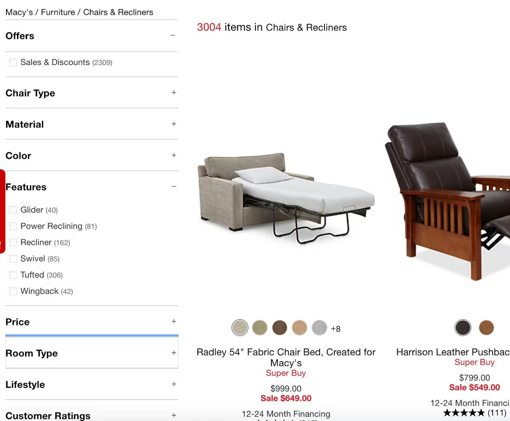
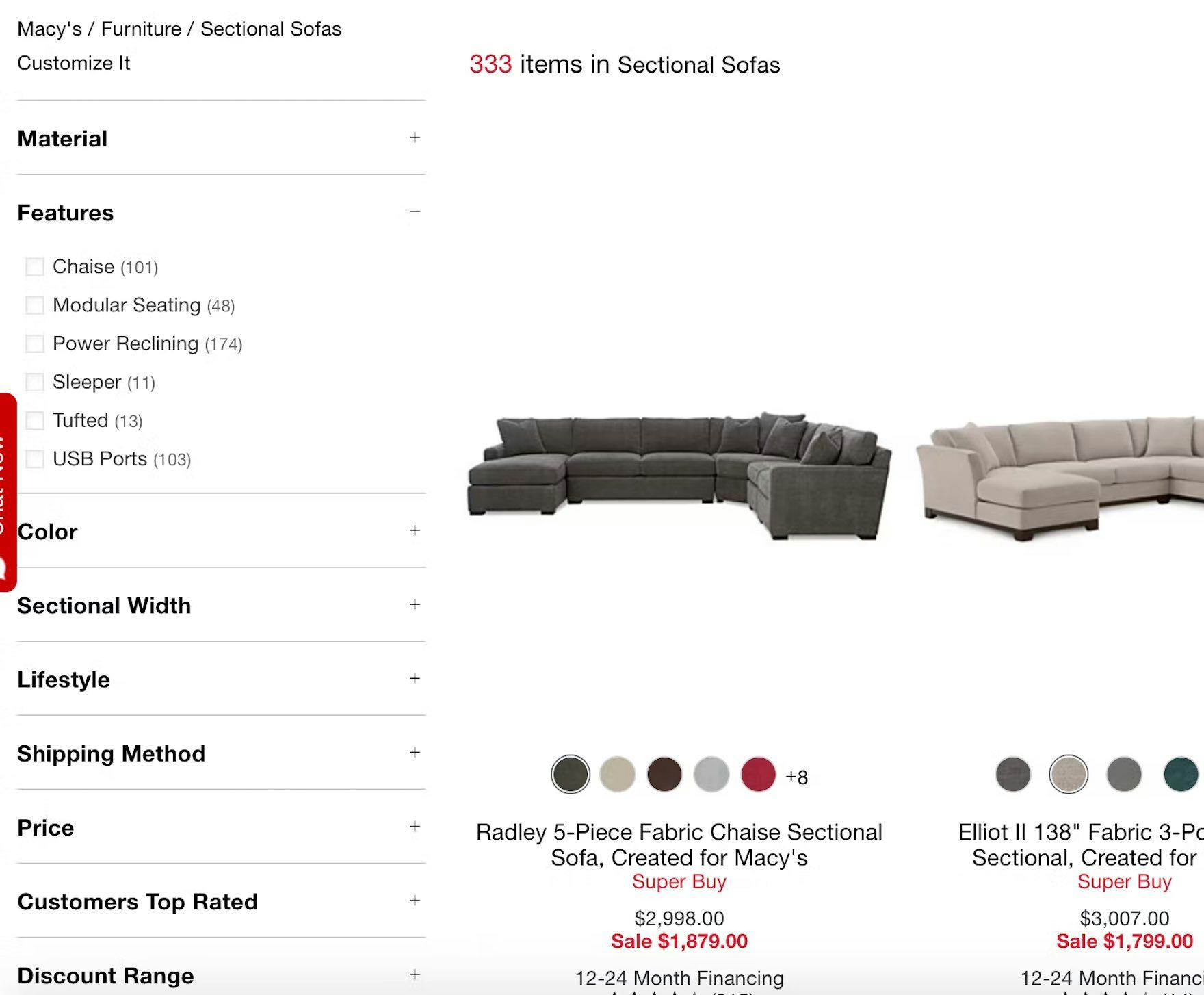
While both the “Chairs & Recliners” and “Sectional Sofas” categories at Macy’s have a “Features” filter type, the filter options are in fact very different between the two product types. For example, “Chairs & Recliners” has “Features” filters for “Swivel”, “Glider”, and “Wingback” (first image), attributes that aren’t relevant for the “Sectional Sofas” category (second image). Thus it’s appropriate to have separate subcategories for “Chairs & Recliners” and “Sectional Sofas”.
That said, the specific nature of the site catalog matters when deciding whether to implement a product subtype as a filter or a category.
It’s important to keep in mind that the role of categories is to serve as scopes that are sufficiently defined so that a large set of attributes are shared among the products, which in turn allows for powerful filtering features across those shared attributes.
On the other hand, filters are tools to adjust and narrow down the list of displayed products within a category (or a set of search results). Filtering values are not mutually exclusive (unlike categories) and therefore allow users to combine multiple filter values to narrow down their product list.
Because filters are combinable they afford the user much greater customization over the product list, yet it is the user’s category scope that determines which filters are available to begin with.
This interdependency between categories and filters can make them look all the more alike, yet actually just makes it even more important to correctly distinguish the two, as misimplementing one automatically hurts the other.
Despite this, our e-commerce UX benchmark reveals that 75% of the top e-commerce websites struggle to get this right — which, in the end, leaves users struggling to both get an overview of the product catalog and find a suitable product to purchase.
This article presents the research findings from just 1 of the 650+ UX guidelines in Baymard – get full access to learn how to create a “State of the Art” ecommerce user experience.
If you want to know how your website performs and compares, then learn more about getting Baymard to conduct a UX Audit of your site.

