When browsing for products, users quickly judge whether a category is likely to have what they’re looking for based on the first few products in the list.
In turn, if these first few products aren’t representative of the product selection as a whole, some users will assume the list doesn’t contain what they’re looking for and may be quick to abandon the category — or leave the site entirely.
In fact, during our large-scale usability testing, we observed users were often misled into thinking the product selection was much narrower than it really was based solely on the default sort order.
Despite this risk, 24% of desktop sites in our UX benchmark fail to showcase the breadth of products available by taking advantage of the default sort order.
In this article, we’ll discuss the often-overlooked impact of a product list’s default sort order, including:
- The impact the default sort order has on users’ ability to find suitable products
- How many otherwise useful sort types can mislead users when used as the default
- How to implement a diversity-based “Relevance” sort type instead
The Impact the Default Sort Order Has On Users’ Ability to Find Suitable Products
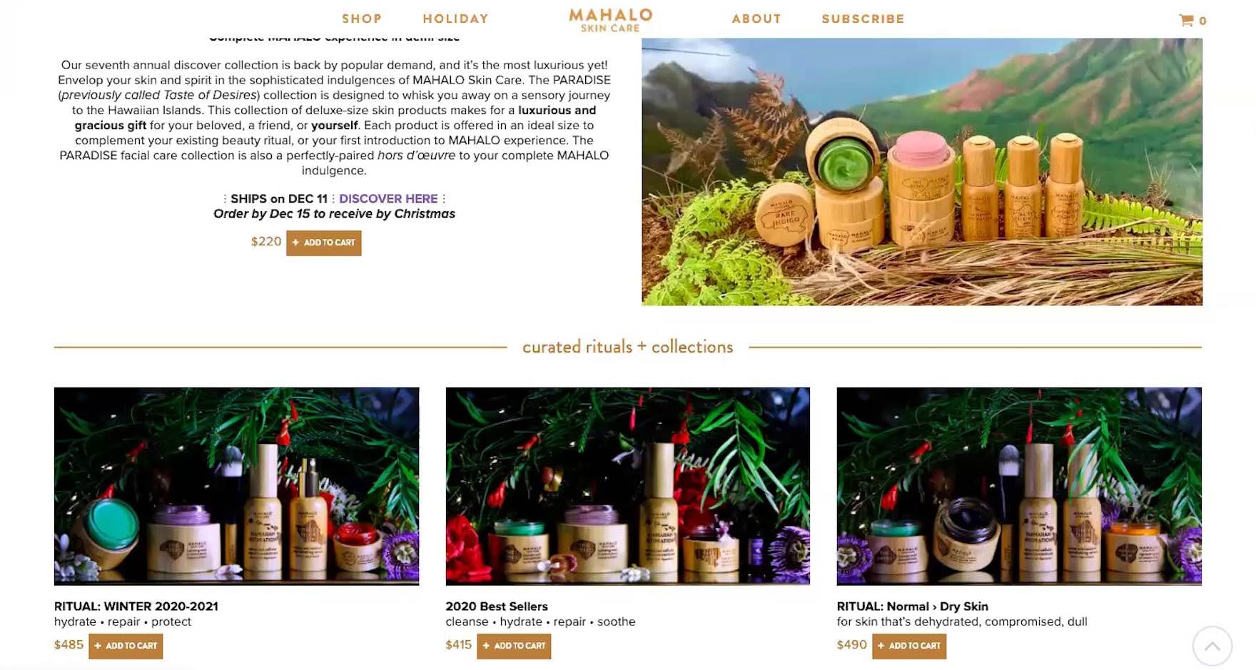
“They seem quite pricey, and just because their most expensive items pop up first, I would probably leave.” On Mahalo, the items at the top of the product list only consisted of expensive multiproduct sets, which deterred this user from wanting to explore further.
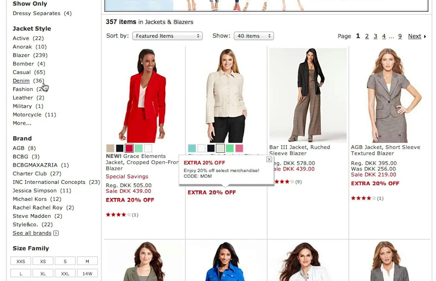
Similarly, at Macy’s, a user navigated to the broad category “Jackets & Blazers” but was confused when seeing mainly blazers. She drew the conclusion that she had to select a “Jacket Style’ filter to see jackets, and as a result ended up applying an overly restrictive filter, removing the vast majority of the available jackets.
Getting a sense of the diversity of the product list is important for all sites, regardless of catalog size, in order to showcase the full range of available products and help guide users to the products they’re most interested in.
In particular, categories that are very broad or represent a combination of products need to instantly communicate to users that they indeed have landed in the right place. In practice, larger retailers and mass merchant sites are most at risk from a poor default sort type.
Across multiple rounds of UX testing, we’ve observed that users are quick to judge whether a product list will have something of interest to offer them, often making this evaluation based only on the first few products or very brief scroll of the product list.
If users aren’t presented with a representative sample showcasing the category’s breadth, they are likely to assume that the product list doesn’t have a wide selection and abandon their current product-browsing strategy — or possibly even the site itself.
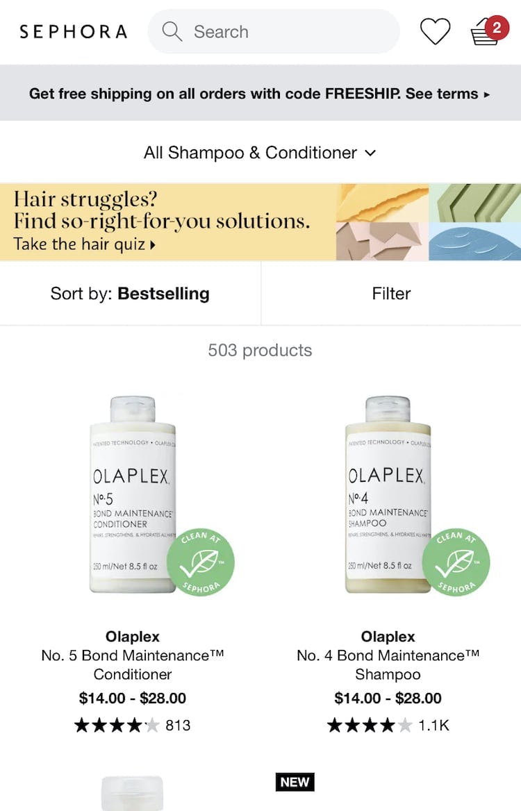
Additionally, because very few products are typically visible within the narrow mobile viewport, the effects of a homogeneous product list can be even more detrimental on mobile.
In effect, mobile users may have to engage in a significant amount of scrolling before discovering the full breadth and diversity of the product list, making them more prone to abandon a site that doesn’t provide enough diversity as part of the default sort method.
Many Otherwise Useful Sort Types Don’t Showcase Product Diversity
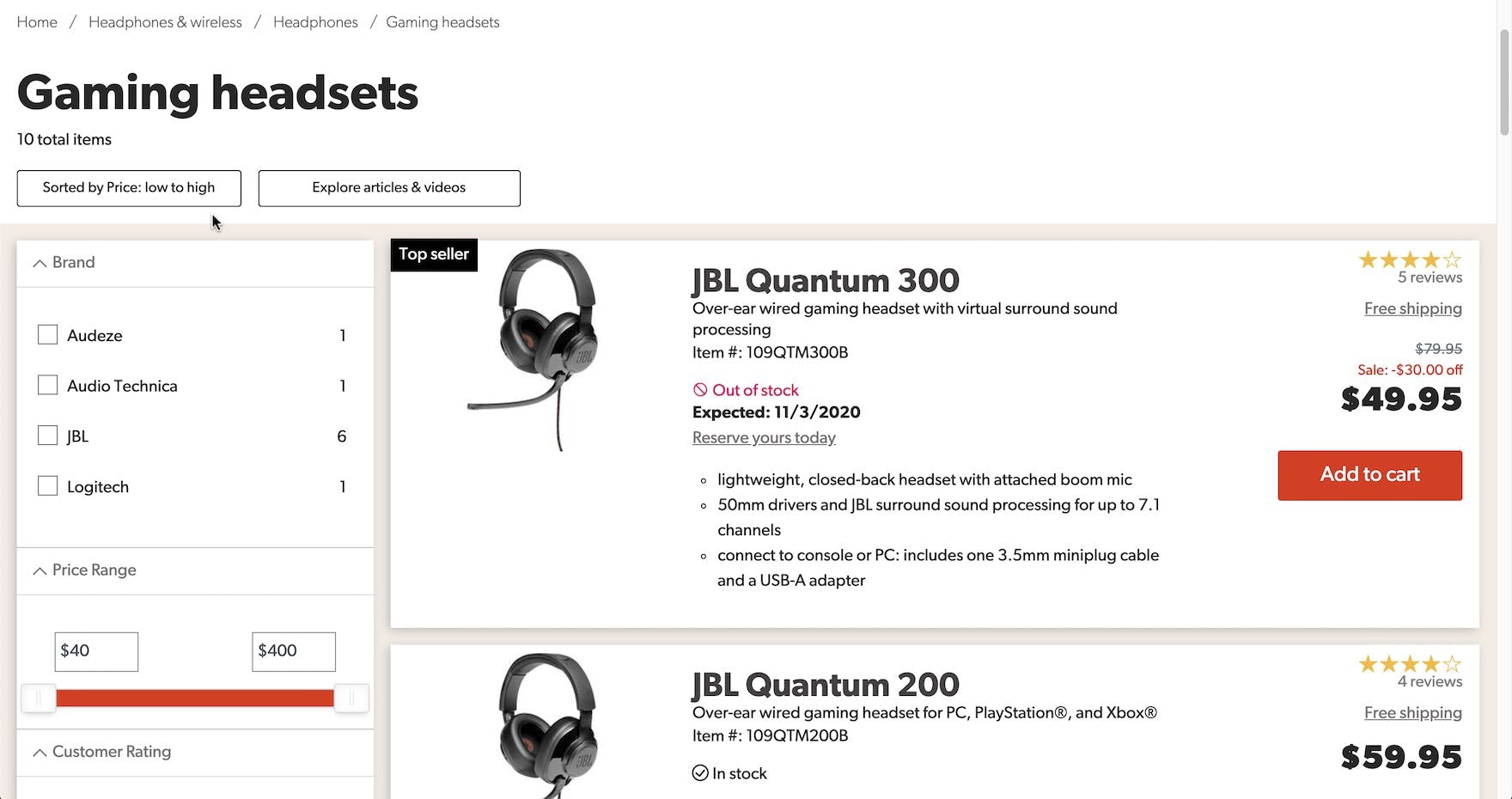
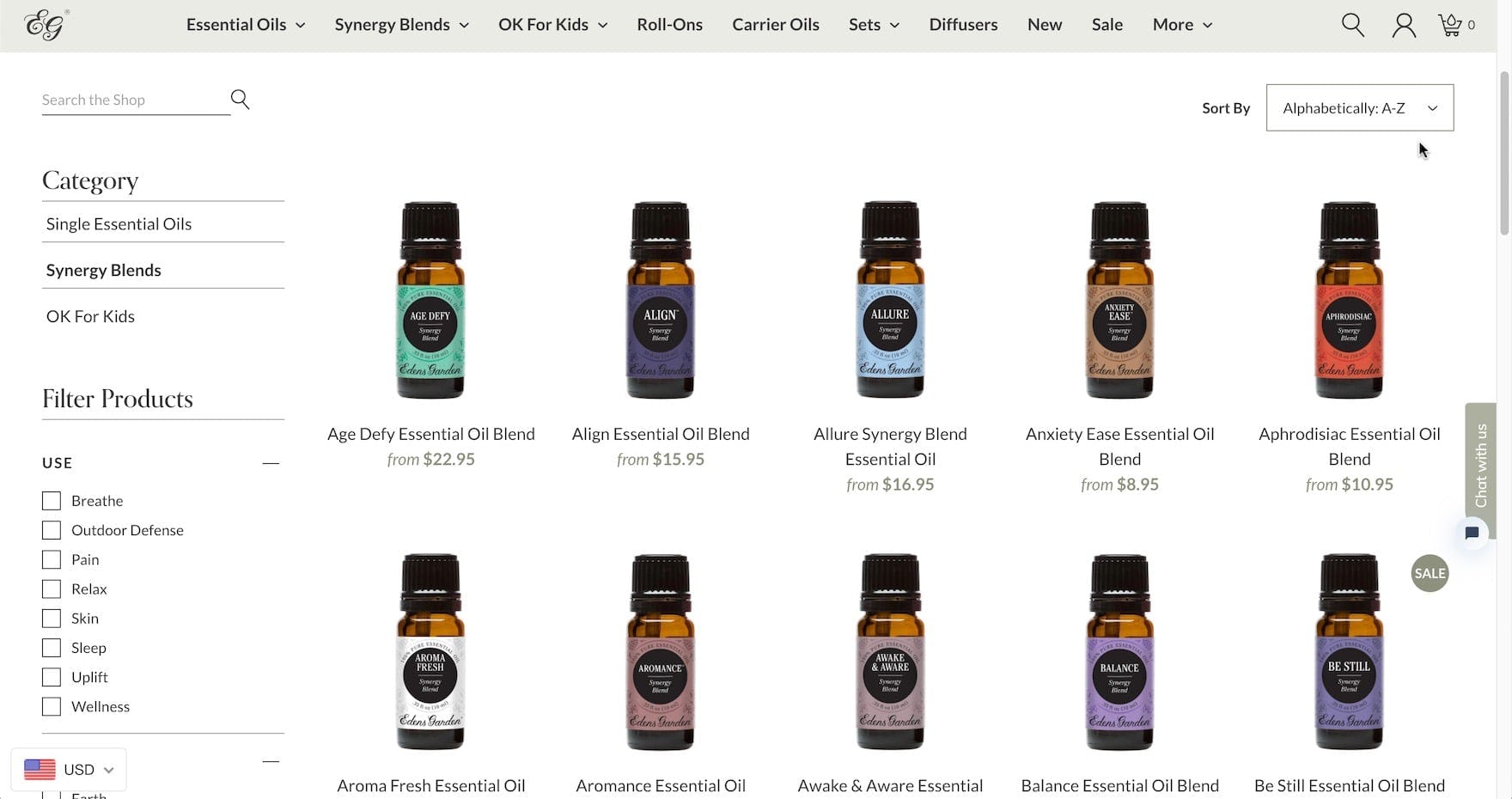
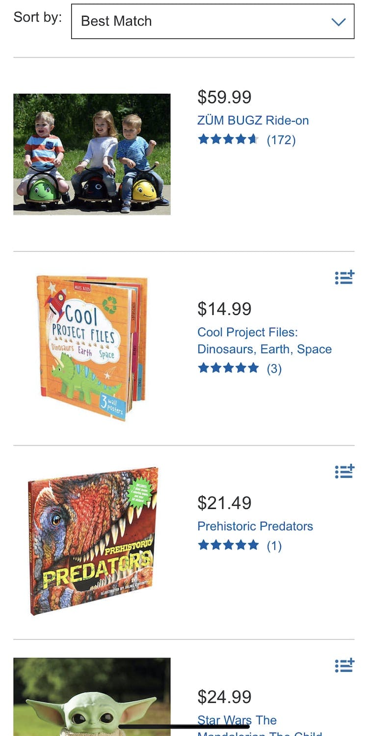
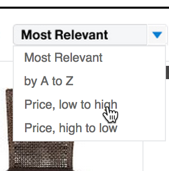
Some sites use “Price” as the default sorting method, such as Crutchfield (first image), which gives a sparse portrayal of the actual product selection available and will have a tendency to group similar items together. It can also establish an inaccurate initial impression of the products carried by the store (as being either very expensive or very cheap). Meanwhile others use “Alphabetical”, such as Eden’s Garden (second image), which doesn’t help guide users to products that are most likely to be of interest.
While useful for users with specific needs in product finding, many of the recommended sort types often fail to represent the diversity available within a product category.
For example, during testing we observed that using “Price” as the default sort type resulted in a skewed perception of the range of prices available, with users mistakenly believing the product selection was either very expensive or very cheap.
Likewise, sorting by “Alphabetical” is typically random and doesn’t necessarily provide a truly representative sample of the breadth of products within the category.
When the initial product list doesn’t show a truly representative sample of products, users risk discarding the very category they need because it doesn’t look relevant at first sight.
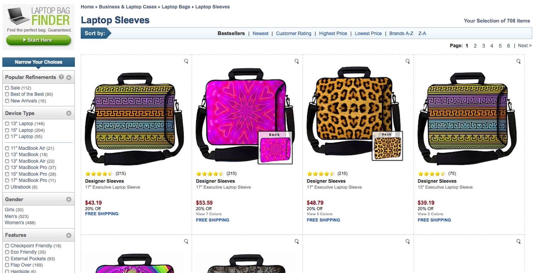
“It’s like they’ve had a big box that they’ve opened up and then just picked them up one at a time”, a user muttered at eBags, disappointed by the default sorting of the products. Notice how the “Bestsellers” sort type results in the first 20 laptop sleeves being dominated by a particular laptop sleeve type.
In particular, “Best Selling” and “Popularity” are commonly used as the default sort type. These sort types did perform somewhat better then the aforementioned “Price” and “Alphabetical” during testing.
However, “Best Selling” and “Popularity” can still cause issues due to a lack of diversity in the first products displayed in the product list. For example, “Best Selling” often doesn’t fully represent the full breadth of the category, or does so only by chance.
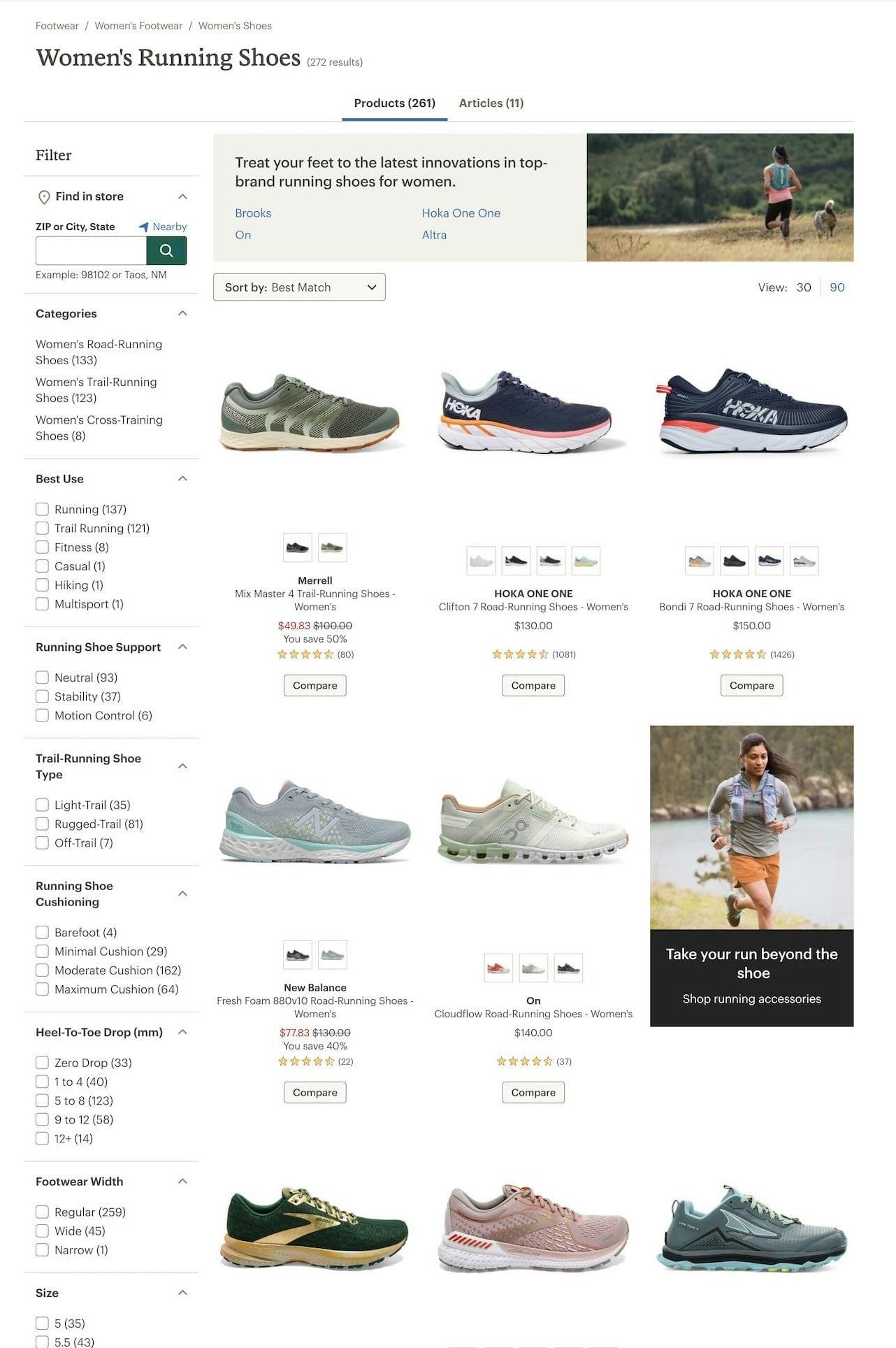
For example, the best-selling shoes on a site may be primarily sneakers or athletic shoes. By using “Best Selling” as the default sort type, users can easily overlook the fact that the site also carries dress shoes, sandals, and boots.
In other words, “Best Selling” or “Popularity” should factor into the default sort type, but they shouldn’t be the only factors.
Implementing Diversity-Based “Relevance”
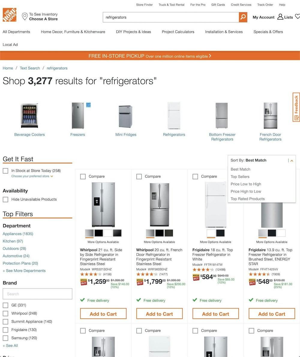
The default “Best Match” sort type at Home Depot includes refrigerators in a variety of sizes, finishes, and price points, helping to showcase the diversity of products in the category.
To most effectively convey a category’s true breadth, a product list should represent all of its major product types within the first 20 or so products on desktop (and within the first 10 or so on mobile, due to fewer products being visible at once).
In most cases, “Relevance” can simply be the same as a standard “Best Selling” order, but with the modification that any product type that constitutes more than 10% of the overall list is included among the first 20 products, regardless of its overall sales.
This implementation ensures that the product list will highlight the variety of product types available, while also being relatively simple to apply.
For a more sophisticated representation of the diversity of a product list, the default “Relevance” sorting can also be refined to incorporate a matrix of data points.
In effect, this approach uses product subtypes as the foundation of the sort order and adjusts the display sequence using additional data, including sales rank, user ratings, pageviews, interrelationships, etc.
The exact distribution or priority of data points is an obvious candidate for both ongoing multivariate testing and for machine learning. Additionally, the distribution of data points can even differ from category to category and can also be part of the site’s personalization efforts, adjusting the default “Relevance” sorting based on each individual user’s prior actions and purchase history.
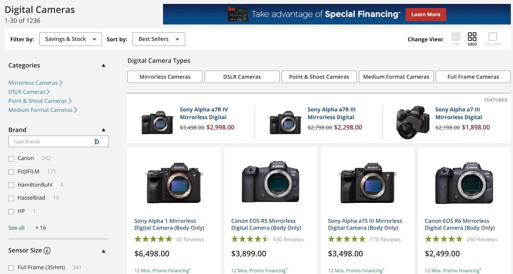
On B&H Photo, the only digital cameras immediately evident are mirrorless camera bodies, despite a diversity of other digital camera types (“DSLR, Point & Shoot”, etc.).
Additionally, when implementing a diversity-based default sorting method, it’s important that the sort type naming doesn’t mislead the user about how the items are sorted.
For instance, while a sort type name such as “Popular” may not technically be misleading (“the most popular items within the selected subproduct types”), in practice test users were observed to equate “popular” with “best selling” — in other words, taking only popularity into account.
Instead, “Relevance” or “Featured” better indicate the broader sort method and provide slight ambiguity, implying that the site has had some say in what items are shown first on the list.
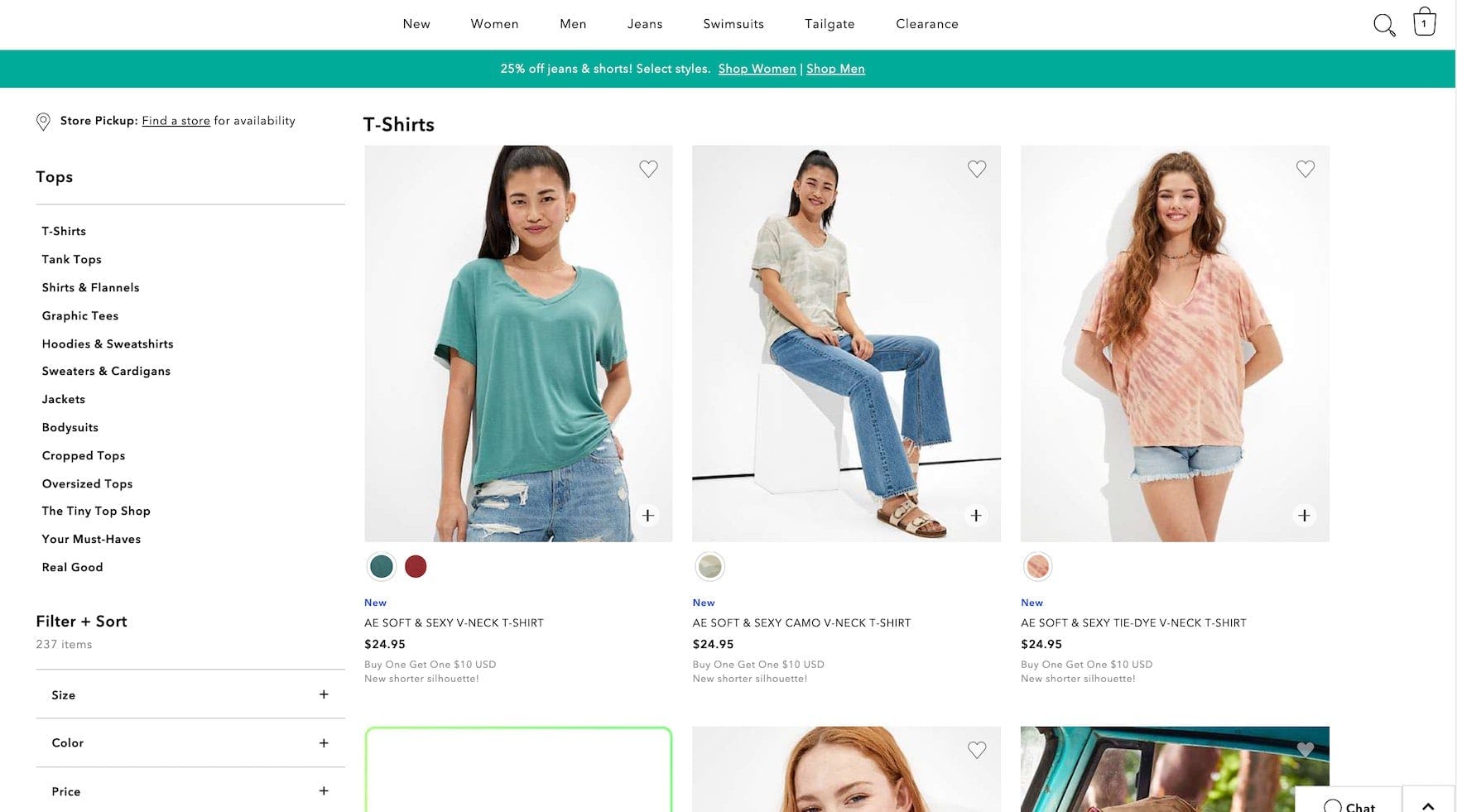
American Eagle’s “Tops” product list only surfaces T-shirts within the first many products, but other product types are only found through excessive scrolling or interacting with the sidebar navigation.
Finally, for some industries, the default “Relevance” matrix may also incorporate the change of seasons if some categories are of seasonal nature.
For example, when testing apparel sites, multiple users were disappointed when looking for jackets and finding only lightweight items such as blazers appear at the top of the list. Based on the (at the time of testing) cool season, surfacing heavier jackets instead would have been more relevant and appropriate.
Promote Exploration by Highlighting Product Diversity
Across multiple rounds of both desktop and mobile UX testing on both large and small retailers, we’ve observed how the default sort order has a heavy influence on users’ understanding of what a category has to offer and their willingness to explore to find products they’re interested in.
An ideal default sort type helps users visualize the diversity of product types available and gives them a starting point for using other sort types and the filtering tool as well to further hone the product list.
On the other hand, commonly used default sort types such as “Price”, “Alphabetical”, “User Rating”, and others simply don’t always capture the widest variety of available products, which can mislead users about the breadth of products they can find by exploring the product list.
Taking diversity into account, whether as a simple weight to “Best Selling” or a complex and dynamic algorithm, ensures sites can impress upon users the full array of products that are available.
This article presents the research findings from just 1 of the 650+ UX guidelines in Baymard – get full access to learn how to create a “State of the Art” ecommerce user experience.

