Key Takeaways
-
Mobile users, like desktop users, often need a broad list of products to consider
-
Yet the mobile main navigation, with no hover option, limits what sites can do to provide access to the top layers of categories
-
Testing revealed that providing a “View All” option in the mobile main navigation is low-cost way for sites to meet this mobile user need — yet only 24% of sites implement this well
When it comes to getting broad product scopes, desktop and mobile users have different options available to them.
On desktop sites, users often have an option of getting a broad scope of products by selecting the top-level scope in the main drop-down navigation, an option that’s indicated to users by the hover cursor change.
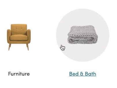
On mobile sites, however, due to the lack of a hover state, sites have to determine whether a user tapping a main category should expand the subcategories within it, or take users to the landing page for the main category item (e.g., a broad product list or an intermediary category page).
In this article, we’ll discuss 3 ways identified from our large-scale testing and Premium research findings that mobile sites attempt to resolve this issue (which only 24% of sites get completely right, according to our e-commerce UX benchmark):
- A tappable header, with only the category or subcategory name as the microcopy
- Multiple hit areas within the main navigation items
- A tappable header, with “View All” in addition to the category or subcategory name as the microcopy
1) A Tappable Header, with Only the Category or Subcategory Name as the Microcopy
One design pattern that can allow users to access a broader scope on mobile is to allow them to tap the header for the category they’re currently in.
For example, a user who has expanded the “Makeup” category and is seeing all of the “Makeup” subcategories can then also choose to tap the “Makeup” header to see all makeup products.
However, during testing participants failed to tap the header of the currently viewed category to get a broader list of products — even when participants wanted the broader list — when the header was simply the name of the subcategory (e.g., “Makeup”, “Tops”, etc.).
This clearly indicates that this tappable-header approach is overly subtle.
Many users are likely to assume that the subcategory header is simply there for informational purposes (e.g., “You’re within the ‘Makeup’ subcategory”), instead of intuitively knowing that the menu option can be tapped to access a category page or a product list for all the products available in the subcategory.
Indeed, many users will miss this “hidden” feature unless they happen to stumble upon it.
2) Multiple Hit Areas within the Main Navigation Items
Another approach is to have multiple hit areas within each item in the main navigation.
For example, users can tap a header to see a broad product list (e.g., tap “Tops” to see all tops), or they can tap an arrow at the end of the header row to expand subcategories (e.g., tap the arrow at the end of “Tops” to reveal “Dress Shirts”, “Casual Shirts”, “Sweaters”, etc.).
This implementation also leans heavily on a very subtle design — something in testing we observed will be lost on many users, either because they’re completely unfamiliar with the concept (and thus have to learn something brand-new while on the site) or because the concept is implemented inconsistently across sites (or even on the same site).
3) A Tappable Header, with “View All” in Addition to the Category or Subcategory Name as the Microcopy
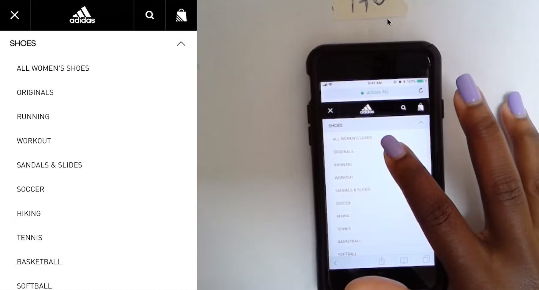
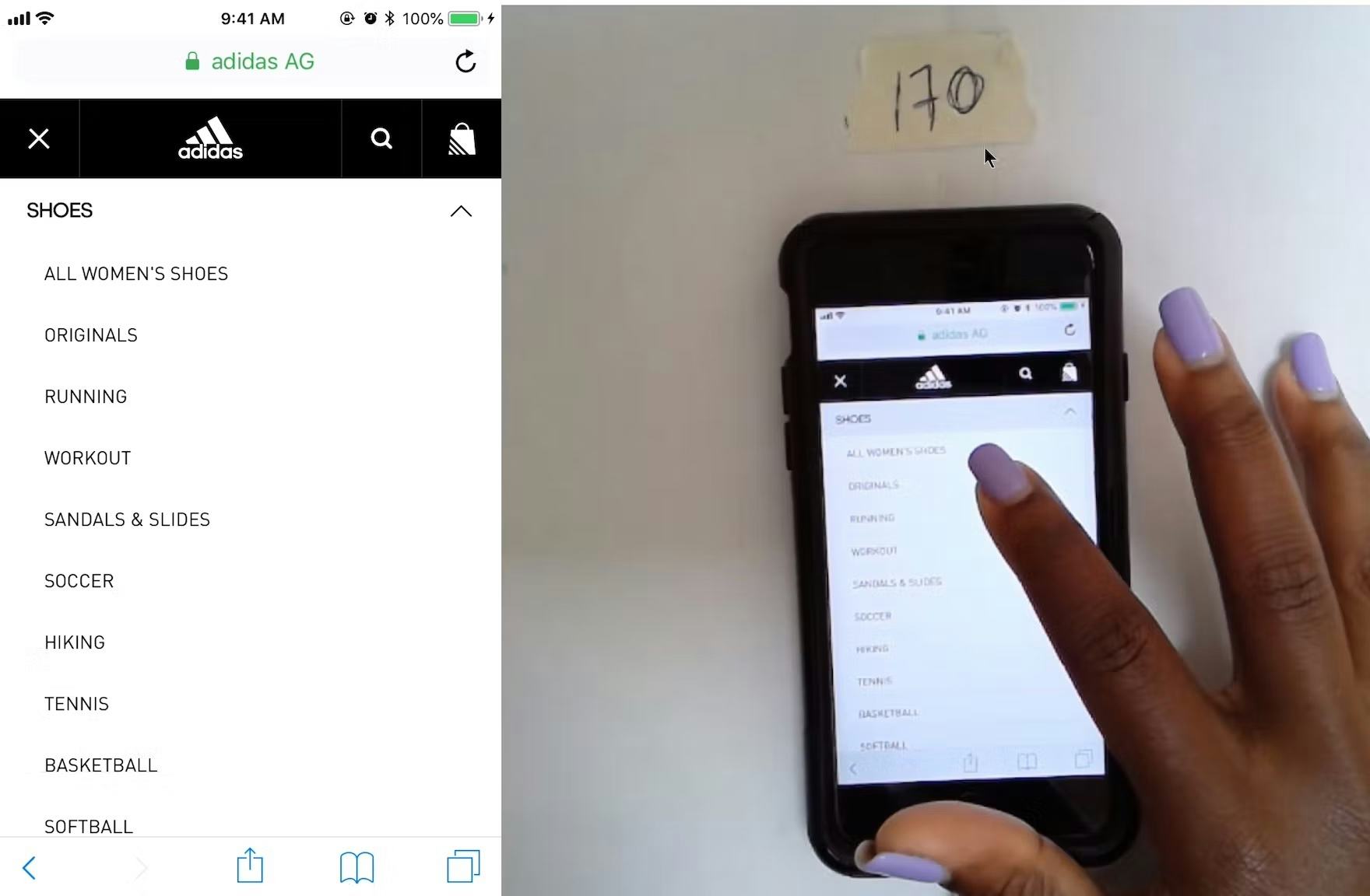
Adidas includes a “View All” menu option at each layer in the hierarchy, ensuring users can easily access a product list containing all the products available in a particular subcategory.
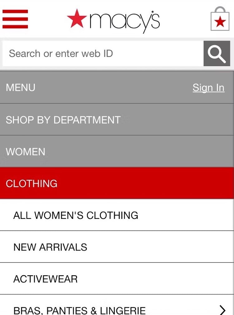
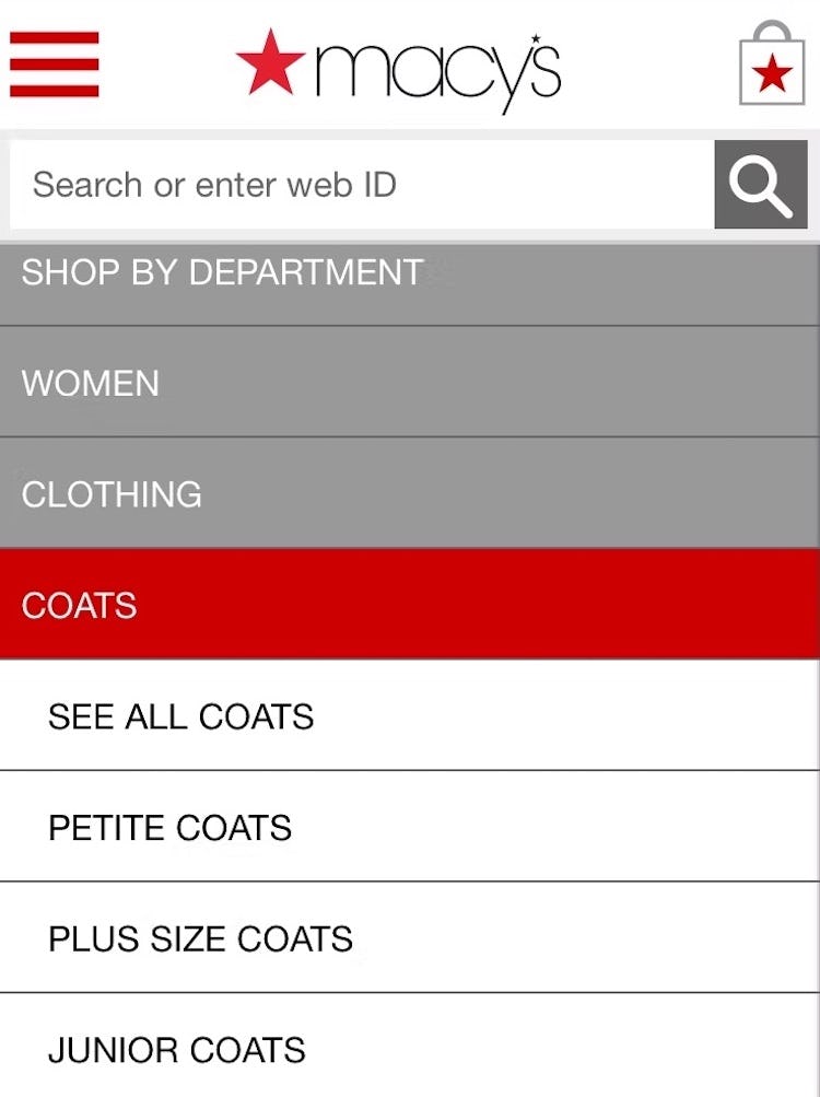
Macy’s also includes “View All” nested menu options at different levels in the category hierarchy.
What was observed to perform consistently well during testing was to have a “View All” menu item nested within every product category in the hierarchy.
For example, a site with the category “Women” and the subcategories “Clothing” and “Coats” would have a “View All” menu item at each level — thus, “View All Women’s”, “View All Women’s Clothing”, “View All Women’s Coats”. If product lists at the very top of the hierarchy would likely be overwhelming or unhelpful to users, then “View All” could take users to Intermediary Category Pages instead.
However, note that the key is to have the words “View All”, “See All”, etc. preface the name of the subcategory the user is currently in.
Implementations that simply read, for example, “Jeans”, instead of “See All Jeans”, will be overlooked by many users, who won’t understand that the header “Jeans” can be tapped to see the broadest “Jeans” path available.
This also means, however, that if the current implementation allows users to see all the products in a subcategory by tapping its header, then correcting this is as simple as adding the text “View All” or “See All” to all relevant headers.
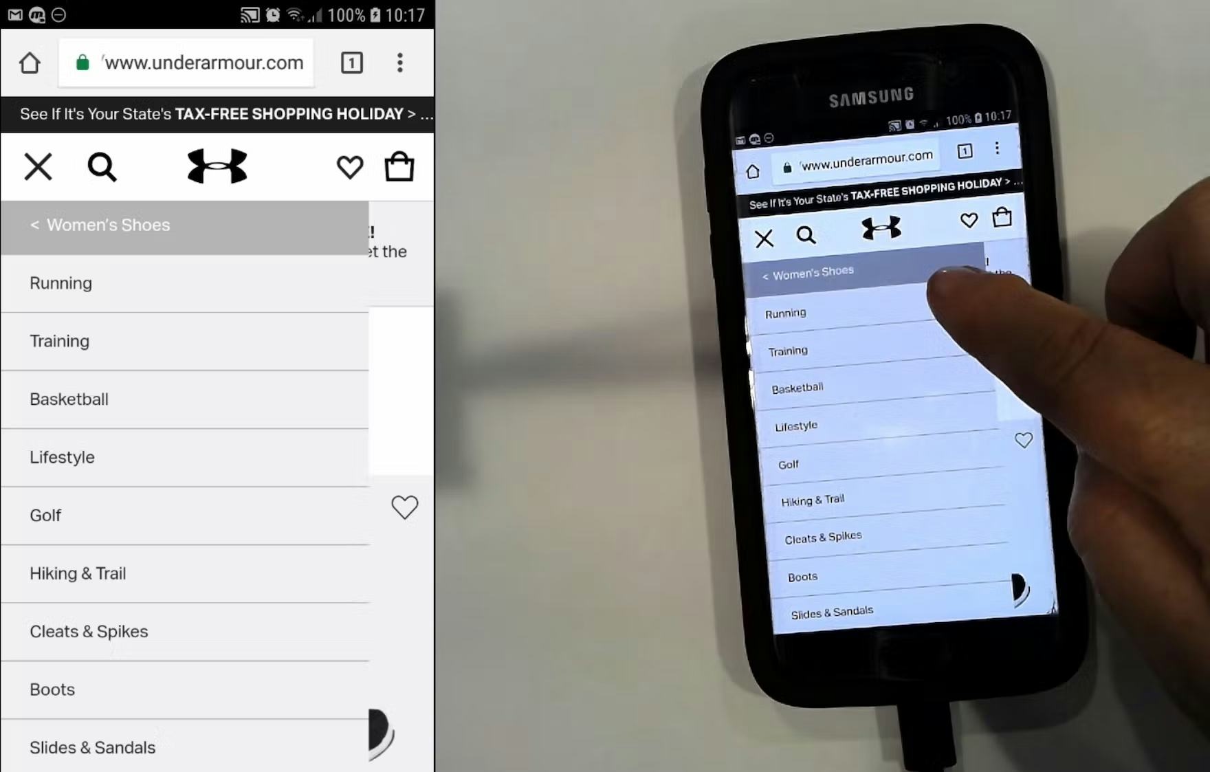
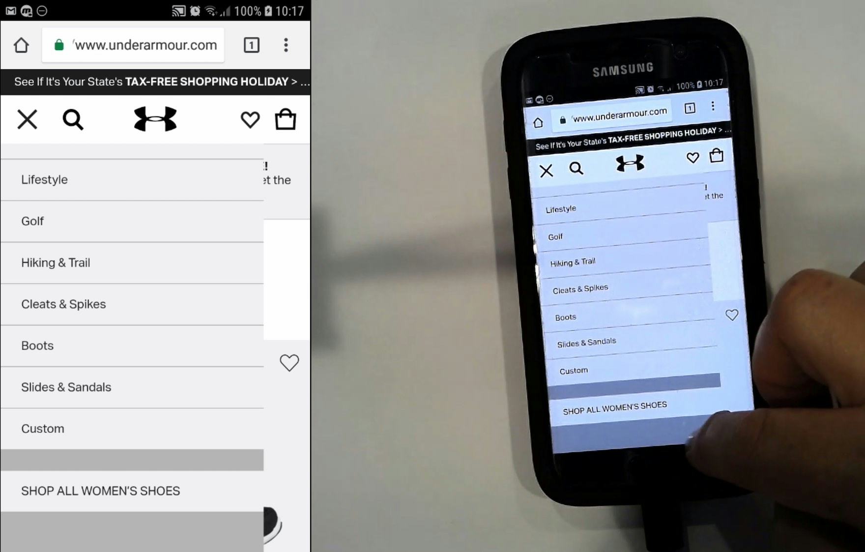
“Now on this one there isn’t an option to…Oh yeah it does at the very end, ‘Shop All Women’s Shoes’. I would prefer the ‘Shop All’ to be at the top…so I could click that link immediately if I want to because I’m not 100% sure what I want.” A participant initially assumed there’s no “Shop All” option in the “Women’s Shoes” category at Under Armour (first image), but stumbled on it after scrolling the menu (second image). Placing the “Shop All” option at the bottom of the menu makes it unnecessarily difficult for users to find.
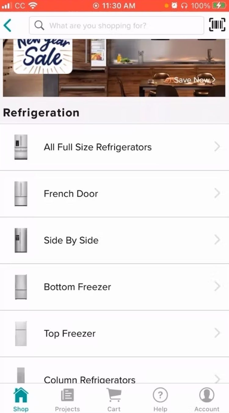
“I think if I wasn’t sure what I wanted, I could just go check ‘all’ and it would show me sort of all of the different configurations. Whereas if I knew that I wanted the side by side, I could go straight to there, or the bottom freezer or the top freezer, I could go straight to those.” “View All” options, like the “All Full Size Refrigerators” here in the Build.com app, allows users to view a broader set of products before narrowing the selection.
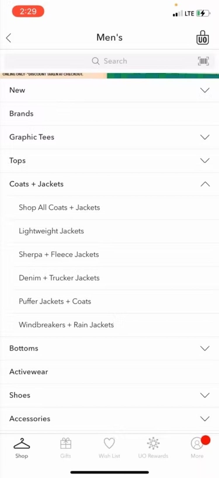
“‘Coats and jackets’. Let’s go ‘Shop All’.” The “Shop All Coats + Jackets” option in the Urban Outfitter’s app was just what this test participant needed, as he wasn’t sure yet what style of jacket was suitable.
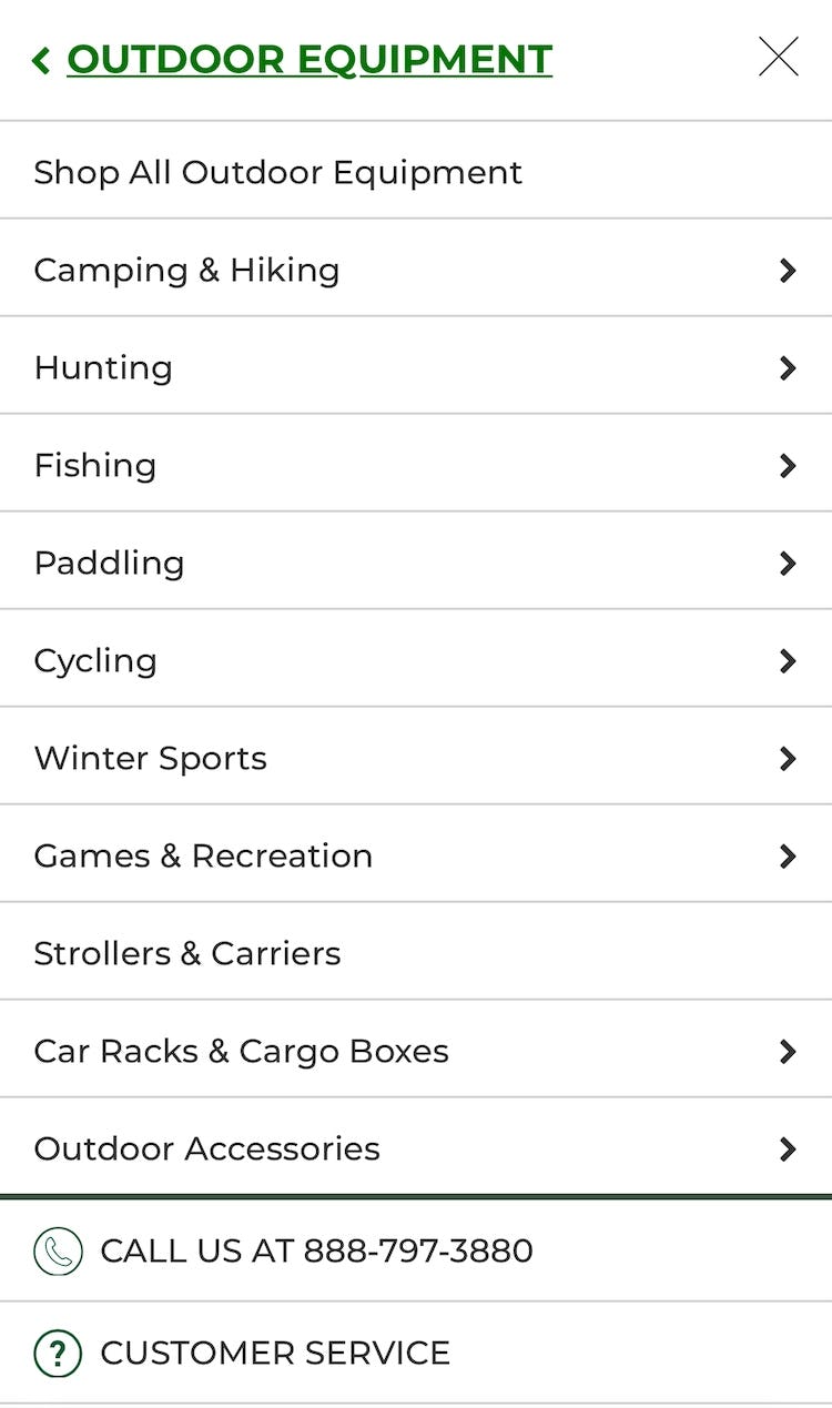
Additionally, the “View All” option should be placed as the first menu item in the list (i.e., at the top), as testing revealed that placing it elsewhere made it harder for participants to find.
This is important because users looking for the broadest scopes will be unlikely to scan a complete list of detailed subcategories.
Furthermore, having “View All” at the bottom or in the middle of a list breaks with the typical information architecture for a nested hierarchy, where the parent item will always come before the children nested within.
Help Mobile Users Access the Most Relevant Product List
Testing revealed that providing a “View All” menu item in the main navigation — which includes the words “View All” and which is placed at the top of the list — is critical to helping mobile users access the product list they’re looking for.
Otherwise, users may wind up in overly narrow scopes — and ultimately fail to find a suitable product.
Yet our e-commerce UX benchmark reveals that only 24% of sites get this implementation right, leaving their users without an important product list navigation tool.
Finally, some sites may think a solution to the issue of accessing broad scopes on mobile is to remove some of the lower layers of the hierarchy on the mobile site.
For example, a site that allows users to drill down 4 layers in the main nav on desktop reduces this to 3 or even 2 on the mobile site — essentially sending users to the bottom of the hierarchy sooner (where users see a bigger product list).
However, this is a poor implementation of the mobile UX.
Beyond being able to access the broadest scopes in all category levels, the main nav should still allow mobile users to keep drilling down the submenus, identical to how users can drill down in the desktop main navigation — as mobile users’ desire to see specific categories of products on mobile sites is no different than that of desktop users.
This article presents the research findings from just 1 of the 650+ UX guidelines in Baymard – get full access to learn how to create a “State of the Art” ecommerce user experience.

