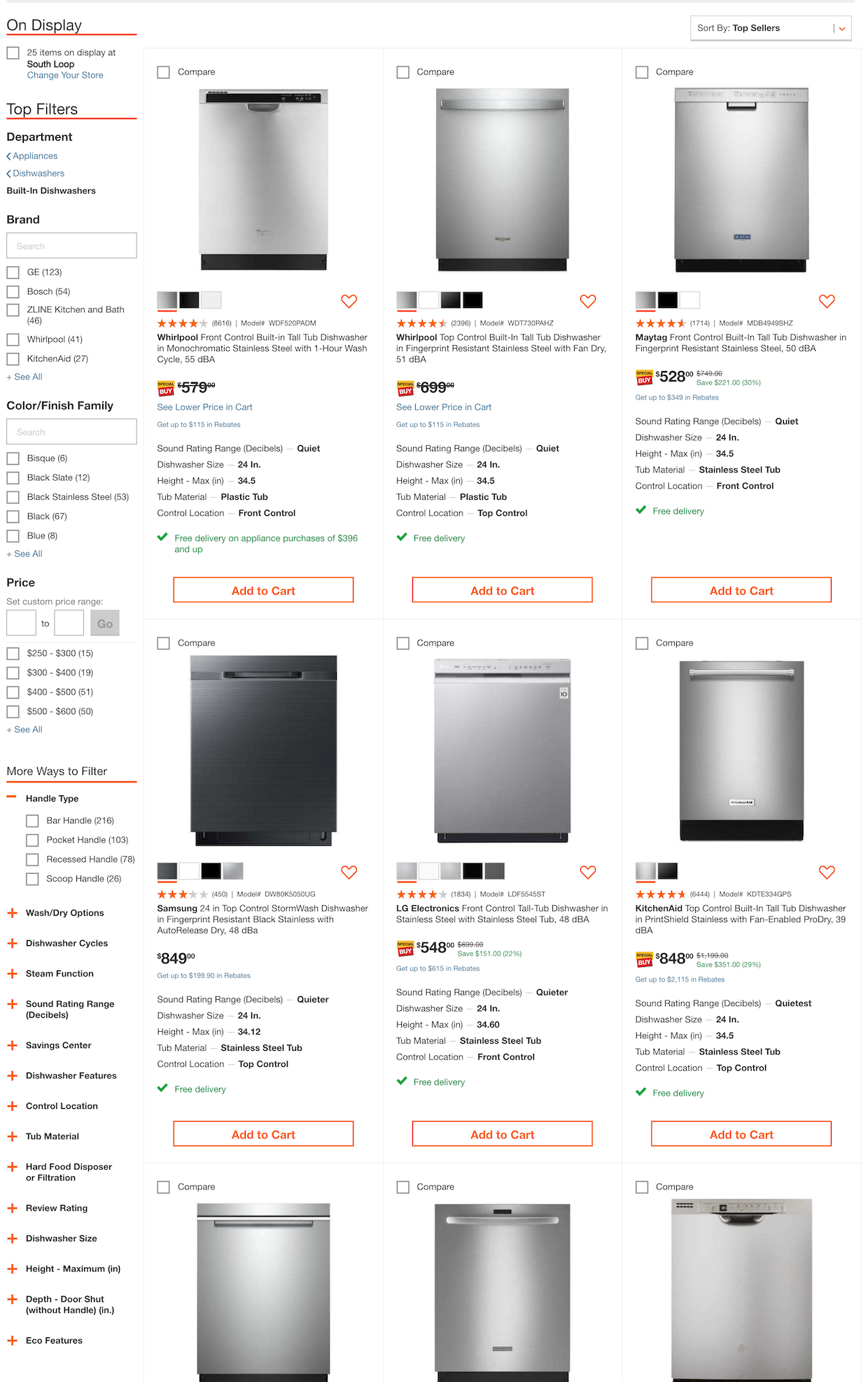
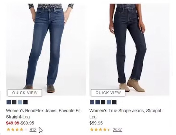
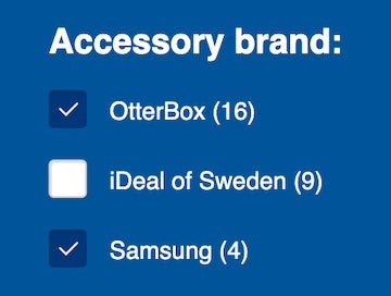
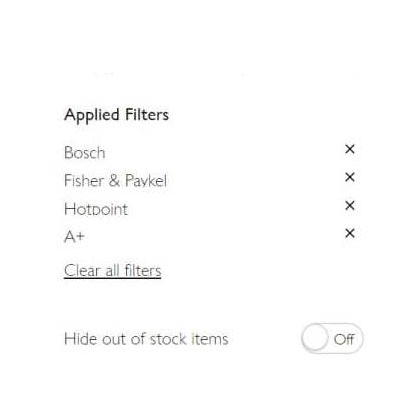
The information presented in list items is crucial for users trying to pick out the products they’re interested in.
However, once users are exposed to product attributes in the list item info, we observe in usability testing that many users will then want to filter the product list by some of these attributes. Yet our UX benchmark shows that 38% of e-commerce sites don’t have filters for all displayed product listing info.
As a result, users are often left with massive, intimidating product lists — and some will simply abandon because of the perceived difficulty in being able to zero in on a suitable product. Despite the severity of the issue, 38% of sites don’t provide filtering options for even the product attributes they include as list item info.
In this article, we’ll discuss the test findings from our large-scale usability study related to providing filters for all displayed list item info. In particular, we’ll discuss:
- Why filtering is so crucial to users’ ability to find suitable products
- How failing to provide filters for all the displayed types of list item info can lead to abandonments
- Providing filters for all displayed list item info
Why Filtering Is Crucial to Finding Products
At Costco, filters provided for laptops can help users narrow down the product listing so they can focus only on those products that are suitable for them.
Filtering is about empowering users to take a large, generic product listing and narrow it down to a small, manageable selection of products that are uniquely tailored to their needs and interests.
When done right, filters enable users to see only the products that match their individual needs and interests. It’s the e-commerce equivalent of walking into a physical store and asking the salesperson for “a brown men’s leather jacket in size medium.”
While there are some “basic” filters that should be provided for nearly all products (e.g., “Price”, “Color”, “Average Customer Rating”), most of the time users are interested in filtering the product listing across category-specific attributes. For example, filtering a list of cameras by camera-specific attributes such as megapixels, zoom level, and lens mount — attributes that aren’t particularly meaningful to other types of electronics, such as TVs (which in turn have attributes that are important to their respective category without being relevant to cameras).
Providing both universal and category-specific attributes in the list item info is a great first step toward helping users find products of interest (yet 46% of sites display too little or poorly chosen content).
However, by virtue of displaying the information in front of the user in the product list item info, users are reminded that the product attribute is important. Or, in the case of users new to the domain, they are taught that the attribute is important. The very display of the attribute then further encourages users to filter by it.
How Missing Filter Types Can Result in Abandonments
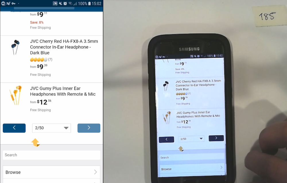
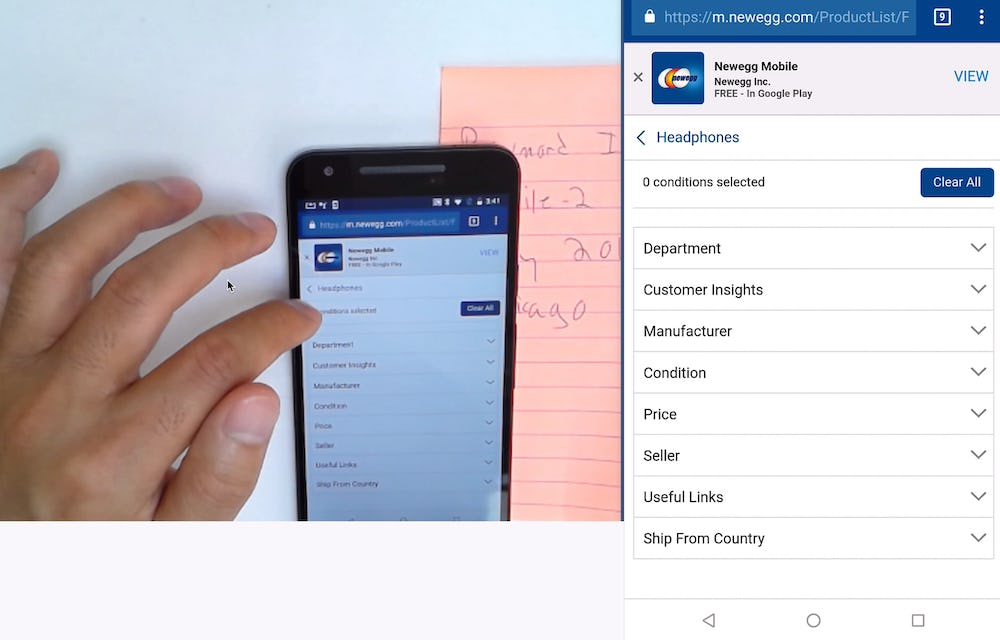
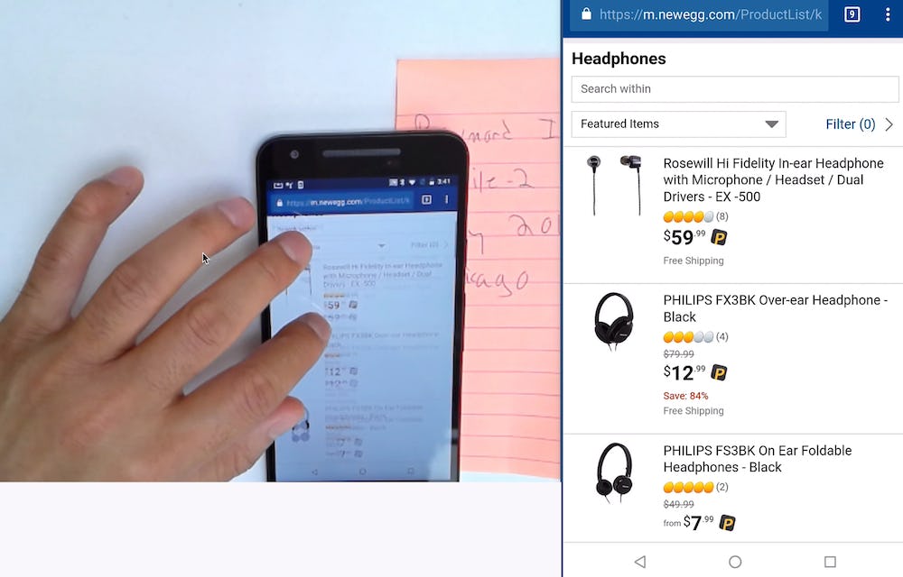
“They need to have a filter for ‘Headphones’. And a filter for ‘Accessories’. Then have ‘Earphones’. They’d make life a lot easier…it’s so all over the place.” A user at Newegg, confronted with a massive 50-page product listing of headphones, earbuds, and accessories (first image), tried to filter to only see headphones. However, that filter wasn’t available (second image), despite the product type being included in the list item titles (e.g., “JVC Gumy Plus Inner Ear Headphones with Remote & Mic”). She abandoned out of frustration.
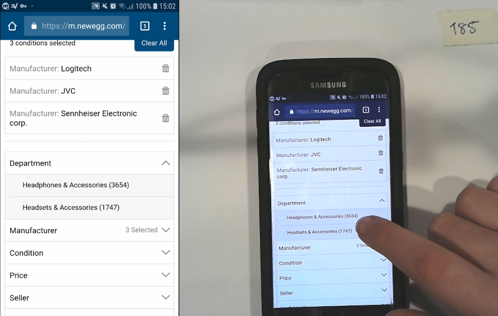
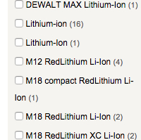
“Uh…okay. The filters aren’t that helpful. They’re not giving me headphone-specific filters for things like ‘Over-the-Ear’, ‘Under the Ear’, ‘Noise Cancellation’, ‘Noise Isolating’. I’m just getting a generic set.” A different user at Newegg became frustrated when he tried to find filters for product features (first image) that were specifically called out in the list item info (second image). He ended up closing the filter menu without selecting any, and struggled to find a relevant product in the product listing.
“All these wheeled ones I don’t like at all…there are so many!…I wouldn’t shop here.” A user at Overstock was looking to reduce clutter in the product listing (first image) by narrowing the list to only nonwheeled backpacks. However, there wasn’t a filter for this attribute (second image), and he abandoned the site.
During testing, as users realized foundational filtering types were missing, it led to an excessive amount of time being spent trying to find the filter type, which “must be there somewhere”.
Users simply can’t understand why, if a product attribute is “called out” by being displayed as part of the product listing item info, there wouldn’t be a way to filter to see only those products that contain that attribute (or, conversely, only those products that don’t contain that attribute).
Thus, users will often scan the filtering interface — multiple times if there are a lot of filters — for the filter they’re interested in. This leads to wasted effort and frustrated users if in the end the filter is simply unavailable.
On mobile, this issue is often worse, as filtering is typically hidden, and the viewport is smaller. Users must first find where filters are, open it (along the way likely experiencing hit-area issues or laggy features), then scan the available filters in a much smaller viewport than on desktop. Furthermore filters are often collapsed themselves in the filter interface, and thus it may be many taps (and many minutes) before a user knows for certain that a filter for a list item attribute doesn’t exist.
Once users realize that they have to browse hundreds or even thousands of irrelevant products, with only a handful of relevant items mixed in-between, many simply abandon.
Provide Filters for All Displayed List Item Info
In short, any piece of information that is so important that it’s included in the list item is also so important that users will need a way to filter by it. It’s therefore crucial to provide filters for all displayed list item info.
These include basic attributes, such as price and brand, which often can be provided sitewide. In addition, category-specific filters must also be provided for each product type carried. For example, sleeping bag products will need a “Temperature-Rating Filter”, while furniture will need a “Color” filter, hard drives a “Capacity” filter, etc.
When determining what category-specific filtering types are needed, one can (either programmatically or manually) look through the attributes included in the list items within each category.
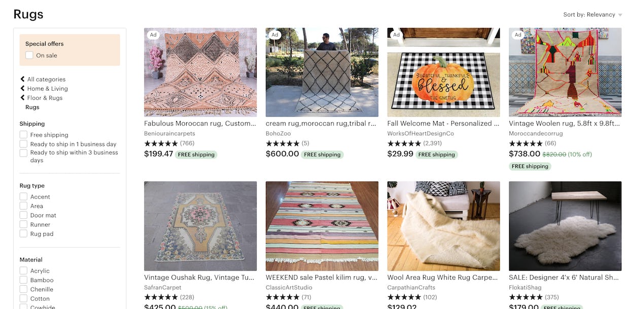
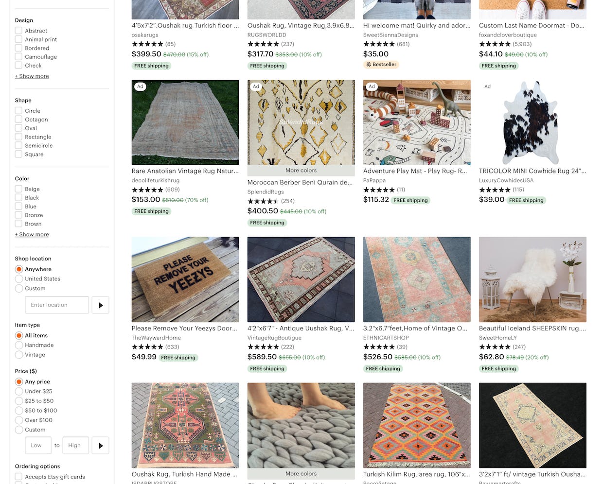
At Etsy, while there are many category-specific filters provided for the “Rugs” category, there isn’t a filter for a crucial attribute: size. Some users, seeing a wide range of rug sizes in the list items, would attempt to narrow the product listing to only those rugs that are a suitable size — but there’s no way to do that using the available filters.
It’s important to note that a site of course should have more filtering options than just the attribute types included in the list items. But those product attributes included in the list item are so foundational that they absolutely must be filters — they cannot be omitted without hurting the user’s filtering experience significantly.
Despite the severity of not including filters for all displayed list item info, 38% of sites in our benchmark don’t. Moreover, this was 42% of sites back in 2015 when we first started to track the issue — indicating that this is a persistent problem for e-commerce sites.
Furthermore, missing filters may be a symptom of an even more foundational issue of poor product data. To offer harmonized filtering values, the vendors’ product data and branded feature names need to be post-processed into a “common name” product attributes that can then be used to filter product listings and search results.
This article presents the research findings from just 1 of the 650+ UX guidelines in Baymard – get full access to learn how to create a “State of the Art” ecommerce user experience.

