Key Takeaways
- The Accounts & Self-Service area of e-commerce sites severely underperforms when compared to other e-commerce themes
- 83% of e-commerce sites have a “poor” to “mediocre” UX performance when it comes to Accounts & Self-Service
- Avoiding the 5 pitfalls discussed in this article is a first step to improving your site’s Accounts & Self-Service UX
Accounts & Self-Service is a unique aspect of the e-commerce user experience.
Unlike the 6 other e-commerce themes Baymard has researched, Accounts & Self-Service is often not part of the “direct purchase funnel” — but rather comes post-purchase.
However, this isn’t to indicate that Accounts and Self-Service UX is less important than other e-commerce themes.
Returning users — those most likely to use self-service features most often — are critically important to a successful e-commerce business, which means the Accounts & Self-Service UX performance can be just as important as the UX performance of the Product Page, Homepage & Category, or any other e-commerce areas when it comes to a site’s overall long-term sales.
To assess the current state of e-commerce sites’ Accounts and Self-Service performance, Baymard has devoted a full year to researching only this area of e-commerce, recently publishing a new in-depth Accounts & Self-Service Benchmark Database (the full benchmark is available as part of our Premium research findings), based on our Accounts & Self-Service Research.
For this analysis, we’ve summarized the 8,000+ UX performance scores for the 59 benchmarked sites that have been manually reviewed and scored by Baymard’s team of UX researchers (embedded below).
Additionally, we’ve added 6,000+ worst and best practice user accounts examples from leading e-commerce sites in the US and Europe (performance verified).
In this article we’ll analyze this dataset to provide you with the current state of e-commerce Accounts & Self-Service UX.
Additionally, we’ll outline 5 common design pitfalls and discuss best practices applicable to most e-commerce sites in 4 Account & Self-Service areas: Account Drop-Down, Account Sign-In, “Your Account”: Addresses, Payments, & Newsletters, and Orders & Order Tracking.
The Current State of Accounts & Self-Service UX
For this analysis we’ve summarized the 8,000+ Accounts & Self-Service usability scores across the 7 benchmarked topics and plotted the 59 benchmarked sites in the scatterplot above.
Each dot above therefore represents the summarized weighted UX performance of one site, for the collection of guidelines within that respective topic of the Accounts & Self-Service UX.
The high-level benchmark results show that 83% of e-commerce sites have an overall “mediocre” or worse UX performance for their Accounts & Self Service implementation, with 12% having a below “poor” performance in terms of aligning with commonly observed user behavior.
Indeed, when users find it difficult or impossible to manage Accounts & Self-Service features the consequences can be severe, both for users and for sites, as negative experiences in Accounts & Self-Service can lead to lasting brand damage.
Additionally, compared to the other e-commerce UX themes, Accounts & Self-Service is the theme with by far the fewest “decent” or high-performing sites, leaning heavily towards “poor” performances.
This indicates that most sites fail to align with user expectations post-purchase, and are not dedicating enough resources to accommodate users who are looking to manage their account details or modify their orders.
For the average e-commerce site, Accounts & Self-Service will be its Achilles’ heel.
Moreover, it’s evident that Accounts & Self-Service is by far the theme within e-commerce that has the highest degree of completely uniquely designed and developed implementations when it comes to bespoke “account concepts”, unique structure, navigation, and information architecture.
This stands in sharp contrast to the other themes of e-commerce UI and UX: our benchmarking within these themes clearly reveals that almost all sites have chosen one of the 3–8 common “approaches” to their navigation/product pages/checkout when it comes to the overall concept, structure, and information architecture — approaches that have matured and evolved throughout the roughly two decades that e-commerce has existed (while allowing that most sites do have a unique look and feel for their category navigation, product details pages, or checkout flow, for example).
The lack of common implementation patterns may also help explain why Accounts & Self-Service UX underperforms compared to other e-commerce themes by such a wide margin.
Below we’ll discuss 5 Accounts & Self-Service UX pitfalls to be aware of in 4 of the 7 benchmarked topics: Account Drop-Down, Account Sign-In, ‘Your Account’: Addresses, Payments, & Newsletters, and Orders & Order Tracking.
Account Drop-Down
Our benchmark data reveals that the Account Drop-Down topic is by far the worst performing one, with a whopping 91% of sites performing at a “mediocre” level or worse — indicating users are likely to immediately get off to a bad start when attempting to access and use account features.
Indeed, users who are seeking to access their account information often go to the “Account” drop-down as a first step, whether they’re trying to track an order, initiate a return, update a payment method, add an address, or perform some other account task.
In particular, sites tend to get the following issue wrong when it comes to the “Account” drop-down:
1) Failing to Distinguish Primary from Secondary Paths (Only 12% Do)
“Right now I’m just trying to check out everything that’s listed under ‘Your Account’. Which is a myriad of options, actually…‘Your Account’, ‘Your Orders’, ‘Your Dash’…it’s sort of all over the place.”
The “My Account” drop-down menu is a crucial area for users attempting to accomplish account-related tasks.
During testing, the drop-down menu often served as a navigational anchor that users would turn to over and over again, no matter what account feature they were looking for.
However, when paths to primary and secondary account features are styled the same in the “My Account” drop-down, it’s more difficult for users to access the most relevant account features — leading to fewer users being able to complete critical account-management tasks, longer completion times for other users, and a more negative perception of the site on the whole.
While visually styling primary paths differently from secondary sounds like a “usability basic”, our UX benchmarking reveals that 88% of e-commerce sites fail to separate primary and secondary paths in the “My Account” drop-down.
Thus, in many cases, improving the “My Account” drop-down is an instance of low-hanging fruit — changes are often not overly difficult to implement, while a well-performing “My Account” drop-down menu can significantly aid users attempting to manage their account features.
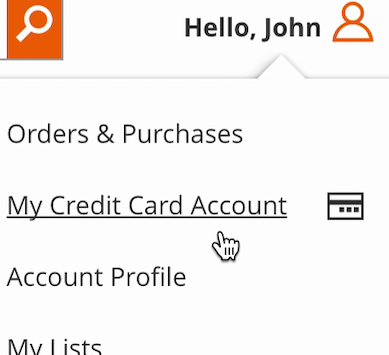
”I guess I would go to…‘My Account’…‘My Credit Card Account’.” A participant at Home Depot attempting to update her saved credit card information (first image) wound up on a promotional page for Home Depot credit cards (second image): ”Credit cards I could apply for, that’s not what I’m looking for.” Note how the “My Credit Card Account” link wasn’t styled any differently than the other account-related links and how its placement between “Orders & Purchases” and “Account Profile” further communicated that it was a primary link.
During testing, some users were observed to get bogged down when facing a “wall of links” in the “My Account” drop-down — while others simply felt overwhelmed.
Users faced with no obvious organization or information hierarchy in a “My Account” drop-down will often become victims of choice paralysis — it’s not clear where to start in order to accomplish an account-management task — and will spend seconds or even minutes scanning the “My Account” drop-down before choosing a path.
However, once paths to account features have been placed into “primary” and “secondary” buckets, then the two groups can be visually distinguished in the “My Account” drop-down menu to ensure the most widely sought-after paths are the most prominent.
This is most important for sites with many “My Account” drop-down links (e.g., more than 10), though sites with fewer links may still want to make primary paths more visually prominent than secondary paths.
At B&H Photo, the “Account” menu prioritized the “My Account” link by placing it first. Note too the use of icons to provide information scent. Moreover, the “My Account” link led to the dashboard, a good general starting place for users who aren’t trying to track an order or view a wishlist.
Therefore, to help ensure an efficient start for users seeking to access account features through the “Account” drop-down, it’s important that the “Account” drop-down is properly organized and paths are visually separated into “primary” and “secondary” paths.
To elaborate, consider treating secondary account features similarly to how “thematic” and inspirational content should be treated in the site’s main drop-down navigation.
That is, locating these secondary paths in a separate column, placed after primary paths, and using a differentiated style for secondary account features — such as using secondary font styling or a faded background color — to indicate their lower priority.
Account Sign-In
When it comes to Account Sign-In, the benchmark data shows that 57% of sites perform at a level of “mediocre” or worse, leaving less than half being “decent” or higher.
In particular, 43% of sites have highly troublesome implementations that — when interacted with by users — will directly break with common user behavior.
Sign-in failures can, for instance, lead to users being unable to access their accounts, resulting in the abandonment of even straightforward account-management tasks and customer-support requests — not to mention users developing negative perceptions toward sites.
Yet, unable to proceed with signing in, users are at a UX dead end, and many of them are likely to simply give up.
In particular, the most glaring issue sites struggle with is the following:
2) Failing to Send Users Where They Want to Go after They “Sign in” or “Reset Password” (Only 42% Do)
It’s very common for users to think they’re signed in when they really aren’t, making it likely that some users will browse a site for an extended period of time before realizing that they’re not signed in (or stumble on the fact when trying to access account features or go to checkout).
During testing, an issue participants encountered after signing in to their accounts was not being taken to where they had indicated wanting to go before signing in.
For example, a user may indicate that they would like to go to the account dashboard (e.g., by clicking a link to “My Account” in the “Account” drop-down), but because they haven’t yet signed in, they are sent to an “Account” sign-in page instead.
However, once the sign-in process is complete, the issue reveals itself when —rather than sending the user to the account dashboard, which is where they indicated wanting to go — the site “ignores” their selection and instead sends them to the homepage or back to the page they were previously on (e.g., an order tracking page).
When not taken to where they’ve indicated wanting to go, users have to again find that path, adding needless friction to the navigational experience.
”Well now the Nelson Mandela book is gone. It’s a bit strange that it just disappears.” A participant from a previous study at Amazon signed in from the product details page (first image) and was directed to an “Account” sign-in page. After sign-in, however, he was sent to an account homepage (second image) rather than being returned to the product details page. Having to refind a product details page can be a challenge, especially at large mass-merchant sites like Amazon.
Conversely, another issue users have is not being returned to the page they were on before accessing the “Account” sign-in page.
Whereas the previous issue is often simply a minor annoyance (as most users will be able to refind the path they had previously selected in the “Account” drop-down), taking the user to an entirely new page can be severe, because users may have trouble refinding the actual page they were on before having signed in.
For example, a user might be on a product details page that took them a long time to find (e.g., they had to perform multiple searches, apply many filters, etc.).
If then the user decides to sign in from the product details page and, after signing in, is sent to the account dashboard rather than being returned to the product page they were on, they may decide it’s not worth the effort to refind the product that took them so long to find in the first place.
At Home Depot, a participant at the account selection step during checkout couldn’t remember her password and decided to reset it (first image). After going to her email account and resetting the password, she was sent to her account dashboard rather than being returned to the checkout where she was earlier (second image). After they reset a password, failing to return users to where they were can be very disorienting.
The issue of not returning users to where they were prior to having signed in can be most acute during checkout, when users are on the account selection step and can’t remember their password.
During testing, participants were frequently observed to have forgotten their account passwords — and if users aren’t returned to the account selection step after resetting their passwords, some — too disoriented — will simply give up restarting checkout.
Furthermore, abandonments are even more likely during mobile checkouts, where users often struggle with figuring out where on a site they are, due to the mobile viewport’s severely reduced overview.
It’s therefore critical that users during checkout are returned to where they were before they had embarked on their password-resetting task (in most cases, this location being the account selection step).
If users aren’t kept on their current page during sign-in, to avoid disorienting them they should be sent to where they indicated wanting to go before signing in (e.g., to the “Order Tracking Page” if they clicked the “track orders” link).
Even more importantly, if they didn’t signal their desired sign-in destination, users after signing in should be returned to where they previously were (e.g., if they click a “sign in” link from the help center, they should be returned to the help center).
The goal is to cause as little disruption as possible to the user if they choose to sign in to their account (or even to reset their password) at any point and from any page on the site — yet 58% of sites fail to honor users’ expectations of where to go after account sign-in.
‘Your Account’: Addresses, Payments, & Newsletters
‘Your Account’: Addresses, Payments, & Newsletters, which covers how users can manage their stored account and profile data, is another “poorly” performing and severely problematic area of Accounts & Self-Service.
A massive 73% of sites perform at a “mediocre” level or worse and 30% have performances that borderline below “poor”.
The observed UX issues within this area are generally also more serious than in the other areas of Accounts & Self-Service.
While users may not access their accounts very often to manage their addresses or newsletters, managing addresses, along with payment methods, is a crucial feature that must work well for users to be able to place and manage orders and returns.
Any issues users have managing addresses or credit cards can be a direct cause of increases to the cart abandonment rate or could require extensive customer service resources to resolve.
In particular, there are 2 issues that sites tend to get wrong when it comes to the “Your Account” area of Accounts & Self-Service:
3) Failing to Use a Fake “Editing” Flow When Updating Credit Card Numbers (Only 27% Do)
“Umm…I can’t edit the card number…Why can you even “edit” the stored card if you can’t change the card number?”
While storing users’ credit cards can be a major convenience factor, users also need to update their stored credit cards from time to time.
Our 2024 data shows that almost all users will need to update their credit cards at some point for all their online e-commerce accounts.
In fact, our quantitative study on self-service and accounts revealed that 38.1% of users get a new credit card at least once a year, and 70.4% at least every couple of years.
Knowing that there is a high likelihood that a user needs to change or update their credit card information at some point during their account ownership should mean that there is a process in place that allows the user to change this information.
Indeed, our research also showed that “Managing Credit Card” is deemed the third most important account self-service feature by users, surpassed only by order tracking and returning an item.
And while many sites do offer this functionality, the process doesn’t always meet users’ expectations.
”Where is the number? Do I update it here? That doesn’t make sense.” When attempting to edit payment method details, many participants — such as this one at Best Buy — struggled to understand that the interfaces would not allow them to edit their credit card number.
In particular, many users will seek to “edit” their existing credit card number — users simply don’t know enough about PCI compliance and card regulations to understand why it’s not possible for the site to store, display, and allow them to edit their outdated card information.
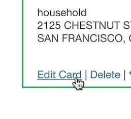
At Home Depot, the stored credit card interface provided what appeared to be a 1-step process for editing credit card data. In reality, the interface created a fake edit feature by combining 2 processes – deleting an old card number and adding a new one – within a single “edit card” task. By default the old partially hidden card number was shown (first image). But as users click into the “Card Number” field the entire field is cleared, leaving users to type a new card number from scratch (second image).
Instead, allow users to “edit” their stored credit card information by creating an illusion of editing the card number.
This is done by combining the processes of deleting the old card and adding a new credit card into one “Edit Card Number” flow.
By automating the process of removing the old credit card number and adding a new one, this can be framed as an “Edit” flow — as depicted above.
4) Failing to Allow Users to Adjust Their Newsletter Frequency (Only 16% Do)
Newsletters are the primary means by which many e-commerce sites communicate regularly with customers.
Our 2024 data shows that users unsubscribe from newsletters for these main reasons.
However, our latest benchmark data shows that only 16% of the benchmarked sites allow users to adjust the frequency of the newsletters.
Yet one of the reasons users unsubscribe from newsletter emails — or don’t sign up in the first place — is that 54% feel they receive too many newsletter emails in general.
”Oh, so that’s once a week, that’s not what I necessarily…on this page I don’t see an option to go to one per month,” noted a participant at Nordstrom. Often users will have different expectations of what is considered “too frequent” newsletter mailings.
Additionally, 47% of respondents say they unsubscribe because they get too many emails from a specific retailer.
Clearly, then, it’s important to allow users to adjust how often they receive newsletters — or risk having users unsubscribe completely from newsletter communications.
When viewing unsubscribe options at Best Buy, participants appreciated the choice to “Receive no more than one General Marketing e-mail per week” as opposed to facing an all-or-nothing decision — with one participant stating ”I do like that they have options, “no more than one per week”, that’s a good one.”
As users’ individual preferences vary, consider allowing them to choose from a range of frequencies, such as “twice a week”, “weekly”, “every second week”, or “monthly”, so users can find a frequency that keeps them engaged without becoming overwhelming.
Orders & Order Tracking
Considering its importance for users, Orders & Order Tracking is the area that has the largest negative impact on the overall Accounts & Self-Service UX performance.
Notably, not even the best performing of these sites have an all-around “State-of-the-Art” implementation, as even the best sites fail in 1-3 smaller aspects of Order Tracking.
The number of sites with very significant order tracking UX issues is high — 70% of sites perform at a “mediocre” level or worse — testifying to the difficulty of implementing a fully-fledged order tracking experience.
In particular, the following area of concern is a missed opportunity:
5) Failing to Integrate All Order Tracking Info and Events Within the E-Commerce Site Itself (Only 65% Do)
Baymard’s quantitative study shows that the single most important self-service feature for users is tracking of open orders — primarily order status and arrival date.
Yet despite its importance to users, many sites outsource all or parts of the order and shipment tracking — like the shipping courier — to third-party sites.
However, visiting a courier site to track, typically, only the parcel for the order can add considerable complexity to the overall user experience of placing and tracking an order.
In particular, the transition from the e-commerce site to third-party sites — along with the fact that the courier sites only contain package info and not the full order info and features — was in testing observed to cause significant usability issues.
Our testing reveals that users will often experience a mix of the following 3 usability issues when the e-commerce site doesn’t provide complete order-tracking information — especially when clicking on a third-party tracking link sent in an email:
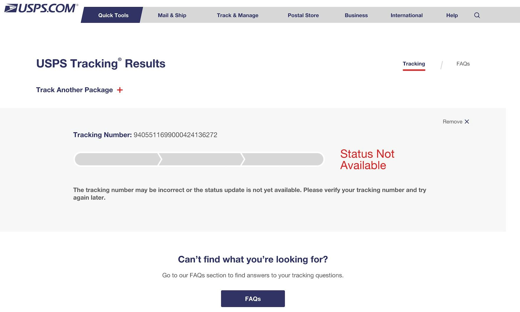
At many third-party courier sites like USPS here, users wanting tracking info will instead often see a message like “Status not available” for several hours until the tracking info becomes available on the courier’s tracking page.
1) Missing information. One downside of providing users with tracking via third-party courier sites is that, until the package has shipped (typically 1–48 hours after placing the order), any attempt to track the order will often result in a message such as “No package information available” or “Status Not Available”.
Such a message doesn’t inform users of an expected arrival date, and can furthermore induce anxiety about whether the order has an issue — not an ideal or reassuring experience right after providing payment for an order.
When participants clicked a link in the shipping confirmation email from REI (first image), the corresponding “Purchase Details” page did not show the delivery date (second image), so all of the test participants then had to click through to a third-party site to find out when their order would arrive (third image). An absent tracking detail forces all users to click away from the e-commerce tracking page to find the information on a third-party site, reducing the effectiveness of the former.
2) Disconnected information. The third-party package-tracking site will often only show the package details — such as arrival date, shipping events, and the package’s current location.
Hence, if users need to see any order details (such as the shipping address, order costs, or contents of the order), cancel an order, contact customer service, or see the product page for one of the ordered items, etc., they will not be able to do so, as these data will not be available on the third-party tracking page.
Users will then need to go back to the e-commerce site’s order details/tracking page — often having to “start from scratch” (by typing in the URL of the e-commerce site, signing in, navigating to open orders, and then opening the specific order) — all because the third-party courier’s webpage seldom links back to the specific order at the e-commerce site.
For users with multiple orders, the severity of these issues scales linearly as all these steps must be repeated for each order.
”Now what do I do? I guess I gotta start backpedaling. I sorta wish there was something here telling me where to go next.” This participant found it difficult to get back to REI after clicking a third-party tracking link — one of a number of participants during testing who had difficulty with the transition between e-commerce sites and third-party tracking sites.
3) An incoherent user experience. An observation gathered from multiple years of usability testing is that some users (especially novice ones) are generally disoriented when taken to a completely new website after clicking a link on an e-commerce site.
Furthermore, any site switch sometimes causes technical or practical issues (especially on mobile devices) that can mar users’ overall order experience — with some users blaming the e-commerce site instead of the third-party courier for the poor experience.
For a better order-tracking experience, sites can provide all the tracking details that users would need — such as delivery date, courier name, and shipment subevents — on their own order-tracking page, that is, within their own site itself.
Set Your Site Apart by Having a High-Performing Accounts & Self-Service UX
Our Accounts & Self-Service benchmark shows that nearly all benchmarked sites continue to perform either “poor” or “mediocre” — clearly there’s still a long way to go before e-commerce sites are meeting the needs of their users when it comes to Accounts & Self-Service UX.
Avoiding the 5 pitfalls discussed in the article should be among the first steps toward improving users’ Accounts & Self-Service experience:
- Failing to distinguish primary from secondary paths (only 12% do)
- Failing to send users where they want to go after they “sign in” or “reset Password” (only 42% do)
- Failing to use a fake “editing” flow when updating credit card numbers (only 27% do)
- Failing to allow users to adjust their newsletter frequency (only 16% do)
- Failing to integrate all order tracking info and events within the e-commerce site itself (only 65% do)
Moreover, this high-level analysis of Accounts & Self-Service UX focuses on only 4 of the 7 topics included in our Accounts & Self-Service research.
The 3 other topics should be reviewed as well to gain a comprehensive understanding of Accounts & Self-Service UX, as well as to identify other site-specific issues not covered here.
For additional inspiration, consider clicking through the publicly available Accounts & Self-Service Page Designs, as these showcase Accounts & Self-Service implementations from top US and European e-commerce sites and can be a good resource when considering redesigning the Accounts & Self-Service experience — not only of what to emulate, but also of what to avoid.
Getting access: all 65 Accounts & Self-Service UX guidelines are available today via Baymard Premium access. If you already have an account open the Accounts & Self-Service study.
If you want to know how your desktop site, mobile site, or app performs and compares, then learn more about getting Baymard to conduct a UX Audit of your site or app.


