“Uhmm. You can’t. I can’t edit the card number…. Why can you even “edit” the stored card if you can’t change the card number?”
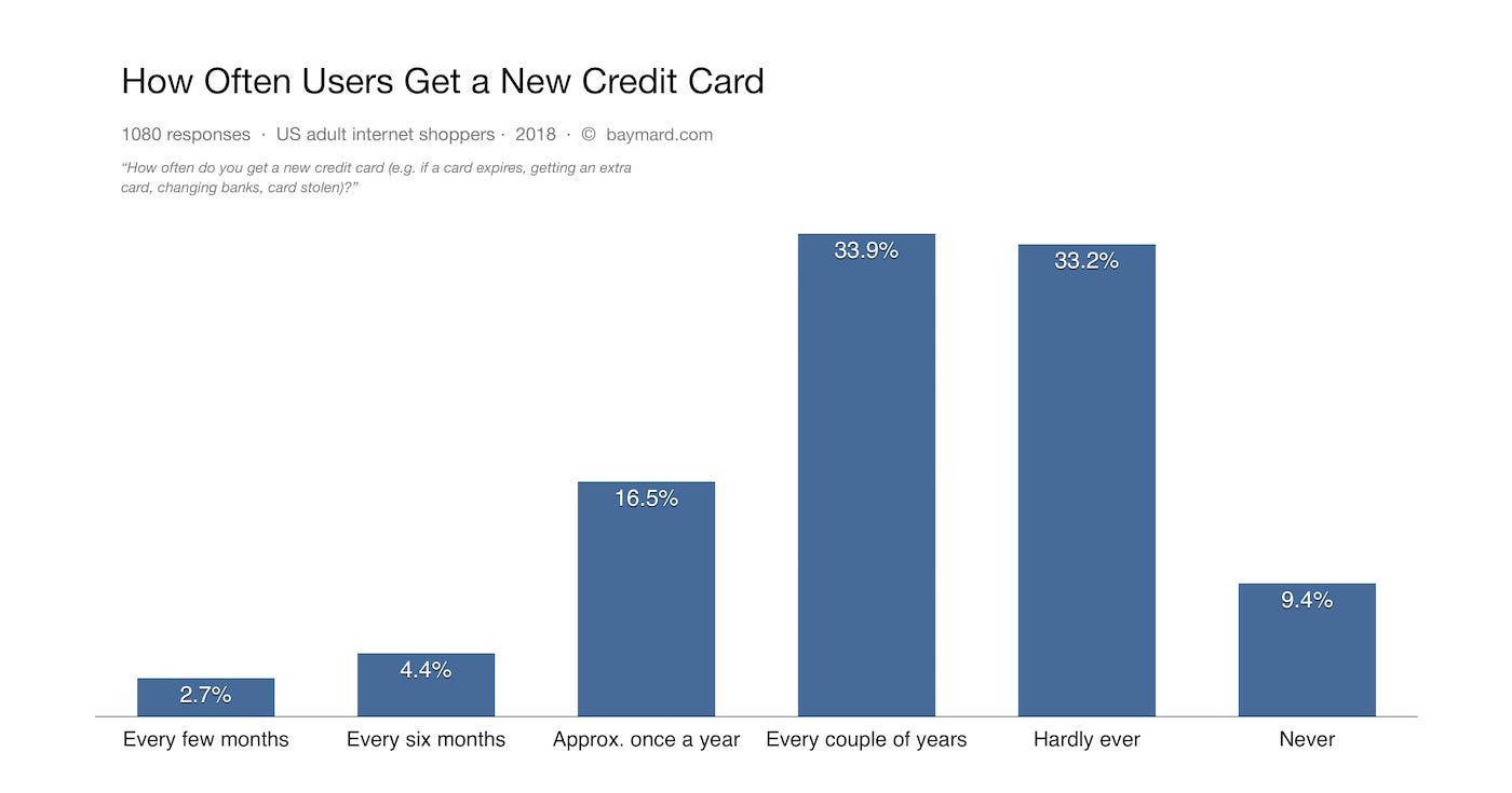
While storing the users’ credit cards can be a major convenience factor, users also need to update their stored credit cards from time to time. In fact, our quantitative study reveals that 54.2% of users have their card stored at one or more e-commerce sites, but it also reveals that 23.6% of users get a new credit card at least once a year, and 57.5% at least every couple of years.
As part of our large-scale usability research, we’ve therefore tested how users actually (try to) update their stored card information at an array of different e-commerce sites. We found that 25% of users who attempted to change their payment methods devoted a significant amount of time investigating how to edit their credit card number. Unfortunately, 84% of e-commerce sites don’t allow users to edit their stored credit card, or don’t clearly indicate how users are then to proceed with updating the stored credit card number.
While updating stored credit card information may sound like a straightforward task, the technical and security restrictions that sites need to have in place means that there’s a severe misalignment between what a user expects to be able to do (i.e., edit their stored credit card number) and what they’re actually able to do (i.e., edit only the expiration date or delete the card entirely).
In this article, we’ll go through our large-scale usability research findings related to how users update stored credit cards and how sites can best support this behavior. Specifically, you will learn:
- How often users get a new credit card
- What happens when a user tries to change stored credit card information
- Why user expectations don’t always match with site requirements
- Creating an illusion of editing the credit card information via the “The Fake Edit Flow”
- Fixing the disparity between user perception and site functionality
How Often Users Get a New Credit Card
Baymard’s quantitative study on Accounts & Self-Service reveals that:
- 54.2% of users store their credit card information on either a small handful of frequently used retail sites (46.9%) or at more than 5 sites (7.3%). (Along with 8% of users storing it in their browser.)
- 23.6% of users get a new credit card at least once a year, and 57.5% at least every couple of years. For most e-commerce sites, this means that the majority of account users will get a new credit card within the user’s lifetime with the site.
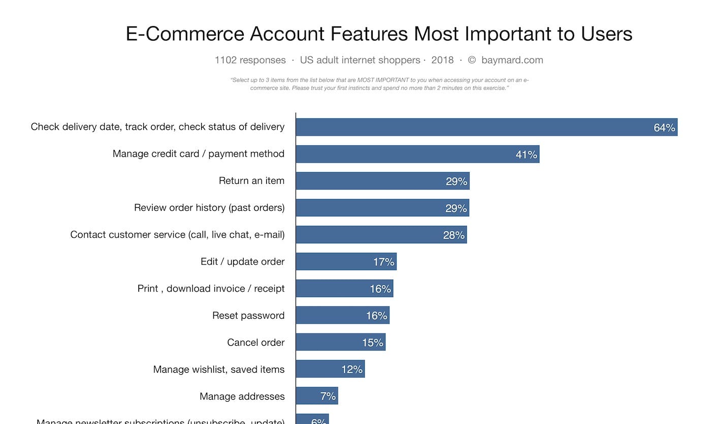
- “Managing Credit Card” is deemed the second most important account self-service feature by users, surpassed only by order tracking.
Knowing that there is a high likelihood of a user needing to change or update their credit card information at some point during their account ownership should mean that there is a process in place that allows the user to change this information. While sites often do offer this functionality, the process doesn’t always meet the users expectations.
What we found during our qualitative large-scale usability testing when users were editing and adding credit card information that is stored at the user’s account is that there is often a drastic difference between how a user perceives a site to function and how the site actually functions on a technical level. In fact our, Accounts & Self Service benchmark reveals that 84% of e-commerce sites have a flow for updating a stored credit card that directly misaligns with users’ behavior and expectations.
In our Page Design tool you can see 110 examples of “Stored Credit Card” interfaces from leading e-commerce sites.
What Happens When a User Tries to Change Stored Credit Card Information
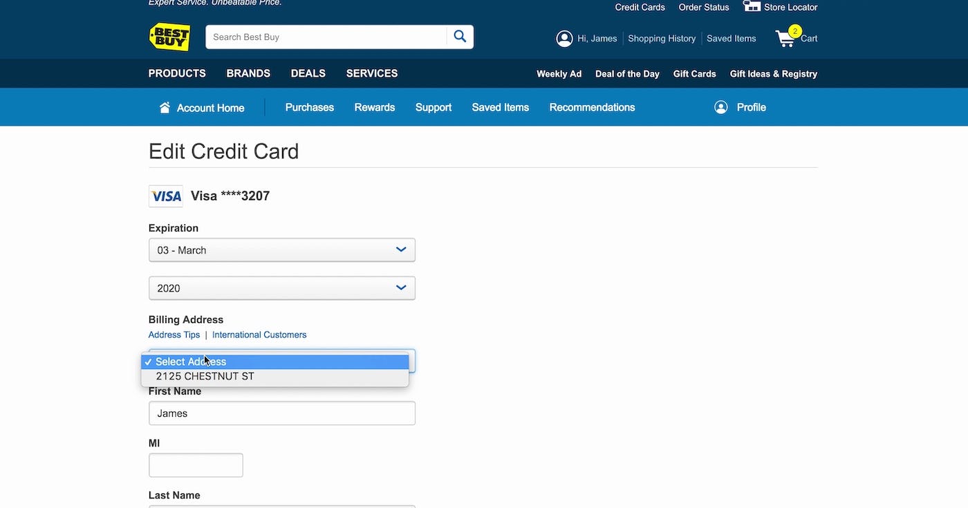
“Where is the number? Do I update it here? That doesn’t make sense.” When attempting to edit payment method details, many users struggled to understand that the interfaces would not allow them to edit their credit card number, like here at Best Buy
As mentioned, our testing shows that 25% of users who attempted to change their payment methods devoted a significant amount of time investigating how to edit their credit card numbers.
While attempting to edit their stored credit card, users went as far as leaving the “My Account” section of the site and explored help documentation and other areas of the site, sometimes searching for up to four minutes before concluding that the stored credit card interface would not allow them to edit the credit card number.
This subgroup of users simply assume that an account-management interface will allow them to edit all stored information. For instance, when editing any other checkout-related information, like an address, all fields can typically be edited. This notion that all user data should be editable might explain the high degree of confusion and frustration observed in users who were unable to directly edit their stored credit card numbers.
The friction here is especially significant considering that users will arrive at stored credit card interfaces for a variety of reasons. As an example, one user may encounter this interface while proactively updating their account information after receiving a new credit card.
Beyond the friction and frustration here and now, not being able to edit their credit card number will often cause more issues later on, as the old (un-updated) credit card will obviously not be valid when the user is trying to complete the checkout for their next order.
In another scenario, a user may arrive at the exact same stored credit card interface after having their purchase declined due to a stored card that’s expired or closed. In this example, the user will already be in a negative mindset where anything other than an easy editing task will cause escalating frustration.
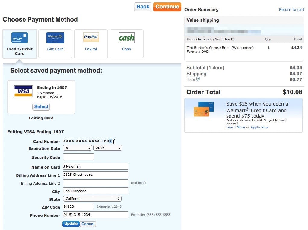
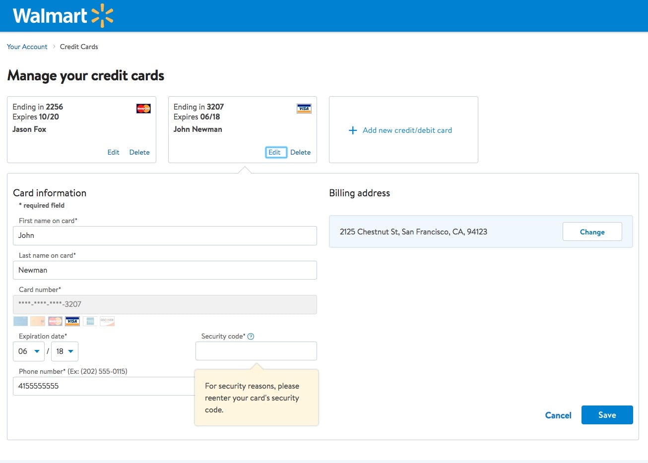
“Uhmm. You can’t. I can’t edit the card number… Why can you even “edit” the stored card if you can’t change the card number? Typically when getting a new card the card number will also be new. And I can change these [billing address and security code, ed.],” One of many confused users said at Walmart after having selected to “edit” a particular stored credit card.
Some credit card editing interfaces instead present non-editable text next to the card number field label. This text typically includes a series of asterisks as well as the card’s last four digits. Presumably, this design is intended as a static indication to users that the credit card number cannot be edited. However, this approach causes issues for users because it presents the credit card information next to other editable data.
So while some users may see the text and understand that it can’t be edited, we observe that many users will instead try to interact with it — not understanding why they cannot edit it, and exactly how they are then supposed to update an expired or invalid card.
Simply put, the interface needs to go beyond indirect visual cues, such as static text masking the credit card number, when it comes to communicating restrictions in editing to users.
Users simply won’t know enough about PCI compliance and card regulations to understand why it’s not possible for the site to store, display, and allow them to edit this outdated card information.
Site Restrictions and User Expectations for Credit Card UX
There is a difference between how a user perceives a site to function and what the actual functionality of a site is on a technical level. This is often simply because users lack the technical insights required to really understand how credit card processing and encryption works
(Tip: see a similar lack of technical understanding that we’ve observed for credit card forms in general, as explored in our article How Users Perceive Security During the Checkout Flow — incl. New ‘Trust Seal’ Study).
This disparity is especially prevalent when it comes to the technical and security restrictions sites face around allowing users to directly edit a stored credit card number, which, at 84% of sites, is not possible.
For instance, payment processing regulations (PCI compliance) prevent sites from storing a user’s credit card number directly — which is also why sites display only the last four digits of the card number to identify a stored payment method.
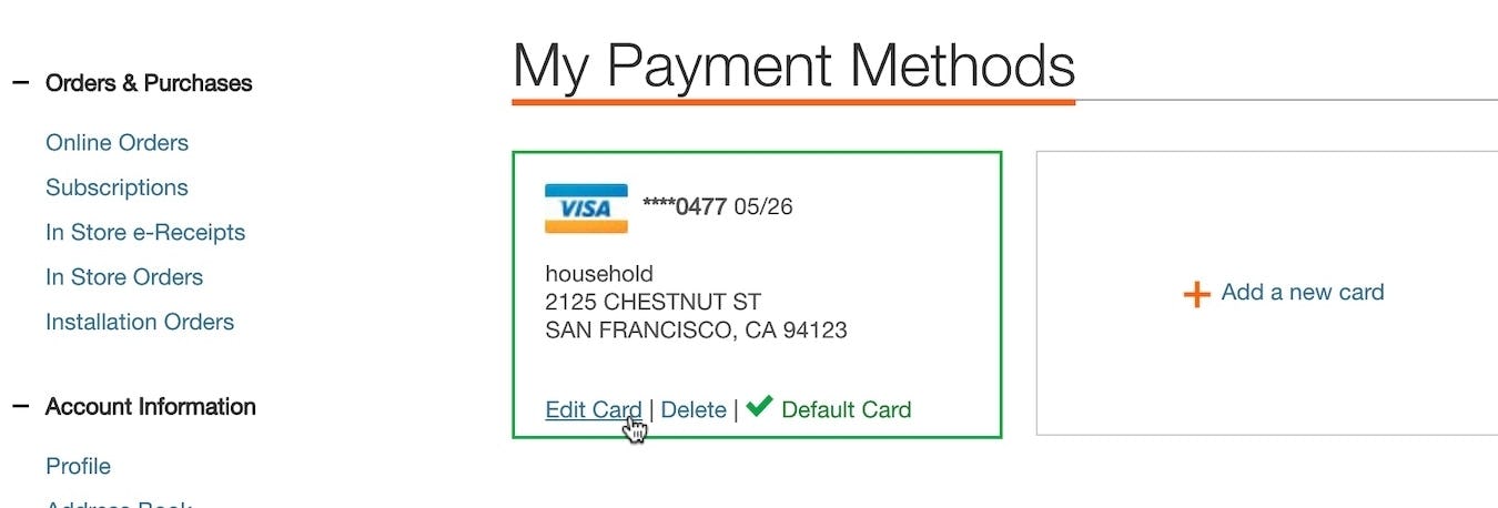
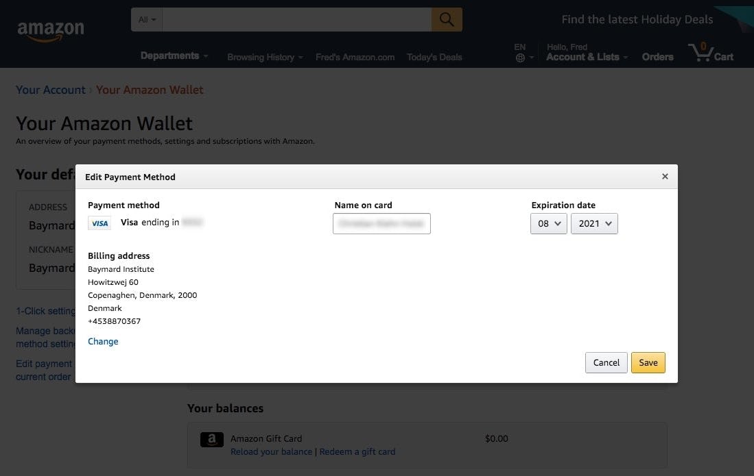
While there is an “Edit Credit Card” option on Amazon, users are only able to edit the cardholder name and expiration date, as well as change the billing address attached to the credit card, but not the credit card number itself.
This restriction limits the stored credit card data that can actually be directly edited by users to data such as cardholder name, expiration date, and any tied billing address (in fact, the most important piece of data, the credit card number. This information is impossible to edit due to PCI regulations (along with the card security code)). Consequently, when users have a new credit card number, a site’s only option, technically, is to delete the old card number entirely and then add the new credit card number.
In testing, however, 25% users were observed to repeatedly be in the mindset of “editing my outdated credit card” and having a very difficult time changing that to the “delete old, add new” mindset that PCI requirements force sites to have.
So what can a site do about it?
The “Fake Edit Flow”
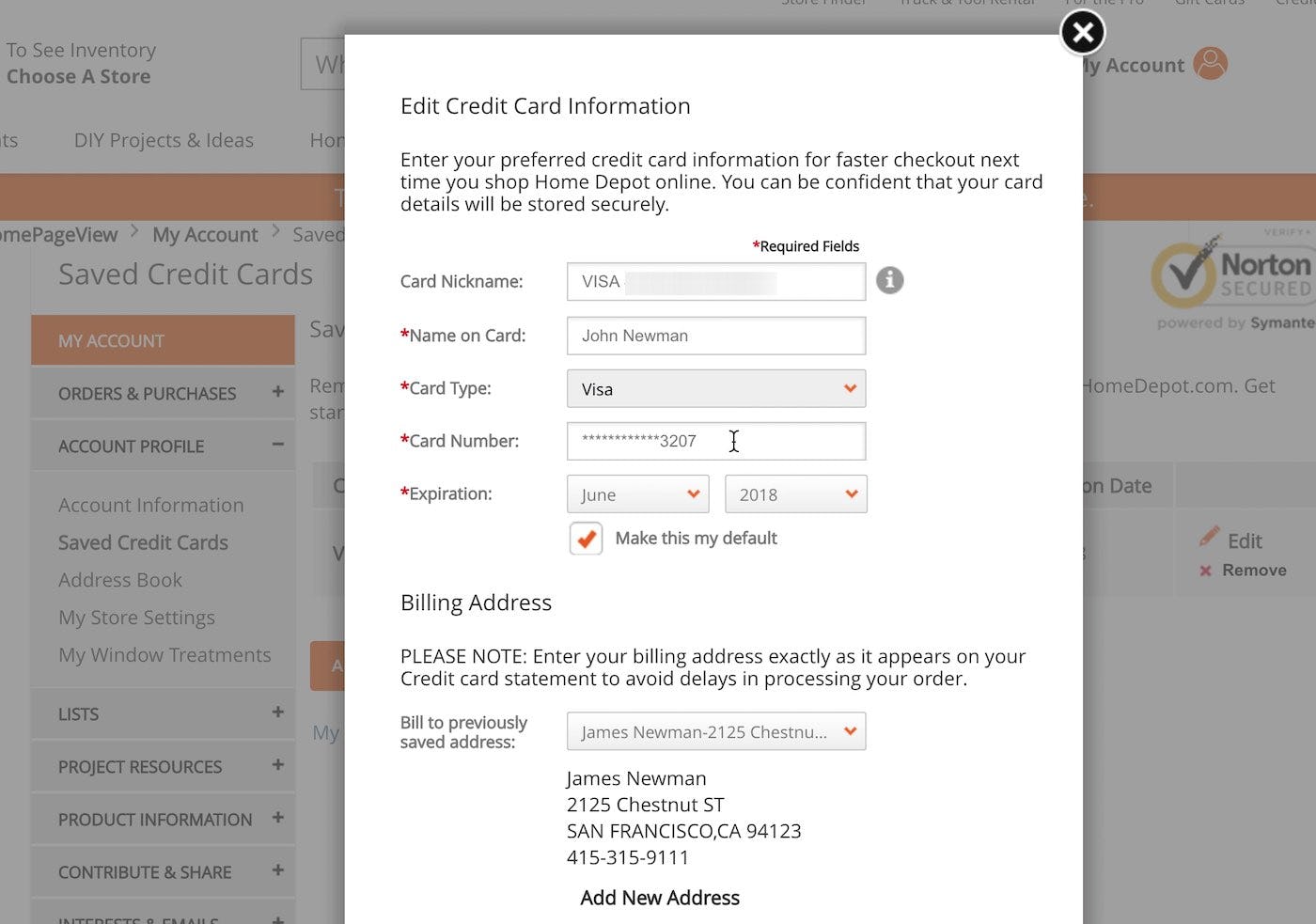
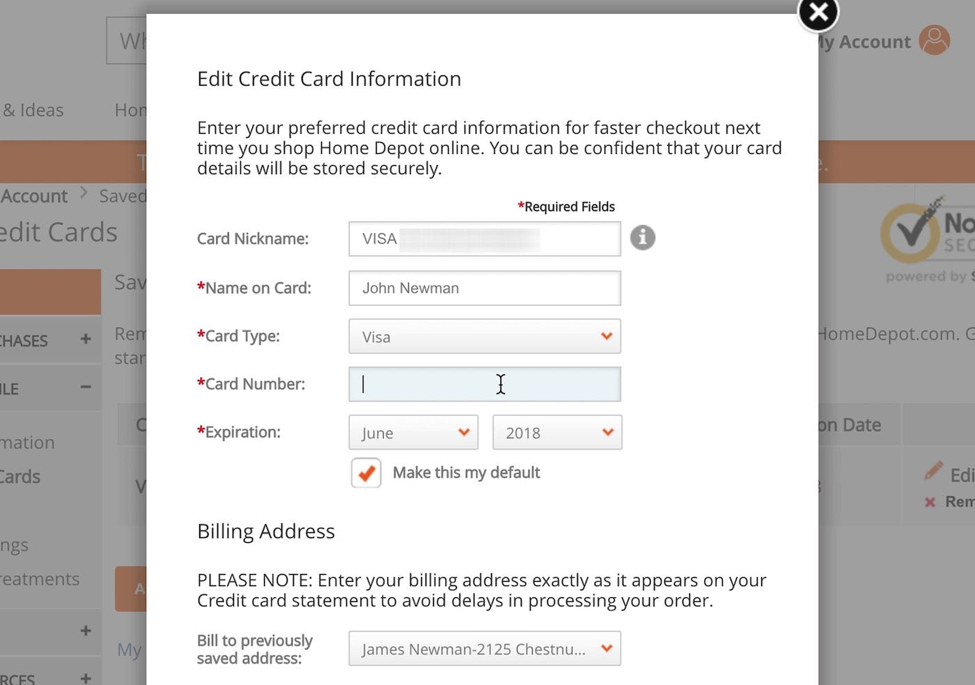
At Home Depot, the stored credit card interface provides what appears to be a one-step process for editing credit card data. In reality, the interface creates a fake editing feature by combining two processes — deleting an old card number and adding a new one — within a single “edit card” task. By default the old partially hidden card number is shown (first image). But as users click into the “Card Number” field the entire field is cleared, leaving users to type a new card number from scratch (second image).
Even with PCI restrictions in place, there is a solution. The ideal stored credit card interface instead creates an illusion of editing the card number by combining the processes of deleting the old card and adding a new credit card into one “Edit Card Number” flow. By automating the process of removing the old credit card number and adding a new one, this can be framed as an “Edit” flow — as depicted above.
If it is technically not possible to create a “fake” editing flow, at least consider having a prominent path to “Add new credit/debit card” from within the “Edit Card” view, to reduce friction for users as they discover that the card number can’t be edited, as seen here on Walmart.
In the event that it is technically not possible to create a “fake” editing flow, a halfway-there alternative is to at least provide a clear pathway to adding a new card from within the “editing” interface itself. While it will still cause some users to stop and still requires them to retype all the other associated card data, users are at least provided with the correct path within the same viewport (compared to when the “edit card” interface is served on a separate page). Rather than users having to navigate away from the “edit” interface, and then begin a separate adding flow, they can glance within the viewport of the “edit” view and find the path for adding their new card.
Fixing the Disparity Between Perception and Functionality by Improving the Credit Card Flow
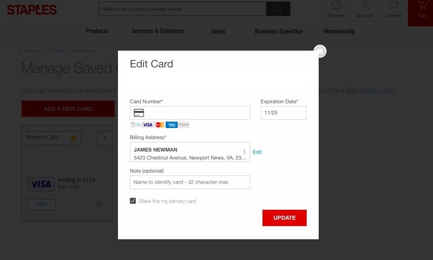
Staples provides the user with a “fake editing flow” for deleting and then adding a new credit card number. This matches the users’ mental model of how to add a new credit card to a site.
Considering that 54.2% of users store their credit card information on sites, combined with the fact that 23.6% of users get a new credit card at least once a year (and 57.5% at least every couple of years), means that being able to edit credit card information is something most repeat customers will be confronted with at some point. This is apparent by the fact that our research reveals that “Managing Credit Card” is deemed the second most important account self-service feature by users (surpassed only by order tracking).
Even so, only 16% of sites offer the user the ability to “edit” their stored credit card information. Although there is disparity between what the users expect to be able to do and what they’re actually able to do, that does not change the fact that users look for, and is in a mindset of, wanting to “edit” their old card details.
As seen, this misalignment between user mindset of “updating their card data” and the actual technical restrictions of sites “not being allowed to display and edit the old card number” is so foundational that “faking” an editing flow for updating credit cards performs the best with users. If this isn’t possible, at least provide the user with a clear pathway to deleting and then adding a new card within the editing interface.
Tip: see 110 examples of “Stored Credit Card” interfaces from leading e-commerce sites – just be aware, they aren’t all good.
This article presents the research findings from just 1 of the 700+ UX guidelines in Baymard Premium — get full access to learn how to create a “State of the Art” Accounts & Self-Service user experience.

