
Key Takeaways
- “Booking” search features are critical to users on travel accommodations sites
- However on 25% of accommodations sites the search feature is unnecessarily difficult for users to find
- A difficult-to-find “Booking” search feature sets a negative first impression for users as they begin their accommodations search
Users shopping for travel accommodations typically have a specific destination and travel dates in mind.
Therefore, search is the preferred — and the most sensible — accommodation-finding strategy.
However, as observed during large-scale Travel Accommodations testing, if the “Booking” search feature is difficult to identify on the homepage immediately, nearly all users, regardless of their familiarity with a site, will be unnecessarily delayed in taking the first step toward identifying a suitable hotel room or property to book.
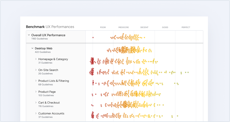
In this article we’ll discuss our Premium research findings on why it’s critical to make the “Booking” search feature the primary content on the homepage — which our travel UX benchmark shows that 25% of Travel Accommodation sites don’t do.
In particular, we’ll discuss 2 findings from our Travel Accommodations testing related to the “Booking” search feature results for online travel agency (OTA), large-brand hotels, whole property rentals, and boutique hotels:
- How inconspicuous “Booking” search features hamper users’ ability to efficiently find a suitable accommodation
- How to ensure the “Booking” search feature is adequately prominent on OTA, large-brand hotels, whole property rental, and boutique hotel sites
How Inconspicuous “Booking” Search Features Hamper Users’ Ability to Efficiently Find a Suitable Accommodation
Testing revealed a key difference in user expectations on OTA, large-brand hotel, and whole property rental sites, and users on boutique hotel sites; namely, the relative importance of the “Booking” search feature is much more important for users in the former category of sites compared to users in the latter.
“Booking” Search on OTA, Large-Brand Hotel, and Whole Property Rental Sites
During testing, nearly all participants — 99% — shopping at OTA, large-brand hotel, and whole property rental sites immediately looked for the “Booking” search feature on the homepage.
Moreover, all the OTA, large-brand hotel, and whole property rental sites tested displayed a “Booking” search feature directly on the homepage.
However, some of these sites failed to give the “Booking” search feature the attention it deserves, considering its importance in locating a room or property to book.
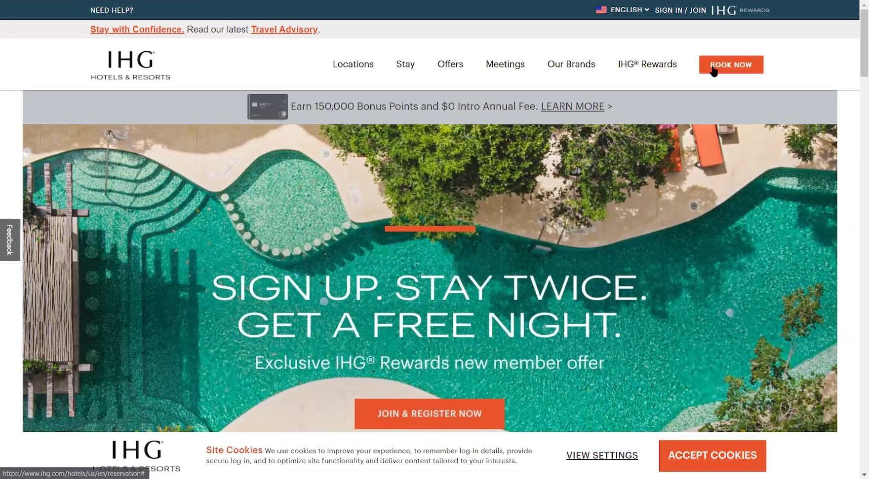
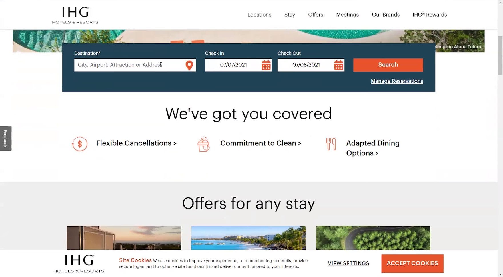
“I did notice their hotel lookup module was lower on the page. I kind of feel like that’s the number one thing people are gonna be doing on the site, so they may wanna consider the position of it…I mean, you land on the page, you can’t even see it”, remarked a participant at IHG as he submitted his query. In the absence of an apparent “Booking” search feature on the homepage, he had clicked the “Book Now” button in the main navigation (first image), which moved him down the page (second image). The “Booking” search feature at IHG wasn’t immediately visible for the vast majority of participants during testing (it fell below the fold for 78% of test participants).

“Oh, IHG, come on! You’re the one where now I have to scroll”, complained a participant, highly annoyed when she landed on IHG’s homepage (first image), and after she realized she needed to scroll to access the “Booking” search feature (second image). She had so easily accessed the “Booking” search feature on all the other test sites that even a brief 5-second delay was unacceptable to her.


At IHG, mobile users must scroll or tap the “Book Now” button (first image) to locate the “Booking” search feature positioned below the page fold (second image). While mobile users are accustomed to scrolling, the smaller screen size and overly prominent adjacent elements such as IHG’s branded credit card offer increases users’ efforts to pinpoint the “Booking” search feature.
Primarily, inspirational imagery on the homepage was prioritized on a few of the test sites, effectively pushing the “Booking” search feature below the fold.
Consequently, participants routinely had to redirect their attention on these sites away from their goal of finding a room or property to finding the “Booking” search feature itself — an unnecessary annoyance that cost nearly all of them some degree of time and effort to scroll or seek out an alternate path via the main navigation.
For example, while one participant needed only a few seconds to scroll and locate the “Booking” search feature hidden below the fold at Marriott, another took nearly 30 seconds to find it.
To be sure, users’ sensitivity to even a minor delay in locating the “Booking” search feature on the homepage shouldn’t be underestimated.


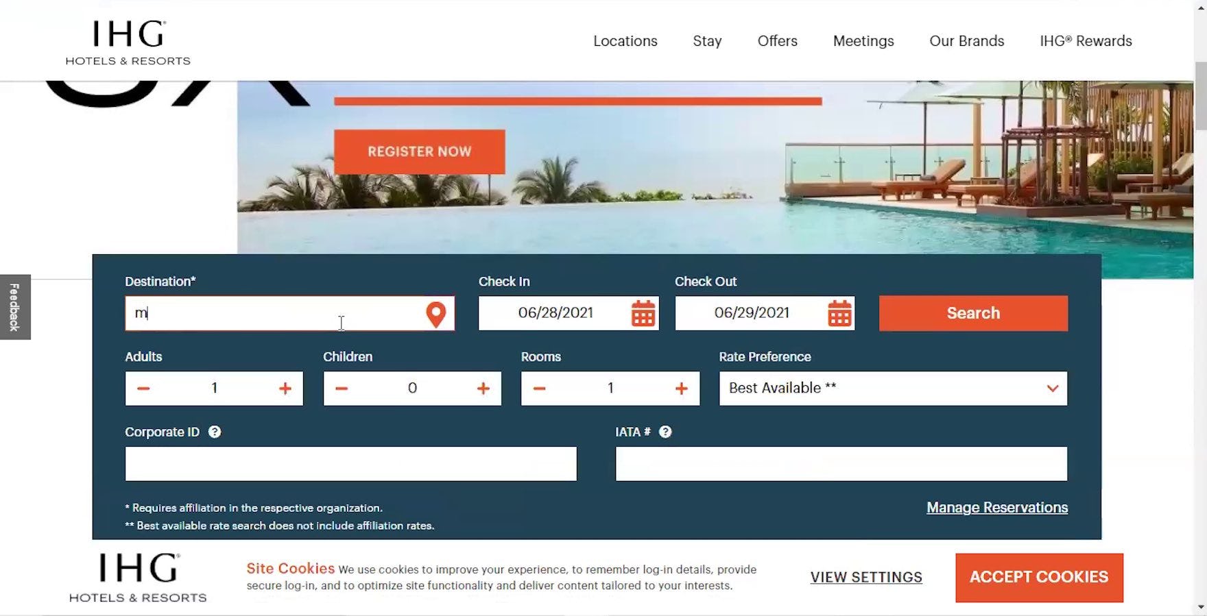
“Oh! I should accept the cookies”, a participant noted as she started to scroll on IHG’s homepage where the “Booking” search feature was not immediately visible (first image). “Okay! This is what I want to see”, she remarked after dismissing the “Site Cookies” notification and spotting the top of the “Booking” search feature (second image).

“It would’ve been a little off if I didn’t have access to put in my information right away…I feel like every website now is asking me whether I want to accept the cookies for the site. So maybe that’s something to consider for them, that it’s kind of — there’s a chance of it being cut off — being at the bottom.” A participant at Sonder initially overlooked the “Booking” search feature on the homepage because the “Site Cookies” notification partially obscured it.
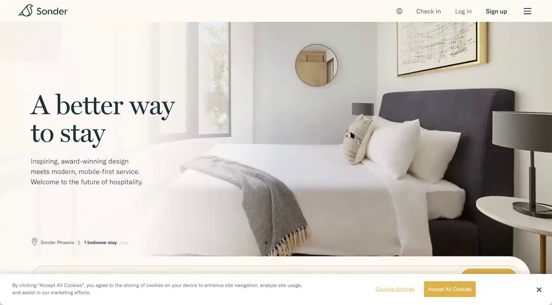
“The module’s just below the fold…So actually, if they could just move it, like, just up an inch or 2, I think that would be better than having this large image, maybe even just decreasing the size of this image”, explained another participant at Sonder as he scrolled to access the “Booking” search feature, partially hidden behind the “Site Cookies” notification anchored to the bottom of the screen.
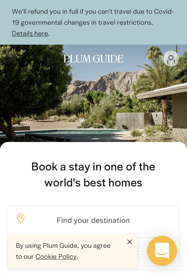

At Plum Guide, the “Booking” search feature is partially obscured by the “Site Cookies” notification (first image) and the sticky chat element (second image). The smaller screen size inherent to mobile UX increases the risk users will have difficulty identifying the “Booking” search feature when it is even just partially obscured by other elements, as well as accessing it to enter their destination and travel dates.
Additionally, prioritizing imagery over the “Booking” search feature on the homepage increases the chance that, even if the “Booking” search feature is visible above the fold, it could be concealed by the site’s “Cookies” notification, which, during testing, was commonly a fixed banner at the bottom of the screen.
Indeed, a few participants had difficulty immediately spotting the “Booking” search feature on the homepage during testing, even when the “Cookies” notification only partially obscured it.
Users’ overall perception of a site can be damaged when identifying a core feature like the “Booking” search feature feels like a chore.
“Booking” Search on Boutique Hotel Sites
In contrast to participants on OTA, large-brand hotel, and whole property rental sites most participants on boutique hotel sites were partial to exploring the property information on the sites before checking availability.
For example, most participants were keen to view the gallery of property photos and learn details about the rooms and amenities. As one participant remarked when she landed on the homepage of one of the test sites, “With boutique hotels, I would want to look at their amenities because usually the boutique hotels are a little more limited on what they have”.
Therefore, the prominence of the “Booking” search feature isn’t an issue for as many participants as was observed for participants on OTA, large-brand hotel, and whole property rental sites.
Yet, although most participants were observed to be more exploratory and less focused on the “Booking” search feature on boutique hotel sites than when shopping at OTA, large-brand hotel, and whole property rental sites, the importance of the “Booking” search feature on the homepage for a subgroup of boutique hotel users should not be underestimated.
Indeed, some participants during testing on boutique hotel sites did immediately look for the “Booking” search feature.
Therefore, while it needs less prominence compared to the “Booking” search feature on OTA, large-brand hotel, and whole property rental sites, the ability to search for rooms and dates must still be readily accessible to boutique hotel users.
However, during testing this wasn’t always the case.
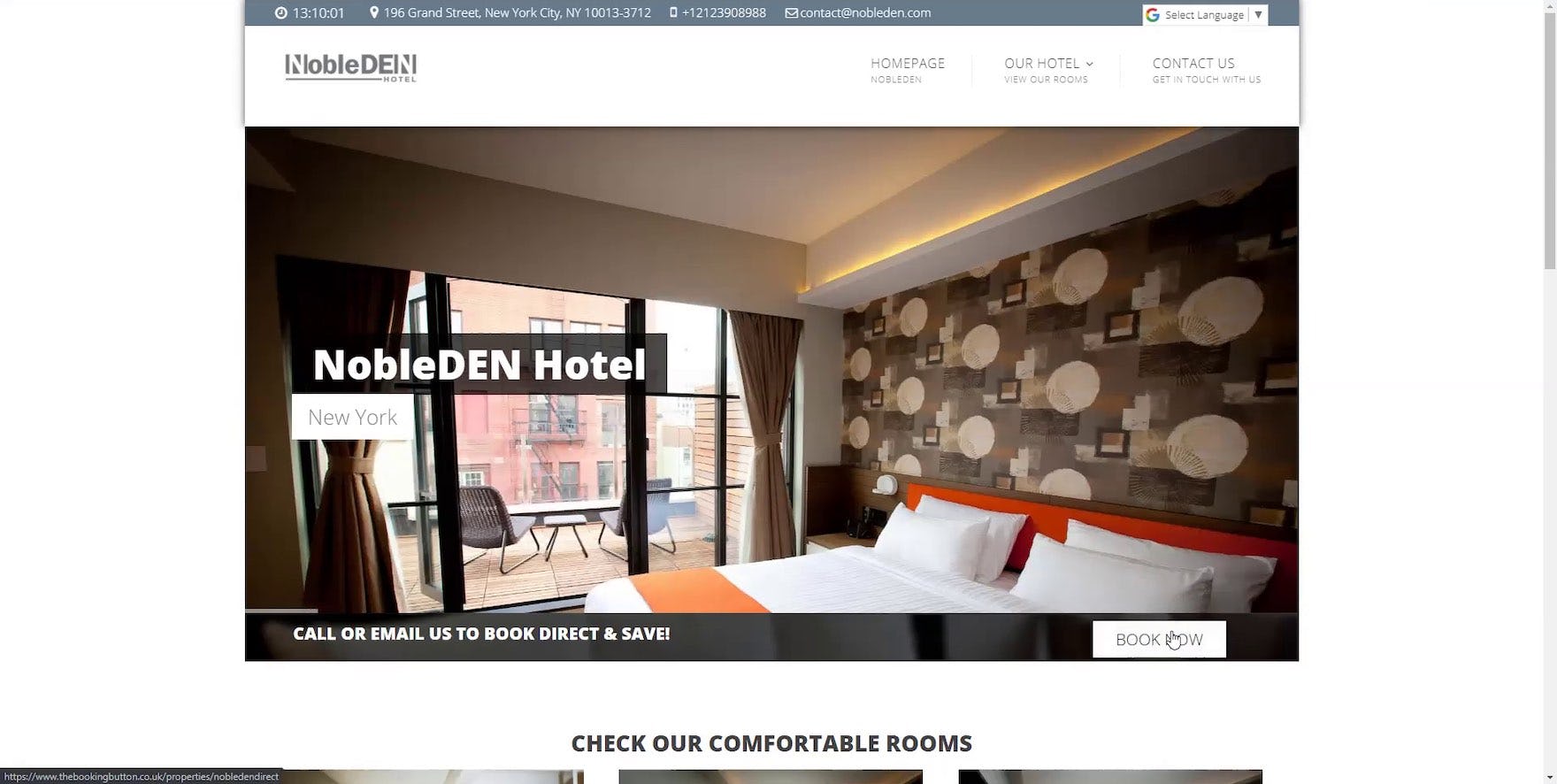
“I was going through the whole page because I couldn’t find the ‘Book Now’ button”, remarked a participant who had scrolled the homepage at NobleDEN and overlooked the “Book Now” button just below the large, animated room imagery. Clicking the “Book Now” button often takes users into the booking process on the boutique hotel sites.
For example, during testing a few boutique hotel test sites, rather than have a “Booking” search feature on the homepage, instead provided users with only a “Book Now” button.
In effect, this substitution risks the button being lost amongst the rest of the homepage content — as, unlike most “Booking” search features, there are no open form fields, which almost always draw users’ focus — and potentially overlooked by the subgroup of users who prefer to check availability and pricing first (as opposed to exploring property and room amenities, things to do in the area, etc.).
How to Ensure the “Booking” Search Feature Is Prominent
While users at OTA, large-brand hotel, and whole property rental sites have different needs when it comes to the findability of the “Booking” search feature compared to users at boutique hotel sites, both groups still require that the feature is easily findable on the homepage.
Ensuring Prominence of “Booking” Search on OTA, Large-Brand Hotel, and Whole Property Rental Sites
In terms of design and implementation, there are multiple design elements in particular that can be used to visually emphasize the “Booking” search feature on the homepage.
For example, prominent placement, high contrast against background colors and imagery, bigger input fields and font size, bold borders, and increased vibrancy of the “Search” button are all effective in helping users identify the “Booking” search feature immediately when they arrive at the site.
In particular, the three design elements that typically have the biggest impact are the following:
- Position
- Style
- Size
1) Position
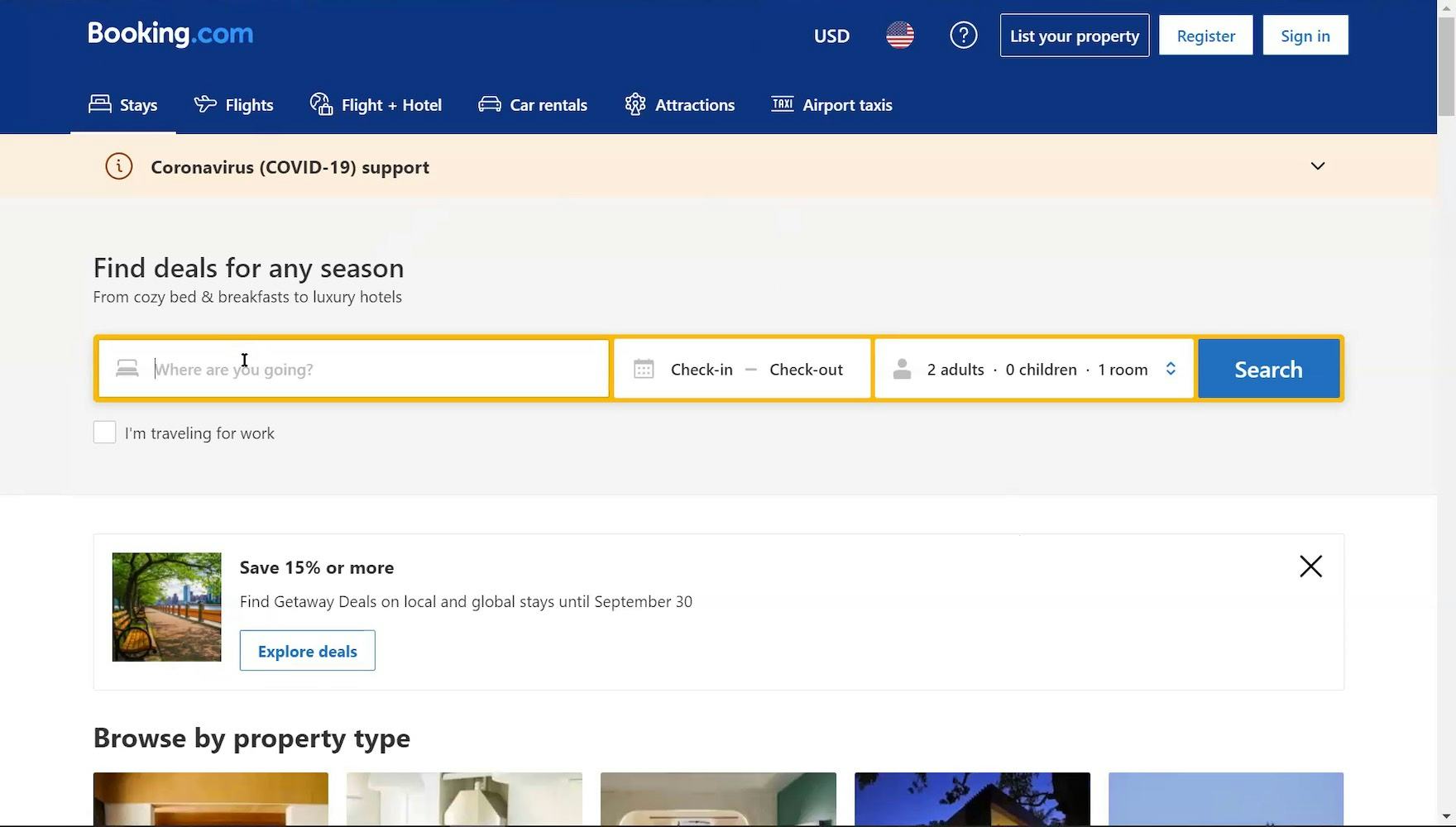
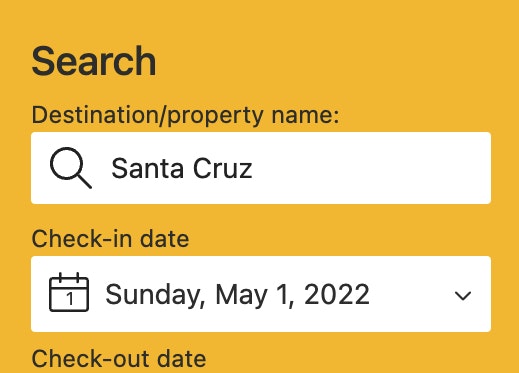
The prominent placement of the “Booking” search feature in the upper half of the homepage at Booking.com ensures it won’t be overlooked by users when they arrive at the site.
First and foremost, the design pattern observed to perform the best during testing positions the “Booking” search feature in the upper part of the homepage.
This placement ensures the “Booking” search feature is immediately visible to users when they arrive at the site.
Additionally, prominent placement reduces the risk of “Cookies”, “Travel Advisories”, or other site notifications anchored to the top or bottom of the screen blocking users from immediately accessing the “Booking” search feature.
Additionally, it’s important to note that users should not have to pause inputting their search criteria to scroll the page in order to view and access all elements of the “Booking” search feature.
In practice, reduced visibility and access to the input fields makes entering information difficult, and can result in errors.
Positioning the “Booking” search feature high on the homepage will help to ensure all components are fully visible.
2) Style
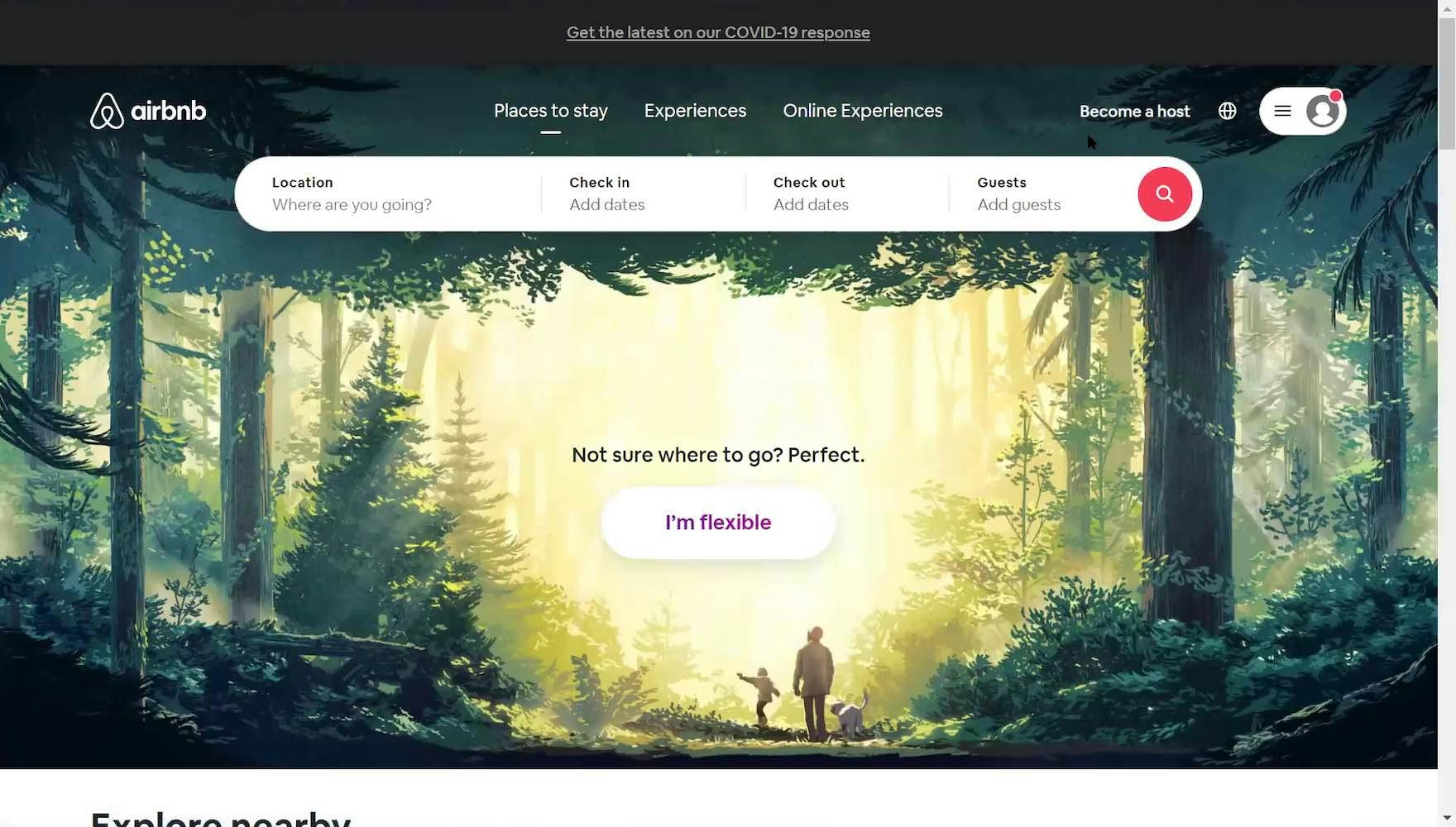
At Airbnb the strong contrast of the “Booking” search feature and brightly colored “Search” button against the inspirational background imagery makes the “Booking” search feature highly dominant.
The homepage on travel accommodation sites often features large, inspirational imagery and other visual elements that fight for the user’s attention.
Increased contrast between the “Booking” search feature and the background, along with a vibrant “Search” button, is a highly effective way to ensure the “Booking” search feature stands out.
3) Size
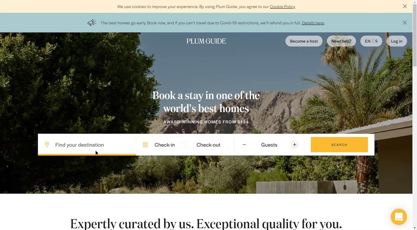
At Plum Guide, the “Booking” search feature spans nearly the entire width of the homepage.
Making the “Booking” search feature large communicates its importance to users.
Additionally, visually wrapping the entire “Booking” search feature, including the “Search” button, increases its overall visual prominence.
Ensuring Prominence of “Booking” Search on Boutique Hotel Sites
Despite the decreased importance for users of the “Booking” search feature at Boutique hotel sites, Boutique hotel sites should still provide a “Booking” search feature that is easily identifiable and accessible directly on the homepage, rather than only a “Book Now” button, which users can too easily overlook.
Yet the prominence of the “Booking” search feature can be reduced compared to the prominence of the feature on OTA, large-brand hotel, and whole property sites (in order to showcase more bespoke imagery, special deals, etc.).
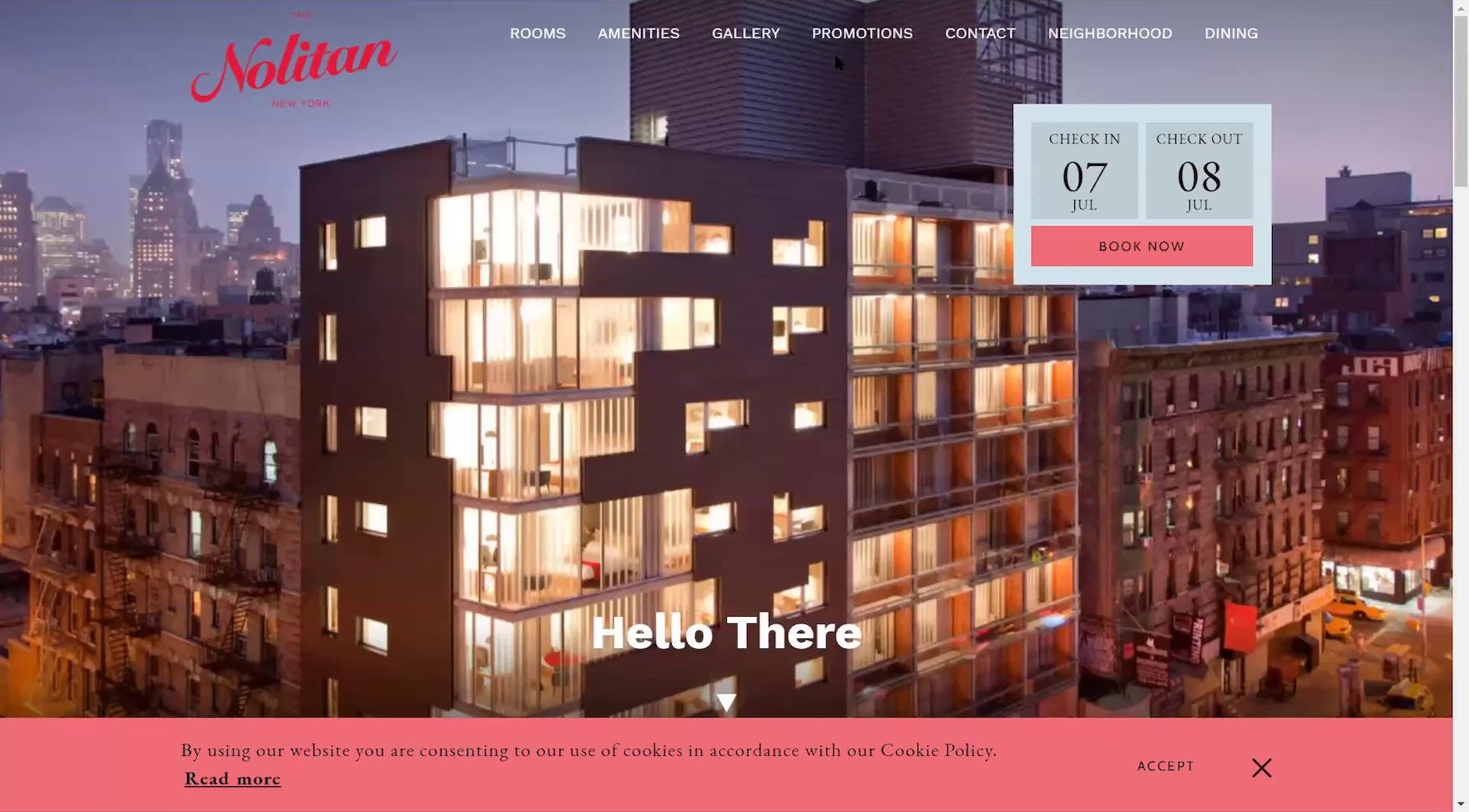
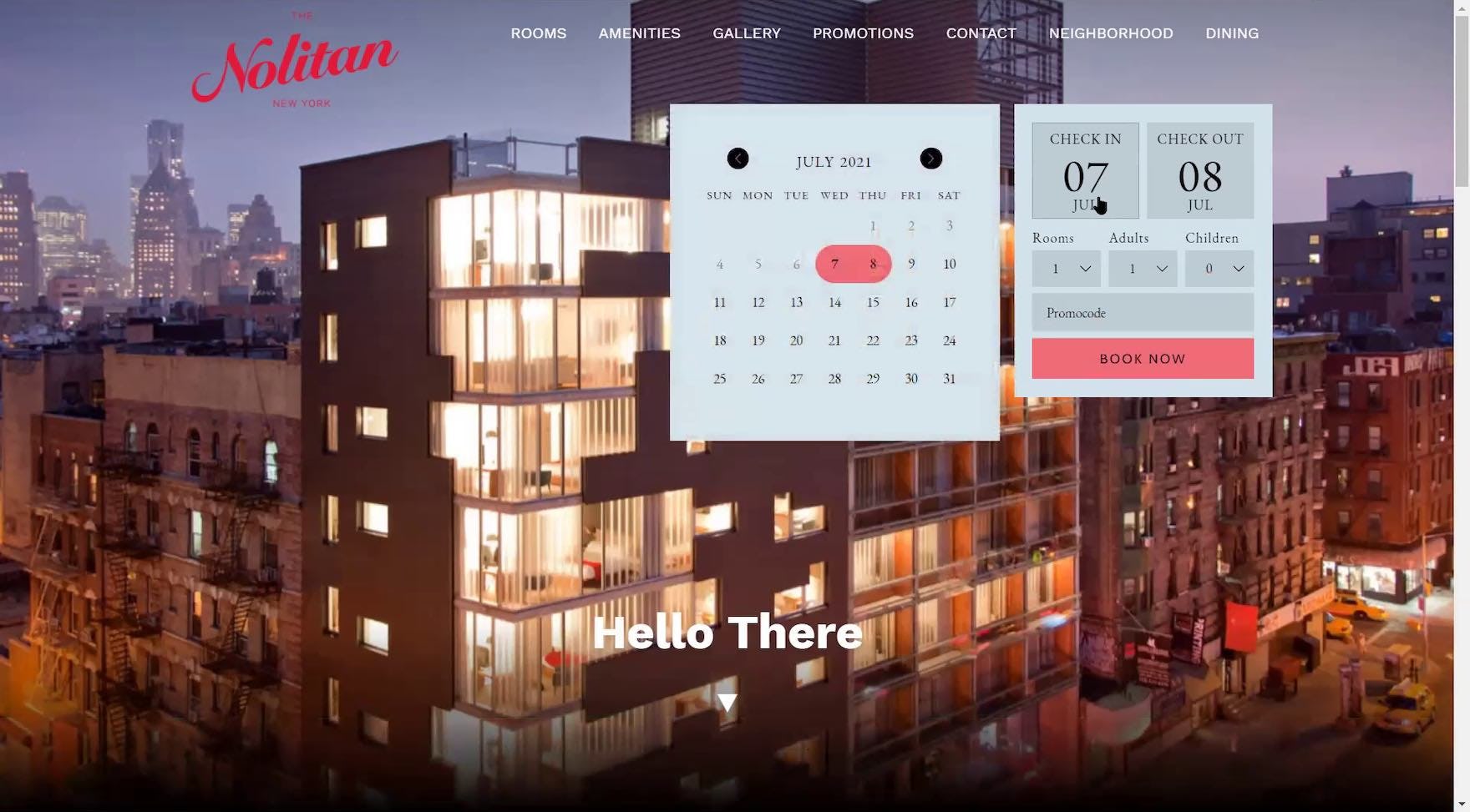
“I like that this module’s front and center, right up at the top right. It’s super easy. That’s the whole point of why they’re in the business, to reserve rooms, you know?” explained a participant at The Nolitan. Notably, instead of substituting the “Booking” search feature with only a “Book Now” button, The Nolitan employs a progressive disclosure design, where only the “Check In” and “Check Out” input fields are displayed initially (first image), and additional menus and fields are revealed when a user clicks into the “Check In” field (second image).
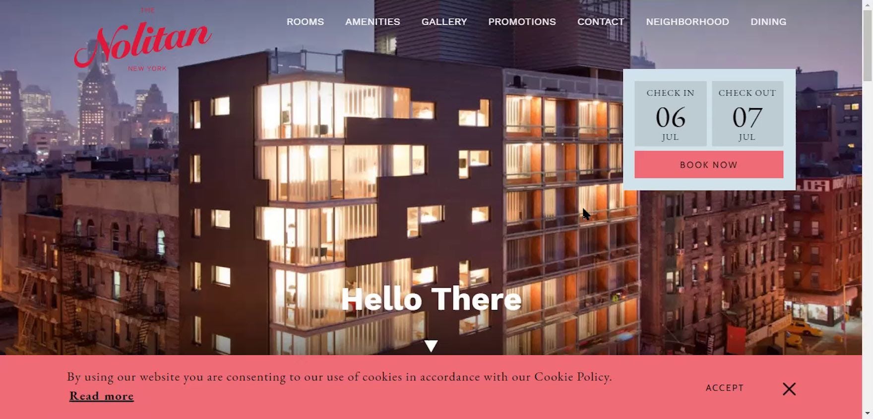
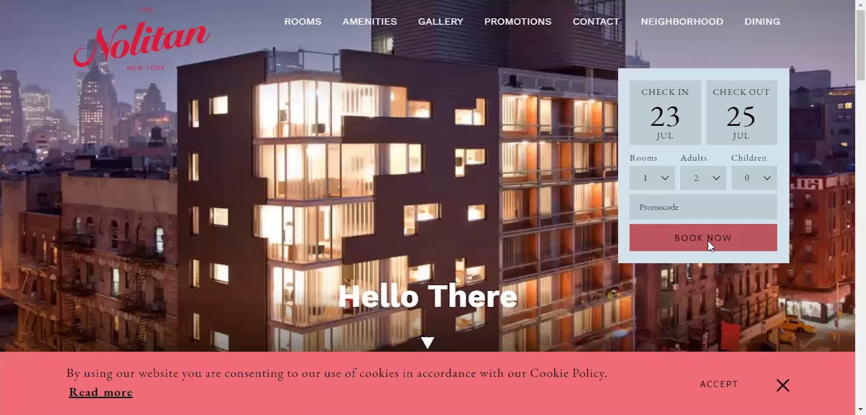
“Whenever I look through a site like this, I always want to see what’s available”, noted another participant arriving at the homepage of The Nolitan (first image). Entering his details, he explained, “A lot of times, I’m like, ‘Ooh, I really like this suite’, and then it’s booked up for the next 9 months because it’s the coolest one there. So for me, it’s always important to know which ones are available on my dates first, before I dive into the coolness of each room” (second image). Although 73% of participants shopping for rooms at boutique hotels began by browsing for property and room information, 27% wanted to check availability first.
One alternate space-saving approach that was observed to perform favorably during testing employs a progressive disclosure design.
In effect, only a portion of the “Booking” search feature — the “Check In” and “Check Out” date input fields and the “Book Now” button — are displayed initially, and the remaining inputs are revealed when users interact with it.
Support Users’ Desire to Quickly Begin Their Accommodations Search
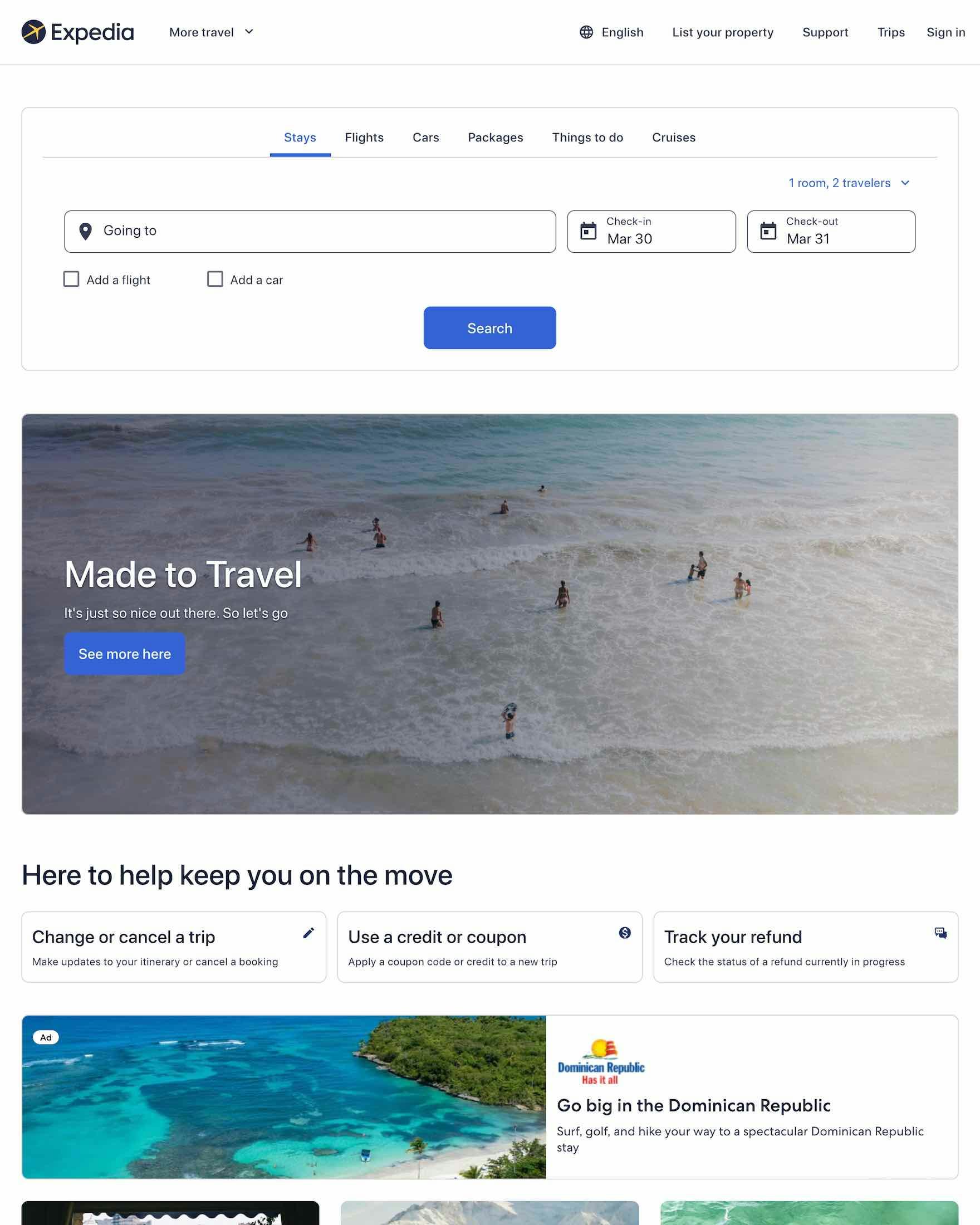
At Expedia, the placement of the “Booking” search feature at the top of the homepage ensures it won’t be overlooked by users.
When it comes to the “Booking” search feature, travel accommodations sites need to cater to the needs of at least 2 groups of users:
- Users on OTA, large-brand hotel, and whole property rental sites, who need the “Booking” search feature to be immediately visible
- Users on boutique hotel sites, who still need the “Booking” search feature to be available, but who have fewer issues with regards to the feature’s prominence
Yet, despite the potential disruption and distraction to users, our e-commerce UX benchmark shows that 25% of OTA, large-brand hotel, whole property rental, and boutique hotel sites don’t make the “Booking” search feature the primary content on the homepage.
On the other hand, when the “Booking” search feature is highly prominent and easily accessible, users on travel accommodation sites are able to efficiently get started with their accommodations search — likely leading to a quicker and less friction-filled entry to the booking process.
Getting access: all 374 Travel Accommodations UX guidelines are available today via Baymard Premium access (if you already have an account open the Travel Accommodations Study)(You may also want to see our Travel Accommodations audit service for information on booking a UX audit of your Travel Accommodations sales site.)