Input masks can help users enter data in restricted inputs, but there are many details to get right to ensure input masks work well for users.
Our large-scale Checkout usability testing reveals that 89% of users are likely to enter numerical inputs in several different ways — even when formatting examples are provided that display the site’s desired input format. Furthermore, during testing, a proportion of test subjects hesitated before they entered their data, as they worried that they would type it in a format the site wouldn’t validate — even on sites that accepted all formatting.
It’s a reasonable worry, as we’ve found that 98% of e-commerce sites restrict inputs for certain fields, and users have had prior experiences at websites where they received validation errors caused by including and omitting formatting the site didn’t accept. During testing these formatting validation errors even resulted in checkout abandonments, especially when the error messaging or error-recovery process was poor as well.
Testing revealed that input masking can be a great way to alleviate users’ concerns over incorrectly entering their information, and at the same time ensure they enter their data in the required or preferred format. Yet our benchmark data shows that 64% of sites don’t use input masks, or don’t use them correctly, to help users enter their data in restricted inputs, such as a phone number field.
In this article, we’ll discuss the test findings from our checkout usability study related to input masks. In particular, we’ll focus on:
- Why providing an example of the desired input format isn’t enough,
- Why input masks can be a good solution for restricted fields, and
- Why sites should only use localized input masks in countries where formatting have been verified.
Why Providing an Example of the Desired Input Format Isn’t Enough
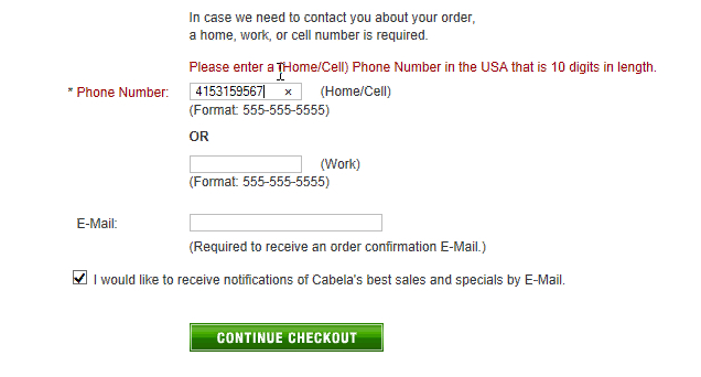
89% of test subjects did not follow formatting examples for restricted fields. This was the case when the formatting examples were provided as static text outside the field, as seen here at Cabela’s, or when provided as field placeholder text, and even when our eye-tracking data revealed that a large proportion of subjects actually noticed the formatting examples before incorrectly typing in an input.
When provided with a formatting example, 89% of test subjects entered their data in a different format from what the site had exemplified. For example, if a site indicates that the desired format for the phone number field is 555-555-5555, nearly all users will still enter the phone number in a different format — (555) 555-5555, 555 555 5555, 555 555-5555, etc.
It’s unclear why this is the case, especially because our eye-tracking test data shows that users do look at the formatting example before inputting their data in a different format — users, most likely, just enter their data in the format they prefer and assume the site will “fix” it, or perhaps users view the formatting example as a suggestion rather than a requirement. In any case, it’s clear that providing a formatting example isn’t enough to ensure users enter their data in the desired format.
Furthermore, sites should be extremely cautious about restricting users’ inputs in the first place — particularly when it’s only vanity restrictions used for input formatting. If possible users should be allowed to enter their data in whatever format they wish. However, for sites that either have inputs where there’s no way around an input character restriction, or for sites that are willing to spend technical resources on perfecting the form-filling experience, input masks were during testing observed to perform well — if considerable technical due diligence is first performed.
Why Input Masks Can Be a Good Solution for Restricted Fields
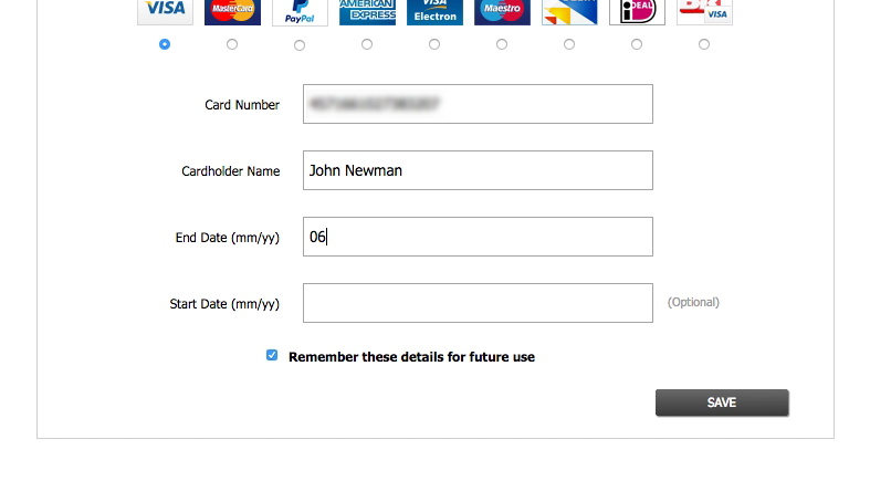
“And here it would be nice if there were one of those [input masks, ed.]. Now I have to type a backslash or forward slash, instead it could have…made it for me.” A test subject was aggravated by the lack of an input mask, as he now felt it was necessary to type the date formatting himself.
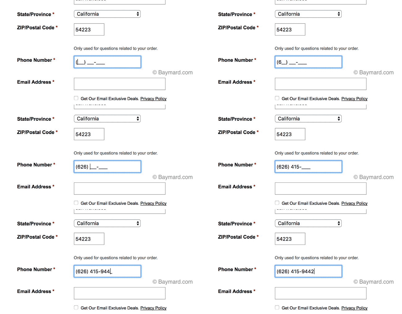
During testing, input masking was observed to be a particularly well-performing solution for restricted inputs. Input masks can show users, before they even start typing, what format the characters are expected to be in and then auto-apply that formatting to the user’s typed input. Hence, users complete a formatted input — with all the verification and legibility benefits that are provided by input masks — but don’t have to type any formatting characters themselves, and are therefore much less likely to get validation errors for input formatting.
Input masking removes users’ confusion about what format is required for restricted inputs, such as phone numbers, along with providing verification and legibility as users type — making typos easier to spot.
Providing an input mask will not only ensure that values are entered correctly, but was also observed to allay users’ up-front concerns on correct formatting, and to generally expedite form completion.
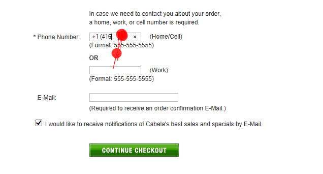
“They probably don’t want +1 because it starts with a parenthesis.” This subject was entering her phone number into the “Phone Number” field. After entering her number, she noted, “That’s nice, in typing fields…I just get a confirmation that it’s fine what it says in this box. And that helps a lot.”
For example, while all phone numbers are valid if prefixed by a country code, in the United States and Canada the “1” or “+1” country code at the beginning of a phone number is in practice usually omitted and will often yield an error if included (due to the phone input now being 11 digits long and including a special character), despite being a valid phone number. An input mask that directs users on how to input their phone number will clarify to users up-front if the country code should be typed, shouldn’t be typed, or is already included (shown in the input mask based on the selected country) — saving users from uncertainty on how to input their information and the potential validation errors.
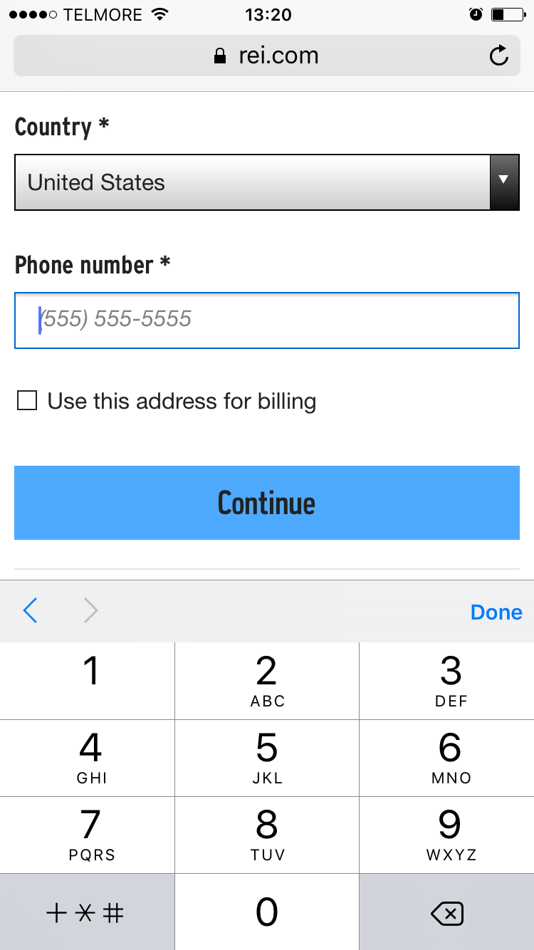
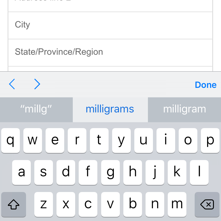
It’s of course crucial to provide formatting examples that users can actually type. Note how it’s impossible for the user to follow the phone formatting example at REI as the phone-optimized keyboard on iOS doesn’t allow entry of dashes or parentheses.
Input masks can work especially well for users on mobile devices, where typing in general is more difficult than in desktop environments, and where the touch keyboard layout should be optimized for specific types of fields (e.g., phone fields, credit card fields, email fields, etc.) — meaning different keyboard characters are available to users depending on the field they’re in. Having an input mask ensures users will be able to enter their input to match the desired or required formatting, in an environment where it can be difficult or impossible to enter the characters normally associated with a particular input type, like phone numbers.
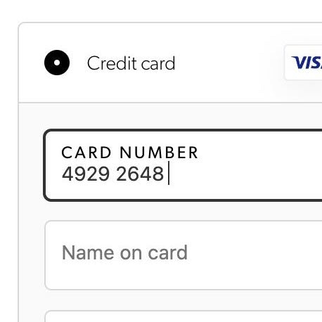
At Best Buy, a user’s credit card number input is auto-formatted with spaces, making it easier to input and read.
The credit card number is another field where our testing has documented that input masks perform very well by auto-formatting card number spaces. Auto-formatting spaces was shown to make it easier for users to read and type long credit card number inputs, which is otherwise error prone. In fact, during testing subjects were seen to enter and read their inputs in “chunks” that mirrored what was on their physical credit card; for example, “4571 [pause] 6610 [pause] …”. An input mask that auto-formats the card number spaces relieves users from having to struggle to read long, unbroken credit card number strings, and makes it easier for them to double-check their input once they’ve finished.
Input Masks Can Perform Well, but Only if Localized and Scrutinized
Implementing input masks can help users to more easily and accurately fill out form fields. However, special care should be taken, as the input mask also directly modifies and sets restrictions on what users can input. Any technical quirks or mismatches with the user’s input are likely to unwillingly force those users to abandon the site, as they are unable to correctly provide the requested input.
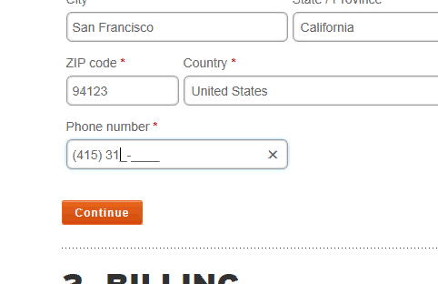
For example, when benchmarking and auditing checkout flows, we often observe that the input mask logic hasn’t fully accounted for how users edit inputs within the field, which is made more difficult due to significant interaction quirks.
Another key consideration for input masks is the regional differences in both input formatting and input structure for inputs like dates, phone numbers, addresses, etc. For example, the date format in the United States is MM/DD/YY, while for most of Europe it’s DD/MM/YY, and for Canada and Japan it’s YYYY/MM/DD.
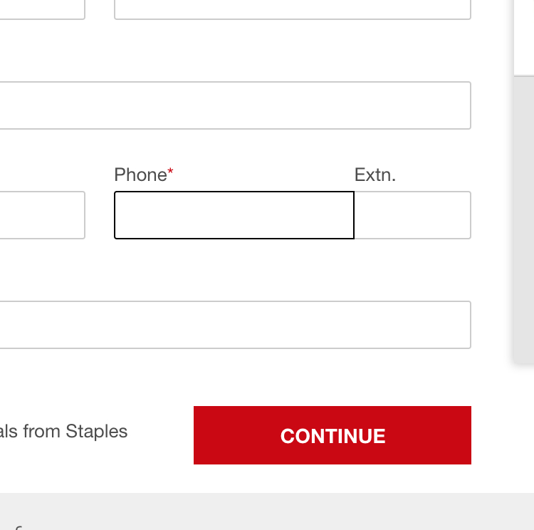
At Staples users aren’t provided with empty placeholder text as they enter the field. Many users will be uncertain whether or not they should type formatting characters.
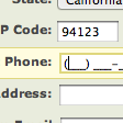
Northern Tool does show users empty placeholder text, clearly indicating that they only need to type their phone number digits.
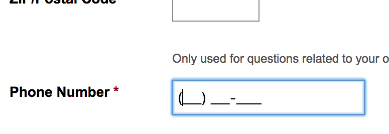
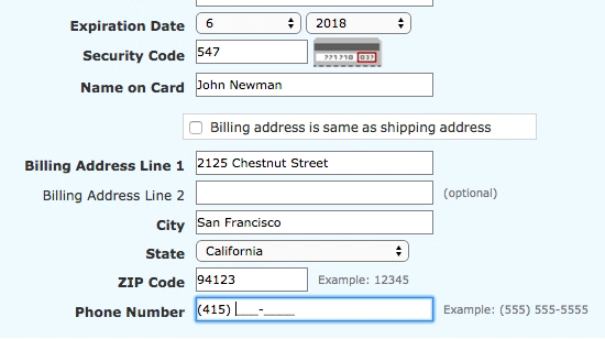
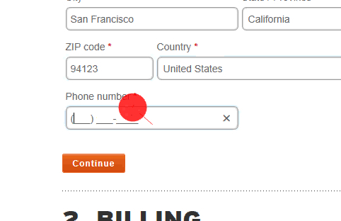
For this reason, it’s important that input masks provide empty placeholder formatting as users enter the field to clarify the expected format of fields, and to clarify that the user is not supposed to type formatting themselves. During testing, all subjects immediately picked up that, when putting focus on a phone number field with an input mask, the use of underscores and parentheses in the placeholder text clarified that they only had to type the phone number digits, whereas if the field had no placeholder formatting it was more difficult for users to know whether or not they had to type formatting characters.
Furthermore, as a rule of thumb, input masks should not be reused in multiple countries before the local input formatting and structure have been verified. For example, the majority of the world’s countries have a phone number length, or phone number formatting, that makes it impossible to reuse a US-centric phone input mask like “(315) 415-9999”. Moreover, phone numbers in several countries like the United Kingdom and Germany are of varying total lengths: for example, Germany has valid phone numbers as short as 7 digits all the way up to 11 digits, with the area code varying from 2 to 5 digits — making an input mask that will correctly display users’ expected input format up-front almost impossible.
If not absolutely sure of the correct regional formatting, or if the target audience for the input mask is deemed to simply be too small, then the input mask should be disabled completely for all users in unverified or unsupported countries, and a traditional form field without any input restrictions should instead be the default.
Given both the technical robustness and the internationalization logic required, it should be underscored that input masks, if they’re to perform well, are somewhat resource intensive to develop, and any external input mask scripts will need to be scrutinized in detail before being used.
Consider Implementing Input Masks — But Proceed Cautiously
When they work well, input masks are in our testing observed to have a number of benefits, including
- removing users’ uncertainty over how to fill out a particular restricted field,
- reducing users’ anxiety over possibly filling out the field incorrectly, and receiving errors as a result, and
- reducing the number of validation errors all users experience, which can sometimes be the cause of site abandonments.
During testing, input masks performed well in helping the test subjects correctly submit formatted and restricted inputs, as seen here at REI. In particular, the initial input hesitation, and the amount of validation errors, are lowered.
Given these very substantial benefits, we recommend implementing input masks for restricted form fields such as phone number, date, credit card auto-spacing, and any other field where a specific formatting is desired or required.
However, input masks must work flawlessly to avoid doing more harm than good. An input mask that doesn’t align with a user’s domestic formatting will often result in an abandonment, as the user can’t complete the form field and hence the checkout (if the phone number is a required field. In which case it’s critical to also explain why).
To ensure input masks are working correctly they need to be localized for users’ specific country or region, which means that the default implementation for all users is a normal empty form field that accepts any formatting. The user interface for this field is then progressively enhanced with an input mask, for those users that are in the site’s key markets, where the local input formatting has been verified.
This article presents the research findings from just 1 of the 650+ UX guidelines in Baymard – get full access to learn how to create a “State of the Art” ecommerce user experience.

