
Key Takeaways
- Our new research has uncovered 1,100+ usability issues specific to B2B Electronic Components and Machinery sites
- The research has resulted in 275+ guidelines that describe the issues, as well as design patterns verified to perform well for users
- In particular, the research provides insights on the content and features B2B Electronic Components and Machinery sites need to provide users to ensure they’re able to make a purchase decision
At Baymard our research team has spent 2,500+ hours usability testing and researching Business-to-Business (B2B) Electronic Components & Machinery website features, layouts, content, and designs — leading to our new study on B2B Electronics Components and Machinery UX.
The research is based on more than 168 qualitative user/site usability test sessions following the “Think Aloud” protocol (1:1 remote moderated testing).
As the sites are geared towards specialists and industry professionals, our participants were all B2B industry professionals experienced in engineering, purchasing, or manufacturing electronic components and machinery.
The research focused on 15 U.S. and global manufacturer and distributor websites offering electronic components and machinery:
Manufacturer sites: Analog Devices, Microchip Technology, Microchip Direct, STMicroelectronics, STMicroelectronics eStore, TDK Corporation, and TE Connectivity.
Distributor sites: Arrow Electronics, CoreStaff, Digi-Key Electronics, Farnell/Newark/element 14, Future Electronics, Mouser Electronics, RS Components, Ltd., and TTI, Inc.
During testing the users encountered 1,100+ medium-to-severe usability issues.
These issues have subsequently been analyzed and distilled into the 275+ UX guidelines found within our B2B Electronic Components and Machinery research study (all of which are available as part of our Premium research findings).
The 275+ guidelines cover most aspects of the online exploration and purchasing of Electronic Components and Machinery, at both a high level of general user behavior as well as at a more granular level of specific issues users are likely to encounter.
In this article we’ll introduce 2 high-level UX findings for B2B electronic components and machinery sites:
- The “Product Table” is critical to get right to ensure a high-performing site
- Product details pages need extensive and specific info to allow users to make purchase decisions
The B2B Electronics “Product Table” Is Critical to the UX

“It’s slower to scroll through. It’s not bad, but I do like the table option a little bit more because you can really scan for key characteristics instead of trying to read through this text here”, remarked a participant (a design engineer) of the “List View” layout of his search results for “MOSFETs” at STMicroelectronics eStore.

“I like the other [sites] because you can sort it by different parameters. Whereas I don’t feel like I would be able to with this one”, remarked another participant (a biomedical engineer), frustrated because he couldn’t sort the list of “Pressure Sensors” at STMicroelectronics eStore by minimum and maximum pressure.
The backbone of a great product-finding experience is a well-designed layout of lists of products.
Extremely spec-heavy products like B2B electronic components and machinery typically have many complex attributes that factor into a user’s purchasing decision.
Therefore, the layout or “View” used to present the product listings significantly impacts the site’s overall performance.

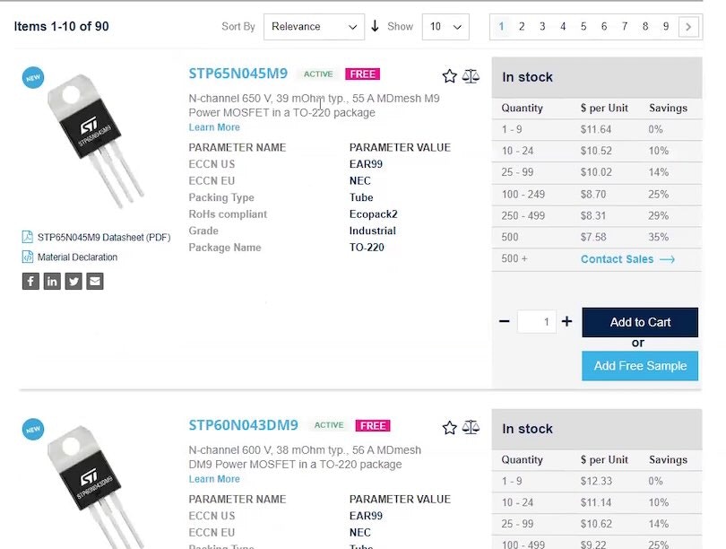
“I can scroll through, and it will show me some of the attributes of the part — probably the same attributes as when I click into the part — which helps a lot“, explained a participant (a computer engineer) as he scrolled horizontally in a “Product Table” at Newark. As observed during testing, “Product Tables” are highly effective because they allow users to quickly scan, evaluate, and compare a wide array of complex product information to zero in on the most suitable products.
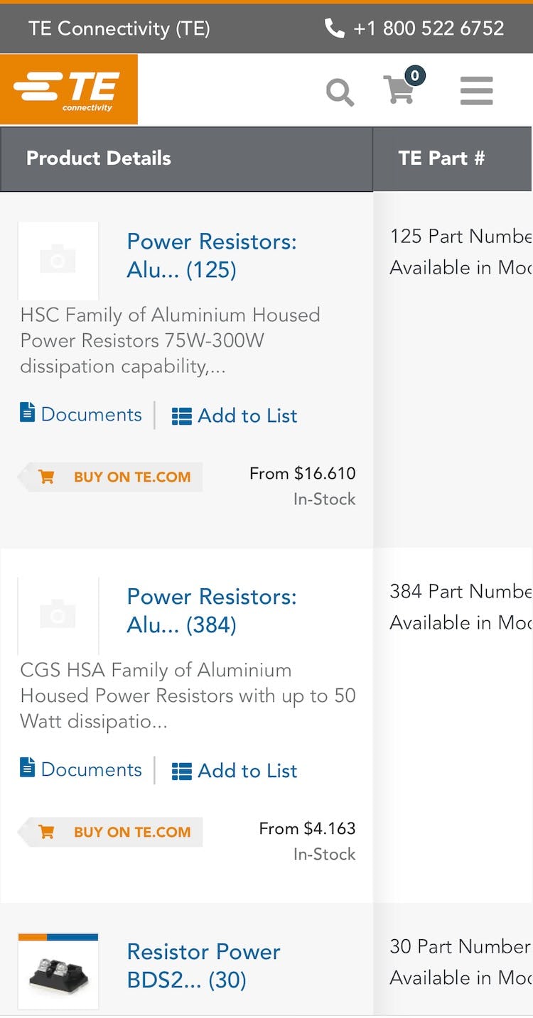

The “Product Table” at TE Connectivity’s mobile website displays key product details in the persistent first column (first image). Swiping horizontally in the table truncates the information, slightly reducing the width of the column and the height of each row (second image; screenshots taken after testing concluded by researcher). However, visibility to additional columns is severely limited even when the “primary” column is truncated. On mobile, “Product Tables” are more of a hindrance compared to a traditional list view, so opting for the list view instead will be the best choice for mobile B2B electronics sites.
Testing confirms “Product Tables” are optimal for supporting desktop users in evaluating and comparing extremely spec-heavy products such as electronic components and machinery because they allow desktop users to view even more product attributes than is possible with a traditional “List View”.
(Note: while mobile users weren’t tested — see note at the end of this section — it’s likely that on mobile sites “Product Tables” will be much less useful, and therefore a traditional list view layout is recommended.)
Additionally, “Product Tables” allow desktop users to more efficiently and effectively compare the highly specialized and often complex attributes across multiple rows of products to quickly identify suitable parts for their projects.
Now, it’s important to remember that “Product Tables” are information-dense and frequently require vertical and horizontal scrolling to evaluate and compare products.
As such, the visual design of the “Product Table” itself can significantly impact users’ ability to efficiently and effectively scan the product data.
Therefore, it’s important to make it easy for users to navigate the table; for example, by providing “sticky scrollbars”, persisting column headings as the table is scrolled vertically, and optimizing the table for scannability.


“There’s actually a few dates. That’s nice”, a participant shopping for a USB hub at Mouser Electronics remarked positively as he clicked a “View Dates” link for the on-order quantity for an item in the “Product Table” (first image). “A lot of my projects, I can tolerate this kind of date, where if I can get it later this month, or maybe even next month, that’s fine”, he explained as he viewed the ship dates in the triggered overlay (second image). Note the overlay also contains a “Factory Lead-Time” to inform users of the wait time for quantities greater than what the site currently has in stock and on order.
Additionally, during testing, participants were unable to effectively evaluate and compare items in the “Product Table” when important attributes or thumbnails were not included in the item details.
Not only should key general attributes like part number, name, price (including MOQ), and thumbnail be included, but so should category- and product-specific attributes that are vital to users’ ability to identify relevant products.
Likewise, product life cycle status, inventory, and lead time are of primary importance for users assessing whether an item meets their current or upcoming product-design schedule.
Furthermore, if attributes are only included for some products, but not all, comparing items in the “Product Table” becomes needlessly difficult.


“I’d maybe sort by ‘Resolution’. Sorry, I wanted descending, not ascending.” A participant (an electronics engineer) intended to sort the A/D converters in the “Product Table” at Microchip Direct by those with the highest resolution. However, he clicked the “up” arrow in the column heading (first image), which sorted the table by converters with the lowest resolution. Upon seeing the new order of items, he immediately clicked the “down” arrow to re-sort the table (second image). Without adequate guidance, there’s an increased risk that users will misinterpret the sorting direction represented by the arrows and click the wrong one.

“So, I want to have ‘Sort Ascending’ — it’s going to show me the cheapest one”, explained a participant (an electronics engineer) as he triggered a tooltip that verified the sort direction for the “up” arrow in the “Price” column heading in the “Product Table” at Digi-Key Electronics. “Okay, this is good…This is what I wanted. So, this is perfect”, he remarked as he scanned the resistor kits in the updated, budget-friendly order. Tooltips are key when it comes to explaining how clicking an indicator arrow will actually sort the “Product Table”.
Finally, the ability to effectively sort and filter the “Product Table” is crucial to users’ ability to use it to find suitable products.
Sorting is particularly popular as a soft-boundary alternative to filtering, with many participants opting to sort the “Product Table” by attributes they can’t typically filter by — namely, price and inventory (“Availability and price are like the two most used sort options here, I’d say”).
Indeed, sorting proved a powerful feature during testing of B2B electronic components and machinery sites and was often combined with filtering.

“The filters that [are] like on the left-hand side, I find it not as good because it takes some of the space that could be used for parts [in the table]”, remarked a participant (an electronics design engineer) about the filters in the left sidebar at STMicroelectronics.

“The space is being taken by this [sidebar] because if this wasn’t there, maybe everything would fit in one page”, complained another participant (an electronics engineer) about the vertical layout for filters at STMicroelectronics.

“So this is something that I really like — here up at the top — it’s one of the most helpful ways to filter for what you’re looking for…[It’s] a very efficient way for designers and buyers to find what they need”, remarked a participant (a computer engineer) as he selected filters in the horizontal filtering tool above the “Product Table” at Digi-Key Electronics. He quickly narrowed the selection of 1,300+ embedded microcontrollers to just 4.

“I do prefer to have the filters at the top, to be honest. More easily to go over them — instead of scrolling down and looking for different options here [at the side], I have all the options here [at the top]”, another participant (an electronics engineer) commented positively on the horizontal layout of filters at Digi-Key Electronics. During testing, participants generally preferred the horizontal layout of filters above the “Product Table”.
When it comes to filtering, 100% of test participants filtered — or attempted to filter — items in the “Product Table” (“You need to narrow it down so that you’re not spending hours looking through things.”).
However, the layout and interface styling of “Product Table” filters can significantly impact users’ success at locating suitable parts for their product design.
Fortunately, testing verified the optimal filtering layout for use with “Product Tables” and identified multiple, related interface styling details — as well as features such as including the ability to search — crucial to the successful application of filters to the “Product Table”.
Note: in Baymard Premium you may notice that these guidelines are limited to desktop devices. Although mobile usage is increasing, desktop usage still dominates for complex tasks such as product configuration, downloading technical information, and placing orders. On average, our tested B2B electronic components and machinery sites receive 73% of their monthly traffic from desktop devices, with some sites receiving as much as 83% of all traffic from desktops. Therefore, we only tested participants on desktop devices.
B2B Electronics Product Details Pages Need Extensive and Specific Info
The product page at an electronic components and machinery site must effectively accommodate anything from a simple tool such as a hand crimper or tweezers to an extremely spec-heavy electronic component like a microprocessor.
On top of this, different manufacturers may provide their product information to distributors in widely differing qualities and amounts.


“I notice that they don’t have a datasheet…I don’t know if I would purchase this product anymore. I mean, maybe I would go to another [distributor] website and search for this FSR number…I don’t know if I would buy it if it didn’t have a datasheet. Without the datasheet, I don’t even know what I’m looking at.” A participant (a biomedical engineer) could not verify key characteristics of a force-sensing resistor at CoreStaff because there was no datasheet available (first image). She located a link to the datasheet for the same part at another distributor site (second image).


“Sometimes the picture does not relate to the actual component; they sometimes place a picture of a component that is quite similar. So, I need to go to the datasheet and make sure that this part number here matches what I want. I need to go here and have a look at the dimensions. Okay, really interesting. Really good to have a 2-D drawing and with all dimensions in millimeters and inches, to be more specific.” A participant (an electronics engineer) shopping for a “spring loaded connector” at element14 didn’t trust the accuracy of the product image on the product page. Consequently, he immediately clicked the datasheet link in the part details section (first image). The datasheet contained a detailed drawing of the connector that reassured him about the part’s exact dimensions (second image).

“They don’t tell me how many they have in stock, which is usually the first thing I’ll look for. If I need 100 of these and they have 100 in stock, I’ll usually try to buy those. Now, if they have 100,000 of them in stock, I might buy more, just in case. But they give me no indication of how many they have”, complained a participant (a senior electrical engineer) at STMicroelectronics eStore as he searched the product page for the desired information.

“Wow! Okay, I guess they just don’t want me to buy anything!” Another participant (an industrial engineer) triggered an error when he attempted to add 200 units of a microprocessor to the cart at STMicroelectronics eStore. When the quantity of product in stock is unavailable, users will be needlessly delayed in confirming whether the site can actually accommodate their specific product-design requirements.
Therefore, it’s critical that electronic component and machinery product details pages offer extensive information on products — and do so consistently for all products.
In particular, product details pages need to provide datasheets, pricing tables, details on shipping and stock status, and compatible parts info, along with product page “basics” like 1–2 product images, detailed product descriptions, etc.
In testing, failing to provide any of the above often resulted directly in participants abandoning the product, and sometimes the site as well, if they felt that the lack of detailed product information was a sitewide issue.
Furthermore, users at the product page are often at very different stages of their purchasing decision: some users may know the exact part number they need for their project and will want to jump straight to confirming key inventory and pricing details (or even checkout), whereas others are newer to the product domain and therefore need to closely examine the product specs and dive into the manufacturer’s datasheet and additional digital media, such as CAD files and other downloadable technical resources.
It’s key therefore that the product page supports both users looking to move as quickly as possible to completing their order, as well as those who need to explore product details in more depth, by making crucial information prominent and easily accessible, along with providing the product details described above.
The combination of the product page being the centerpiece page in users’ purchasing decisions, the potentially extreme diversity of product types the page must be able to accommodate, and users’ varying use-contexts for the page makes it vital that the product page implementation is “state of the art”.
Otherwise, failure in the product page implementation will often lead to failure in the user’s e-commerce experience.
Help Your B2B Electronics Users Quickly Find and Purchase the Parts They Need

“I can’t just share my cart. That is already annoying. So, like I say, I’d have to do the manual thing here…I’ll copy and paste this — it’s not easy to copy and paste either. It doesn’t look like I can share my cart. Yeah, I just don’t think you’d ever find me using Arrow at this point!” A participant (a design engineer) scanned the cart at Arrow Electronics, looking for an option to pass the cart information to his purchasing team, but none was available. He resorted to copy and paste but then abruptly gave up in frustration.

“I don’t see anything where you can save a list. That is something that’s very useful to be able to save the list and send it to somebody. [Scrolls down] Let’s see. Yeah, I don’t see anything.” Another participant (a computer engineer) was frustrated and disappointed by the lack of features in the cart at Arrow Electronics for collaborating with others on his order.
Of all the industries we’ve researched at Baymard, the B2B electronic components and machinery sites have been the most highly specialized.
However, while the B2B product attributes, the B2B user-purchasing preferences, and the B2B terminology vary greatly from B2C e-commerce, we do observe in testing and in our many UX audits of B2B sites that how any user responds to and interprets an e-commerce interface is often consistent across a wide variety of different sites.
This is because user behavior on any particular website — and in particular web interface interpretation — is largely based on common human web behavior.
This is a user behavior that is mainly shaped by the current and prior experiences from the “globalized” interfaces where users spend the majority of their online time.
That said, we’ve identified many, significant areas where the needs of B2B electronic components and machinery users differ drastically from general e-commerce users.
Failing to get this right — as described above for the “Product Table” or product details page — will lead to less efficient browsing sessions, frustrated B2B users, and lost sales, as users abandon a disappointing site for one that better supports their needs.
Getting access: all 275+ B2B Electronics Components and Machinery UX guidelines are available today via Baymard Premium access. (If you already have an account open the B2B Electronics Component and Machinery study.)
If you want to know how your electronic component and machinery website performs and compares, then learn more about getting Baymard to conduct an Electronics Component and Machinery UX Audit of your site.)