Key Takeaways
- UX research is sometimes assumed to be narrowly applicable to a specific context or industry
- Our research indicates however that this isn’t the case when talking about the e-commerce landscape as a whole
- Similar usability issues occur across platforms (76% shared issues in desktop and mobile, 96% shared issues in mobile web and native apps) and across industries (74+% across industries selling physical products)
Over 10+ years of e-commerce usability testing and 130,000+ hours of UX research at Baymard, a consistent pattern has emerged: a large part of the issues users experience, and the design solutions required to resolve them, are largely shared and universal across sites and industries.
Indeed, we’ve observed this even as the diversity of platforms we test has increased from primarily desktop sites to include mobile sites and native apps.
Additionally, we’ve also observed this when testing across a variety of different industries — for example, mass merchants (e.g., Amazon and Walmart), smaller, single-brand sites (e.g., Allbirds and Daniel Wellington), and SaaS sites offering only digital products (e.g., Zoom and Slack).
That said, this doesn’t mean that all user issues and design solutions are the same across platforms and industries — it’s why we have separate research dedicated to Mobile UX and Travel Accommodations UX, for example.
In this article we’ll discuss our observations regarding the generalizability of UX e-commerce research, and the implications of our findings.
Note: this article is about how the UX of e-commerce UI components is generalizable. However, of course, there are often great differences when considering very different countries and demographics, purchasing power, what copy resonates with a localized user population, and so on, all of which are out of scope in this discussion. Here we discuss only the generalizability of the UI-related part of the user experience.
Similar User Issues Are Observed Across a Variety of Different E-Commerce Sites and Industries
When talking with clients, many have a clear sense that “their users” or “their industry” is unique, with user issues and design patterns distinct from other types of sites.
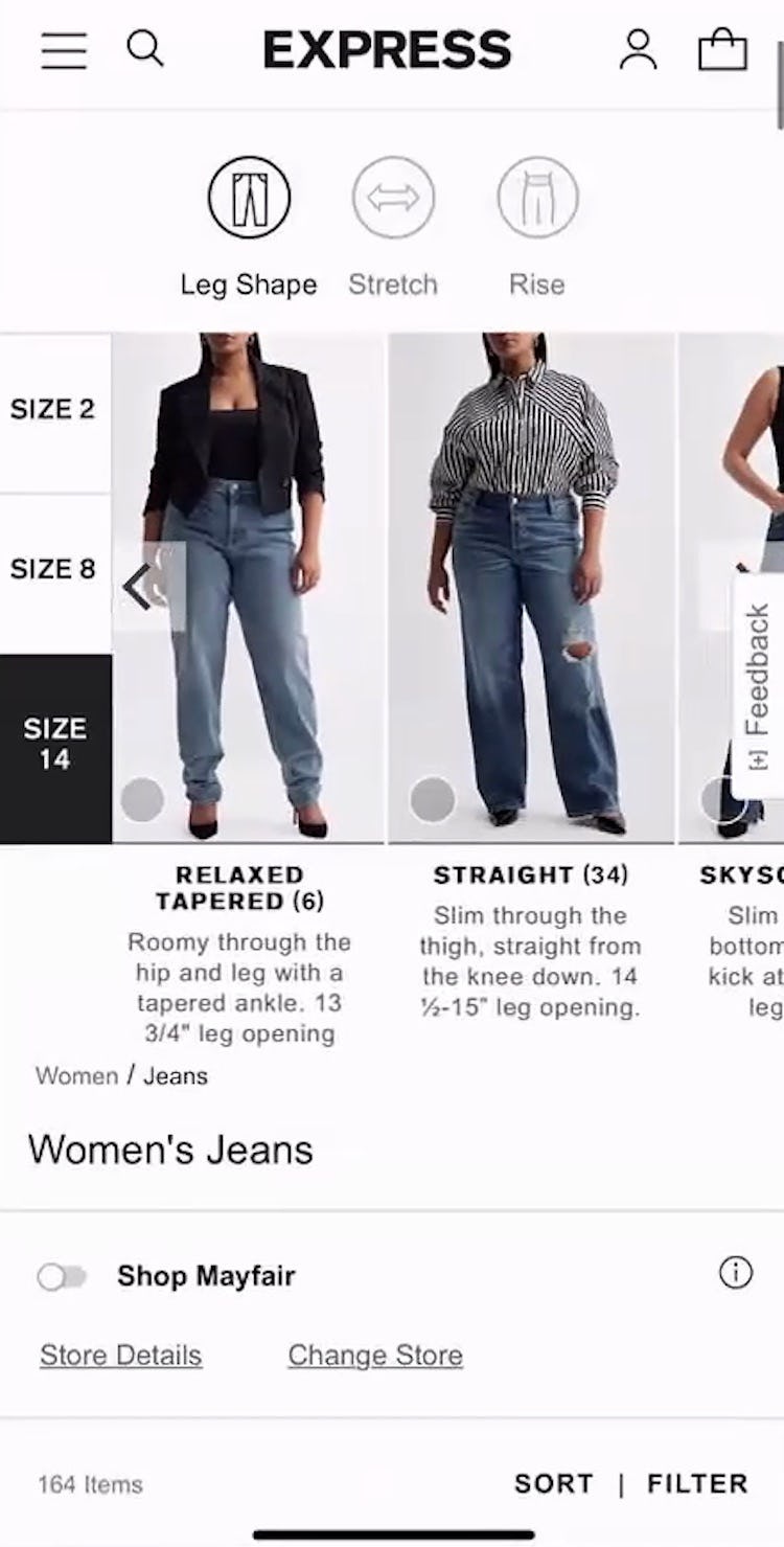
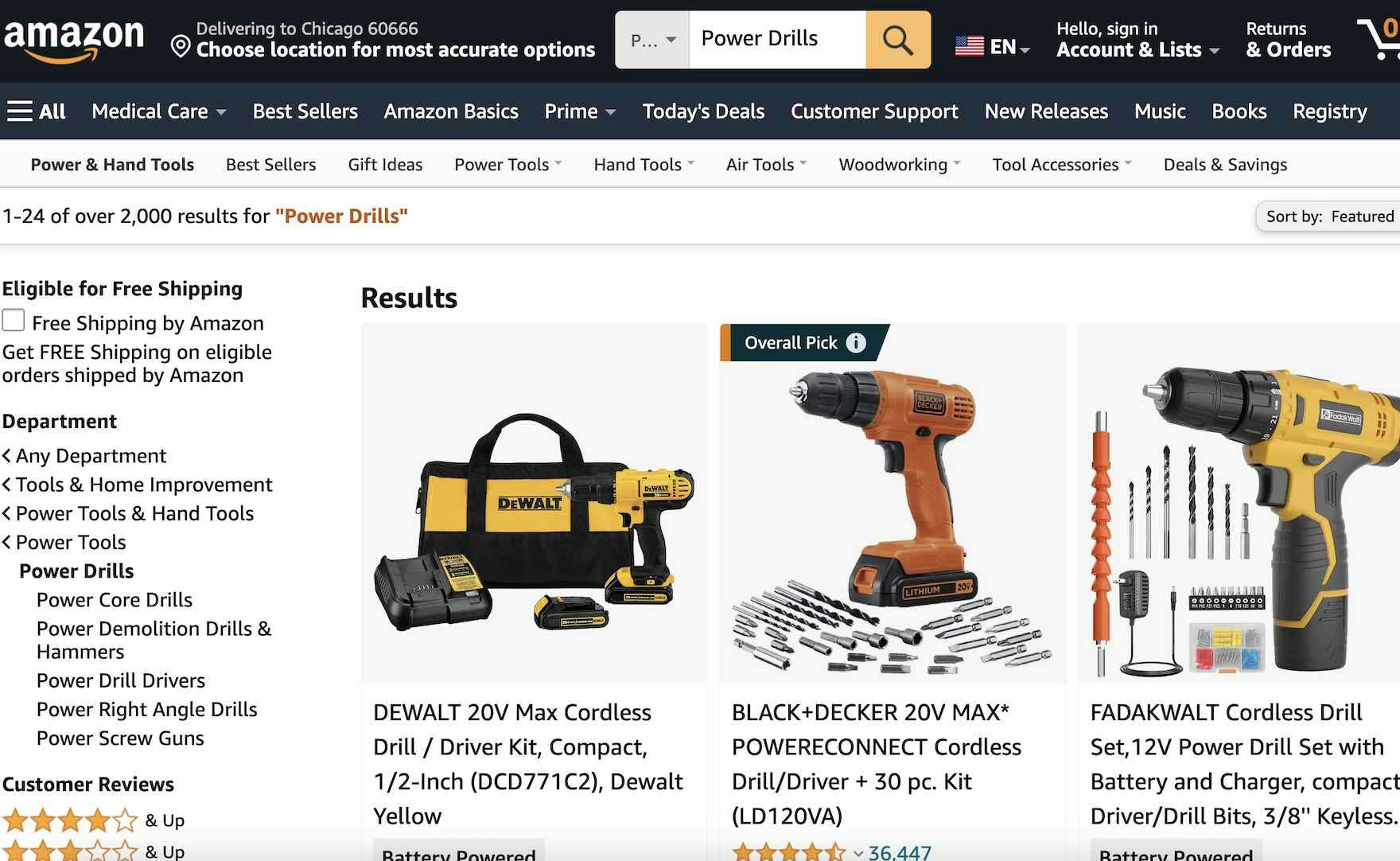
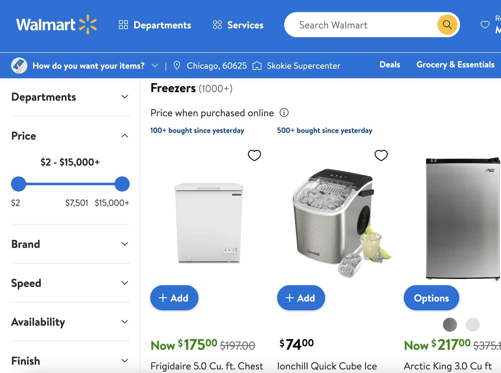
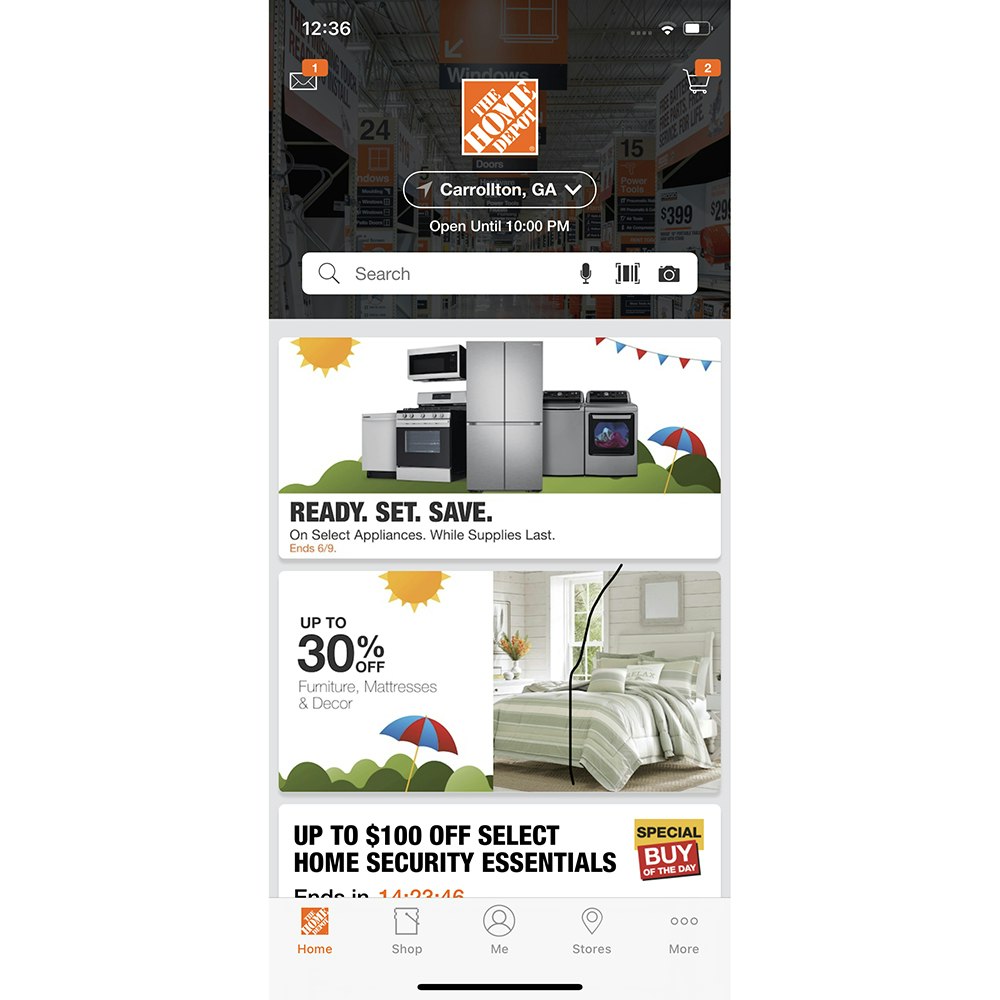
Whether shopping on mobile for jeans at Express (first image) or for drills on desktop at Amazon (second image), users will experience many of the same usability and UX issues.
For example, an apparel site may believe that users shopping for jeans require a completely different experience from users shopping for a drill on a mass merchant site — and thus any user insights must be based on research bespoke to the apparel industry.
Additionally, when it comes to different platforms, many clients assume that desktop users, mobile users, and app users will experience completely different issues on their site depending on which platform they’re using, and thus that the design patterns needed to resolve the issues are unique to each platform.
While granting that some user needs and expectations will differ depending on the platform a user is shopping on, or the industry a user is shopping in, our research shows that the vast majority of user issues — and design patterns needed to address those issues — are the same no matter what type of site a user is on or how they’re accessing it (i.e., on their desktop computer, on their mobile phone, or through a mobile app).
Desktop vs. Mobile vs. Apps
In our Premium research findings we have research specific to desktop sites, mobile sites, and (native) mobile apps.
However, if we dig into our findings a bit, we see the following:
- Desktop guidelines: 509
- Mobile guidelines: 429
- Mobile app guidelines: 414
Note: each of our guidelines represents a discrete set of user issues, and provides recommendations on design patterns verified to perform well for end users to address the user issues observed during test sessions.
Now, for mobile guidelines, we have 53 guidelines that are unique to the mobile UX.
The rest of the guidelines in the mobile research theme — 376 — are shared between the mobile and desktop platforms.
73% of usability issues are shared between desktop and mobile sites.
That means that 73% of the exact same UX and usability issues occur when we test desktop websites vs. mobile websites.
If we consider mobile websites vs. native mobile apps, the similarities are even greater: 96% of issues in our mobile catalog are also applicable to apps.
So while the platform users access the site on does matter — particularly when considering desktop vs. mobile or app users — it matters less than many people think, as the majority of issues mobile or app users have desktop users also have, and vice versa.
And when considering app users vs. mobile users, the differences are so small that we’re led to conclude that mobile users and app users will experience nearly all the same issues, and will require nearly all the same design solutions to resolve the issues.
Industries vs. “General” E-Commerce
Moving to considering users in specific industries vs. all users, we have the following:
“General” E-Commerce: 543 guidelines
- Mass Merchant: 527 guidelines
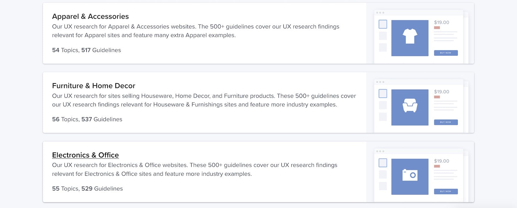
- Apparel and Accessories: 517 guidelines
- Vitamins and Supplements: 478 guidelines
- Direct to Consumer: 412 guidelines
- Groceries: 413 guidelines
- Digital Subscriptions and SaaS: 184 guidelines
Note: this is only a small sample of the industries we have in our Premium research findings, with Digital Subscriptions and SaaS having the lowest number of guidelines at 184.
E-commerce site users mostly share the same issues, whether on a Mass Merchant, Apparel, or Food Delivery and Takeout site.
If we take Mass Merchant sites we see that 97% of “General” E-Commerce usability issues and user behavior patterns are also applicable to Mass Merchant sites.
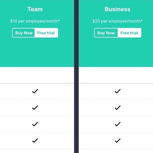
Looking at Digital Subscriptions and SaaS — our industry with the most extreme differences compared to “General” E-Commerce — we see that 30% of “General” E-Commerce usability issues and user behavior patterns also apply to Digital Subscriptions and SaaS sites.
Therefore, even when we consider sites that don’t sell physical products — and thus there’s no need to consider shipping and returns issues, and minimal consideration needed for other critical areas like “product” images, filtering, search, and so on — we find that Digital Subscriptions and SaaS sites still share one-third of the usability issues and user behavior patterns that “General” E-Commerce sites have.
If we return our focus to the sites above that sell physical products — albeit in different industries — the difference between any individual industry and “General” E-Commerce is small, with Direct-to-Consumer having the lowest number of shared usability issues and user behavior patterns at 74%.
Most “General” E-Commerce UX Research Is Applicable to All Sites Selling Physical Products
So where does this leave us when considering if e-commerce research for “your” industry is applicable to “mine”? Or when considering if e-commerce research conducted with mobile users is also applicable to desktop users on the same site?
Understand the Underlying UX Issue
First, it’s more likely than not that our research — whether published in our public articles or in our Premium research findings — will be applicable to any particular e-commerce site (as long as it sells physical products).
It’s therefore key, when considering a research article or guideline, to understand the underlying user issues that the research is discussing.
In particular, even if a specific industry isn’t represented by a test screenshot or video in an article — that is, the visuals don’t “look like my site” — it’s prudent to first understand the user issues described before discounting the research as “not applicable to my site”.
Indeed, we typically find that user issues are highly generalizable regardless of platform or industry.
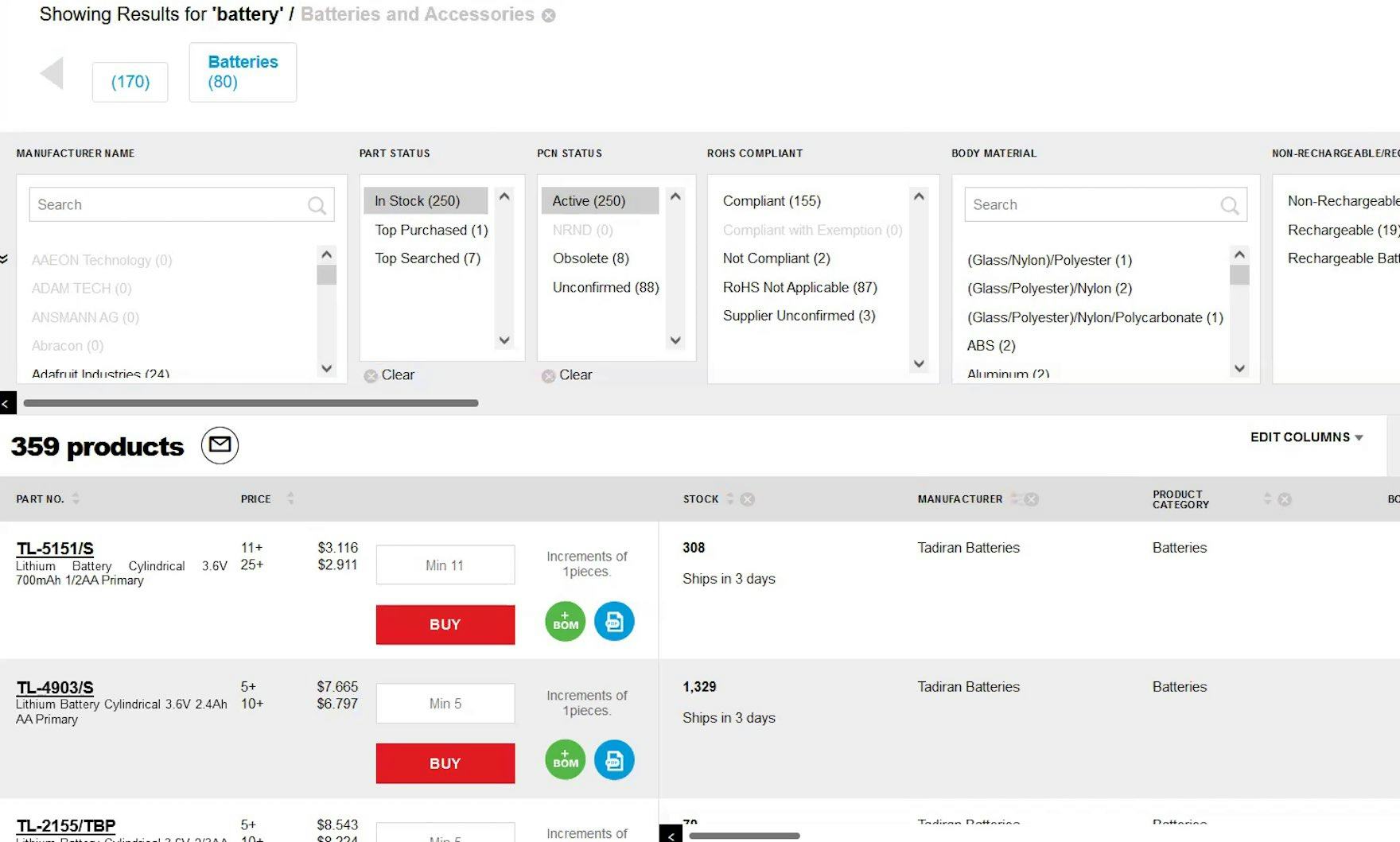
For example, users on B2B Electronics Components and Machinery sites, as well as users on Mass Merchant sites, need powerful filtering options to find the product they’re looking for, as users often have to contend with considering hundreds or thousands of similar products.
If the filters they need aren’t available, users on either B2B Electronics Components and Machinery sites or Mass Merchant sites may end up leaving the site without finding a suitable product.
Instead, where there tends to be more divergence is when discussing UX solutions — for example, the specific filters needed by an Electronics Components and Machinery site will differ from a Mass Merchant site (though a few will be shared across both).
However, the underlying user issue is the same regardless of the industry: insufficient filter options can lead to overwhelming product lists and abandonment.
If we take another example, “General” E-Commerce users run into issues if there aren’t “Lifestyle” images — images showing a product in a use context — provided for a product under consideration.
Similarly, users shopping for Furniture and Home Decor products (one of our current industry research tracks) also need “Lifestyle” images — but they need more “Lifestyle” images than users shopping for more general, less expensive products to feel confident in moving forward with a purchase.
Consider How the Research Findings Relate to Your Specific Context
Second, while our starting point can be “this research will apply to my context”, it’s key to investigate where the research findings may differ.
After all, there are some mobile considerations that are only applicable to mobile users, and some research findings may be contradictory when considering a particular industry.
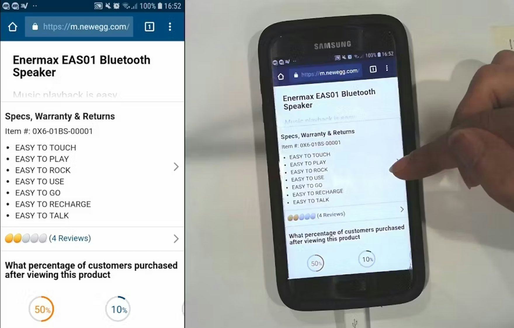
Issues mobile users experience often concern how mobile users are physically interacting with the screen, or the reduced overview of the interface, when compared to issues desktop users have (seen here at Newegg).
For platform-specific differences, we’ve found that the differences most often center around mobile-specific interfaces (e.g., being more constrained than desktop interfaces) or interaction methods (e.g., using the mobile keyboard or tapping the mobile screen).
If the research is focused on other areas — for example, the user need for “Lifestyle” images — the mobile context will matter much less, if at all.
For industry-specific differences, consider the few ways your industry differs dramatically from “General” E-Commerce.
For example, DTC sites typically have much smaller catalogs compared to “General” E-Commerce sites — and thus have much less of a need for robust search features.
Or, for Travel Accommodations sites, a key consideration is obviously where the accommodation is — hence a stronger user need for maps and other location-related information and features.
If Necessary, Tweak the Research Findings for Your Specific Context
Third, after determining that the underlying user issue is applicable to your context, and considering how your context may affect the research findings presented, it’s best to adjust the research findings if necessary to match your context.
After all, our research can’t account for all sites’ individual contexts, given the vast diversity of sites in e-commerce (which is obvious when considering our e-commerce UX benchmark).
Therefore, if necessary, it’s entirely appropriate to use the research recommendations as a starting point for further investigation.
For example, our search research provides guidelines on the types of search sites need — in general — to support.
These findings can be made more appropriate for your industry and your site by considering the data you have on your own users — for example, an analysis of the search logs may indicate that one or another search type is more important, and thus should be given priority when attempting to improve the search feature.
(For platform-specific research, it’s not typically necessary to tweak the research findings for desktop if they only apply to mobile or apps, and vice versa, as a guideline not being verified for a platform is an indication it simply doesn’t apply to that platform.)
Consider How Specific UX Research Applies in Your Context — Even if It’s Not Obvious
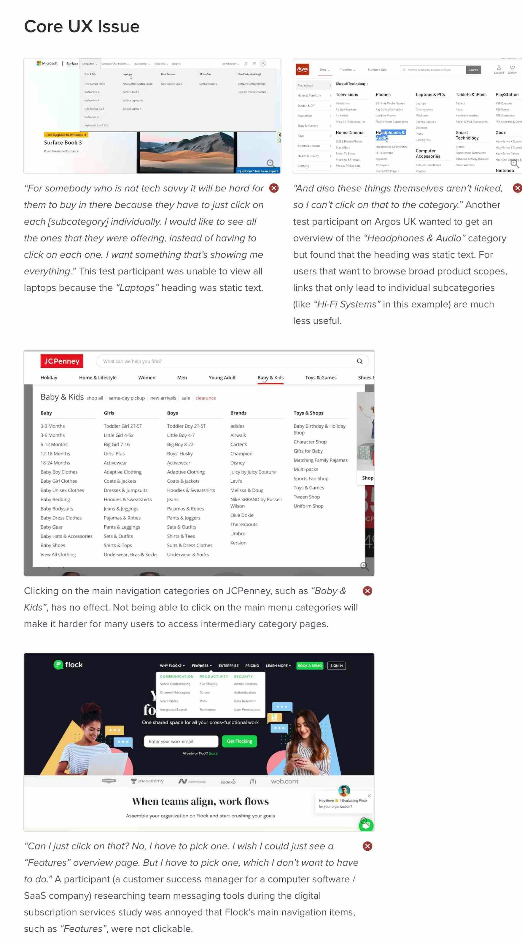
The same usability issues often occur across sites, even if the sites are in different industries. Here test participants on Microsoft, Argos, J.C. Penney, and Flock all tried clicking a menu category heading in the main navigation, to no avail.
At Baymard, we understand that it can be jarring to read UX research and not find a screenshot or video of the industry or platform you care about represented in the test findings.
Yet our 130,000+ hours of large-scale e-commerce UX research — across a variety of industries and for desktop, mobile, and app platforms — indicates that the research is generally applicable for most sites selling physical products, whether on the desktop or mobile site or in an app.
Even if the industry you’re interested in isn’t directly addressed in the text or test screenshots, it’s important to consider whether the underlying UX issue discussed still applies.
If it does (and it most likely does if it’s not a platform-specific issue) then it’s a matter of considering how your context may affect the research findings, and tweaking the guideline recommendations so that they align with your site-specific insights.
In the end, while users and sites are incredibly diverse, we find that users generally set their expectations by browsing e-commerce sites such as Amazon, Walmart, and the other large sites.
When they come to your site, some of their expectations and needs will shift — yet the vast majority will remain the same.
Thus, it’s less a question of “Is this research applicable to my site?” but rather “How is this research applicable to my site?” that should be your starting point when considering our research findings.
This article presents observations and insights from 130,000+ hours of UX research resulting in the 650+ UX guidelines available in Baymard Premium – get full access to learn how to create a “State of the Art” e-commerce user experience.
If you want to know how your desktop site, mobile site, or app performs and compares, then learn more about getting Baymard to conduct a UX Audit of your site or app.

