Key Takeaways
- Our new research has uncovered 1,200+ usability issues specific to Travel Tours and Experience Booking sites
- The research has resulted in 280+ guidelines that describe the issues, as well as design patterns verified to perform well for users
- In particular, the research provides insights on the content and features Travel Tours and Experience sites need to provide users to ensure they’re able to make a purchase decision
At Baymard our research team has just spent 1,700+ hours usability testing and researching Travel Tours and Experience Booking website features, layouts, content, and designs — leading to our new study on Travel Tours and Experience Booking UX.
The research is based on more than 311 qualitative user/site usability test sessions following the “Think Aloud” protocol (1:1 remote moderated testing).
The test sites focused on small- and medium-sized sites offering a variety of tours and experiences, including the following:
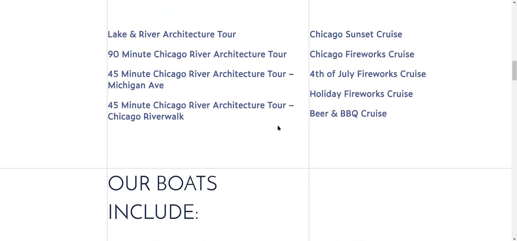
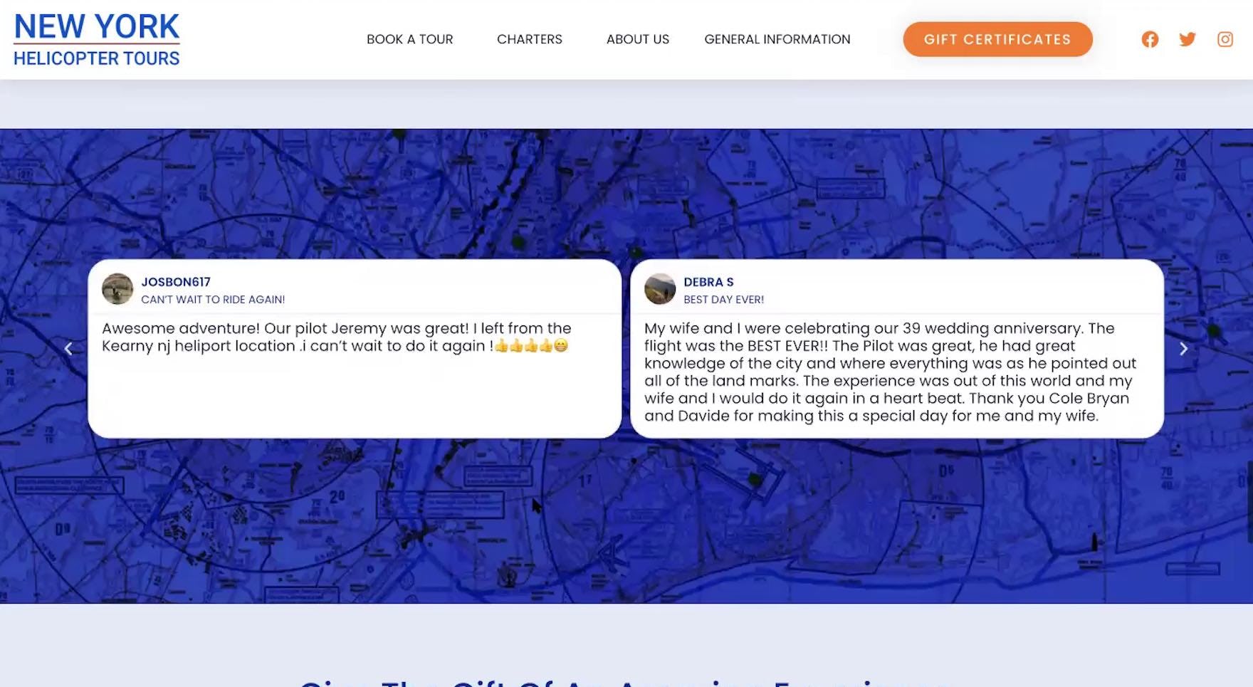
- Helicopter tours of New York City: HeliNY Sightseeing, New York Helicopter Tours, Zip Aviation
- River tours and lake cruises in Chicago: Shoreline Sightseeing, Tall Ship Windy, Wendella
- Guided tours and activities in Hawaii: Blue Hawaiian Activities, Roberts Hawaii, Volcano Tours
- Group walking tours in London: Fun London Tours, Golden Tours, London Top Sights
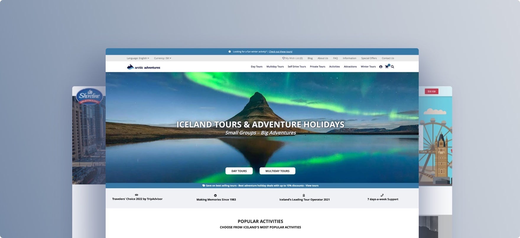
- Guided tours and adventures in Iceland: Arctic Adventures, Gray Line Iceland, Reykjavik Excursions
During testing, users at these sites frequently ran into issues that severely disrupted their ability to efficiently explore and book a tour.
Indeed, during testing the users encountered 1,200+ medium-to-severe usability issues.
These issues have subsequently been analyzed and distilled into the 280+ UX guidelines found within our Travel Tours and Experience Booking research study (all of which are available as part of our Premium research).
The 280+ guidelines cover most aspects of the online exploration and booking of tours and experiences, at both a high level of general user behavior as well as at a more granular level of specific issues users are likely to encounter.
In this article we’ll introduce 3 high-level UX findings for Travel Tours and Experience Booking sites:
- “Basic” tour information is often not provided — leaving users at a dead end
- Supplementary tour information is often not provided — leaving users with critical unanswered questions
- The “Calendar Date Picker” often fails to meet users’ needs
1) “Basic” Tour Information Is Often Not Provided
When it comes to shopping for tours and experiences, testing revealed that basic tour information is critical for users considering booking.
It was thus somewhat surprising that many of the tour test sites failed to provide this basic information.
Essentially, some test sites asked participants to book a tour — oftentimes costing hundreds of dollars — without the information they needed to make a purchase decision.
As a result, many users will abandon the site to contact the tour company over the phone — or search for an alternative tour online that provides this basic information.
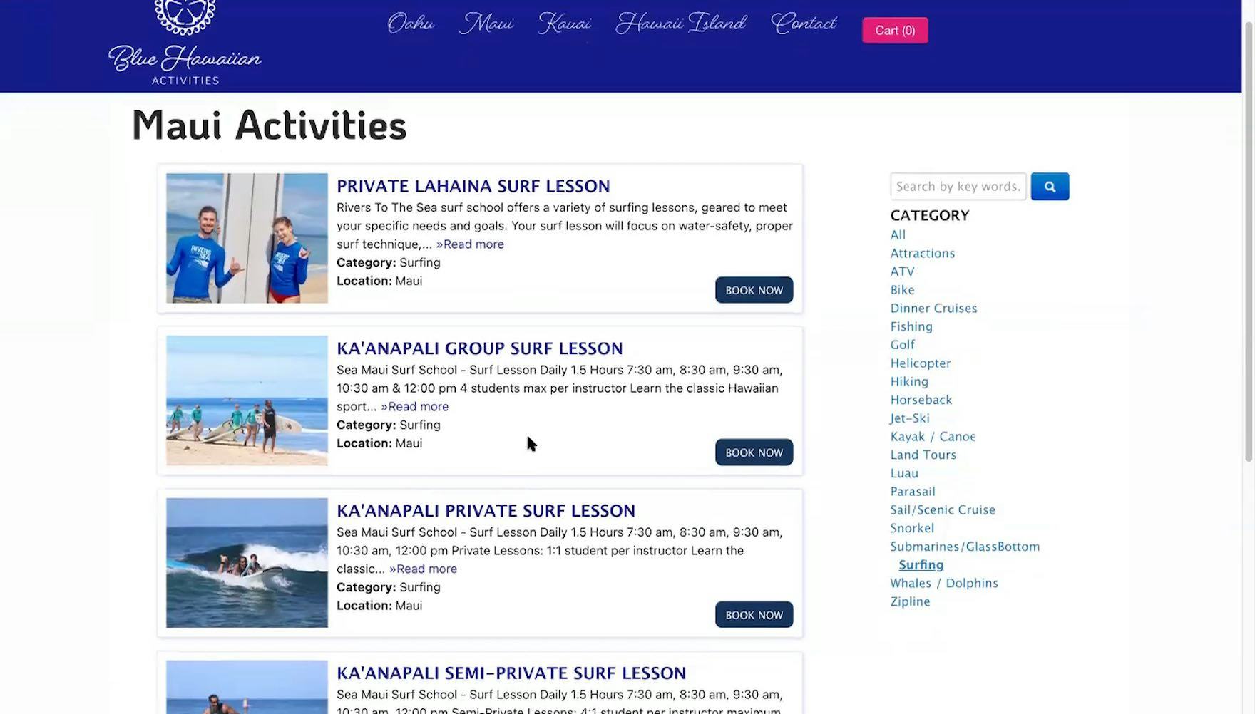
“I wish that it would show me the price right away because then that’s going to save me the time of having to click each one”, complained a participant shopping for surf lessons at Blue Hawaiian Activities. She opened a “Tour Details” page but immediately discarded the tour upon discovering the price. Missing prices in tour listing pages are always likely to make a poor impression on users.
“The thing I don’t like and just realized is there’s no pricing! I don’t want to have to go to each one I’m interested in to find out what I’m looking at for price. That is aggravating!” exclaimed another participant at Blue Hawaiian Activities. Without price, users have to spend extra time and effort to open each “Tour Details” page, resulting in a laborious and time-consuming shopping experience.
For example, as on traditional B2C e-commerce sites, price is a huge factor, both in terms of evaluating each tour or experience on its own and for comparing them to one another.
Yet, unlike on traditional e-commerce sites, where the price of a product is typically a straightforward consideration, on Travel Tours and Experience Booking sites unclear ticket types (e.g., “Kids”, “Adults”, “Seniors”, “Veterans”, etc.) and prices (e.g., surcharges for additional tour amenities, more flexible cancellation options, etc.) make tour evaluation and comparison more challenging for users.
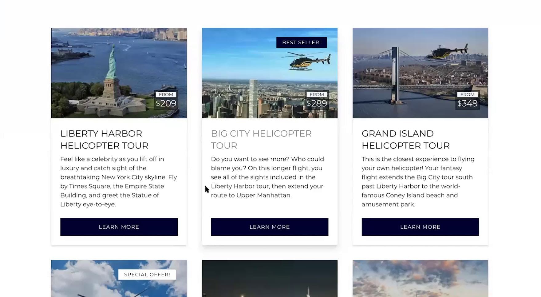
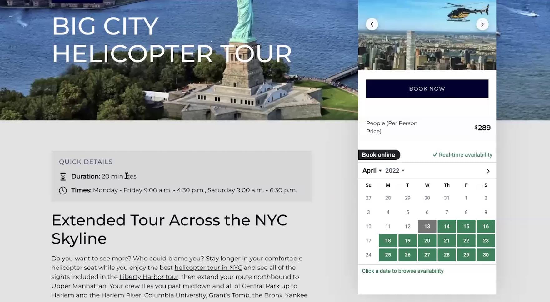
“Let’s see, ‘fly by Times Square, the Empire State Building’. This one is ‘a longer flight’, but this doesn’t tell me how long it is.” A participant at Zip Aviation struggled to compare 2 sightseeing tours in his budget of under $300 because, although one was described as longer than the other, neither included a duration (first image). He ultimately opted to explore the longer tour, discovering on the “Tour Details” page that it was a 20-minute flight (second image).
“I definitely like it more when there are pictures because I feel like it gives you more of an experience of what you’re getting before you click on it”, complained a participant at Wendella. The tour listings contained only tour names, resulting in a cumbersome and dispiriting shopping experience.
Along with price details, testing revealed the following to be “basic” tour information that most users will look for when booking a tour:
- Tour duration and start time
- Tour departure or meeting points
- Special requirements or restrictions (e.g., “for ages 16+”, weight maximums for helicopter tours, physical fitness requirements for hiking tours, etc.)
- Full descriptions of the experiences users can expect during the tour
- The cancellation policy
If any of the above information isn’t provided — or is difficult to find — at multiple locations, many users will come to a stop and fail to initiate the booking process.
2) Supplementary Tour Information Is Often Not Provided
Beyond basic tour information, testing also revealed that most users need more information when they’re trying to make a booking decision.
After all, it’s important to keep in mind that booking a tour is quite different from purchasing a product on a typical e-commerce site.
On a typical e-commerce site, product purchases can be relatively inexpensive, and return policies generous, which help allay user hesitation when users are considering finalizing a purchase.
On the other hand, when considering booking a tour or experience, users are often considering spending a significant amount of money — typically hundreds of dollars — and contending with vastly different cancellation policies depending on the tour booked.
Moreover, there’s a strong user desire to “get it right” when booking a tour — users are loath to ruin a once-in-a-lifetime trip to Iceland because the key tour they picked failed to meet their expectations.
Thus, users are extra diligent when considering booking tours and experiences — and consequently need an abundance of “supplementary” information to make their booking decision.
“I never read the testimonials on a website. I think it’s a pointless waste of space because, of course, they’re going to just put whatever nice things that they would say.” A participant at HeliNY dismissed the curated testimonials featured on the homepage outright, perceiving them to be too biased.
“Here I see testimonials, which, usually to me, I don’t really read on their main site because it’s nice that they have them, but obviously they can pick which ones they want to put on there as opposed to a third-party website”, explained a participant at New York Helicopter Tours.
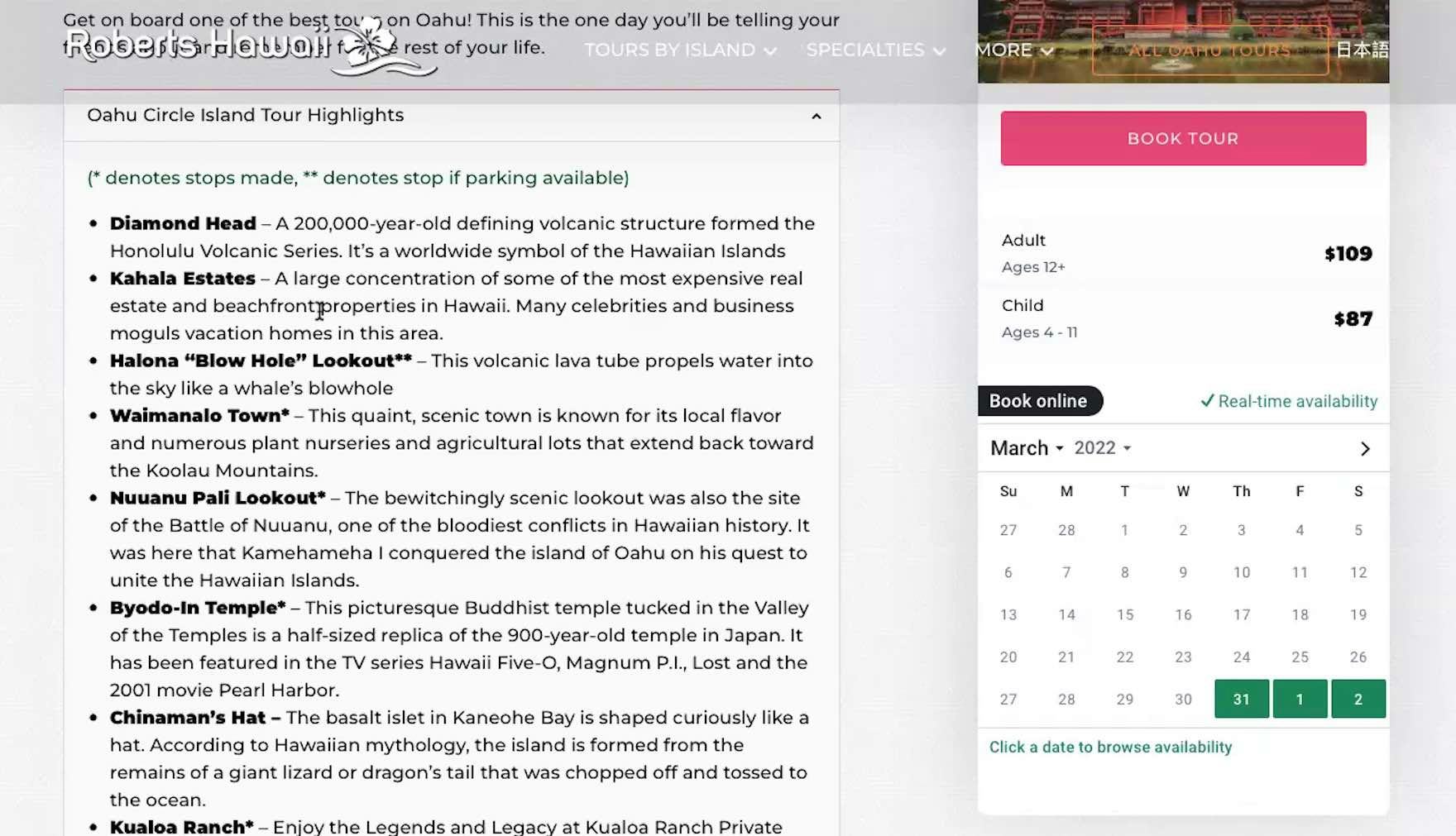
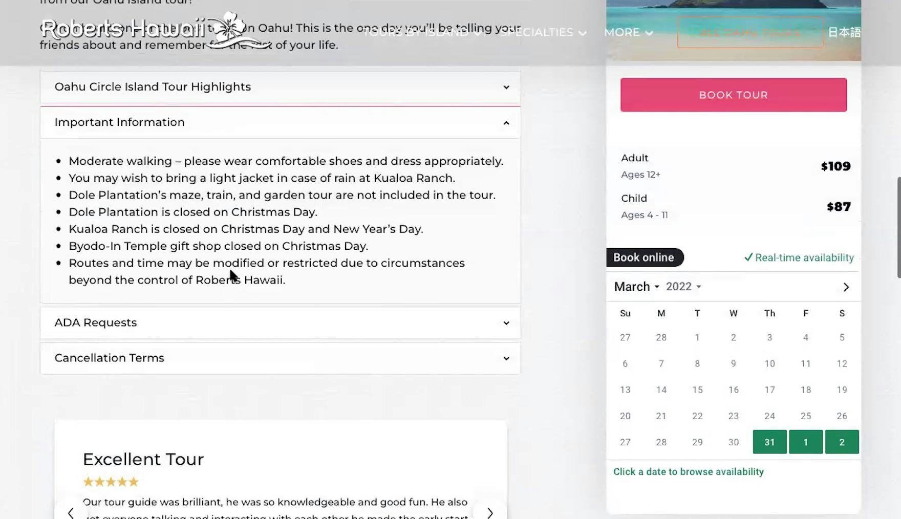
“I’m going on a day trip — I’m not going to choose it based on the food — but I’m going to want to understand, like, are we going to have to figure out what to pack the day before? I feel like if we’re driving around, this is an opportunity to stop at a great restaurant or something, and that doesn’t appear to be here. So I’m less interested in this [tour]”, remarked a participant discarding a 9-hour Oahu sightseeing tour at Roberts Hawaii. She reviewed the “Tour Highlights” (first image), then the “Important Information” (second image), but found no information about whether food and beverages were included or if there would be an opportunity to purchase food and drinks during the tour. Without sufficient details about what’s included with a tour or experience, users are unable to make a confident booking decision, increasing the risk of abandonment.
This includes, but isn’t limited to, the following:
- Third-party reviews
- Details on tour amenities
- Itineraries
- Tour group sizes
- Currency conversion
Additionally, users on travel tours and experience booking sites rely heavily on visuals when evaluating tours and experiences (just like users on traditional B2C e-commerce sites rely heavily on product images).
Tour photos, videos, and maps communicate and set expectations about the overall breadth and scope of a tour or experience, as well as provide valuable insights about the location, length, and difficulty level.
Indeed, users lose patience with inadequate or deficient visuals — for example, some users will quickly drop a sightseeing tour that lacks a detailed route map from consideration, and others are easily annoyed by the absence of a map indicating the departure or meeting point for a tour.
Therefore, travel tours and experience booking sites should invest not only in tour photos and videos, but also in interactive maps — and be mindful of their presentation — to avoid unnecessary abandonments.
3) The “Calendar Date Picker” Fails to Meet Users’ Needs
During testing, the calendar date picker served as a particularly important anchor for users considering tours and experiences.
Indeed, the calendar date picker is where users typically select an appropriate date (and sometimes a time as well), get more information about tours, and often serves as the first step in the booking process.
Yet testing revealed that the calendar date picker often hinders users considering booking a tour — rather than helping them begin the booking process.
For example, during testing users often needed additional information about a tour, and attempted to use the calendar date picker in order to access this, but were stopped when the calendar date picker didn’t link to tour information — necessitating users take a long detour to attempt to find the information they’re looking for.
Additionally, tours — typically more than traditional e-commerce products — frequently vary in terms of availability.
For example, some tours are only available during certain times of the year, while other tours may quickly sell out or have limited availability, and per-tour pricing often changes depending on the desired tour date or time.
Communicating this amount of information in a restricted interface like a calendar date picker is challenging to say the least — and many sites during testing made it difficult for users to access and understand this crucial booking information.
As a result, the calendar date picker becomes an unnecessary block to users who are either seeking more information about tours or who have already made a tour decision and are looking to initiate the booking process.
Ensure Users Shopping for Tours and Experiences Are Able to Easily Find, Book — and Get Excited About — Their Ideal Activity
Being able to efficiently gather information about a tour and successfully complete a booking process is of course crucial to users’ ability to effectively use a tours and experiences site.
The 3 overarching issues described above — not providing basic tour info, not providing supplementary tour info, and providing a difficult-to-use calendar date picker — all contribute heavily to the ultimate usability of a given tours and experiences site.
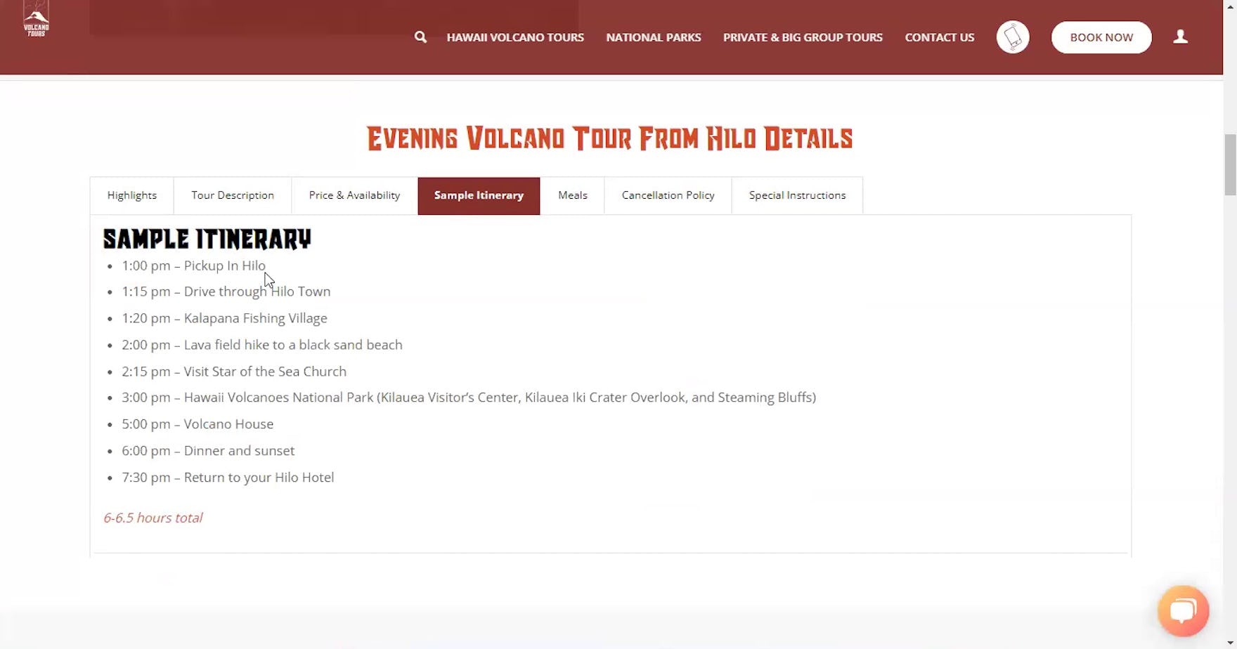
“That’s a nice one! Yeah, I would definitely book this one”, remarked a participant at Volcano Tours upon viewing a detailed sample itinerary for a volcano hiking tour. During testing, participants rarely complained about having too much tour information.
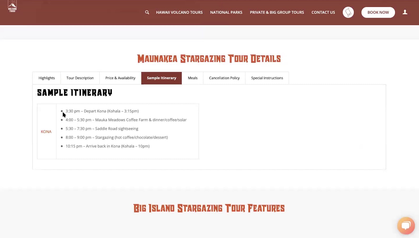
“There we go! This is great because it tells you the whole layout of what you’ll be doing and when you’’ll be doing it”, remarked another participant at Volcano Tours after he reviewed the sample itinerary for an evening stargazing tour.
Yet the sales aspect of tours and experiences sites shouldn’t be discounted — as testing revealed, users are quick to drop a particular tour from consideration if their information needs aren’t met, or a particular site’s booking process is difficult to navigate.
Indeed, users will typically have more than 1 option — often 5 or more, depending on the location being considered — when it comes to tours and experiences sites, and brand loyalty is usually low (as users are often visiting a location for the first time and thus are eager to explore their options).
Yet the need to “sell” the tour to users doesn’t mean resorting to marketing gimmicks or tricks to persuade them to book a tour.
Instead, it’s “UX basics” — with a heavy focus on providing users with all the information they need to consider a tour — that need attending to.
Otherwise, users are likely to simply go to another site — as for many users, a low-performing tours and experiences site is an indication that the actual tour itself will similarly be disappointing.
Getting access: all 280+ Travel Tours and Experience Booking UX guidelines are available today via Baymard Premium access. (If you already have an account open the Travel Tours & Experience Booking study.) If you want to know how your Travel or Booking website performs and compares, then learn more about getting Baymard to conduct a Travel Tours & Experience Booking UX Audit of your site.