
Key Takeaways
- Our new Furniture & Home Decor sites research is now available in Baymard Premium
- The new research describes the issues uncovered as well as design patterns verified to perform well for users
- This article explores 3 high-level UX findings specific to Furniture & Home Decor sites
Key Stats
- 2,500 hours spent testing and analyzing Furniture & Home Decor sites
- 1,900+ medium-to severe usability issues uncovered
- 500+ new Furniture & Home Decor guidelines available in Premium
At Baymard our research team has spent over 2,500 hours usability testing and researching Furniture & Home Decor website features, layouts, content, and designs — leading to our new study on Furniture & Home Decor UX.
The research is based on more than 275 qualitative user/site usability test sessions following the “Think Aloud” protocol (1:1 remote moderated testing).
The study included 16 U.S.-based retailer websites: Article, Ashley Furniture, Bed Bath & Beyond, Bob’s Discount Furniture, Burke Decor, CB2, IKEA, Joybird, Lamps Plus, Parachute, Pottery Barn, Raymour & Flanigan, Room & Board, Serena & Lily, The Company Store, and Wayfair.
Test sites were selected across multiple criteria. They ranged from large furniture stores to small boutique decor shops, and included both omnichannel brands and online-only retailers.
There were different geographic distribution models, with some sites offering products nationwide and others with a regional focus.
The study included both multibrand and single-brand sites. It covered a cross-section of price points from discount to high-end brands, and a variety of product types, ranging from furniture to decor to bedding.
During testing participants encountered 1,900+ usability issues, ranging from moderate to severe in impact.
These issues have subsequently been analyzed and distilled into the 500+ UX guidelines found within our Furniture & Home Decor research study (all of which are available as part of our Premium research findings).
The 500+ guidelines cover most aspects of the online exploration and purchasing of furniture and home decor, at both a high level of general user behavior as well as at a more granular level of specific issues users are likely to encounter.
In this article we’ll introduce 3 high-level UX findings for furniture and home decor sites, all related to the high-consideration nature of the shopping journey for these products:
- Visual information is critical on both the product list and product page
- Users need lots of details about product features and specifications
- Clear return policies and delivery logistics increase buyer confidence
1) Visual Information Is Critical on Both the Product List and the Product Page

“I always look at the pictures first.” The majority of test participants shopping for furniture and home decor products looked at images first in both the product list and on the product page, like this test participant at Parachute.
Most users shopping for furniture and home decor products will seek out visuals first, because while these products are both decorative and functional, the decorative aspect often takes precedence early in the shopping journey.
In testing, 65% of test participants prioritized thumbnails over all other aspects of list items when browsing the product list or search results.
(When asked what aspects of the image they were assessing, 68% said they were looking at the product’s overall style, with the other 32% focused on the product’s features, functionality, or quality.)

“If I were interested in it size-wise, I would hover over it. [But] see, this one doesn’t come to life”, a participant at Serena & Lily complained when hovering didn’t trigger access to an “In Scale” thumbnail like he expected.

“Ooh, this one’s pretty! They have a lot of colors. I’m swiping to the right to see if it will show me other pictures, and it doesn’t! I [prefer] when…you don’t have to click into it to see the different pictures.” At Pottery Barn’s mobile site, a participant interested in a sofa was taken aback that additional thumbnails weren’t offered.
Despite this focus on visuals, many test participants struggled to get enough visual information from thumbnails to make an accurate assessment of a product’s suitability.
As a result, participants often chose to abandon list items and continue scrolling the product list rather than click through to products that might not meet their needs.
To address this, sites should offer 3 or more thumbnails directly in the product list, which gives users enough visual context to decide whether an item is worth further consideration.
This is important because users have a lot to assess visually about furniture and home decor products to determine if they fit their needs, which 1–2 images often can’t adequately convey.
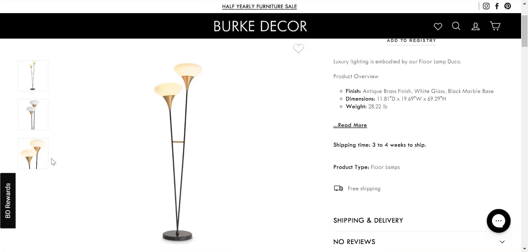
“You’re showing me three generic photos for a $2,000 lamp. I’d expect a little more effort, you know? This is terrible. I’d expect at least a photo or two in a room. Show you what it would look like.” This participant on a product page at Burke Decor was frustrated to find only 3 images of the lamp he was considering, and needed more to feel comfortable spending $2,000 for a lamp sight unseen.
The same held true on the product page, where 79% of participants interacted with the main product image or thumbnails as their first action — notably higher than the 46% on average seen in general ecommerce testing.
Yet in testing many product pages didn’t offer enough variety and quantity of images to convey all the different visual information participants were seeking.

“Oh, I like this picture. This is the style I [like], it’s the same colors as my house, more organized. This is totally the style that I want to mimic for my room, so I might just screenshot this for me to reference later on and then also to send to other people.” This iOS participant at Wayfair was so enamored by the “Lifestyle” image for the table she was viewing that she took a screenshot so she could replicate it later.

“I’m a little curious to see how tall it really is. I like to look at photos. [Two lamps] could be the same height and even the same width, but if the material [for one] just looks bulkier, then it just feels so much bigger. Seeing [this lamp] in this room, it looks delicate, it’s pretty, it’s taller than I expected.” This participant at Serena & Lily on Android used a “Lifestyle” image as an “In Scale” image, thoroughly assessing the size of the lamp she was considering by comparing it to other objects in the image.

“I appreciate that they show exactly what they’re measuring and where too, just because it’s easy to misinterpret those things if you’re just seeing them listed on a site, as opposed to showing exactly what they’ve measured within each piece of the furniture.” This test participant at IKEA felt more confident in her understanding of the written dimensions when she could reference a corresponding “Dimensions” image.
Test participants had more success on product pages that not only offered an abundance of images, but included a variety of image types as well.
Image types such as “Lifestyle”, “Dimensions”, and “In Scale” images help users trust that products will visually match their existing decor while also fitting in the intended space.
Since many online shoppers won’t see furniture or decor in person before purchasing, offering a wide range of images helps them feel confident in how the product will look and fit upon arrival.


“It’s hard for me to believe this material in this color is on this couch right now. It doesn’t look like this ’Brushed Basketweave’ at all, even when I zoom in.” After viewing the real photograph inset showing the fabric swatch (first image), this participant at Pottery Barn found it impossible to believe the updated product image (second image) featured the same material. She decided to delay her purchase by several weeks so she could receive a physical swatch of the fabric in the mail.


“I just wanted to see what the stain looks like”, this participant at Room & Board explained as he clicked on the product image to zoom in (first image). “It’s not a very good picture, it doesn’t seem like it’s high-def or HD”, he lamented when the zoom function didn’t result in all the visual information a real photograph would (second image).
More important than the image types provided is image quality, as users shopping for furniture and home decor need to explore lots of visual details, and low-quality images can deter them from suitable products.
Test participants who zoomed in on product images but couldn’t see the level of detail they expected were often frustrated, and many lost confidence in the product.
(Note that many participants expected to be able to zoom on any image in the gallery, except for clearly “functional” image types like “In Scale” and “Dimensions” images.)


“I like the fact that they give you a close-up…[zooms in on close-up image]…I like that you can get a super close-up as opposed to a predetermined close-up. I like that I can control that. I can get a really good sense of what this tabletop is like.” This participant using an Android device at Bob’s Discount Furniture appreciated the “Feature Callout” image showing a close-up of the tabletop (first image), and was even more pleased when he saw how much further he was able to zoom in on it (second image).
Therefore, sites should ensure all product images have resolution and level of zoom sufficient to convey a photorealistic level of detail.
High-resolution images and videos allow users to thoroughly assess the “look and feel” of the product when they aren’t able to see it in person.

“To me this is more useful than the [AR feature]…the ability to zoom in and take a closer look at it. I just feel like I get a better look at the whole thing this way. Yeah, I think it’s more important to look at the thing itself than [‘View in] Room’ using that tool. This is more useful information to me.” In testing nearly all participants found product images to be more useful than AR features, like this Android participant at Joybird scrolling through the main image gallery on a product page.
In testing, high-quality images were more effective than any other feature or content in helping participants feel confident enough in their assessment of furniture and home decor products to purchase them sight unseen.
This included features like Augmented Reality (AR); in testing, 87% of test participants who encountered “View in Room” features unprompted chose not to use them, with most citing negative prior experience as the reason.
Sites should thus prioritize image quantity and quality for furniture and home decor products, as seeing features or product quality consistently depicted across many high-fidelity images provides reassurance to users that the product will meet their expectations.

“Here’s some customer photos, and clearly it goes really nicely in a lot of different environments. So I would say it’s definitely worth considering, for sure.” This participant at Room & Board felt more confident the table would work well in her home after seeing it across a lot of different environments in the social media carousel on the product page.
When those features or product quality are also reflected in user-generated content like images and videos from social media or user reviews, users feel even more confident they’re truly getting what they’re seeing.
2) High-Consideration Journeys Require Higher Levels of Detail
“If I’m going to spend $3k or $4k, I want to make sure I have the same feeling about it tomorrow as I do today.”
As this test participant points out, furniture and home decor items are often long-term investments, requiring more careful consideration than users may typically put into other online purchases.
Indeed, in testing, participants shopping for furniture, home decor, and housewares products shopped on average 25% slower than participants shopping for non-luxury apparel and accessories (when controlling for most variables).
The high-consideration nature of these products results in users spending more time on the product page doing research before adding to cart.
As another participant explained, ”When it’s a bigger purchase, I’m a really slow shopper. I might spend an hour or two looking at a particular product and reading the information about it.”

“I want to know more about, does this thing extend? If so, by how much? What is the purpose of this thing down here? Is that purely design or is it functional? I was scrolling through here, didn’t see too much.” This participant at Burke Decor was frustrated with the lack of detail in the product description, which left a lot of unanswered questions.

“It includes one fitted sheet and one pillowcase set. So does it mean it has two pillowcases? Does it only have one — like, is it two pillowcases with the pillowcase set?” This participant at Parachute checked what items were included in the linen sheet set she was considering in the “About” section of the product description, but it wasn’t clear whether the ”Pillowcase Set” had 1 or 2 pillowcases. For sets and bundles, it’s critical that the product description make it clear exactly which items are included.

“I don’t know what this is made out of. I just would close this, cause I need to know what it’s made out of. And so, that’s it. I found nothing on Ashley.” This participant at Ashley Furniture wasn’t satisfied with the “metal construction” description of the table, wanting to know exactly what metal the table was made of, and ultimately abandoned the site.
But when product pages lacked sufficient detail for these high-consideration items in testing, participants were much less likely to proceed with a purchase.
Even after spending weeks or months researching options, users may still abandon the purchase due to a single missing detail, highlighting how critical they perceive complete information to be for these types of purchases.

“I like how they say ‘Small cracks can develop’ and that it will vary because it tells me it’s real material. This is information, nice info that they give here that was not provided on the other site. So I can have expectations.” This participant at Article explained how the detailed descriptions of the material gave him confidence the product was made of genuine material and set his expectations for how it might vary over time. Going into additional detail in layperson terms about materials that users may be unfamiliar with can help increase buyer confidence.

“We’ll go to ‘Details’. I love ‘gauze fabrication made of 100% cotton’. Yeah, I actually have like face towels that I use that are that same material. So I already know that I would like the feel of it.” This participant at Parachute was pleased to see a type of gauze cotton mentioned in the “Details” section, as she was familiar with the fabric and it made her confident she’d like the feel of the duvet.
Therefore, sites must provide comprehensive product information to give users enough detail to feel confident making a major purchase online without seeing it in person.
Although specific details may vary by product type, some information should be offered for almost all furniture, home decor, and housewares products.
This includes material and care information, which nearly all participants sought out in testing, to better understand a product’s “look and feel”, its composition, and the requirements for maintaining it.

“It says ‘Order free samples’. That’s something I might do ‘cause I am a touchy person, so I want to feel it. There’s nothing worse than to buy something you really like, it looks good, but it just does not slap when you’re laying down on it. Like it’s just not a nice material. Maybe it’s itchy or whatever.” This participant at Raymour & Flanigan on Android appreciated the option to order a sample, offering her a way to assess the tactile feel of the $2,000 couch’s fabric.

“Oh, it’s nice that you can get swatches for them. ‘Cause like I was saying before, they sometimes look very different in photos versus real life.” Another participant at Raymour & Flanigan on iOS wasn’t sufficiently confident in the images of the material for the $1,600 couch, preferring to get a physical sense of it as well before ordering.
However, some users will need more than “material and care” information, requiring something tactile to truly grasp how a product might feel.
So offering options like material samples for a subset of the catalog can help users feel more confident in “look and feel” when high-quality images or clear descriptions aren’t enough.

“I almost wonder if I might be able to go to Seattle and see it. It might be worth it because the price here, that’s an expensive sofa. I kind of hesitate buying a sofa online without seeing it first. So [I’ll click] on that, ‘On Display In My Store’.” This participant at CB2 appreciated the option to easily check if the sofa was on display at a nearby store; the option to see it in person made her more comfortable with the idea of purchasing such an expensive item online.
Of course there will always be users who need to see the item in person before committing to a purchase.
Offering “Find in Store” locators, store pickup options, and other omnichannel features to aid them in easily locating the product in stores or showrooms can help reduce abandonment by this subset of users.
3) Ease User Concerns Over Cost, Delivery, and Returns Logistics
Choosing a piece of furniture or home decor is one challenge, but figuring out how to get it delivered, how to pay for it, and what to do if it doesn’t work out is another.
In testing, participants who couldn’t find clear information about delivery or returns often abandoned their purchase, highlighting how gaps in logistics information are especially detrimental to high-consideration purchases.


“[reading out loud] ‘We stand behind the products. Your satisfaction is guaranteed.’ Blah blah blah’ Okay, it’s a lot of information…[But] I wouldn’t buy it until I knew for sure that I could return it with no cost if I didn’t like it…” This participant at Lamps Plus tried to read the lengthy return policy, but wasn’t able to find what she needed quickly, and considered abandoning the purchase instead of weeding through the dense text (first and second images).

“So if I ordered this, I’m just wondering if it’s returnable.” This participant at Raymour & Flanigan wasn’t sure if the sofa she was considering was returnable or not, and the product page provided no information to answer her question. High-cost items represent a significant financial commitment and most consumers lack the financial flexibility to absorb the cost of a mistake, a concern that a clear and flexible return policy can mitigate.
Indeed, in testing many participants shopping for expensive furniture products like sofas actively sought out the return policy as early as the product page.
Many participants perceived returns for these types of products as complex; as one participant explained, “It’s a large piece of furniture. It’s not like a little trinket I can return and I just box it back up”.
But when the return policy was difficult to locate or buried within a generic page, participants in testing abandoned the product — or even the entire site — out of concern that returning the item, if necessary, would involve excessive effort or risk.

“And then I see ‘90-day returns’ too. That’s what I like to see if I’m going to spend a couple thousand dollars. I would spend maybe 30% more knowing that I have 90 day returns.” A participant at Joybird was pleased to see he had a lot of time to return the sofa he was considering, which made him more willing to spend extra, knowing he could not only return the sofa if it didn’t fully meet his standards but also had 90 days to work out the logistics of doing so.


“No way I’m throwing a couch in my car to return to the store. So just looking to see what their policy is for that”, this participant at CB2 explained as she scrolled down the cart to look for information about the return policy and found a link reading “Our Return/Exchange Policy” (first image). She clicked the link and an overlay opened with the level of detail she was looking for: “So it seems like you have to call them within seven days and after that it has to be back within 30 days. And you have to pay a restocking fee which totally makes sense for a product like that. So I would be satisfied with that” (second image). She continued on to checkout.
To address these concerns, it’s important to ensure the returns policy is accessible throughout the journey, as users seek this information at different times or in different places.
This includes the product page, cart, checkout, and even the product list; transparent policies build trust and can be a deciding factor in completing a purchase, but only if users can find them.
The return policy itself should clearly detail what is required of the customer to complete the return, so users can feel confident they can get their money back if the item doesn’t meet their expectations.


“And then probably I would go into delivery options…” a participant at Article explained as she motioned over the “Buy” section, but trailed off when she realized no information about delivery options was provided (first image). She continued perusing the product page for information about how the product could be procured after purchase, but ultimately had to add the table to her cart and progress through checkout to see the available fulfillment options and their associated level of service and cost: ”I’m sure there will be more delivery information listed here…okay, so ‘Front Door Delivery’” (second image).


“I’ll ‘Add to Cart’ and see if they allow pick-ups. It seems like most of the time, even though it says ‘shipping and handling’, it allows you to pick up.” A participant at CB2 wasn’t sure if the site offered fulfillment options beyond the “Ship” option displayed on the product page (first image). She added the item to her cart to check if pick-up was available, which it was (second image). She was frustrated that she had to go to the cart to find that information.
Participants in testing were also often unwilling to make a final purchase decision until they could factor in delivery costs and logistical challenges, seeking out delivery and pickup options earlier than they might for general ecommerce products.
However, many test sites failed to present delivery and pickup options on the product page or even in the cart, forcing participants to advance to checkout to find these details.
This issue was exacerbated when participants were still evaluating or comparing options, as they had to repeat this tedious process for each item they were considering.

“It’s nice to see what possibilities there are and about how long they might take. If for the same price I could get it delivered for free today or even maybe for a small fee, versus having to wait for it to ship and get to me in a week or two, or if I could just pick it up at a local store. It’s nice to see that here, not just in the final checkout screen. That way I can start thinking about it before I go through the process of purchasing it. It might make a little bit of a difference as to whether or not I choose one versus another.” This participant at Bed Bath & Beyond on iOS found the fulfillment selector critical to her decision whether to purchase the item or not.

“It says ‘Currently unavailable’, but I can pick it up in a store at Renton. Ok, so perfect. I would pick that up in Renton. I’m not sold on it, but I like knowing that I can move forward.” This participant at IKEA on iOS almost abandoned a sofa she was considering because it was unavailable for ship-to-home delivery, but then noticed it could be picked up at a nearby store instead, which was an acceptable alternative to her. She eventually purchased the sofa for pick up.

“I actually think it’s nice that you can pick a day like this because if you don’t work at home, it’s nice to have it more scheduled than just have to play the guessing game.” This participant at CB2 on iOS was pleased the site let her choose a specific delivery date so she could plan ahead to be available.
Thus providing detailed information throughout the customer journey about delivery options, starting at the product page, helps users manage expectations and plan ahead.
Clearly highlighting available delivery and pickup options, along with timing, cost, and any specific requirements (e.g., needing two people to lift an item at pickup) allows users to consider these factors when it’s most relevant to them.
At checkout, offering scheduling options in particular further increases buyer confidence, as it reassures users that they can plan around their own availability, reducing stress and uncertainty around receiving their delivery.

“I love that they have the four payments interest free. That always makes it a little bit easier to do things that you’re not expecting to purchase.” This participant at Lamps Plus was only planning to purchase one lamp but found herself considering a set of two. She was more comfortable with the bigger purchase once she saw a buy now, pay later (BNPL) option was available, and ended up buying the lamps.

“One of the next things I go to before I keep shopping is just to see, ‘cause I don’t have liquid cash, so I would be looking at what type of installment plan I could do.” This participant at CB2 on iOS shopping for a sofa was about to abandon the purchase until he saw that the site offered financing options (here a credit card offer).
Cost is another barrier to purchase that sites often have limited control over unless they can offer financing options.
Expensive items like art or furniture aren’t easy for most users to afford; as one participant pointed out, “A $4,100 couch. Like, I’ve had cars that cost less than that.”
When buy now, pay later (BNPL) or other forms of financing are available, prominently displaying them can help cost-conscious users factor these options into their purchase decision, increasing the likelihood of purchase for some.

“This [site] has ‘free and easy returns’. So this is my kind of place. They probably assume you’re going to like it, but if you don’t, they’re not going to give you an issue about it.” The clear and simple return policy at Room & Board was highlighted on nearly every page throughout the customer journey, making it easy for customers like this test participant to proceed confidently with purchase.
By making it easier for users to understand and navigate complex logistics and increasing their confidence that things will go as planned, furniture and home decor sites can help users focus on the core decision at hand: which item to purchase.
Facilitate a Long, Research-Intensive User Journey for Furniture and Home Decor Products

“[I] would spend certainly a substantial amount of time on this page making doubly sure that it’s what I want. Particularly with furniture where there’s usually shipping costs associated, [and] if something were to go wrong, returns can be highly problematic. I really want to cross my T’s and dot my I’s.” This participant at Bob’s Discount Furniture explained why she would thoroughly read through the product page before purchasing.
The issues Furniture & Home Decor participants encountered during testing closely resemble those faced by general e-commerce users.
However, the high-consideration nature of the furniture and home decor shopping journey, regardless of price, can amplify minor issues, turning what might be tolerable in other categories into potential dealbreakers here.
Users want to be confident about the factors they can control, as there are already so many risks inherent in shopping for these items online.
Therefore, in order to have a high-performing furniture and home decor site, it’s essential to ensure the site performs well across a wide range of UX considerations.
This includes the homepage, where users seek out inspiration, to the category taxonomy, which users rely on to guide them through product catalogs.
Product lists require comprehensive filtering options, clear and jargon-free labeling, and lots of thumbnail images.
On the product page, images and other visuals are of top priority, as is in-depth product information, all of which must be clearly communicated without overwhelming the user.
Lastly, a clear and clean cart and checkout experience is vital to ensure users follow through and convert.
Making sure the site performs well across the spectrum of e-commerce UX will set a solid foundation for user success, which can then be refined further by applying the Furniture & Home Decor-specific guidelines included in this new study.
Getting access: all 500+ Furniture & Home Decor UX guidelines are available today via Baymard Premium access.
If you want to know how your furniture or home decor desktop site, mobile site, or app performs and compares, then learn more about working with Baymard to conduct a Furniture & Home Decor UX Audit of your site.