Key Takeaways
- Baymard’s large-scale testing reveals that 87% of users largely avoid AR features when furniture shopping
- When AR technology is used to model furniture in a room, it often generates doubt about product suitability and delays purchasing decisions
- Instead, invest in high-performing images on the product page to better help users effectively visualize furniture
Video Summary
When furniture shopping at brick-and-mortar stores, users can view a product from any angle to envision how it will fit in their home and simply rely on a handy tape measure to make or crush their decorating dreams.
But online, users struggle to asses the form factor and attributes of online furniture products and primarily rely on 2D information to make informed decisions.
When it debuted, augmented reality (AR) was all the rage – aspiring to help users visualize products in real spaces, build confidence in pricey purchases, and reduce returns.
However, Baymard’s large-scale research into Furniture and Home Decor reveals most users find the “View in Room” AR feature unhelpful and actively avoid it.
In this article, we’ll discuss our Premium research findings enumerating the issues users face with AR. We’ll cover:
- 5 reasons why AR features should be deprioritized
- The most helpful visual aids to use to assist those shopping for furniture and decor
5 Ways “View in Room” AR Introduces Doubt and Delays Purchase
Despite the potential of the “View in Room” feature, only 6% of participants sought out and used it proactively during large-scale testing.
For those few who engaged with the AR tool, the experiences were largely problematic for at least 1 of the following 5 reasons:
- Negative prior experiences
- Real-life space constraints
- Insufficient instructions
- Clunky controls
- Low-quality 3D models
Note: Testing included sites that offer web-based AR using USDZ files within native mobile AR viewers. Participants did not encounter any app-based or custom AR experiences.
1) Negative Prior Experiences
In testing, 87% of test participants who encountered “View in Room” chose not to use it, with most citing negative prior experiences as the reason.
Some found the feature difficult to use in the past and weren’t interested in trying again: “I typically don’t [use AR] because I tend to find it hard to work with. It’s not very user-friendly.”
Other participants distrusted the feature’s accuracy for critical considerations like fit: “I would go measure [instead]…I’m just not comfortable with AR [showing] it in a hyper-accurate way and sometimes furniture needs that precision.”
Indeed, sample quotes from participants during testing illustrate a general reluctance to engage with AR features:
- “I know [on] some of the furniture websites you can place it in your room…When I tried to use that feature, it was just so frustrating I couldn’t get it to work and I was just like, whatever.”
- “I know there’s ‘View in Room’ features and I’m guessing that [it’s] somewhere on this [page]…but even when those are offered, I don’t get a lot of value out of those typically.”
- “‘View in Your Space’…I don’t use stuff like that though. That’s like an AR thing. I’m going to get out of that…I’ve tried it before and it just doesn’t seem like it is really accurate and it doesn’t really help me very much.”
- “I’ve used it one time before…I don’t want to say gimmicky, but…it’s not like something that I make sure that I use that feature.”
When users make the effort to try AR and fail to get sufficient (or any) value out of the experience, they are less likely to try it again on any site.
2) Real-Life Space Constraints
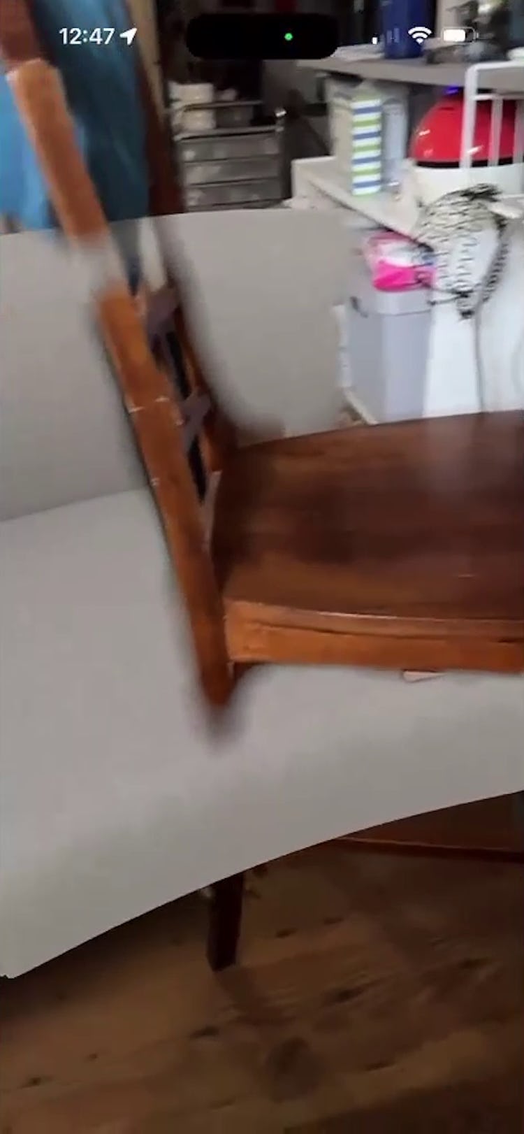
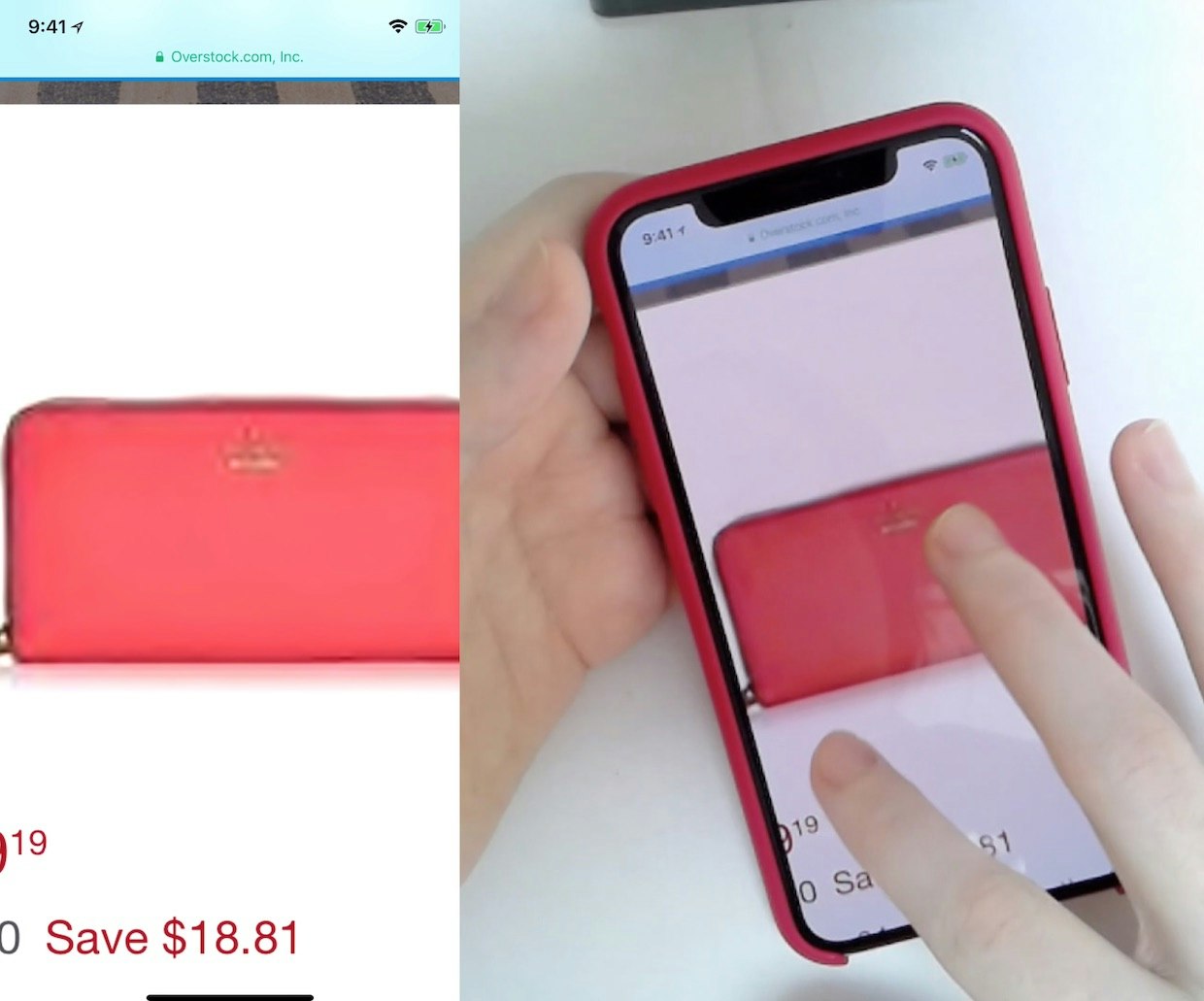
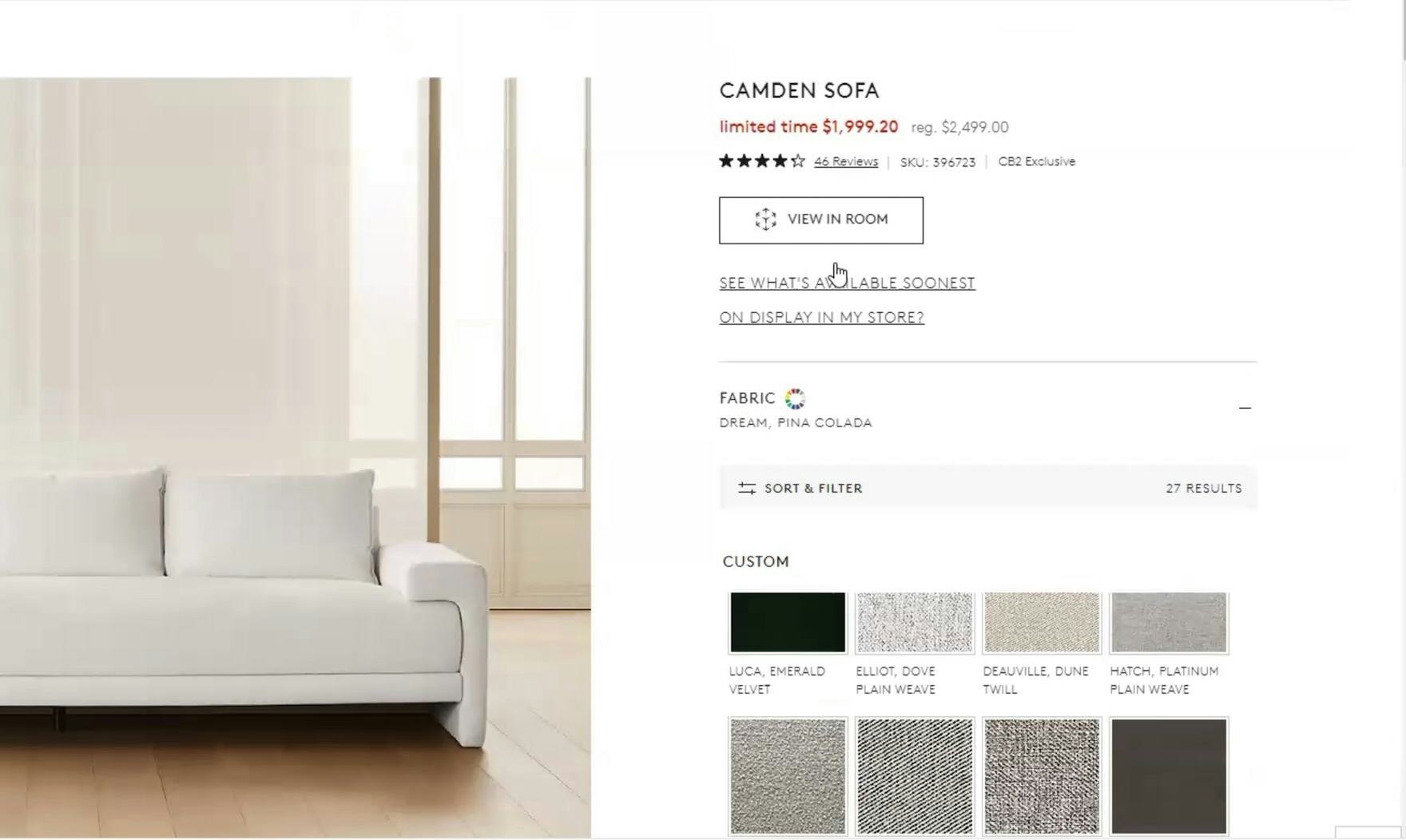
“I wouldn’t really be able to use that unless I had an empty space, ‘cause I saw that the stool was coming through the couch.” In fully furnished rooms, users often have to superimpose the AR model over existing furniture, like this iOS participant did at CB2, which doesn’t offer them a realistic representation of the product.
Another challenge users face when considering “View in Room” is whether they have enough physical space to use the tool effectively.
Some users may be in rooms that are too small for AR to work well — even though the item being considered might fit — like this participant noted in testing: “I have used ‘View in Room’ before…I don’t really anymore, just because I don’t have that much space.”
Other users prefer to only try AR in empty spaces, as rooms filled with existing furniture make the product difficult to evaluate, as this test participant experienced: “It’s also tricky ‘cause in my actual space I have a couch where I would put the [new] couch. So I don’t actually know if that would work…there’s not an empty spot there where I can just see what it would look like.”
Lastly, some users may be away from home and not in the space for which they are purchasing the furniture.
Space constraints and other physical barriers often deter users from trying “View in Room” before they even have a chance to consider its usefulness.
3) Insufficient Instructions
The few users who overcome AR’s mental and physical barriers will next need to contend with its usability challenges.
In testing, many participants experienced friction immediately when opening the AR feature when it lacked the proper guidance to help users get started.
When instructions did appear, they were not always responsive to participant movements or relevant to what the participant was trying to do.
When instructions (also known as “coaching”) aren’t provided, users may try tapping buttons indiscriminately or abandon the feature altogether.
Guardrails are important to build into experiences when their usage can result in significant negative consequences, such as the loss of a big purchase; this application of AR was frequently under-equipped to help prevent or reduce user problems.
4) Clunky Controls
Even if users successfully figure out the tool’s basic functions, they may struggle to use the controls with any precision—a crucial element of this task.
The potential of AR lies in its capacity to manipulate the model along three planes of movement: side to side, back to front, and up and down.
Yet users are directed to use the same “touch and drag” movement for all three planes; when a user’s gestures don’t work as expected, they don’t know how to fix it.
Users experience similar issues with the “resize” and “rotate” controls, which both use two-finger pinching movements in some capacity.
However, some test participants resized the 3D model without realizing it, resulting in inaccurate conclusions about the product’s size or fit.
Others intentionally resized the product but then forgot they’d done so and proceeded to evaluate it based on the wrong size.
Users often don’t realize that making certain changes within the tool can lead to a skewed representation of the product.
As a result, they might incorrectly perceive the product as suitable (or unsuitable), as their judgment is mistakenly based on the modified characteristics.
5) Low-Quality 3D Models
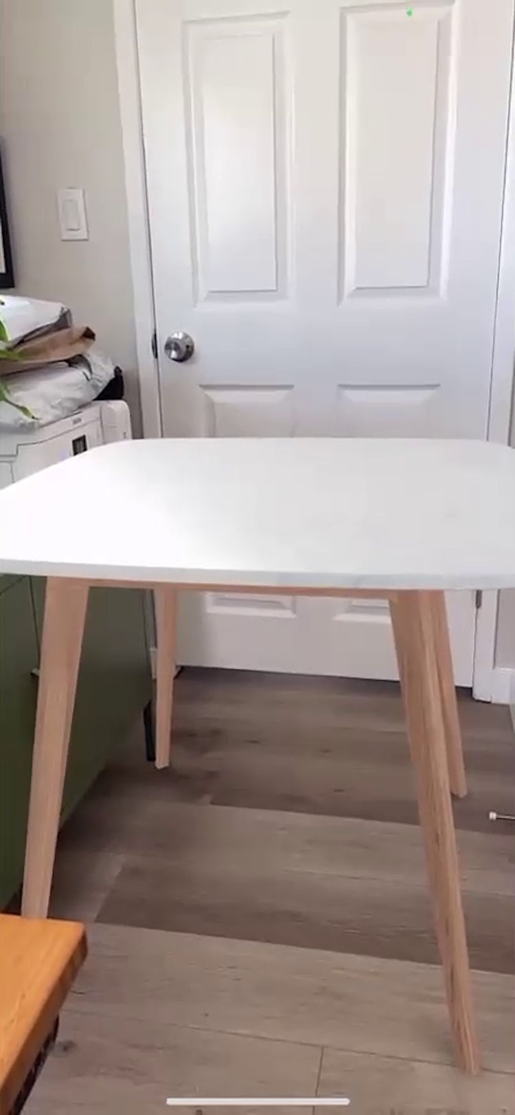
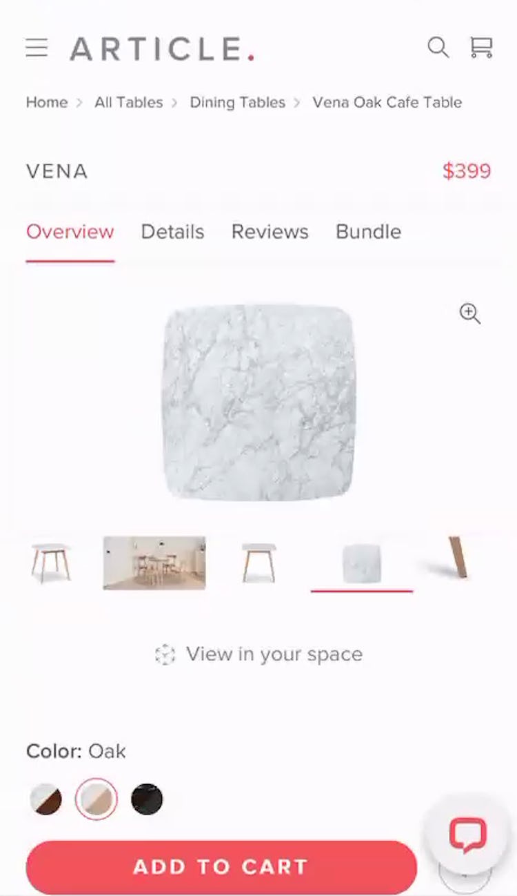
“You can’t see that marble tabletop. That’s one of the main things I’d want to be looking at. It doesn’t have enough detail on it for me. I think it would have more detail in real life. The resolution doesn’t look great in it.” The 3D model in the “View in Room” feature at Article (first image) lacked the level of detail and high-resolution offered by the product images (second image), so this iOS participant couldn’t learn anything incremental from the AR experience that wasn’t offered elsewhere on the product page.
During testing, some participants were immediately frustrated when they opened “View in Room” to find unrealistic 3D models.
Most users will easily pick up on signals that models are unrealistic, such as image pixelation, a lack of texture, or color variances.
When models are visibly low-quality, users feel they are wasting their time looking at an inaccurate representation of the product, negatively impacting their perception of the site and delaying their purchase.
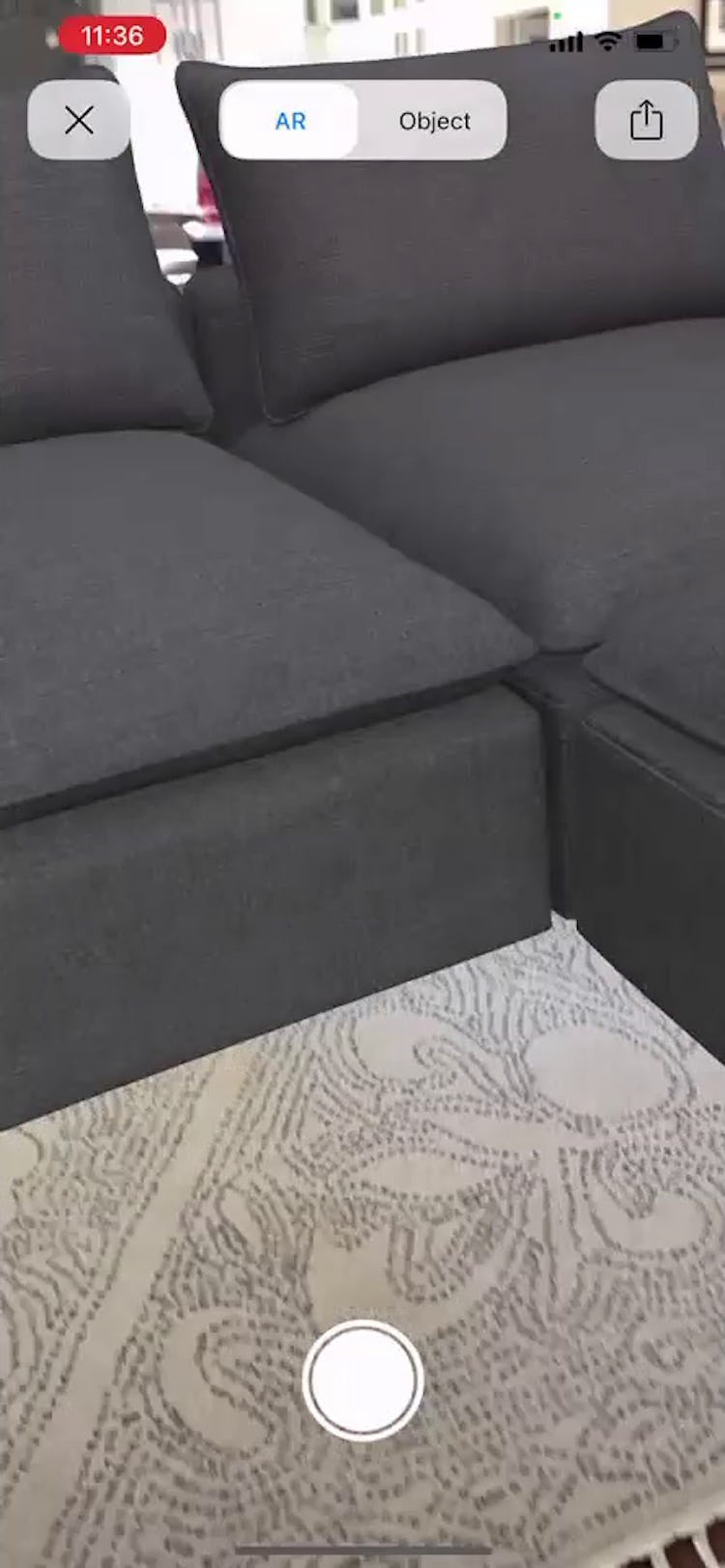
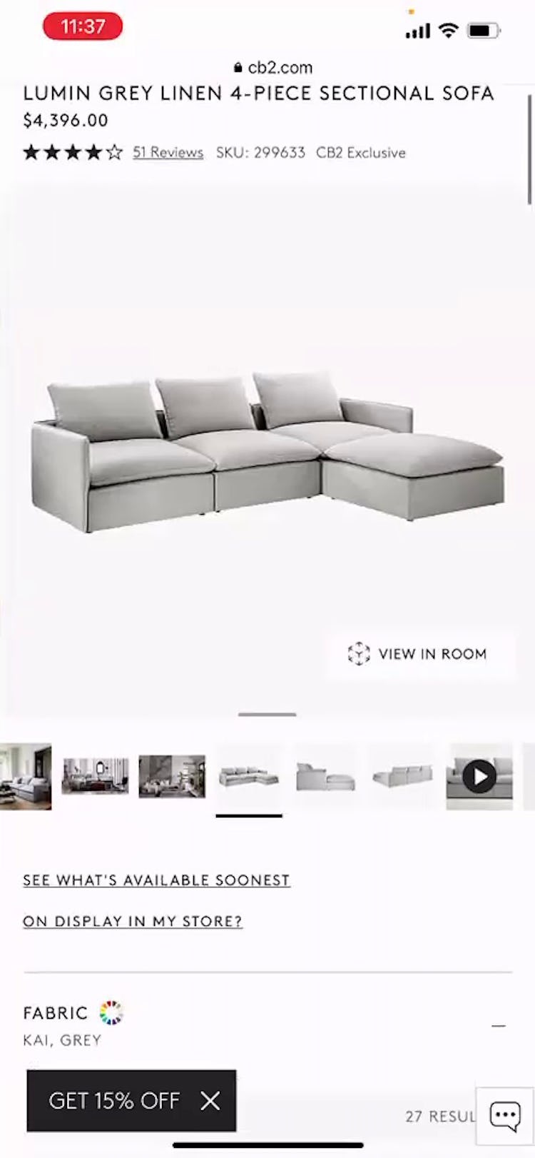
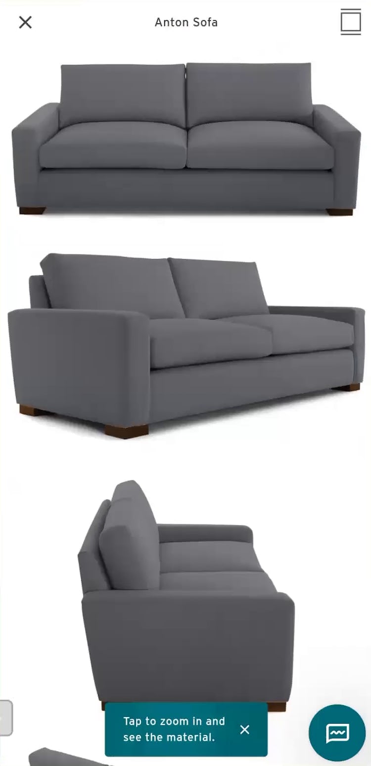
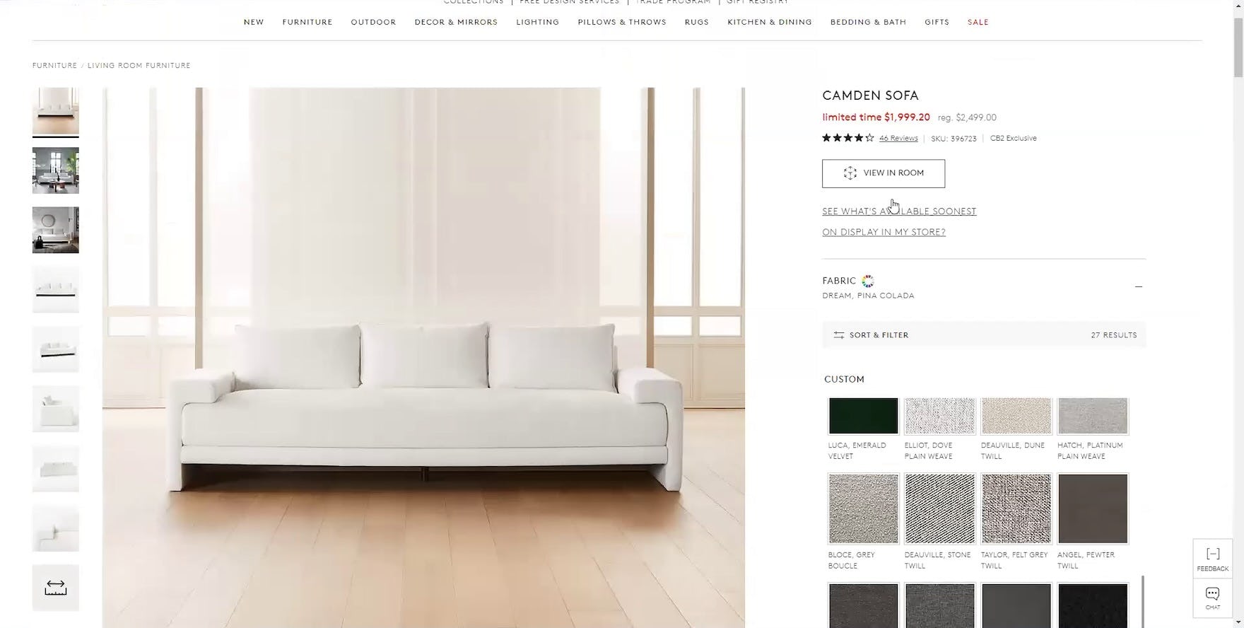
“I’m confused about the fabric [color]…In the AR, it’s a lot different than how it looks right here.” This participant on iOS noticed the couch color at CB2 appeared differently in the AR feature (first image) than it did in the product images (second image). “It’s making me second-guess. Are these going to be really the colors that it’s going to look like?…I think the AR did a disservice to it…it didn’t really help me in any way and actually made the whole thing more confusing.” Uncomfortable with the discrepancy, she went next to look through the photos submitted by users alongside their reviews to determine which medium displayed the color most accurately.
Users may also be thrown off by 3D models that look noticeably different in color or texture from the item’s product images.
When this occurs, most users will need to reconcile any differences to reestablish their confidence in the product, forcing them to spend time on additional product research.
In testing, participants spent more time comparing the 3D model to the product images or looking for a third visual representation to “tiebreak”, like user-submitted photos.
When those tactics failed, participants abandoned the site in favor of future, more tactile shopping methods.
The time between the AR experience and eventual purchase may extend to weeks, as the user must wait for swatch samples in the mail or find time to squeeze in a store visit.
Bolster the Ways Users Prefer to Gather Critical Visual Attributes
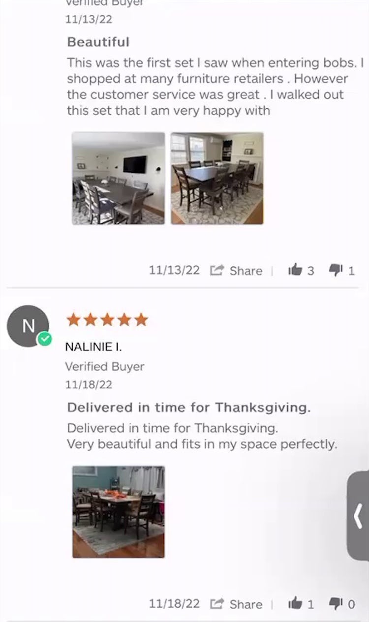
“Customer photos [are] really, really helpful. That almost provides a better visual in some ways than what the 3D ‘View in Room’ view does.” Many test participants found customer photos and reviews more helpful in increasing their confidence than AR, like this iOS participant did at Bob’s Discount Furniture.
“To me this is more useful than the [AR feature]…the ability to zoom in and take a closer look at it. I just feel like I get a better look at the whole thing this way. Yeah, I think it’s more important to look at the thing itself than [‘View in] Room’ using that tool. This is more useful information to me.” Users often find product images to be more useful than AR features, like this Android participant at Joybird.
Test participants noted that they generally preferred other ways to obtain the visual and spatial information required to assess a product’s suitability.
When landing on the product page, 79% of participants in our furniture study went to the product images first, proving that product images remain the gold standard for furniture shoppers to build a visual understanding of a product.
Photos with professional lighting can be used to relay texture, material, and finishing details even though colors are somewhat dependent on users’ monitor for accuracy.
Even when spending large amounts of money, users are more comfortable navigating image galleries, and coupled with easy-to-find product dimensions, rely heavily on this type of content to replace physical touches and tape measures.
Accordingly, high-performing images on the product page should be prioritized higher than AR, using images with high resolutions and pinch-and-zoom, images with feature callouts, images paired with descriptive text, and at least one image that depicts scale.
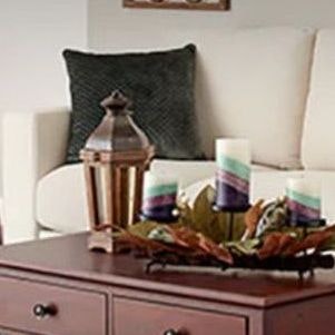
While not 3D, curated photos of “room vignettes” can provide users with a great sense of the product’s size and scale when placed alongside other objects commonly found in a room.
Users also gravitate to review content, particularly customer-provided photos to further envision the product in a realistic environment, which sites should encourage as well: “[AR] doesn’t help me per se. What helps me is real life reviews…and looking at these style pictures.”
Further, our large-scale product testing shows that 41% of users watch videos on the product page, a far larger quantity than the 6% who seek out AR.
Consider too that videos can convey movement, which can be helpful to, say, illustrate the level of cushioning and support provided by sit-on furniture.
Users Prefer Simpler Methods to Assess Visual and Spatial Details
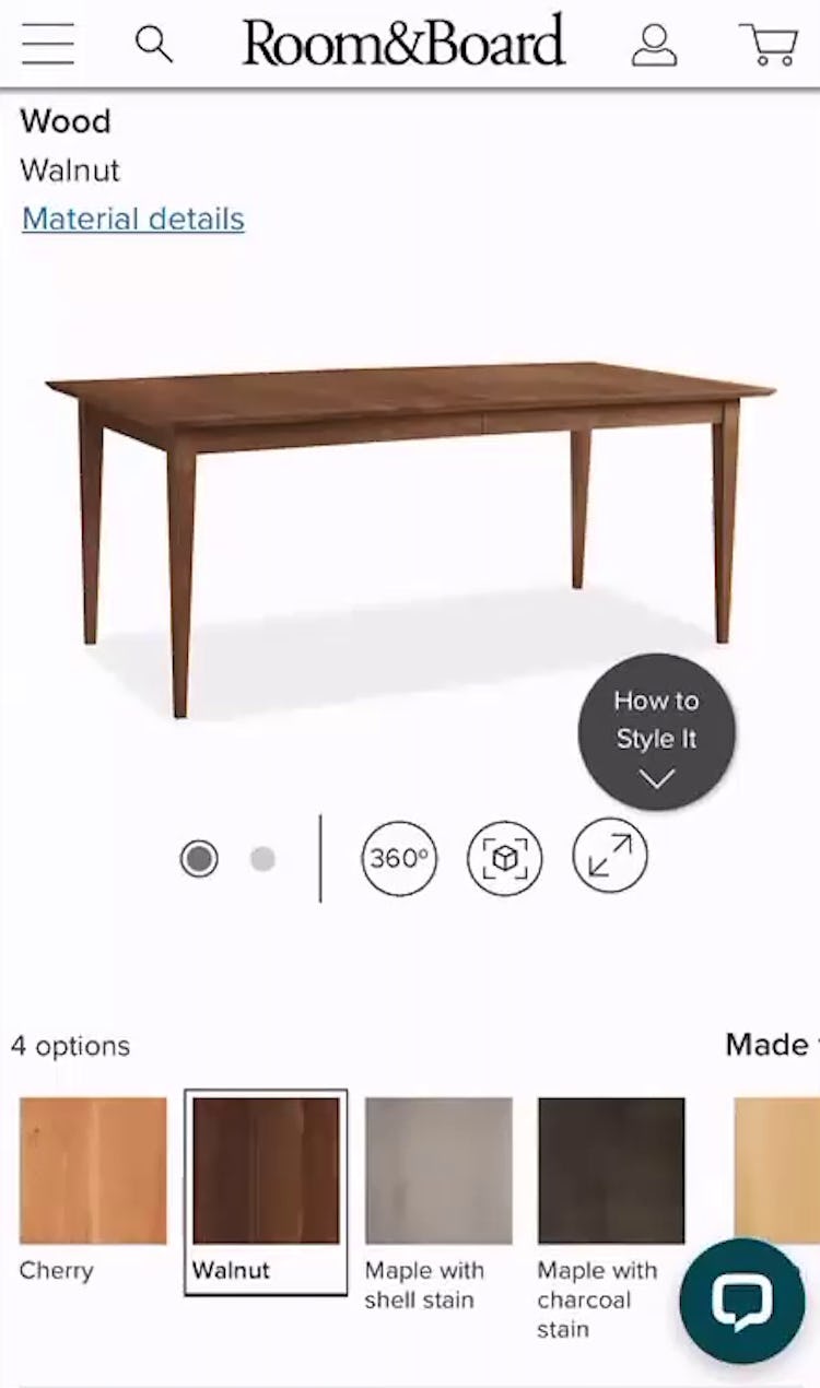
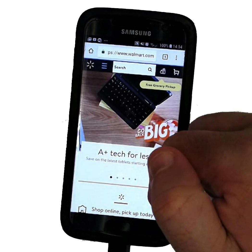
“This next icon, I think that’s going to open an augmented reality sort of thing where it uses my phone camera to try to place it in the room, or at least I’ve seen tools like that before…Yeah.” Nearly all users easily recognize the AR icon, spotted in the image gallery here by a participant at Room & Board using iOS who ultimately decided not to use the feature.
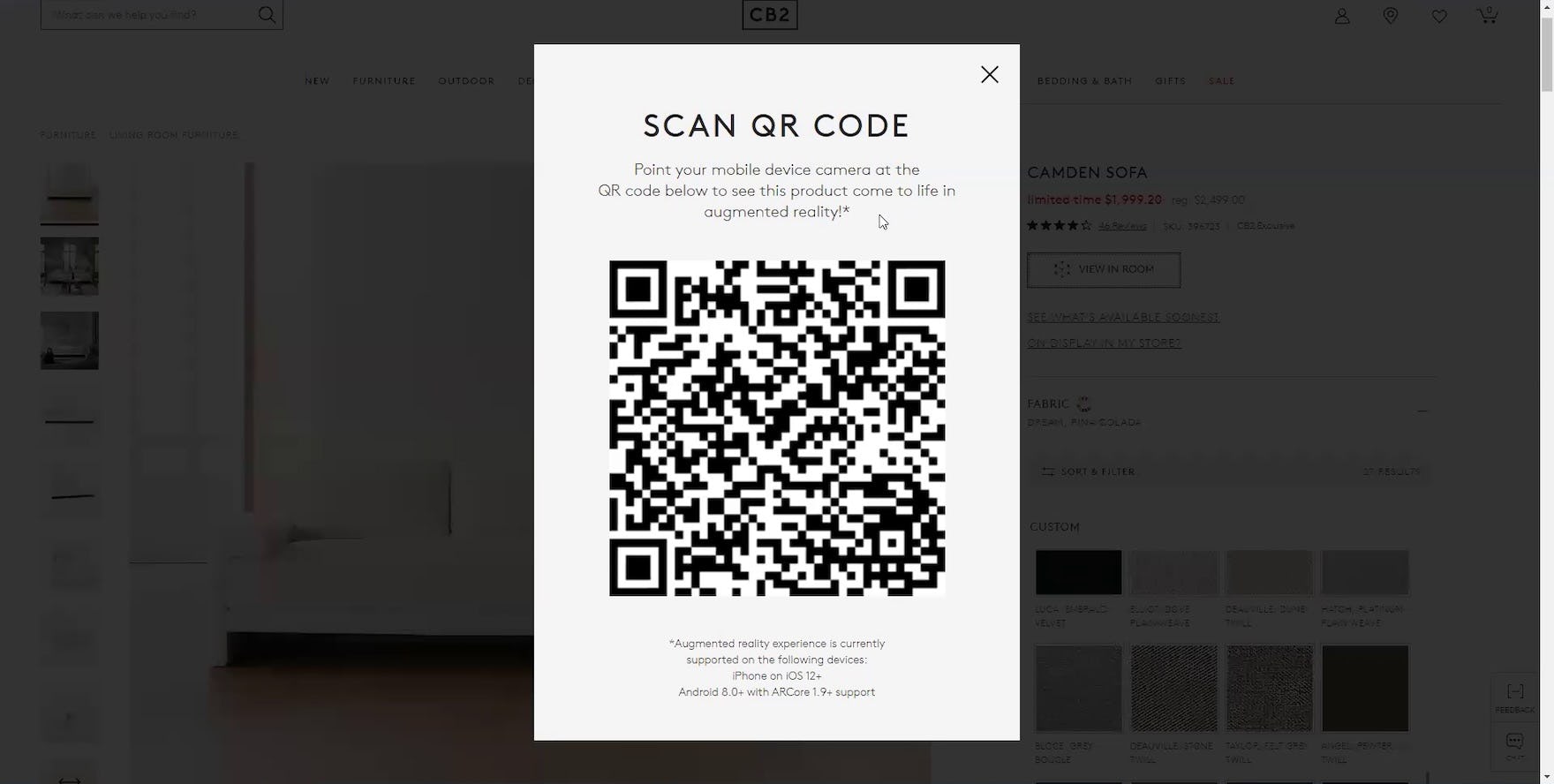
“There’s a ‘View in My Room’…I believe what’s gonna happen here, you’re going to scan this QR code and then with your phone you’re going to go look at the area or the space that you want the sofa in and it’ll place it there so you can see what it would look like.” During testing, familiarity with the AR icon was generally pervasive, such that participants knew what it represented even when they saw it on desktop sites (and thus out of context). This participant at CB2 knew what would occur upon scanning the QR code with his mobile device, even as he declined to try the feature.
During testing, many participants’ objections to the AR feature could be traced to a distrust of its veracity.
That said, if there’s a strong desire or requirement to implement an AR feature, testing revealed that discoverability is often the key driver of its usage for the few users who are interested.
These users will look for “View in Room” in or around the image gallery (near other “rich visuals” like video and “360 View”), so access to this AR feature should be located within the image gallery on both desktop and mobile.
Users generally have no difficulty recognizing an AR feature on the product page when it is denoted by the AR icon, the “View in Room” verbiage, or both.
However, sites that exclusively use the icon might consider providing a text label to reduce confusion for users unfamiliar with this technology.
In testing, 87% of test participants who encountered “View in Room” chose not to use it, with most citing negative prior experiences as the reason.
Sometimes, it’s what users don’t do that offers insight into where to invest time and money; in testing, 66% of users opted out of using AR and another 21% said they would but then didn’t.
To put AR in perspective, consider the following research insights:
- For the small percentage of users who try the feature (only 13% in testing), “View in Room” does not replace the work of measuring their space and comparing that against product dimensions
- With usability issues at play, the participants modeling furniture were unsure of how to use the technology or reached poor conclusions from its use
- Even when a participant expressed confidence that a couch would fit in a certain space while using AR, that conclusion alone wasn’t sufficient to make a purchase
- Worse, it frequently opens up doubt about the product and delays the purchasing decision to a later point in time
High-quality product photos in the images gallery, customer-provided photos of the furniture, and easy-to-find product dimensions were observed to be more effective means of helping users determine fit for furniture purchases.
This leads us to a new question: given such low usage and the cross-pollution from negative experiences at other sites impacting users’ perceptions, is this AR feature still worth the investment?
Getting access: all 500+ Furniture & Home Decor UX guidelines are available today via Baymard Premium access. (If you already have an account, open the Furniture & Home Decor studies.)
If you want to know how your furniture and home decor desktop site, mobile site, or app performs and compares, then learn more about getting Baymard to conduct a Furniture & Home Decor UX Audit of your site or app.)