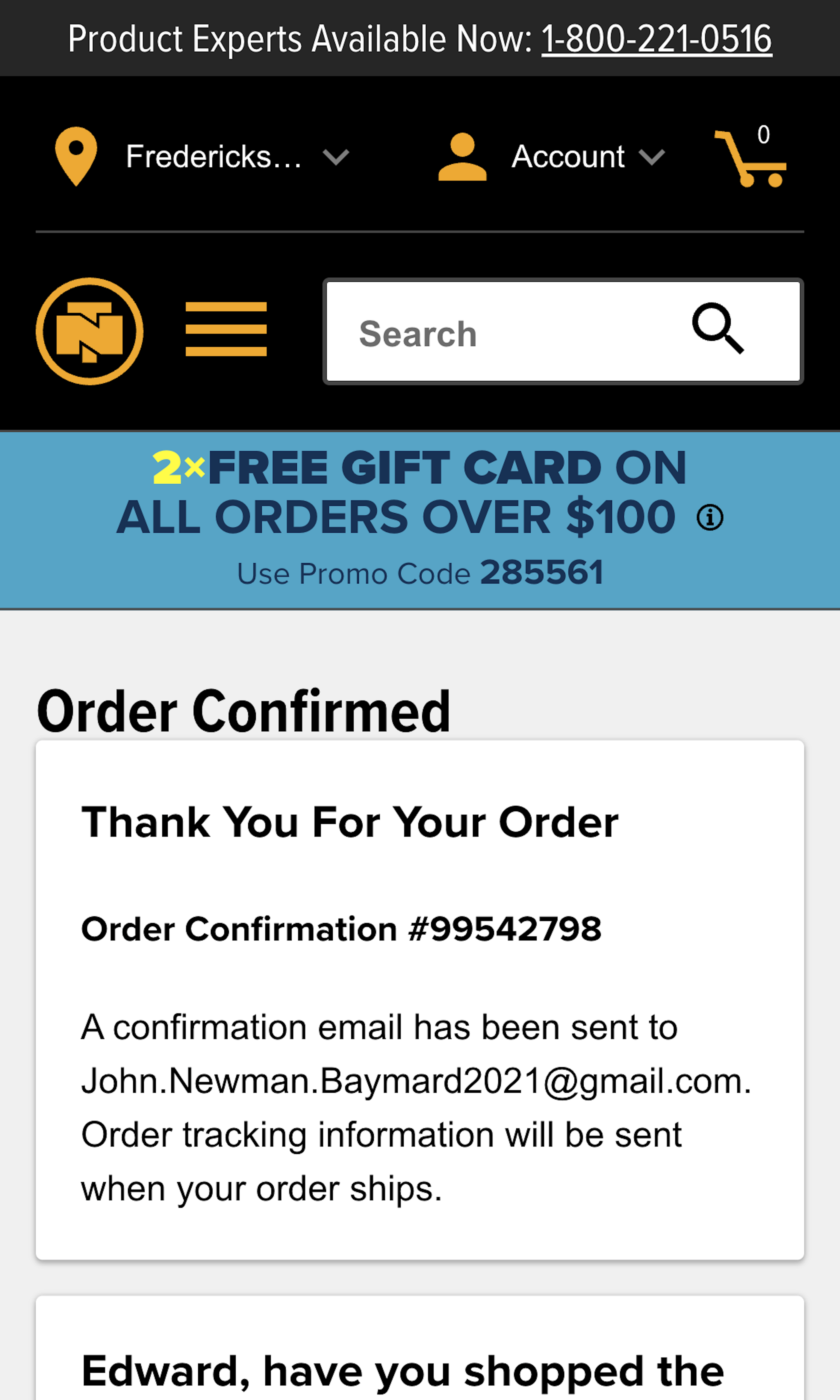
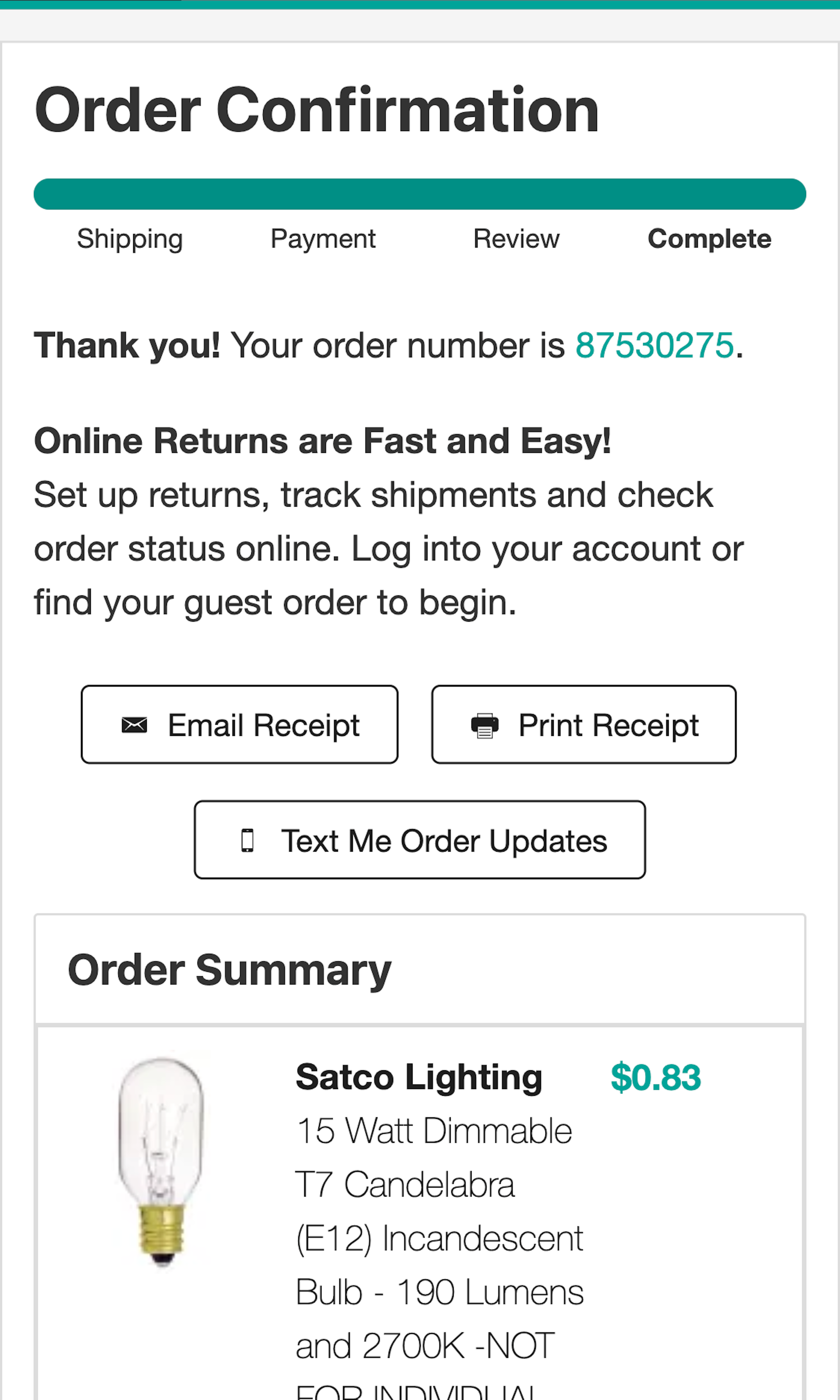
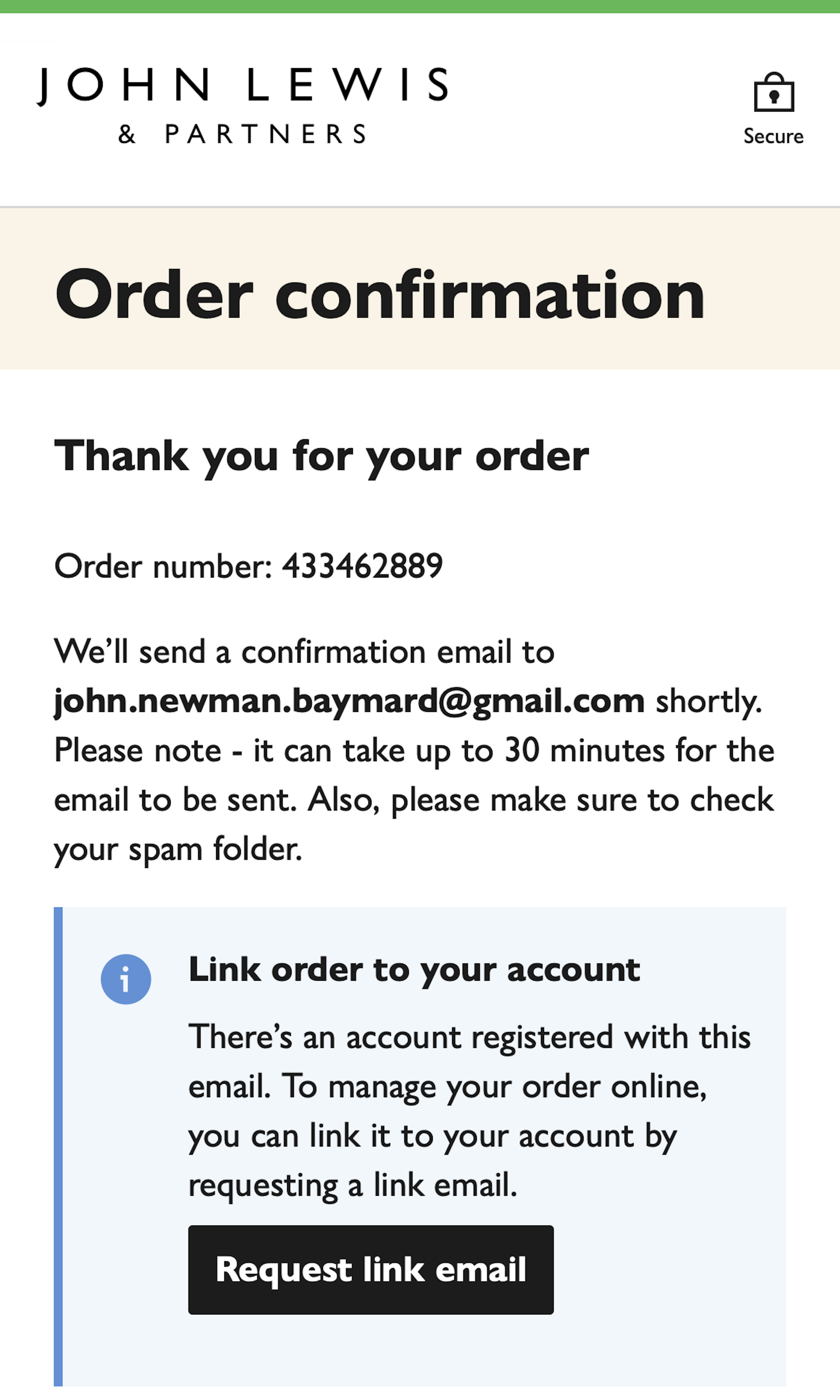
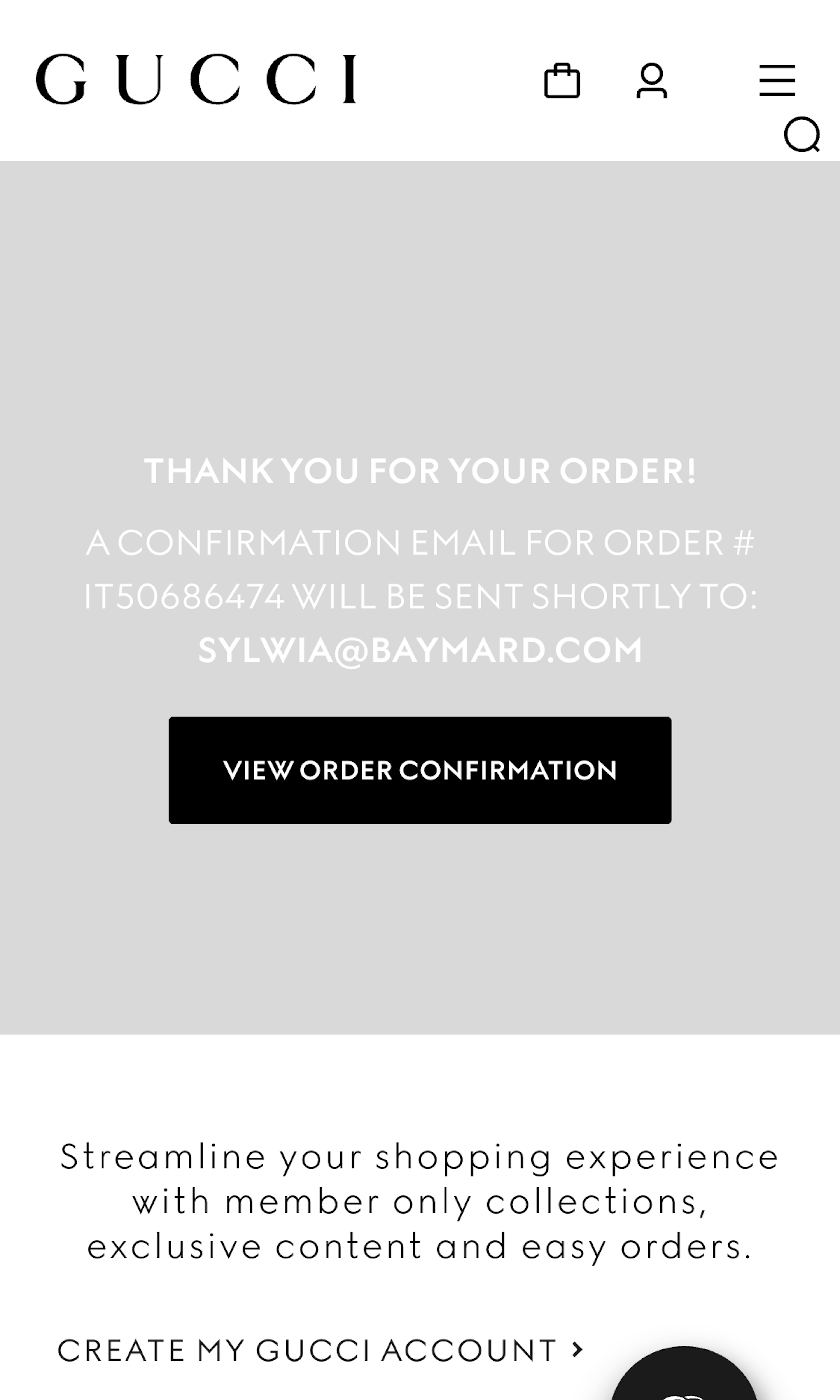
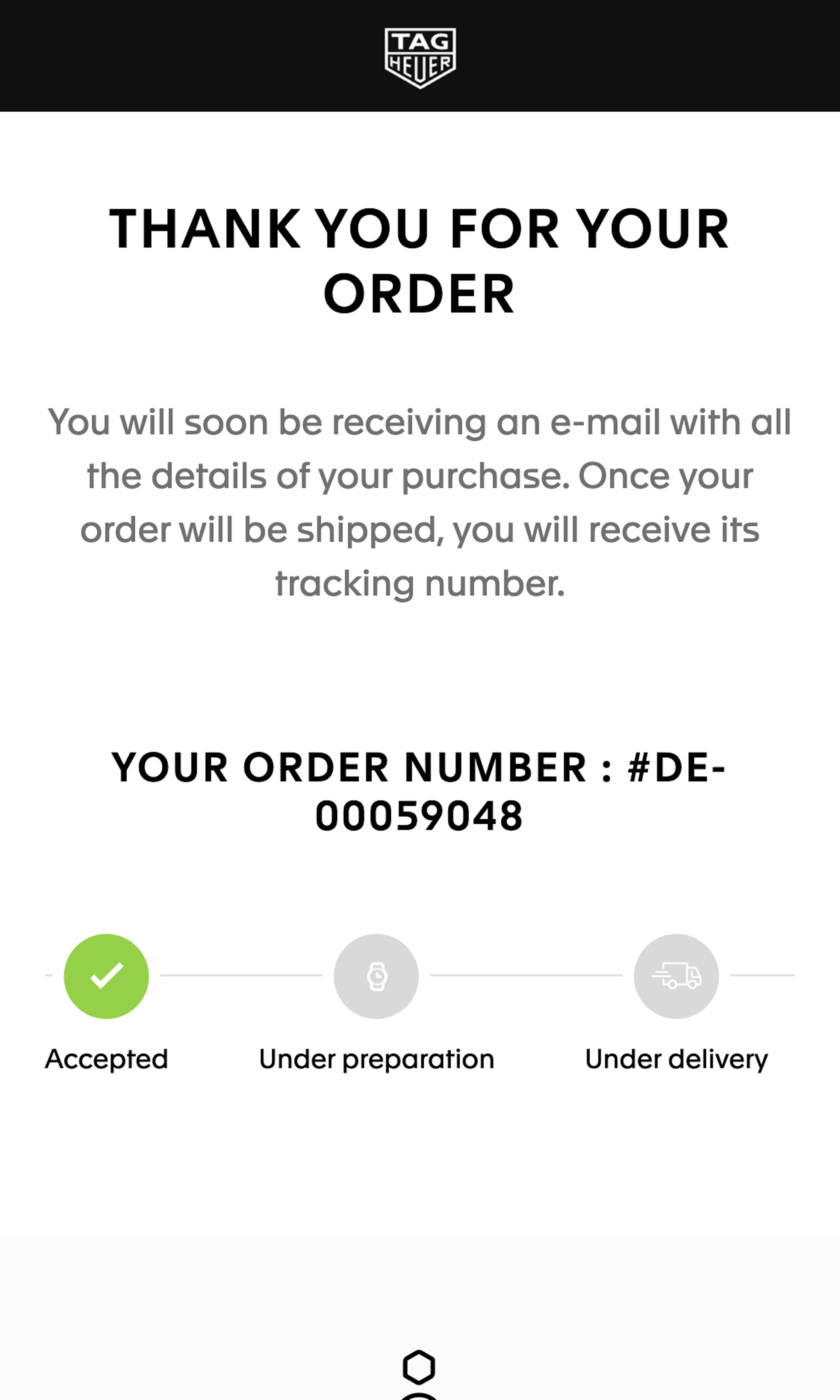
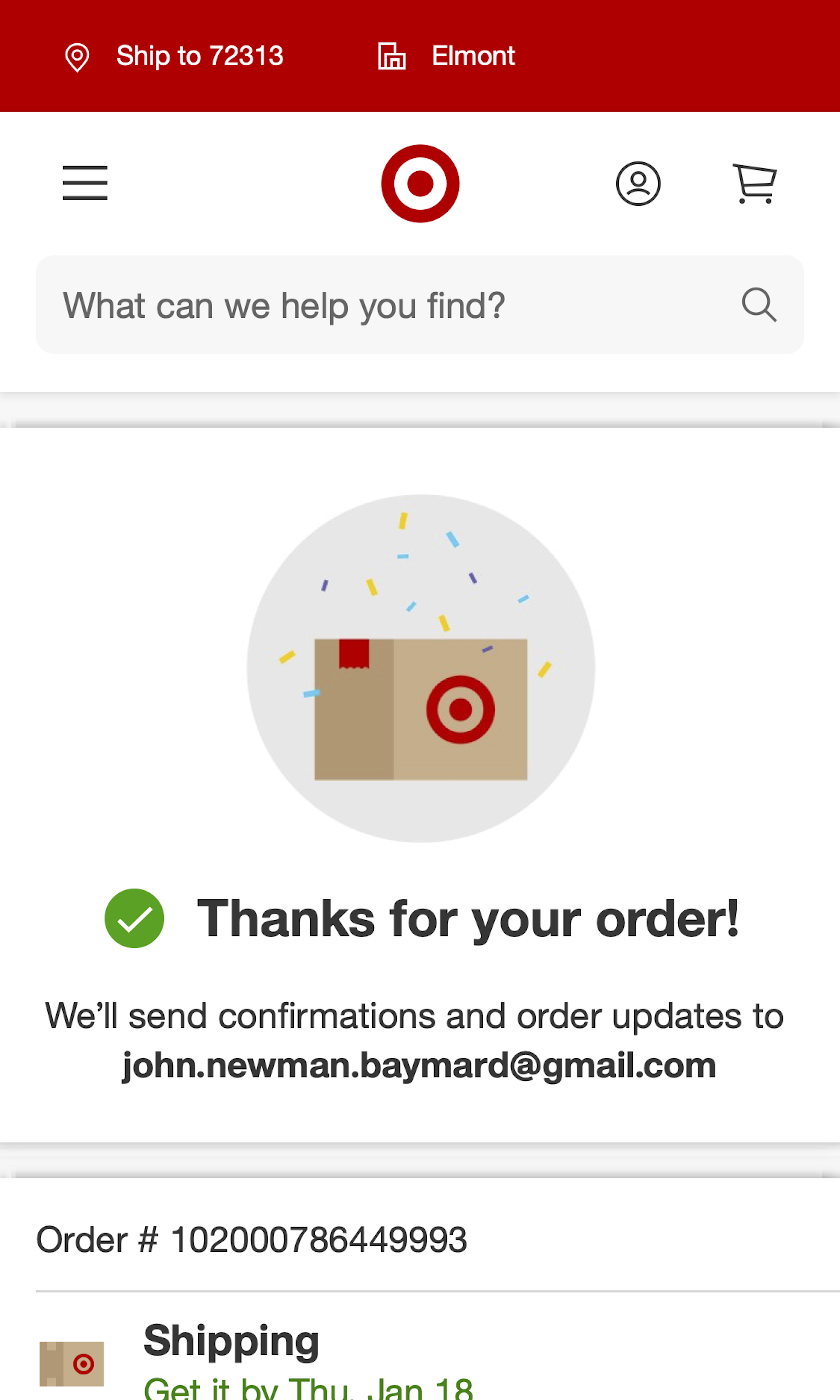
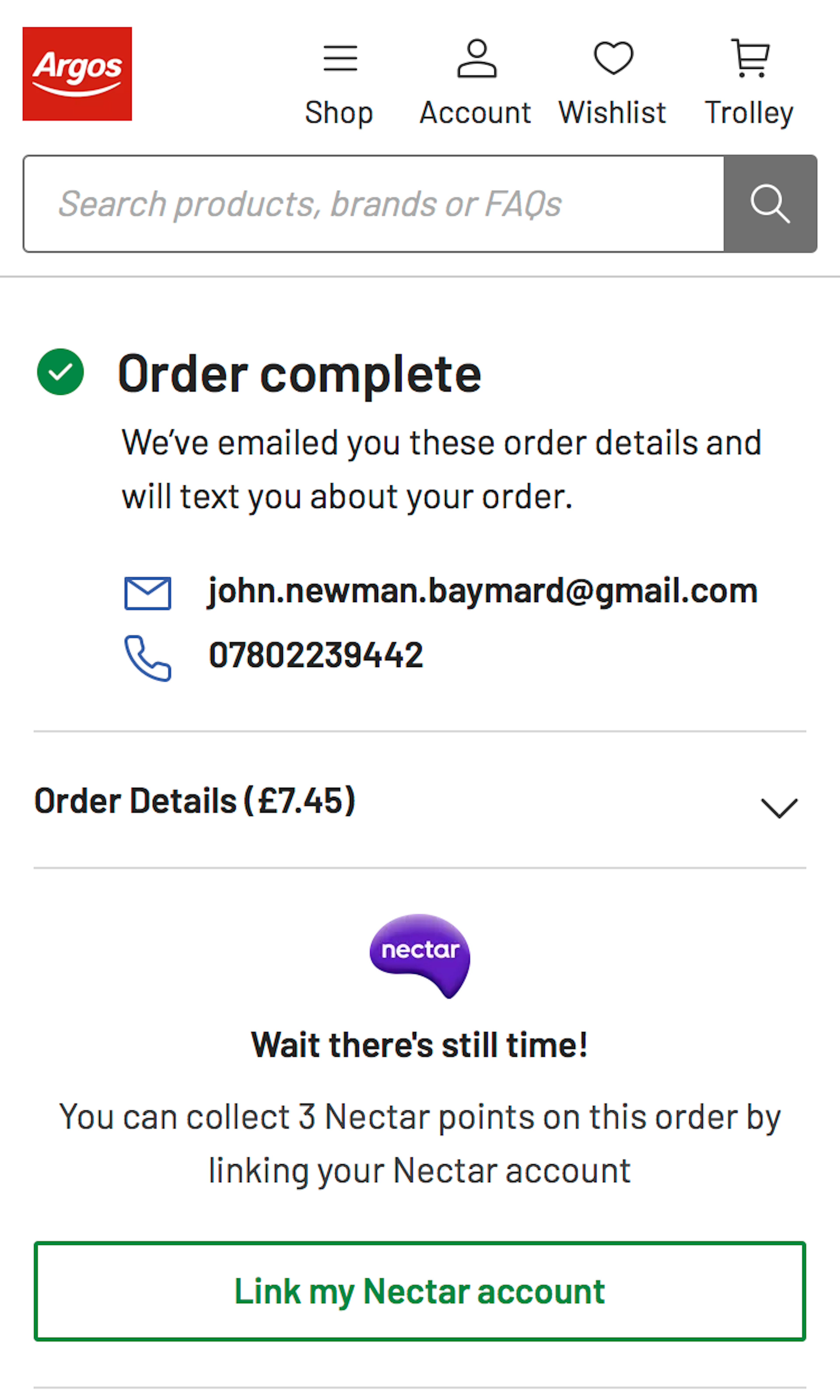
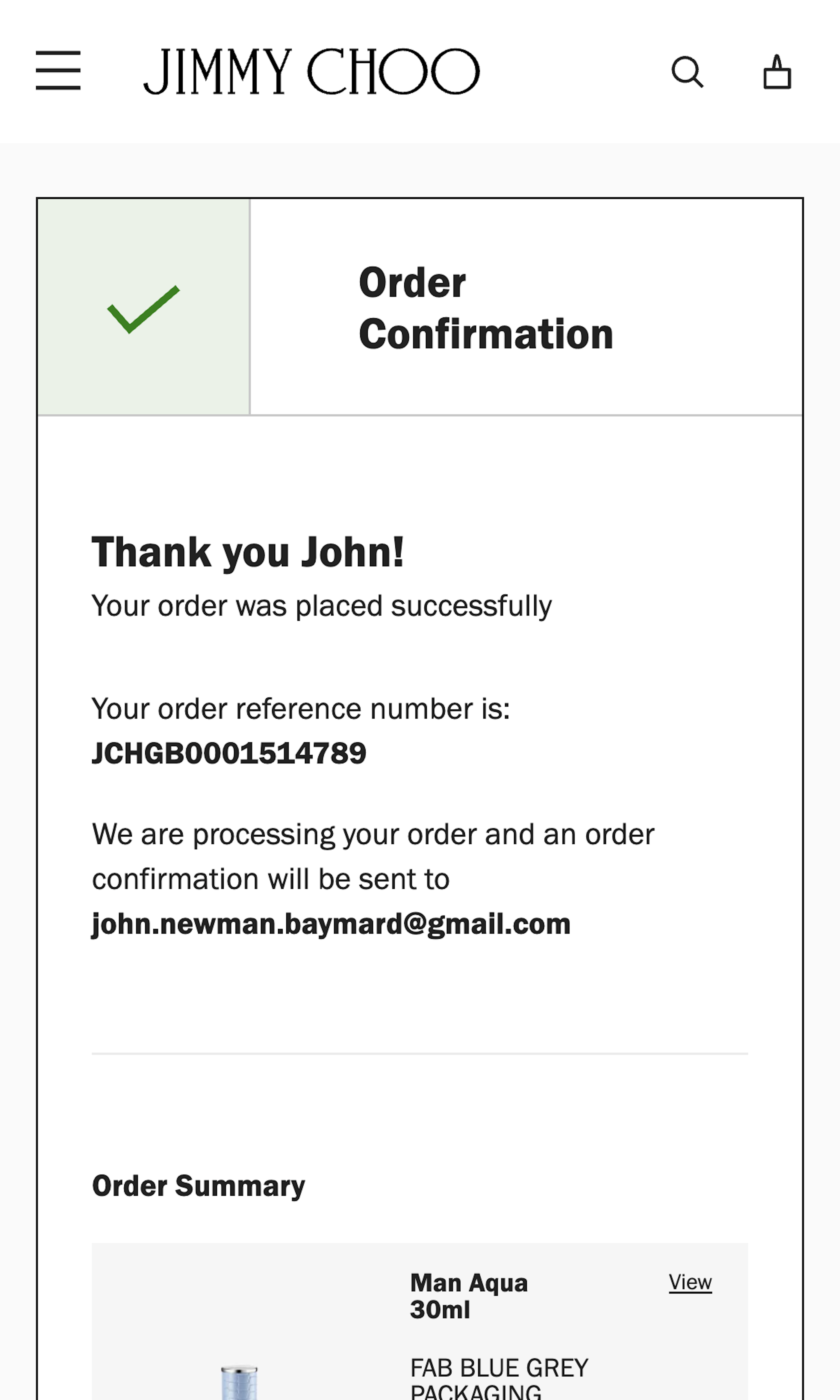
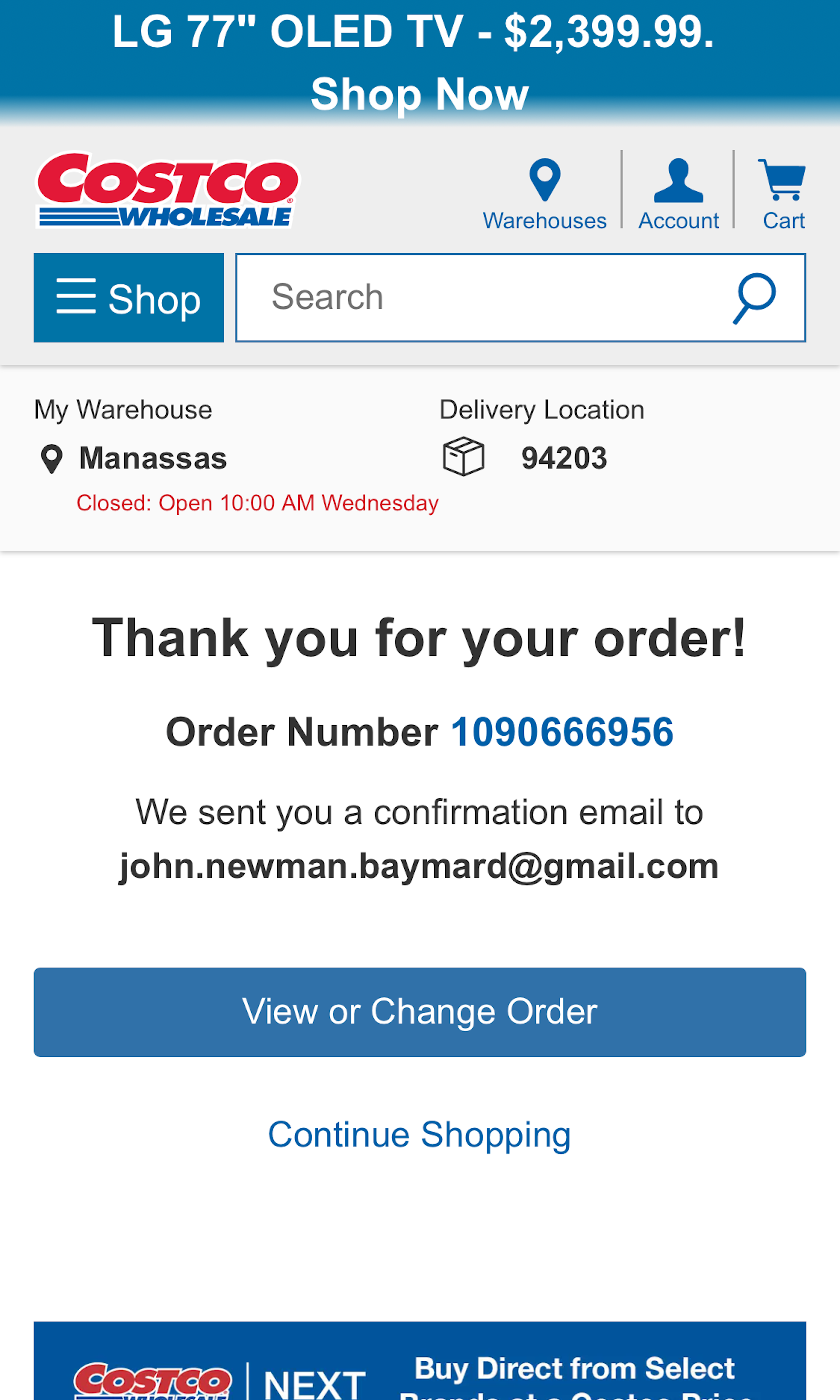
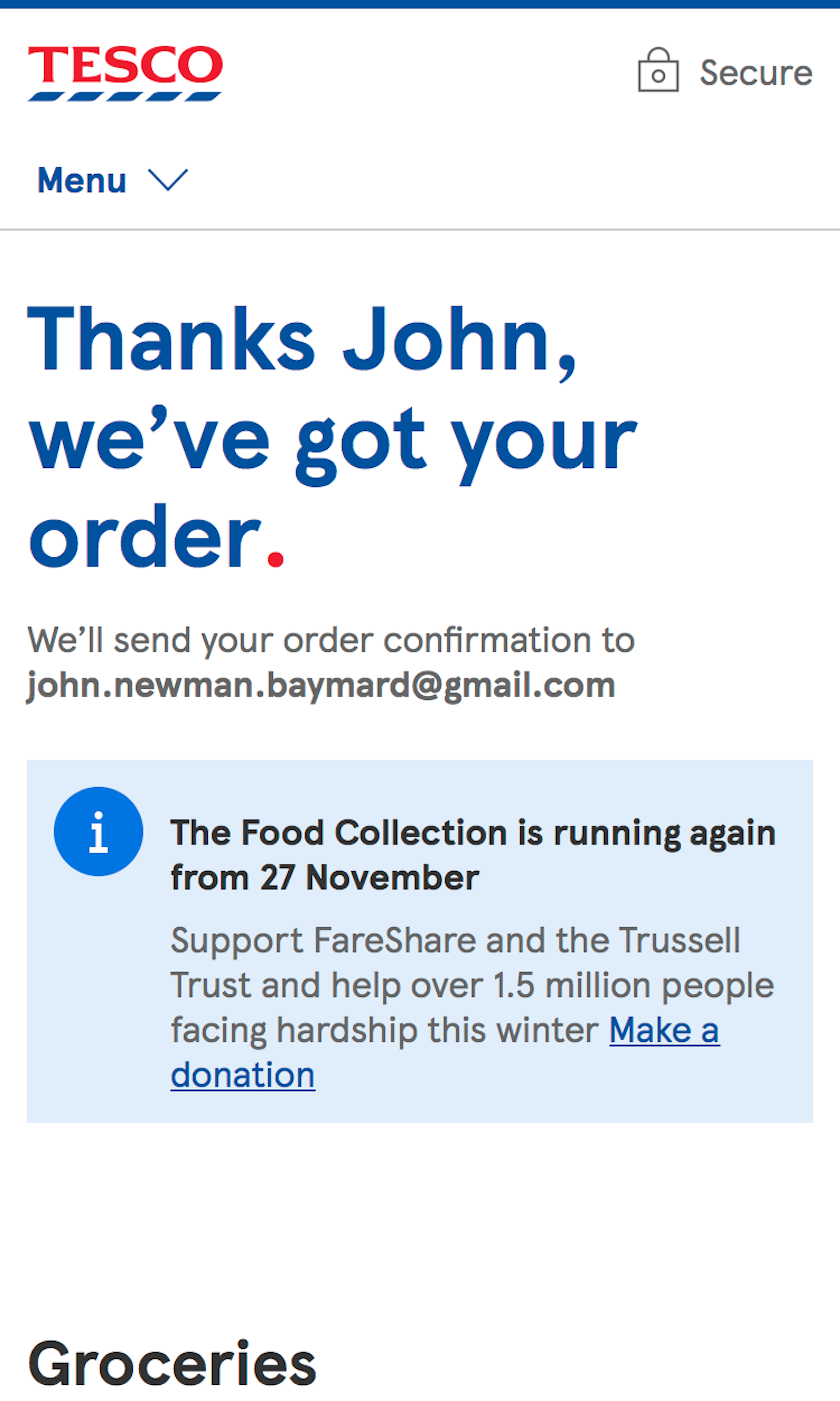
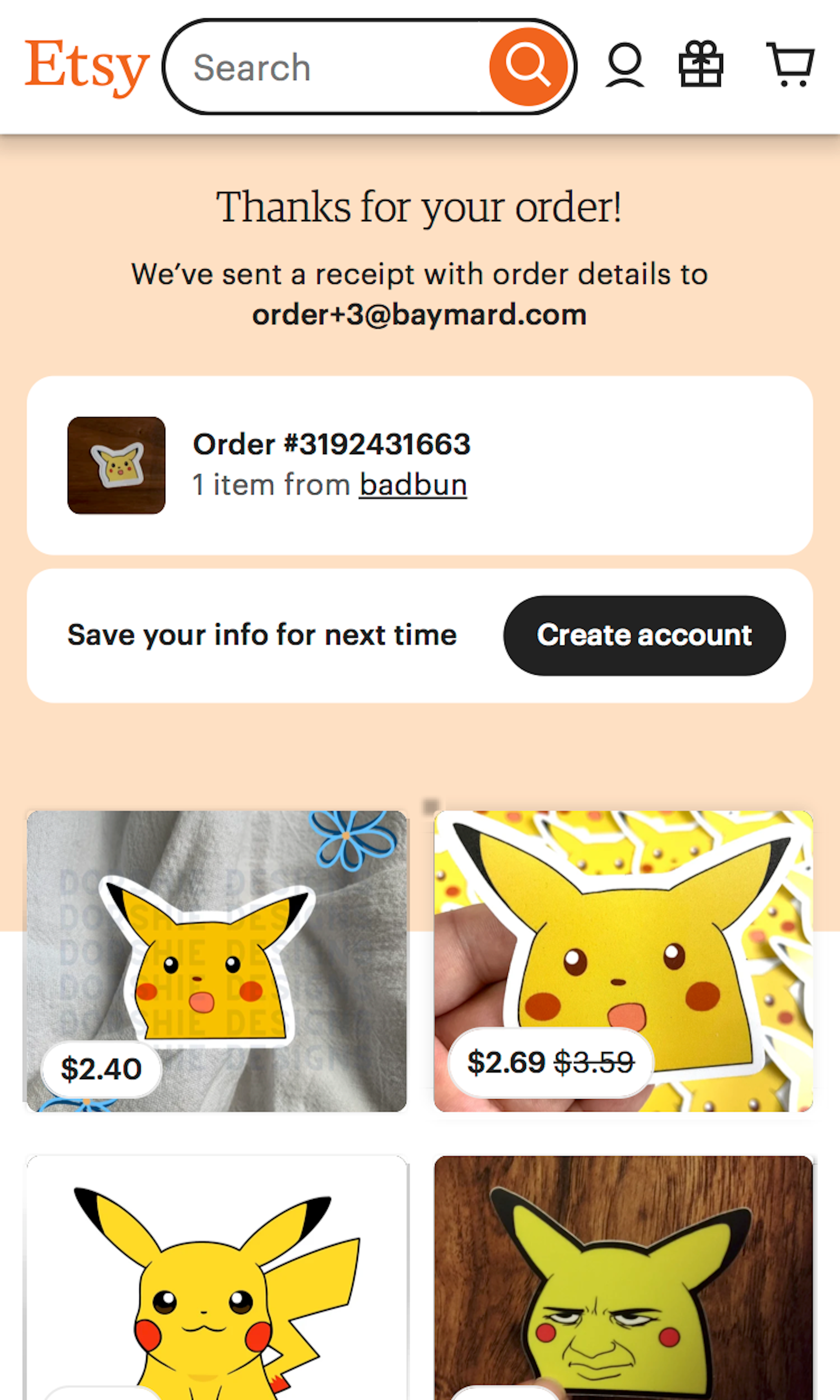
What’s this? Here you’ll find 291 “Mobile: Receipt” full-page screenshots annotated with research-based UX insights, sourced from Baymard’s UX benchmark of 93 ecommerce sites. (Note: this is less than 1% of the full research catalog.)
While the Order Confirmation / Receipt page technically can’t cause any checkout abandonments (as users have now placed their order), we in our mobile usability testing observe that the page can still cause UX issues for users. Commonly observed issues include users not daring to close the page before they’ve received a confirmation email. This behavior sets some unique design requirements for the Order Confirmation page.
More ‘Order Confirmation’ Insights
-
Desktop Examples: Besides the mobile examples below, we also have 115+ desktop examples of Order Confirmation implementations.
-
Learn More: Besides exploring the 75 mobile “Order Confirmation” design examples below, you may also want to read our related article “6 Mobile Checkout Usability Considerations”.
-
Get Full Access: To see all of Baymard’s 351 mobile research findings you’ll need Baymard Premium access. (Premium also provides you full access to 150,000+ hours of UX research findings, 650+ ecommerce UX guidelines, and 275,000+ UX performance scores.))
User Experience Research, Delivered Weekly
Join 60,000+ UX professionals and get a new UX article every week.

User Experience Research, Delivered Weekly
Join 60,000+ UX professionals and get a new UX article every week.

Explore Other Research Content

300+ free UX articles based on large-scale research.

257 top sites ranked by UX performance.

Code samples, demos, and key stats for usability.


