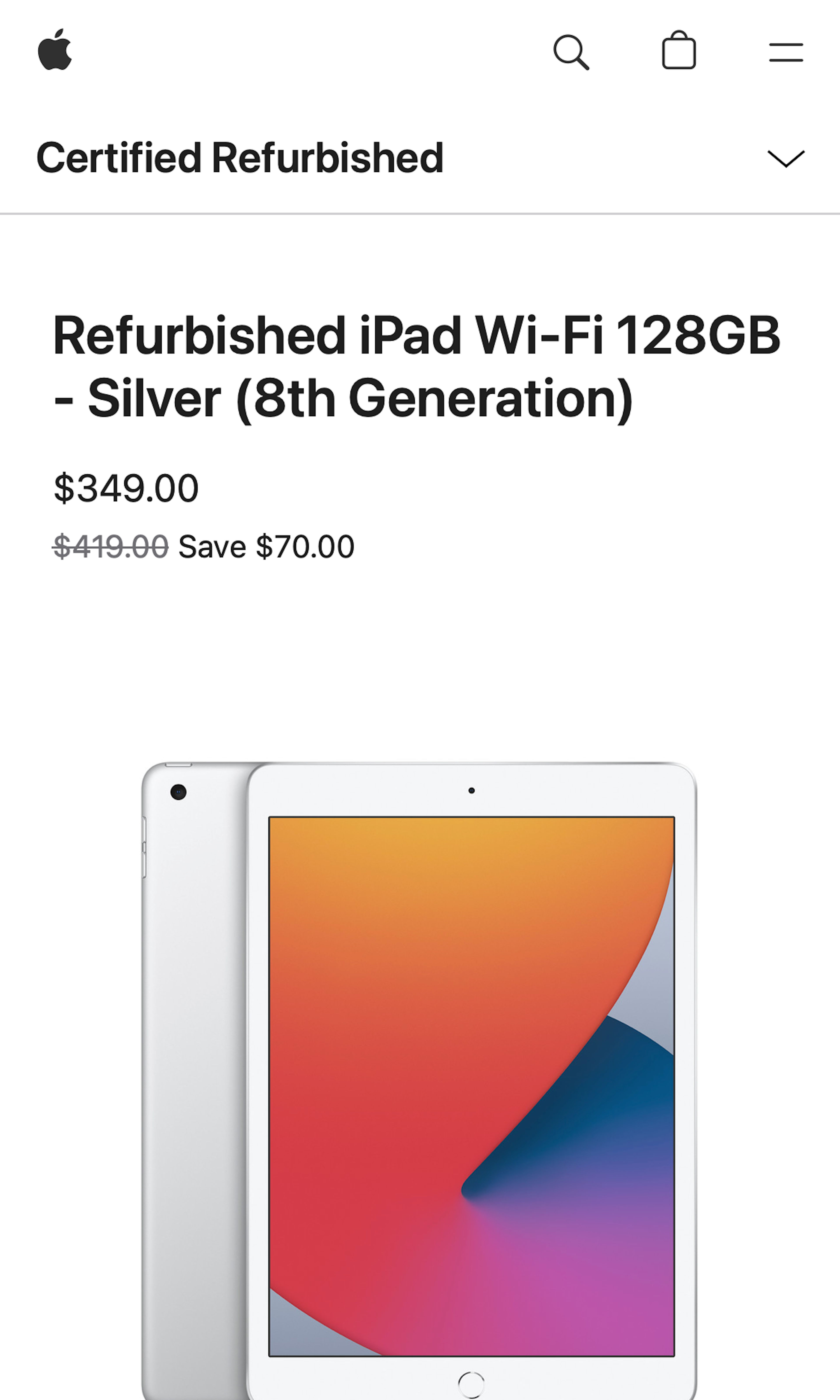
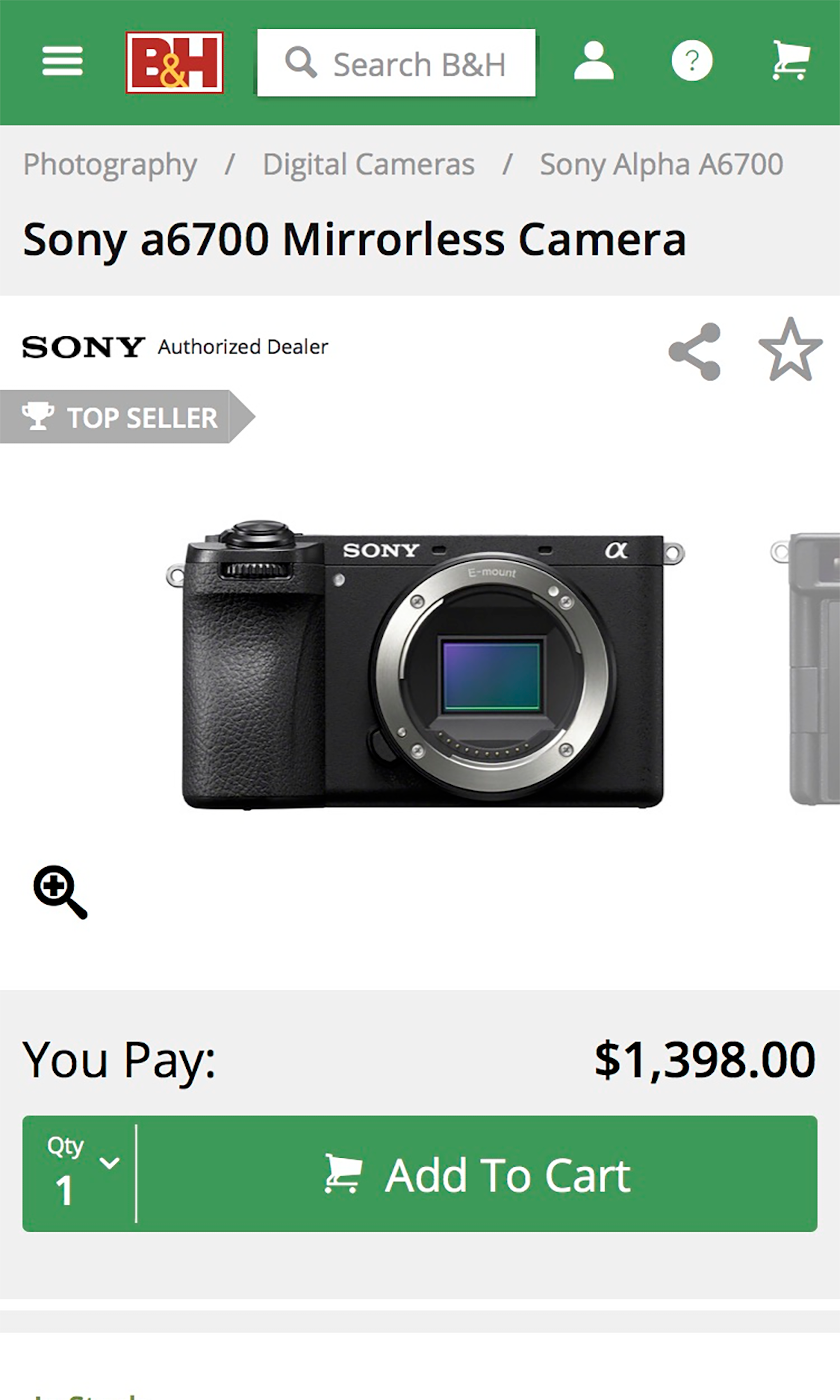
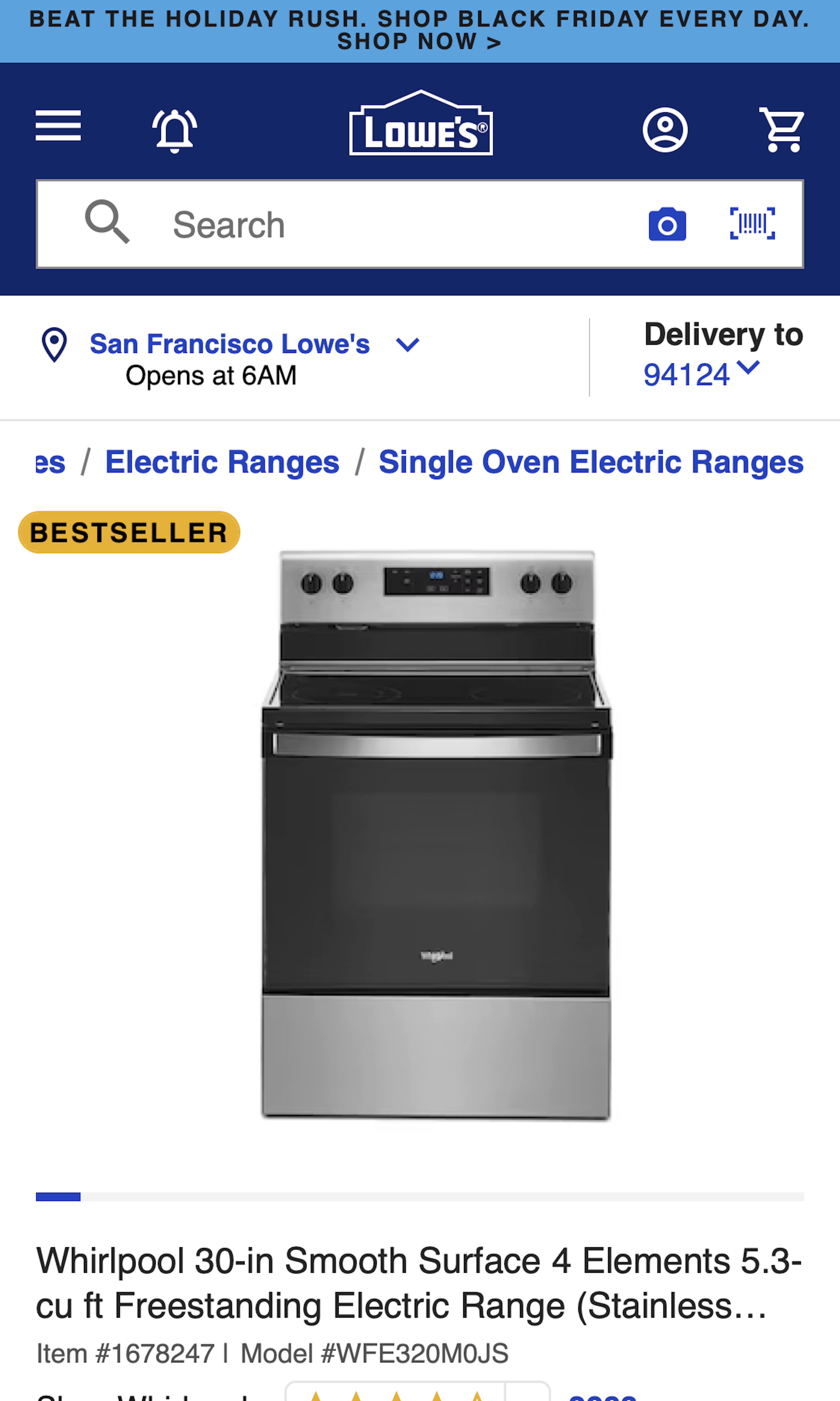
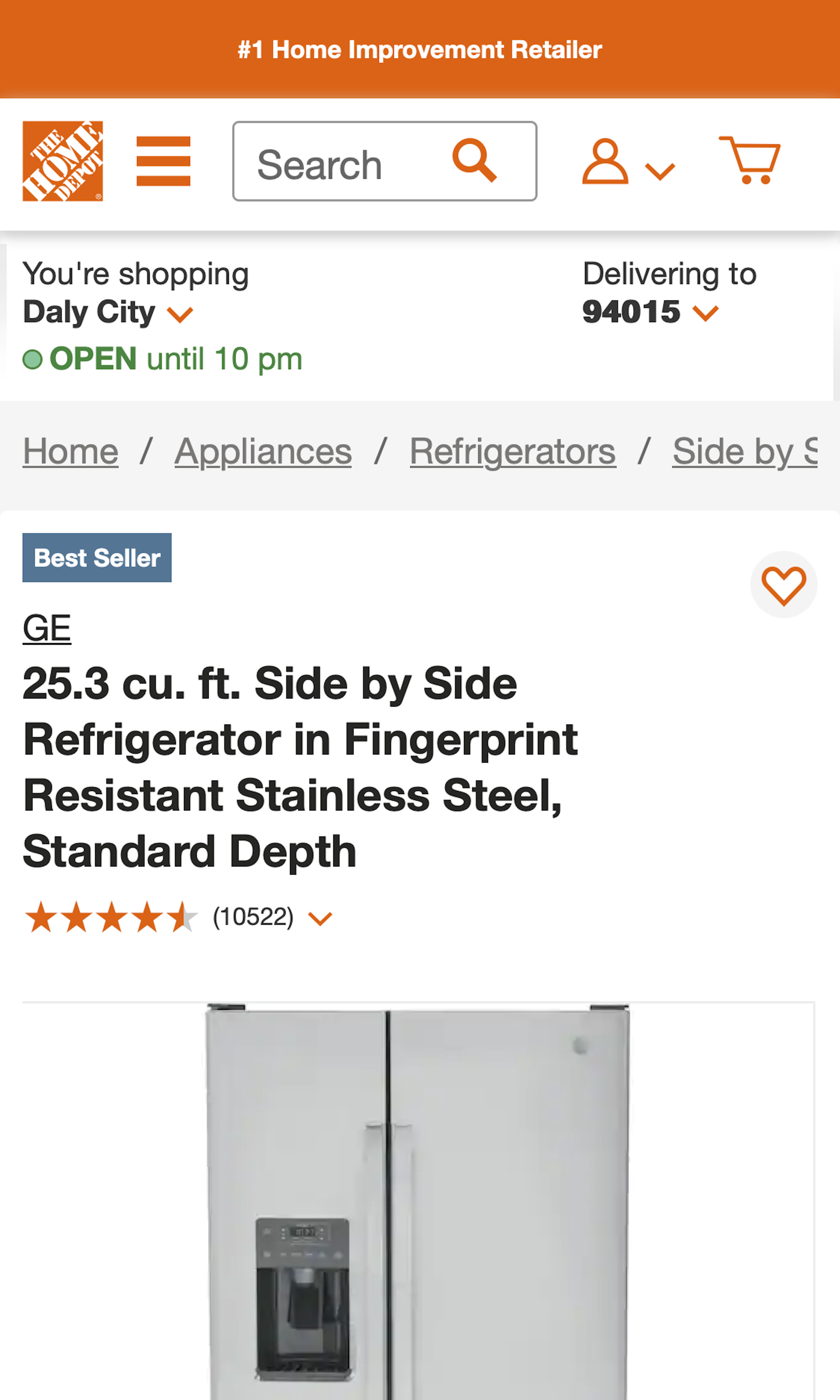
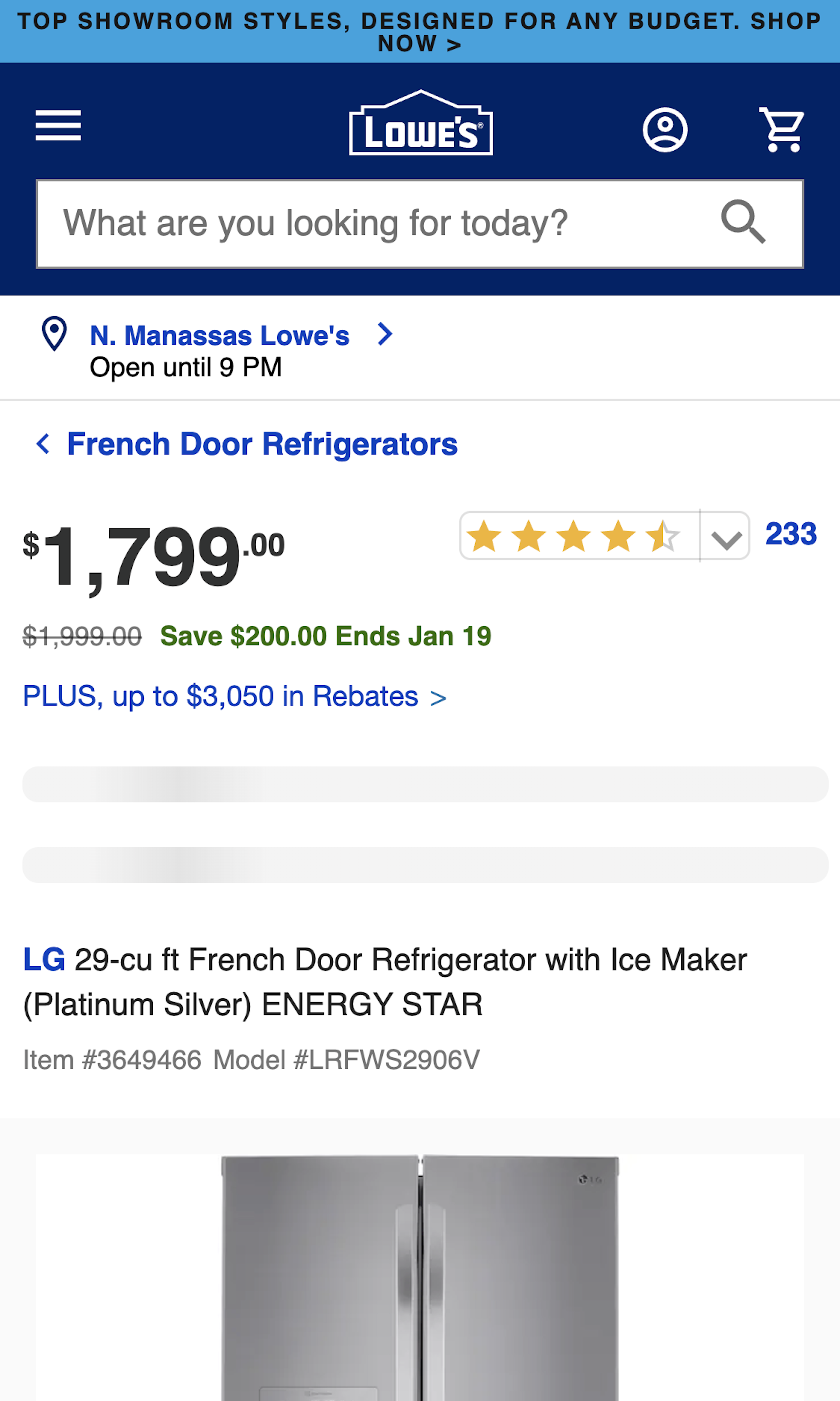
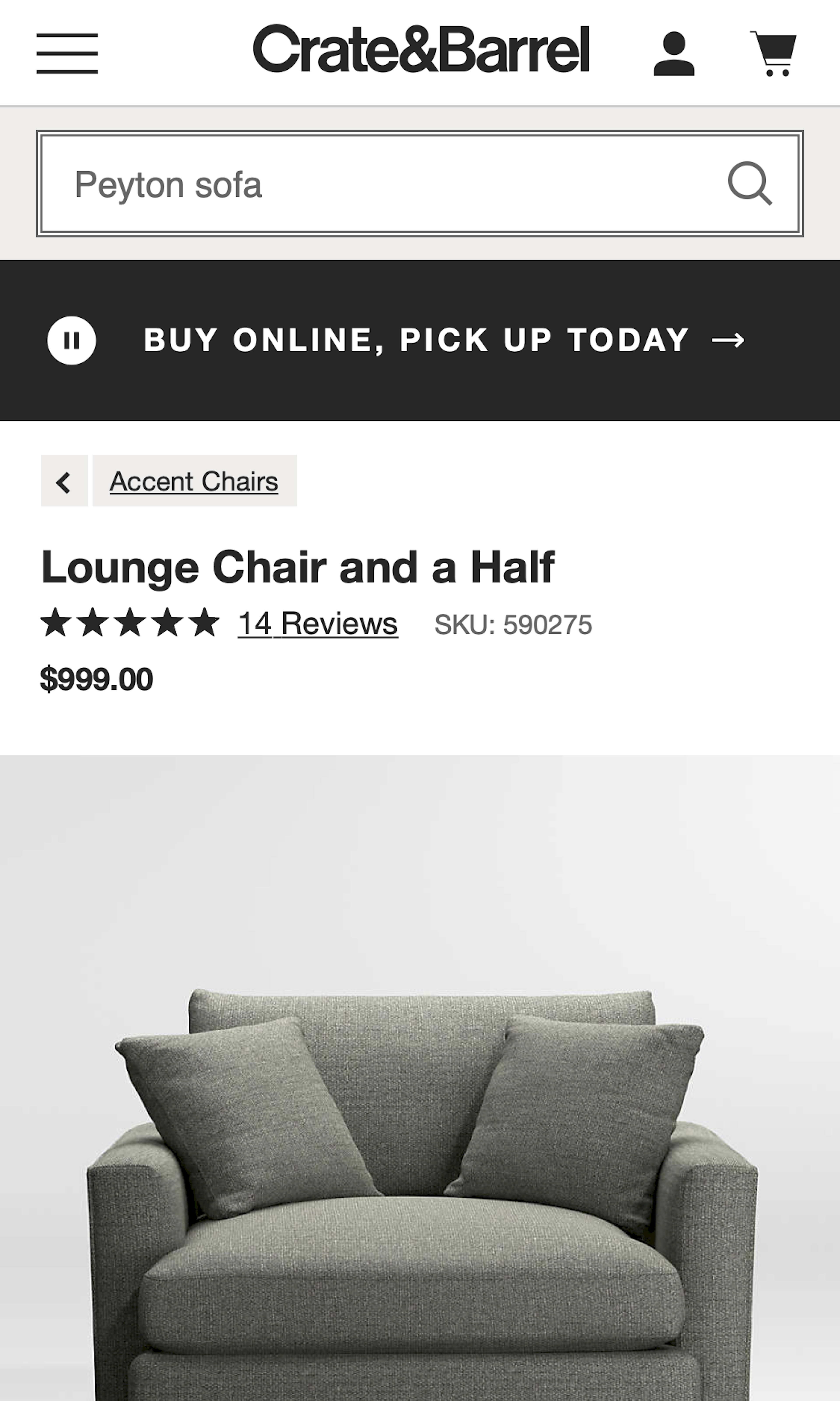
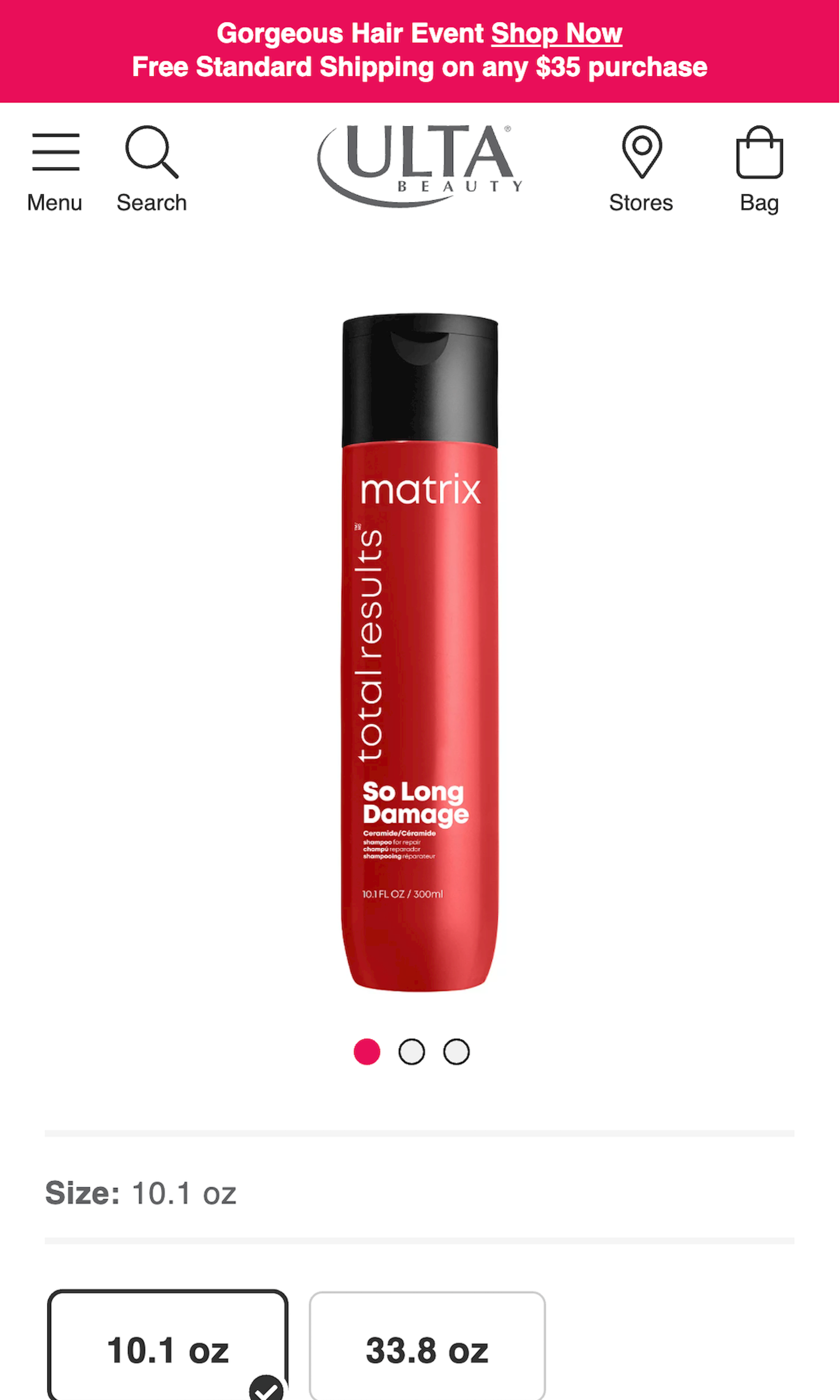
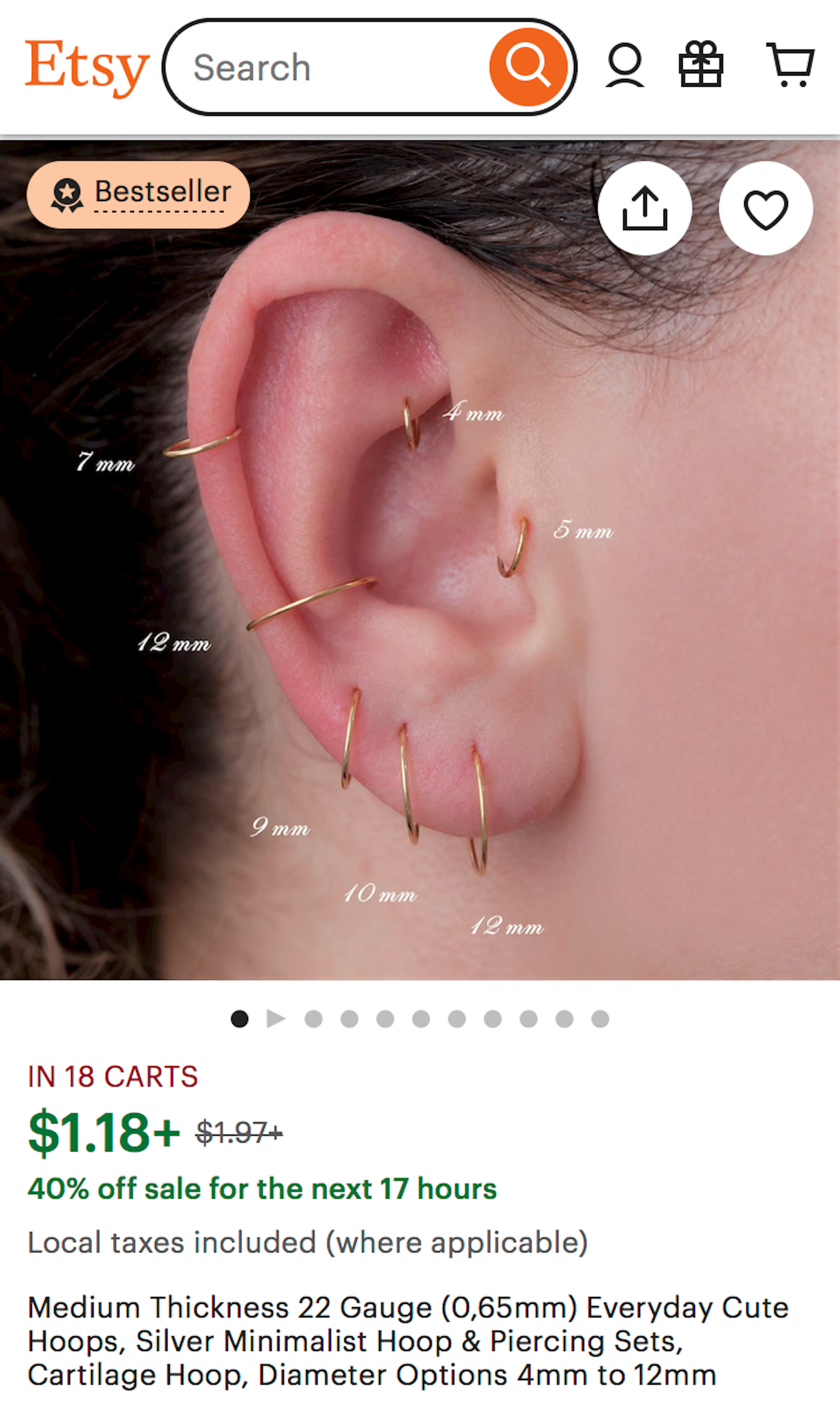
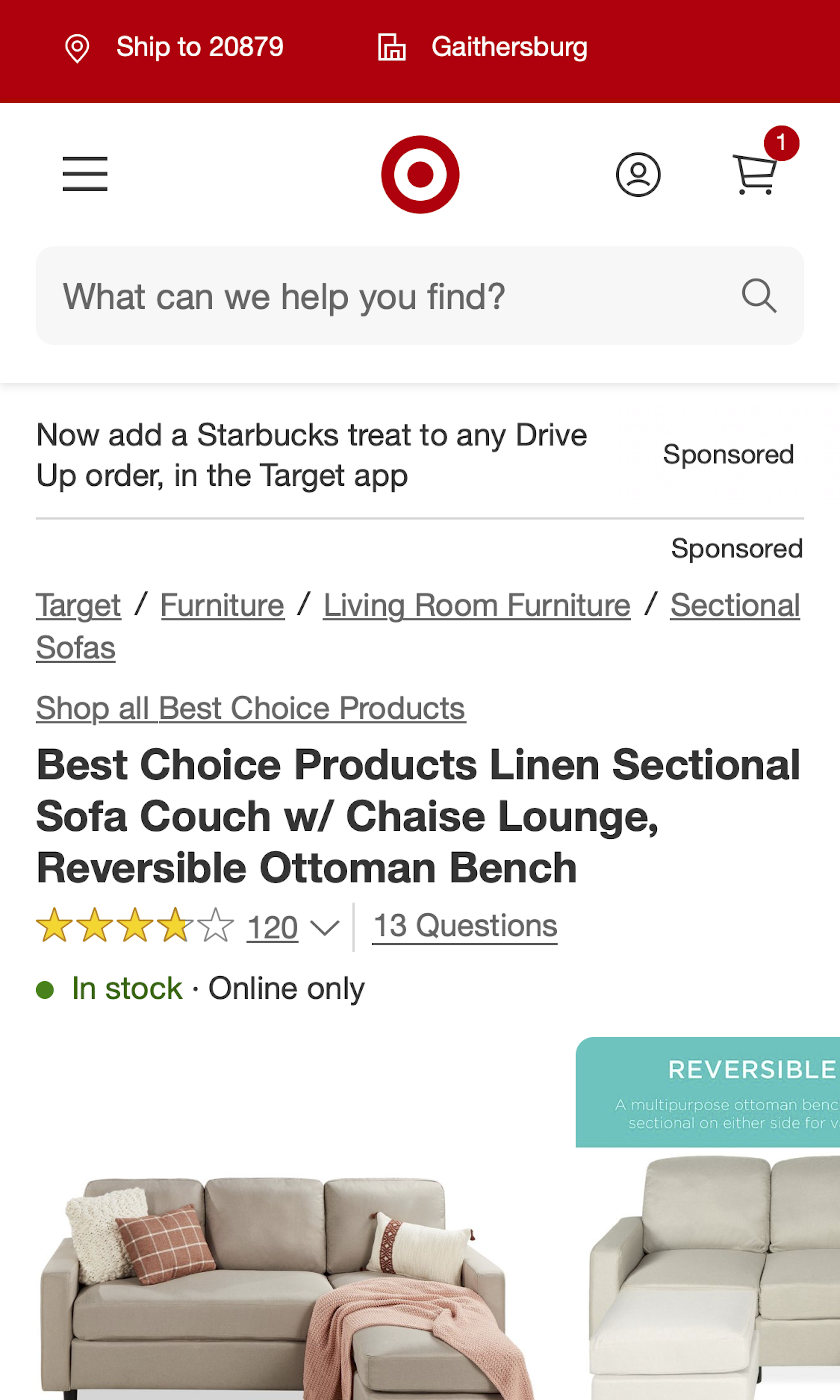
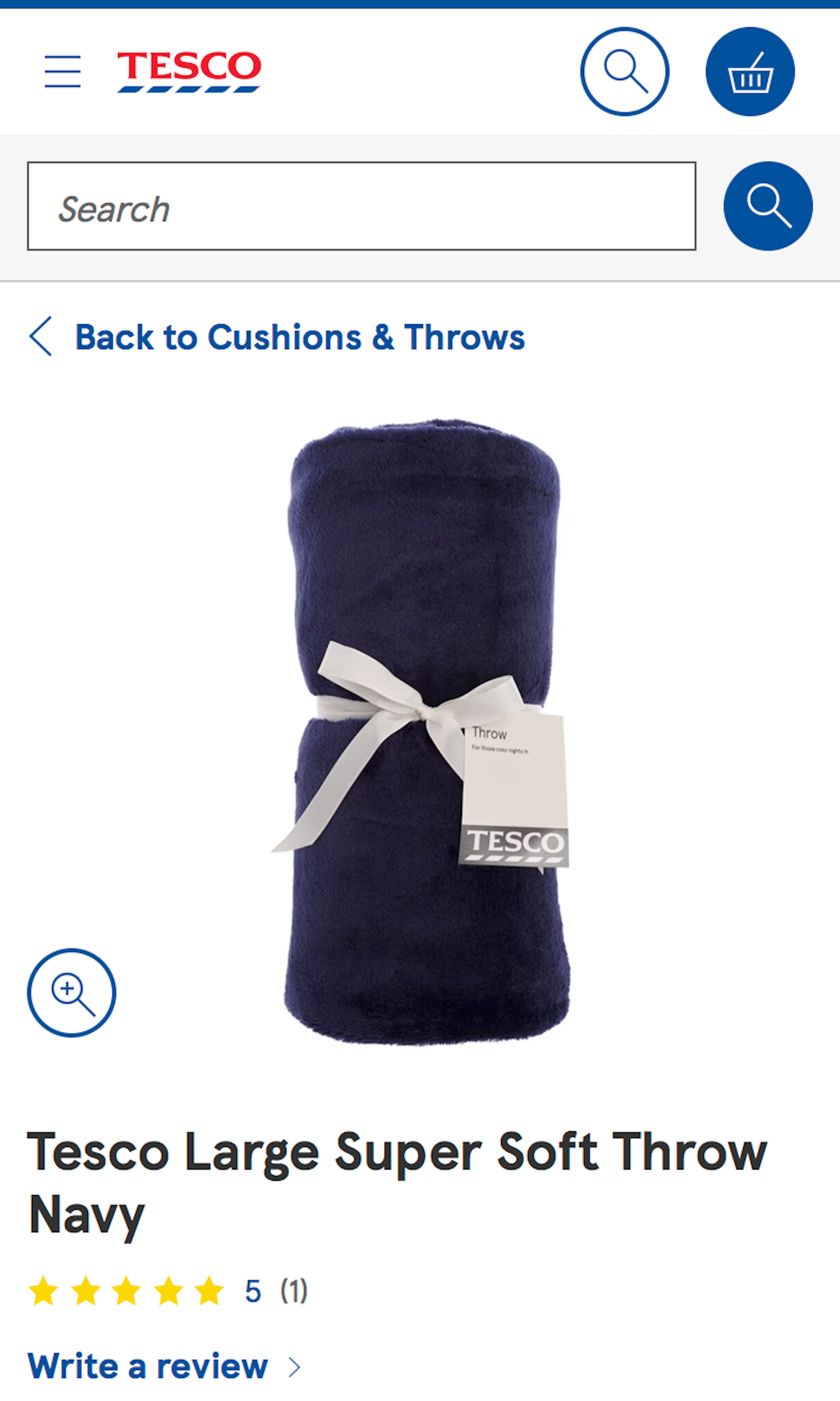
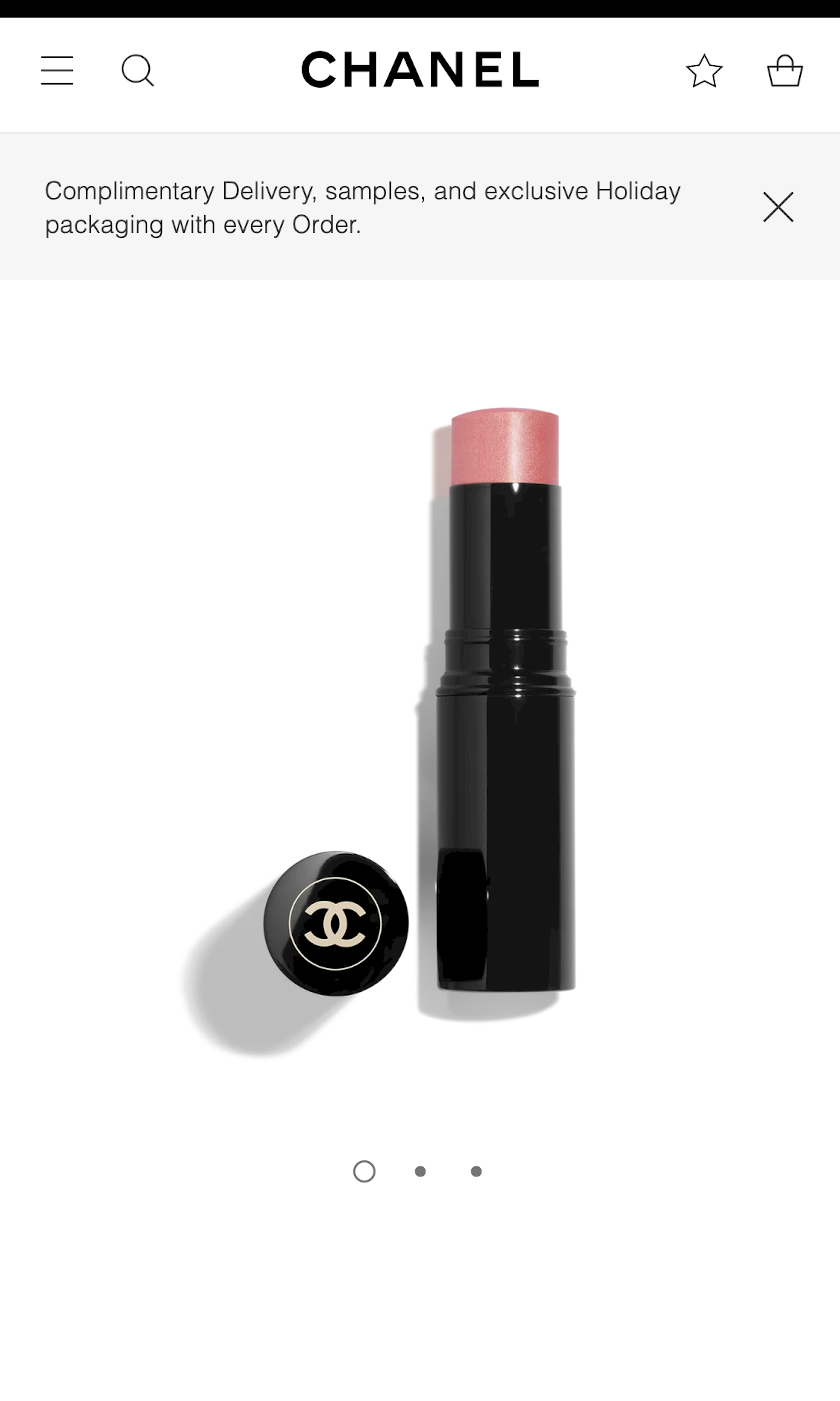
What’s this? Here you’ll find 425 “Mobile: Product Pages” full-page screenshots annotated with research-based UX insights, sourced from Baymard’s UX benchmark of 93 ecommerce sites. (Note: this is less than 1% of the full research catalog.)
In our testing we observe that mobile product pages often cause a range of highly severe usability issue. Often the mobile product page designs cause users to completely overlook important product images or, even worse, completely overlook entire product page content sections. The small mobile screen makes it very difficult to ensure that users can get a complete overview of what product content is even available on the page.
More ‘Product Page’ Insights
-
Desktop Examples: Besides the mobile examples below, we also have 235+ desktop examples of Product Page implementations.
-
Learn More: Besides exploring the 92 mobile “Product Page” design examples below, you may also want to read our related articles “Mobile UX: Avoid Using Subpages within the Product Details Page (26% Don’t)” and “6 Important Aspects of Well-Performing Mobile Product Page Breadcrumbs”.
-
Get Full Access: To see all of Baymard’s 351 mobile research findings you’ll need Baymard Premium access. (Premium also provides you full access to 150,000+ hours of UX research findings, 650+ ecommerce UX guidelines, and 275,000+ UX performance scores.))
User Experience Research, Delivered Weekly
Join 60,000+ UX professionals and get a new UX article every week.

User Experience Research, Delivered Weekly
Join 60,000+ UX professionals and get a new UX article every week.

Explore Other Research Content

300+ free UX articles based on large-scale research.

257 top sites ranked by UX performance.

Code samples, demos, and key stats for usability.


