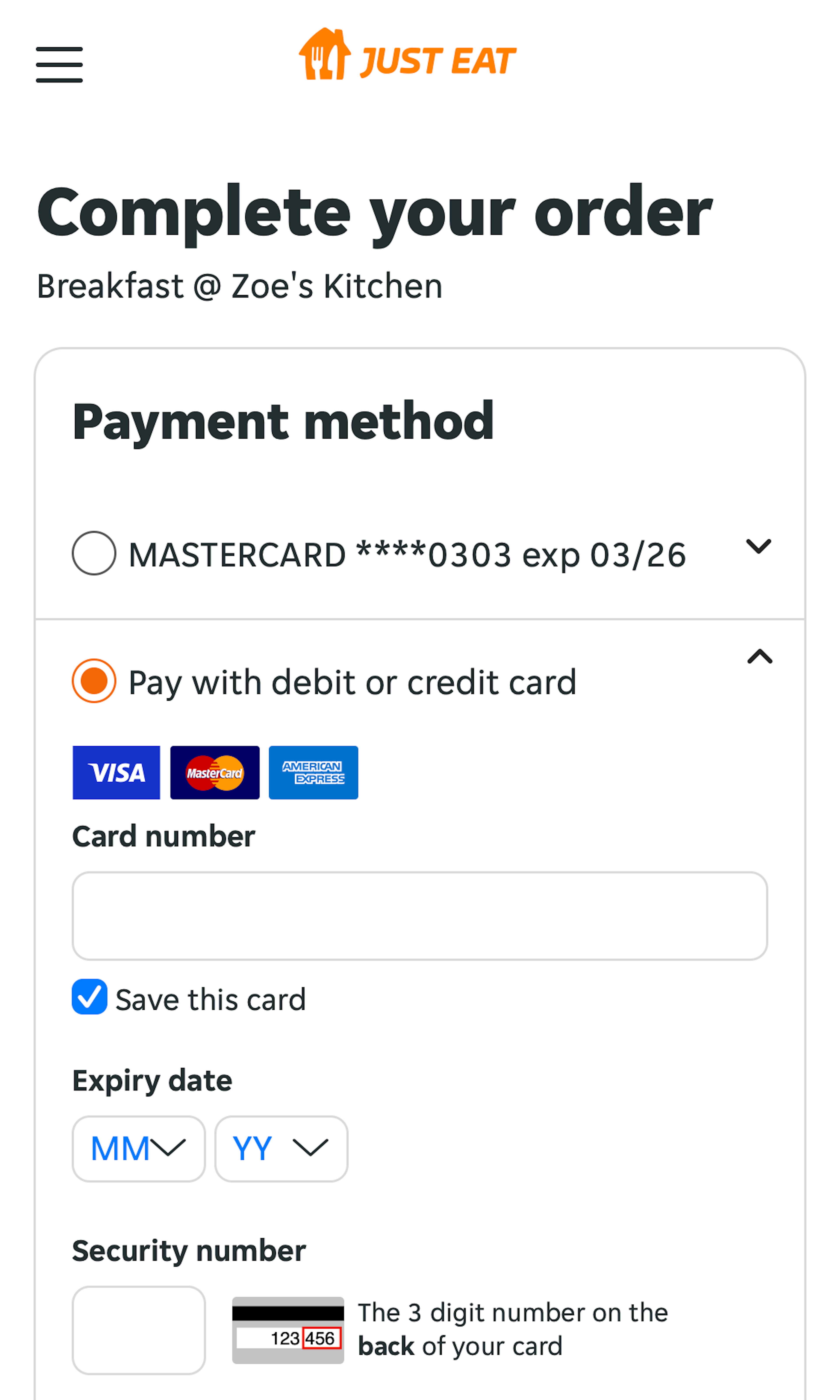
What’s this? Here you’ll find 477 “Mobile: Payment” full-page screenshots annotated with research-based UX insights, sourced from Baymard’s UX benchmark of 93 e-commerce sites. (Note: this is less than 1% of the full research catalog.)
During our large-scale usability testing of mobile checkouts we’ve observed that the Payment Method selection is yet another mobile checkout design where a large number of e-commerce sites use a design pattern that causes usability issues for users. On mobile the Payment Method design is particular difficult to get right, as most sites have one predominant method (typically credit card), yet still need to show a handful of 3rd-party payment options, which can be difficult to balance within the small mobile viewport.
More ‘Payment Method’ Insights
-
In practice the mobile Payment Method designs used by most sites are prone to users either not being able to establish an overview of their payment options or more commonly are unintentionally nudged into a 3rd-party payment option they don’t fully understand (due to too-little emphasis on the most popular Credit Card option).
-
Desktop Examples: Besides the mobile examples below, we also have 125+ desktop examples of Payment implementations.
-
Learn More: Besides exploring the 92 mobile “Payment Method” design examples below, you may also want to read our related article “6 Mobile Checkout Usability Considerations”.
-
Get Full Access: To see all of Baymard’s 351 mobile research findings you’ll need Baymard Premium access. (Premium also provides you full access to 150,000+ hours of UX research findings, 650+ e-commerce UX guidelines, and 275,000+ UX performance scores.))
User Experience Research, Delivered Weekly
Join 60,000+ UX professionals and get a new UX article every week.

User Experience Research, Delivered Weekly
Join 60,000+ UX professionals and get a new UX article every week.

Explore Other Research Content

300+ free UX articles based on large-scale research.

256 top sites ranked by UX performance.

Code samples, demos, and key stats for usability.

Add UX Best Practice Cards to your Figma projects.


