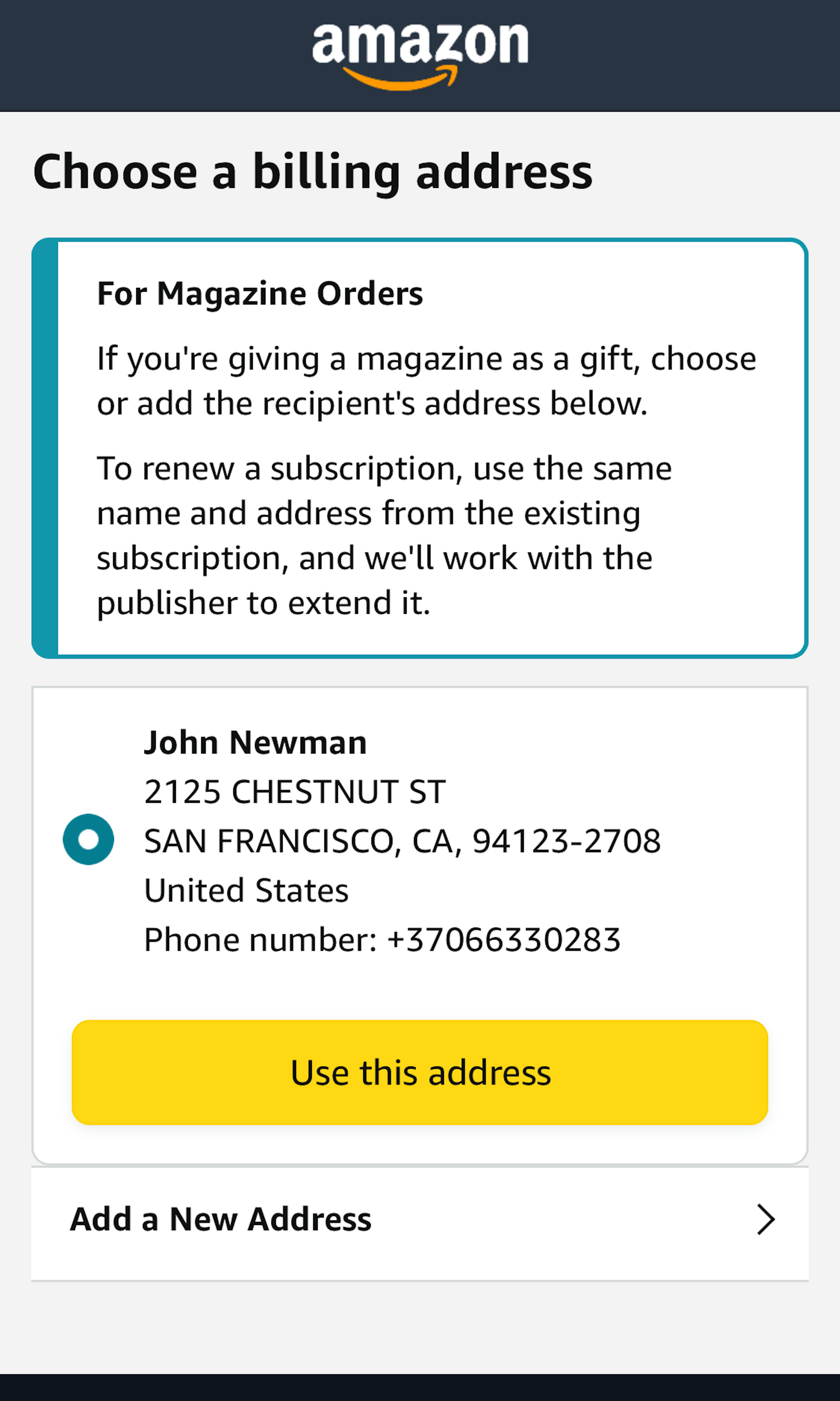
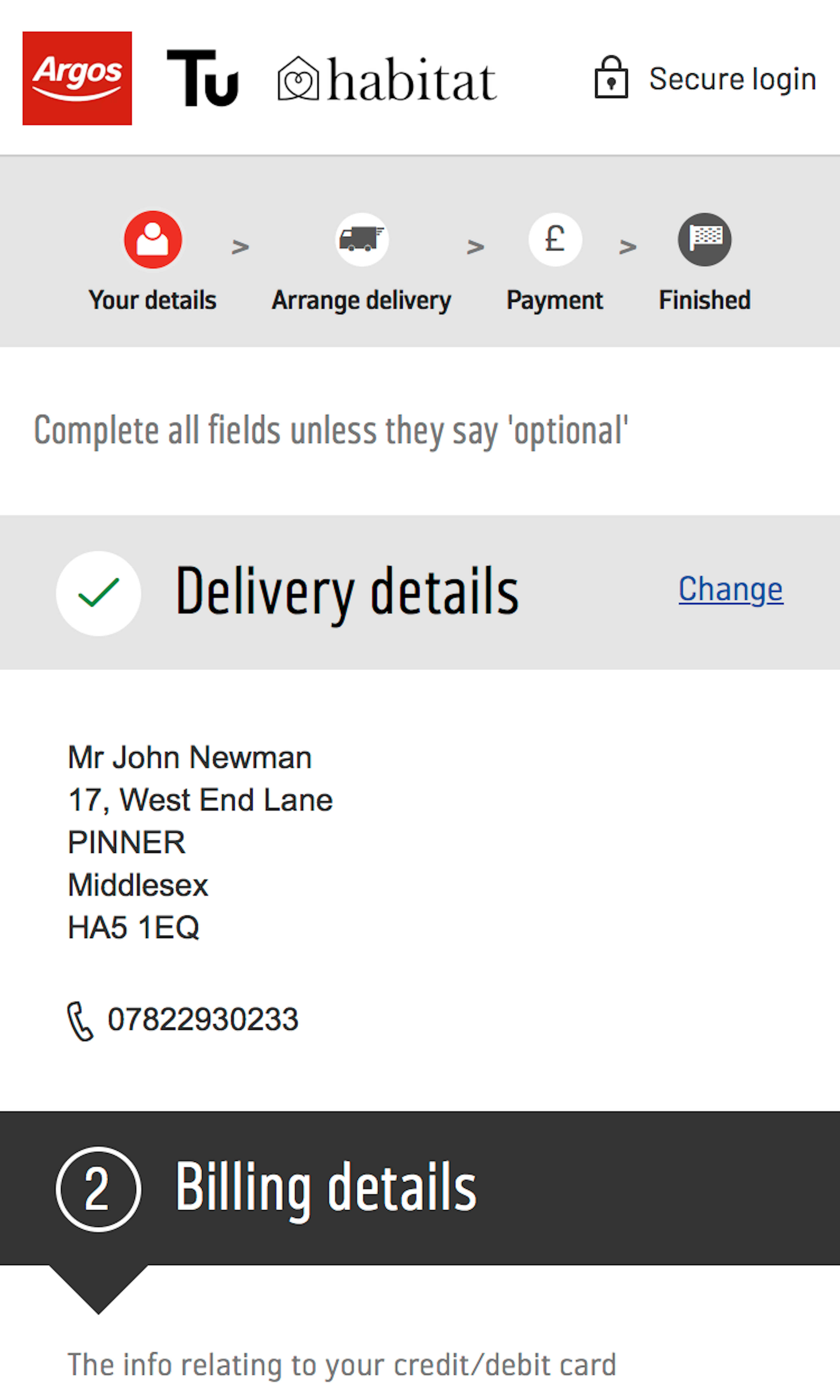
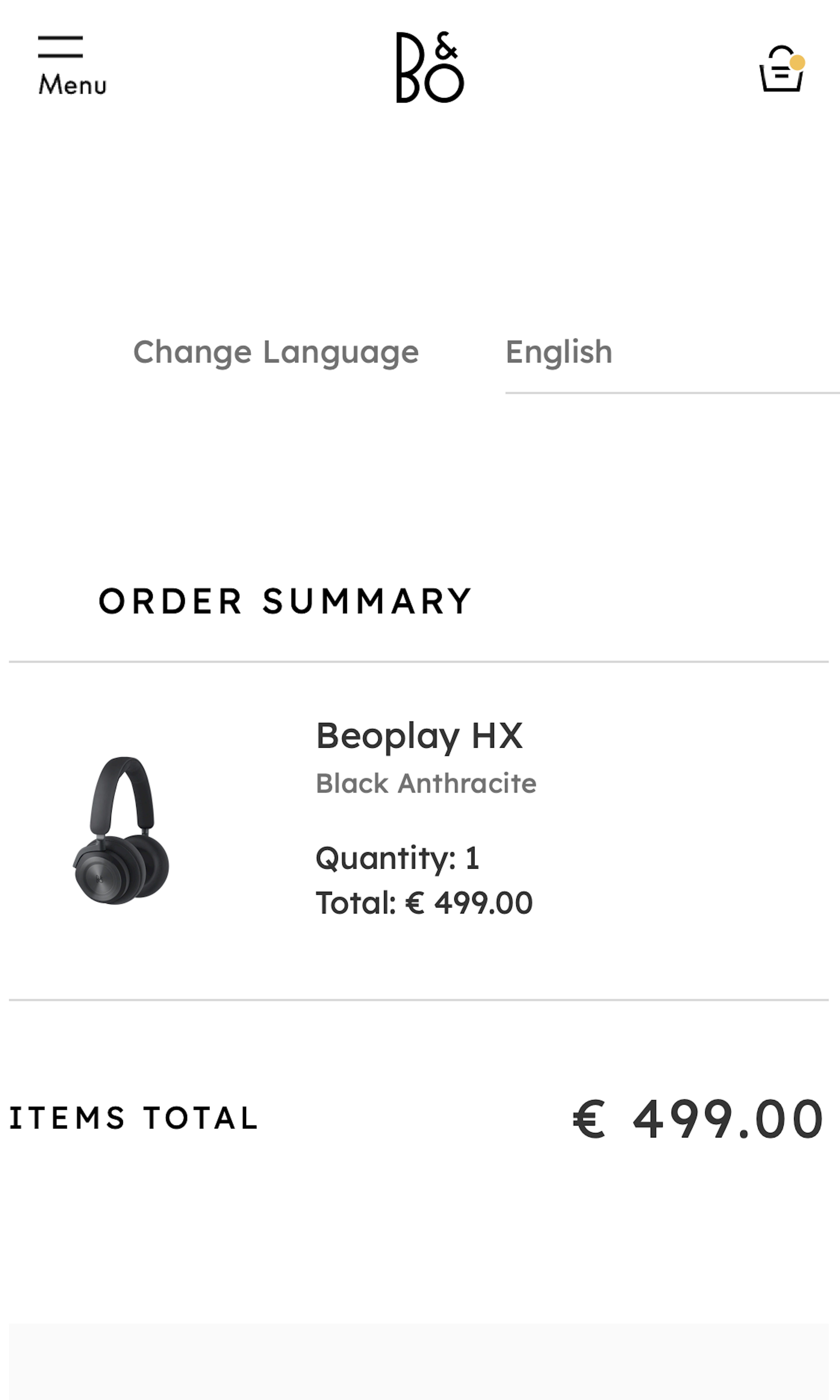
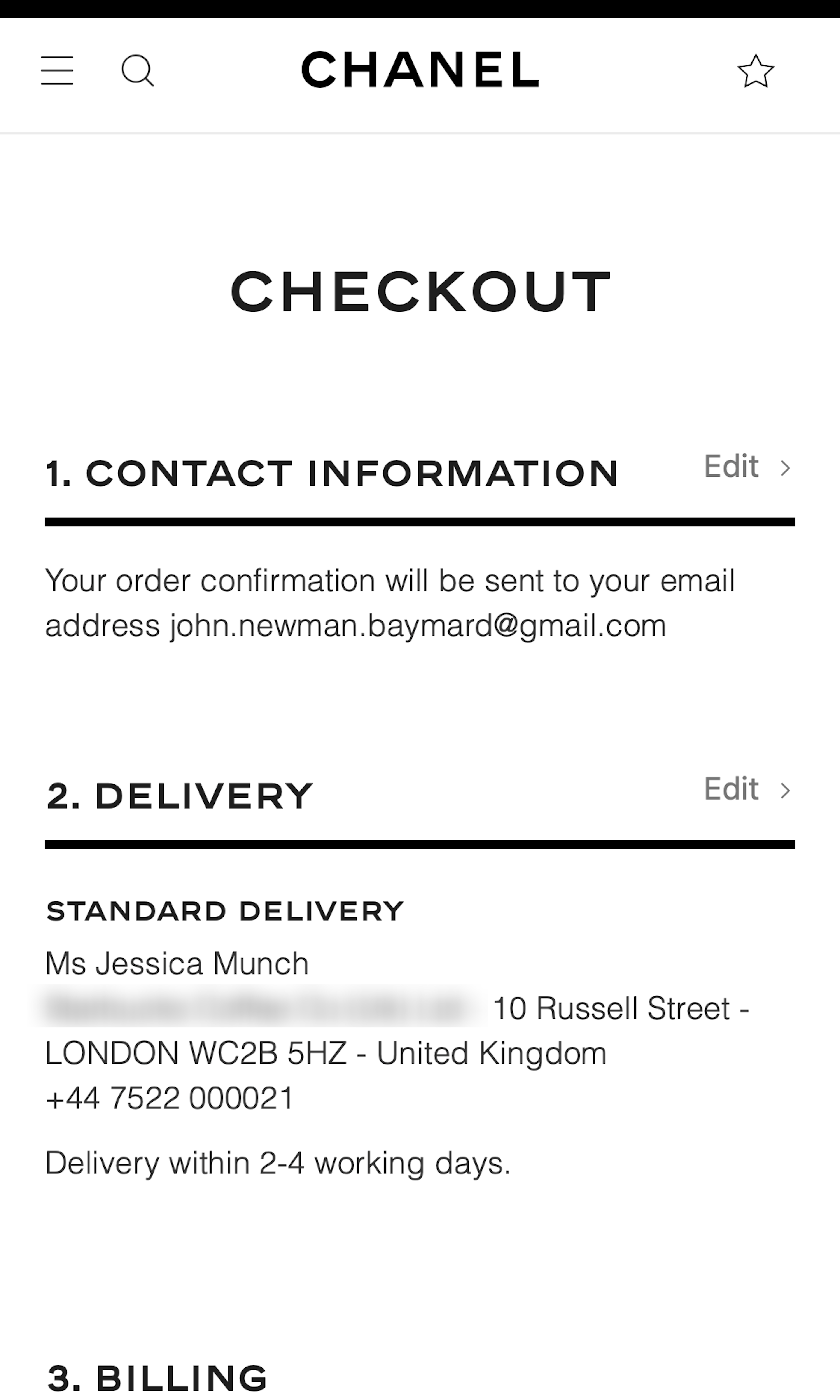
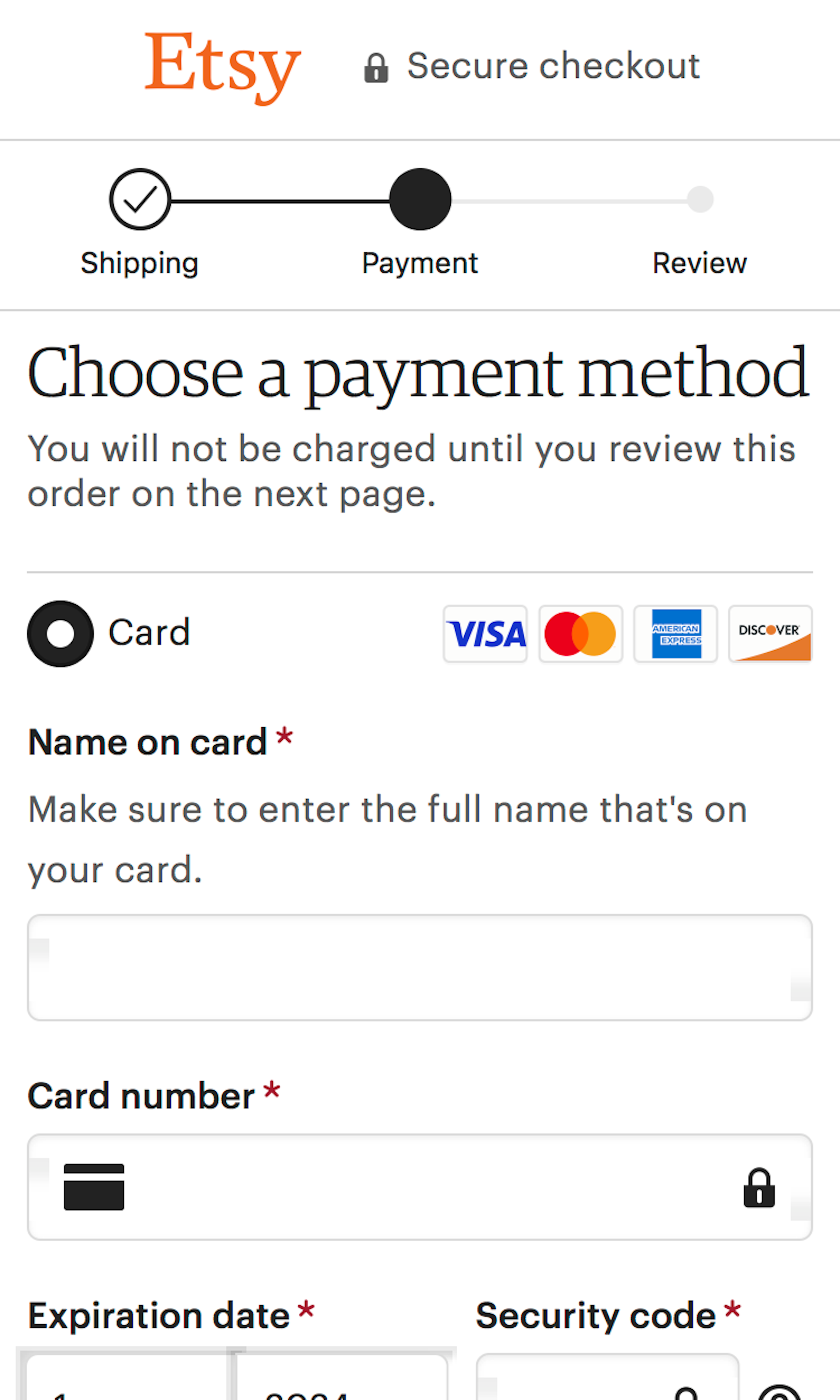
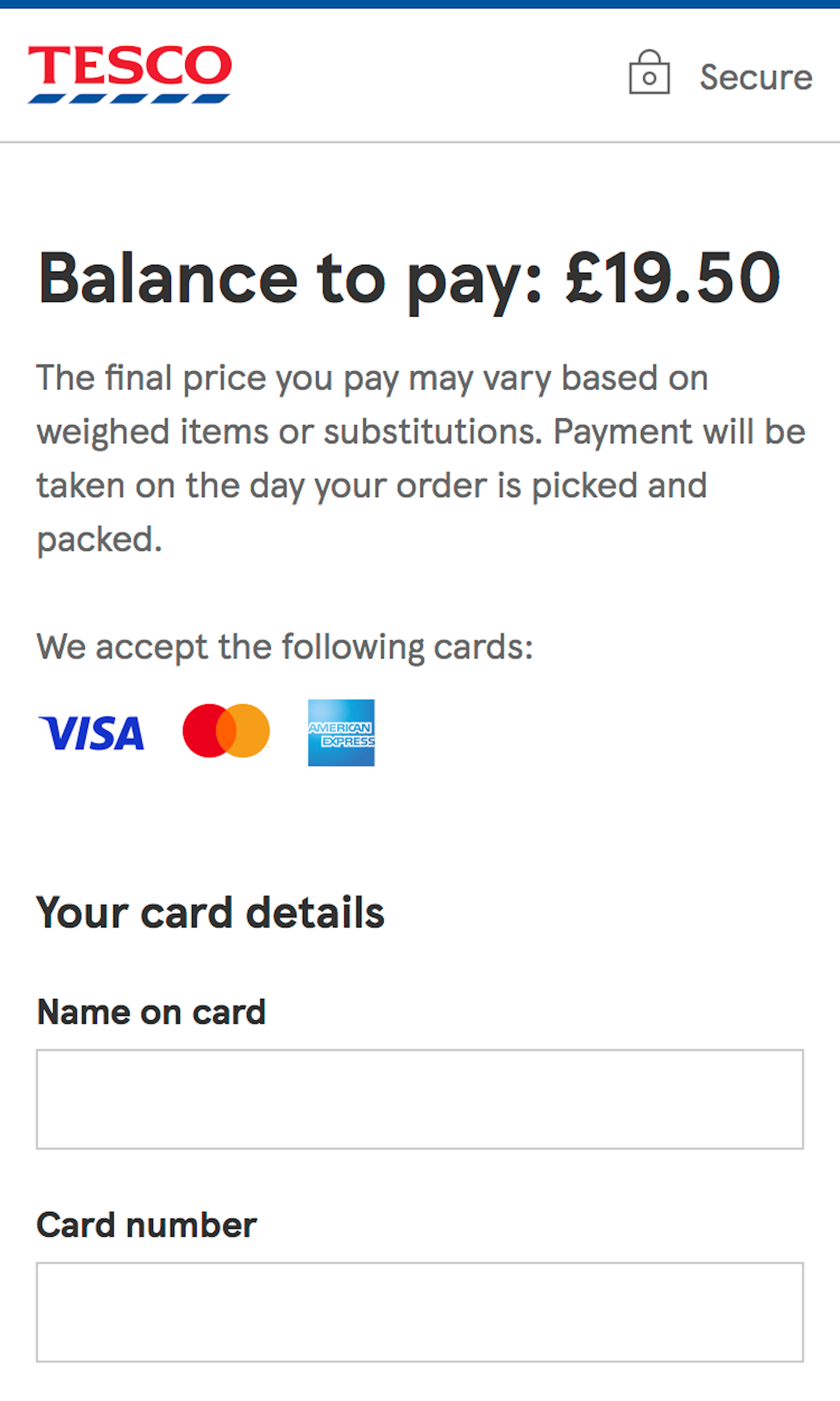
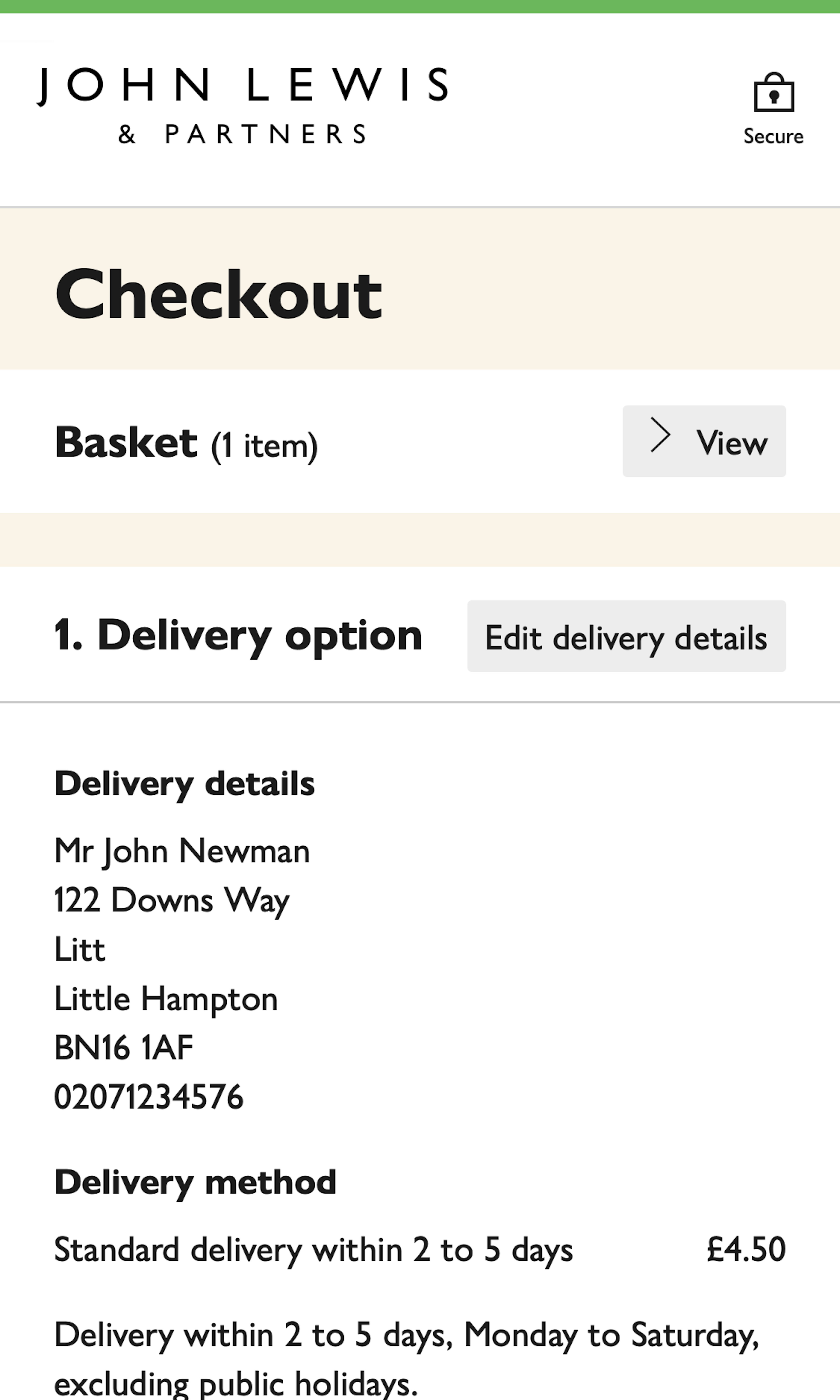
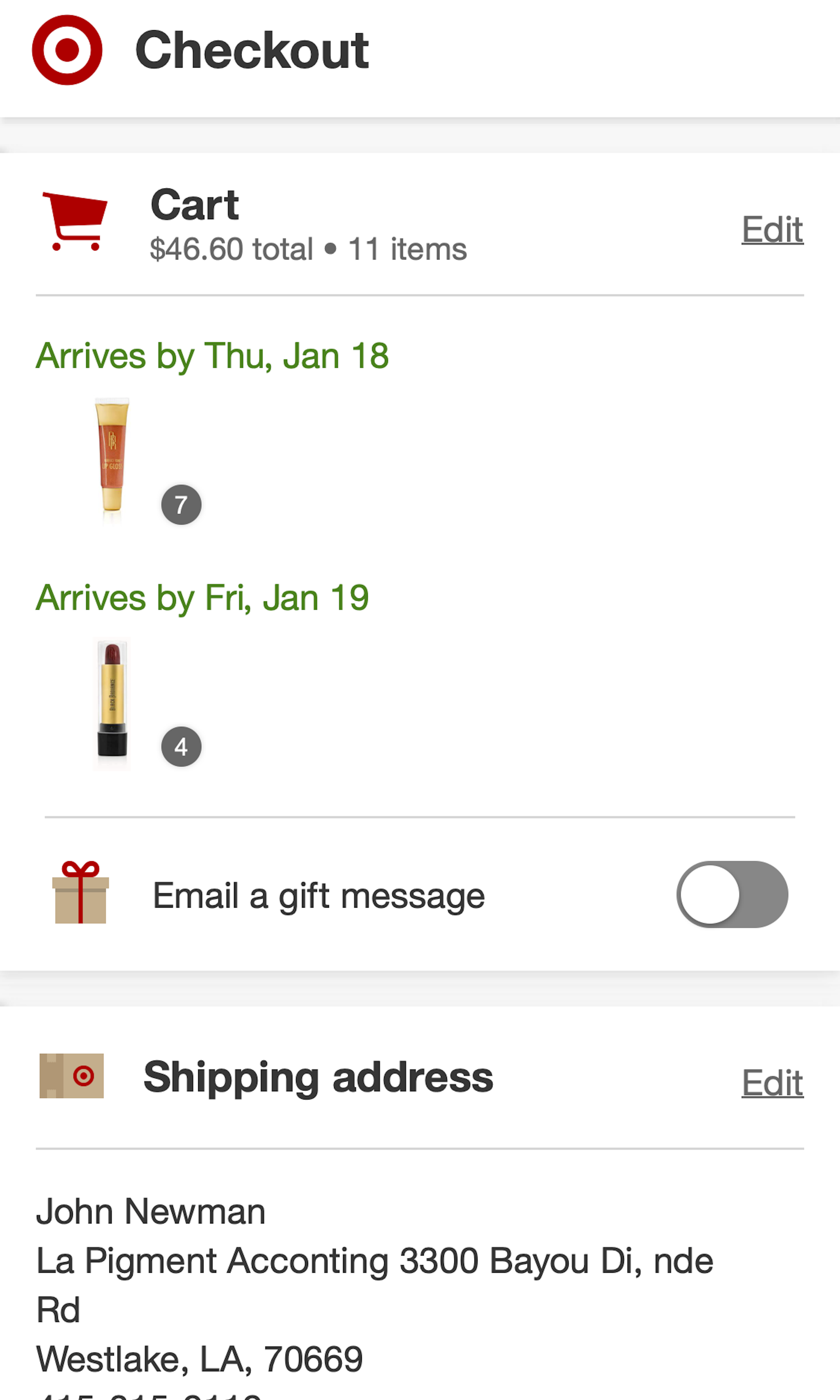
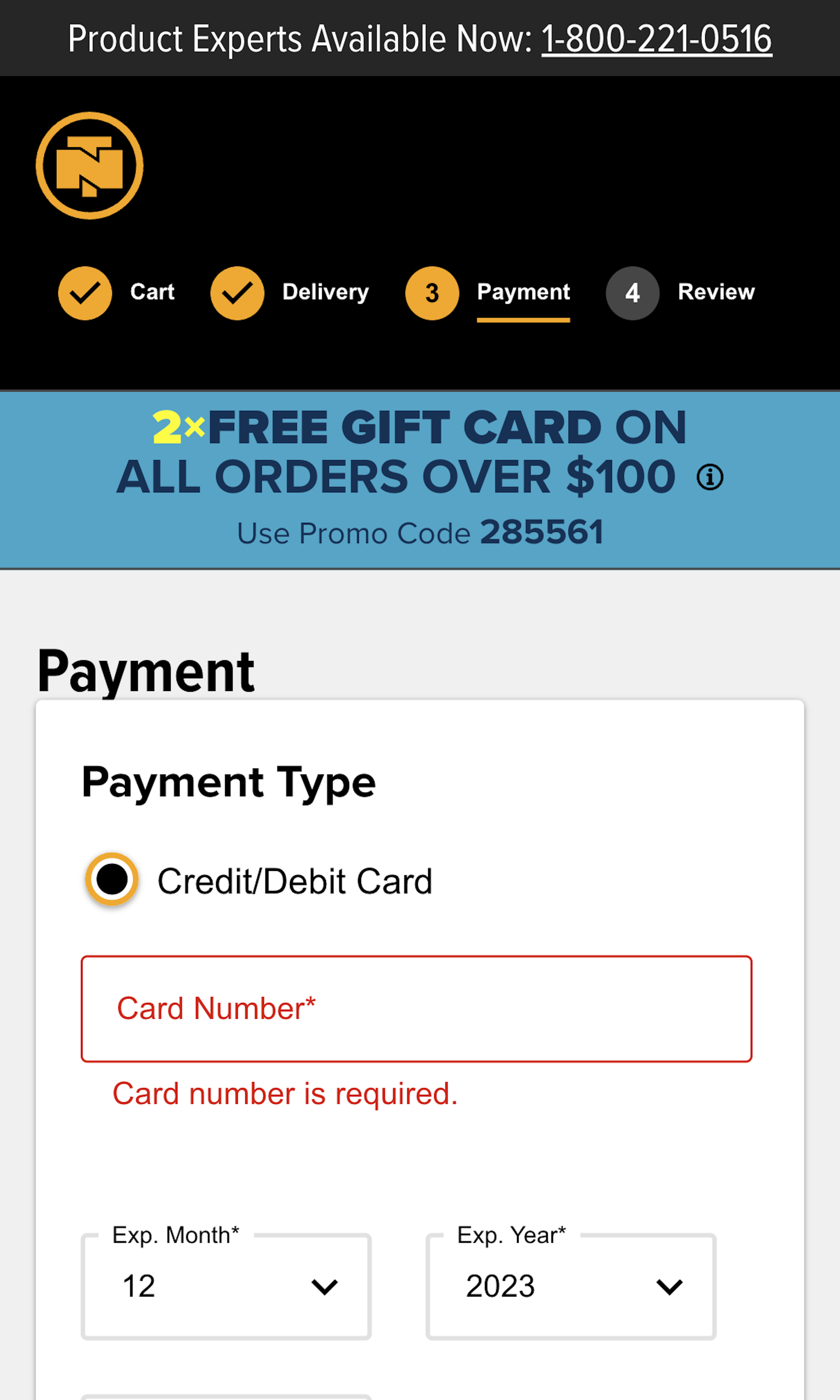
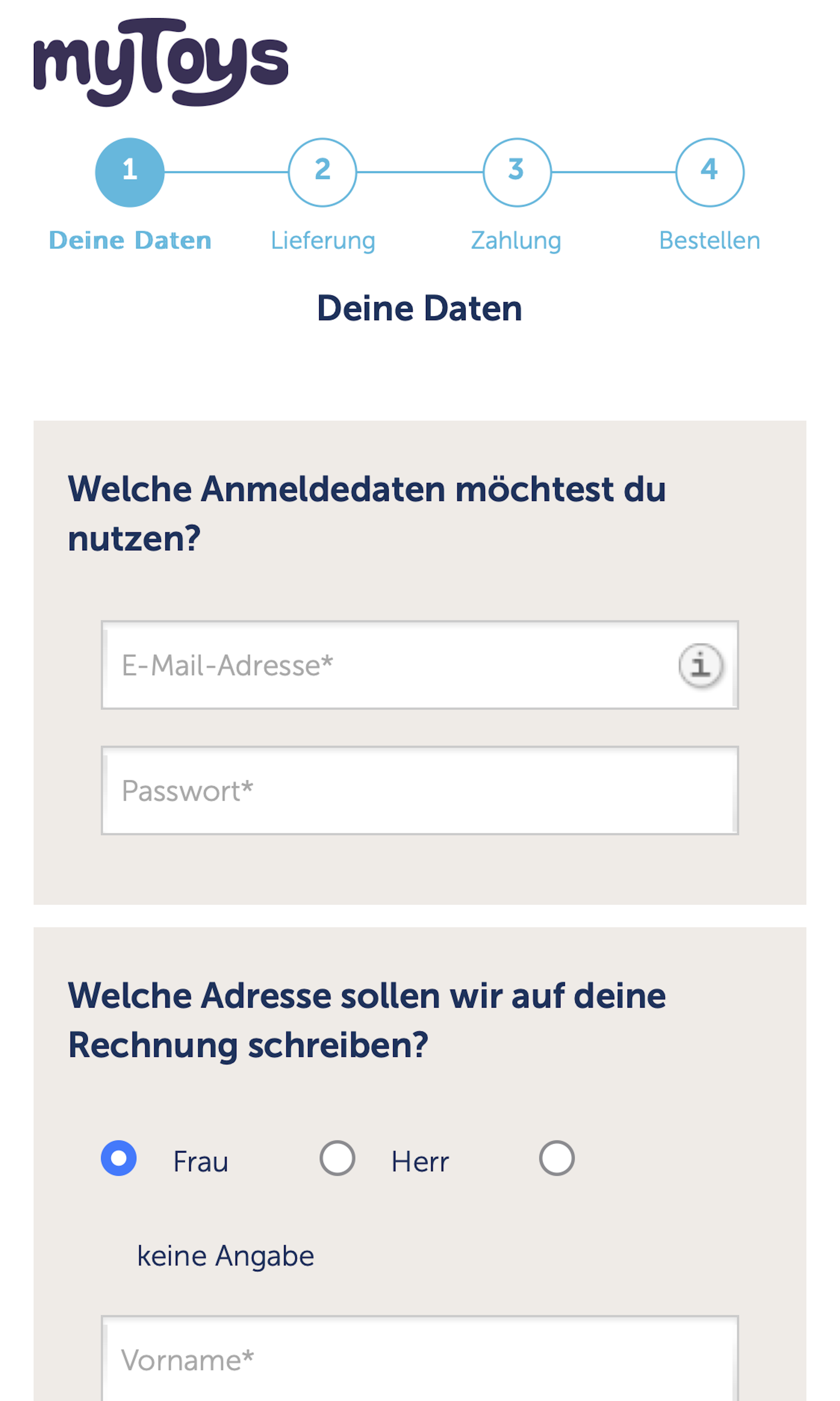
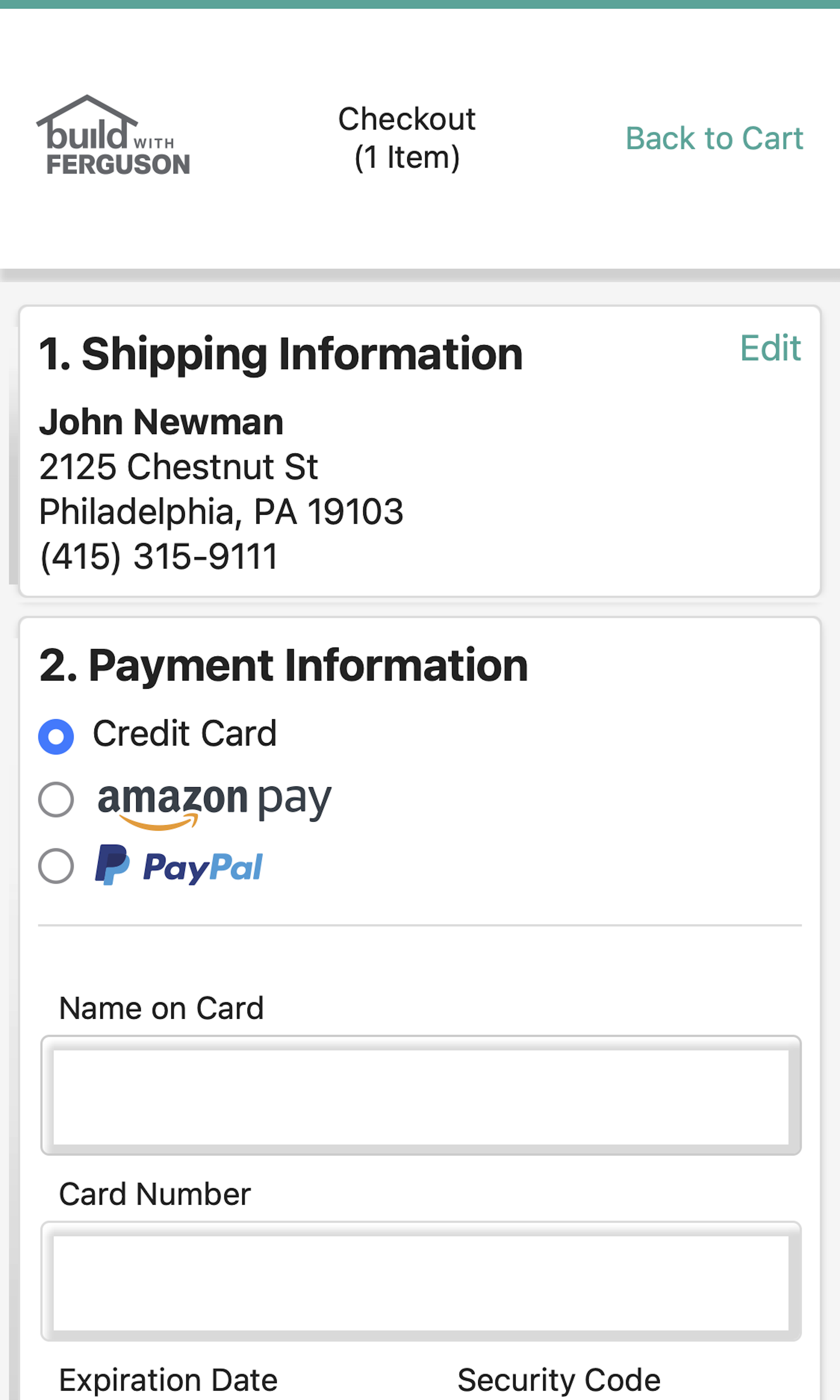
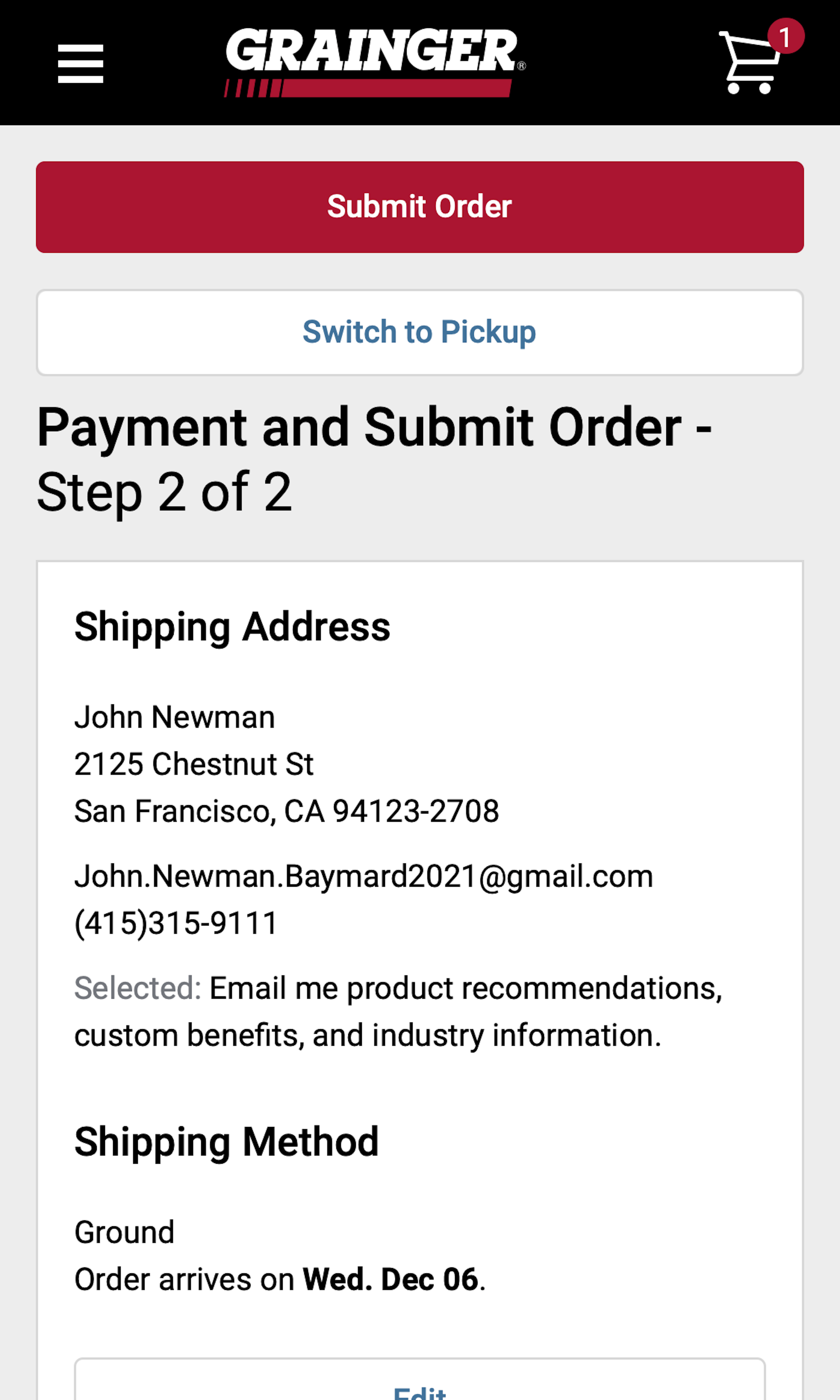
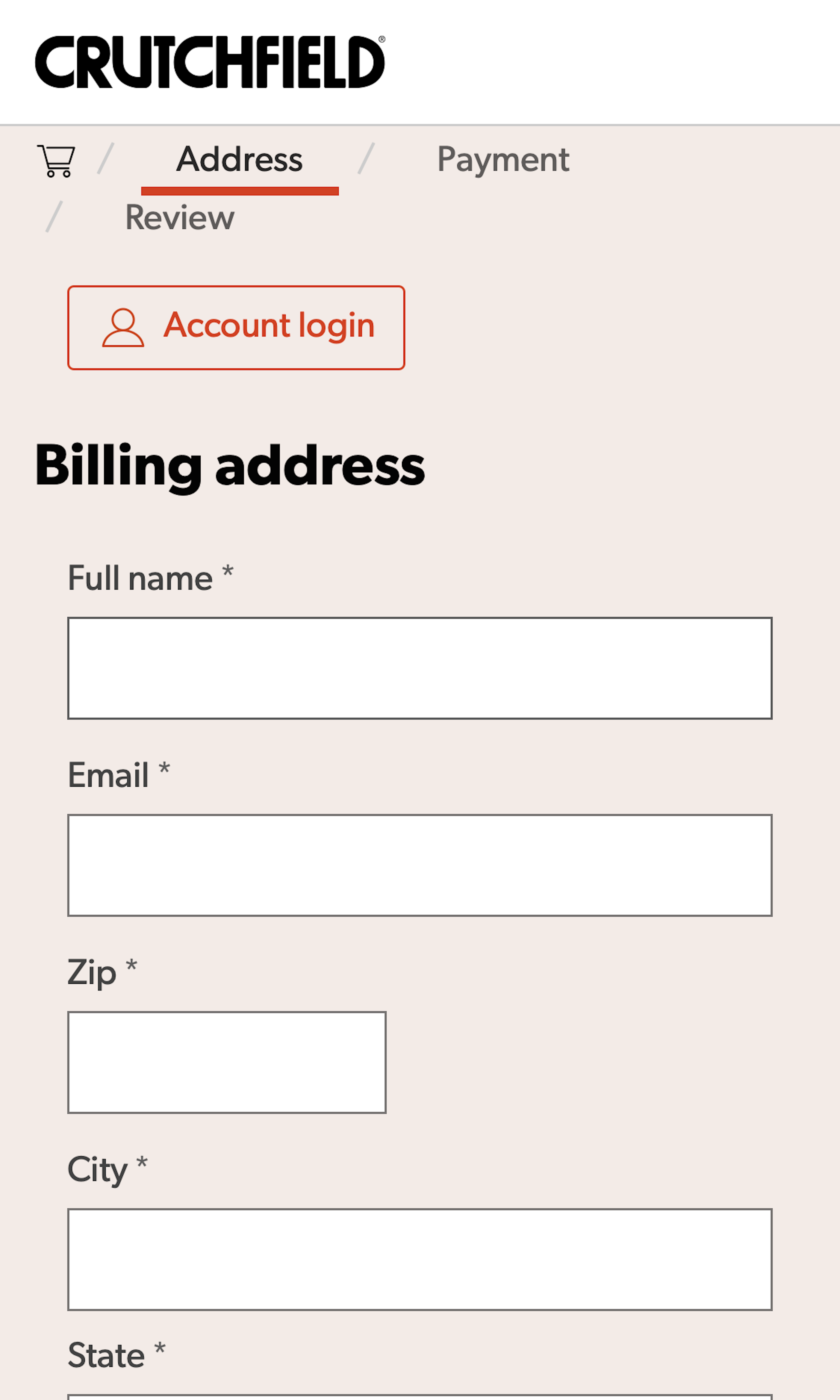
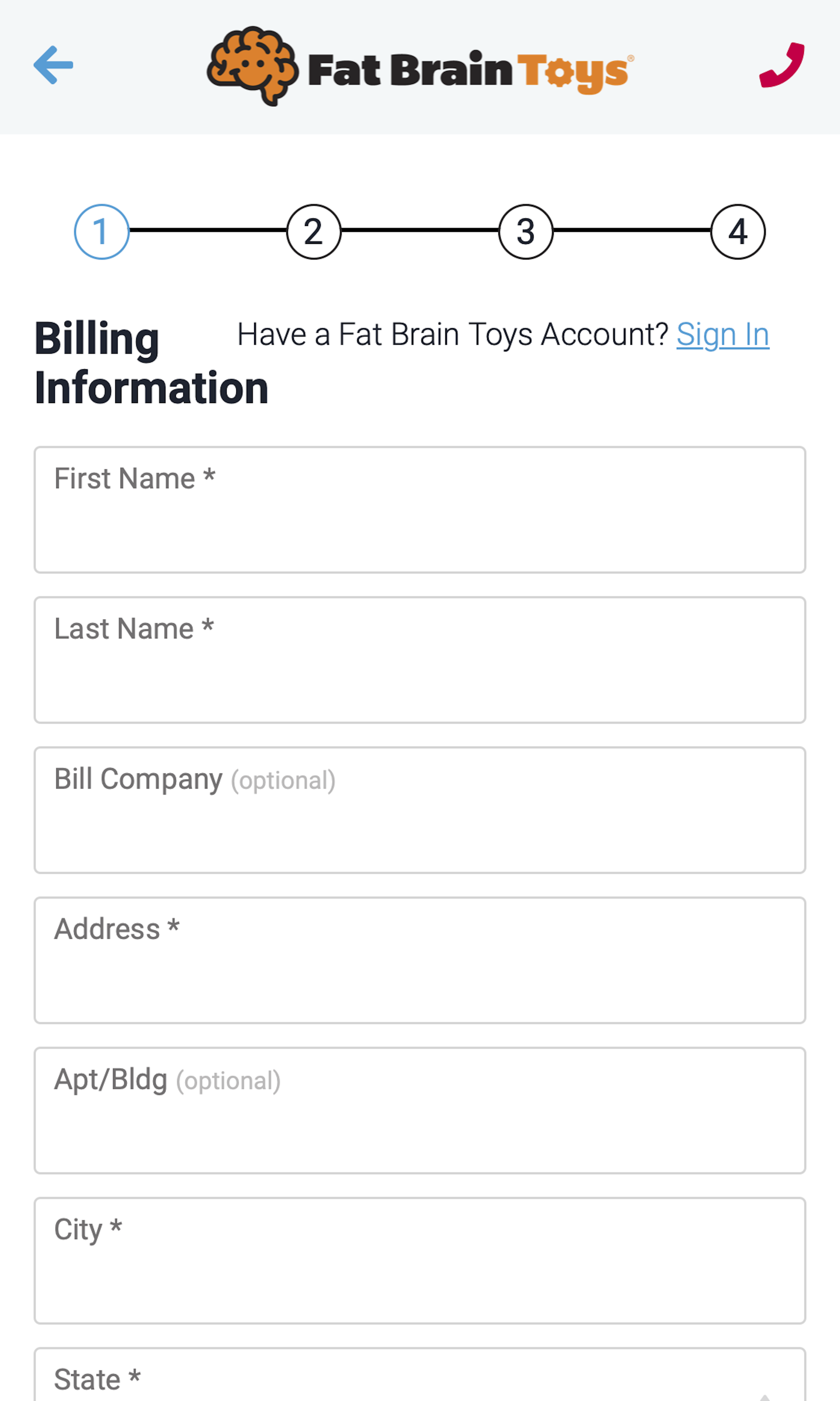
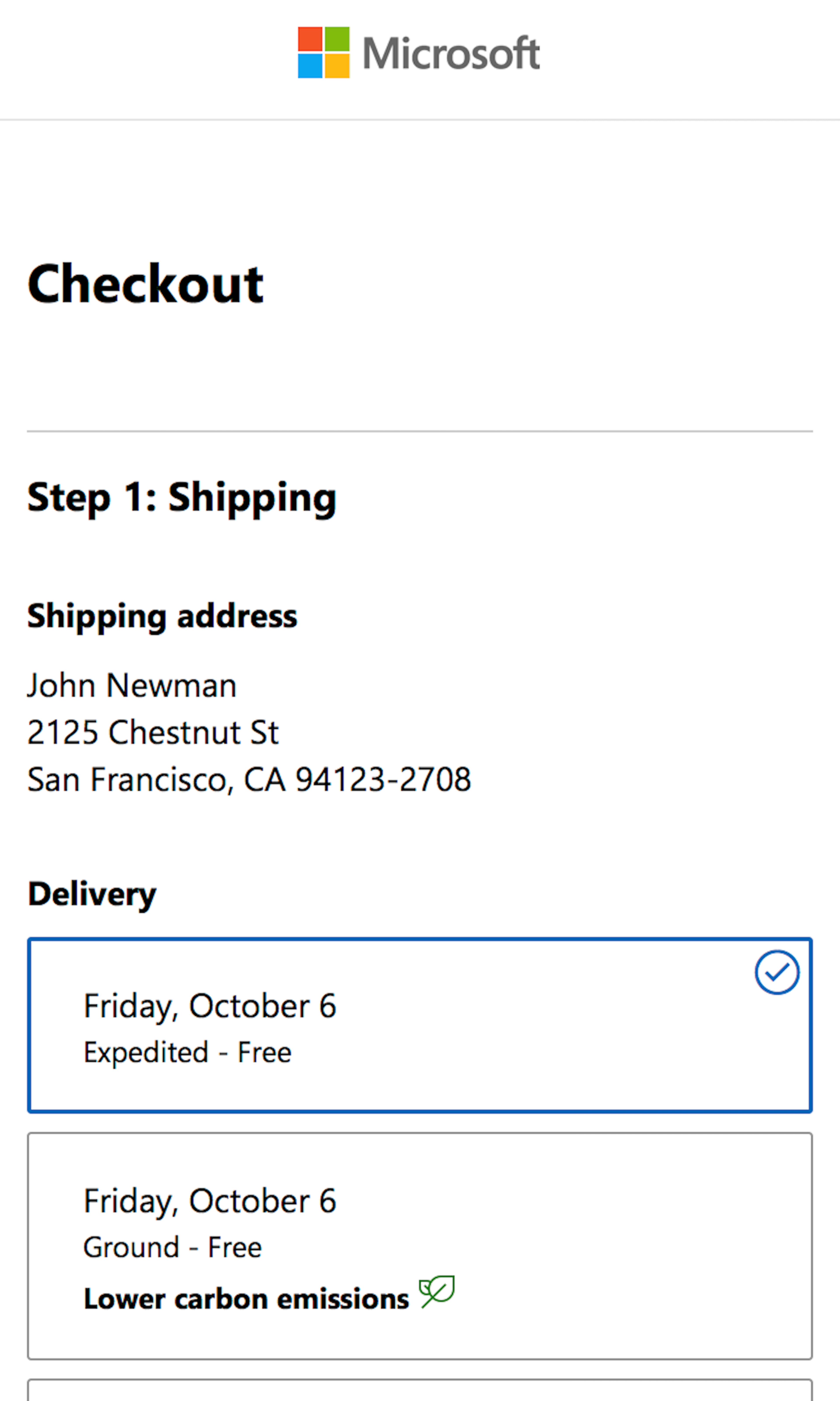
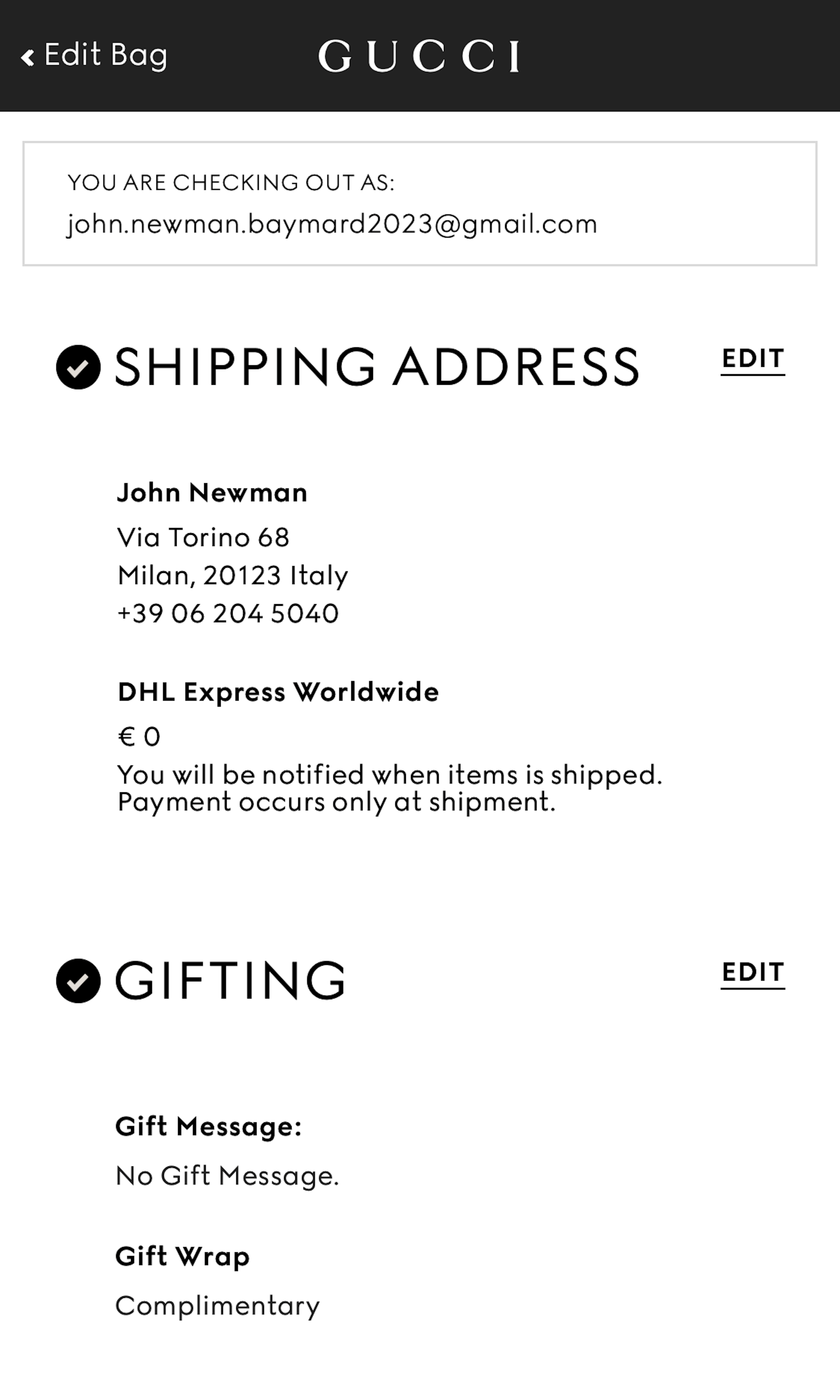
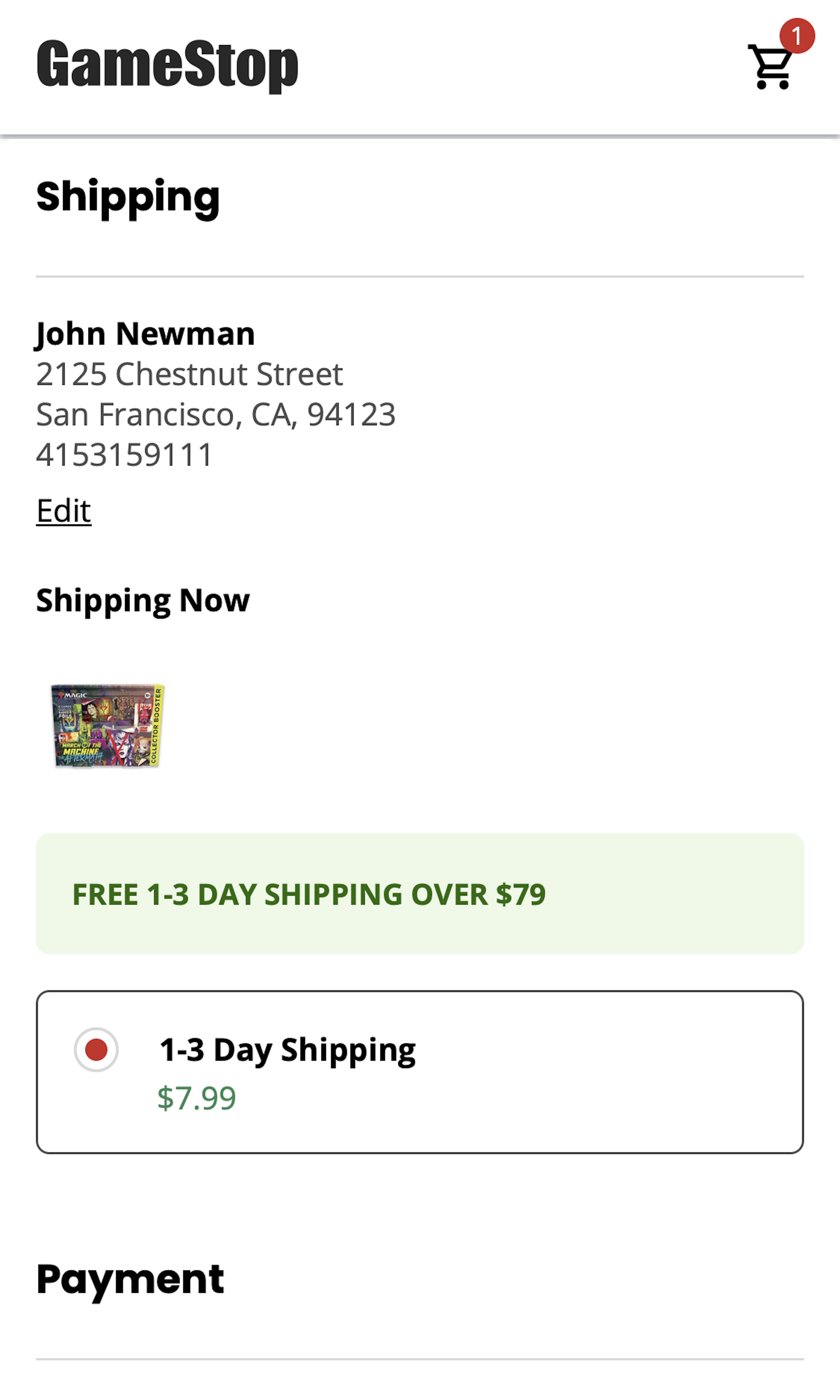
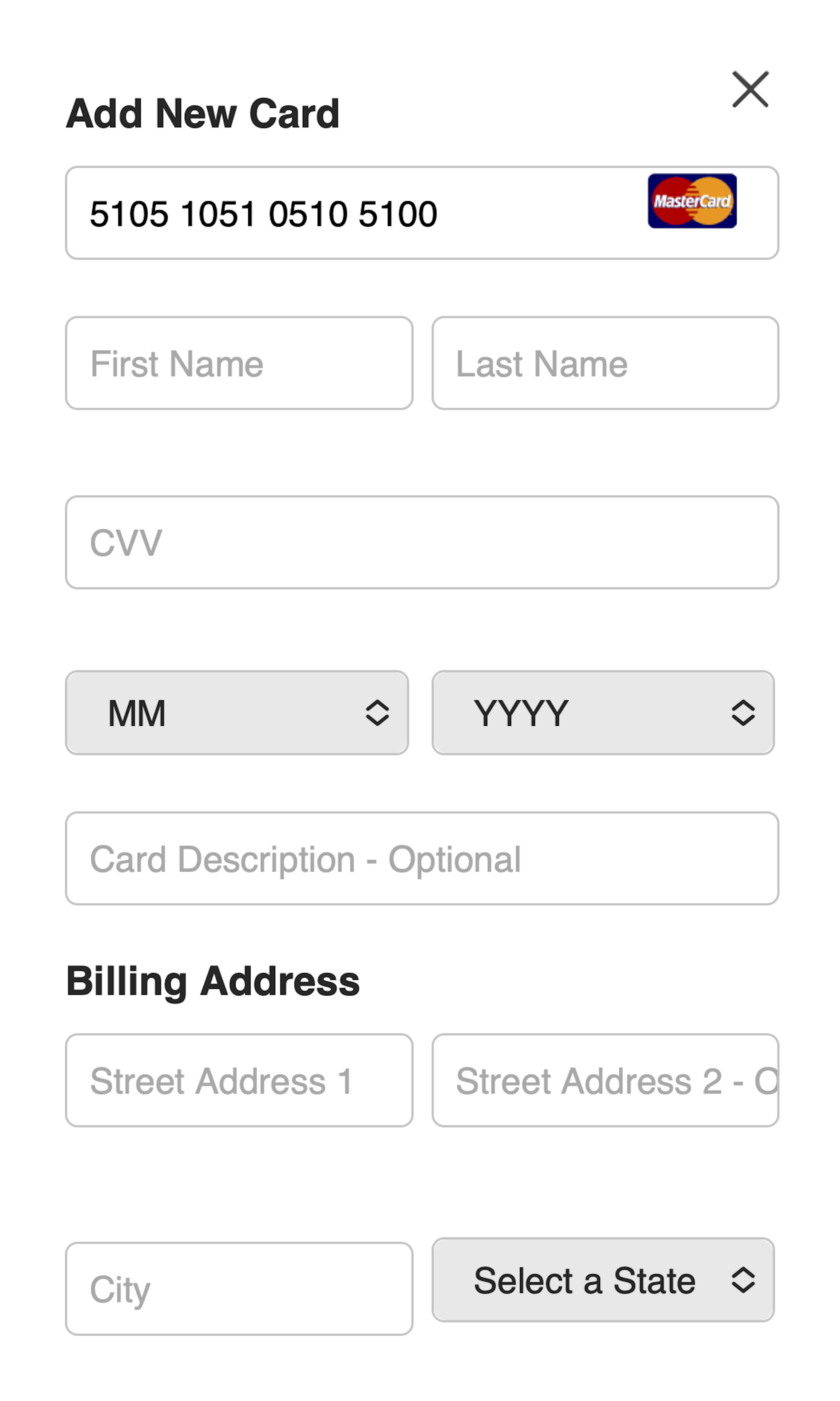
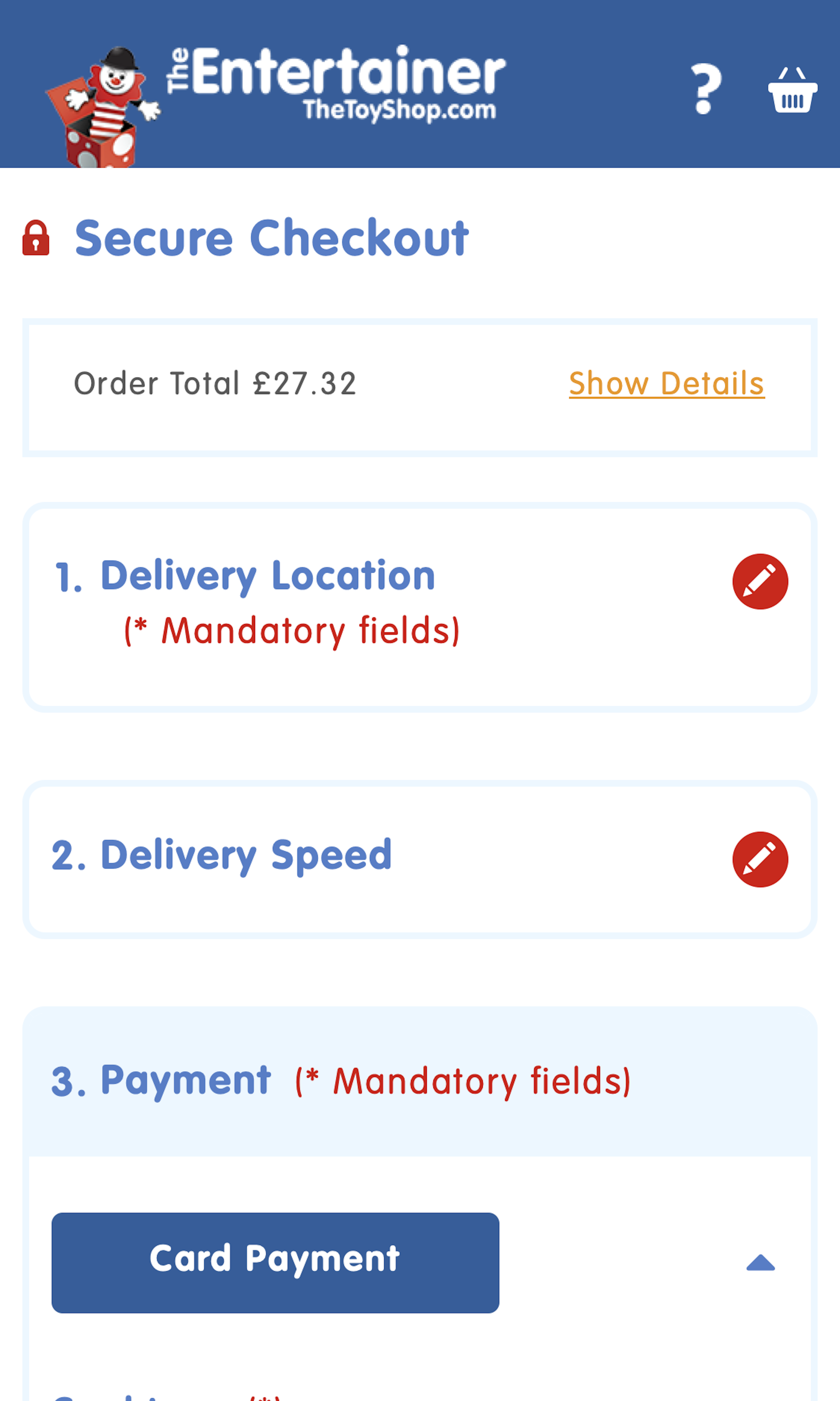
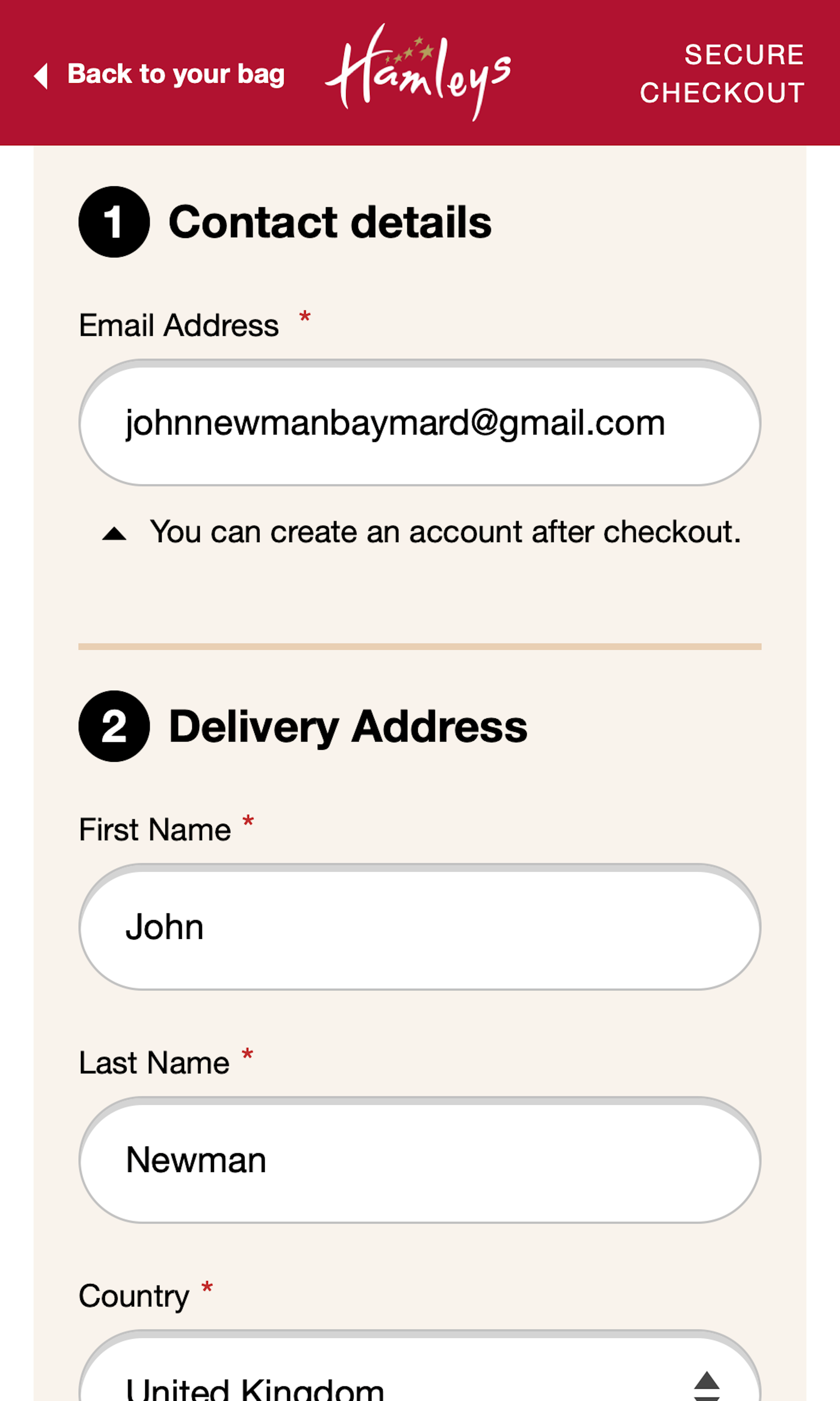
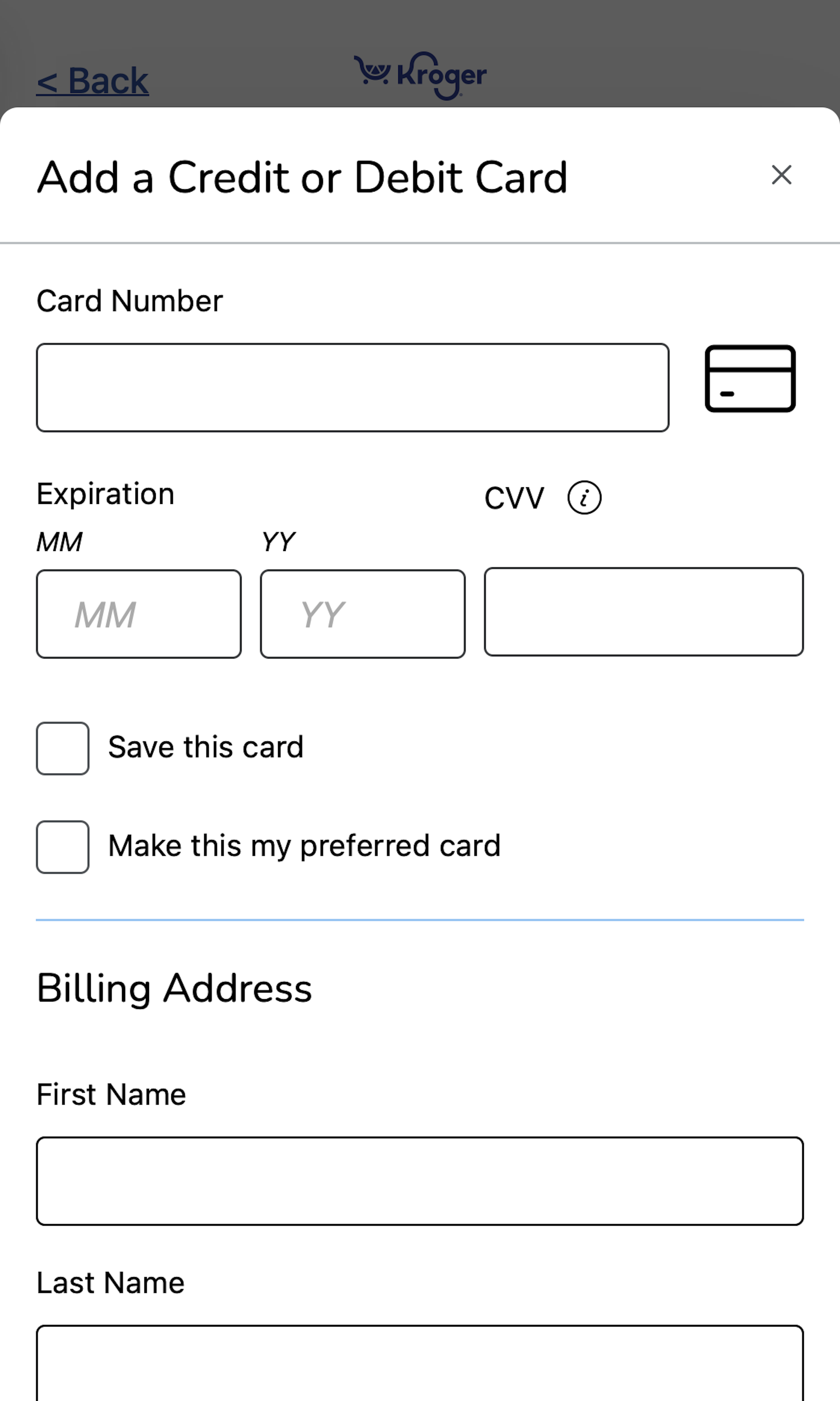
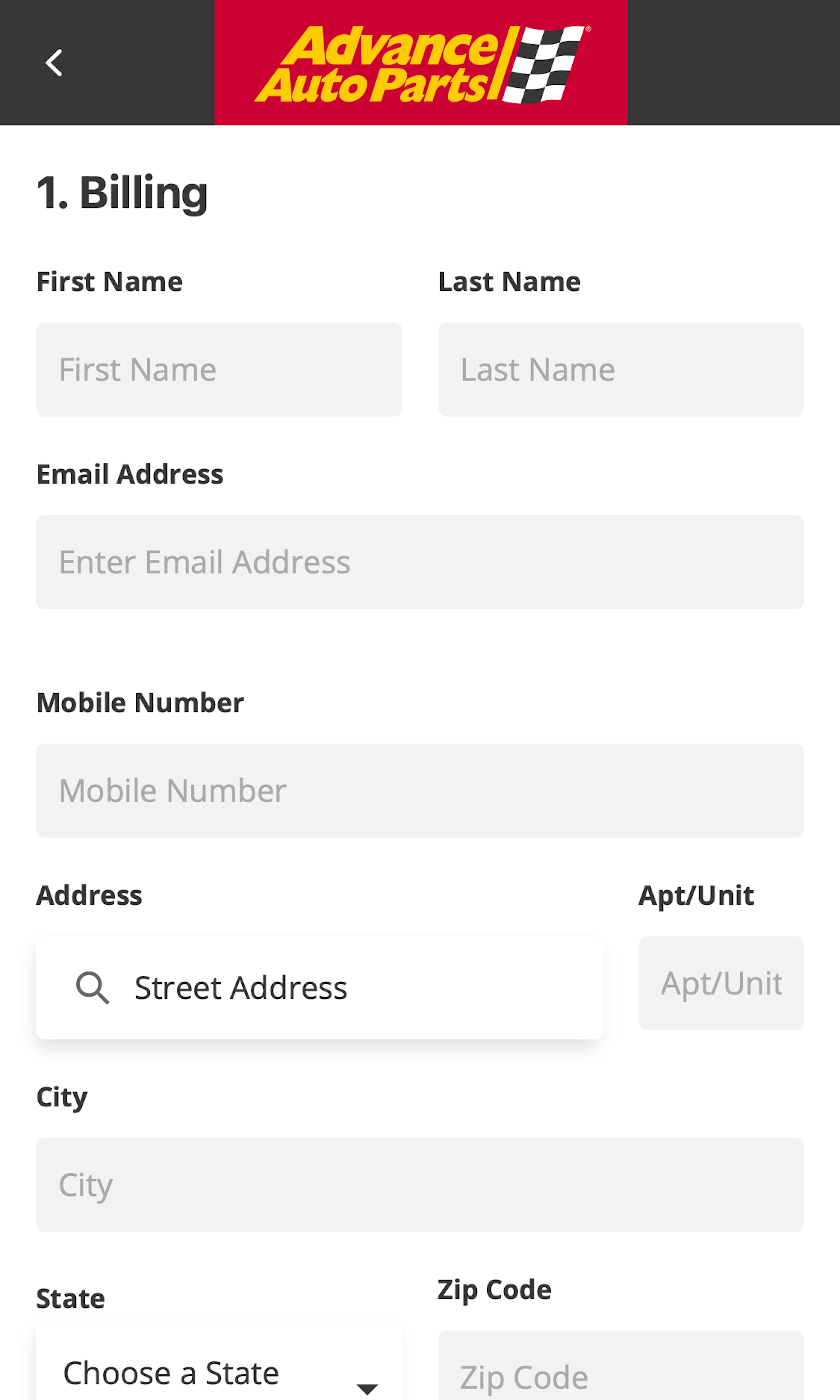
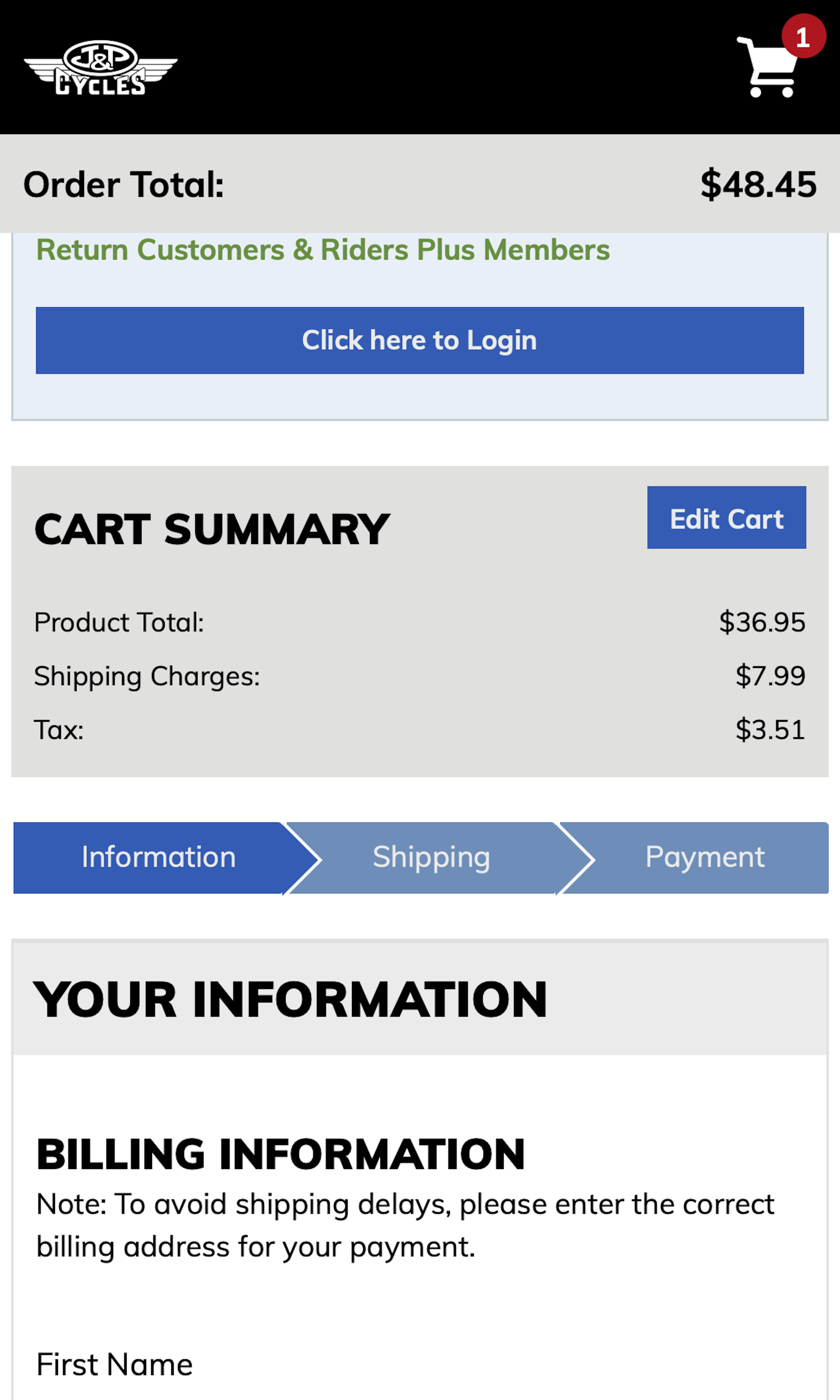
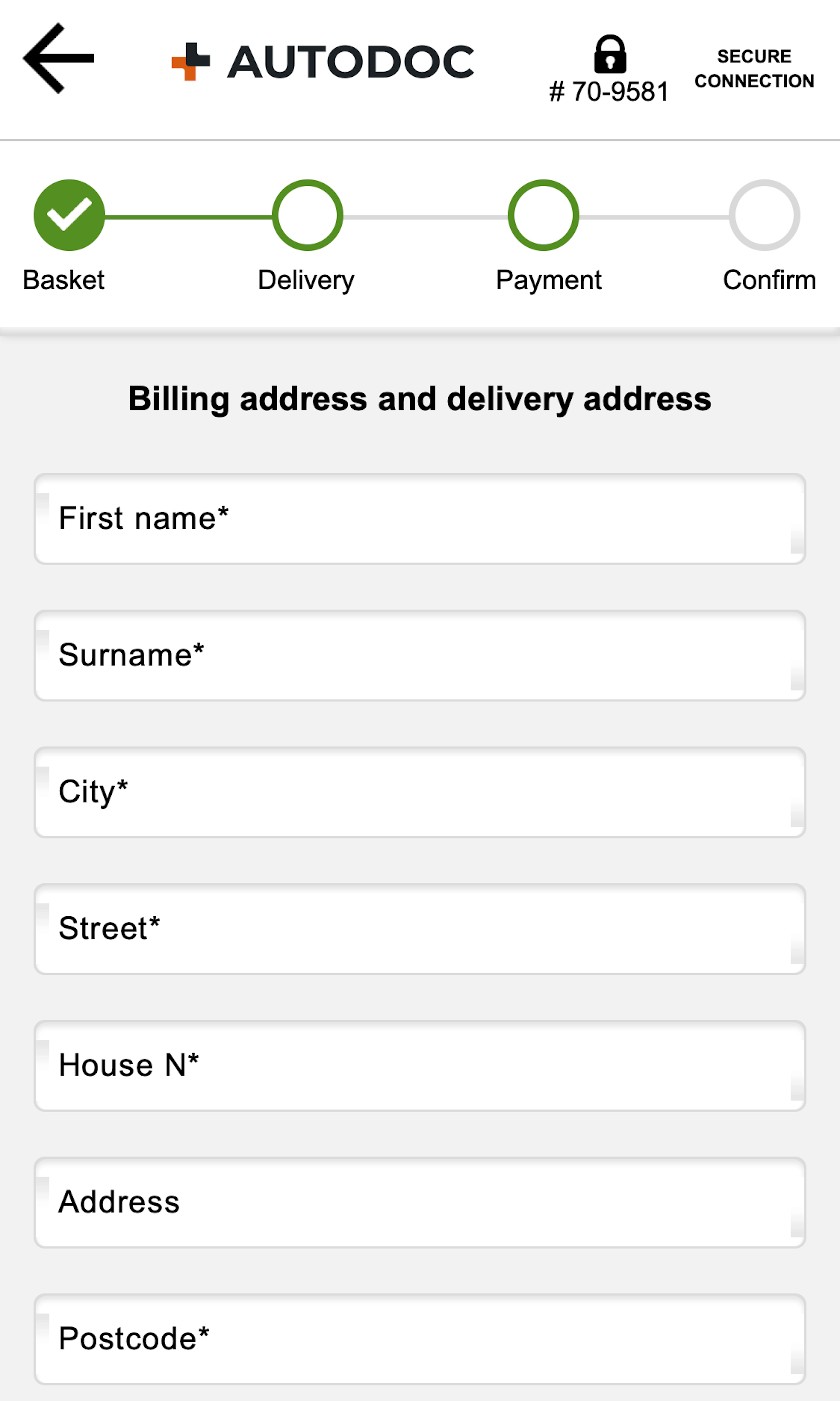
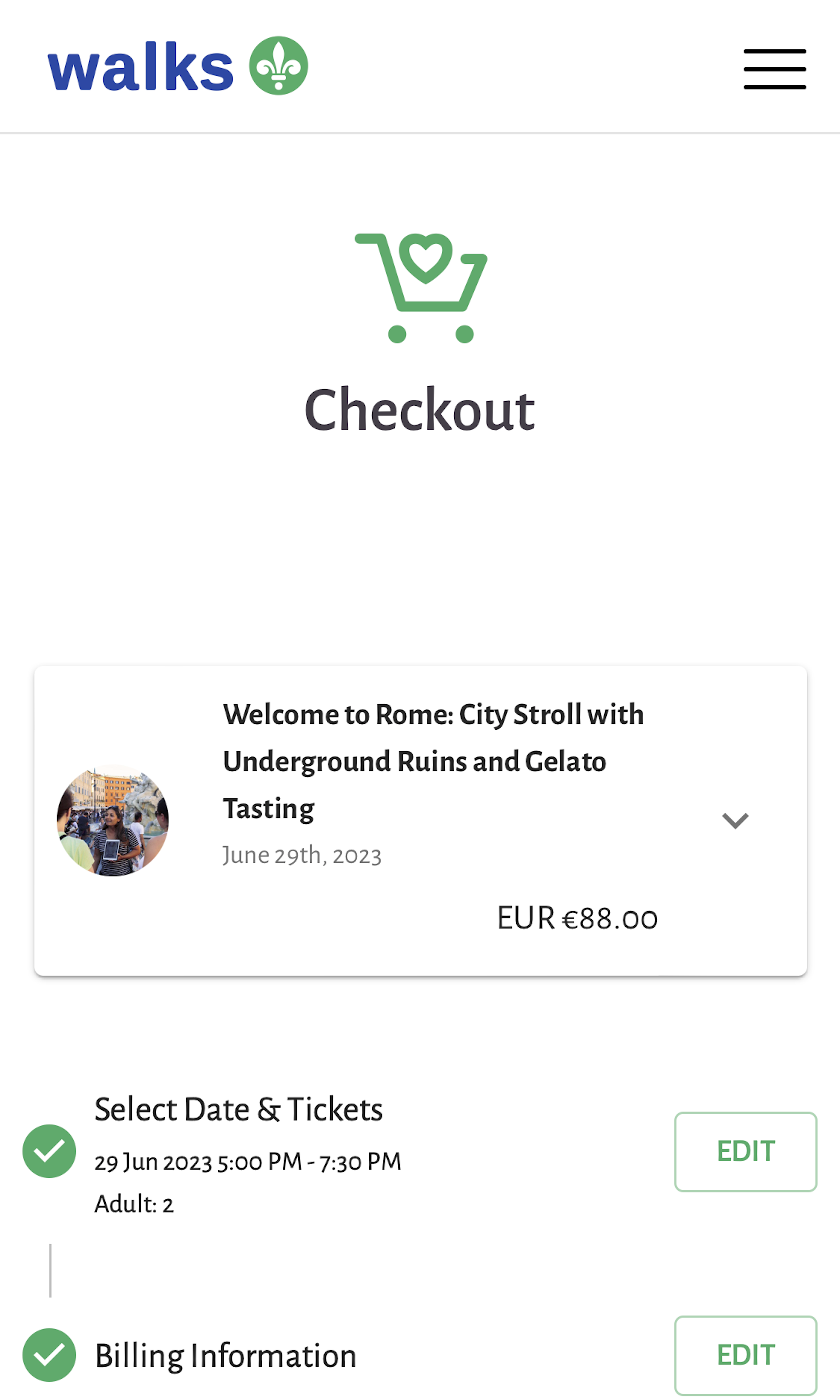
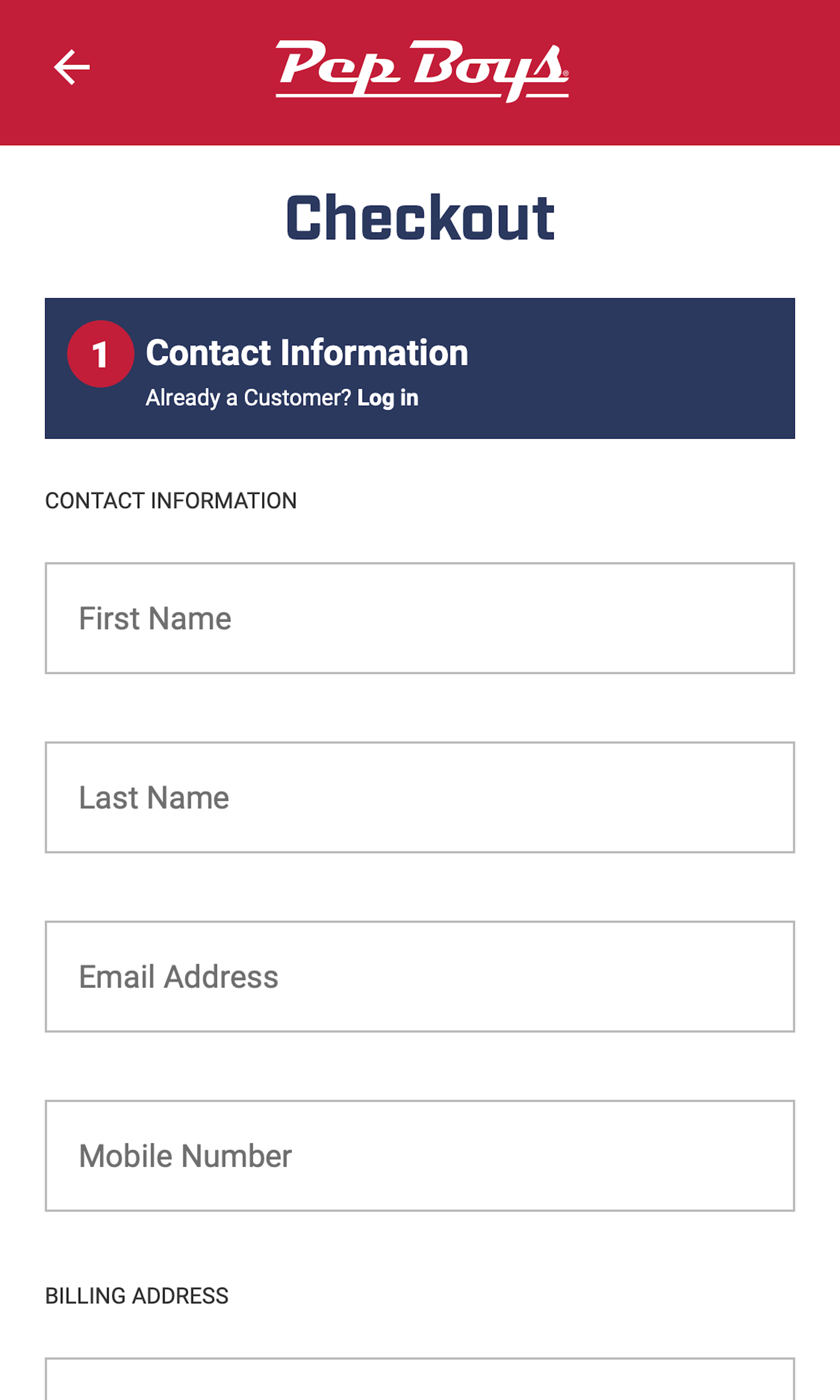
What’s this? Here you’ll find 247 “Mobile: Billing Address” full-page screenshots annotated with research-based UX insights, sourced from Baymard’s UX benchmark of 93 ecommerce sites. (Note: this is less than 1% of the full research catalog.)
The billing address fields during the mobile checkout are on B2C ecommerce sites ideally completely hidden and defaulted to “be the same as the shipping address”. While we in testing observe this to be important in desktop checkouts, it’s critical in mobile checkouts, due to users’ lack of page overview. When not hidden by default we observe mobile users who start retyping their address — a behavior particular taxing on the small and error-prone touch keyboard.
More ‘Billing Address’ Insights
-
Desktop Examples: Besides the mobile examples below, we also have 85+ desktop examples of Billing Address implementations.
-
Learn More: Besides exploring the 29 mobile “Billing Address” design examples below, you may also want to read our related articles “‘Touch Keyboard’ Implementations Have Improved Just 9% Since 2013” and “6 Mobile Checkout Usability Considerations”.
-
Get Full Access: To see all of Baymard’s 351 mobile research findings you’ll need Baymard Premium access. (Premium also provides you full access to 150,000+ hours of UX research findings, 650+ ecommerce UX guidelines, and 275,000+ UX performance scores.)
User Experience Research, Delivered Weekly
Join 60,000+ UX professionals and get a new UX article every week.

User Experience Research, Delivered Weekly
Join 60,000+ UX professionals and get a new UX article every week.

Explore Other Research Content

300+ free UX articles based on large-scale research.

257 top sites ranked by UX performance.

Code samples, demos, and key stats for usability.


