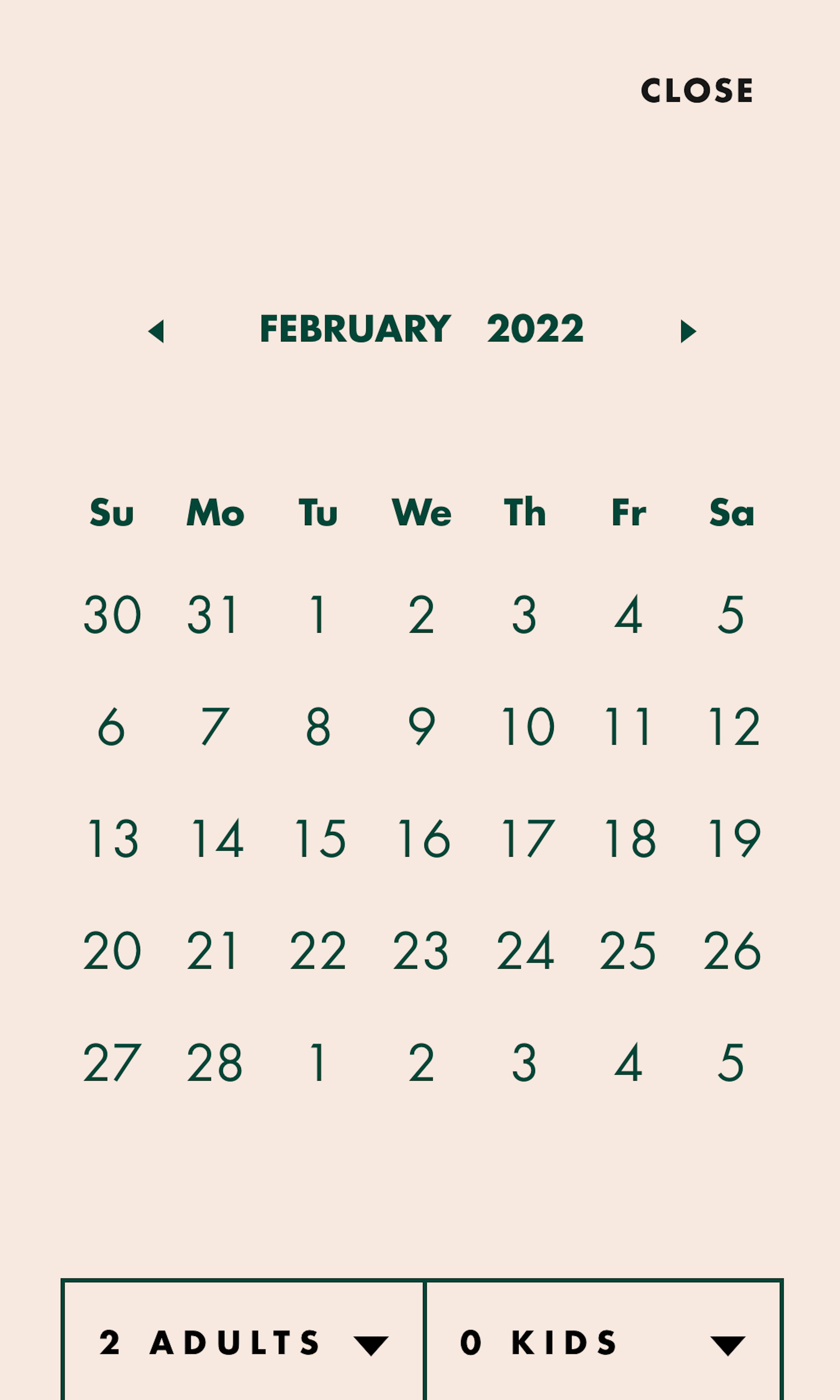
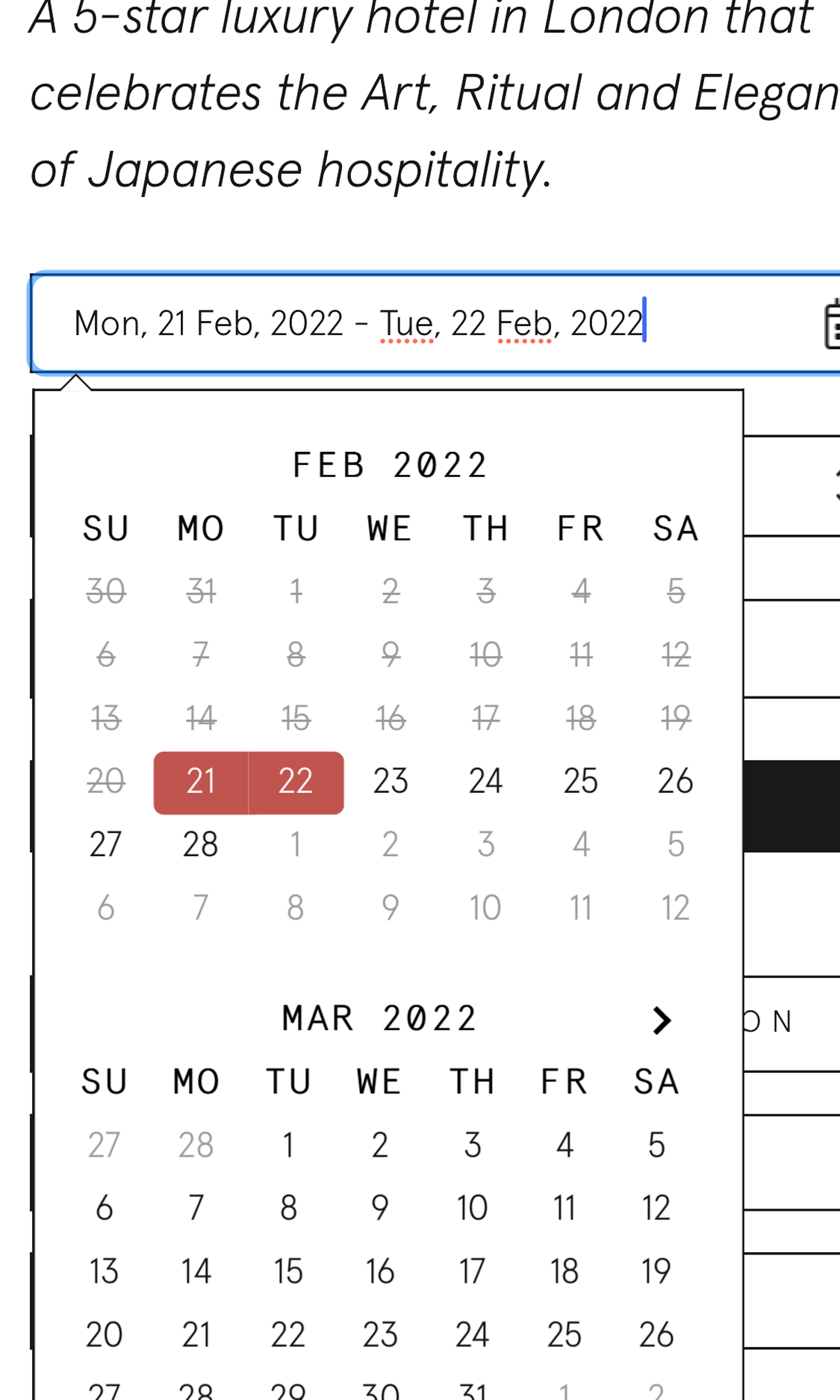
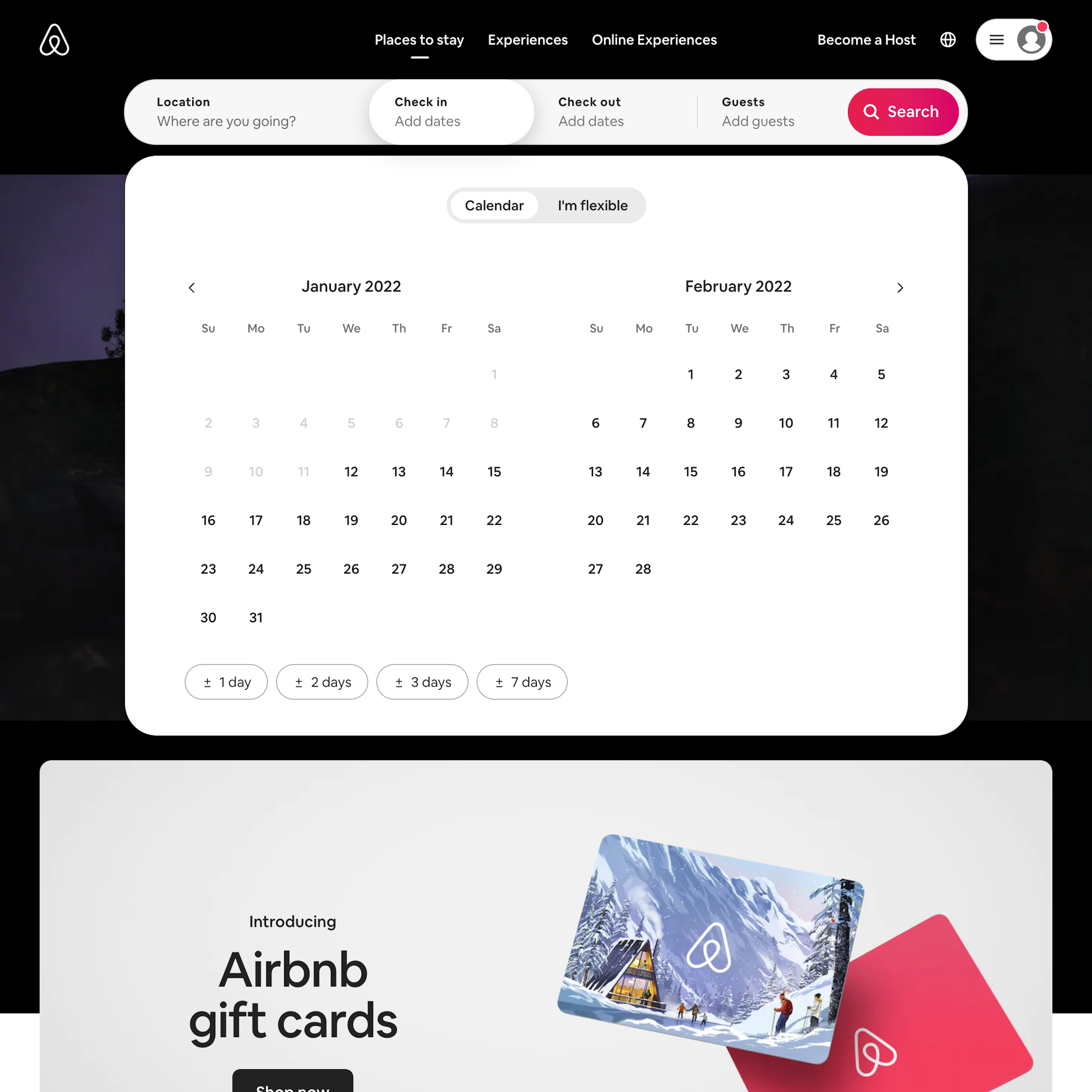
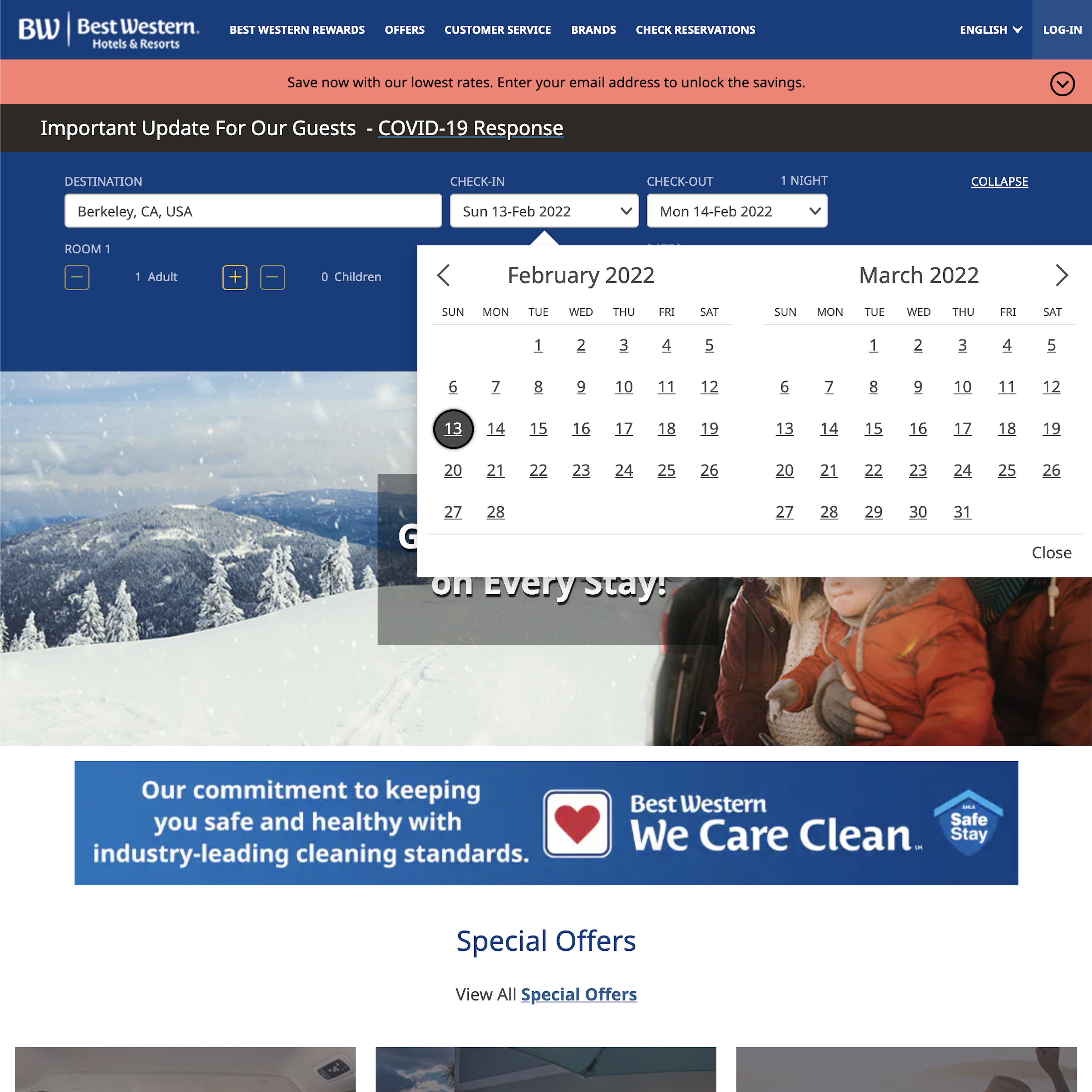
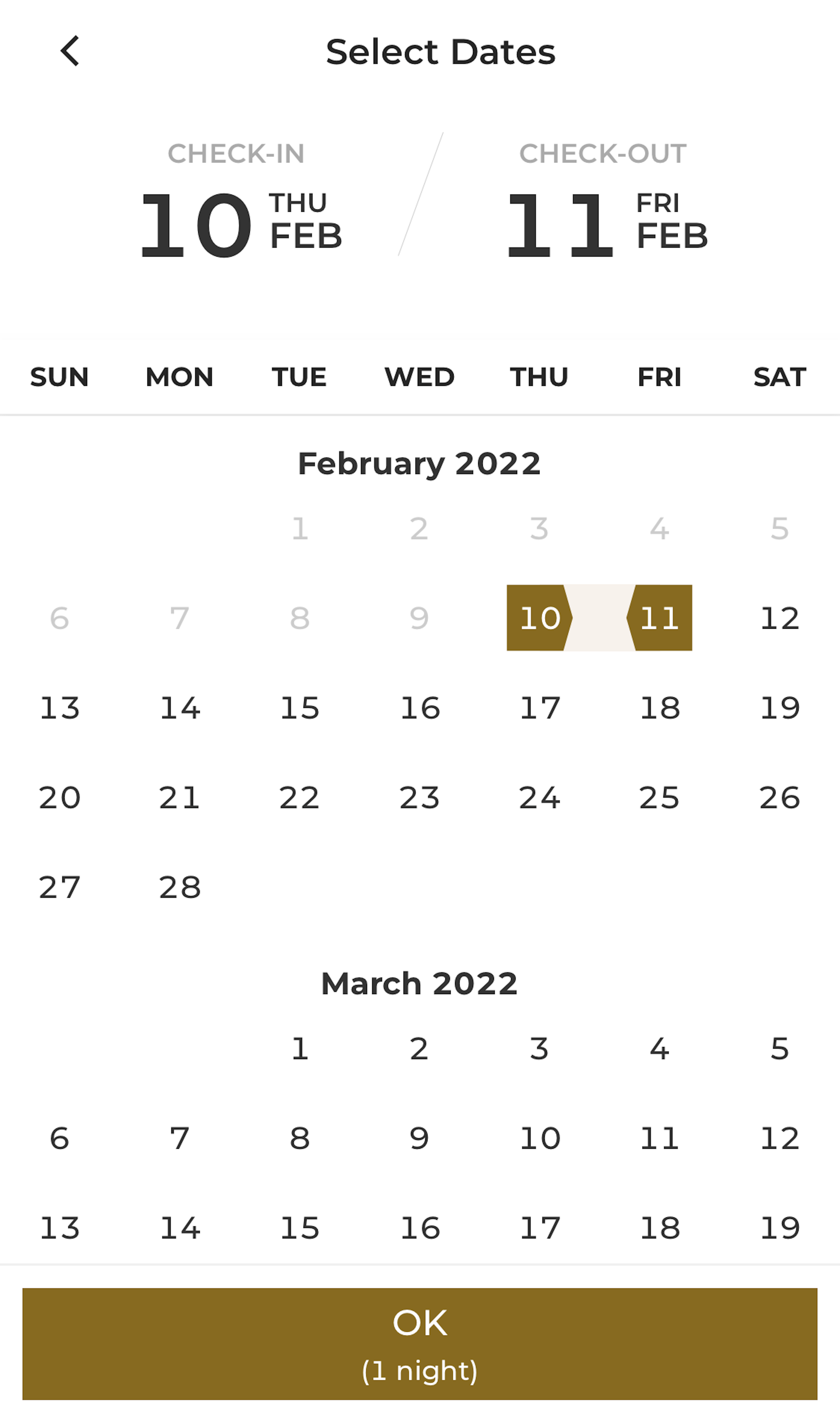
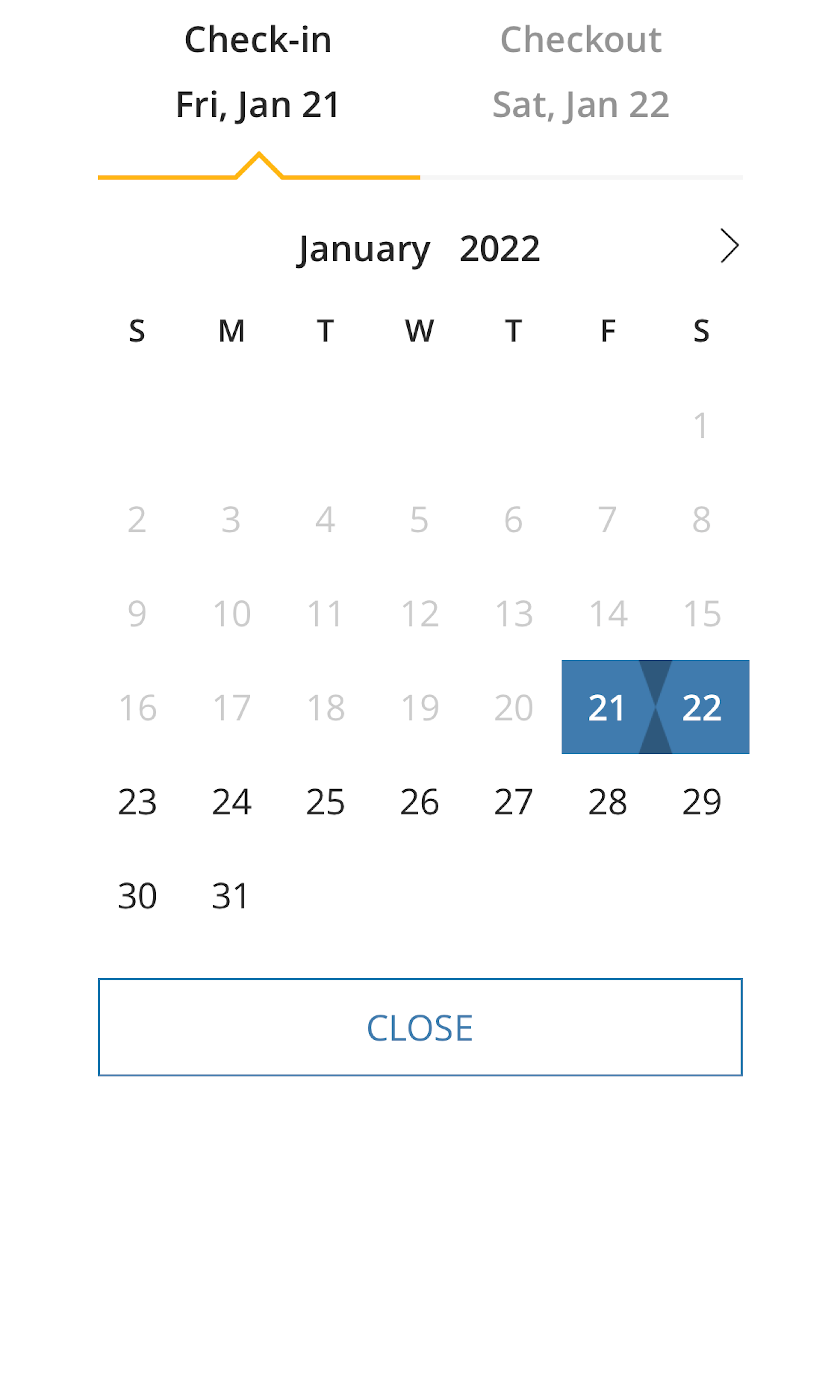
37 ‘Date Picker’ Design Examples
Also referred to as: Calendar Date Picker
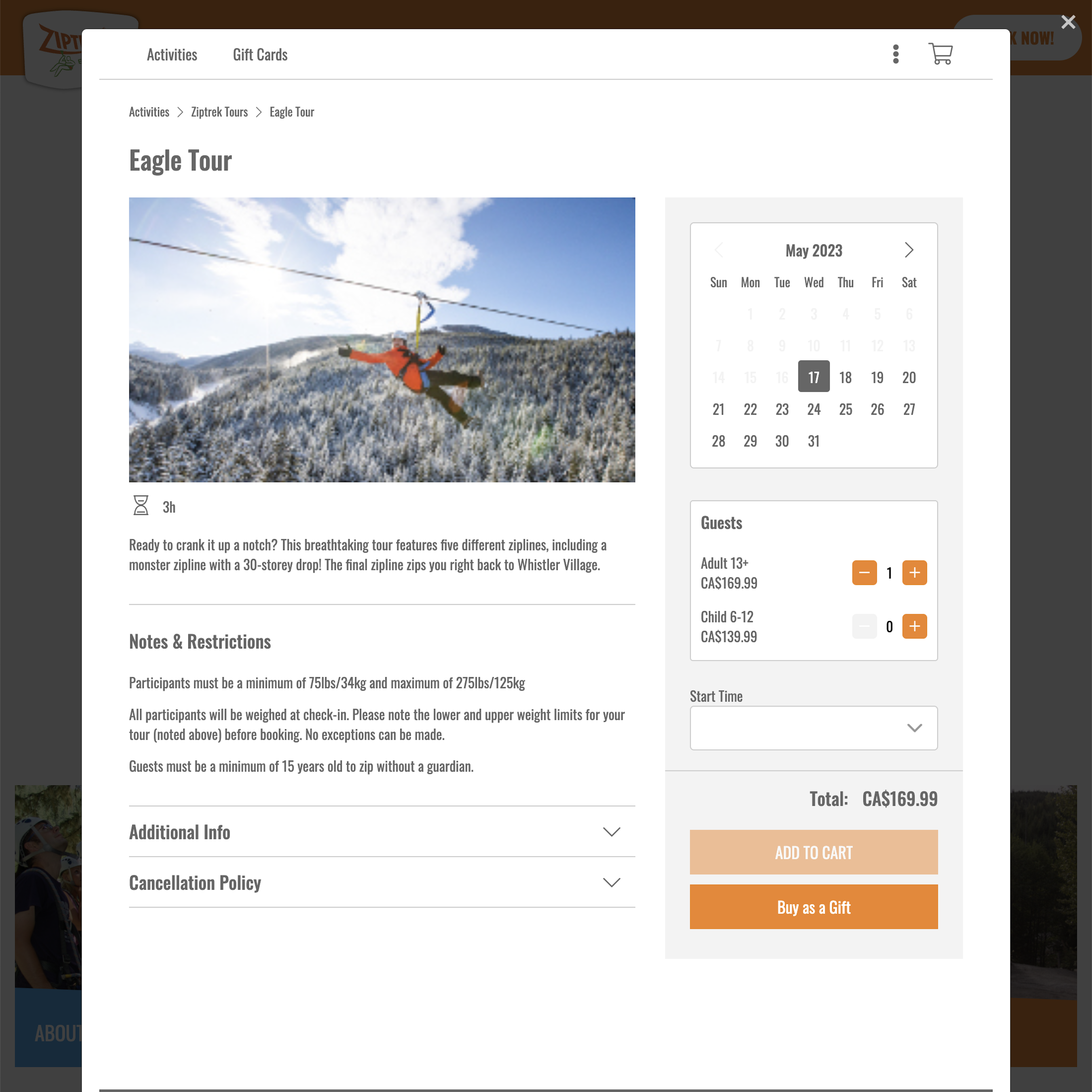
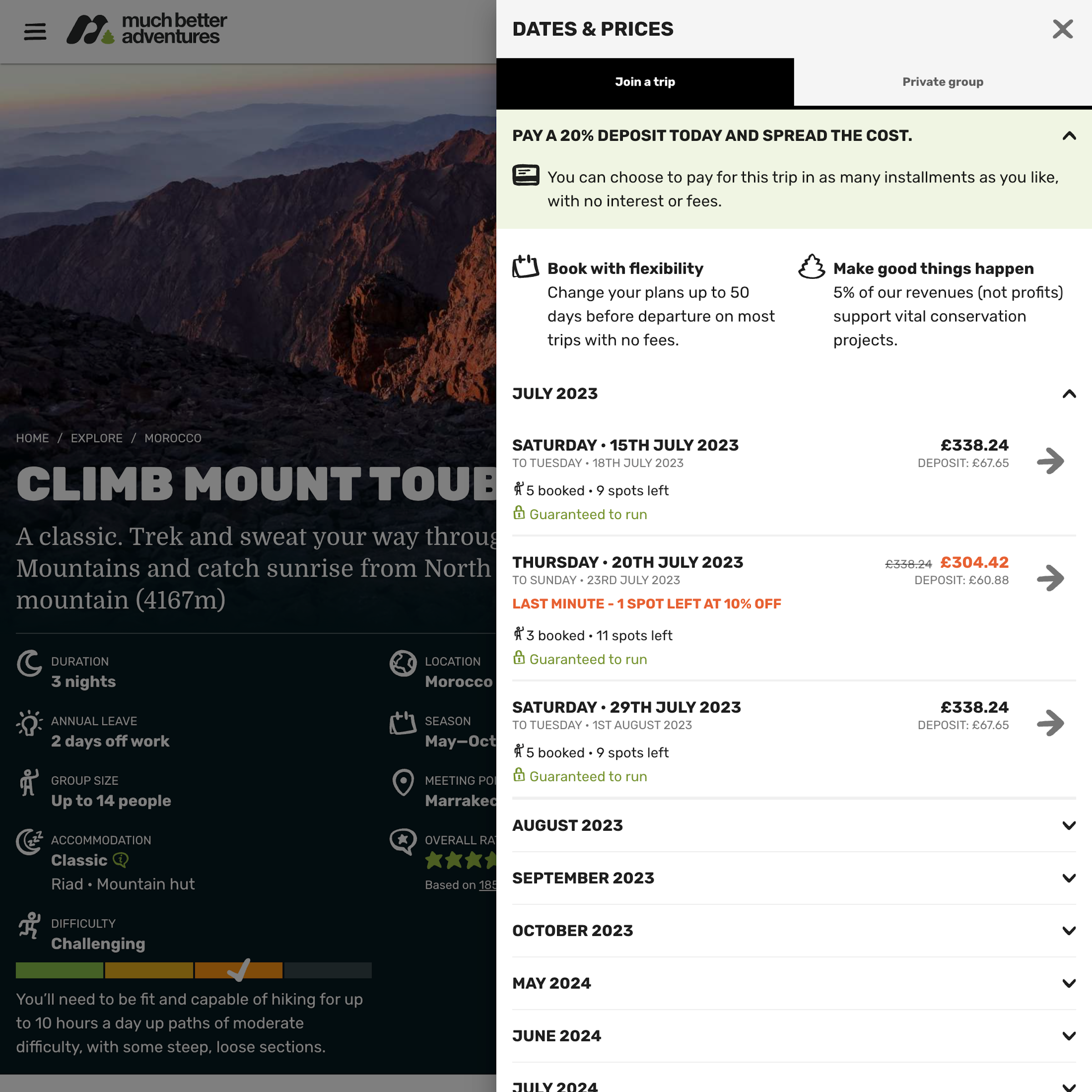
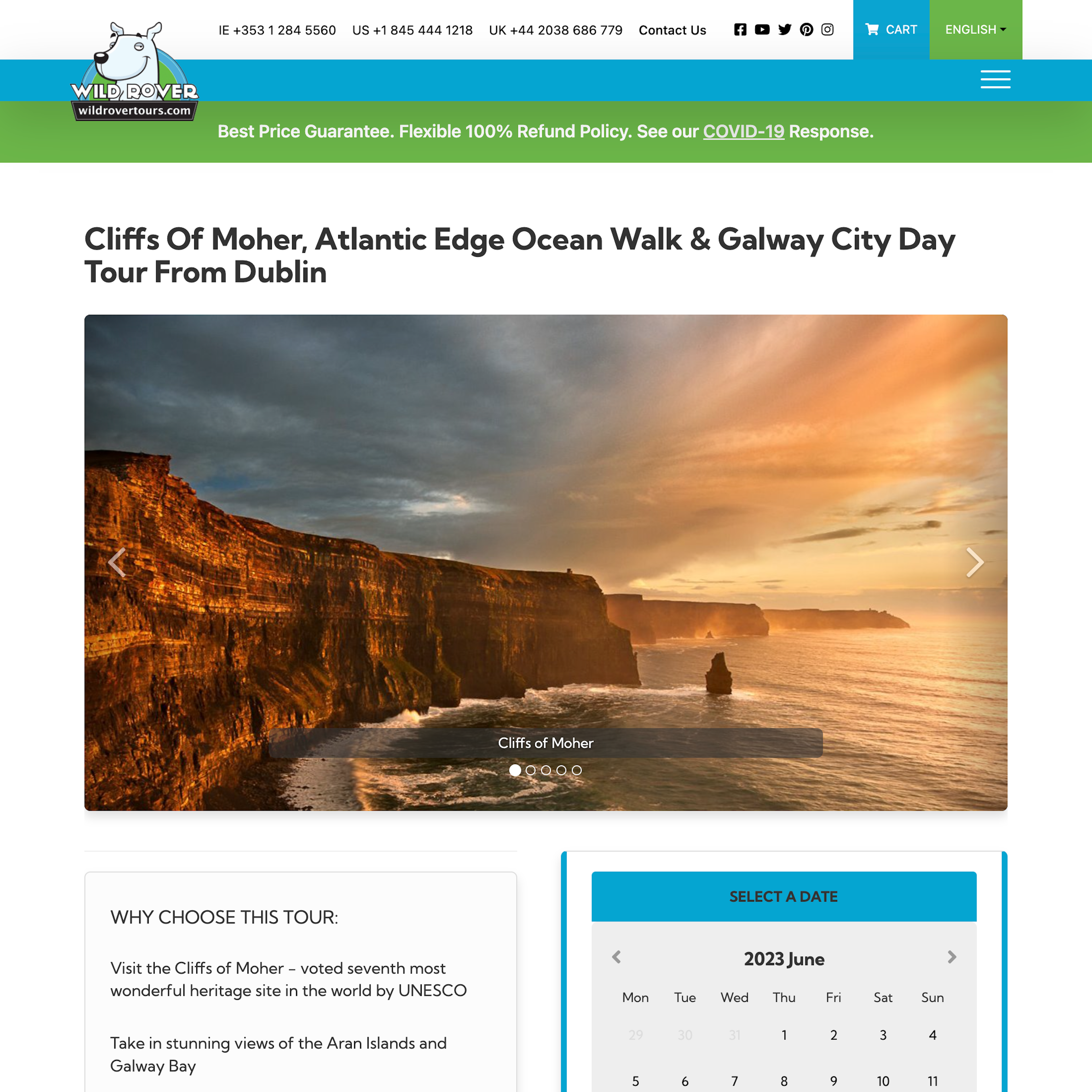
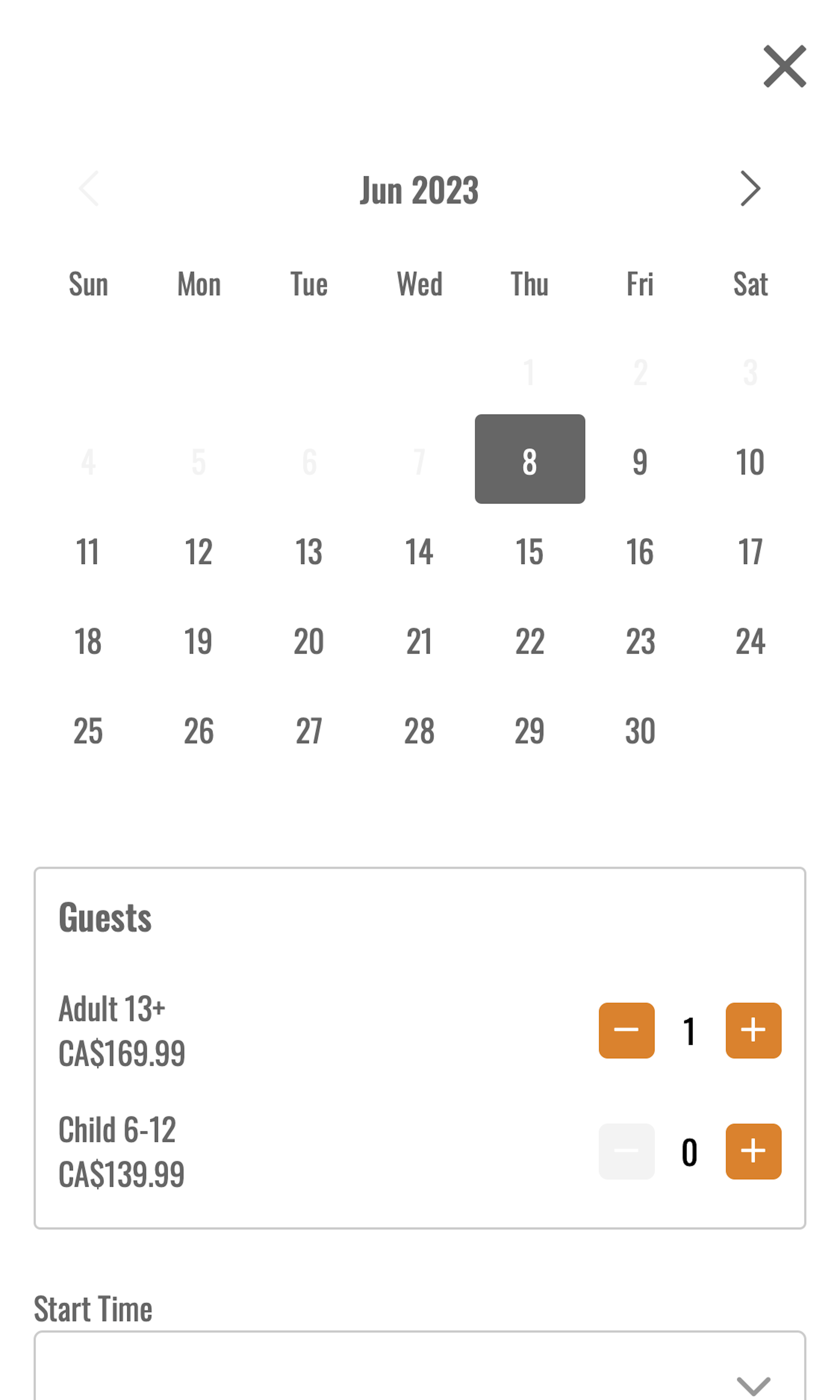
What’s this? Here you’ll find 37 “Date Picker” full-page screenshots annotated with research-based UX insights, sourced from Baymard’s UX benchmark of 257 e-commerce sites. (Note: this is less than 1% of the full research catalog.)
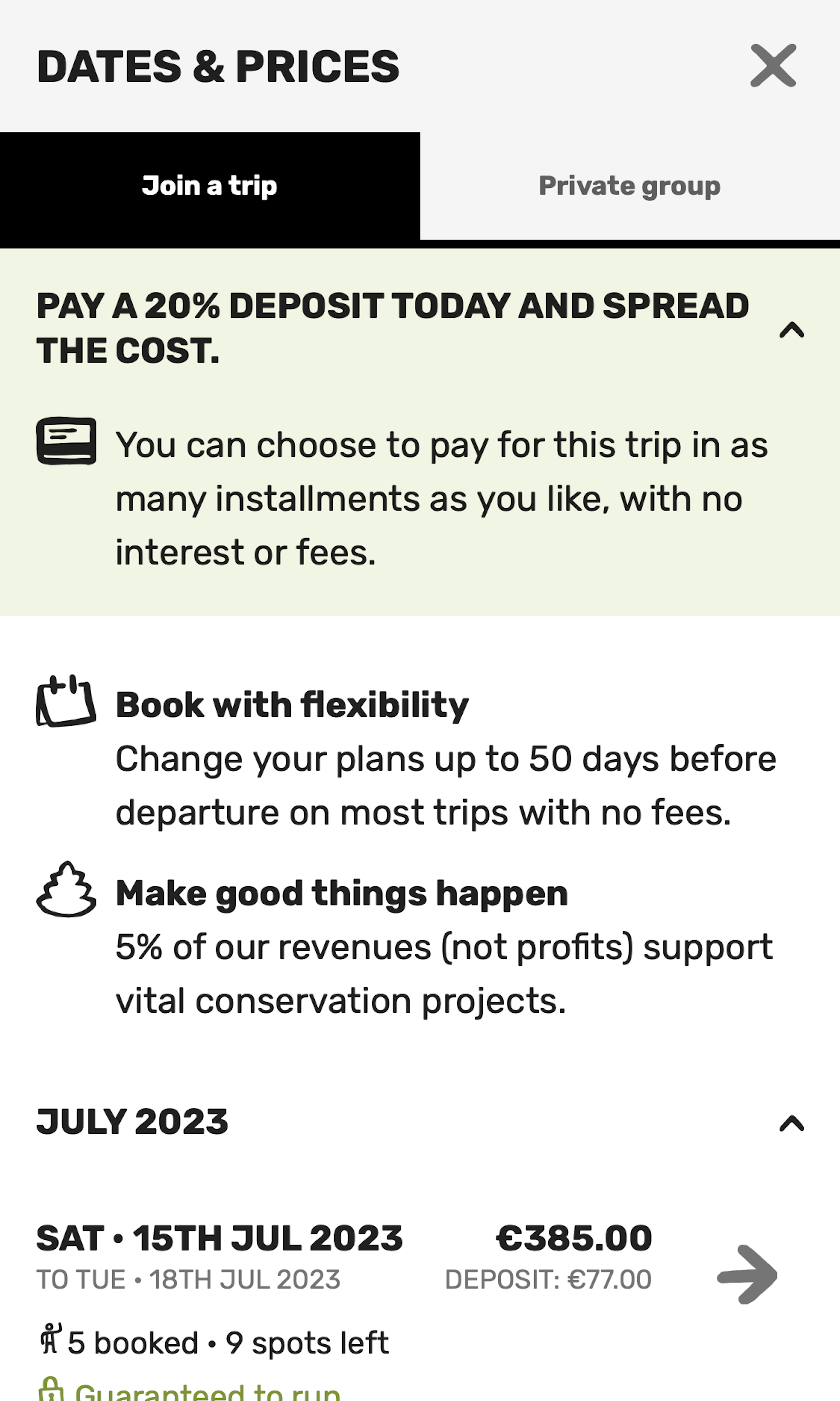
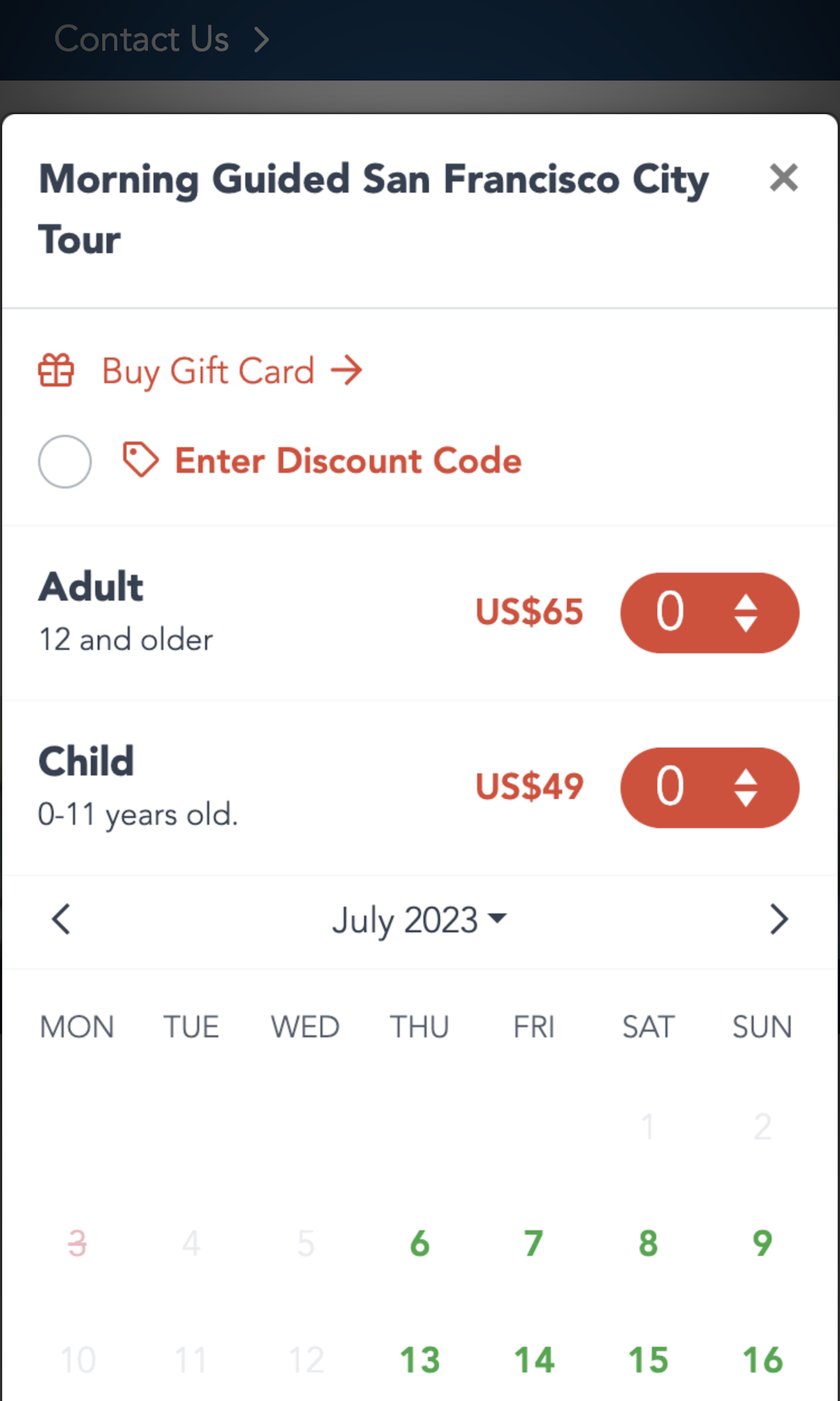
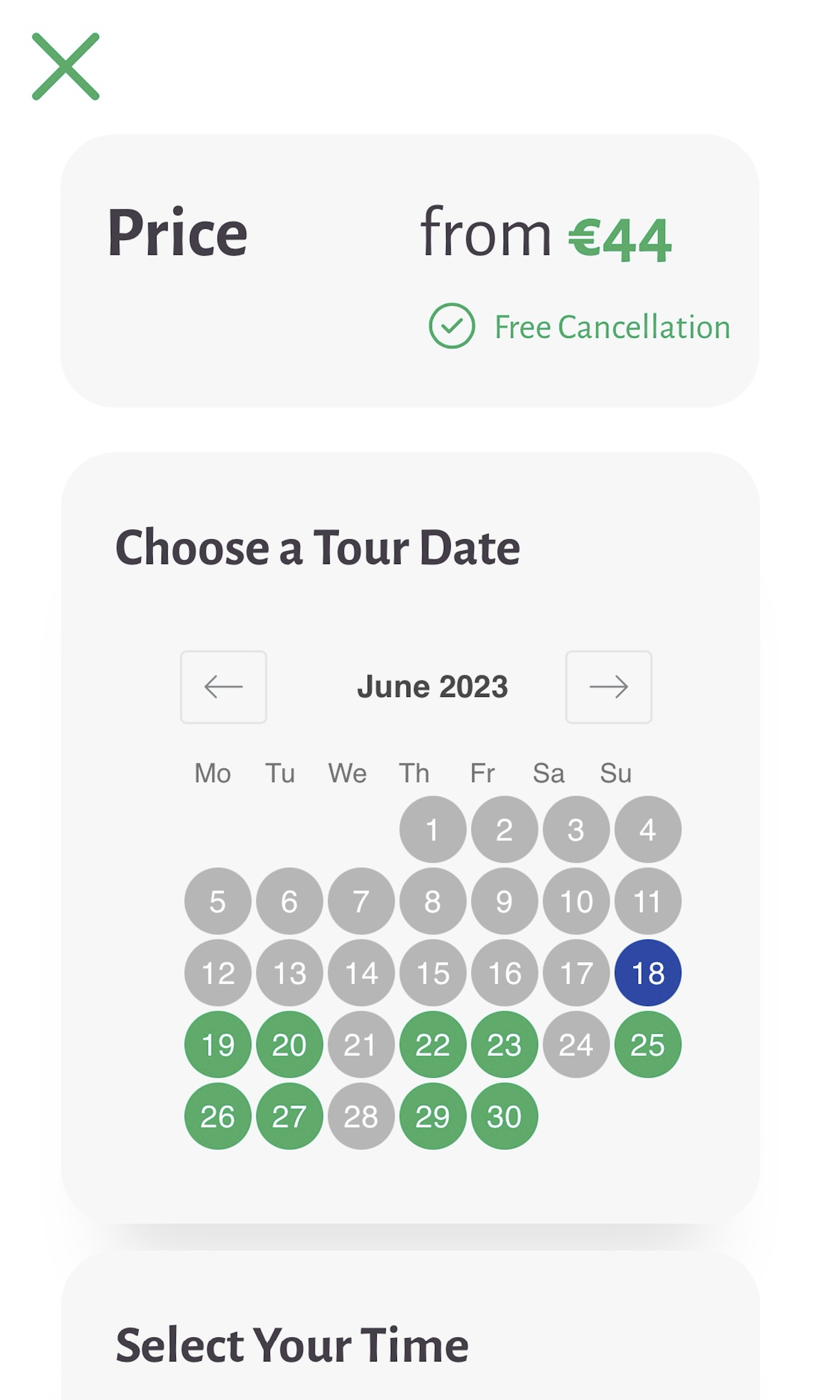
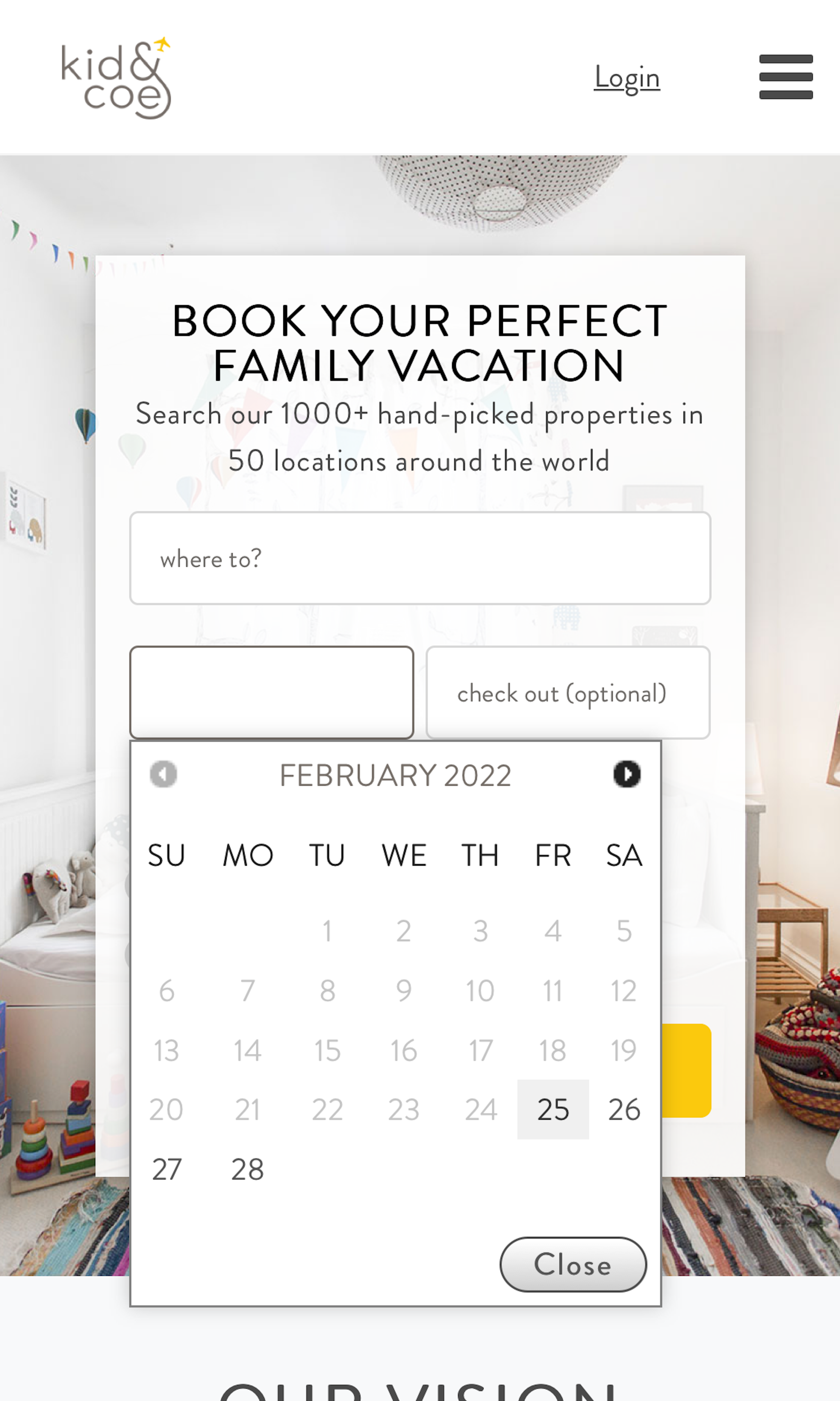
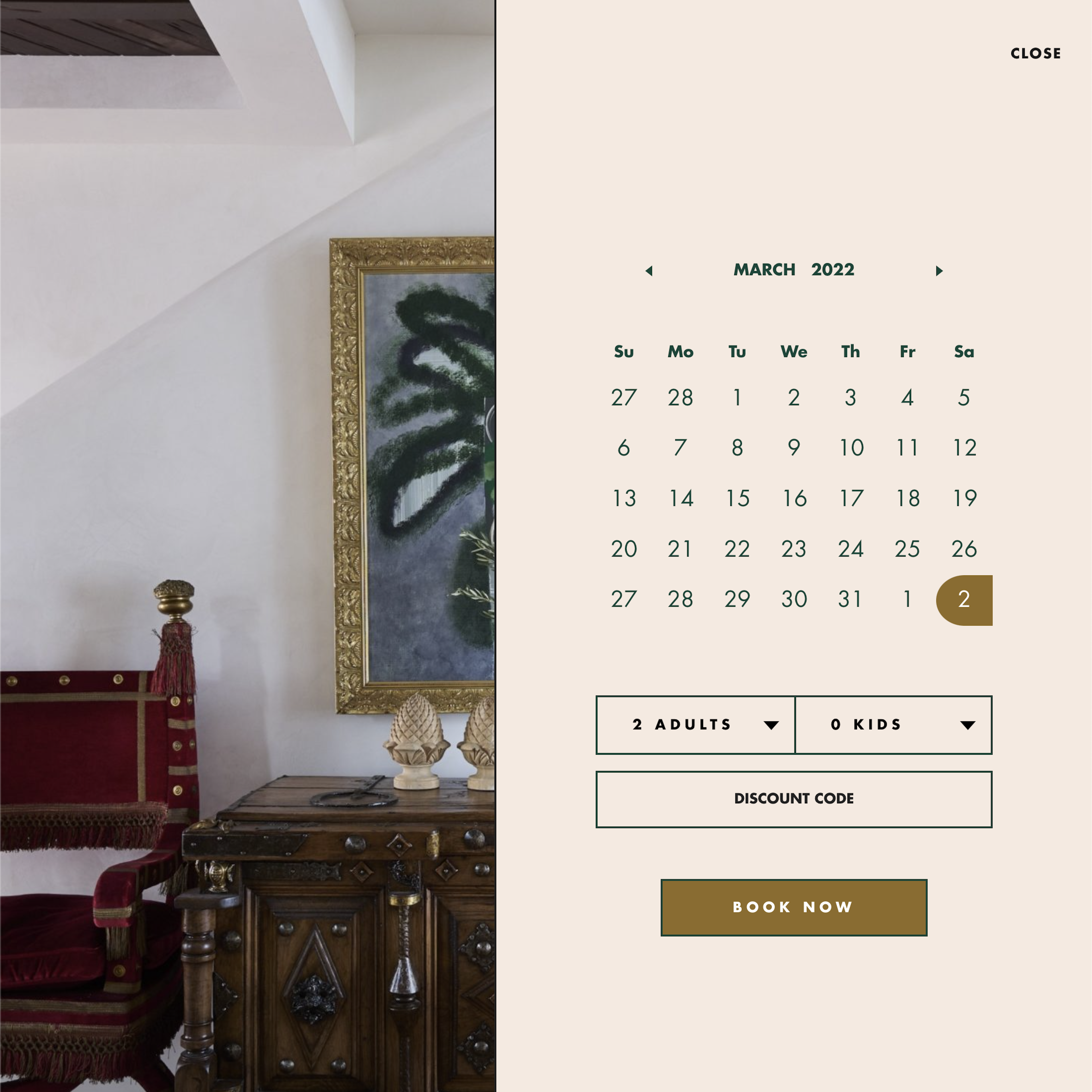
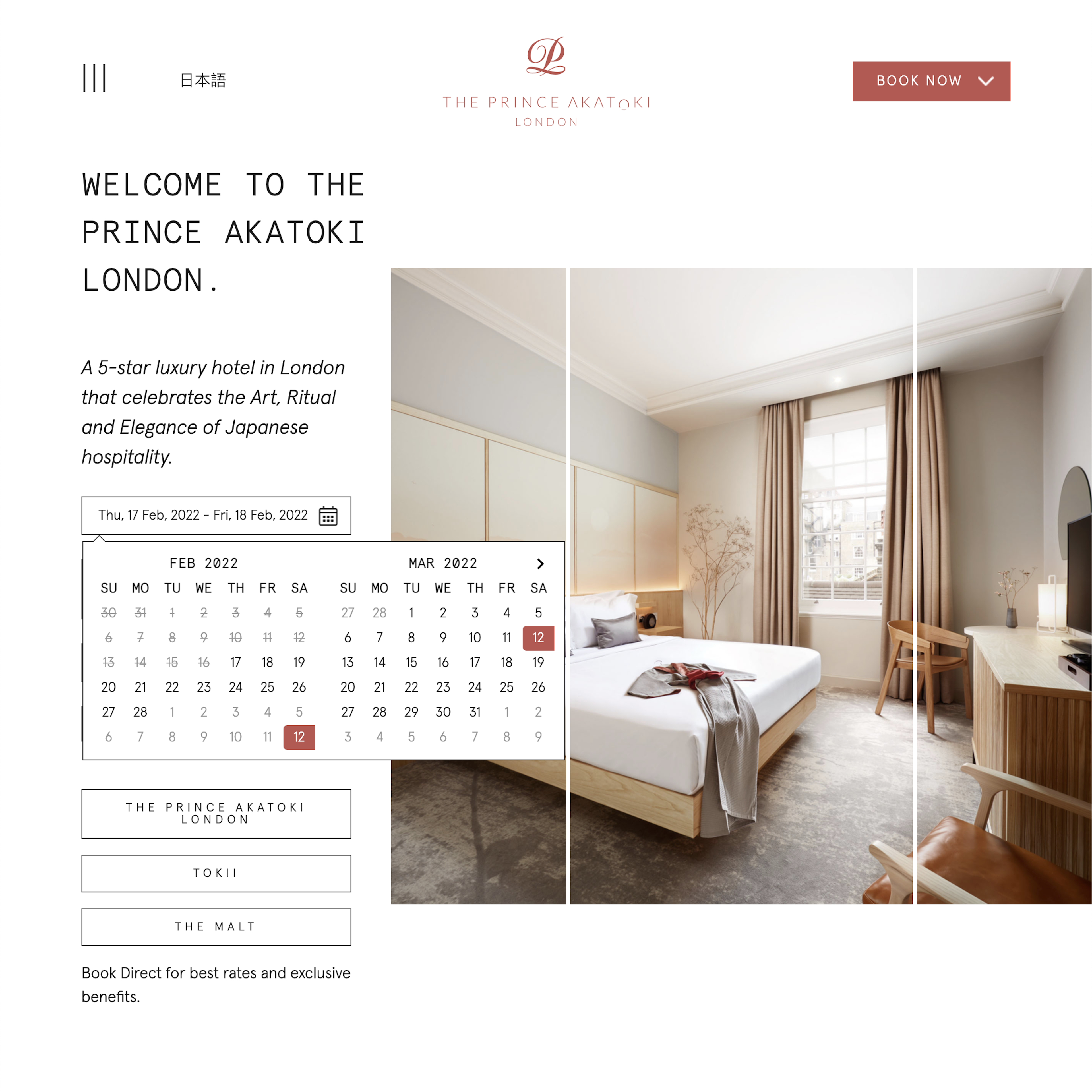
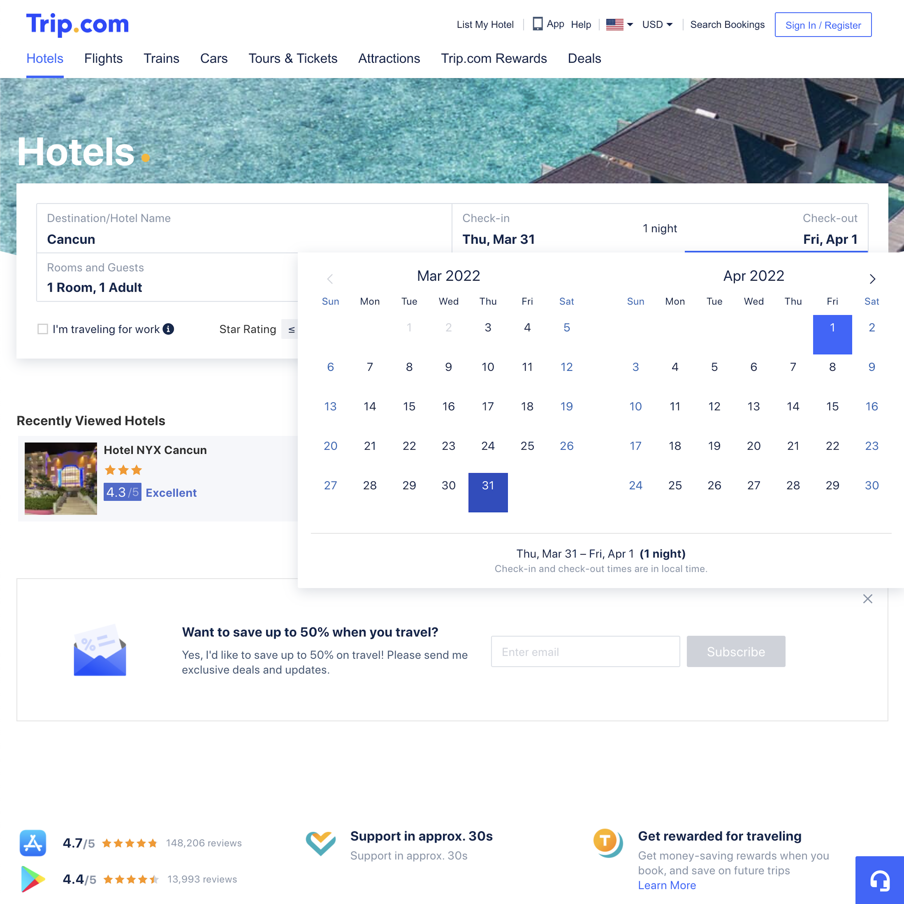
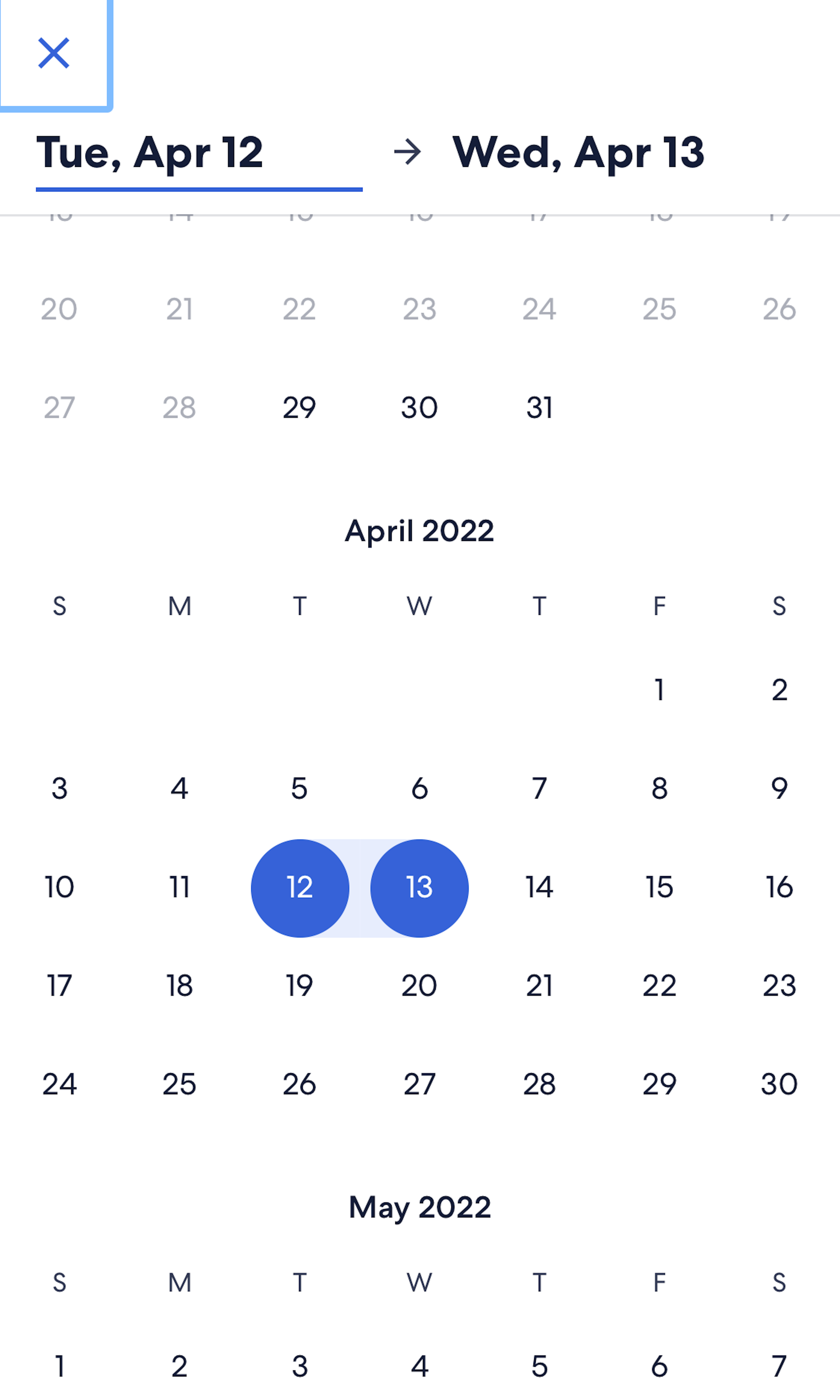
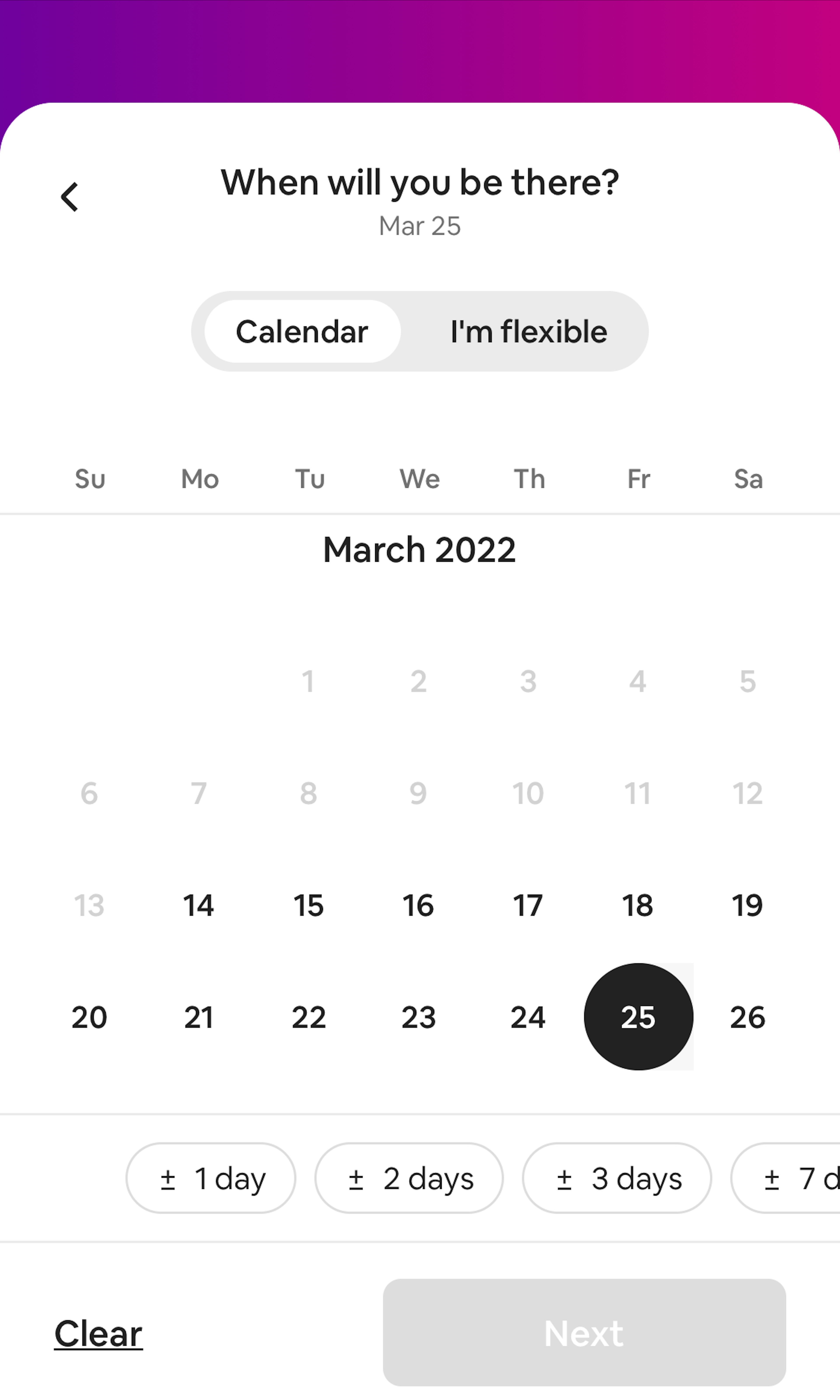
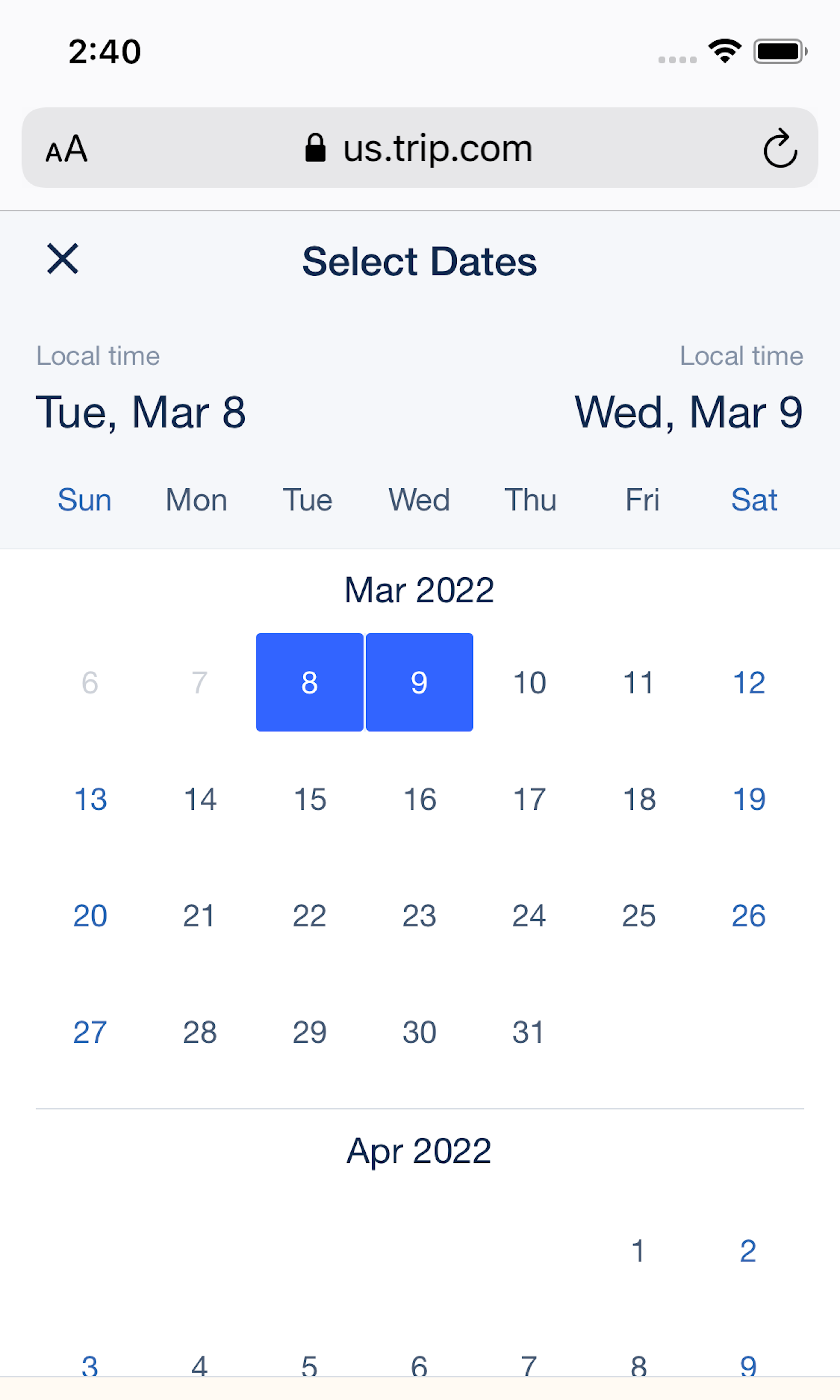
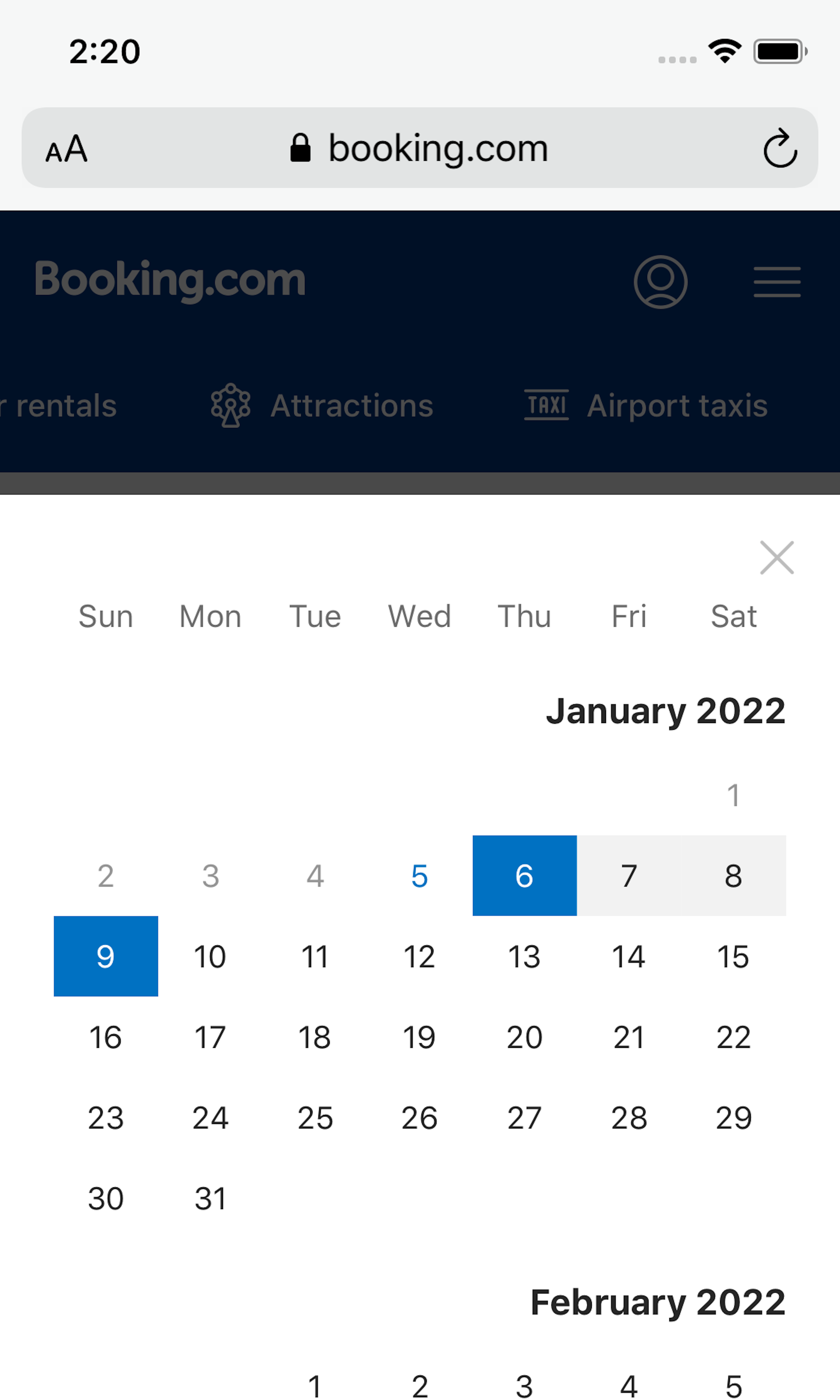
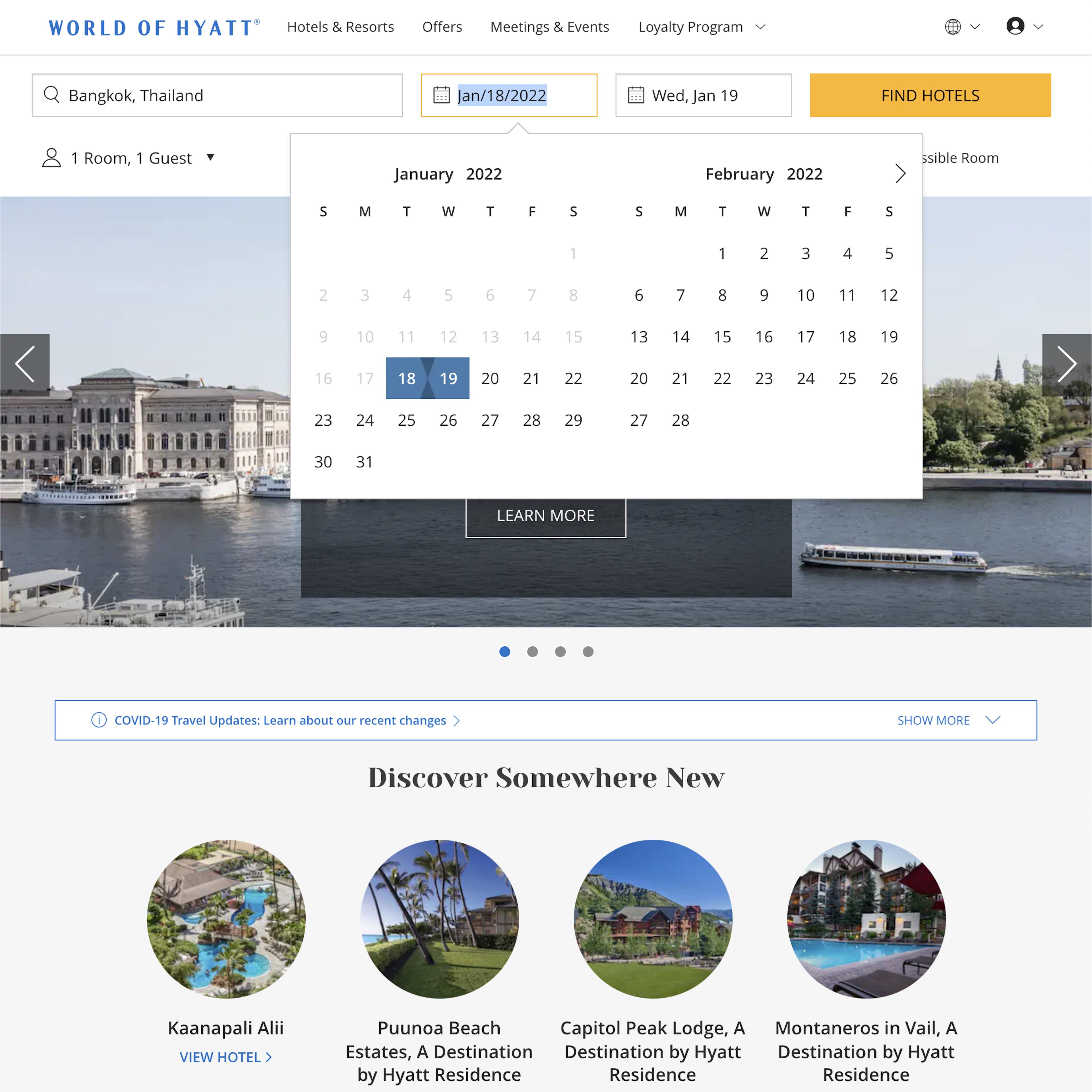
Users shopping for tours and experiences or travel accommodations often already have a specific date or, minimally, a date range in mind. Thus, once they have identified a potentially suitable tour and experience or travel accommodation, they will likely turn their attention to the calendar date picker to confirm whether it’s available to book for their preferred date. However, as observed during testing, when the calendar date picker does not adequately or accurately communicate availability, users have to spend additional time and effort verifying this information, leading to frustration and disappointment — and potential abandonment.
More ‘Date Picker’ Insights
-
During testing, users often needed additional information about a tour and attempted to use the calendar date picker in order to access this, but were stopped when the calendar date picker didn’t link to tour information — necessitating users to take a long detour to attempt to find the information they’re looking for.
-
Learn More: Besides exploring the 37 “Date Picker” design examples below, you may also want to read our related articles “3 High-Level Takeaways from 1,700 Hours Testing Travel Tours and Experience Booking Sites” and “Travel Accommodations UX: 3 High-Level UX Takeaways from 992 Hours of Testing Leading Travel Accommodations Sites”.
-
Get Full Access: To see all of Baymard’s “Date Picker” research findings you’ll need Baymard Premium access. (Premium also provides you full access to 150,000+ hours of UX research findings, 650+ e-commerce UX guidelines, and 275,000+ UX performance scores.)
User Experience Research, Delivered Weekly
Join 60,000+ UX professionals and get a new UX article every week.

User Experience Research, Delivered Weekly
Join 60,000+ UX professionals and get a new UX article every week.

Explore Other Research Content

300+ free UX articles based on large-scale research.

257 top sites ranked by UX performance.

Code samples, demos, and key stats for usability.


