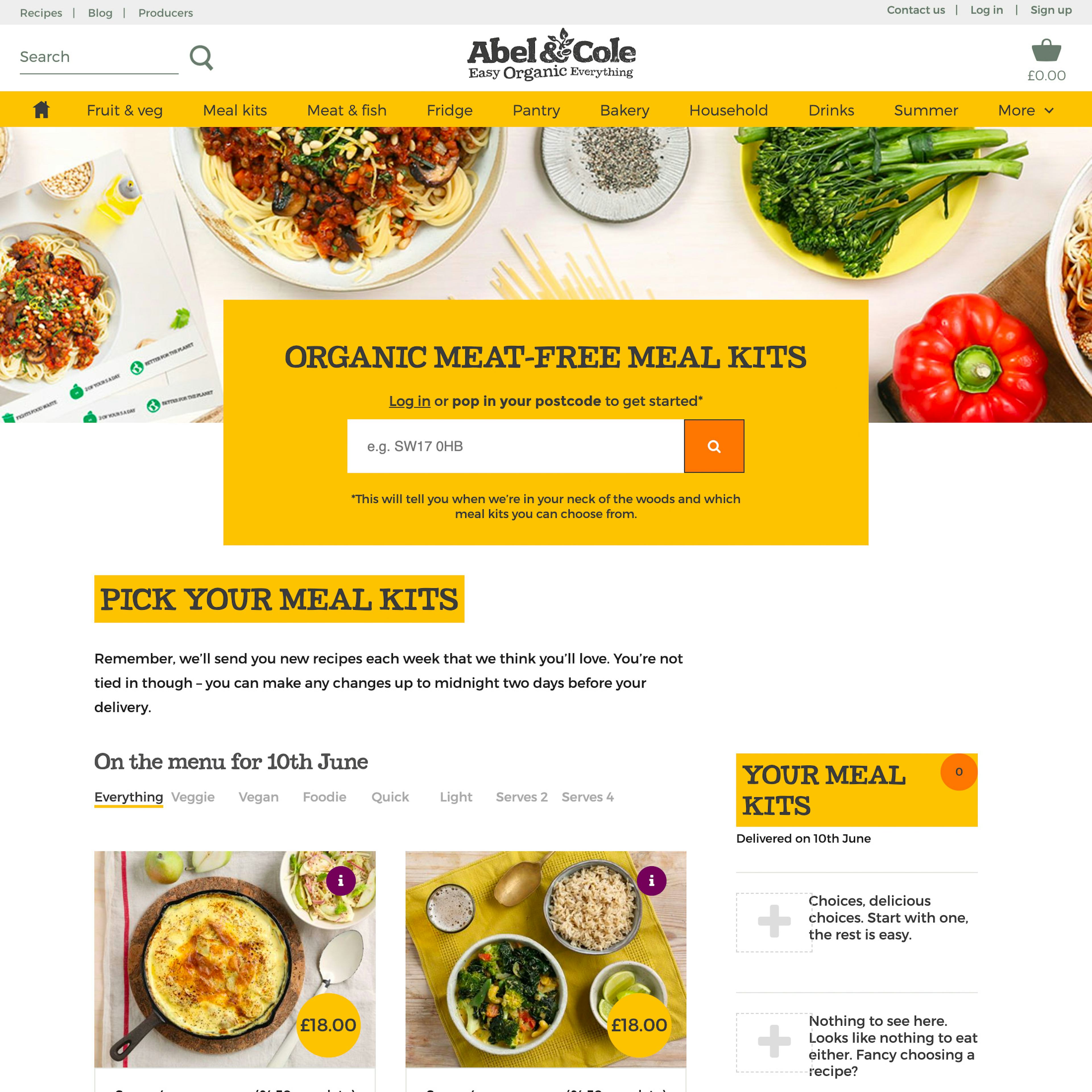
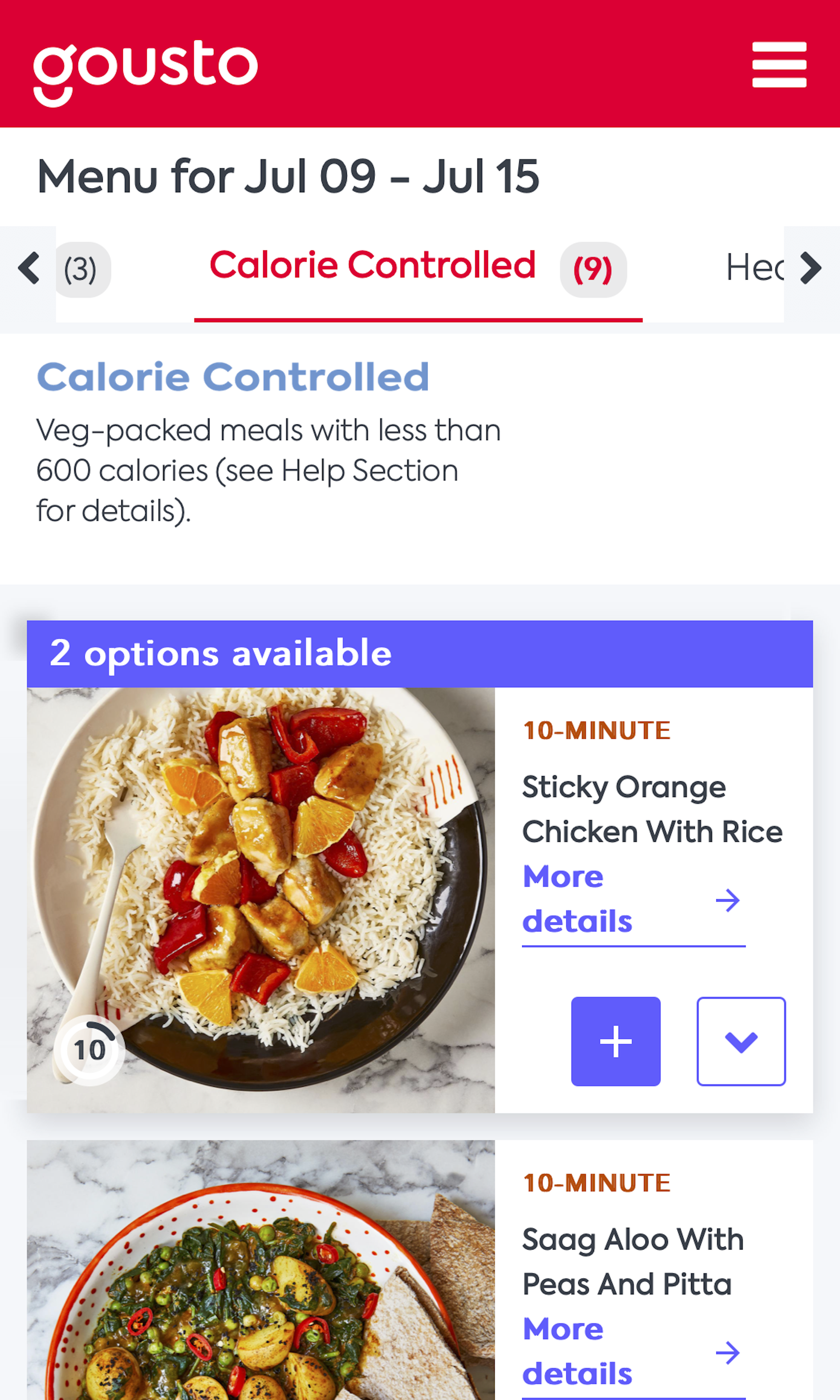
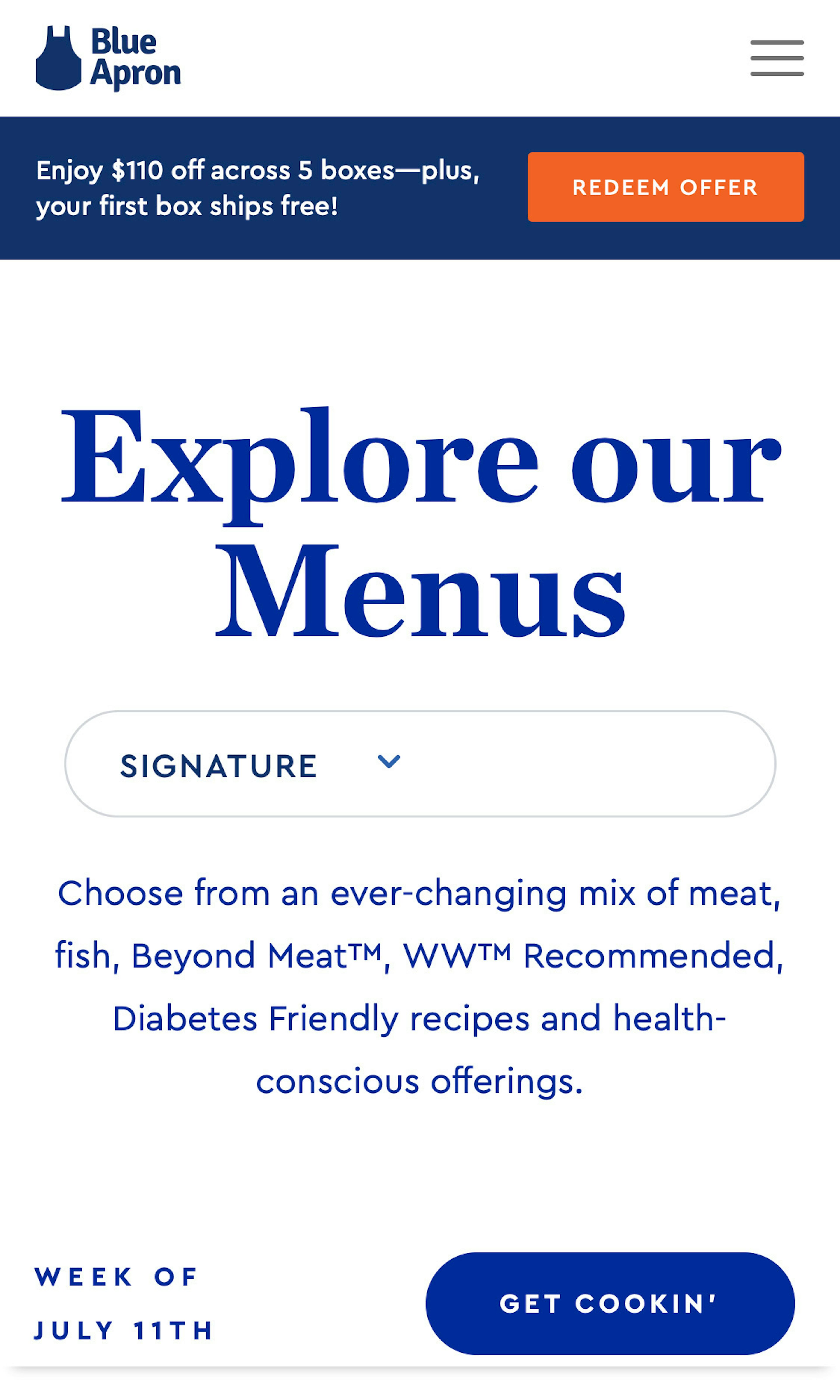
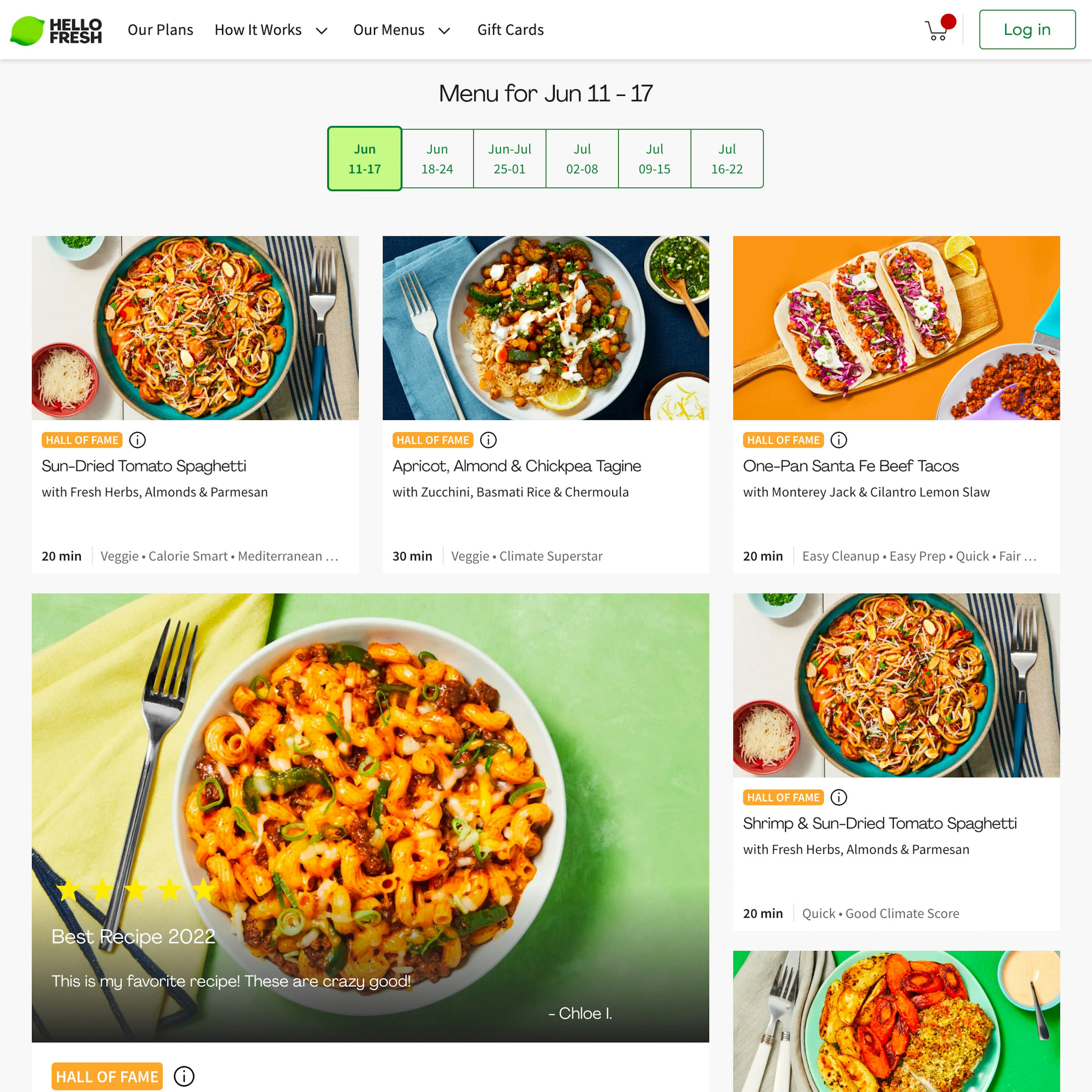
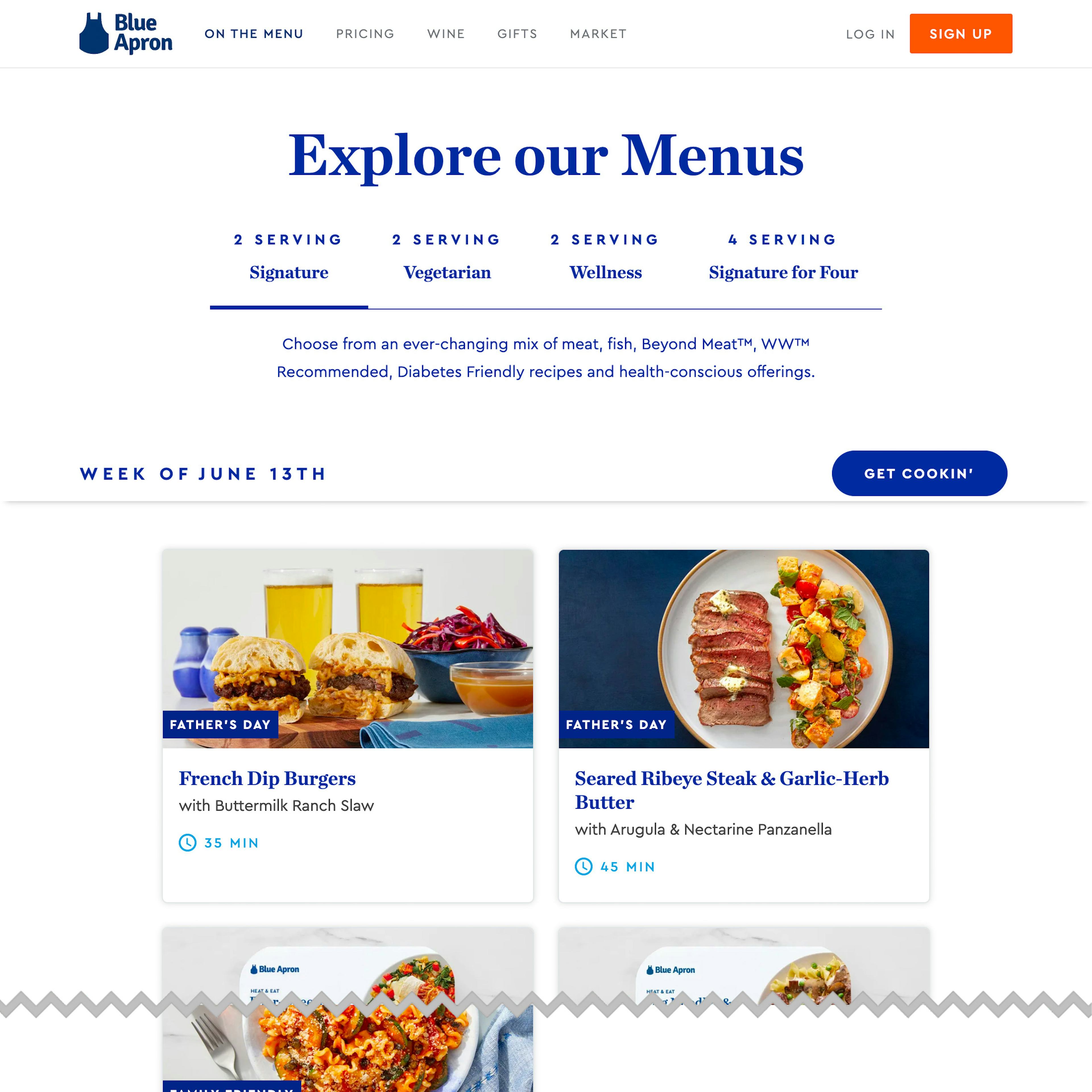
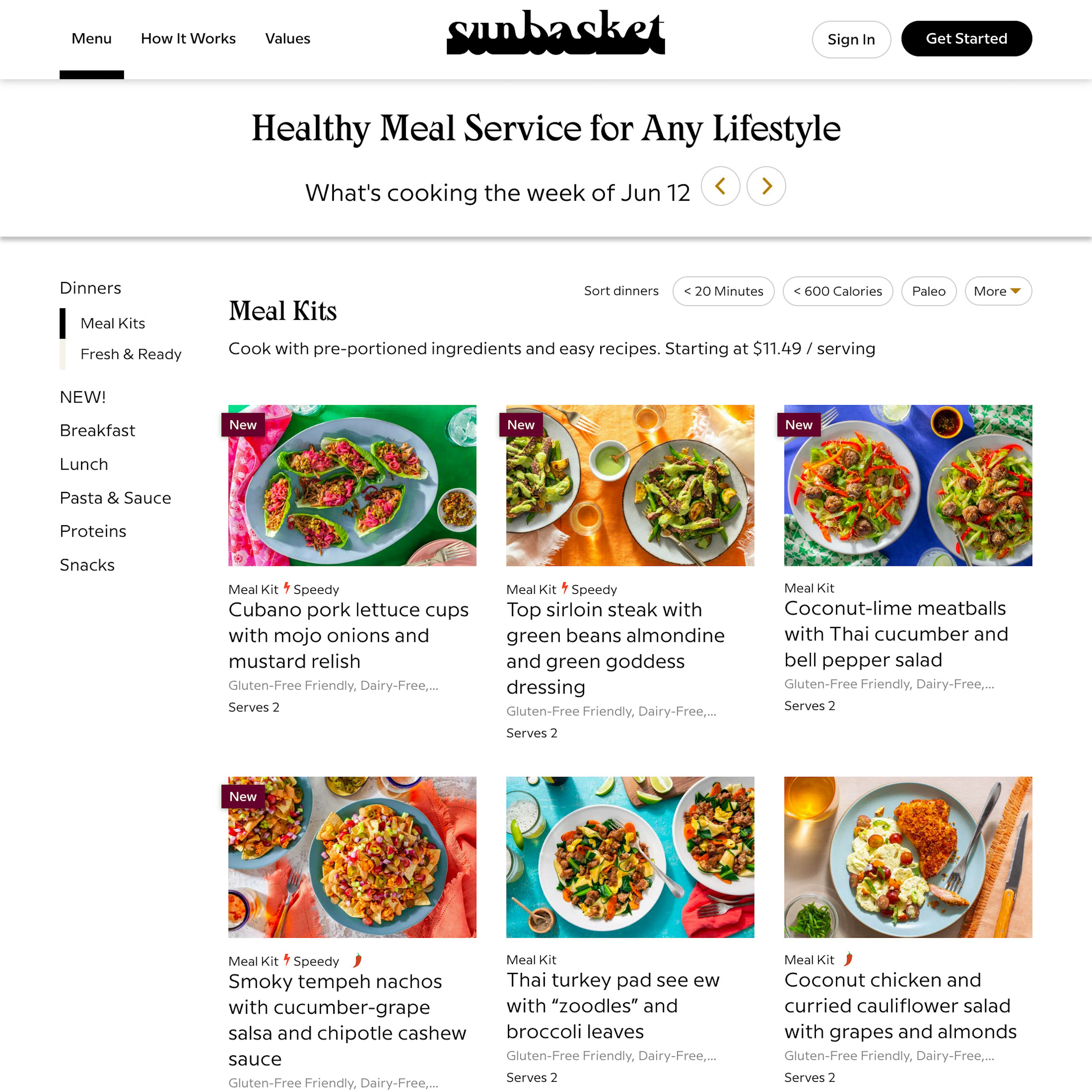
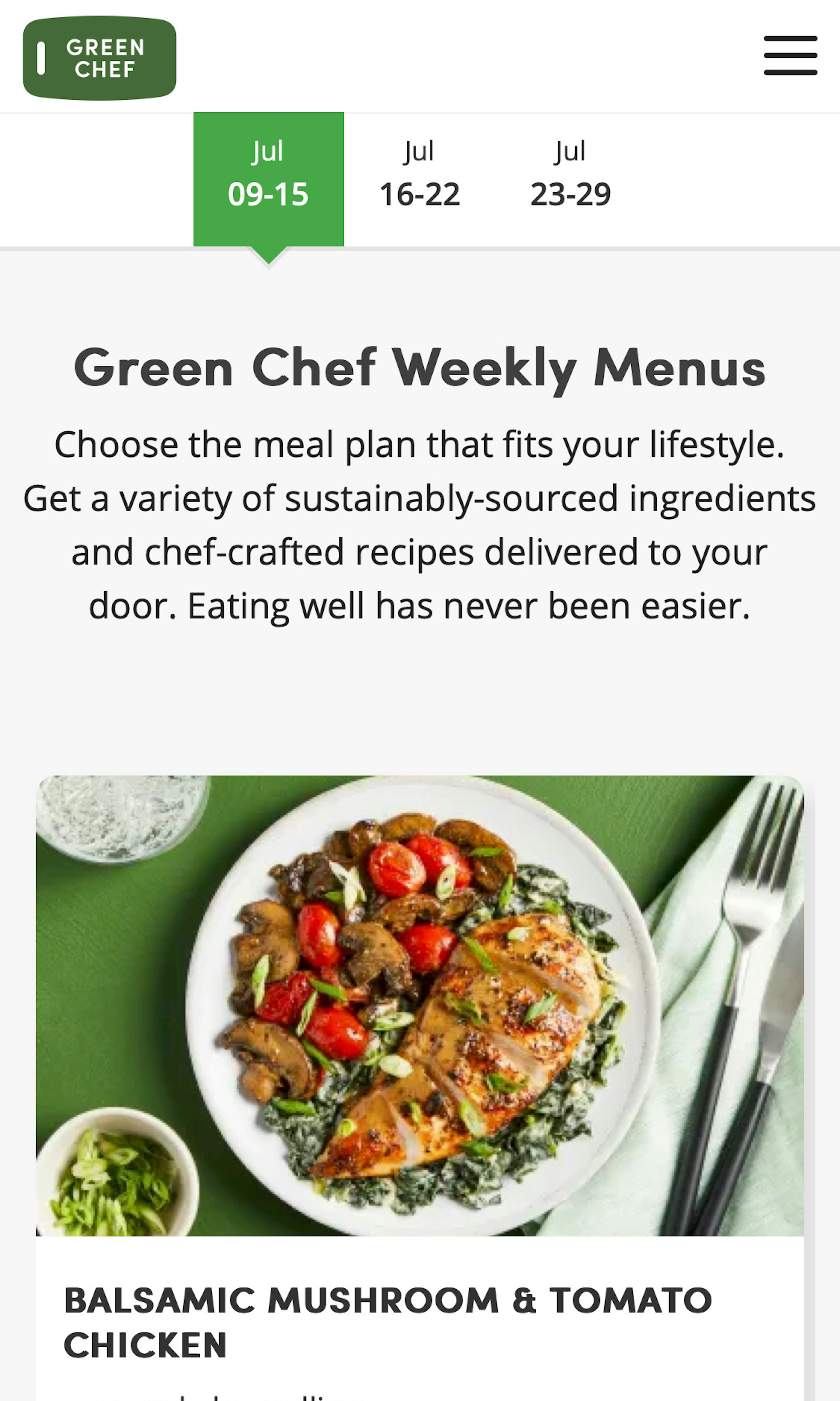
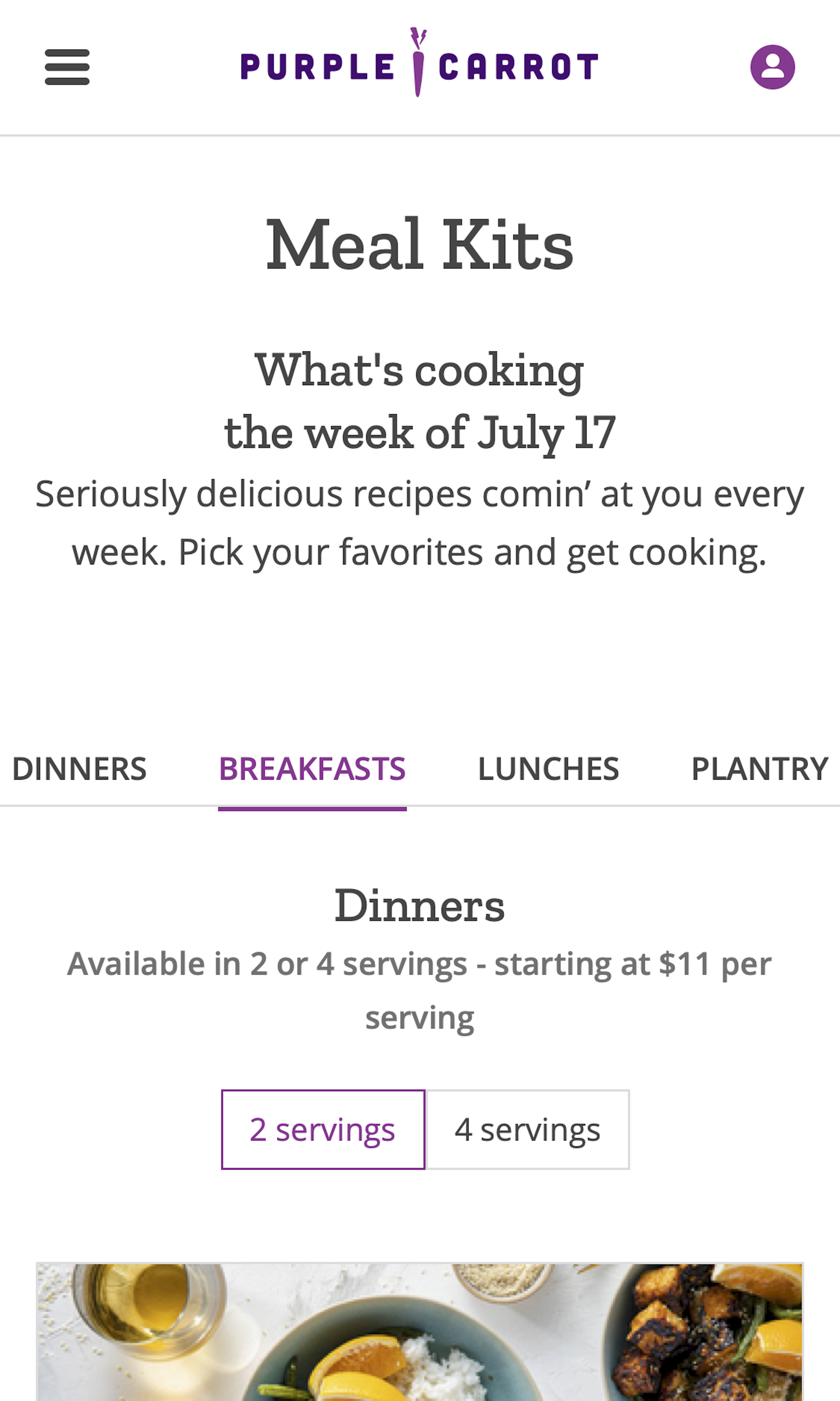
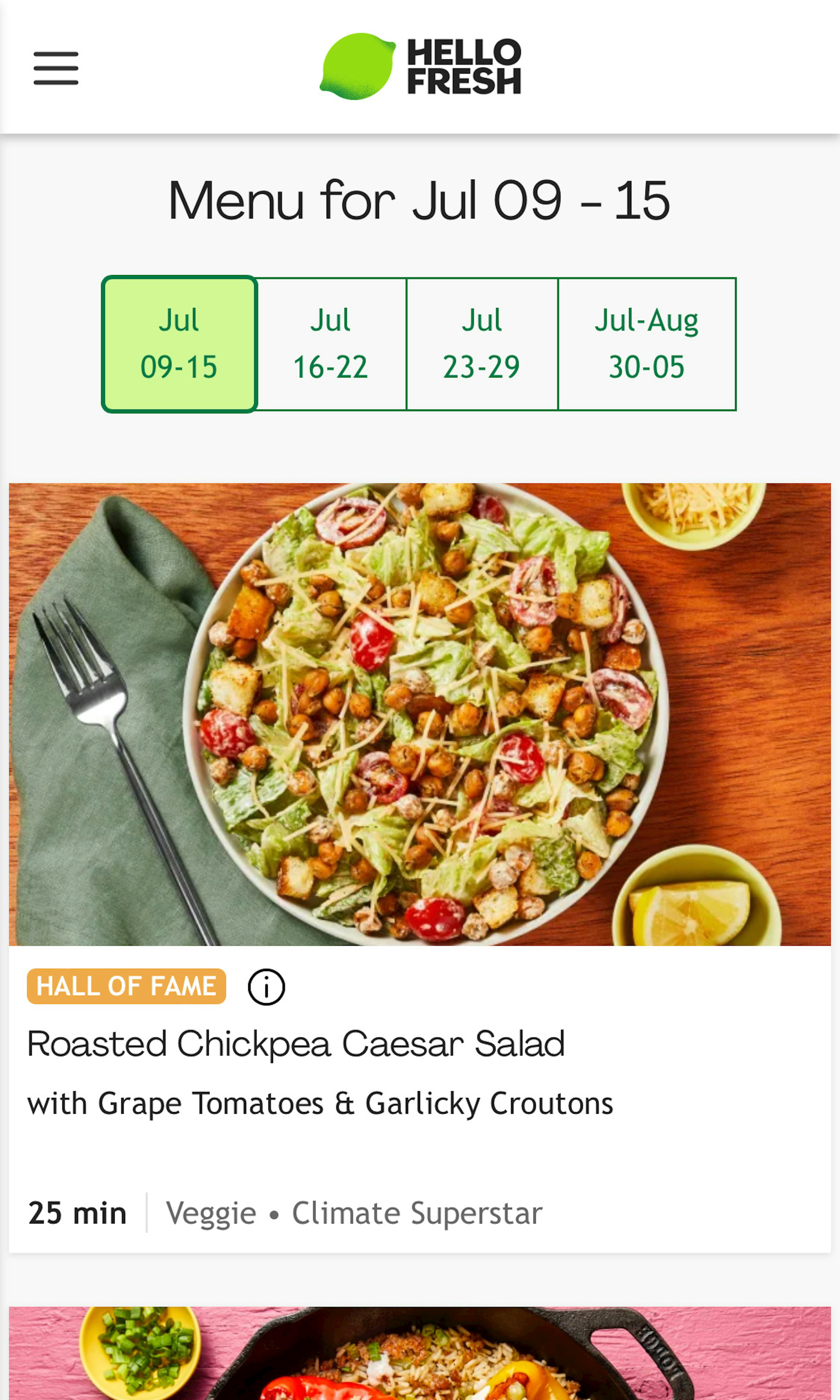
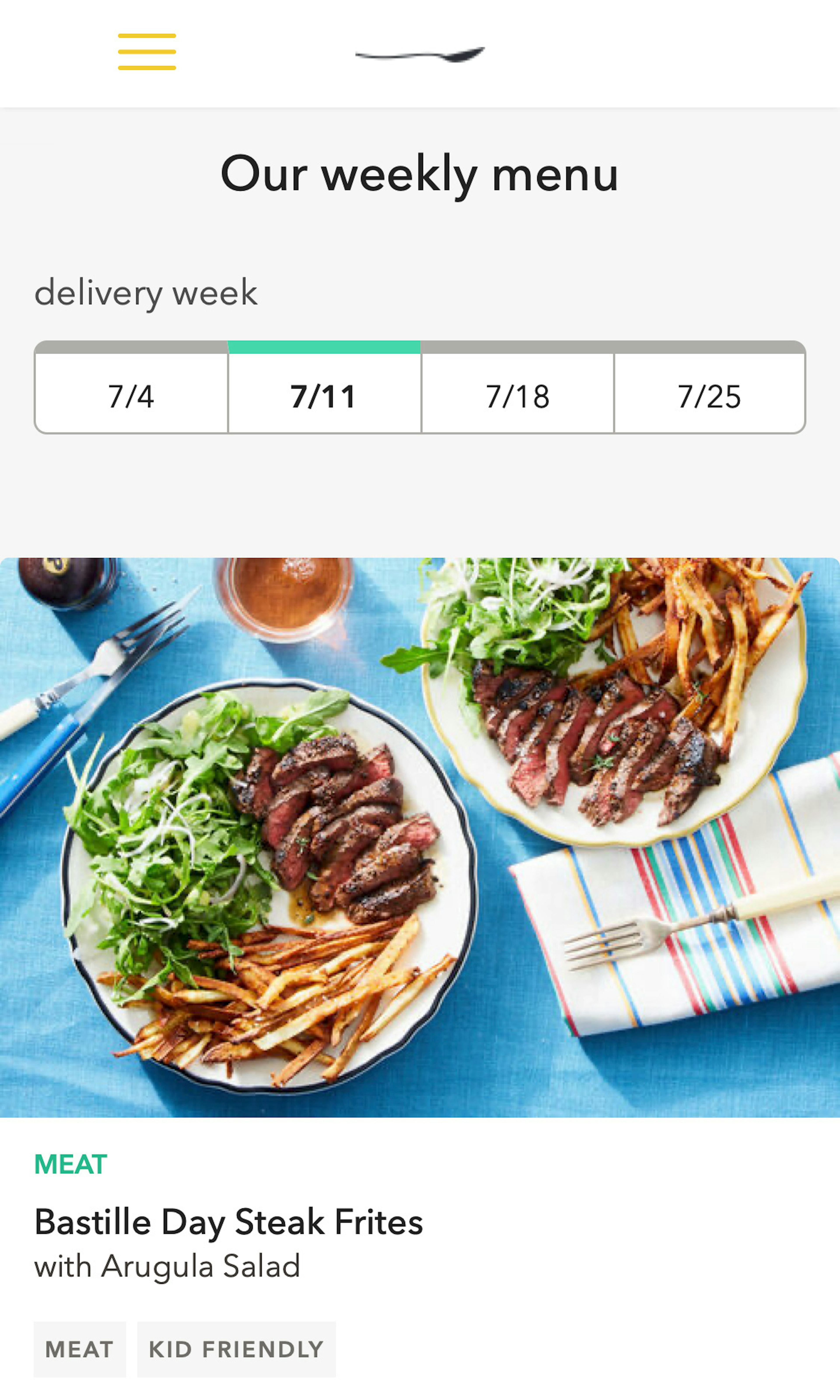
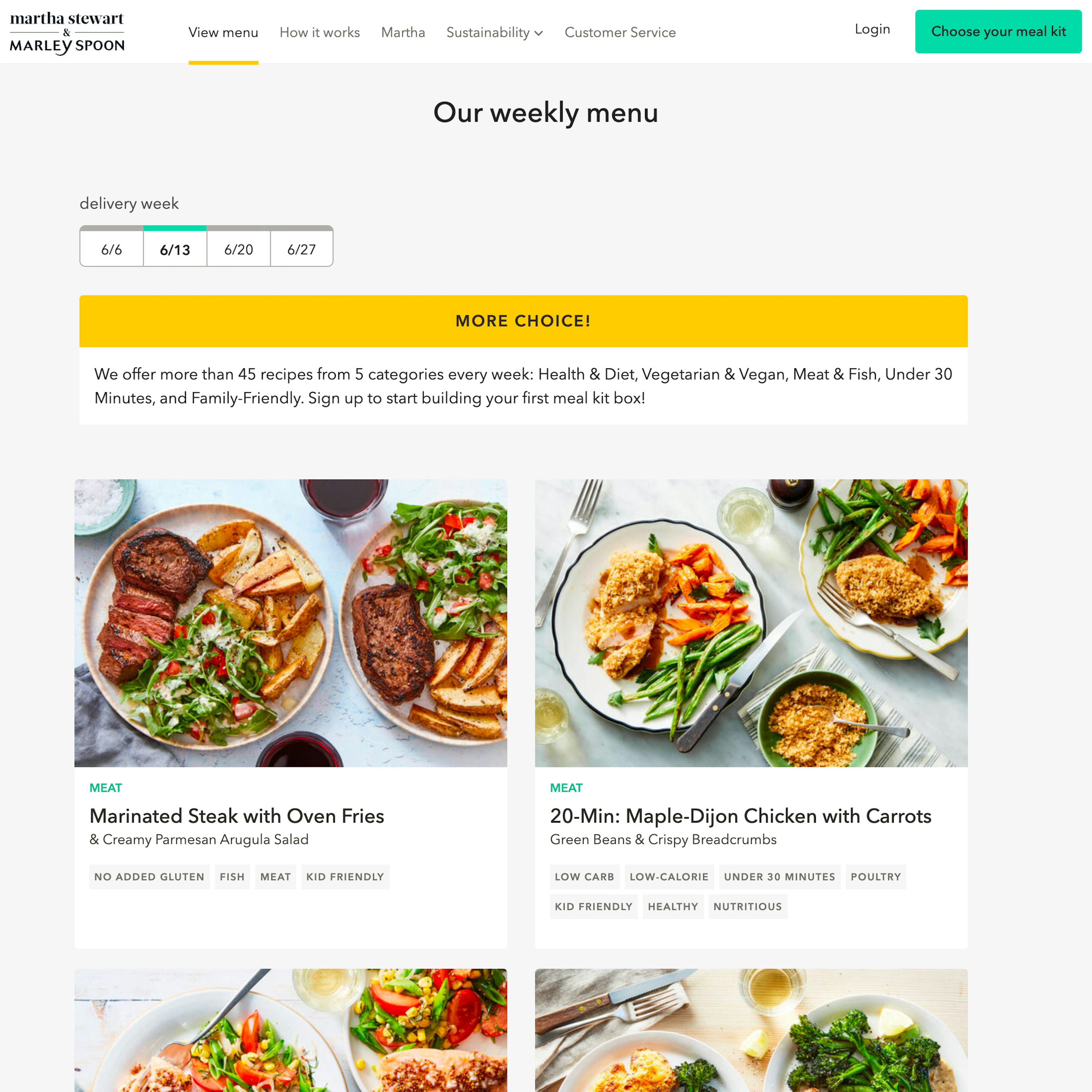
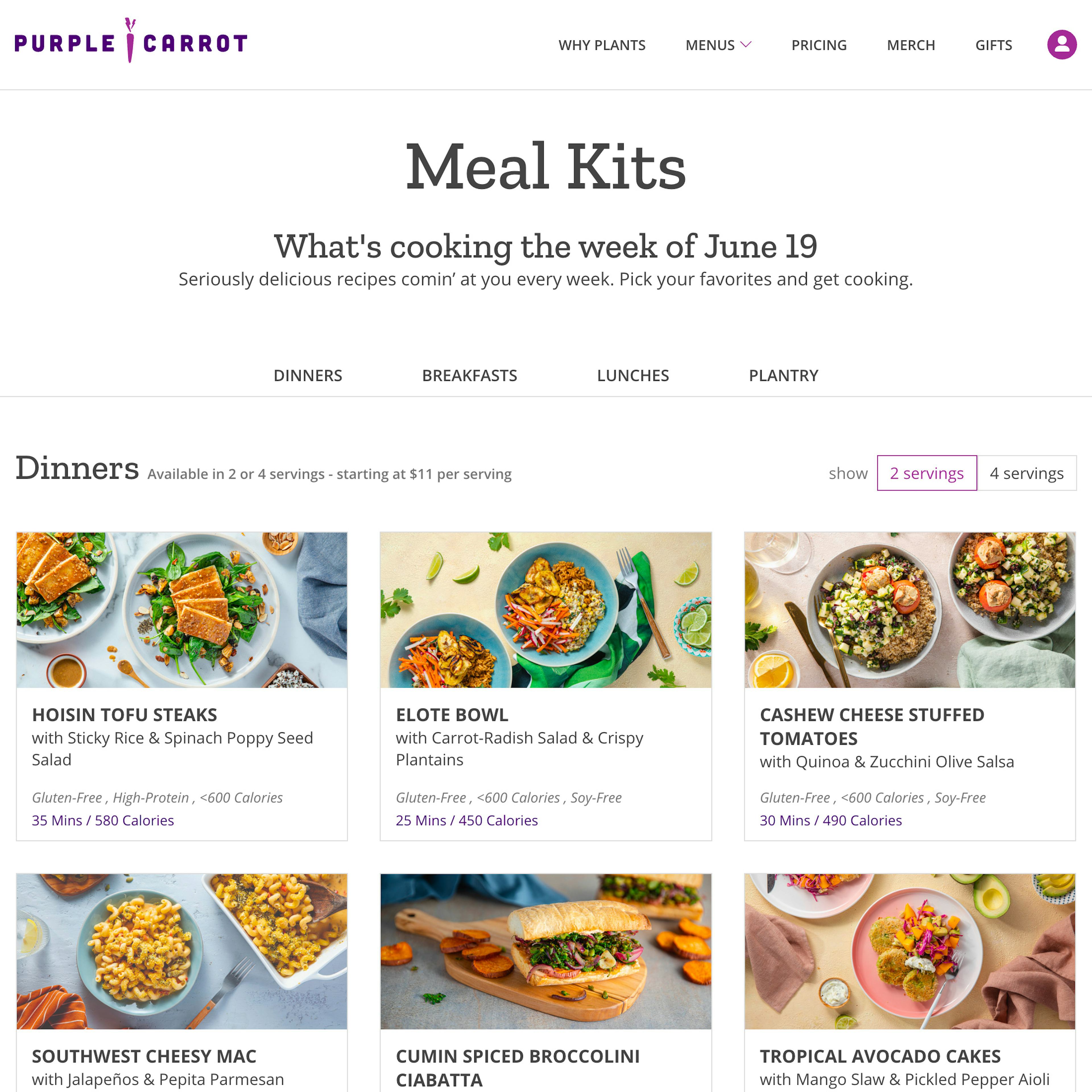
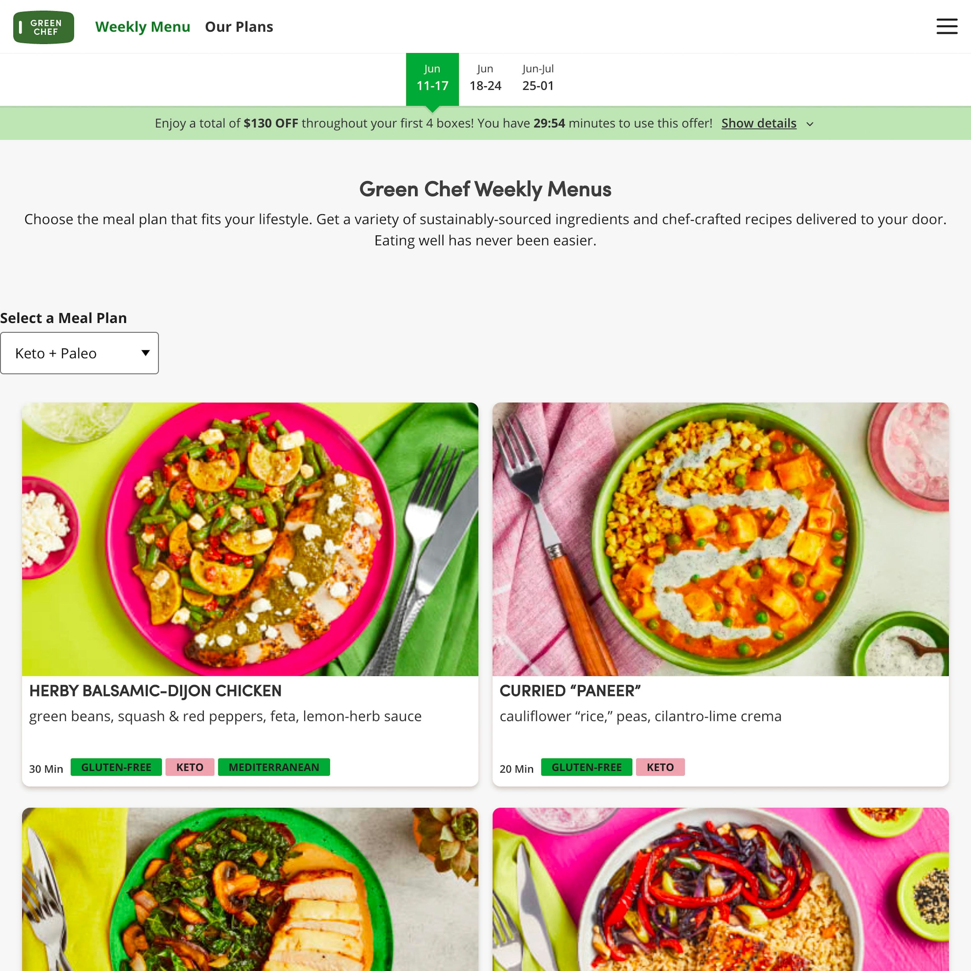
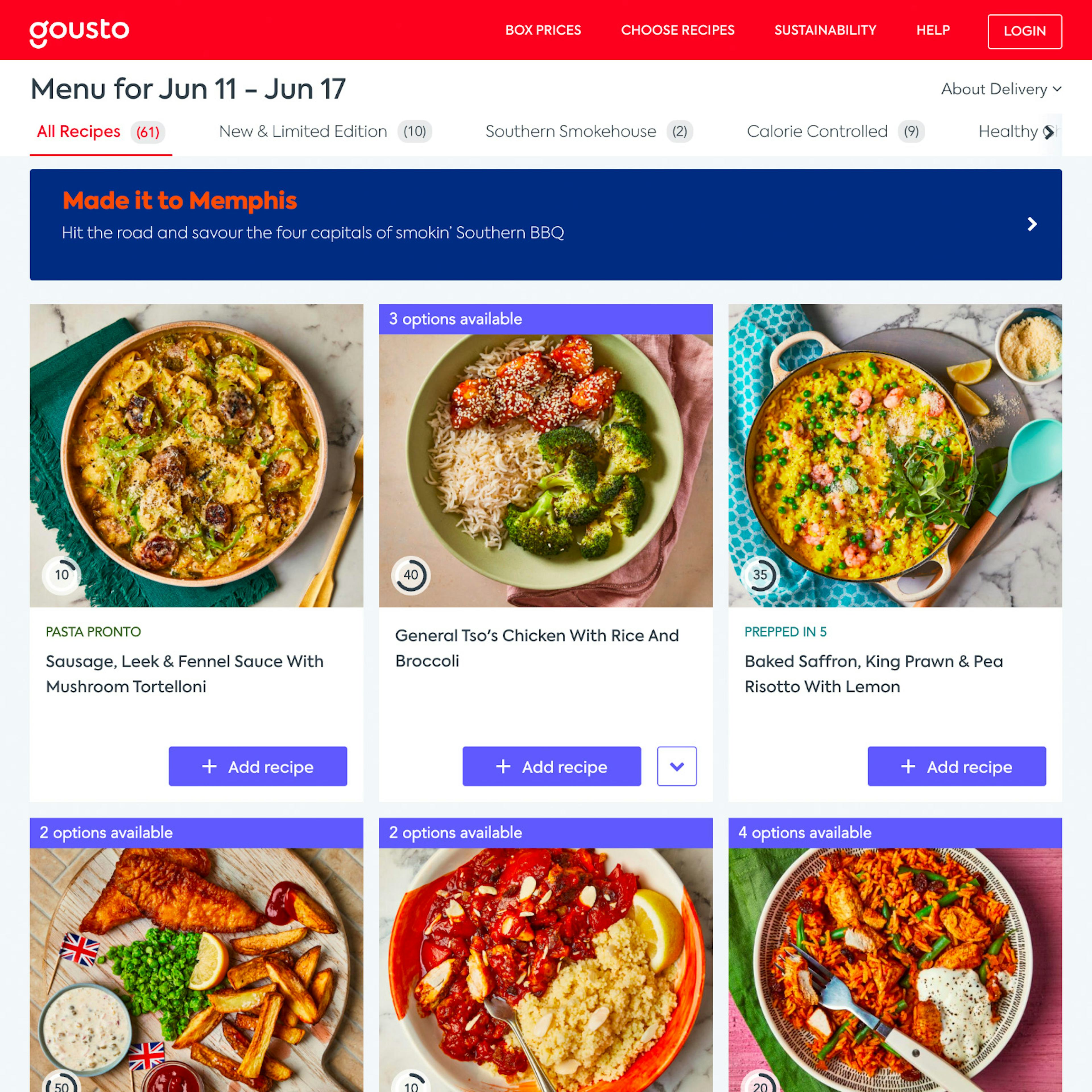
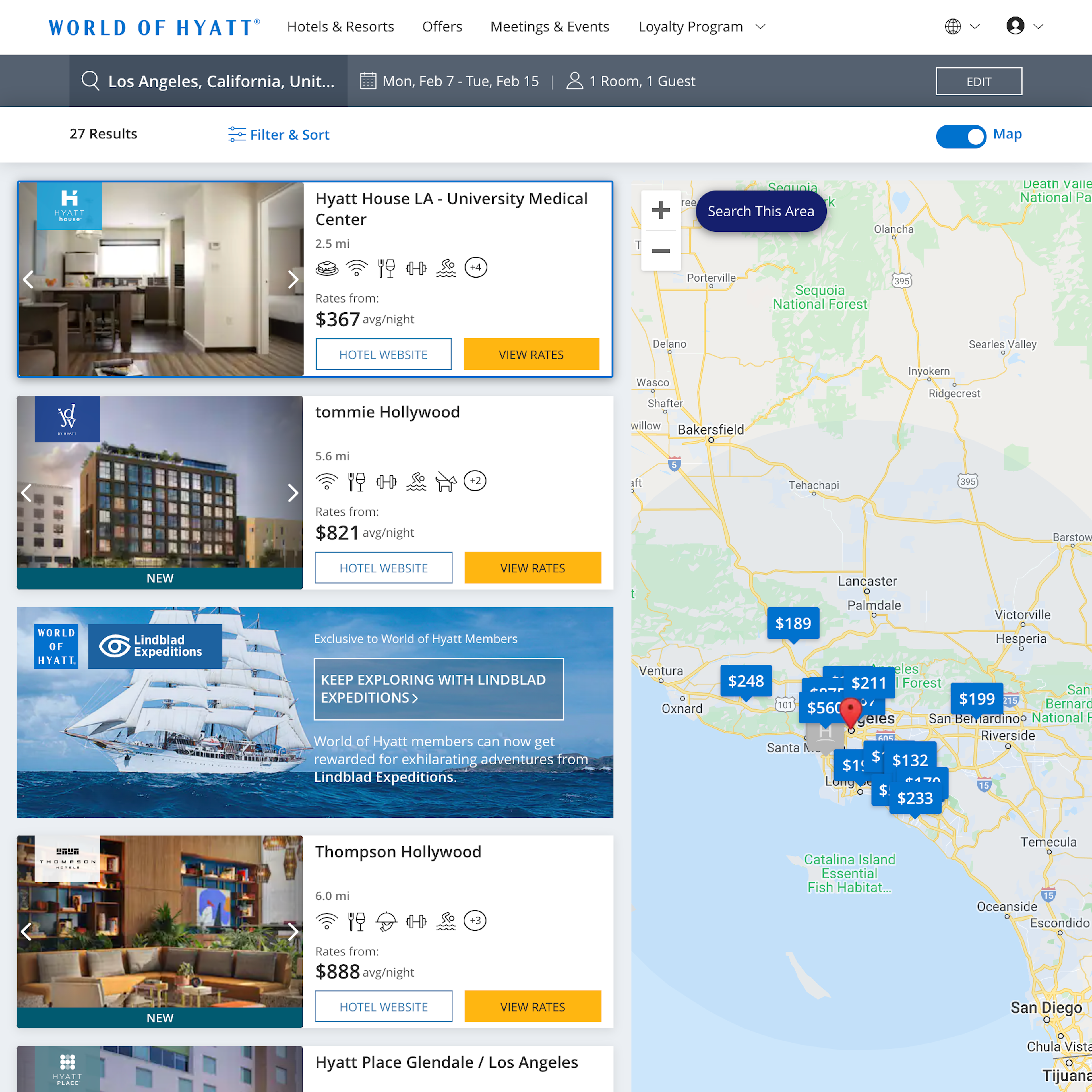
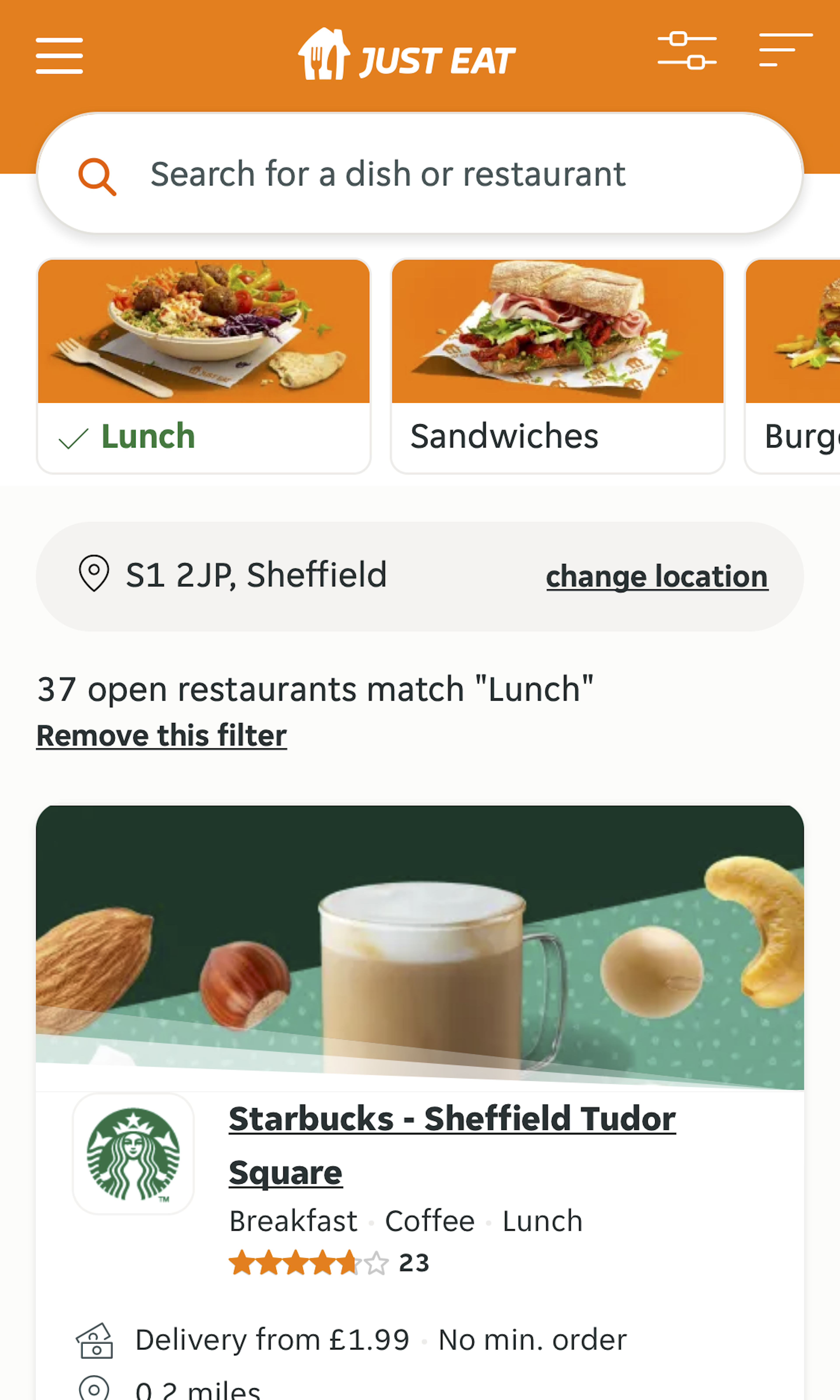
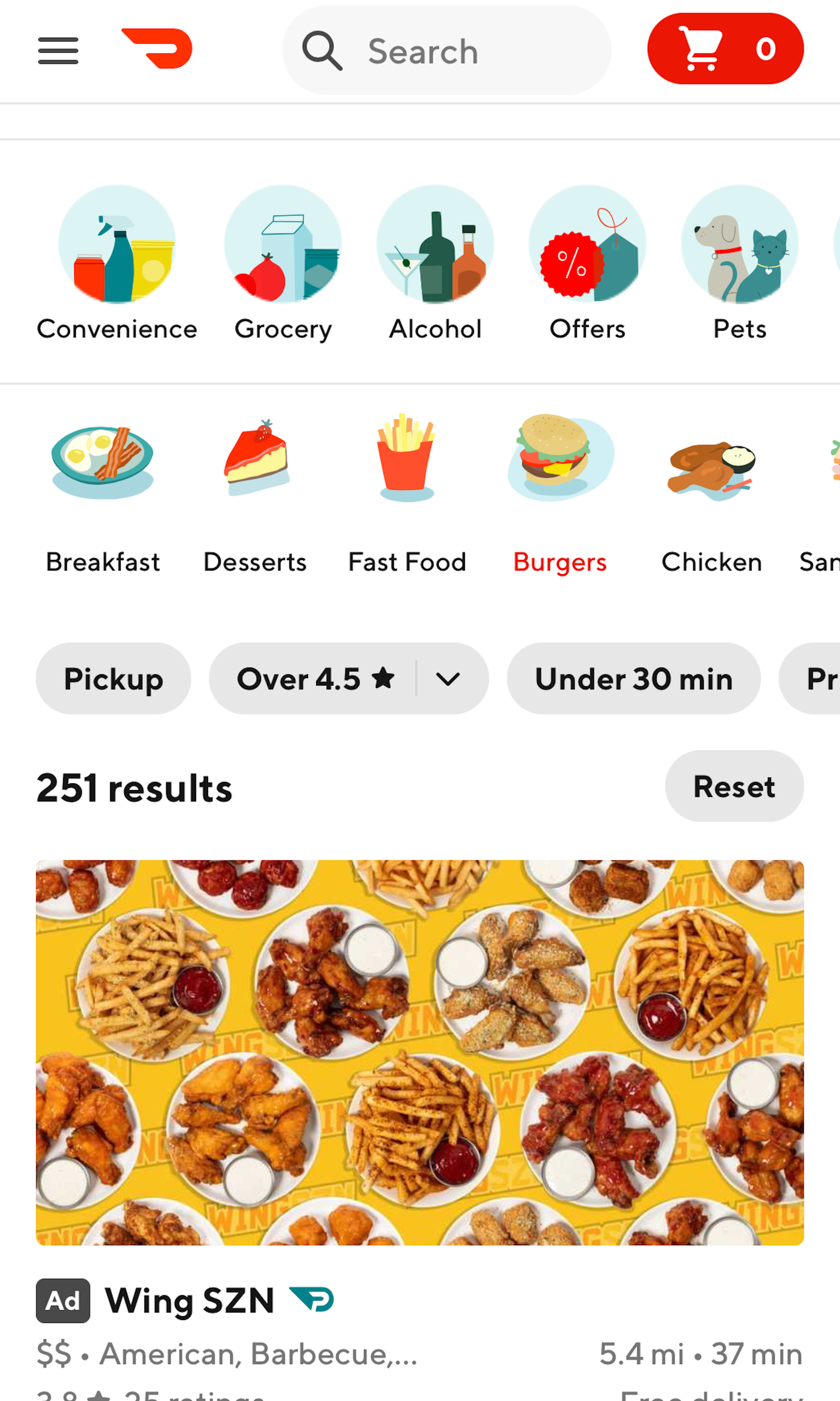
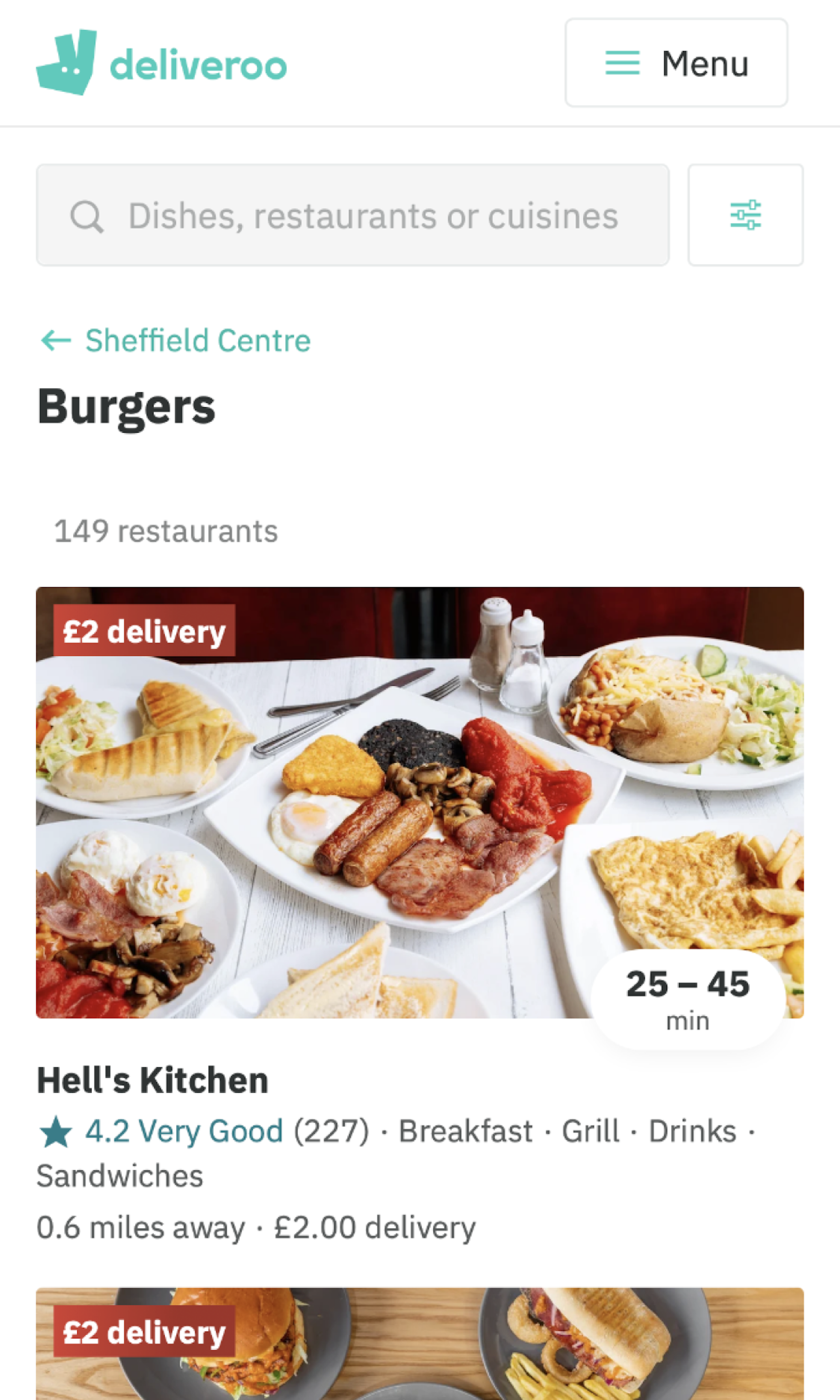
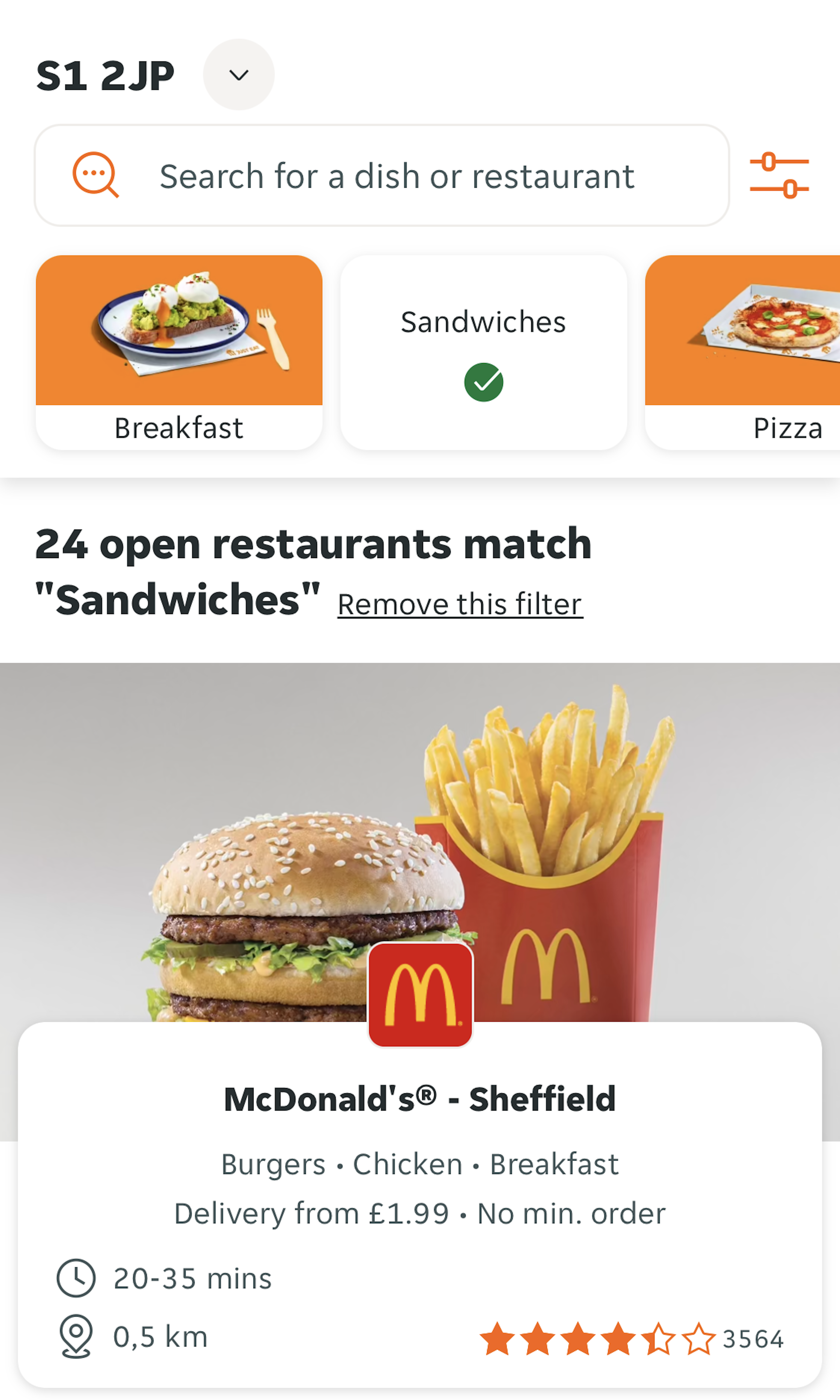
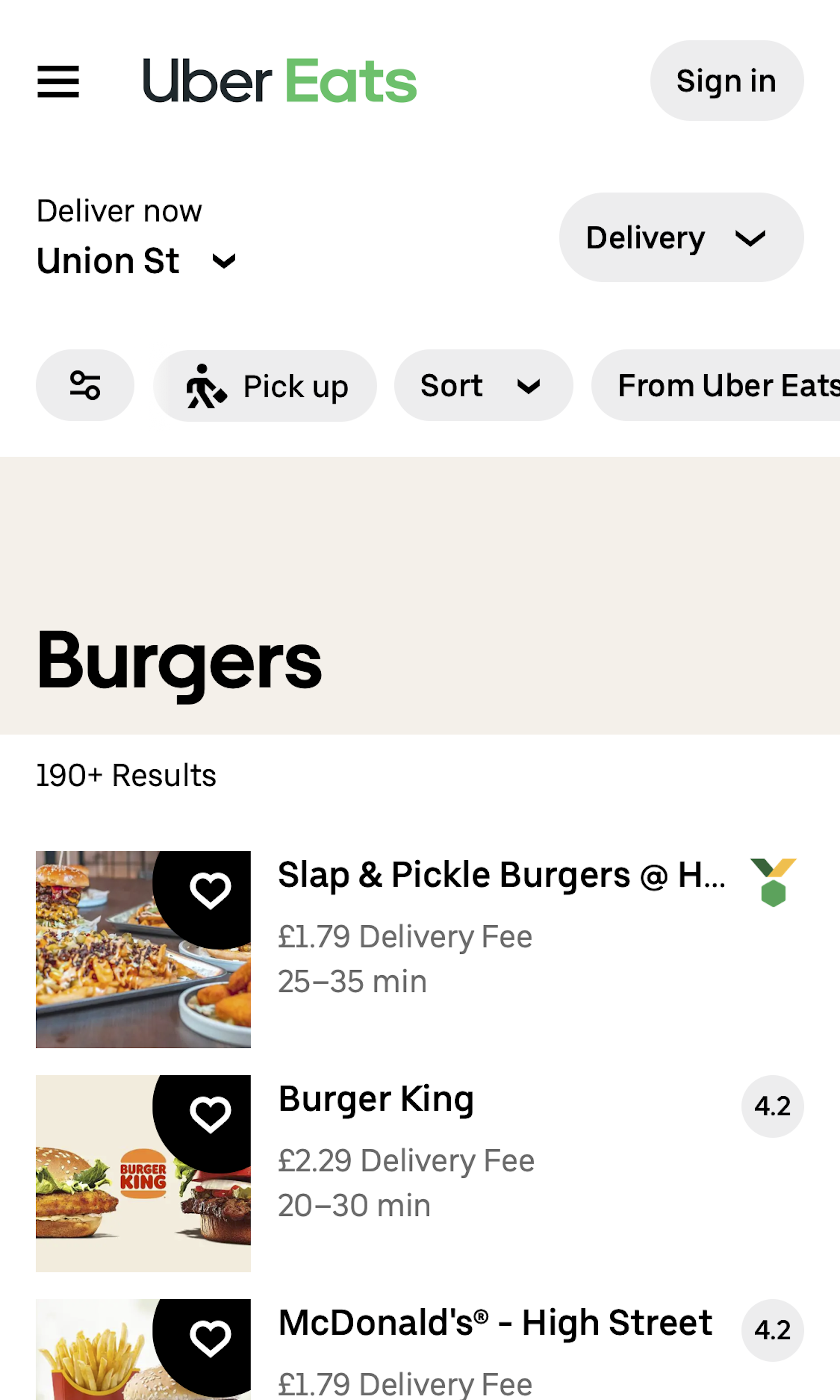
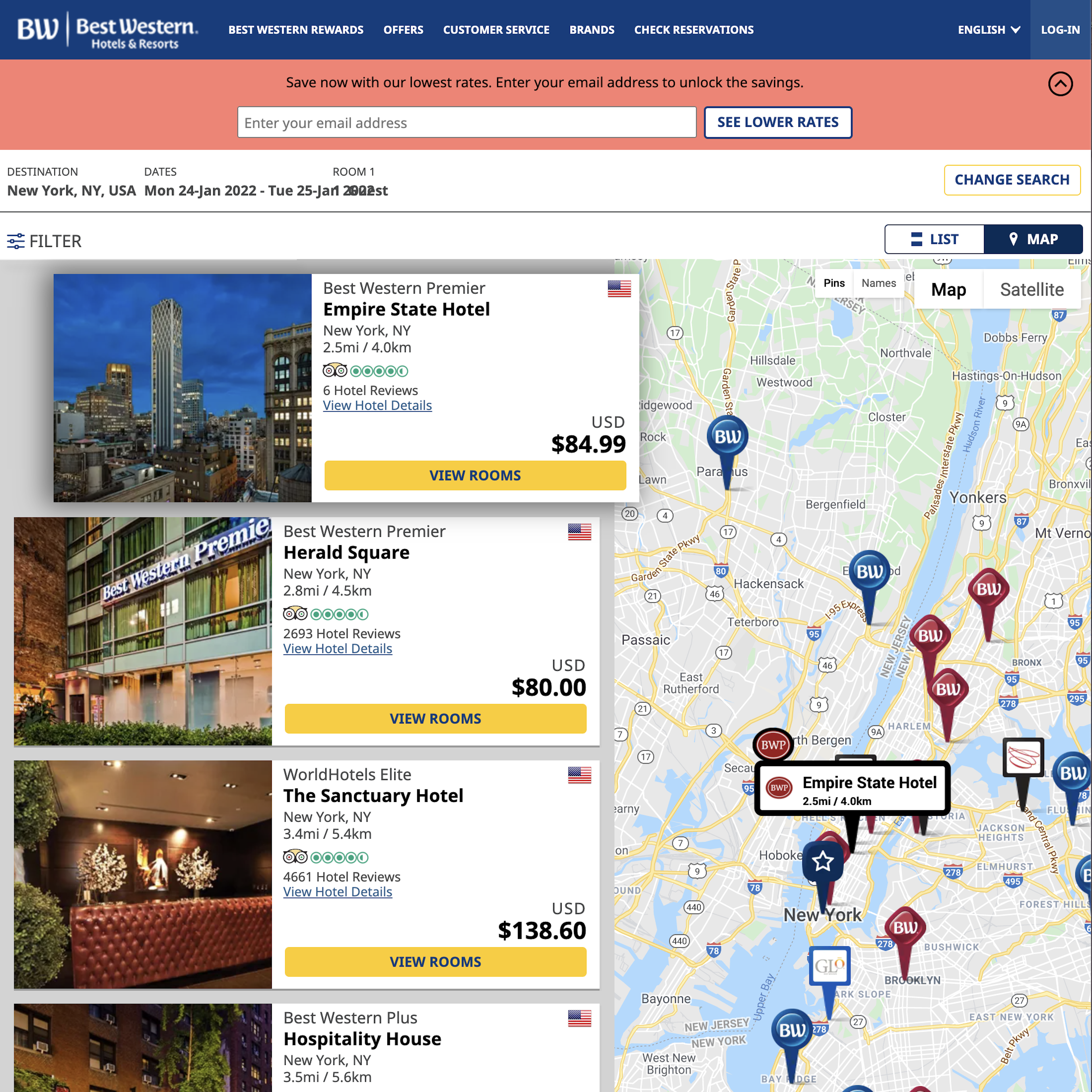
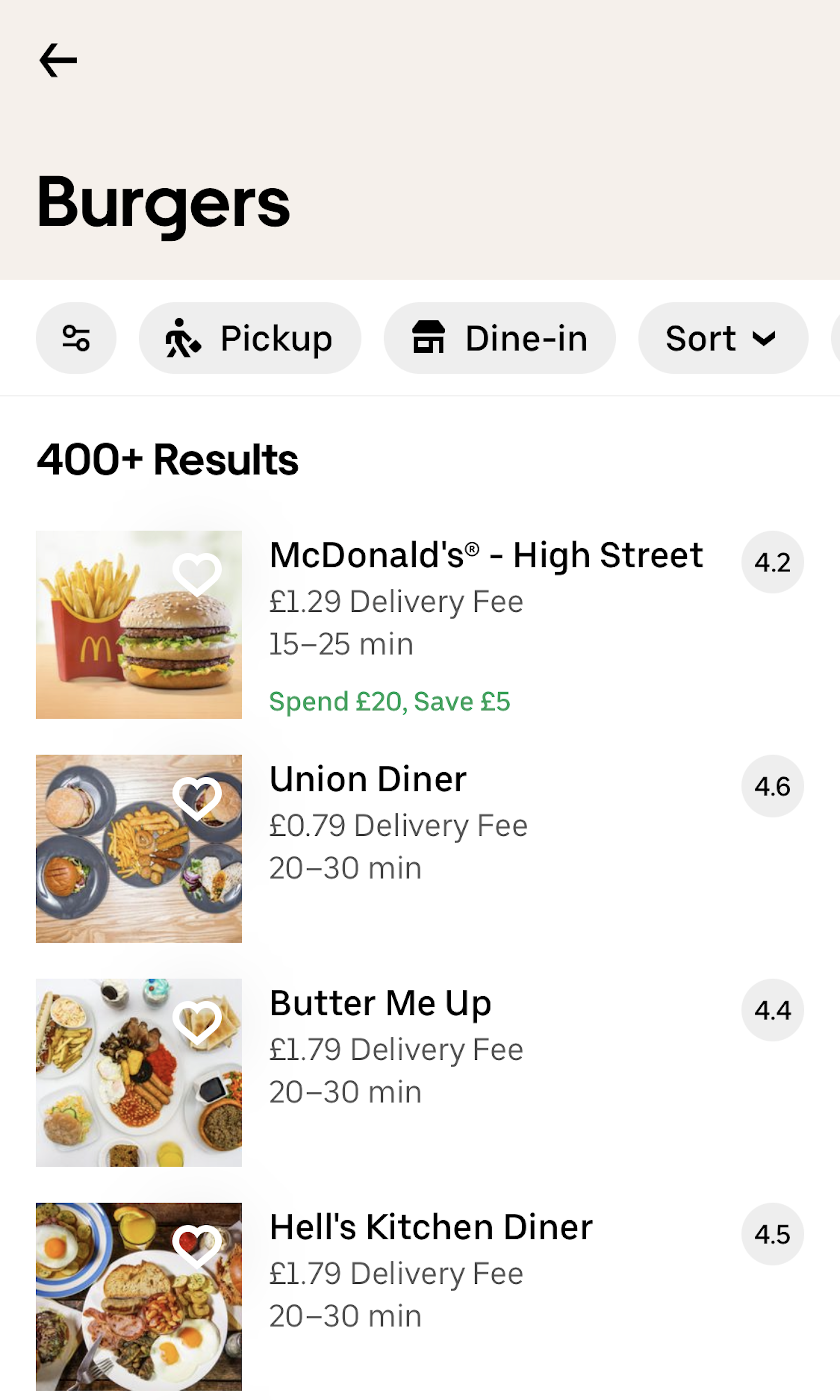
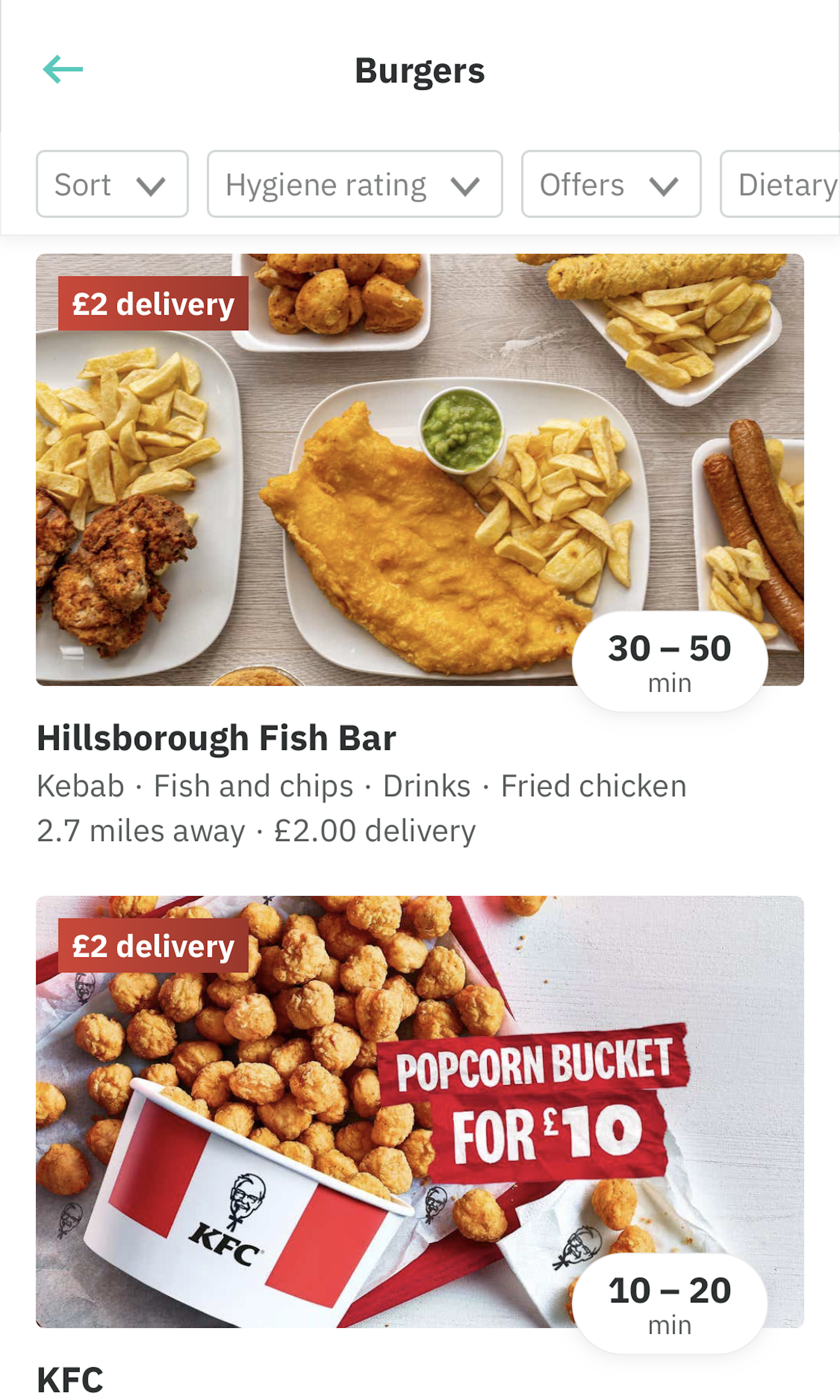
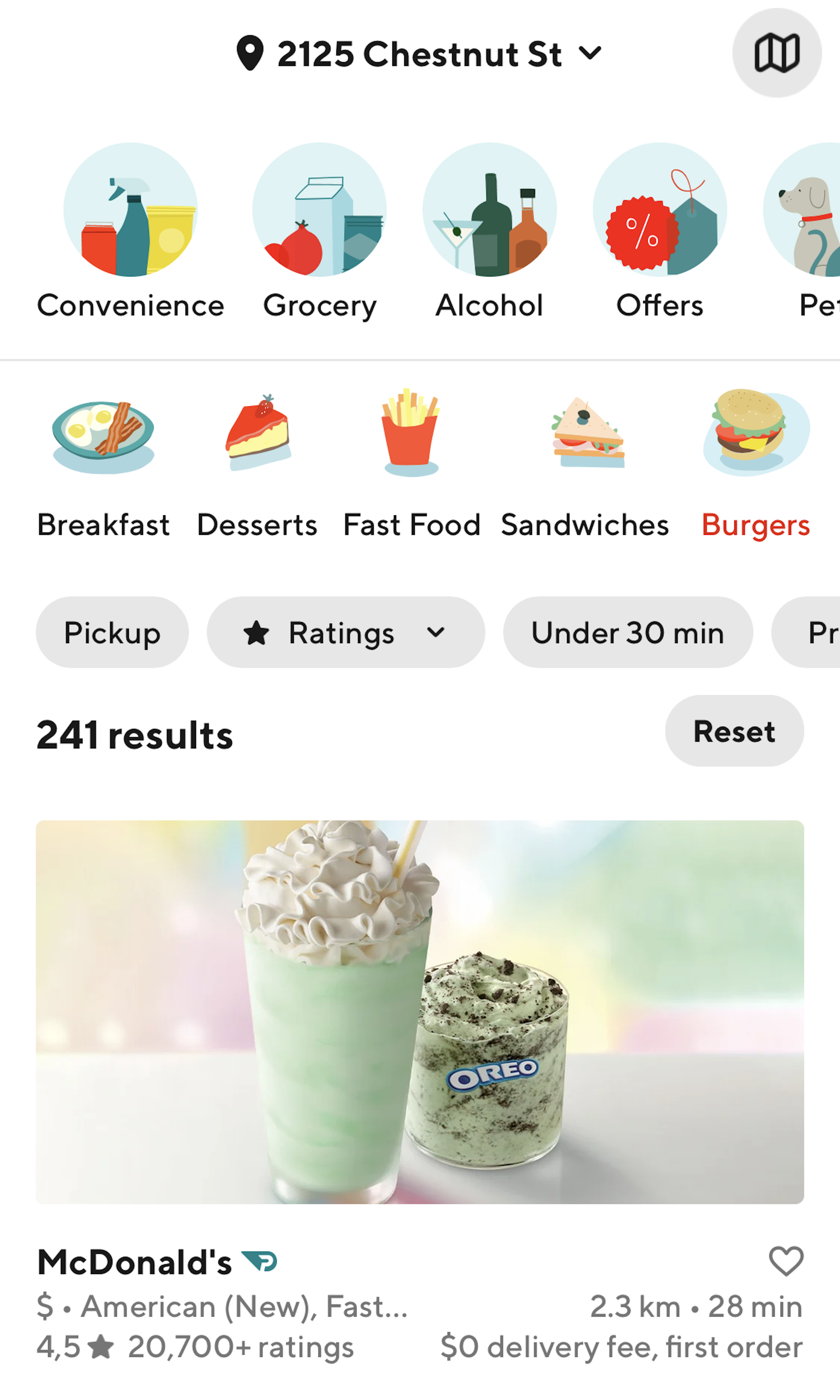
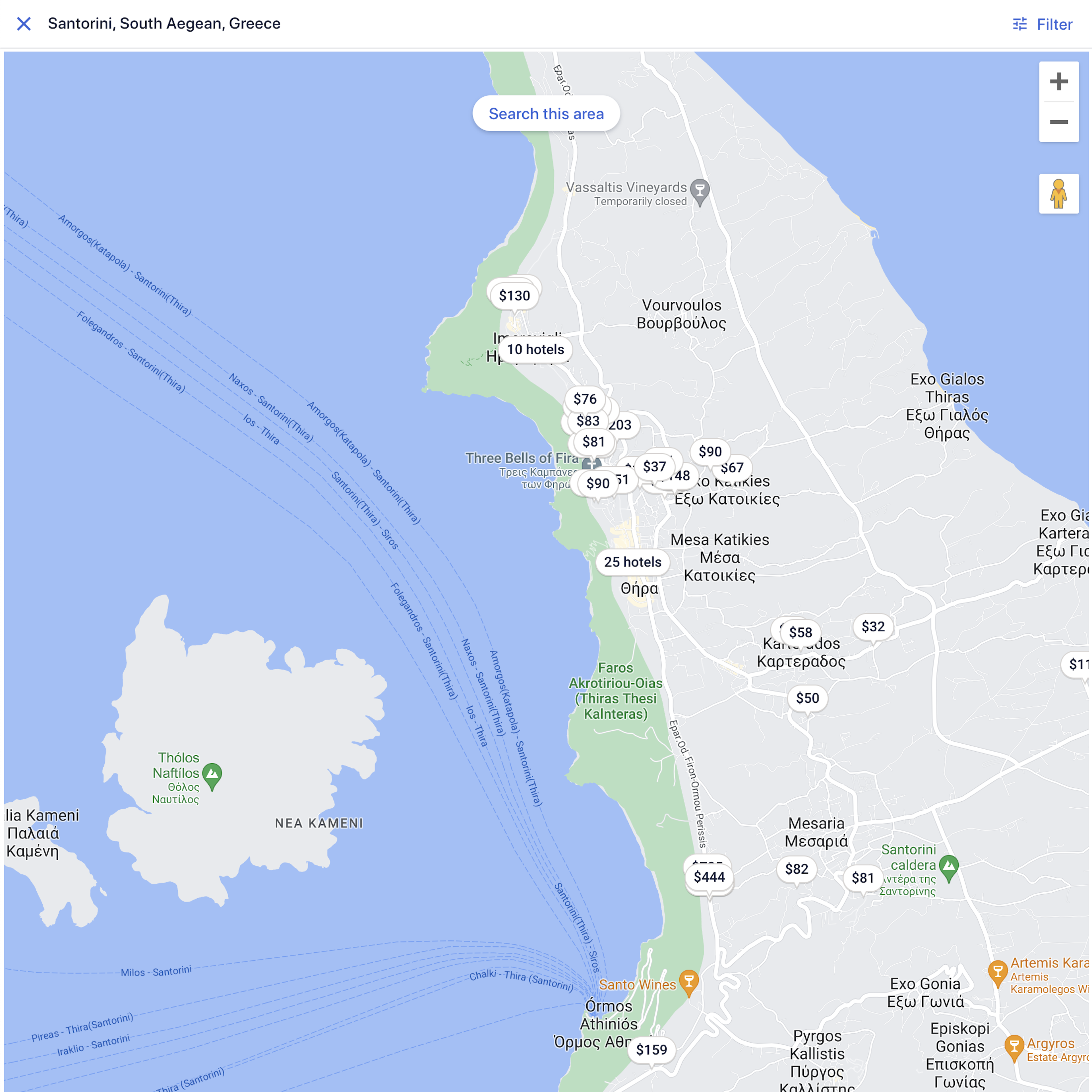
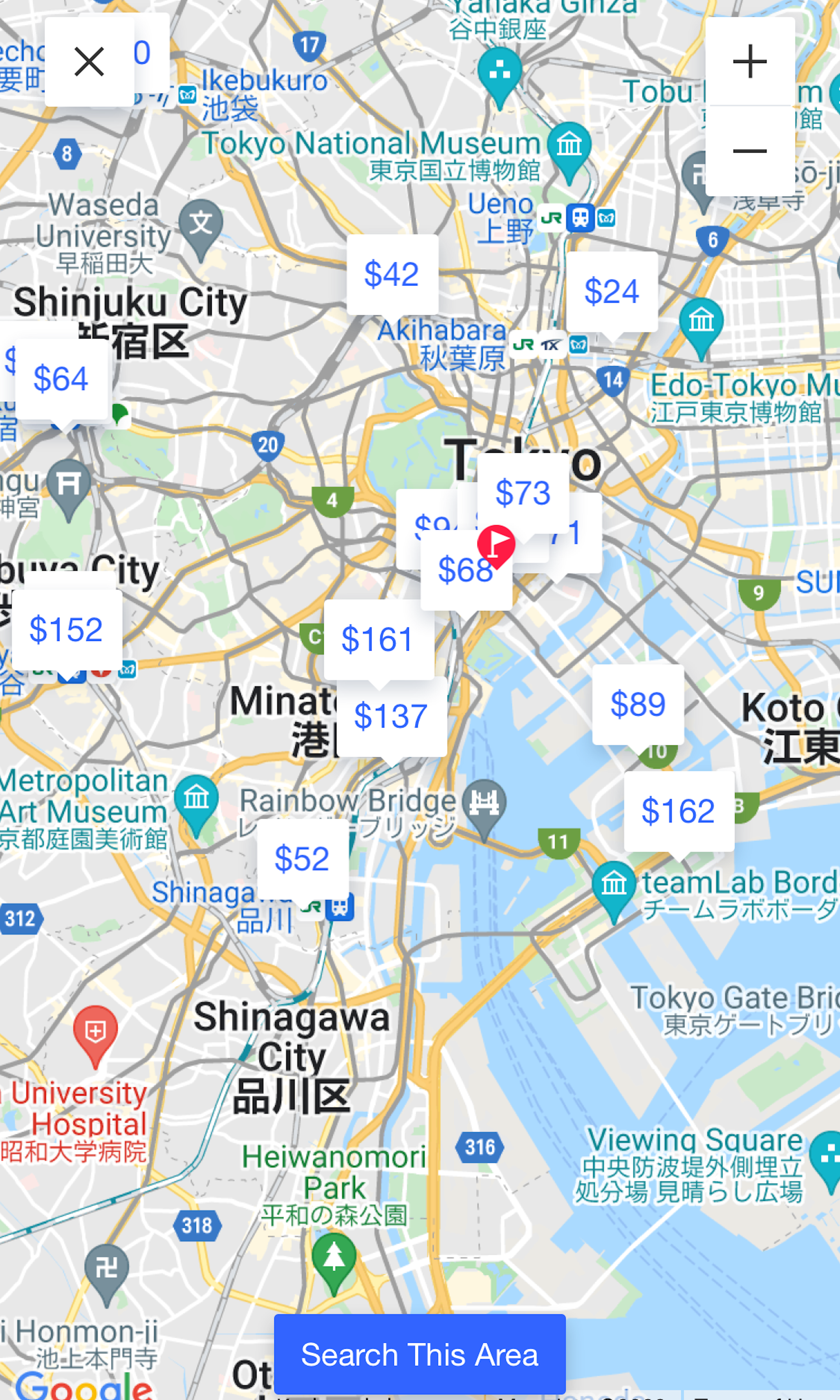
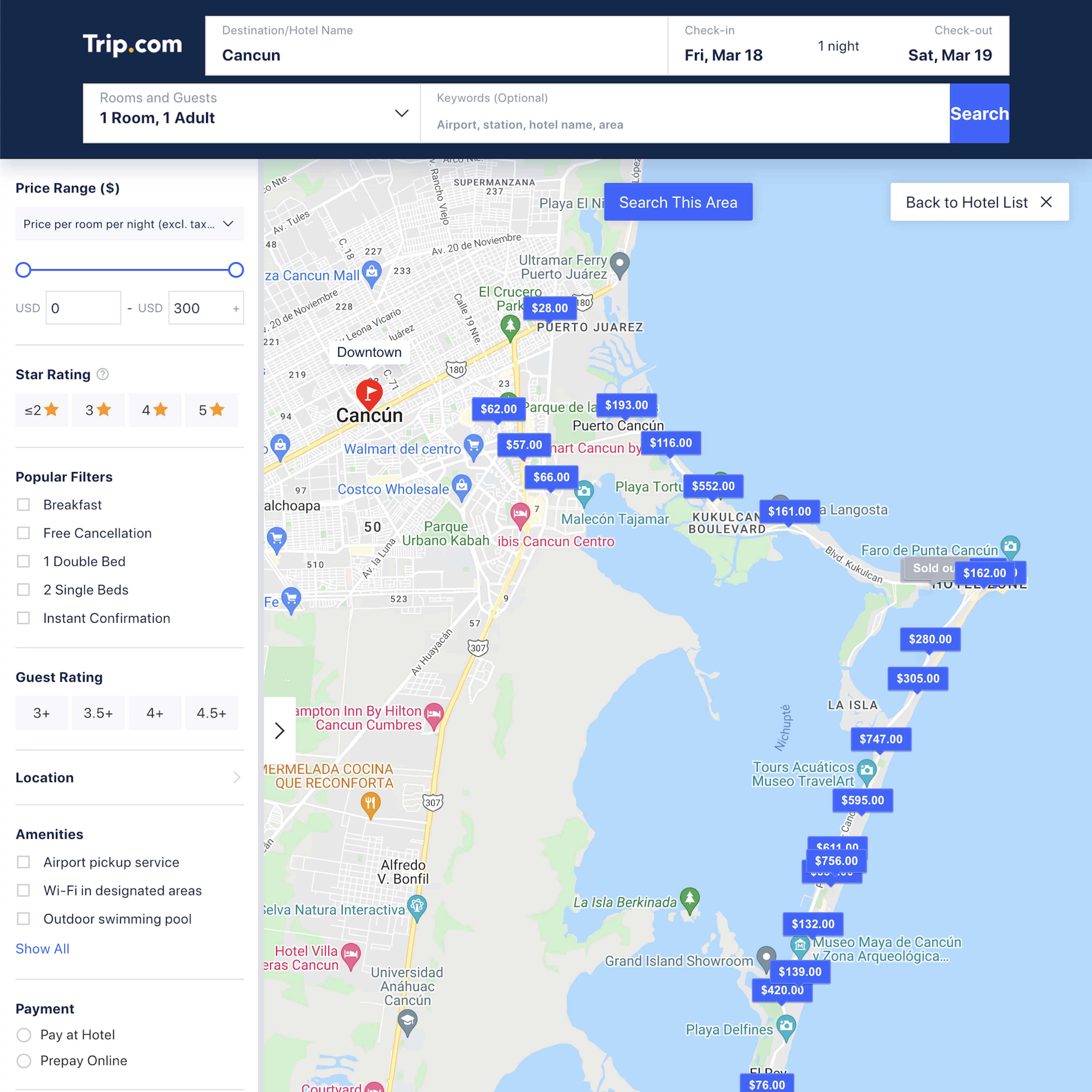
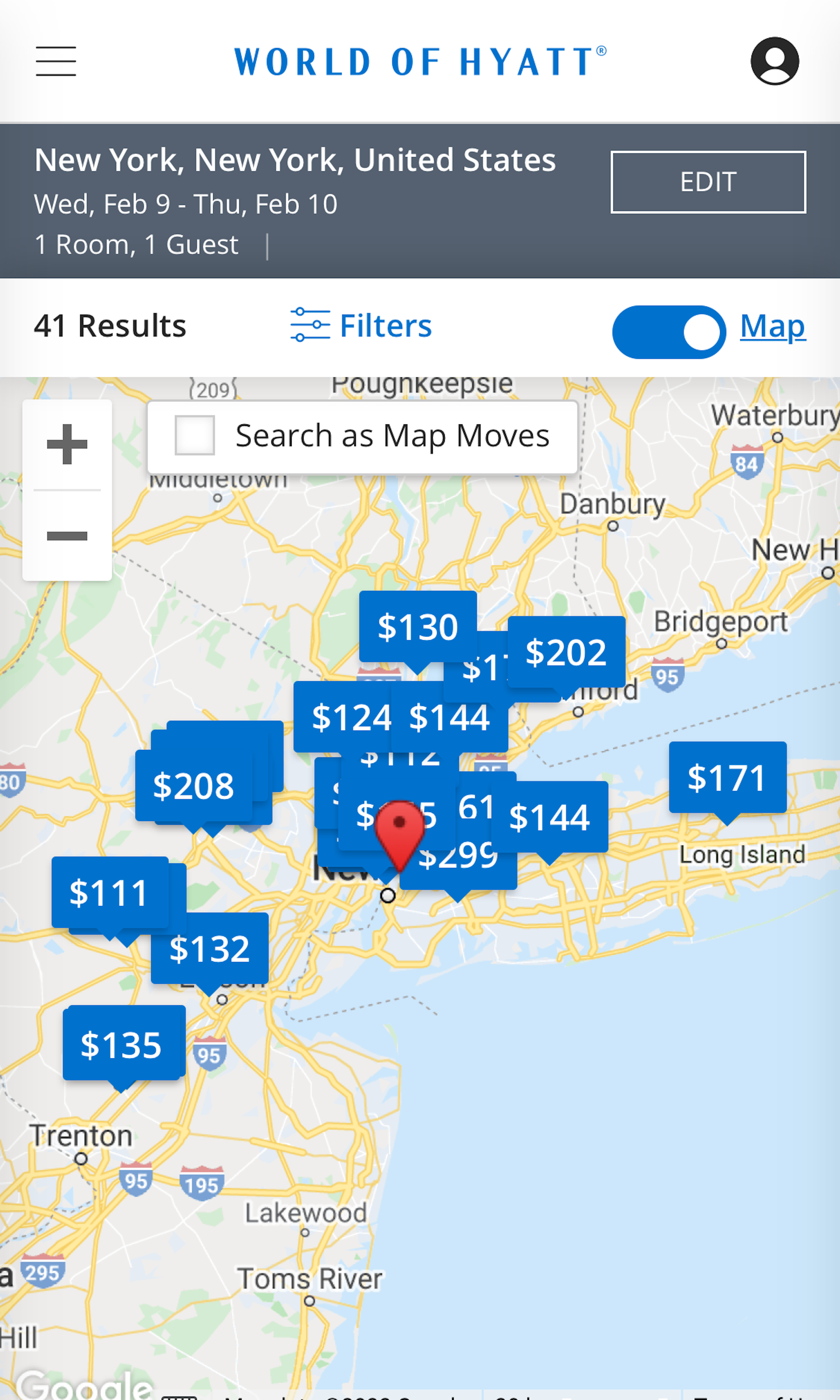
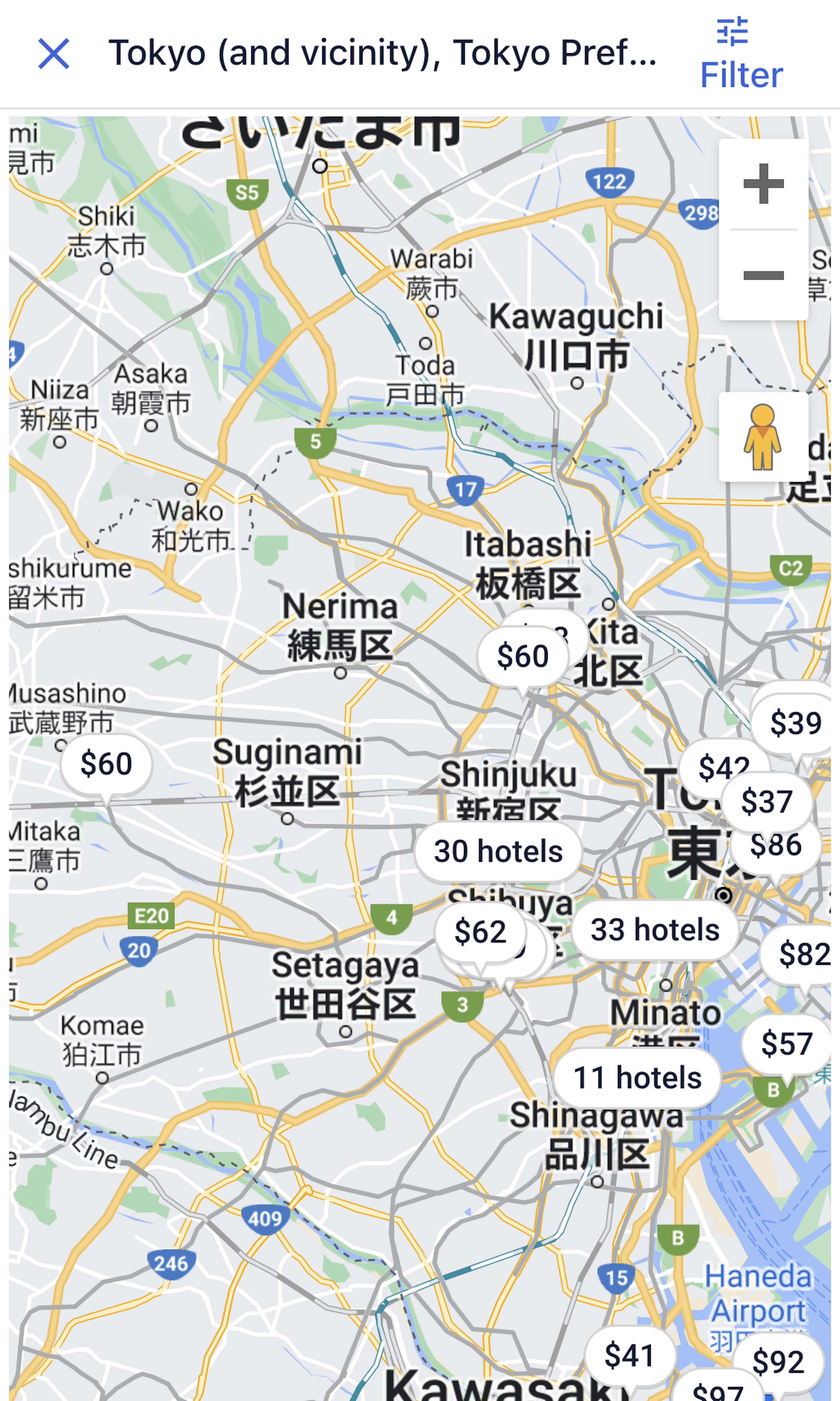
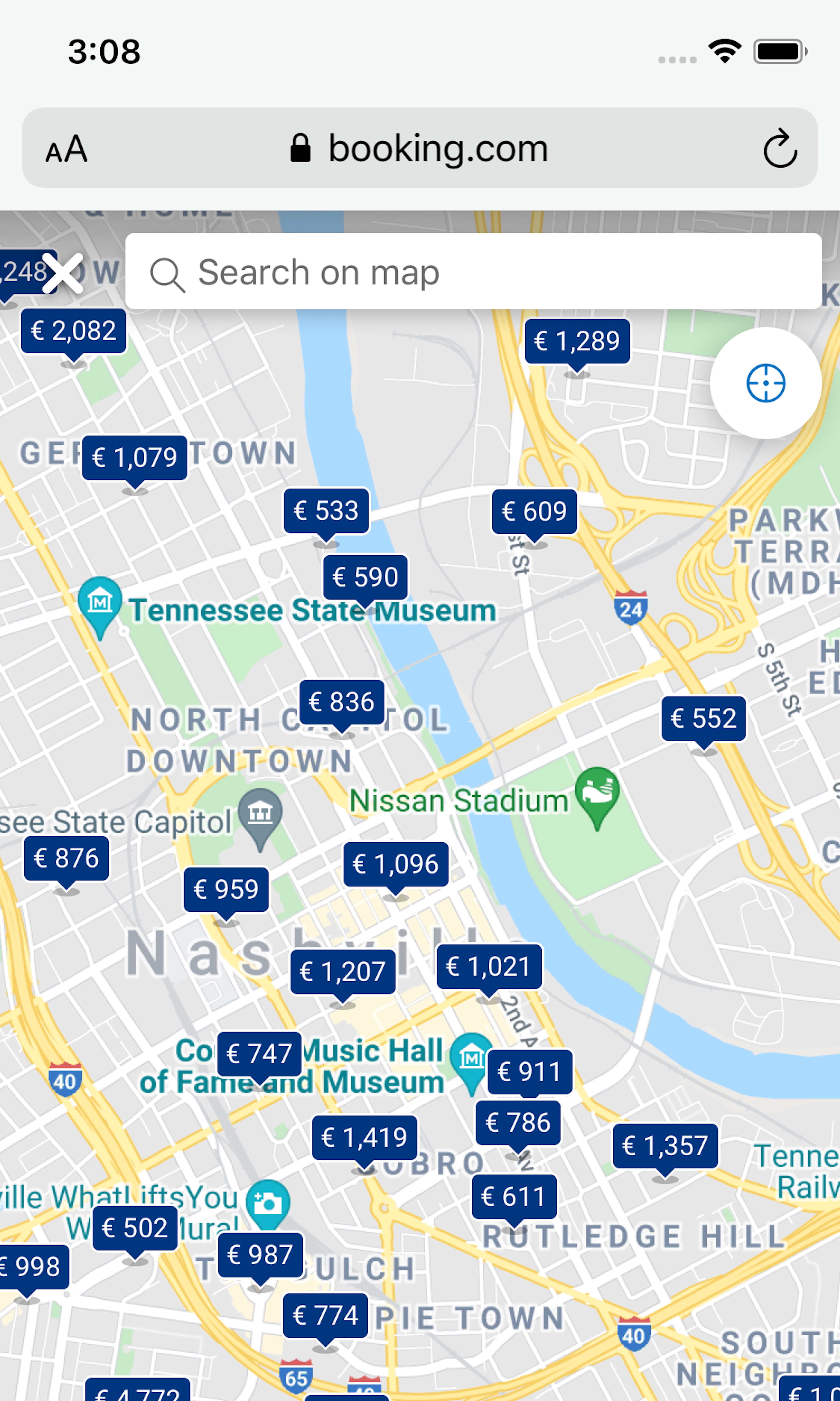
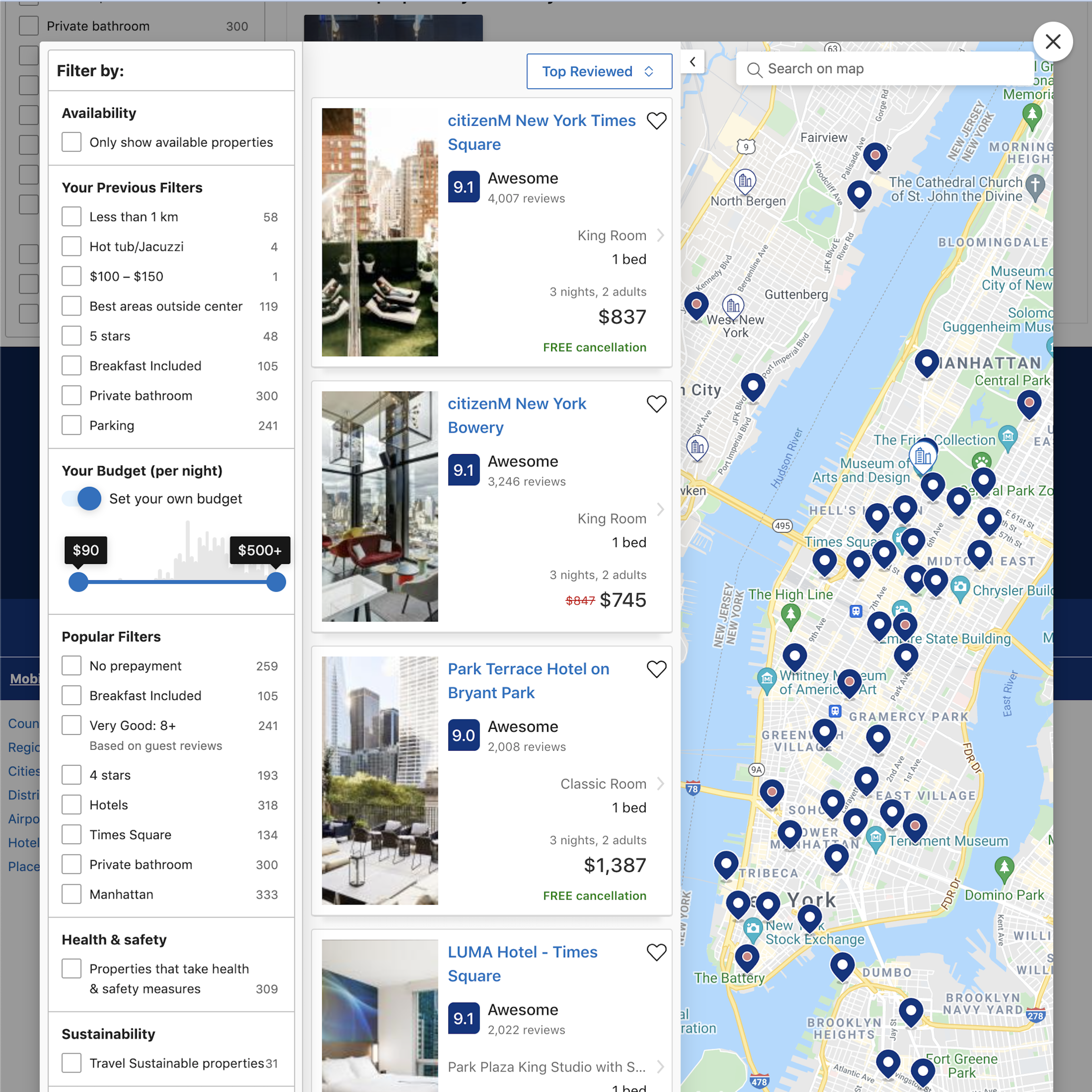
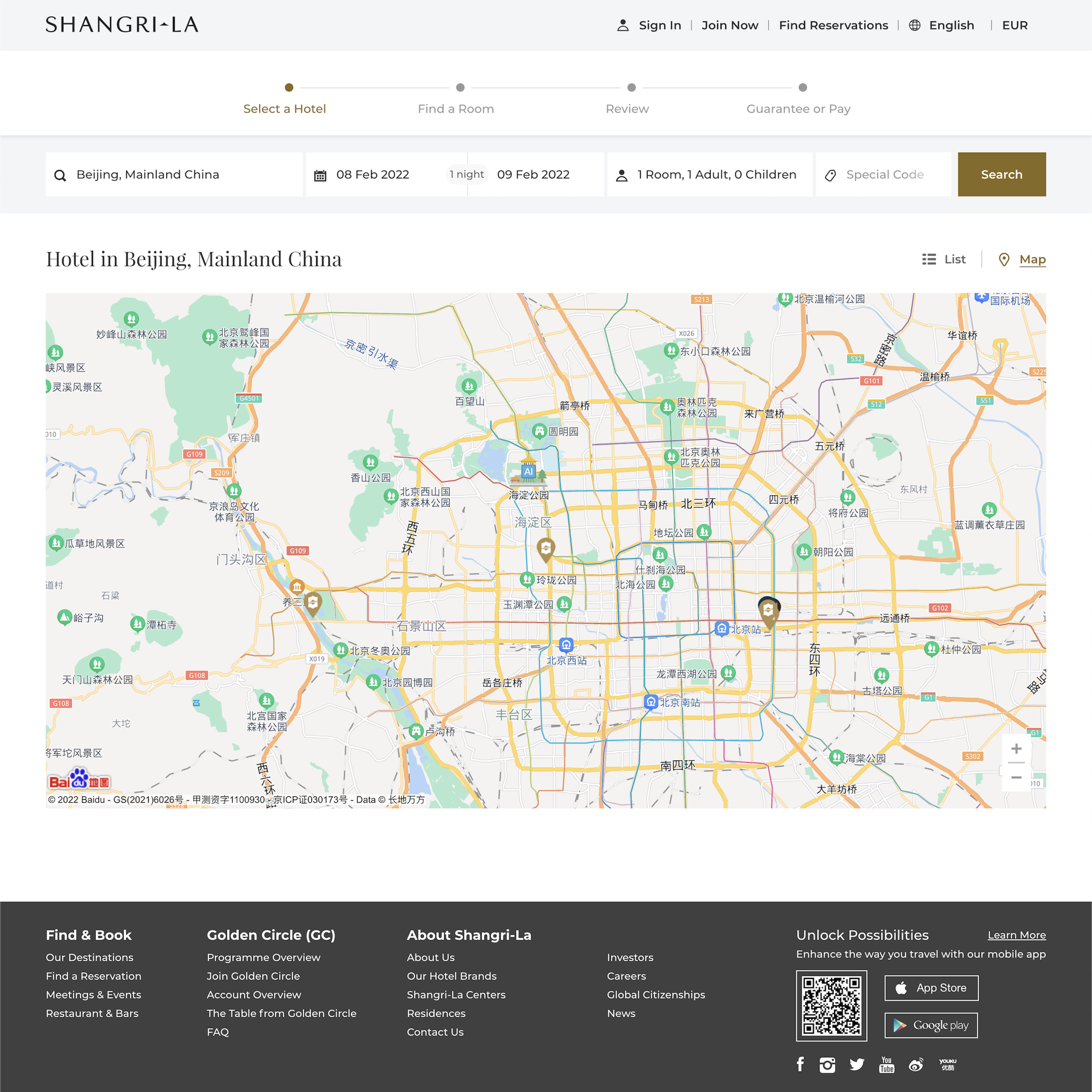
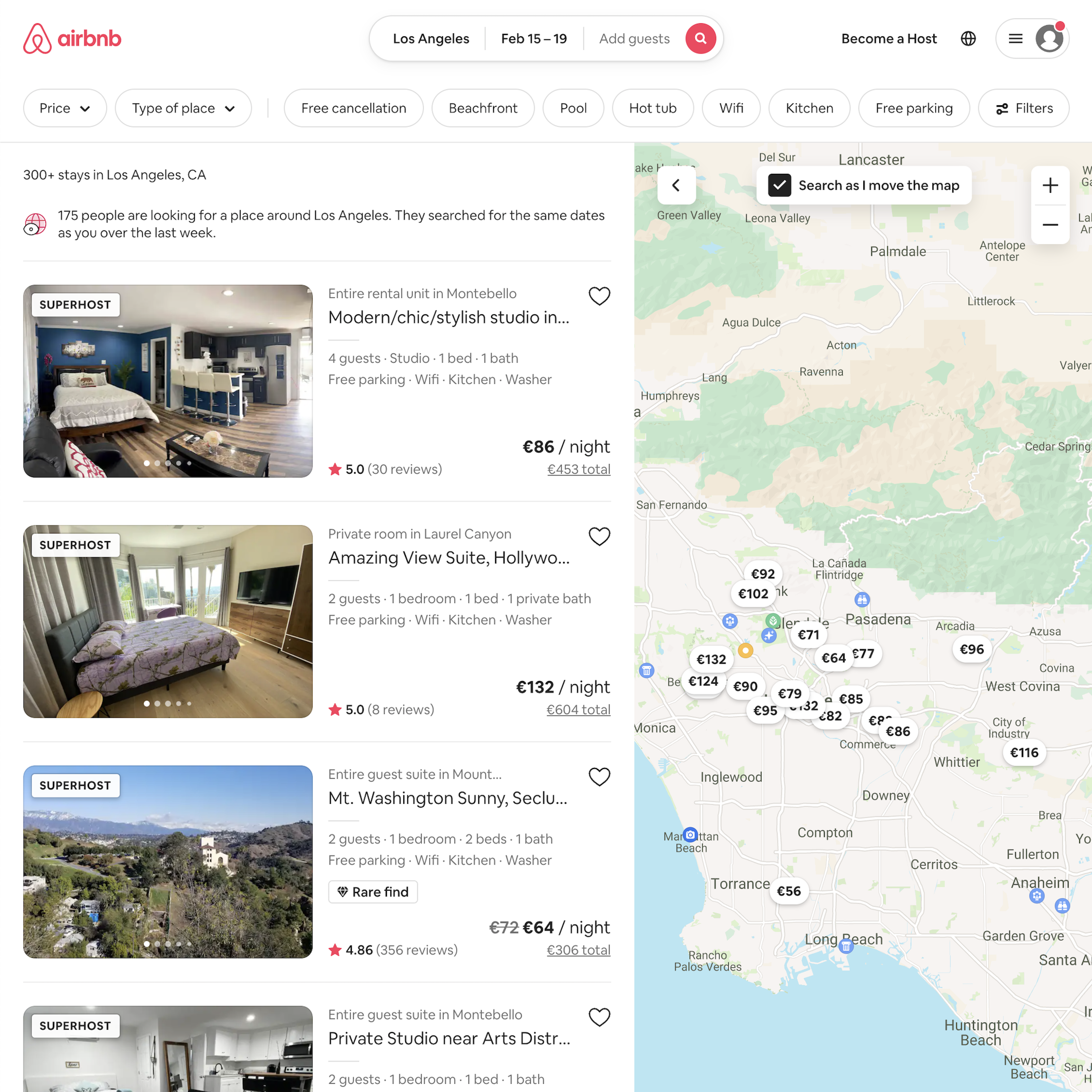
40 ‘Custom Listings Page’ Design Examples
Also referred to as: Recipe List, Meal Kits Recipe List, Map Listings, Travel Accommodation List
What’s this? Here you’ll find 40 “Custom Listings Page” full-page screenshots annotated with research-based UX insights, sourced from Baymard’s UX benchmark of 257 e-commerce sites. (Note: this is less than 1% of the full research catalog.)
“Custom Listing Pages” covers a collection of industry-specific listing page designs, e.g., “Recipe List” and “Map Listings”. How a product list effectively dictates product presentation and provides the pathway to the right (or wrong) product page the same is valid for custom listing pages.
A balanced product list design provides users with a better overview of the products available and helps them more accurately determine which products to investigate further — essentially, whether a list item’s product page is worth opening or if it should be skipped. These are just as valid for custom listing page designs with their list items and their elements. Therefore, product listing page guidelines also cover most of the implementations for custom listing pages, and the industry-specific elements that are unique to Meal Kit sites and Travel Accommodations sites are catered by industry-specific guidelines.
More ‘Custom Listing Page’ Insights
-
Learn More: Besides exploring the 40 “Custom Listing Page” design examples below, you may also want to read our related articles “Travel Accommodations UX: 3 High-Level UX Takeaways from 992 Hours of Testing Leading Travel Accommodations Sites” and “3 High-Level UX Takeaways from 950+ Hours of Testing Leading Meal Kits Sites”.
-
Get Full Access: To see all of Baymard’s “Custom Listing Page” research findings you’ll need Baymard Premium access. (Premium also provides you full access to 150,000+ hours of UX research findings, 650+ e-commerce UX guidelines, and 275,000+ UX performance scores.)
User Experience Research, Delivered Weekly
Join 60,000+ UX professionals and get a new UX article every week.

User Experience Research, Delivered Weekly
Join 60,000+ UX professionals and get a new UX article every week.

Explore Other Research Content

300+ free UX articles based on large-scale research.

257 top sites ranked by UX performance.

Code samples, demos, and key stats for usability.


