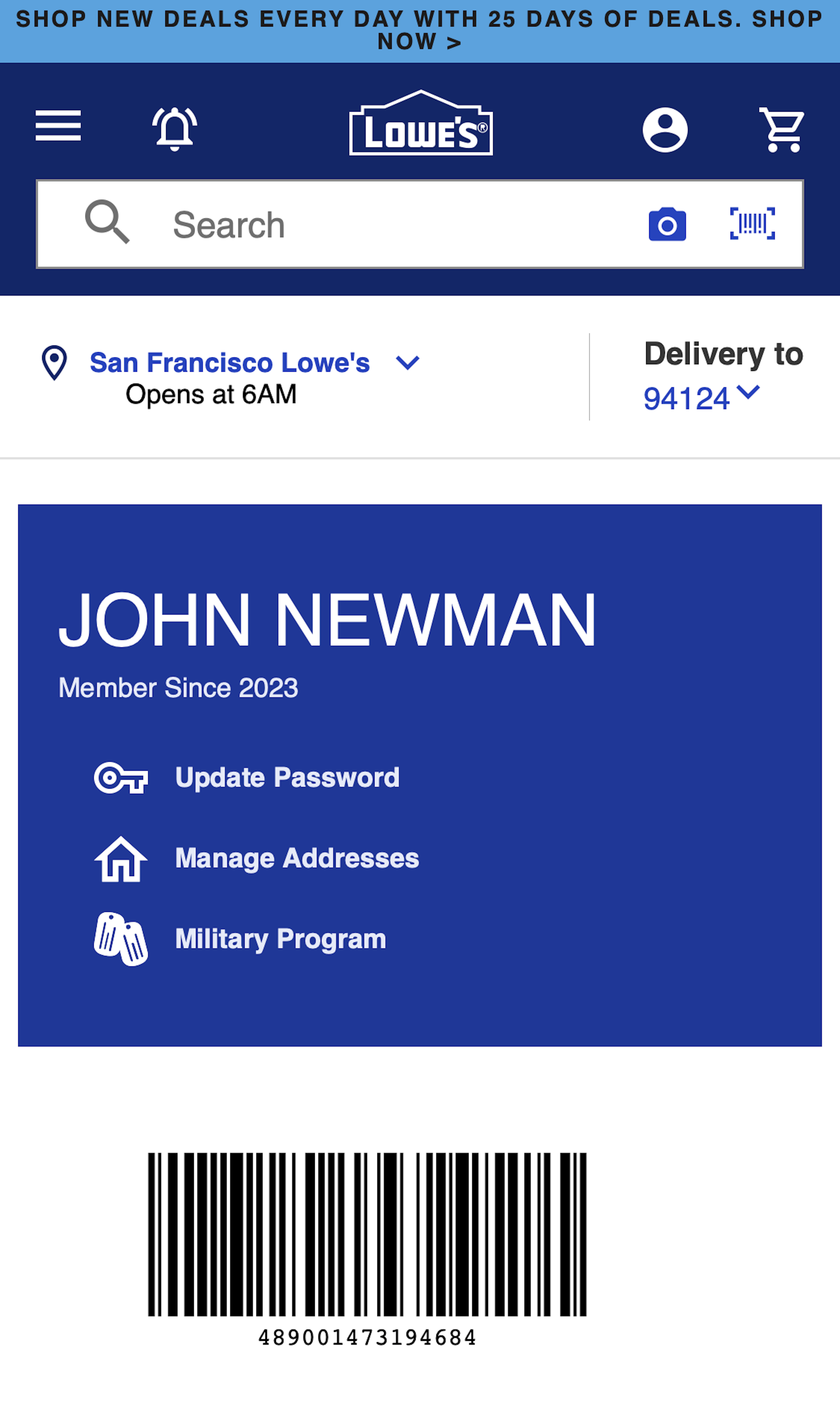
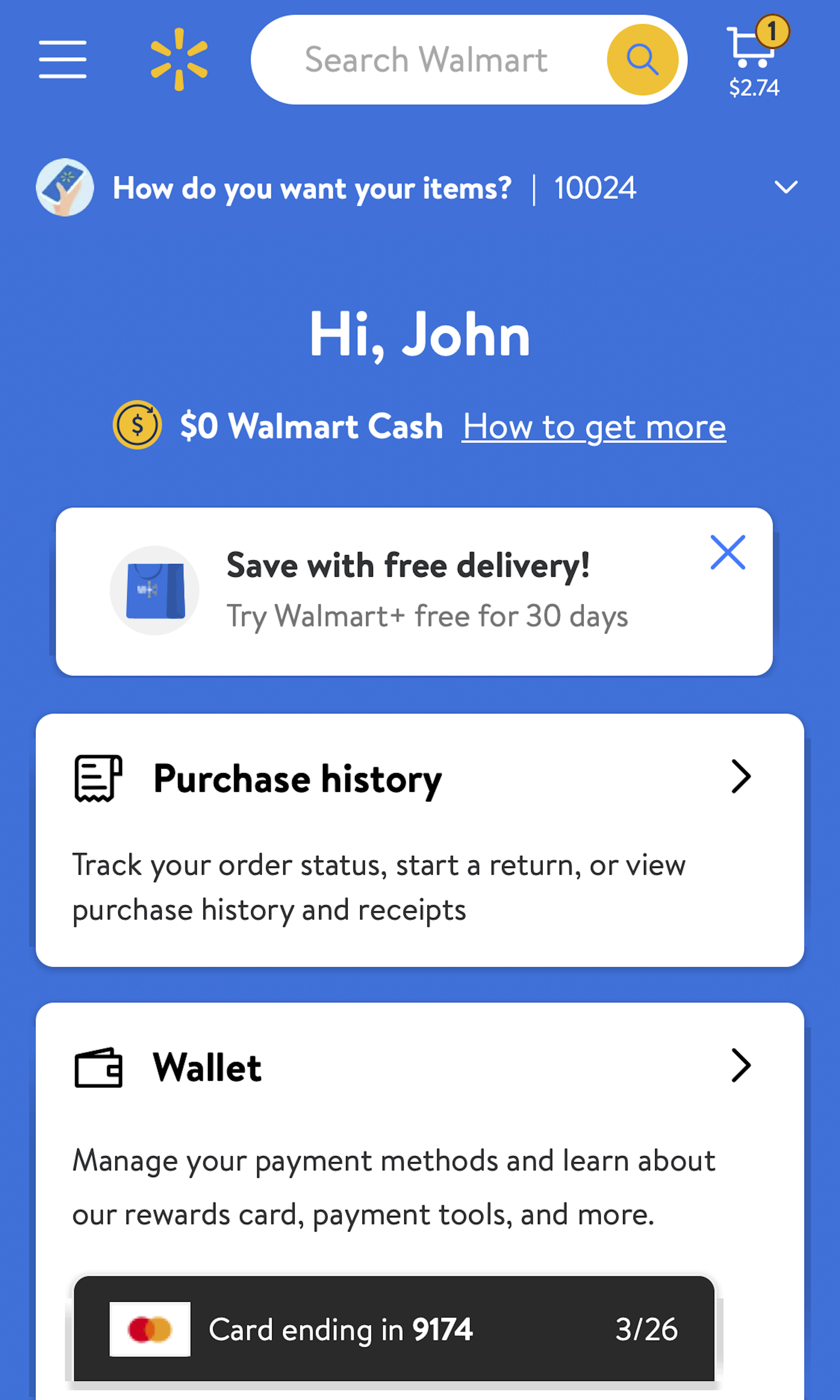
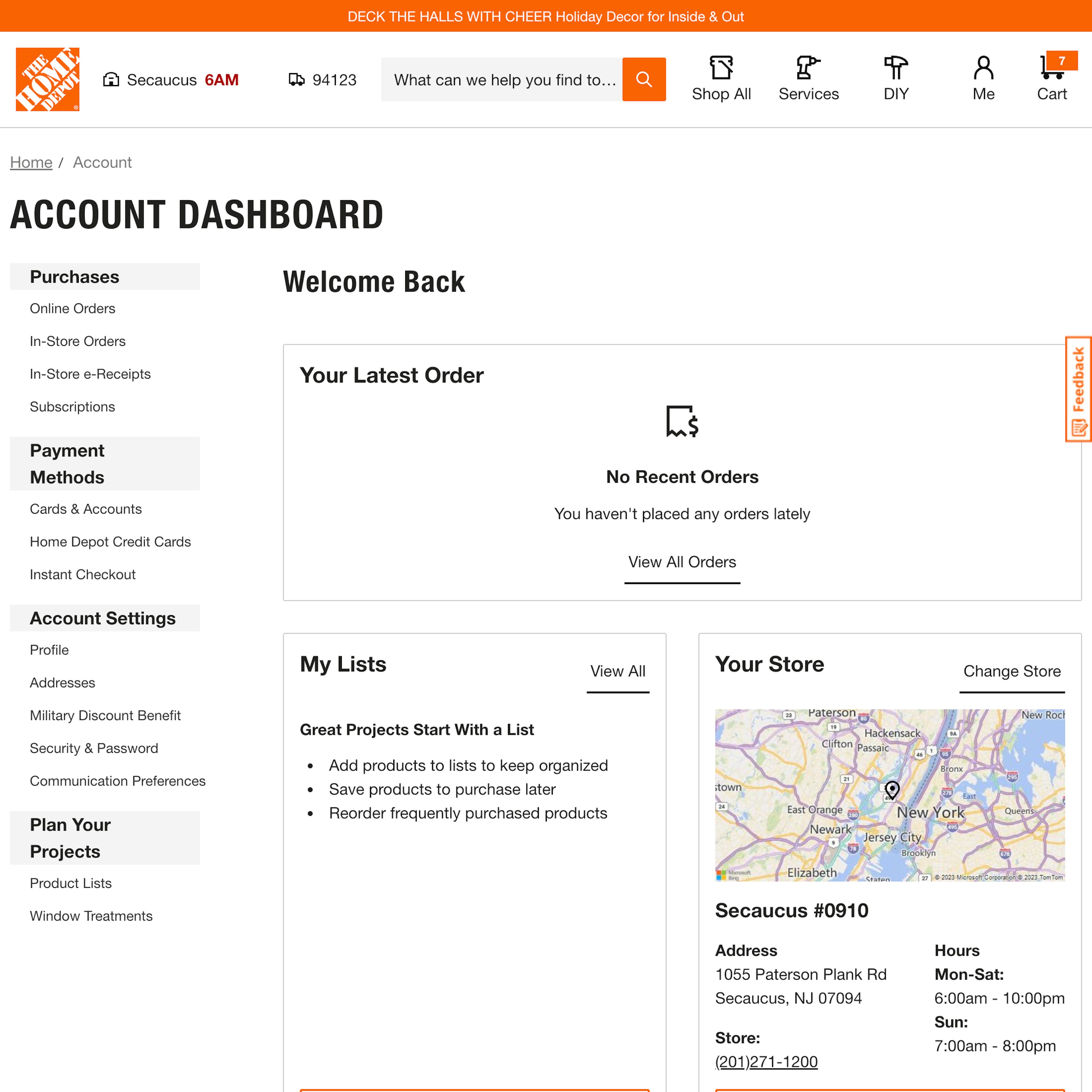
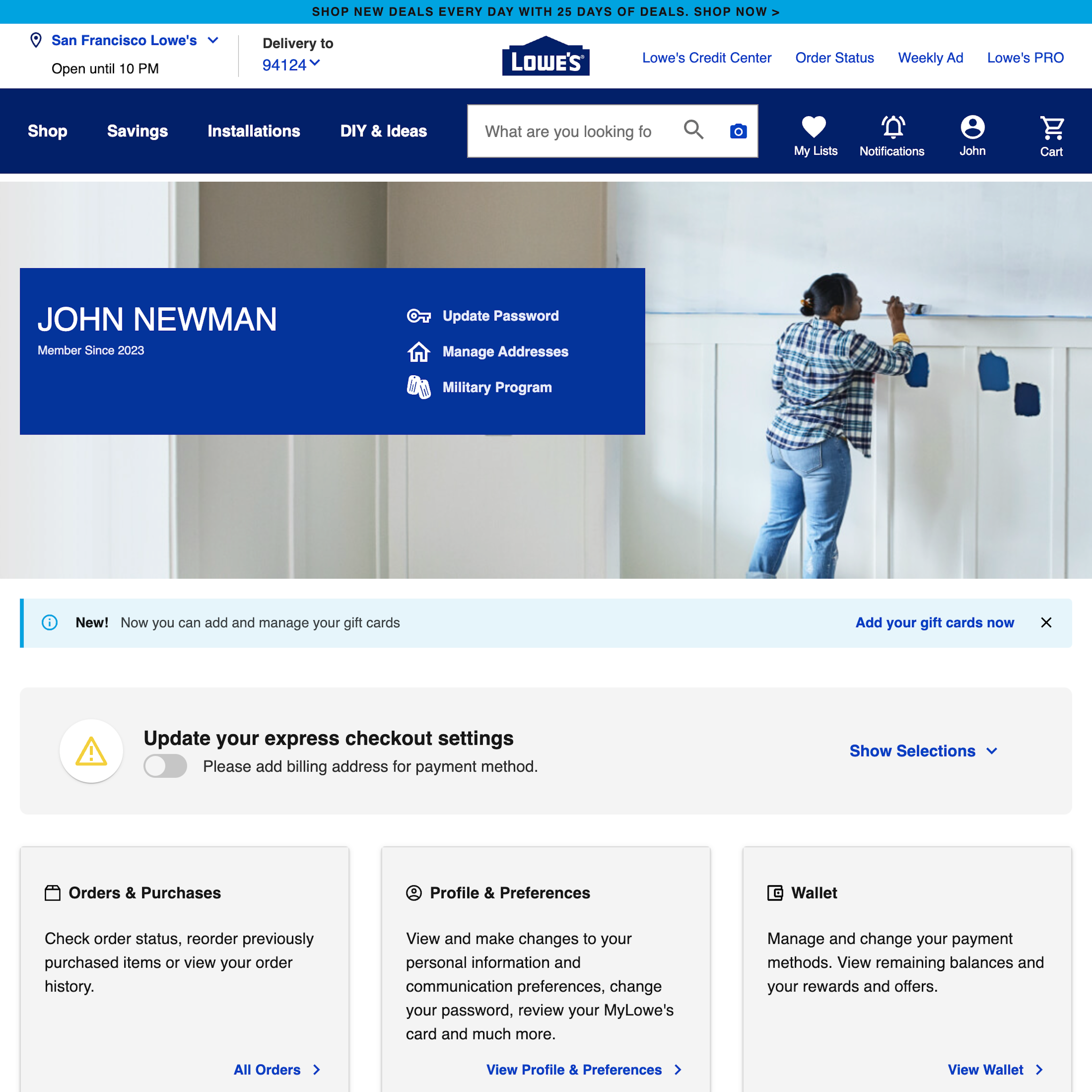
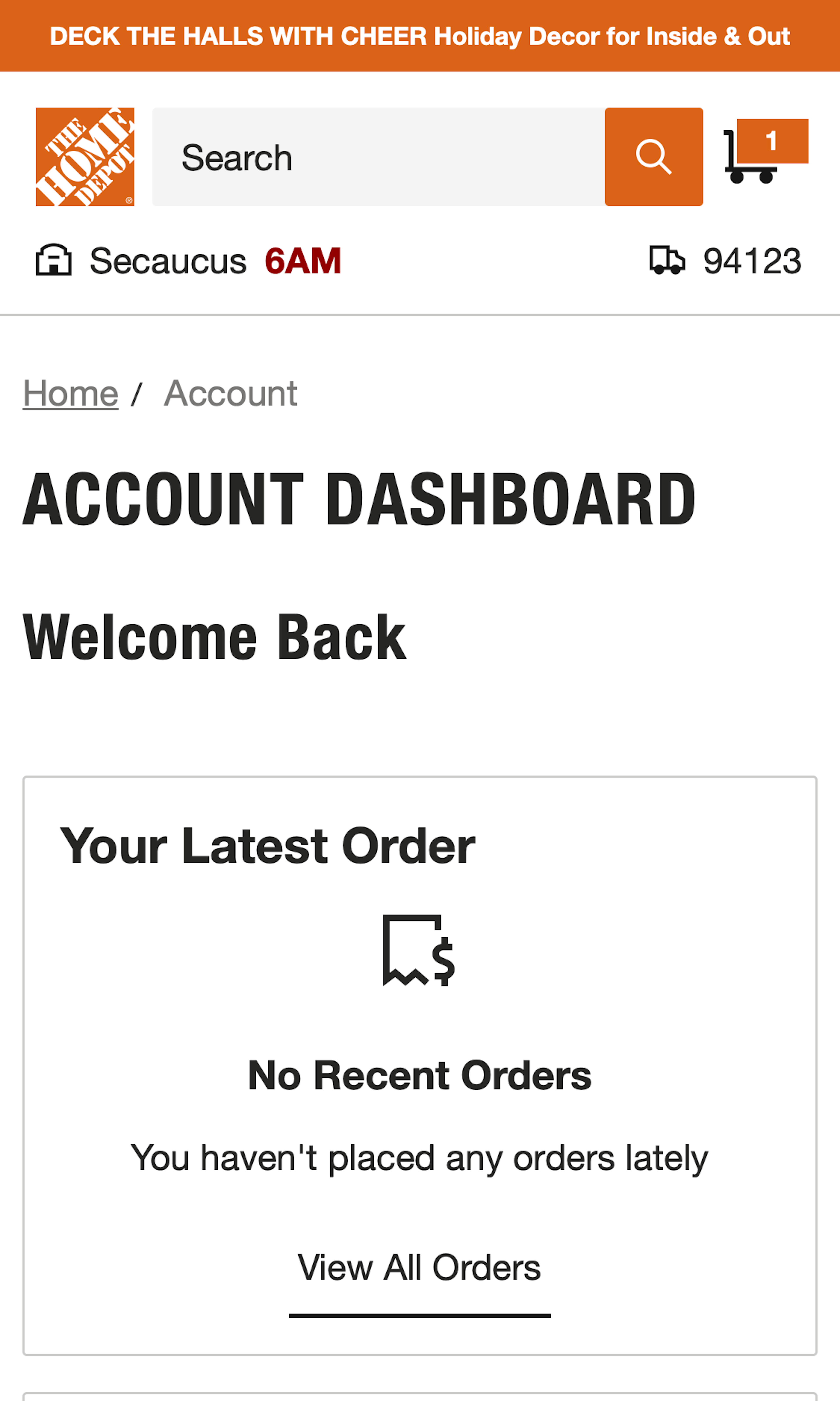
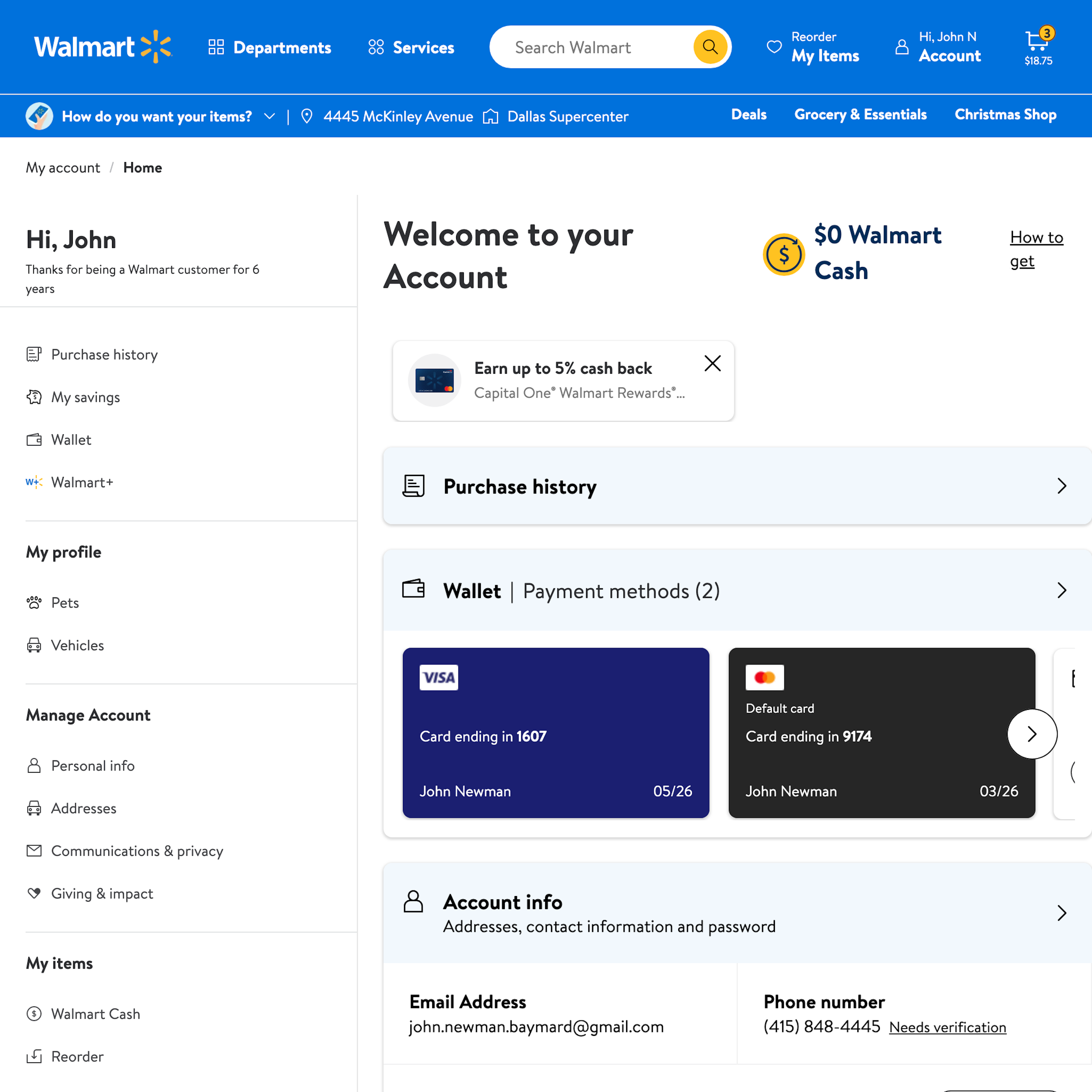
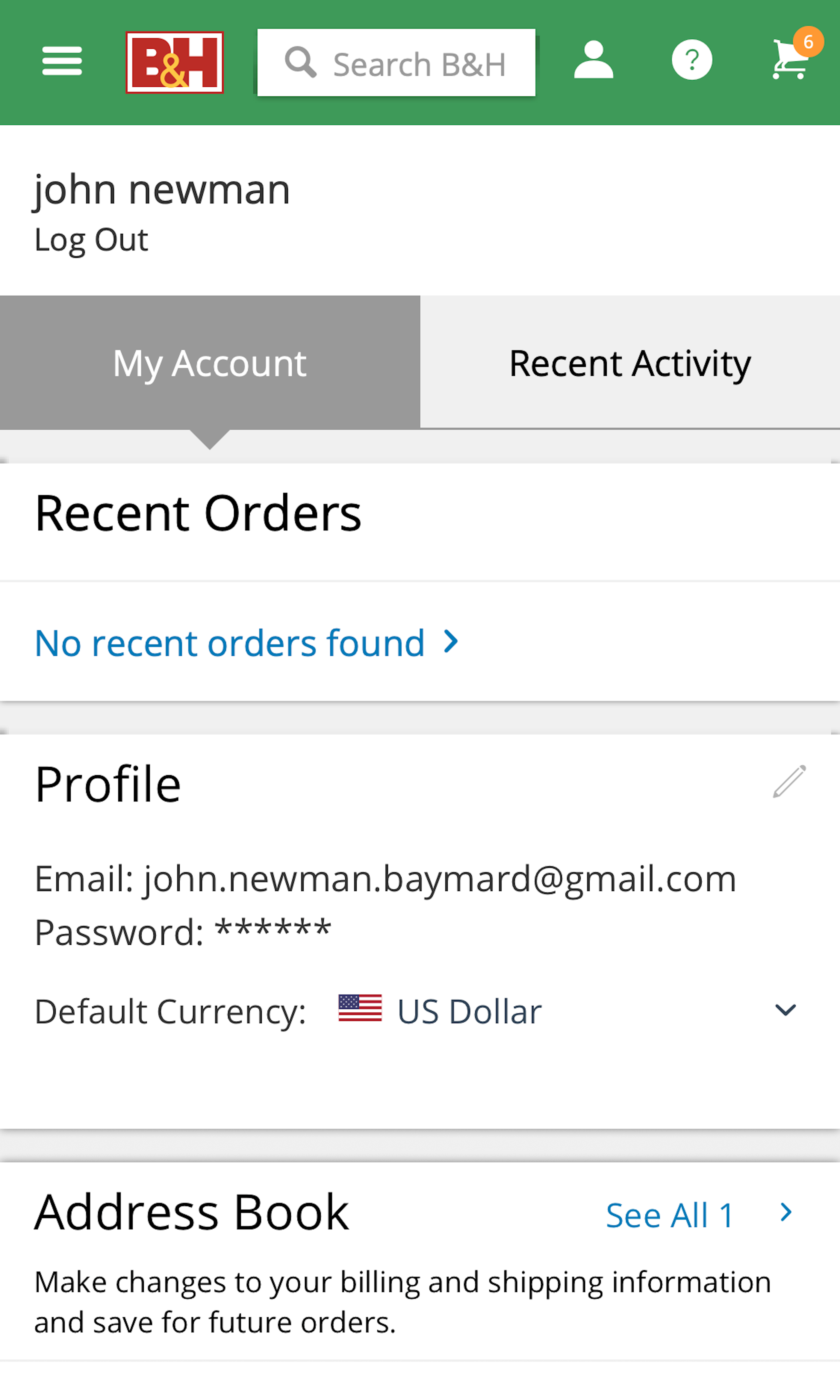
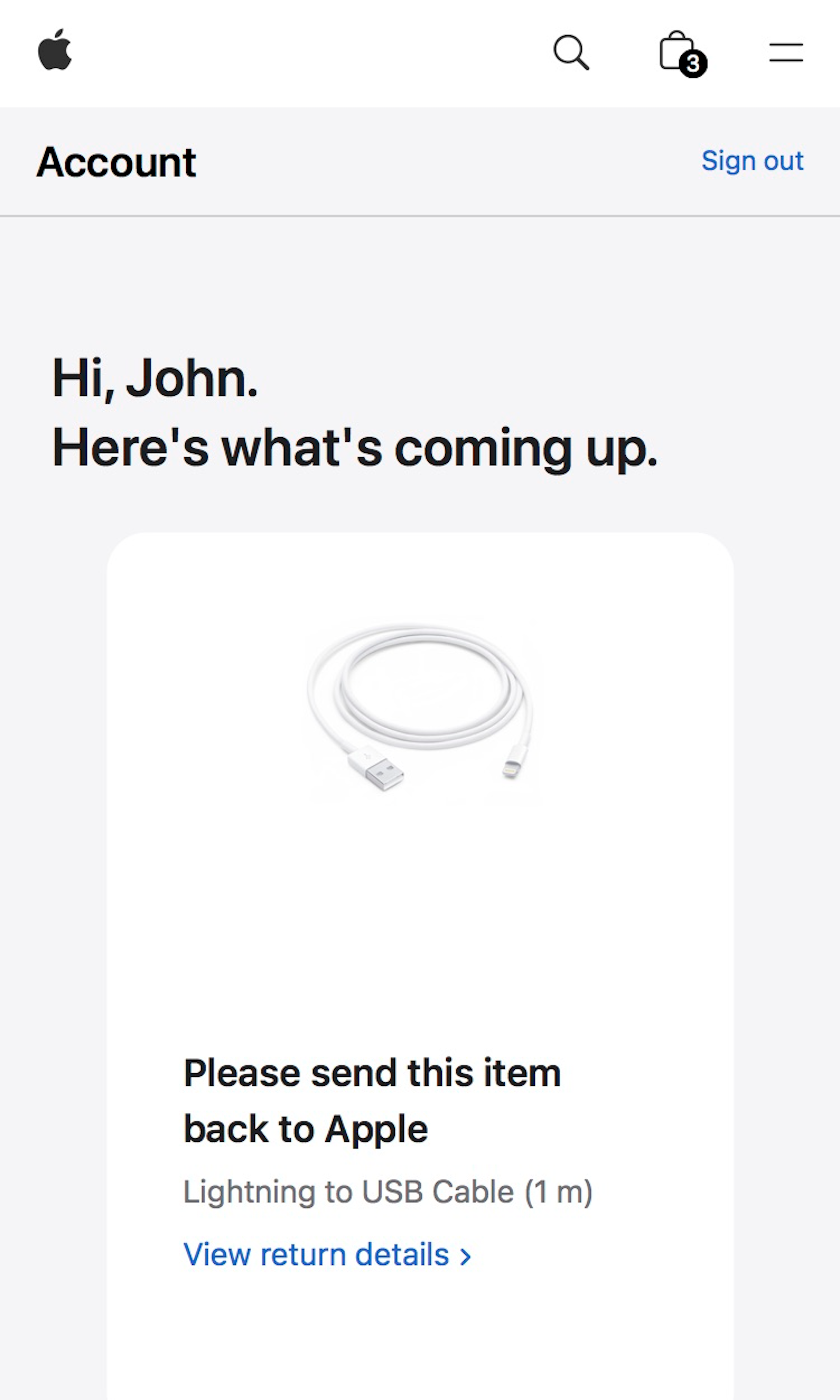
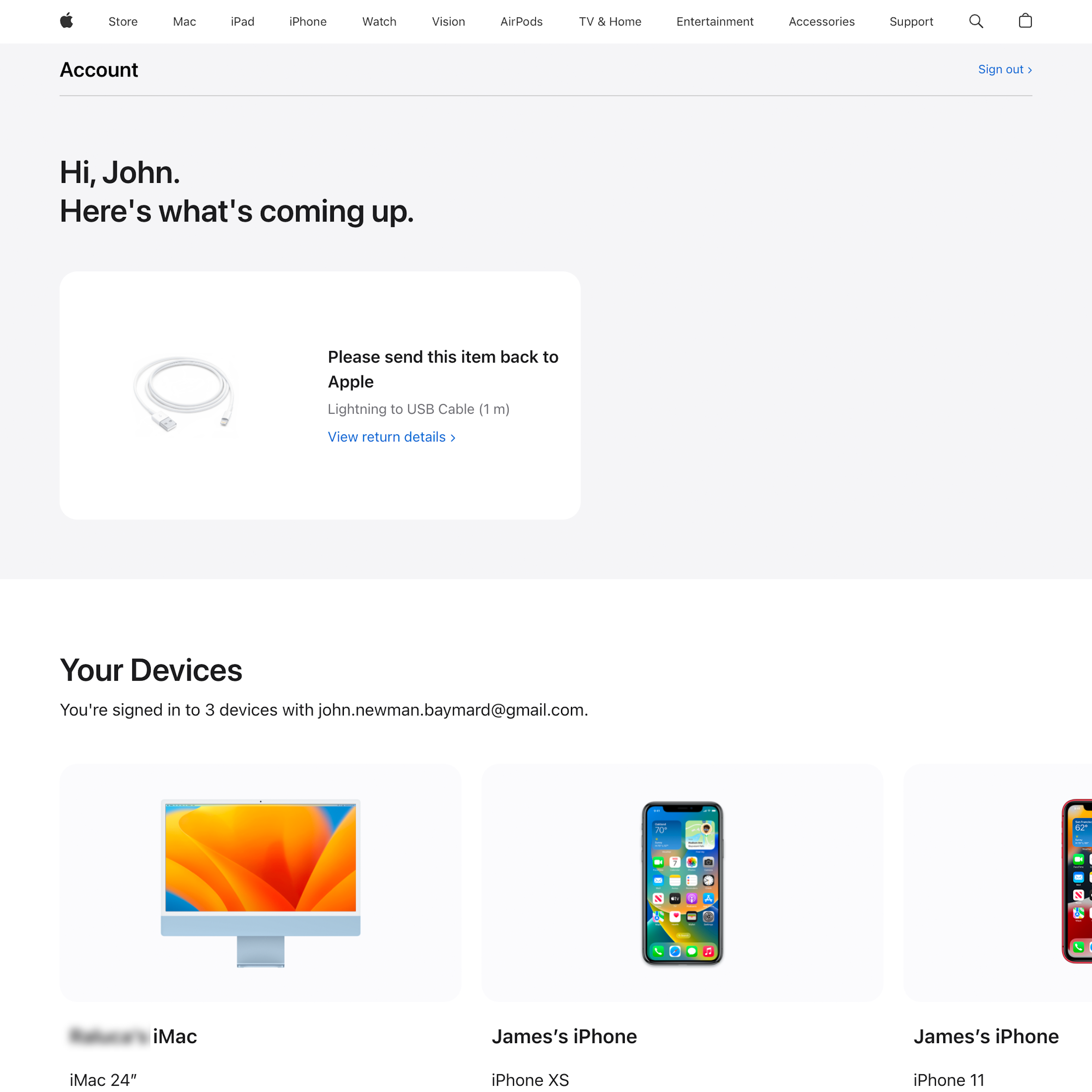
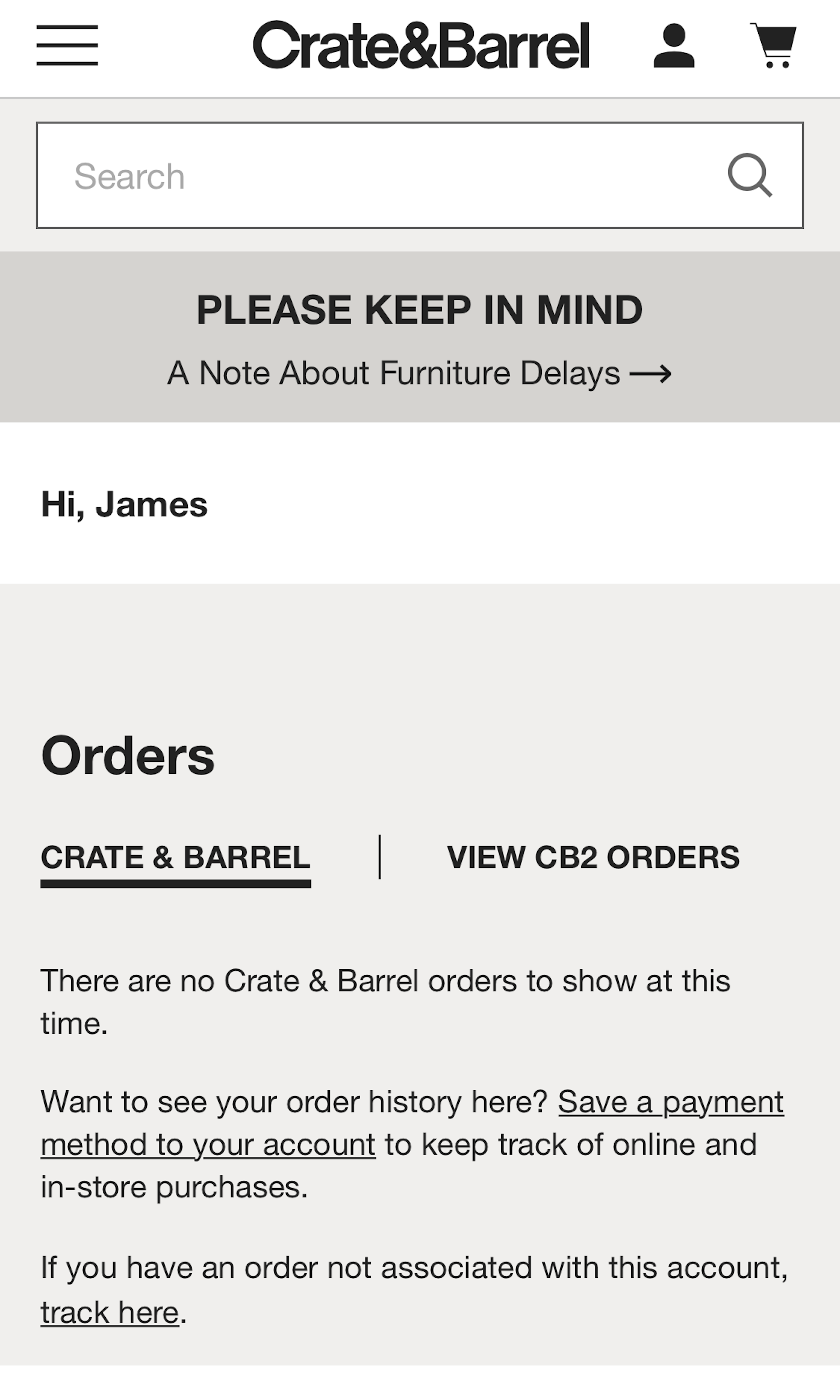
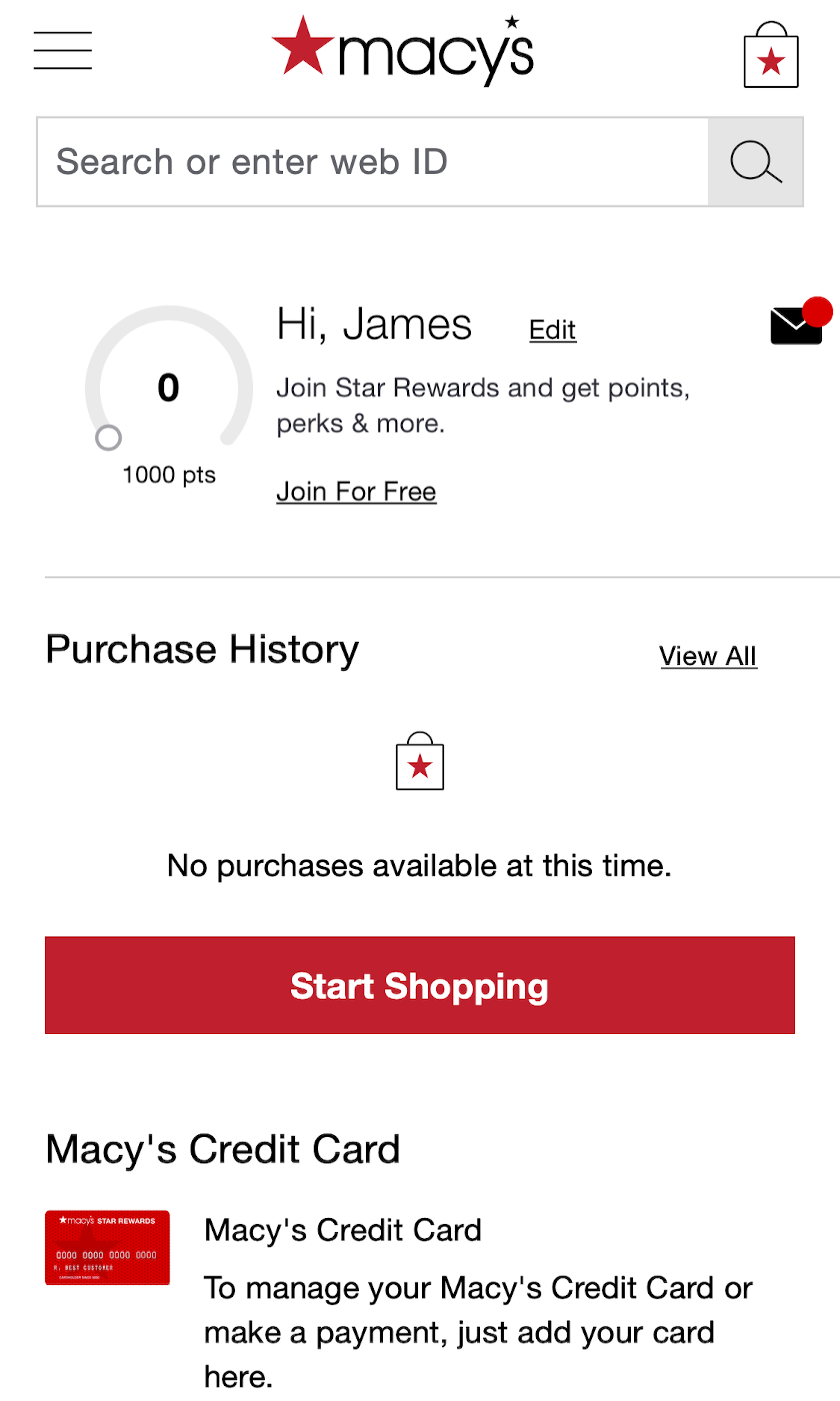
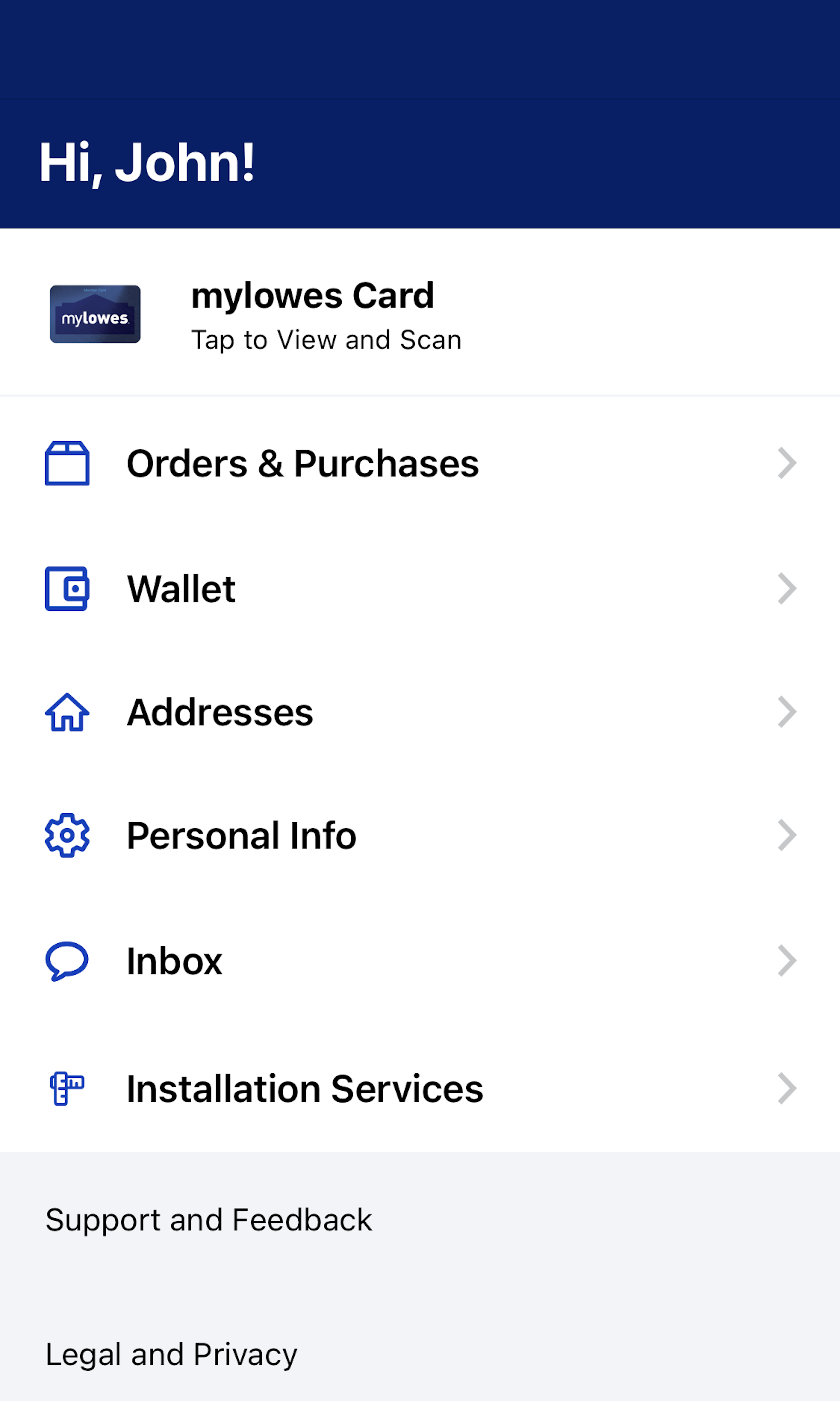
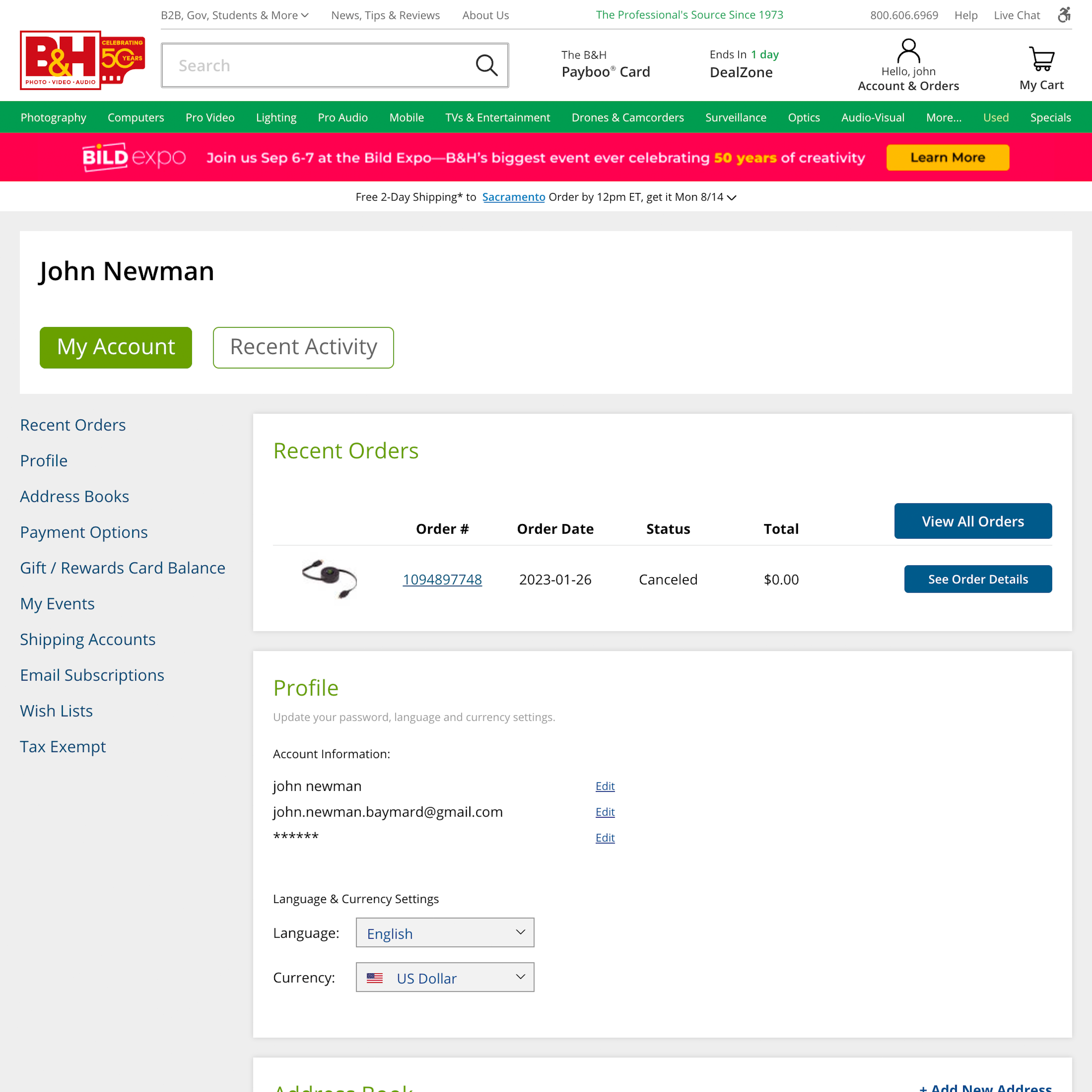
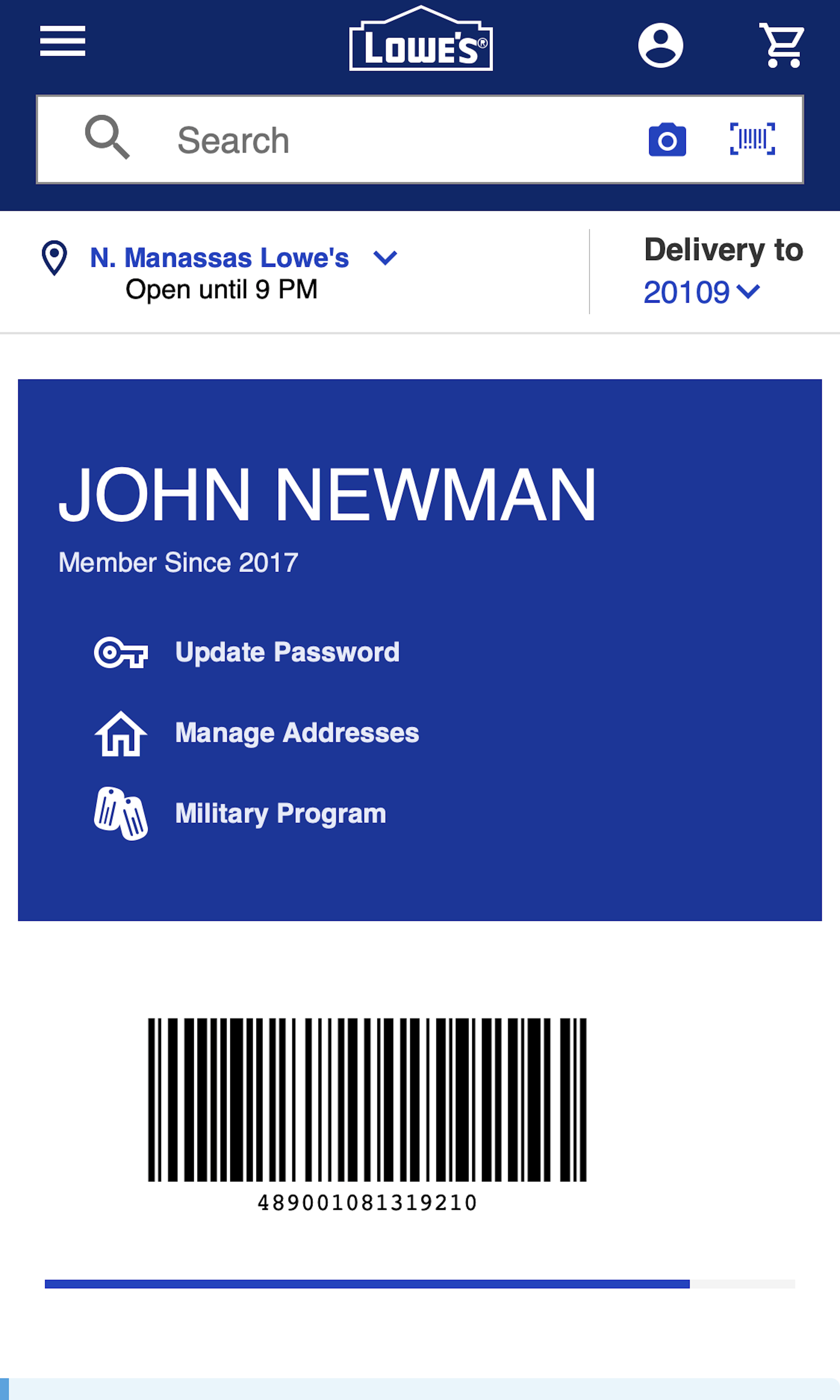
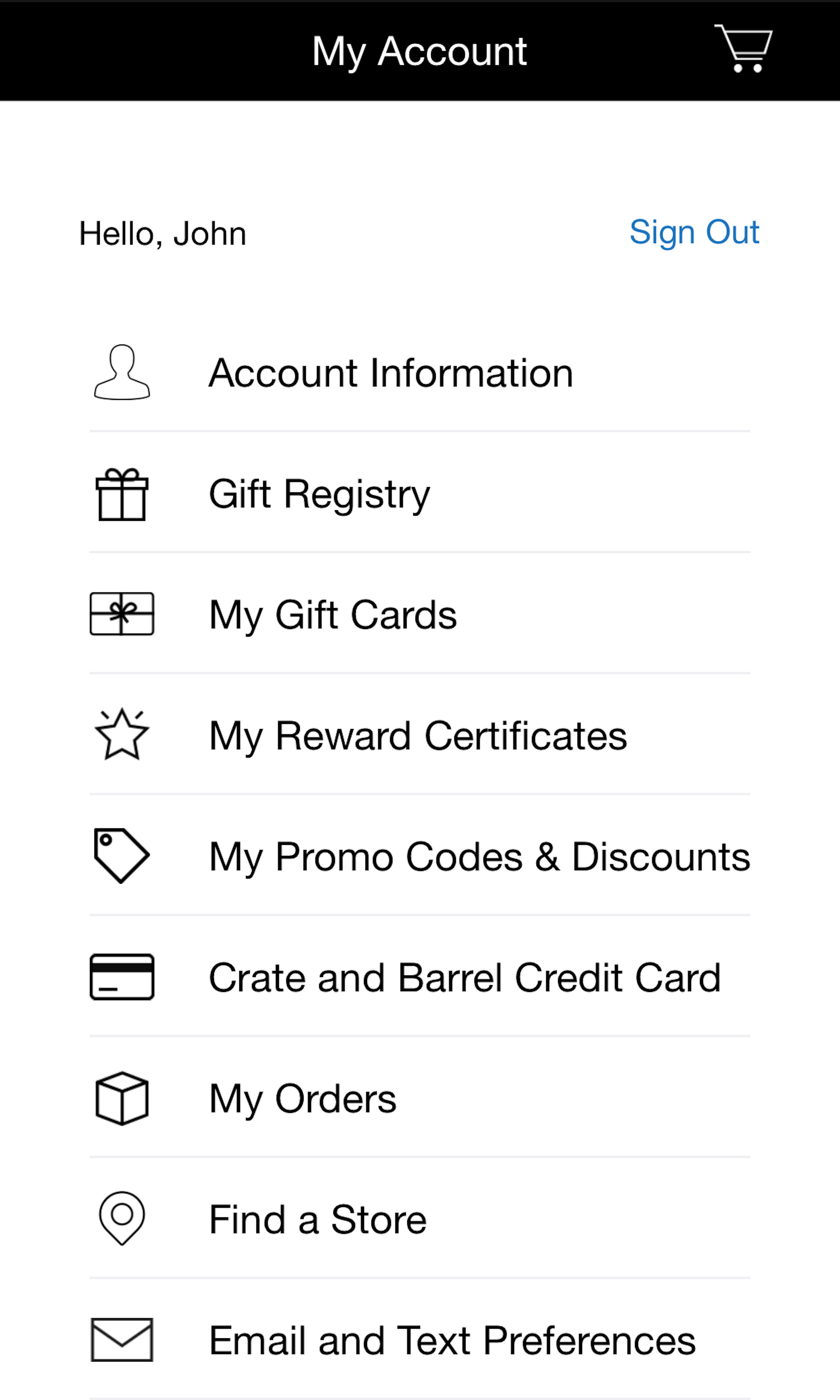
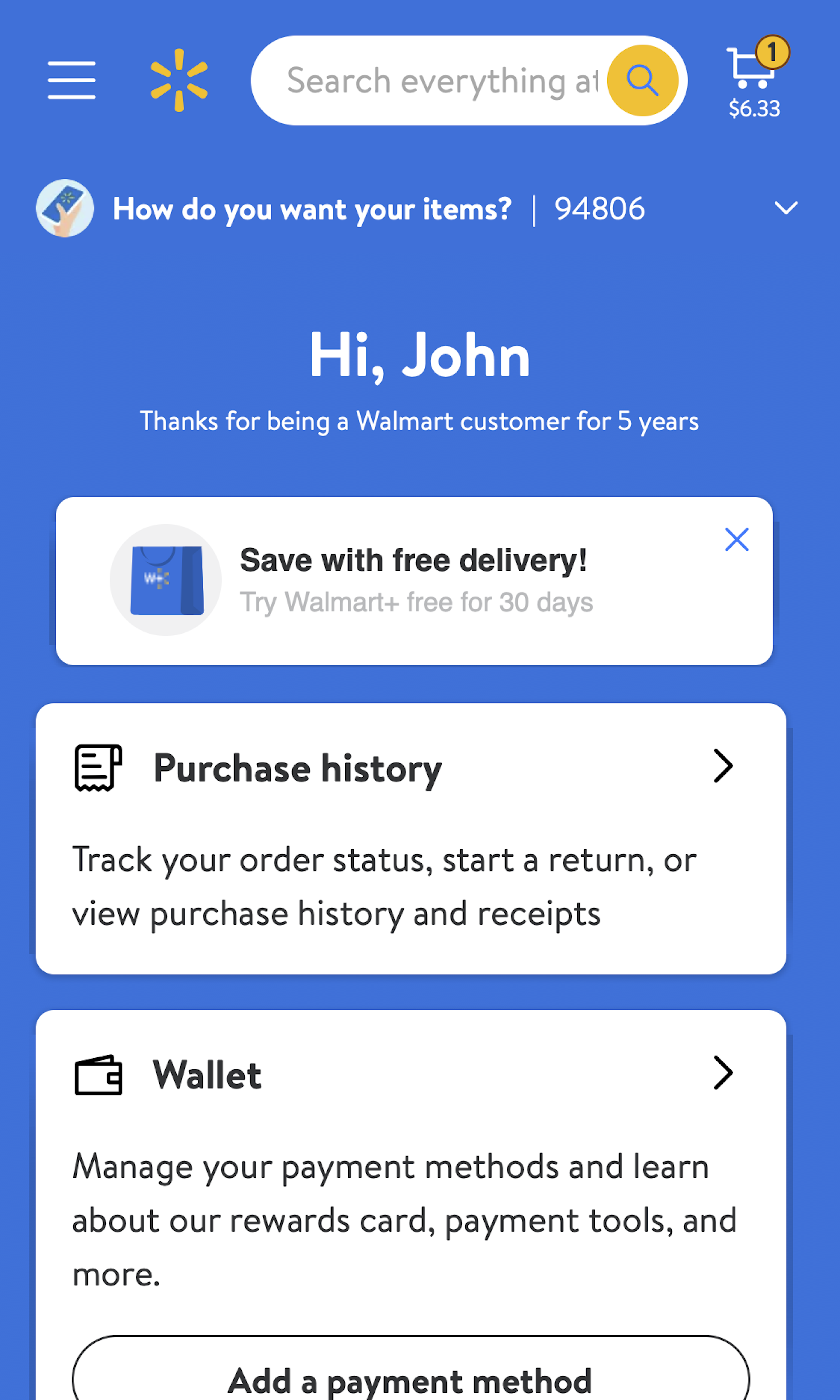
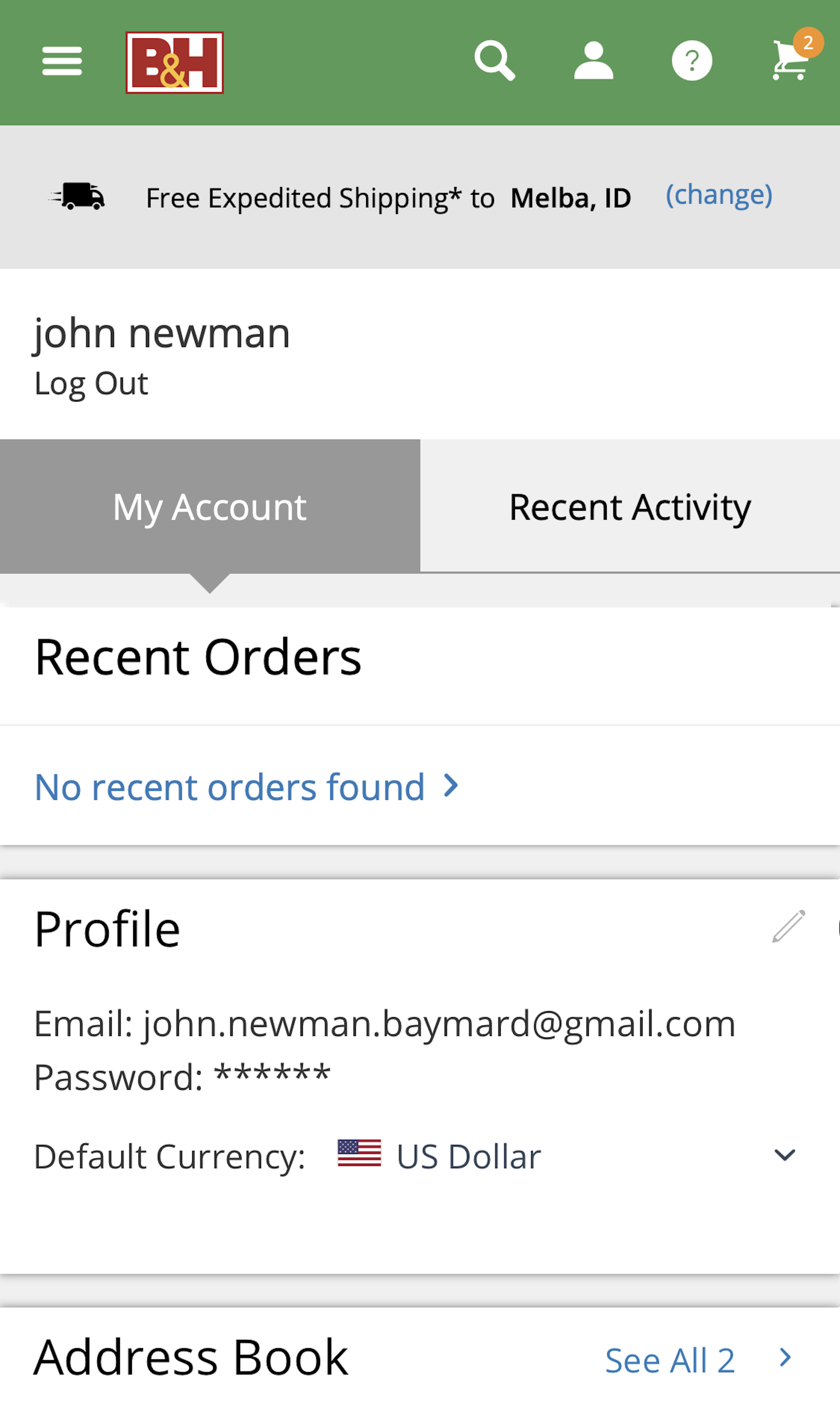
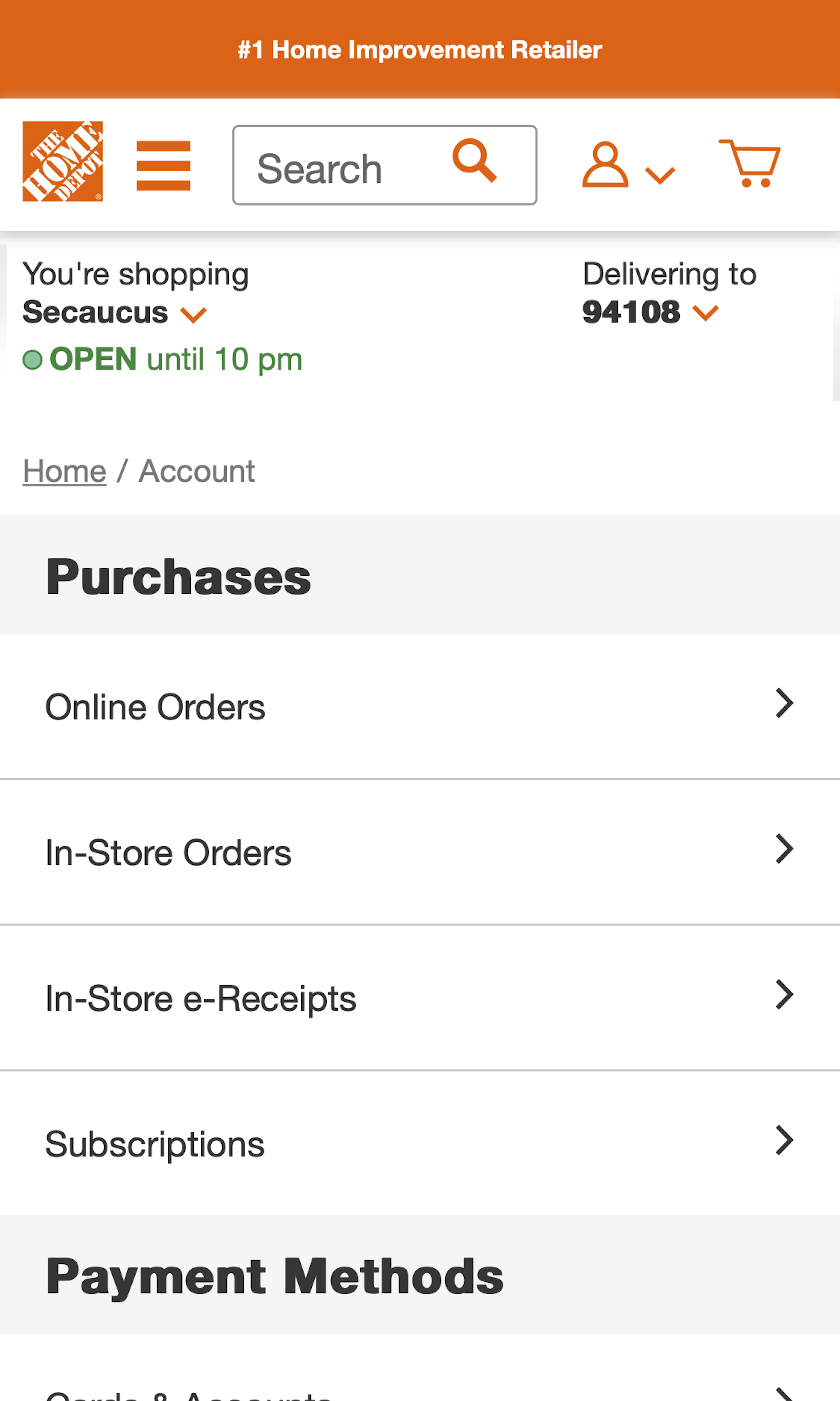
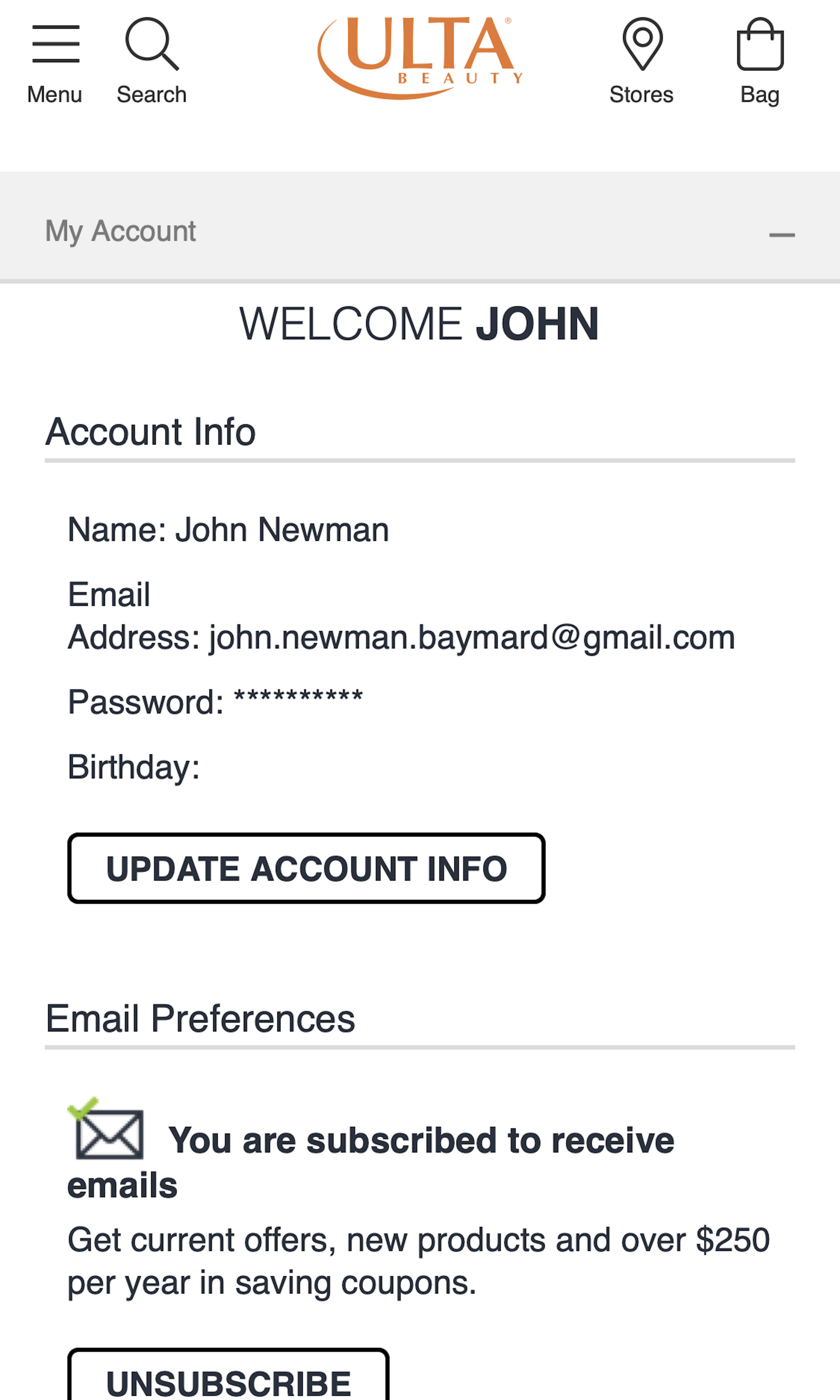
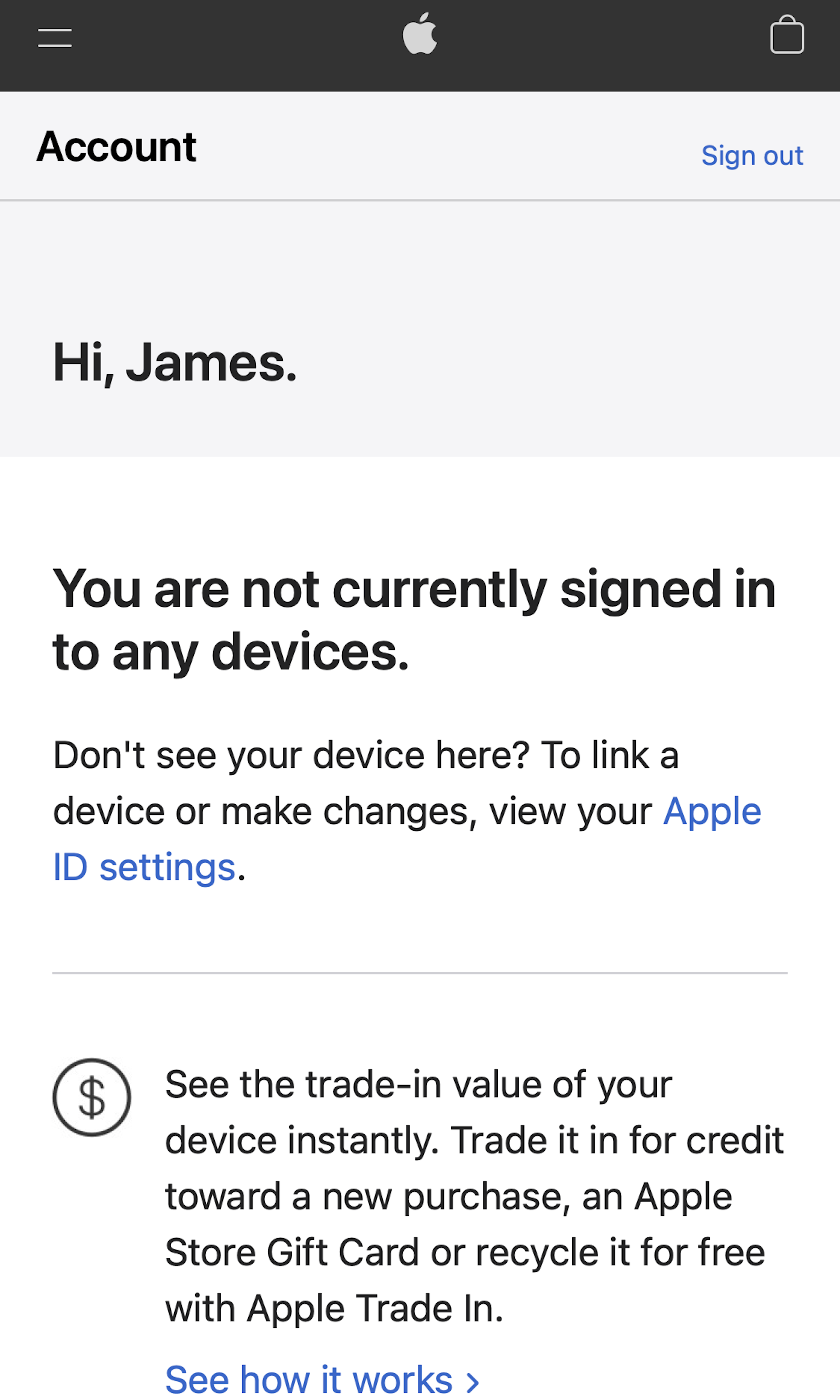
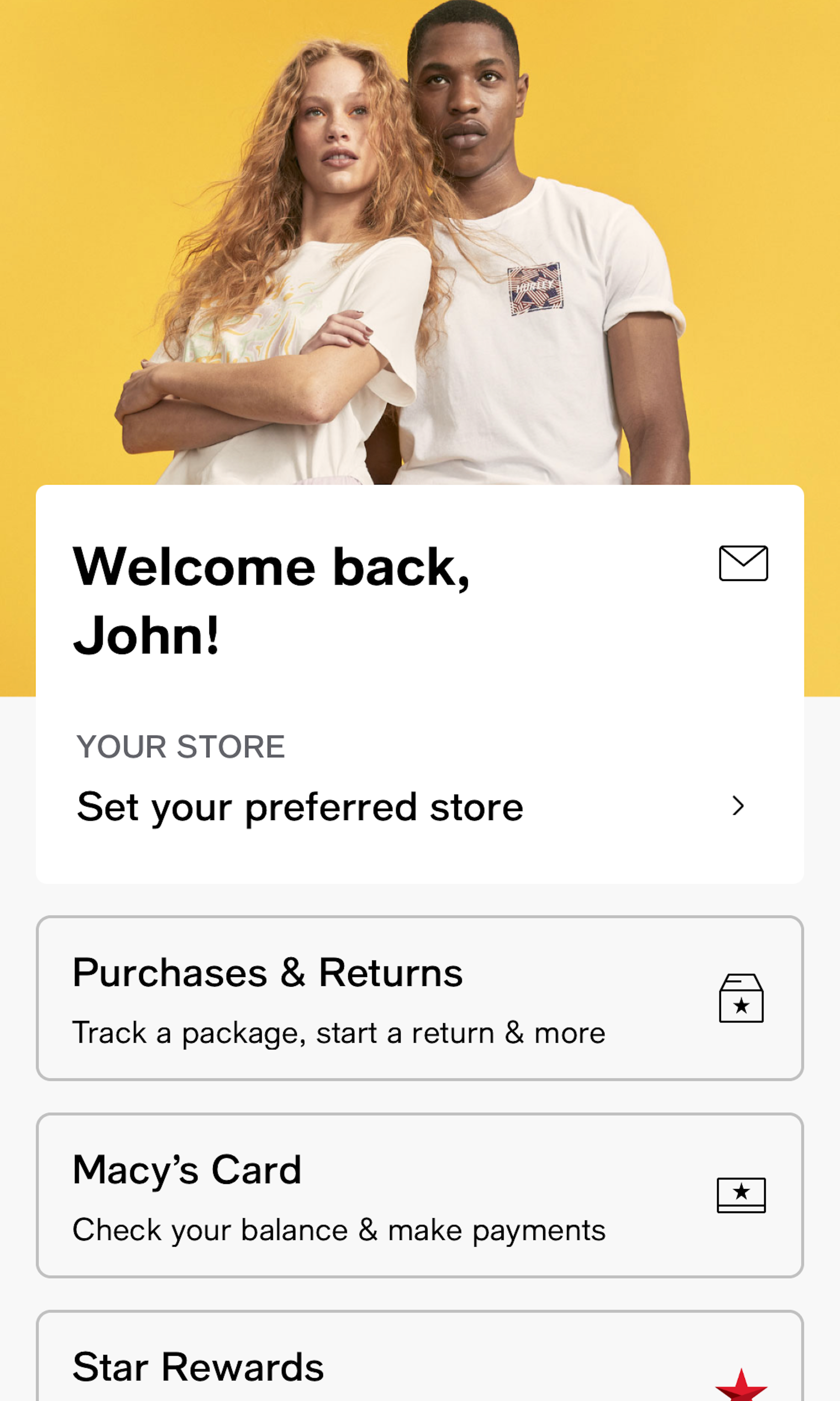
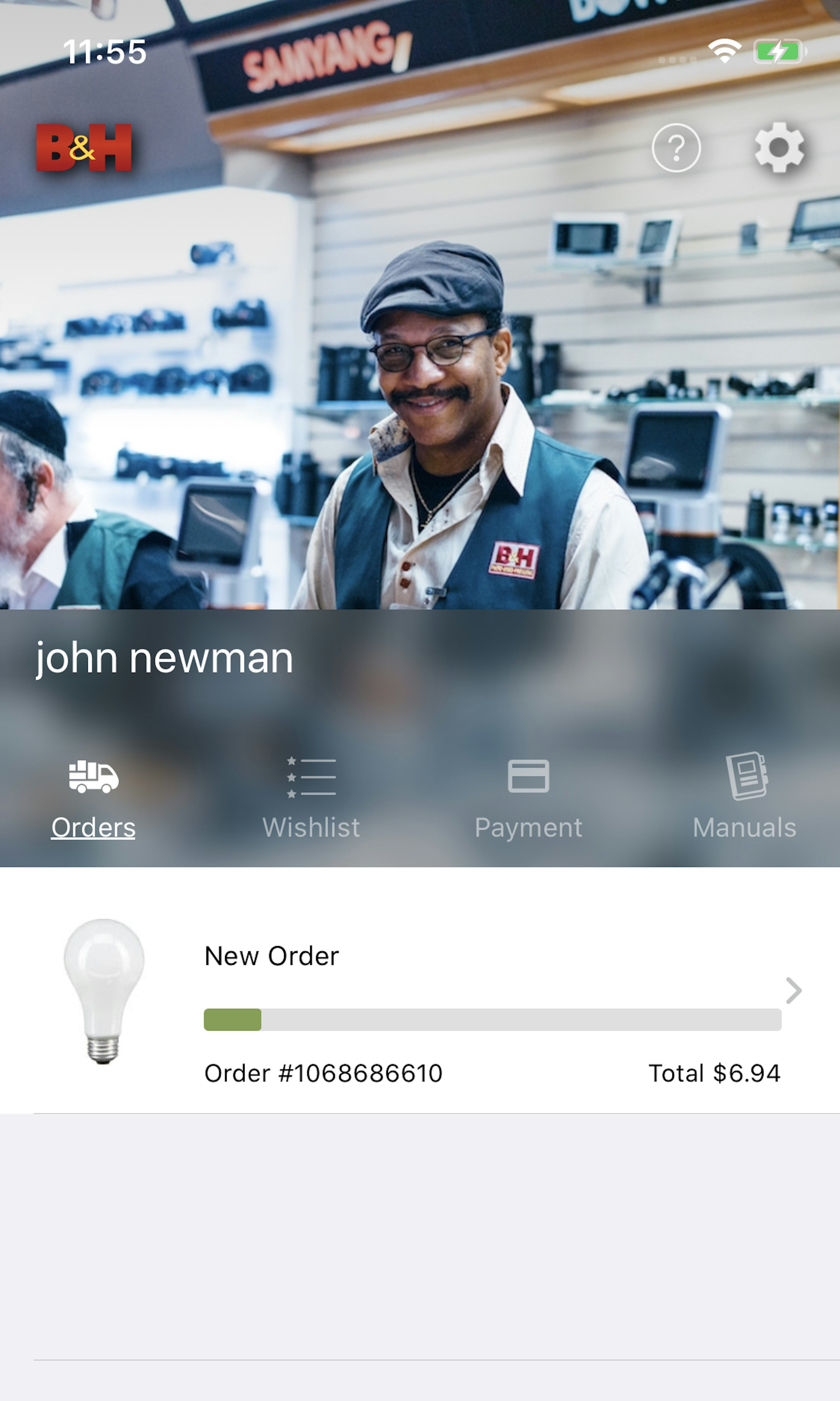
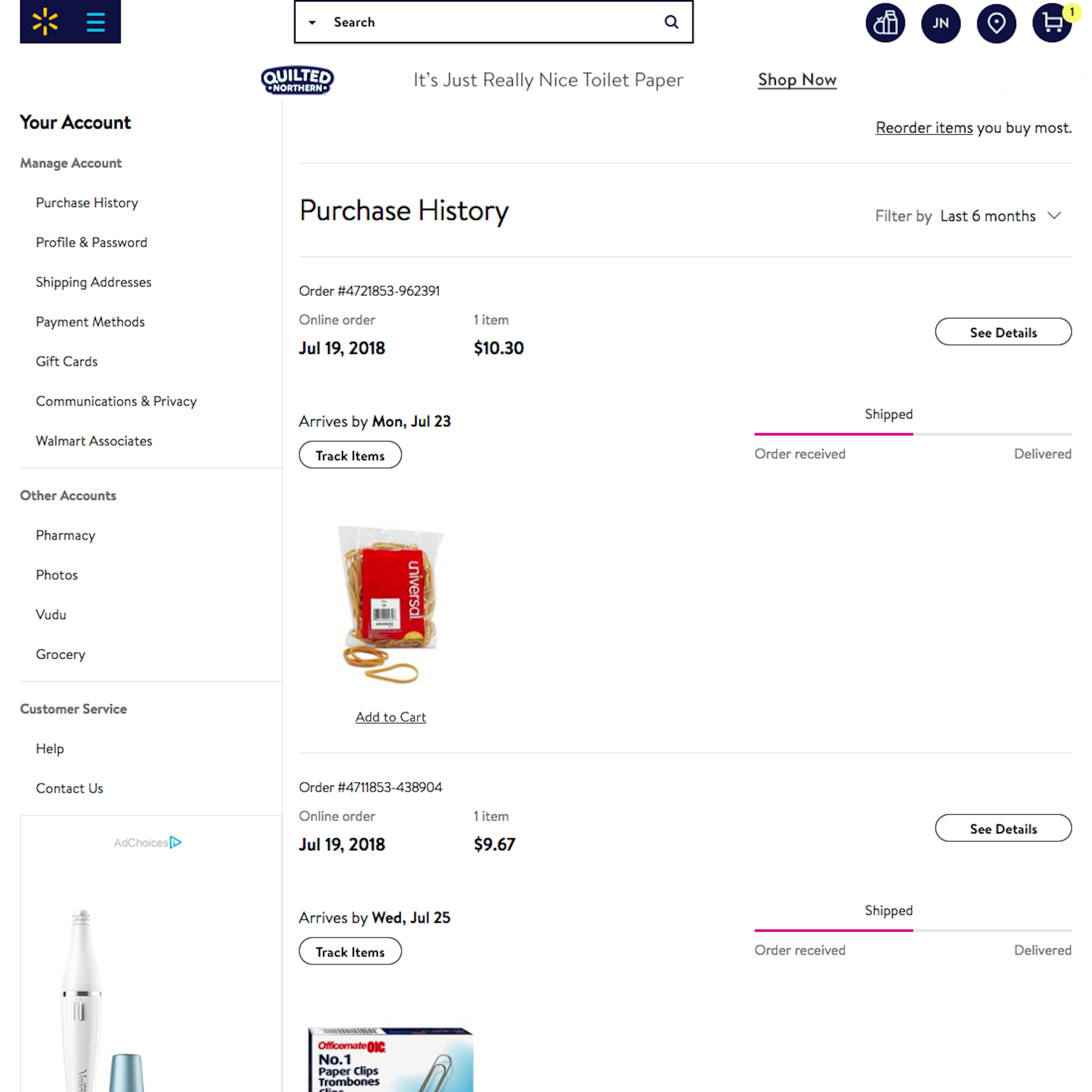
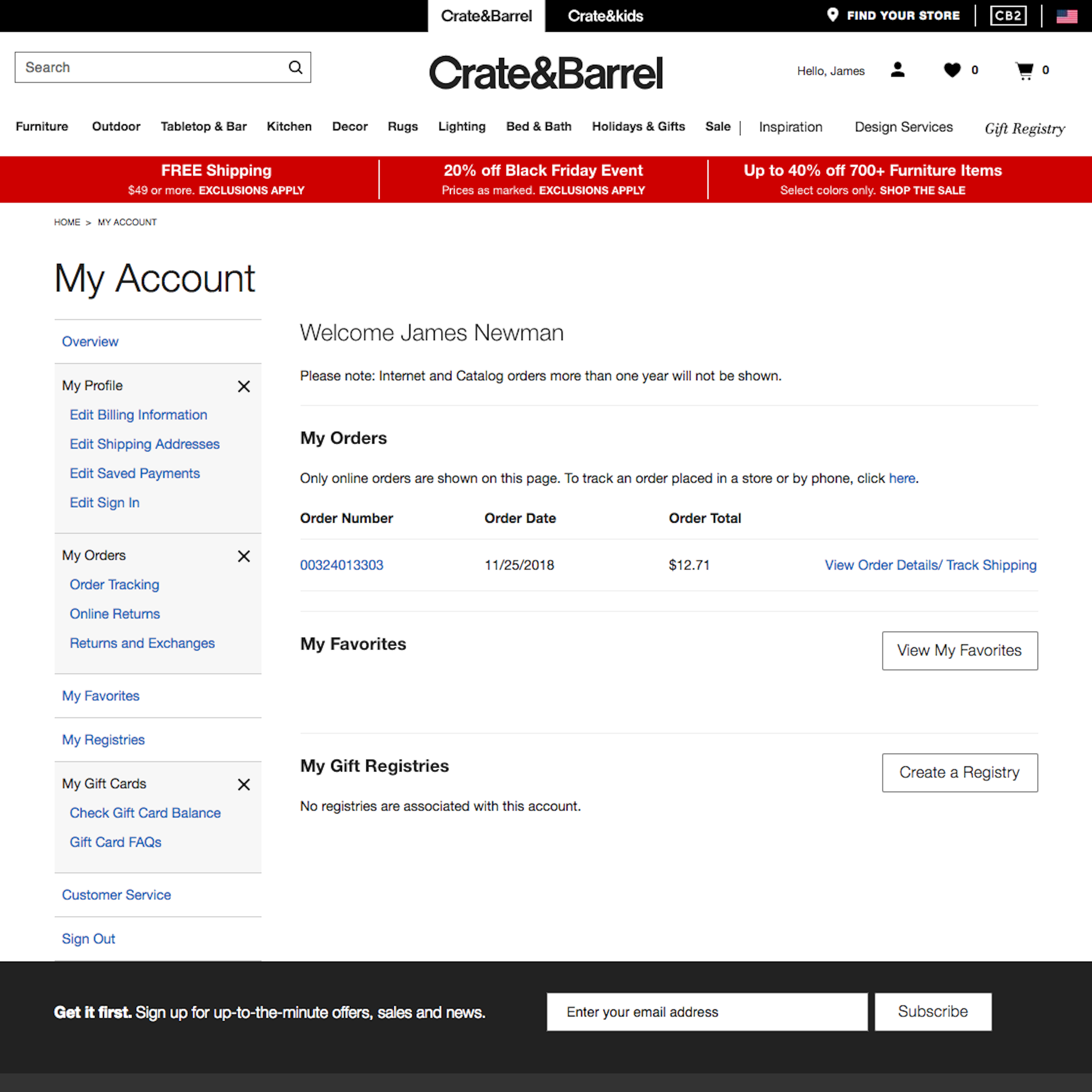
572 ‘Account Dashboard’ Design Examples
Also referred to as: Account Page
What’s this? Here you’ll find 572 “Account Dashboard” full-page screenshots annotated with research-based UX insights, sourced from Baymard’s UX benchmark of 256 e-commerce sites. (Note: this is less than 1% of the full research catalog.)
The account dashboard serves as an important navigational anchor for many users attempting to accomplish account-related tasks (similar to the ‘My Account’ drop-down). However, it’s important to acknowledge that, unlike e-commerce product navigation and e-commerce search, users almost never “sporadically” navigate their e-commerce account dashboard to “get inspiration” or “see what’s available”.
Our large-scale accounts & dashboard UX research reveal that users who navigate all their account dashboard and account pages only do so when they have a specific task they need to complete. Hence, within the account pages, users are extremely “task-oriented” with a single goal in mind; for example, “changing my password,” “updating my stored credit card,” “looking up my orders overview,” etc.
Our UX testing of account dashboards revealed that users are typically better off with a few somewhat long account pages rather than a deep multilayer navigation hierarchy, which proved difficult for users to navigate effectively.
More ‘Account Dashboard UX’ Insights
-
During our large-scale usability testing we observe that this combination of “task oriented” and infrequent usage of the dashboard means that the vast majority of users are unlikely to benefit from “learning” how your account navigation is structured, because the next time they go to their account they will likely have forgotten the navigational structure.
-
Even on e-commerce sites that have predominantly returning account users, we observed that most users navigating to the account pages should be considered novice first-time users (e.g., when determining the amount of clarifying microcopy or the clarity of the navigation).
-
In practice, our testing revealed that this means users are typically better off with a few somewhat long and overwhelming pages, rather than a deeply nested and structured multilayer navigation hierarchy, which proved difficult for test subjects to navigate effectively.
-
Learn More: Besides exploring the 572 “Account Dashboard” design examples below, you may also want to read our related articles on “‘Cards’ Dashboards Must Be Highly Consistent and Appropriately Styled” and “New Research Findings on ‘Accounts & Self-Service’ UX”.
-
Get Full Access: To see all of Baymard’s design guidelines on Accounts & Self-Service pages and features you’ll need Baymard Premium access. (Premium also provides you full access to 150,000+ hours of UX research findings, 650+ e-commerce UX guidelines, and 275,000+ UX performance scores.)
User Experience Research, Delivered Weekly
Join 60,000+ UX professionals and get a new UX article every week.

User Experience Research, Delivered Weekly
Join 60,000+ UX professionals and get a new UX article every week.

Explore Other Research Content

300+ free UX articles based on large-scale research.

256 top sites ranked by UX performance.

Code samples, demos, and key stats for usability.

Add UX Best Practice Cards to your Figma projects.


