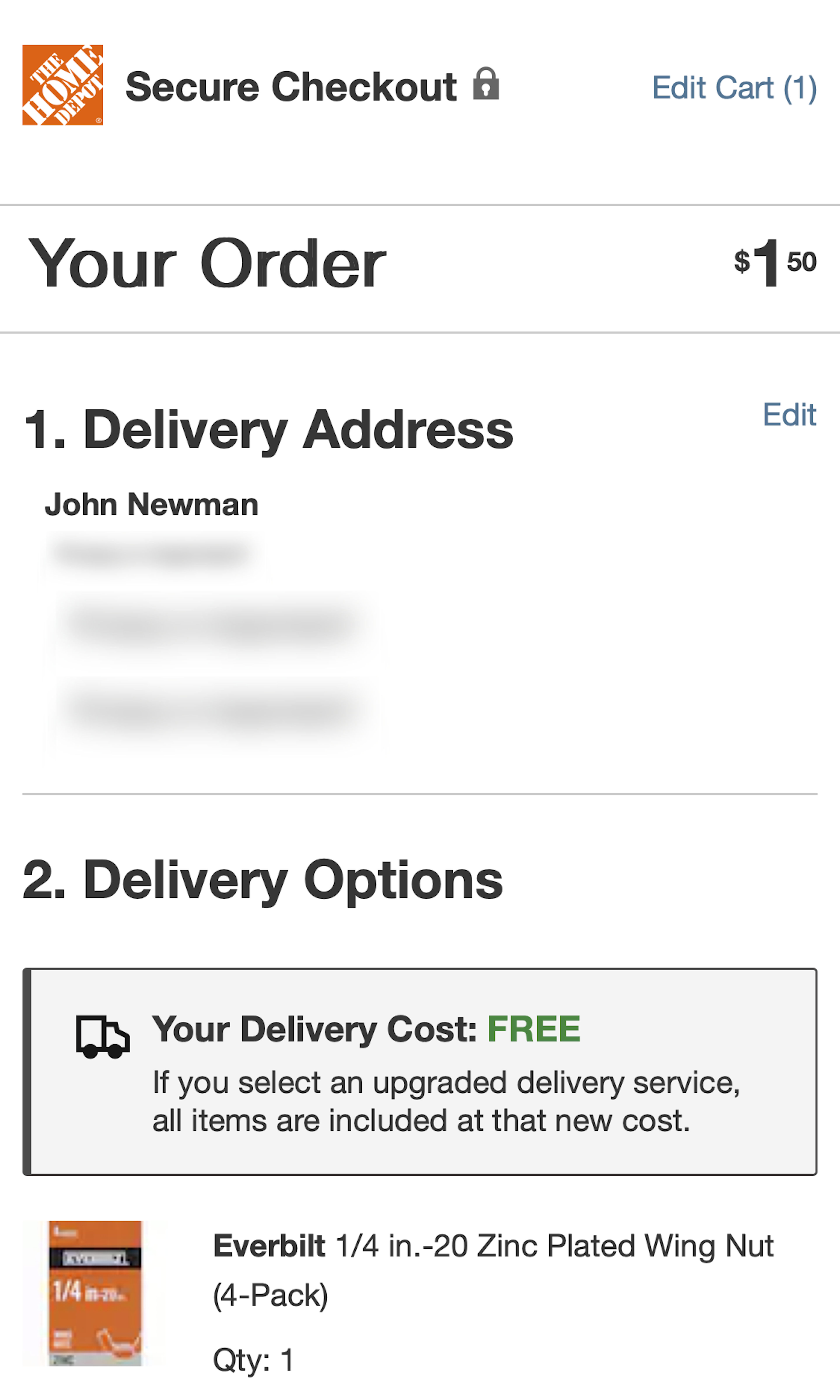
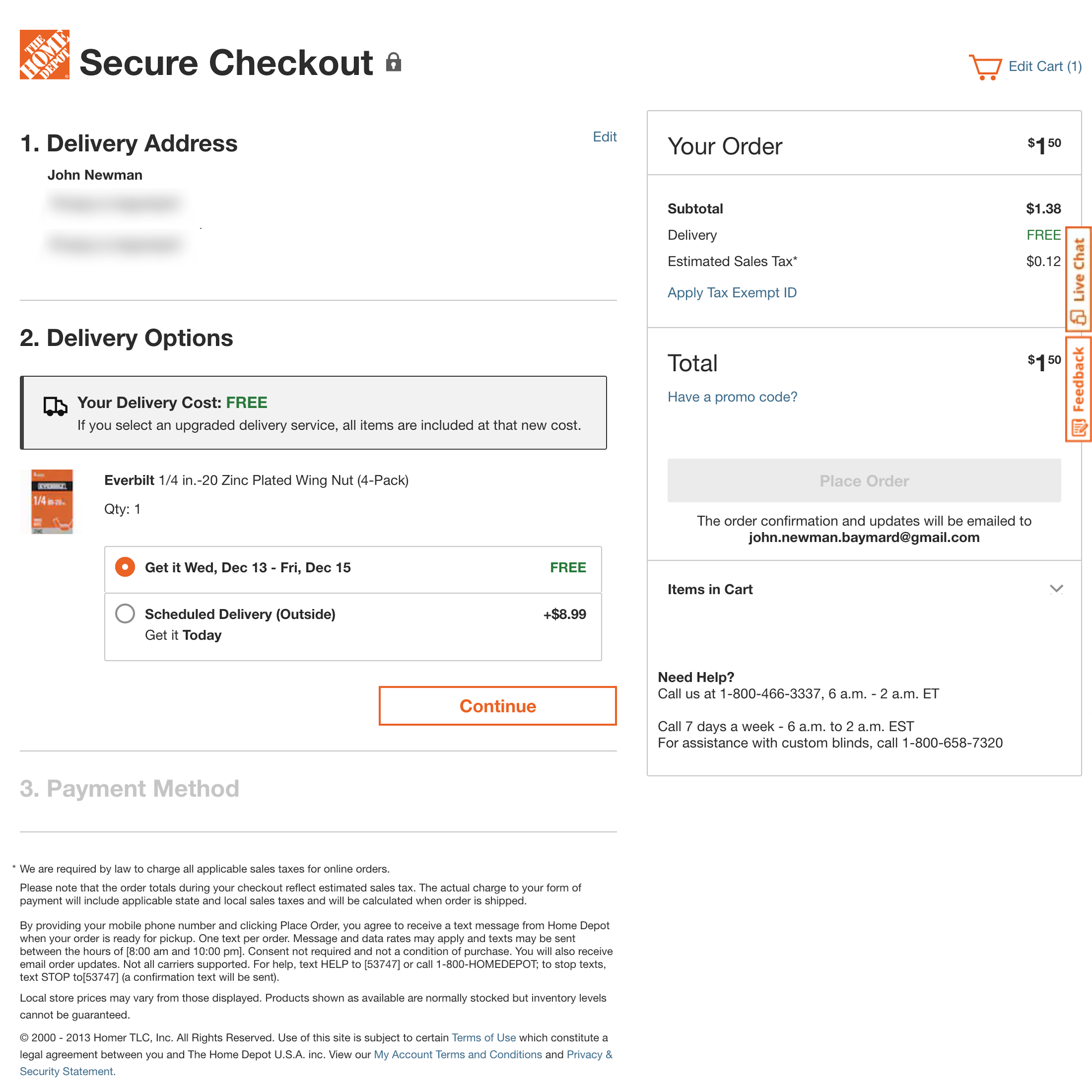
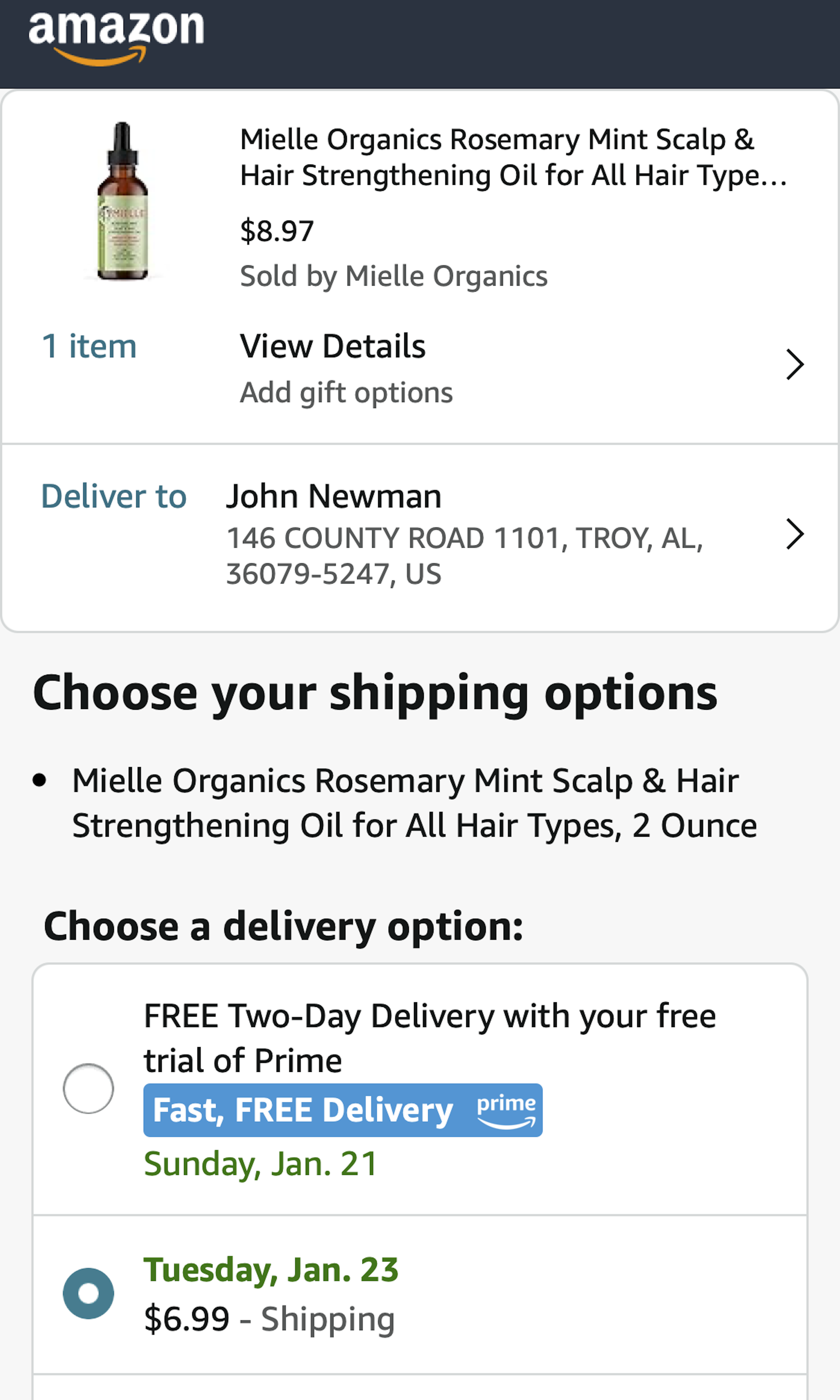
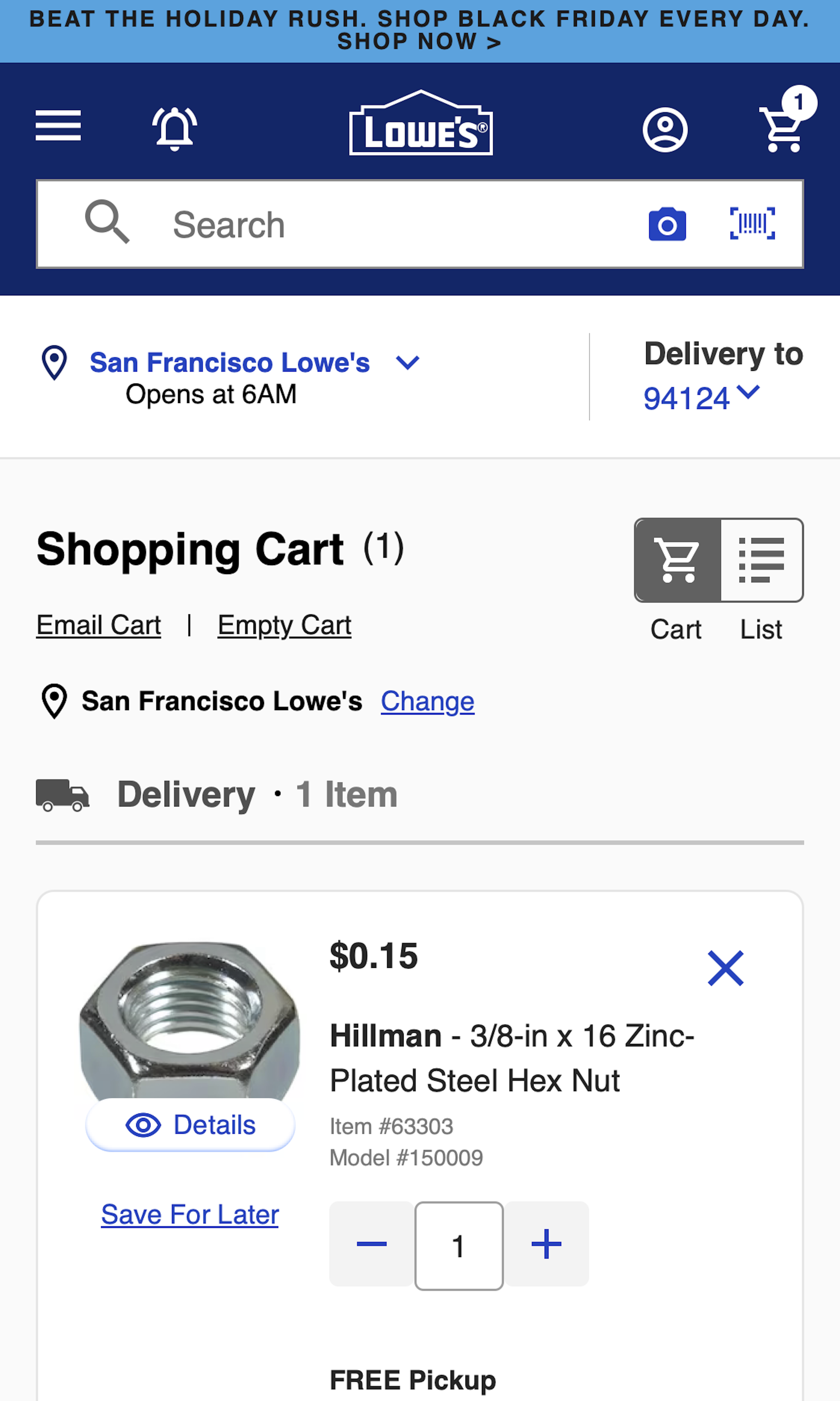
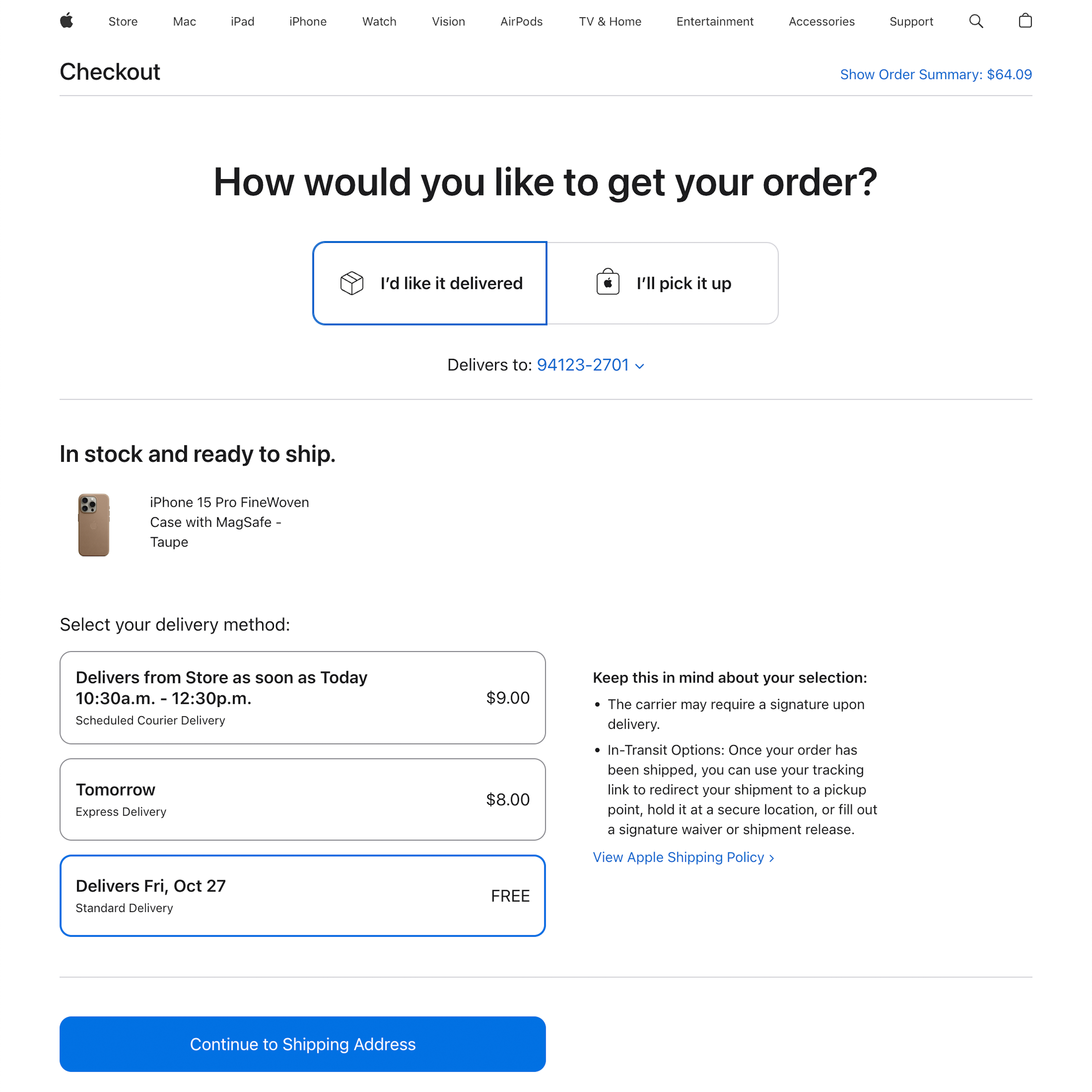
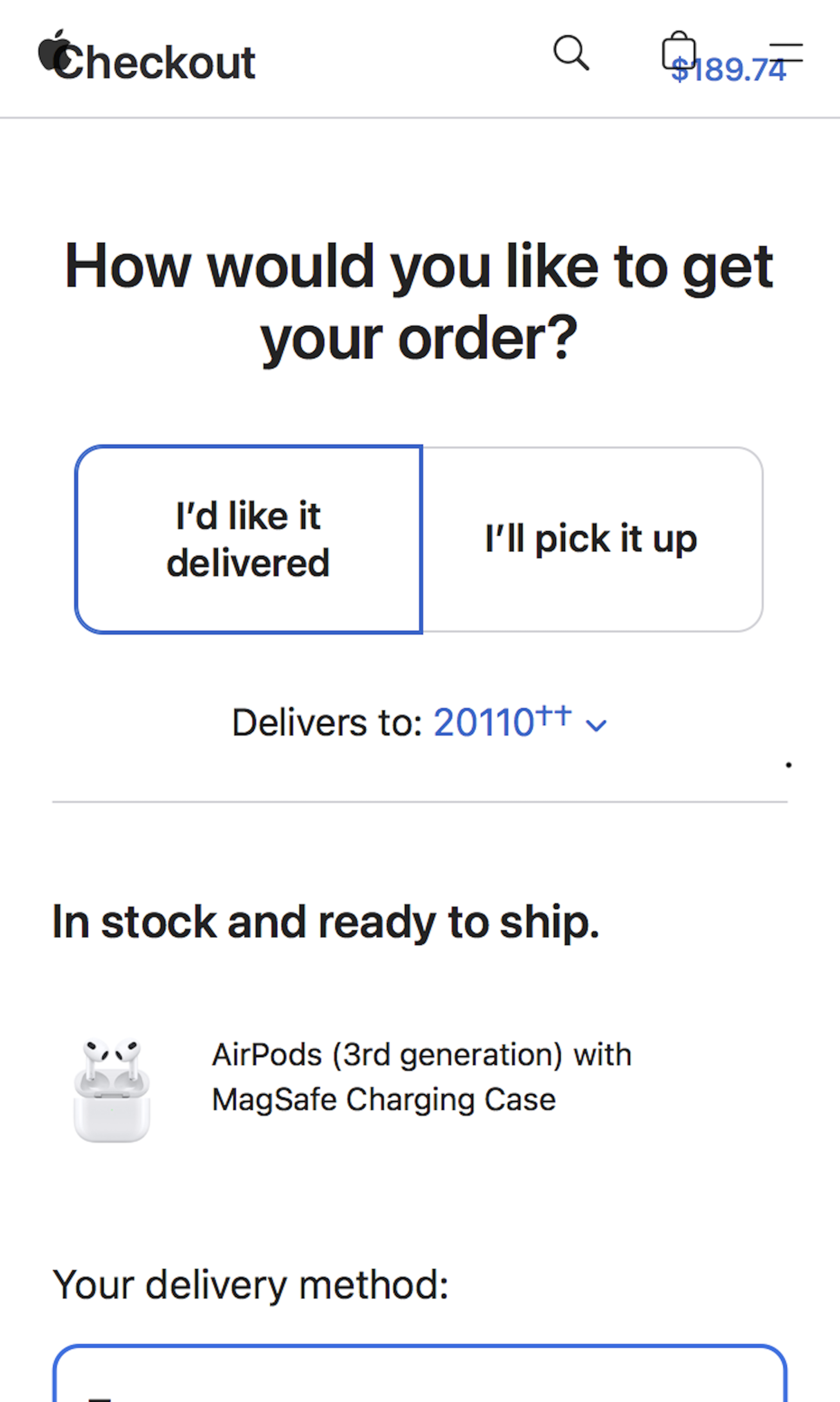
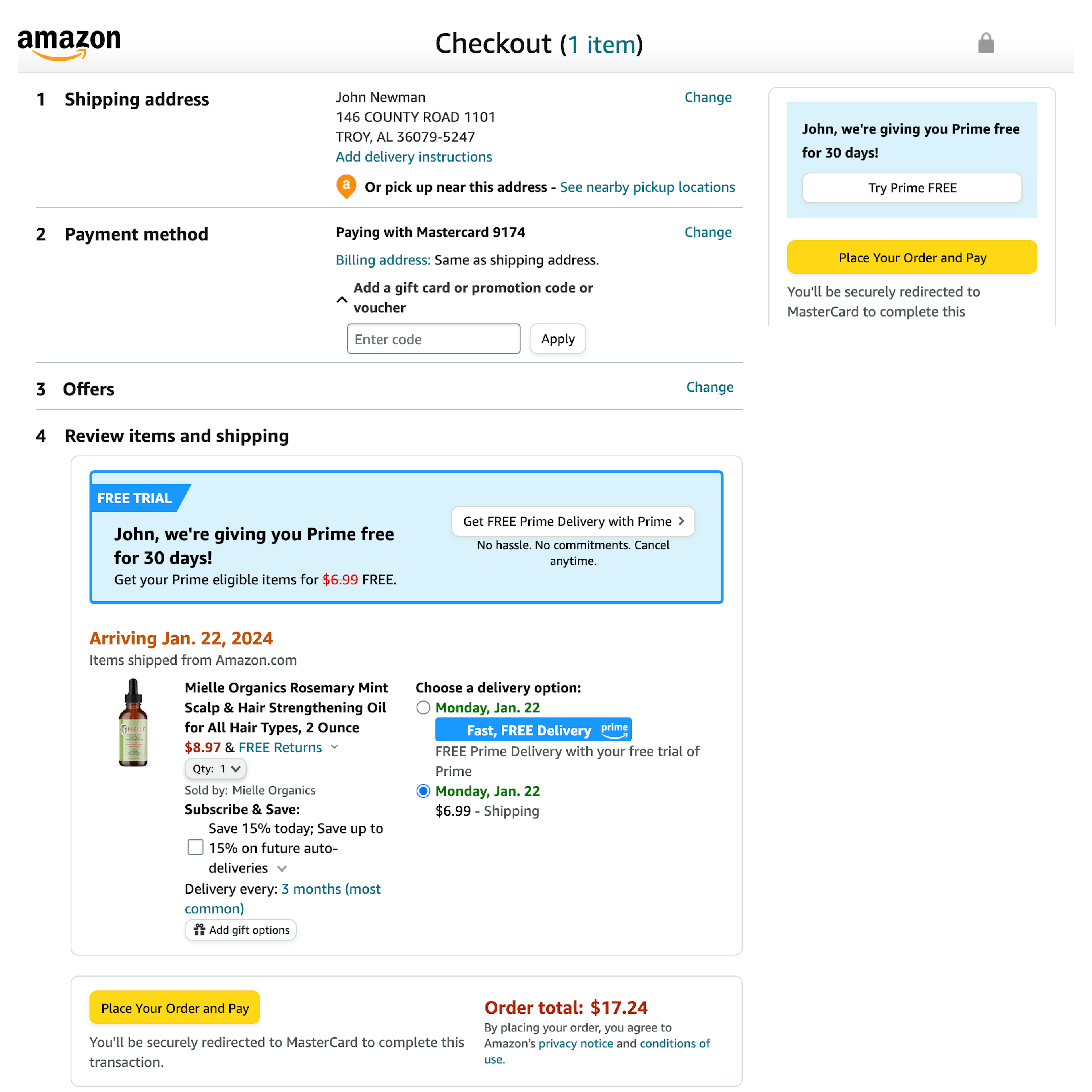
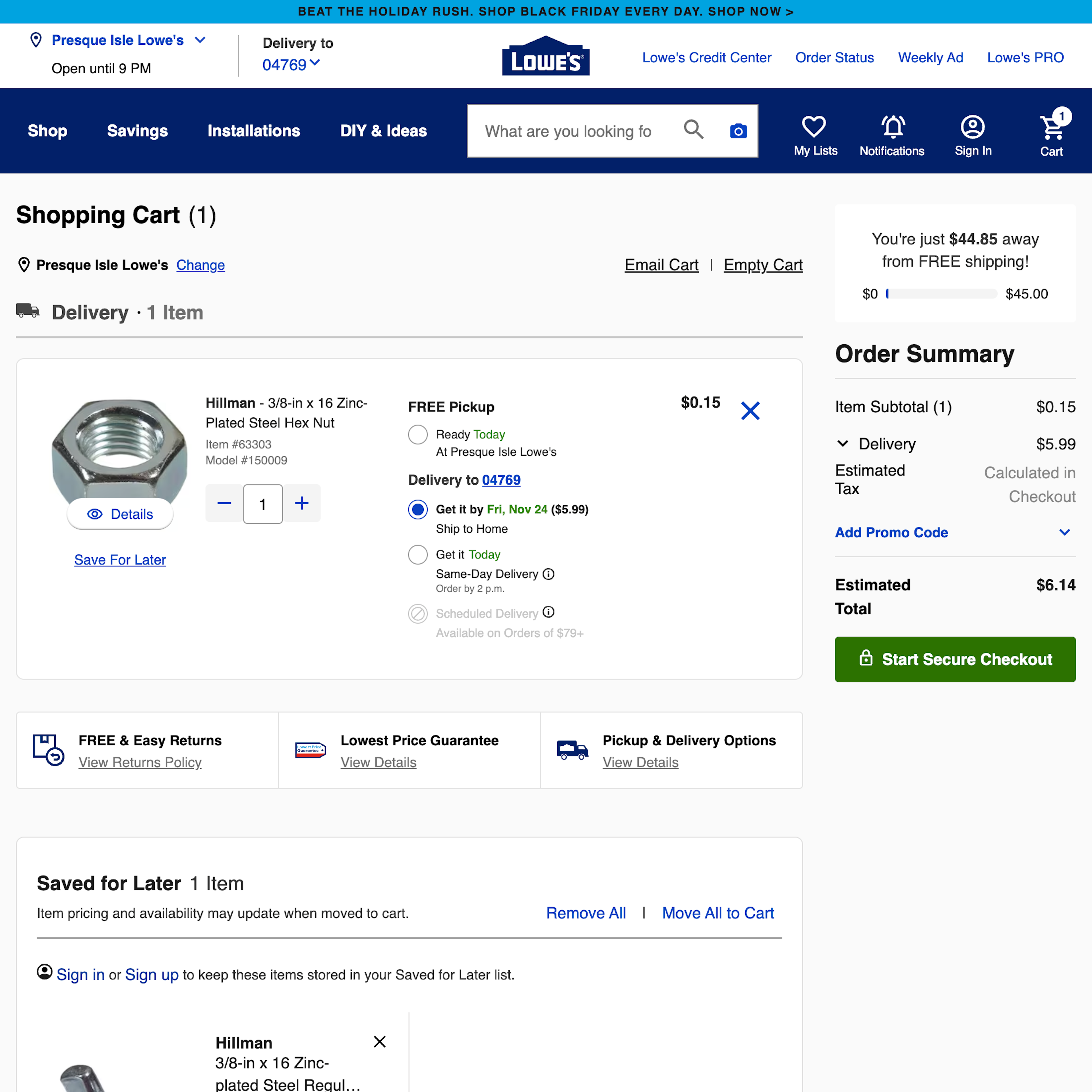
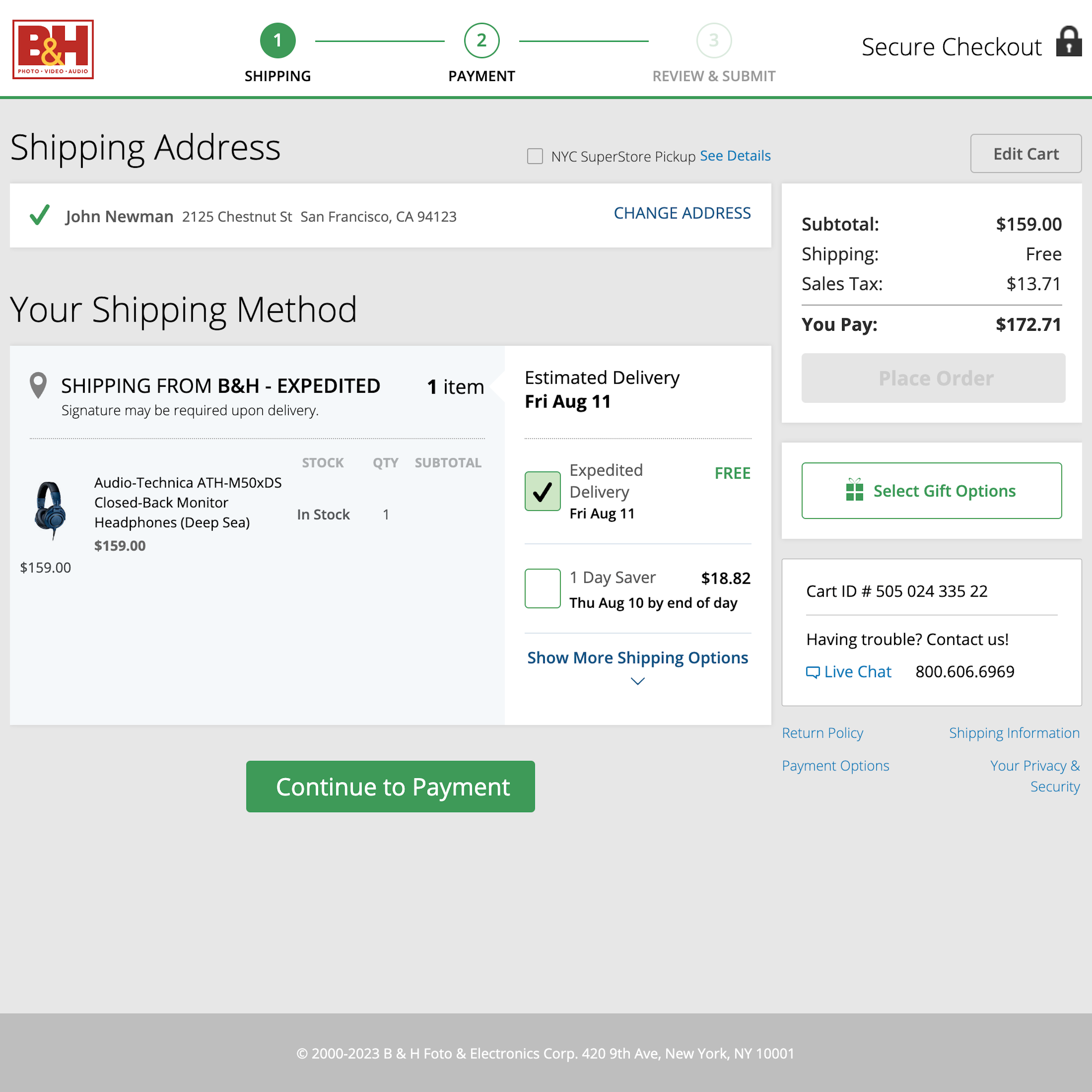
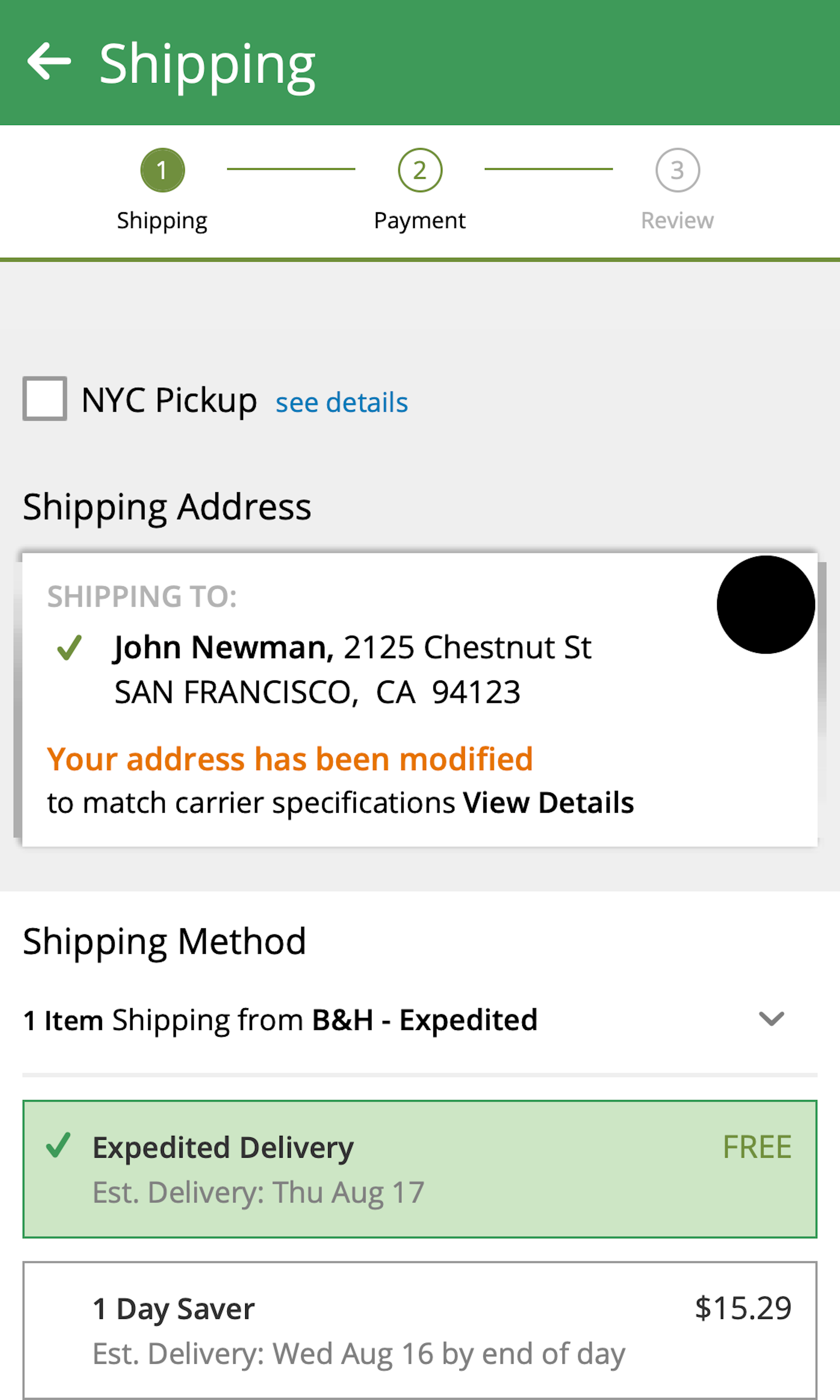
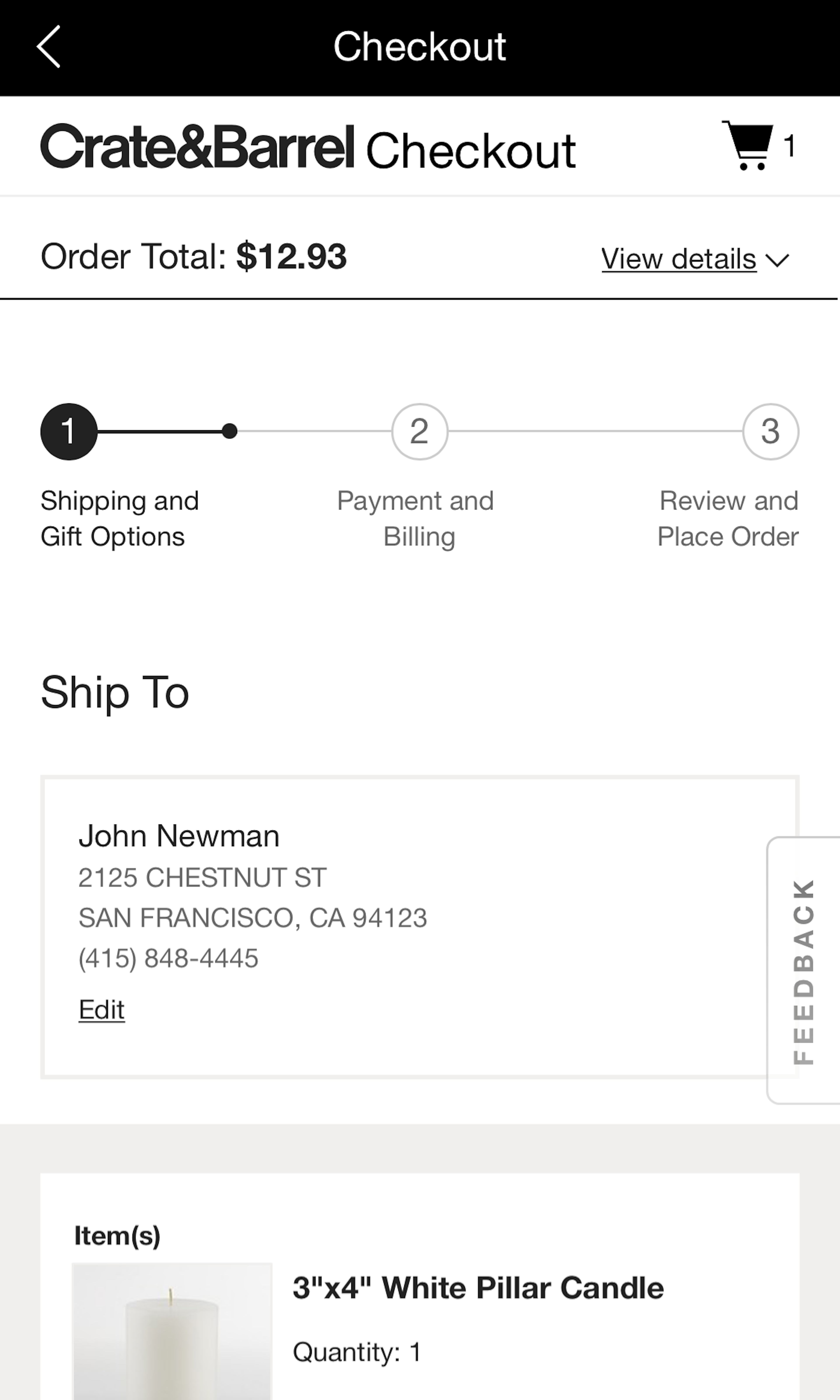
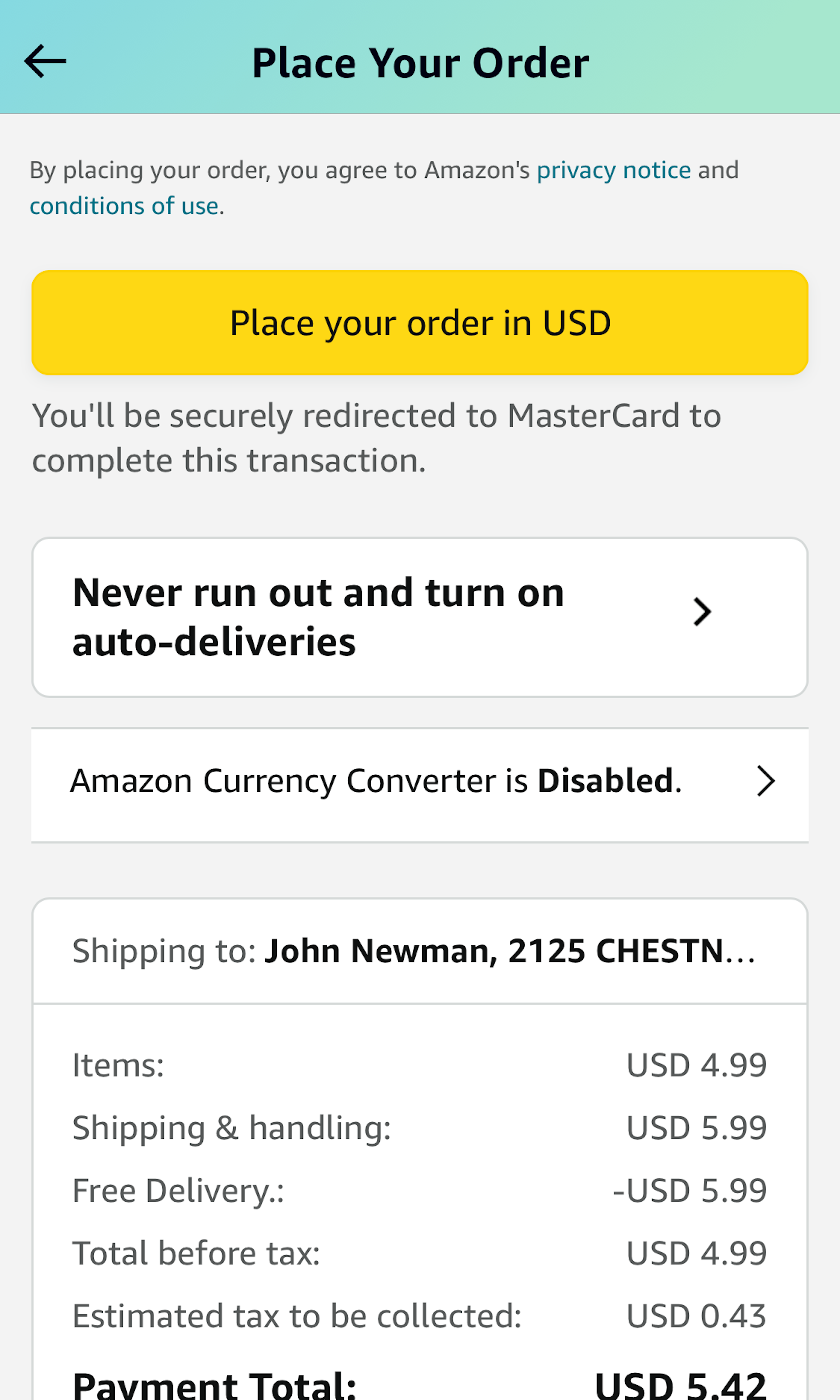
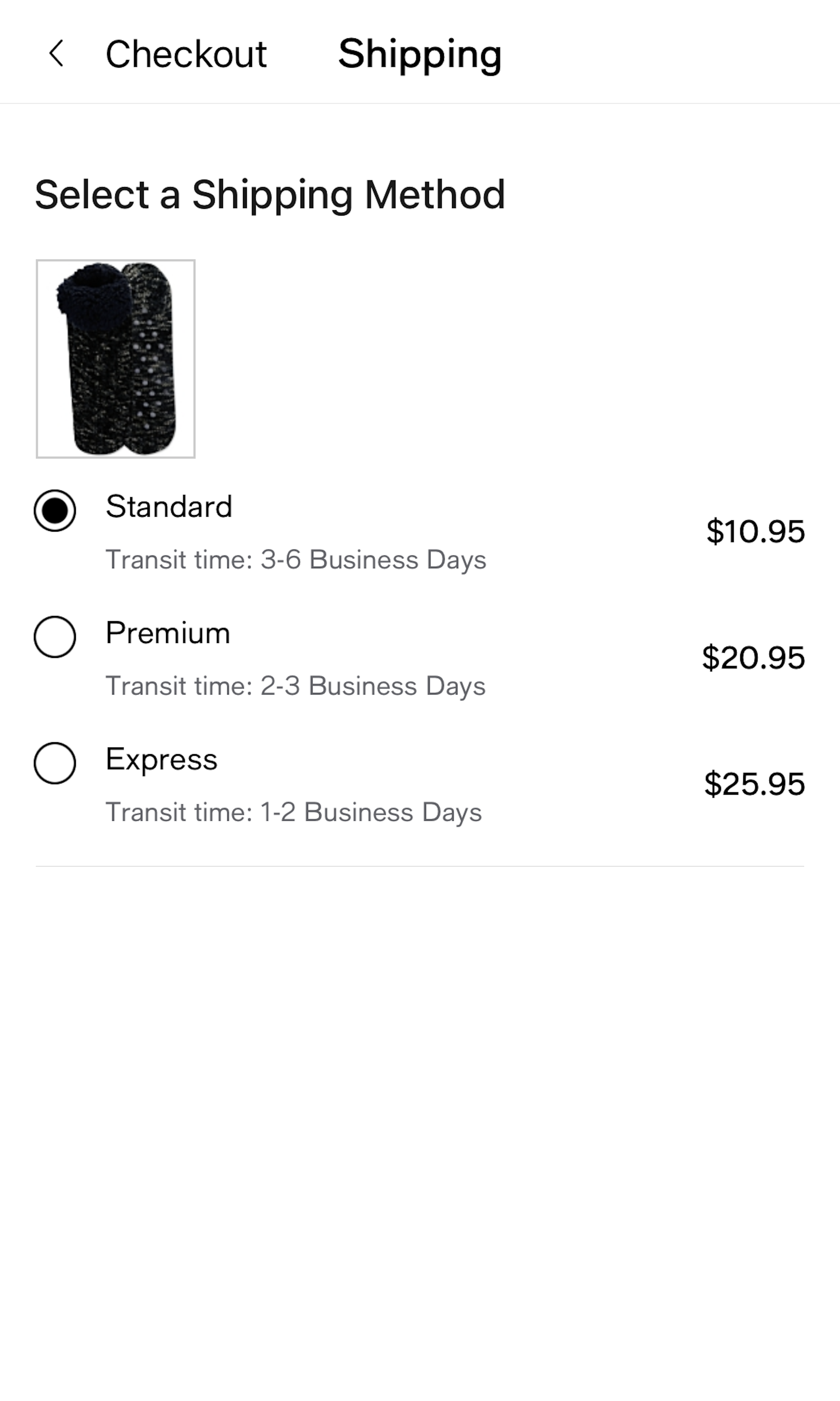
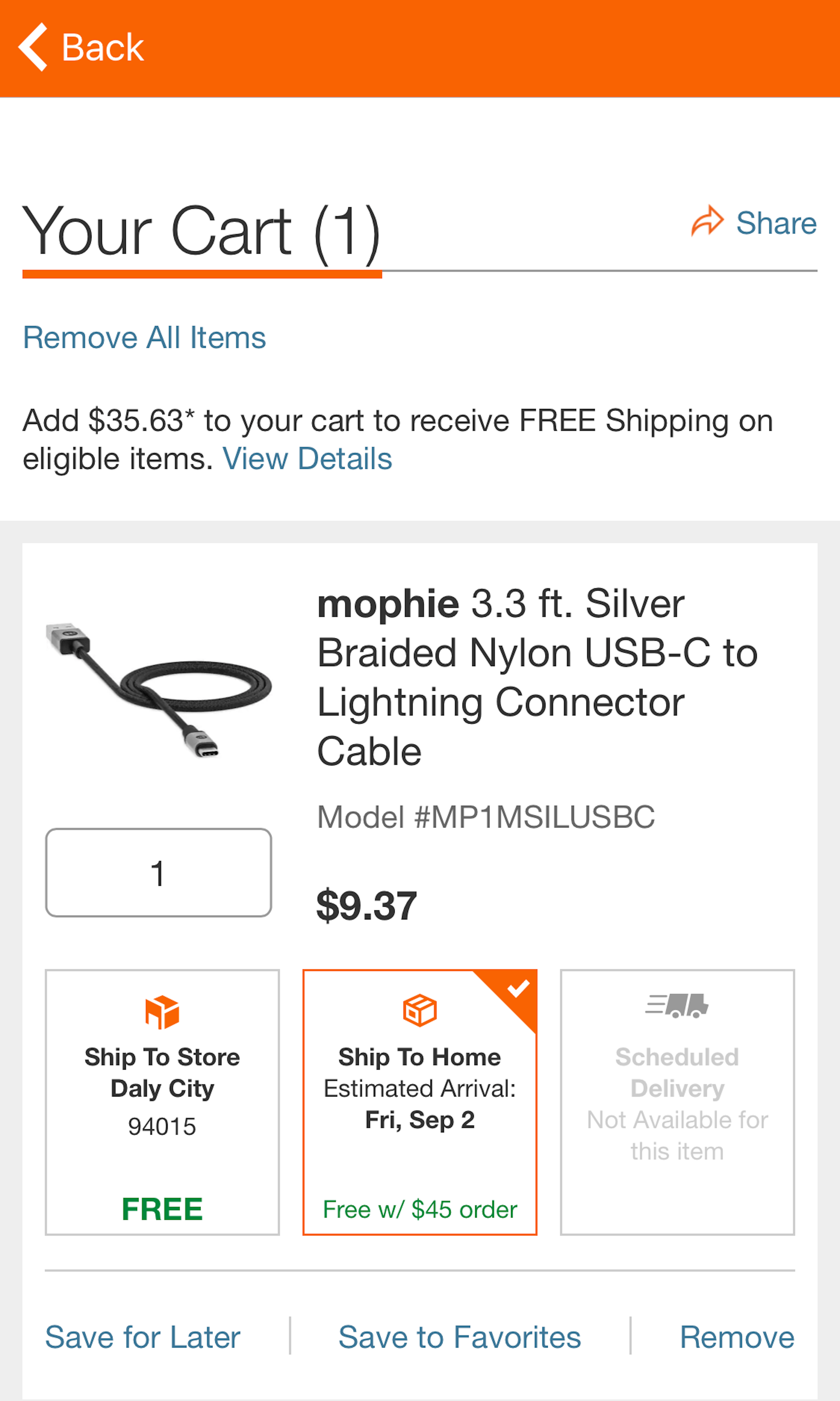
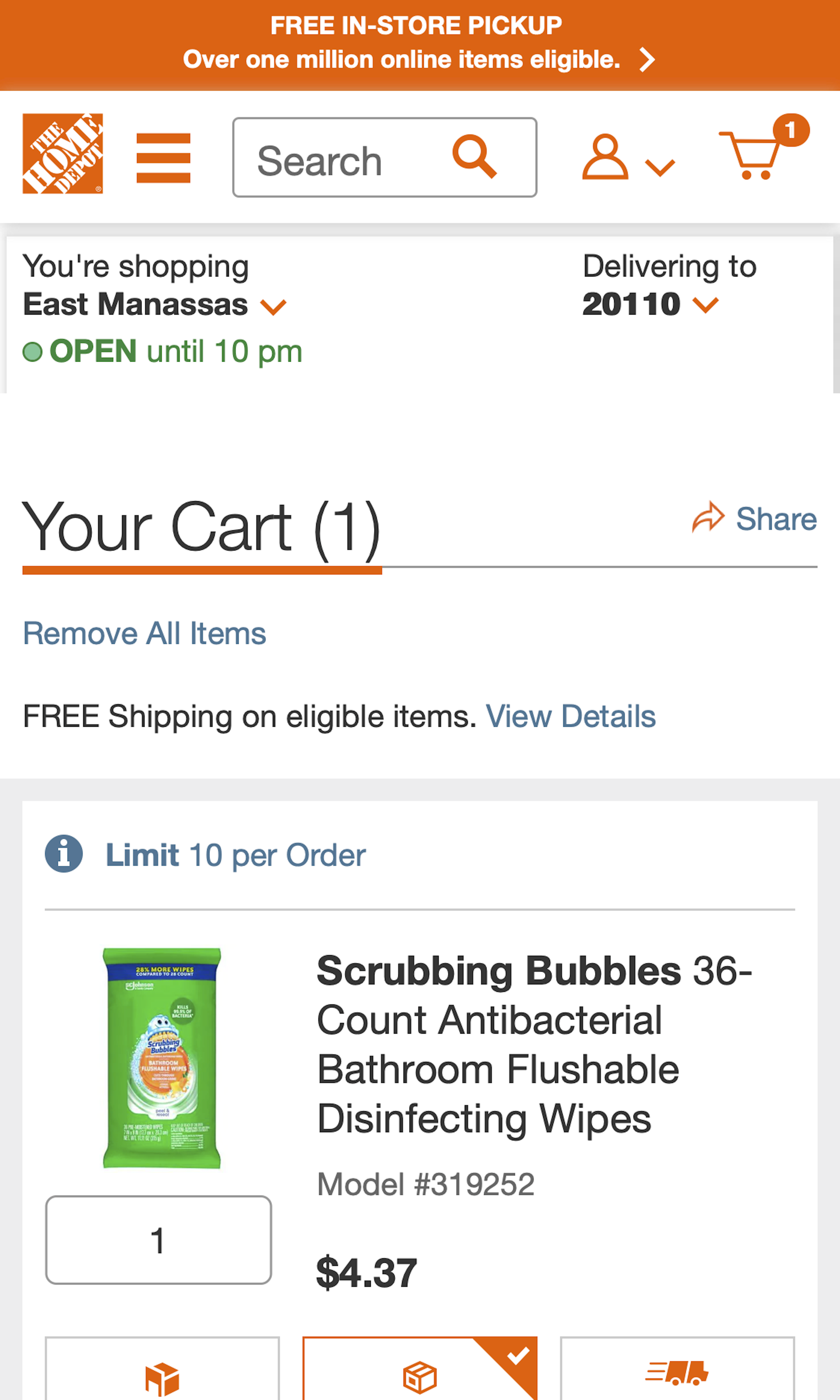
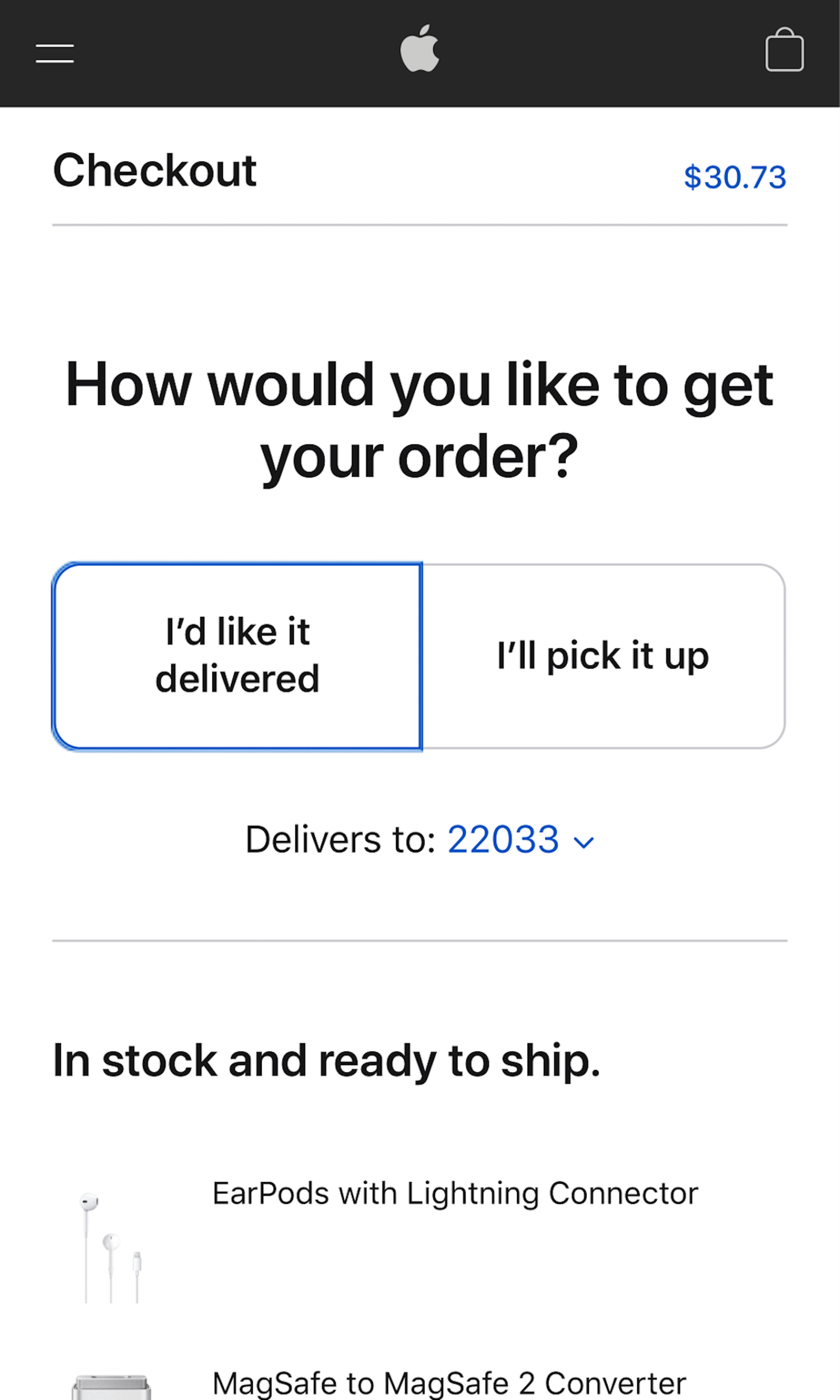
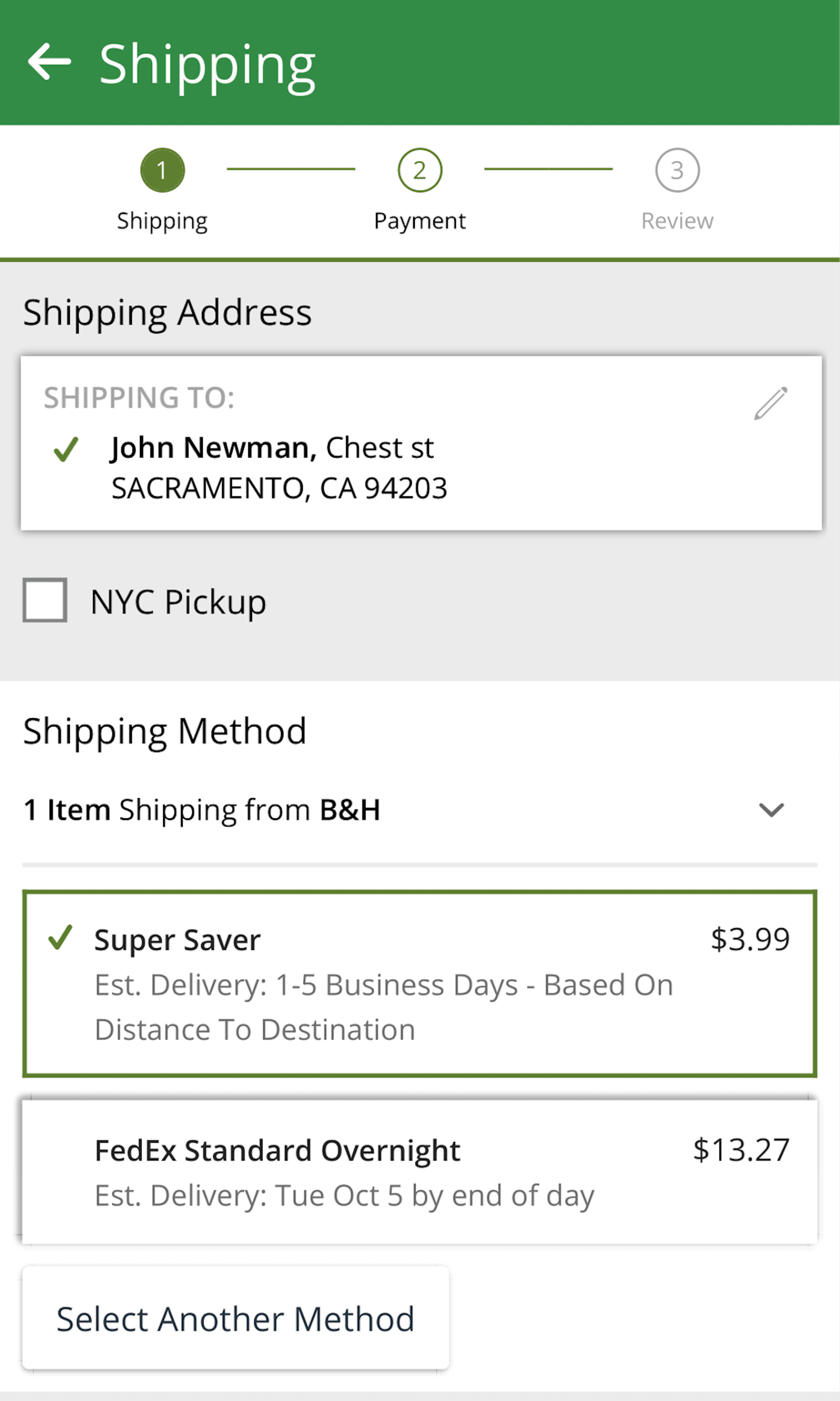
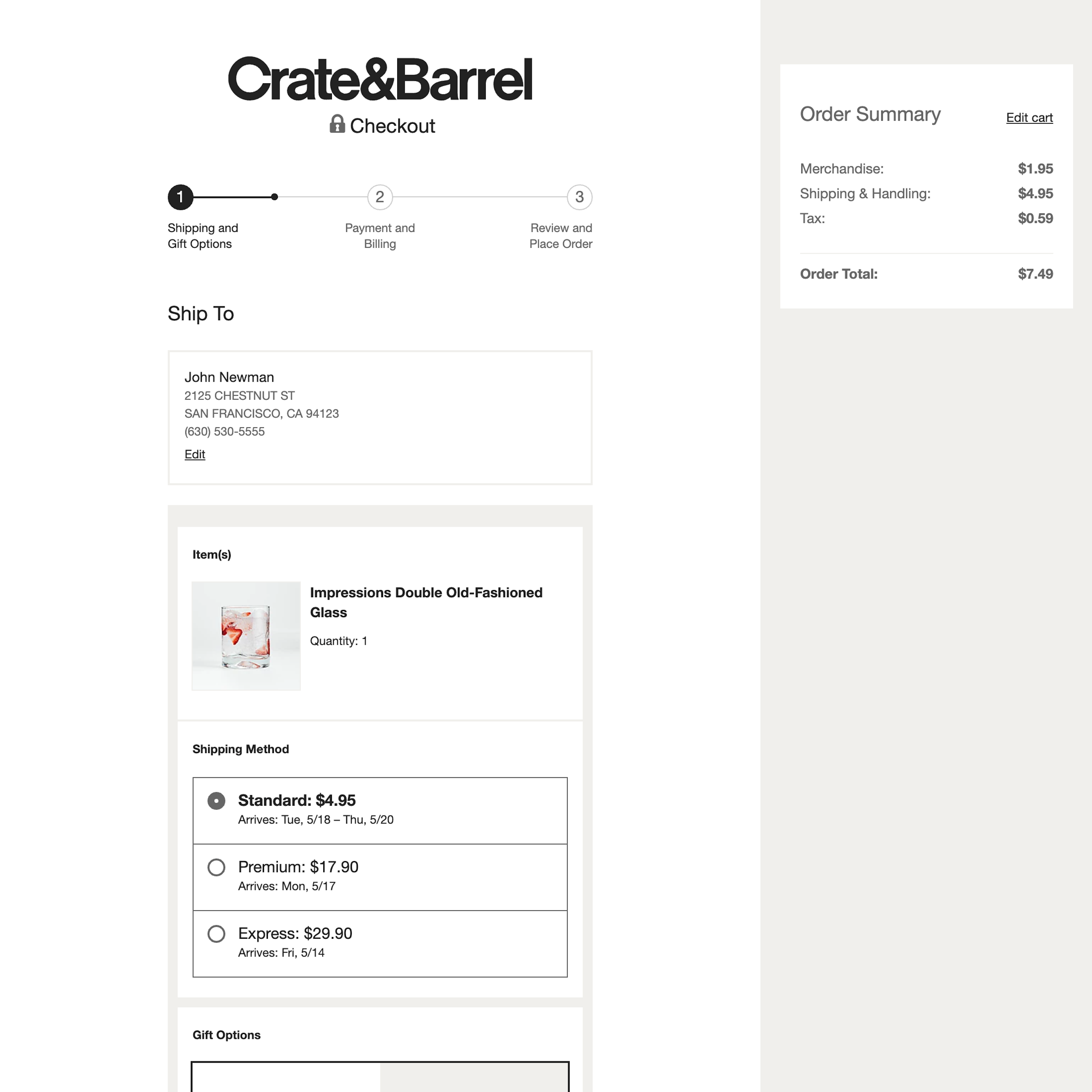
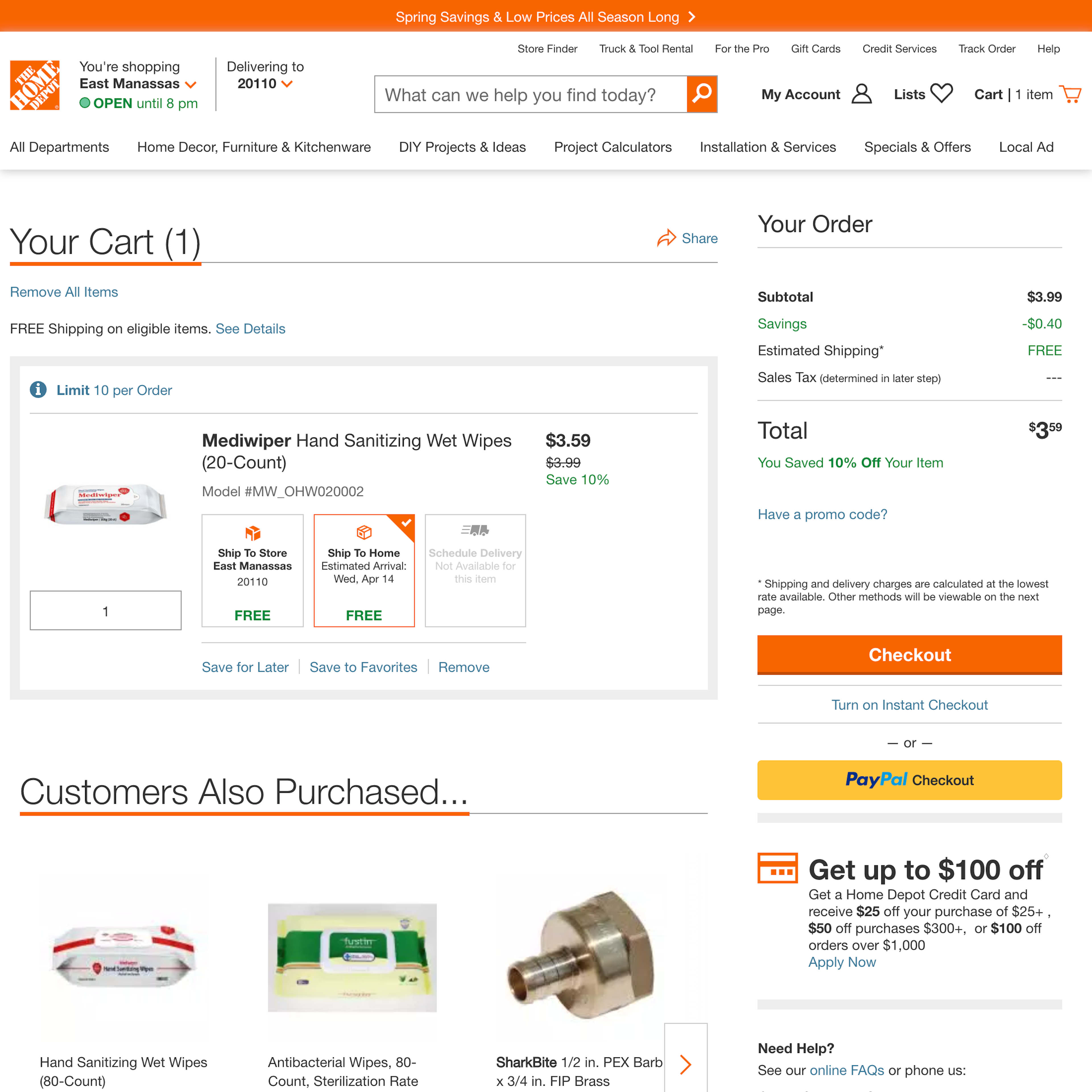
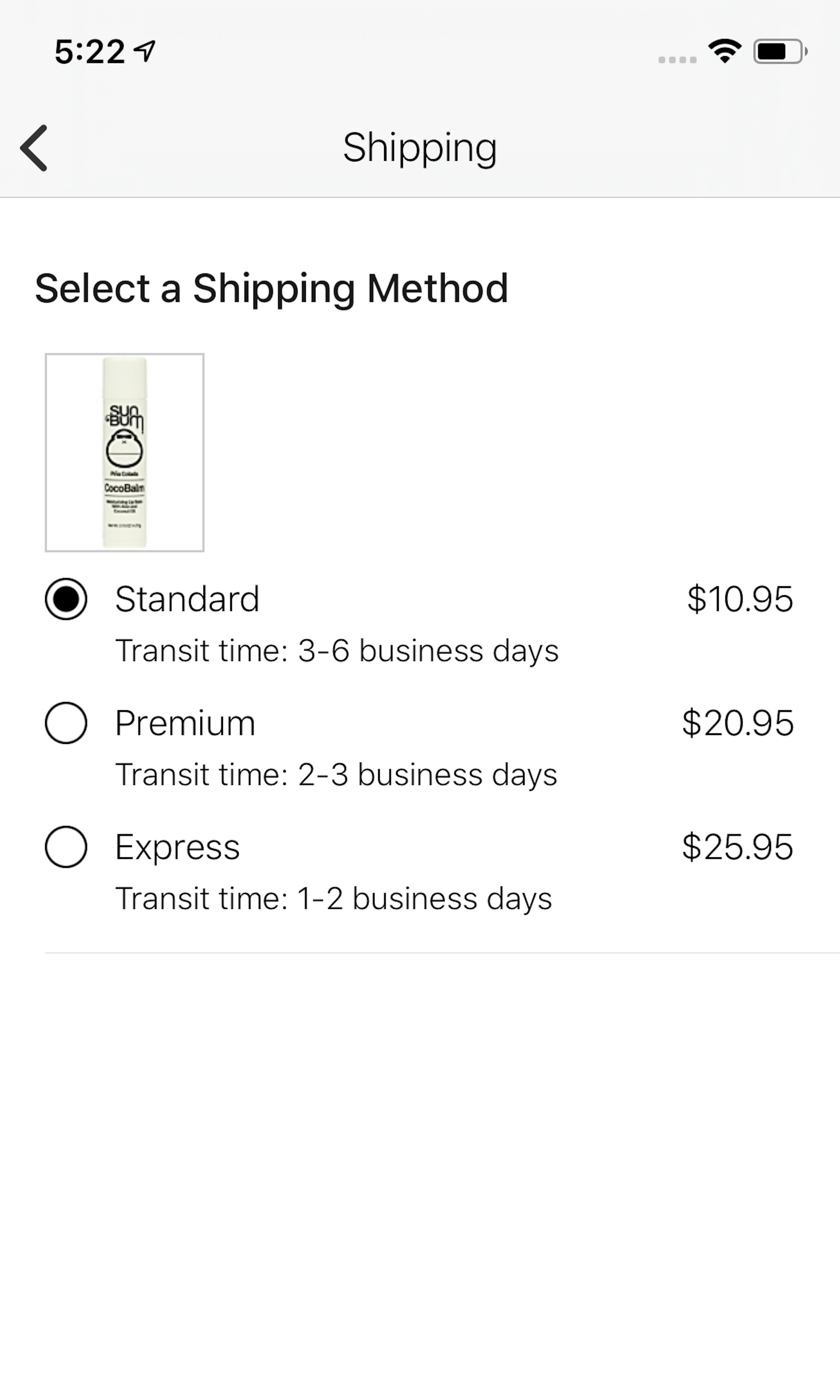
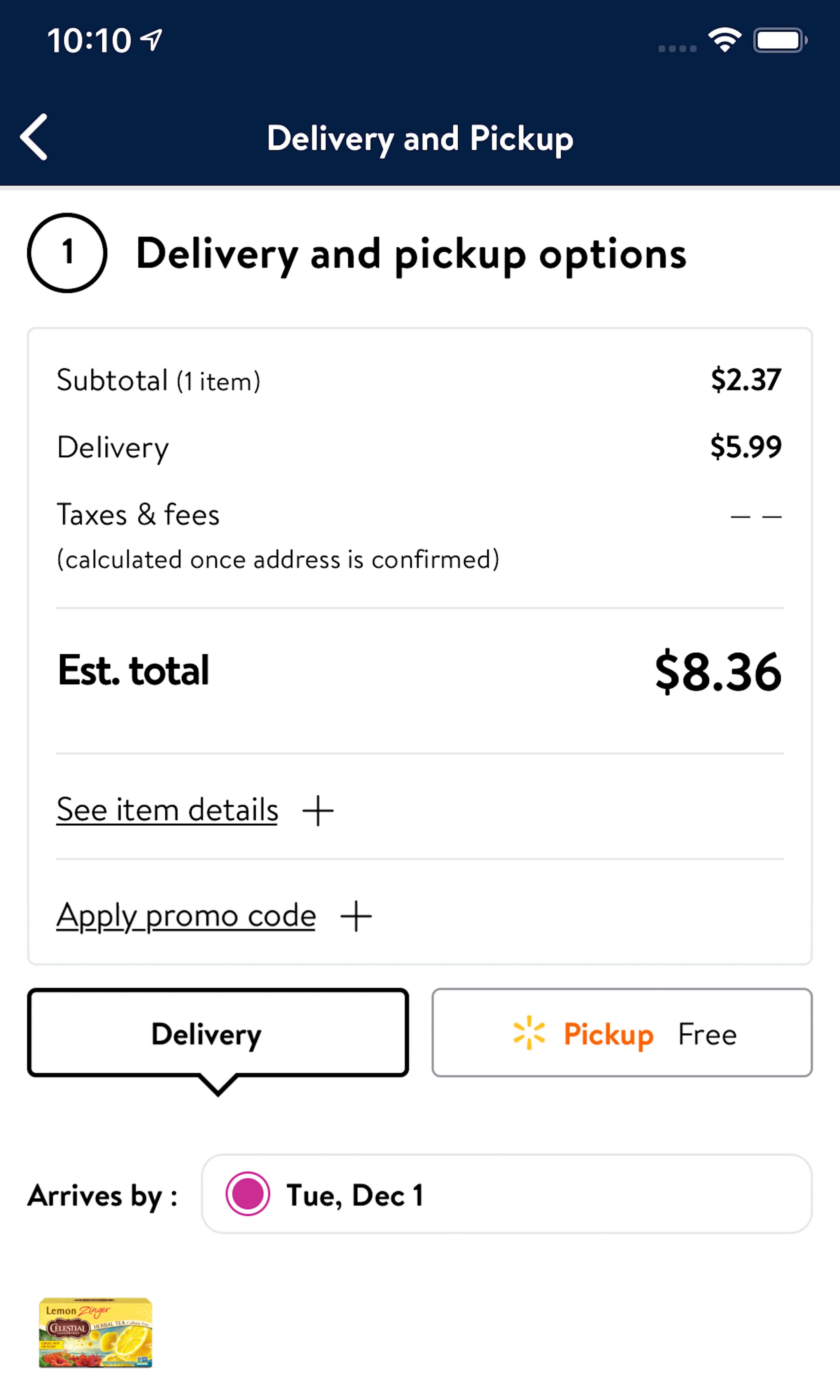
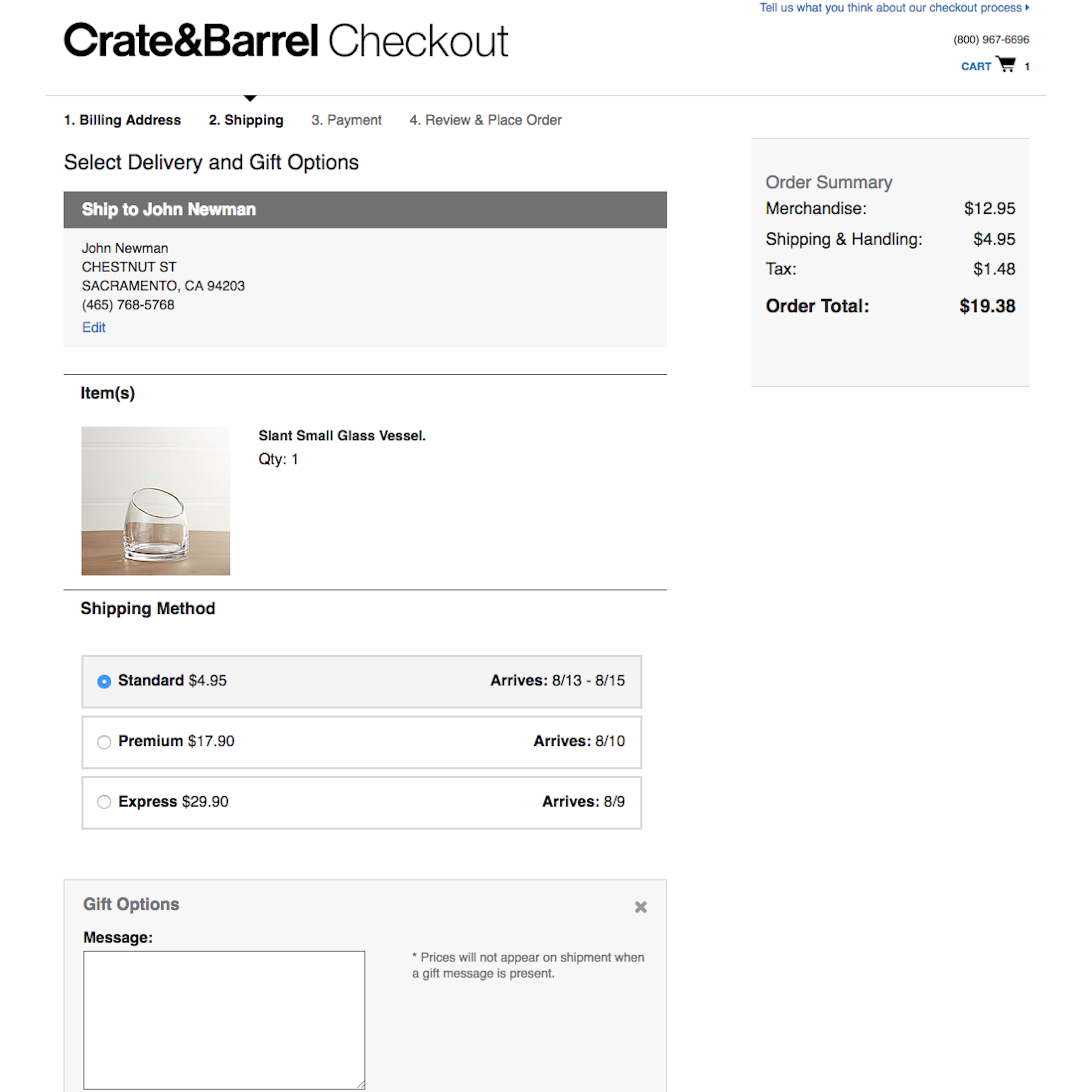
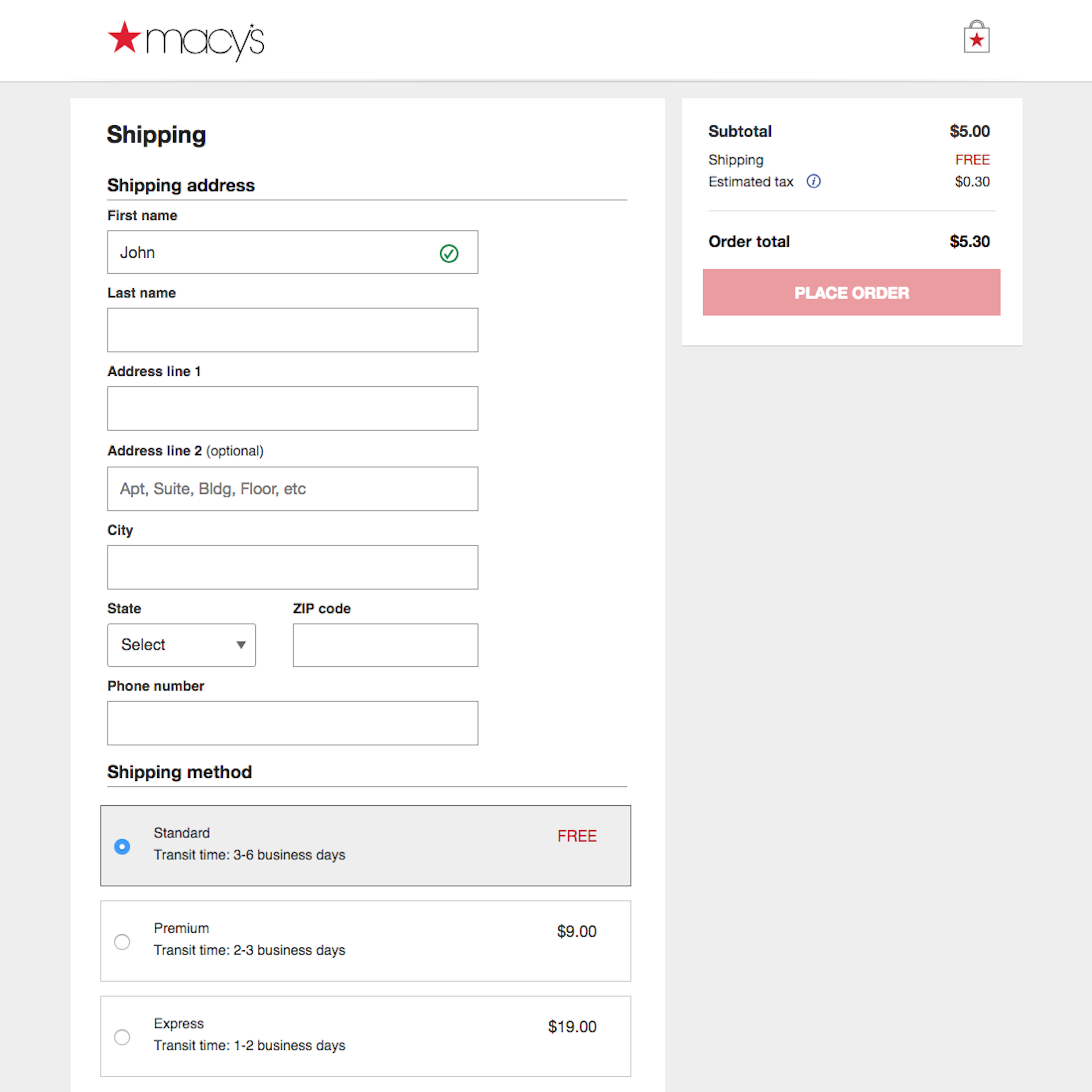
857 ‘Delivery & Shipping Methods’ Design Examples
Also referred to as: Delivery Options, Shipping Options, Delivery Methods, Shipping Methods
What’s this? Here you’ll find 857 “Delivery & Shipping Methods” full-page screenshots annotated with research-based UX insights, sourced from Baymard’s UX benchmark of 257 e-commerce sites. (Note: this is less than 1% of the full research catalog.)
During our testing we consistently observe that some types of shipping method interfaces provide users with a vastly better understanding and overview of their options. There are several, often missed, implementation details that can cause severe user misinterpretations of the shipping methods available, especially for sites that offer Store Pickup.
More ‘Delivery & Shipping Methods’ Insights
-
Shipping costs can constitute a relatively large part of the total order cost. Indeed, our latest quantitative study on reasons for checkout abandonments reveals that 60% of US online shoppers have abandoned orders in the past quarter due to “Too High Extra Costs Added” (typically shipping), and that 18% have abandoned due to “Delivery Being Too Slow”.
-
Learn More: Besides exploring the 857 “Shipping Method” design examples below, you may also want to read our related articles “Use ‘Delivery Date’ Not ‘Shipping Speed’ – From UX Research to Implementation Roadmap” and “Users Overlook ‘Store Pickup’ When Not Presented as a Shipping Option”.
-
Get Full Access: To see all of Baymard’s cart and checkout research findings you’ll need Baymard Premium access. (Premium also provides you full access to 150,000+ hours of UX research findings, 650+ e-commerce UX guidelines, and 275,000+ UX performance scores.)
User Experience Research, Delivered Weekly
Join 60,000+ UX professionals and get a new UX article every week.

User Experience Research, Delivered Weekly
Join 60,000+ UX professionals and get a new UX article every week.

Explore Other Research Content

300+ free UX articles based on large-scale research.

257 top sites ranked by UX performance.

Code samples, demos, and key stats for usability.


