Key Takeaways
- The homepage is a critical area for grocery and food delivery users
- Highlighting “Past Purchases” on the homepage is an important way to support users’ desire to navigate grocery and food delivery sites as efficiently as possible
- “Past Purchases” must be prominently displayed on the homepage to ensure their visibility to users
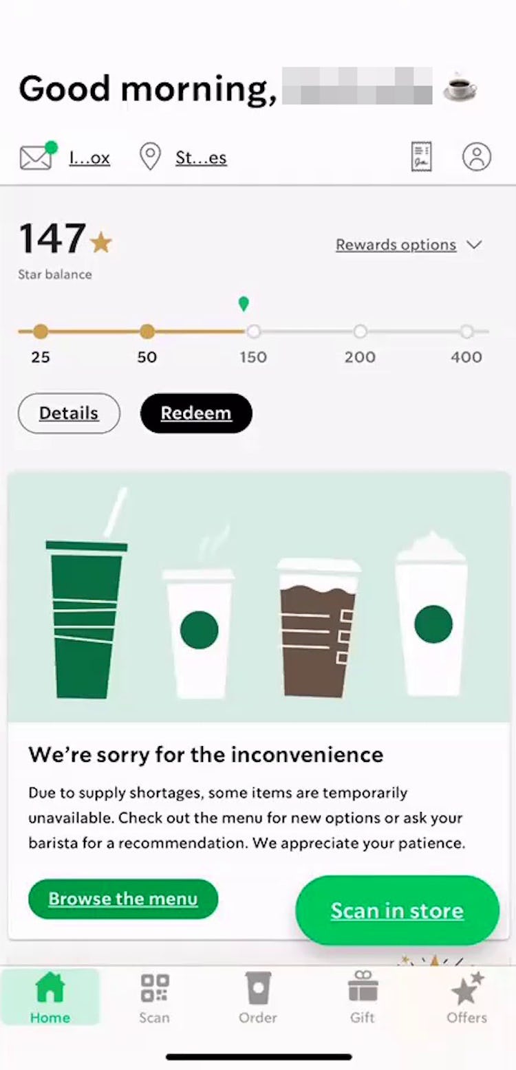
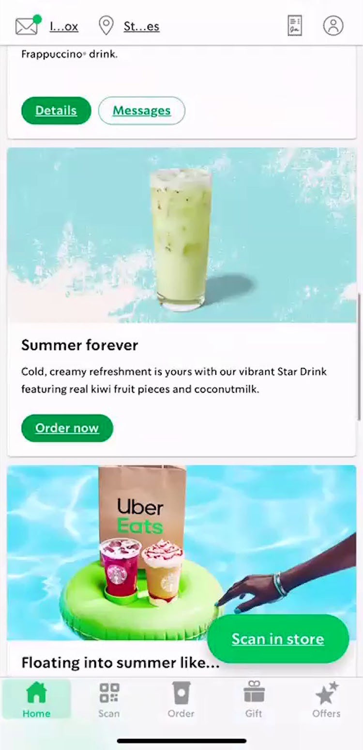
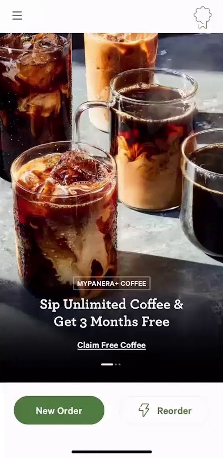
“I tend to be a creature of habit…and I want to just be able to click as few buttons as possible and just make it happen”, shared a user while on the Starbucks app, who continued, “I’m disappointed to not see a reorder function here”.
Our testing of grocery and food delivery and takeout sites revealed that users shopping for groceries or household staples tend to rely on the same purchases again and again, favoring certain items and brands.
Likewise, users ordering restaurant delivery or takeout typically have favorite meals or a “standing order” that they tend to repurchase often (or possibly every time they order from that restaurant).
For returning users loyal to such staple products and orders, the efficiency with which they can add these items to their cart for repurchase becomes one of the most important components of their user experience — but, without a prominent path to do so quickly and easily, this process risks becoming a major bottleneck.
In this article we’ll discuss our Premium research findings from testing grocery and food delivery and takeout sites.
In particular, we’ll discuss the following:
- Why users on grocery and food delivery and takeout sites look to the homepage for “Past Purchases”
- How grocery and food delivery and takeout sites should display “Past Purchases” on the homepage
The Homepage Is Key for Grocery and Food Delivery Users
Testing revealed that for grocery and food delivery users, convenience is king.
The behavior of these users is typically less exploratory and more transactional compared to users on more traditional e-commerce sites — users want to quickly find the grocery items or food order they want and complete the order as efficiently as possible.
Indeed, for products that tend to be repurchased often (e.g., consumable products like groceries or prepared food such as takeout), users are likely to have strong preferences for particular items or brands — for instance, relying on staple grocery items such as eggs and milk and having favorite brands or varieties of each.
In practice, users may repurchase the exact same items multiple times, possibly adding these same items to their order every time they shop.
Testing showed that — given the user preference for completing their order as quickly as possible, combined with their typical behavior of repurchasing the same items over and over again — the homepage in particular was a shortcut sought by users to accomplish their goals.
In fact, users during testing were just as likely to look for items to reorder on the homepage as in their account order history.
“Where the hell is that order? I always have a hard time finding that…I don’t think there’s a way to do that.” Despite being a regular Starbucks customer, this user testing its mobile app was unable to locate how to reorder her “Past Purchases”, initially scrolling up and down the homepage to find this functionality. When users are likely to have staples or “standing orders”, the lack of visibility to these items makes it harder for them to achieve their goal.
However, if the homepage doesn’t provide the order shortcut users are looking for, they must consider other means to locate particular items to repurchase, risking that they get sidetracked or fail to find the exact item they were looking for.
Moreover, it’s likely that users have come to expect that their “Past Purchases” will be available on the homepage: during testing of grocery sites, all test sites featured “Past Purchases” on the homepage, indicating that providing “Past Purchases” on the homepage is becoming a web convention (for grocery sites at least).
Thus, not meeting this user expectation makes it even more likely that a user will perceive that the site is making it unnecessarily difficult for them to start their order.
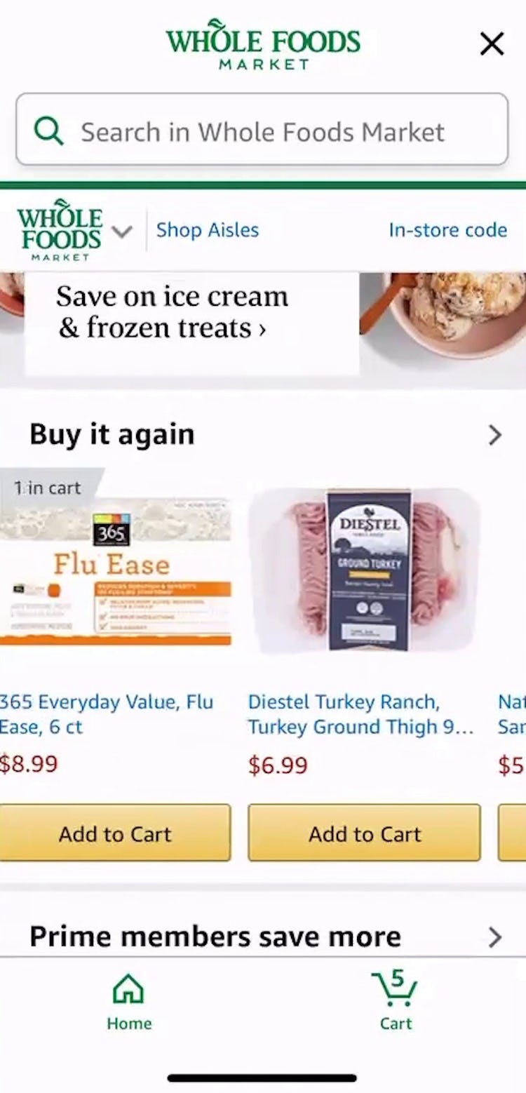
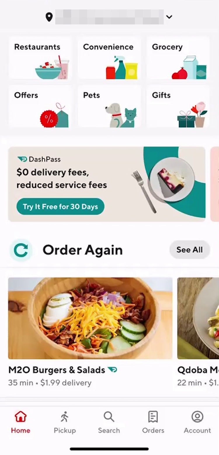
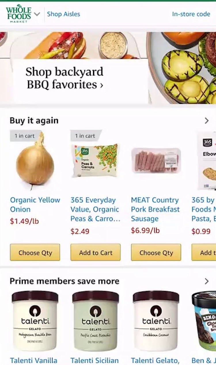
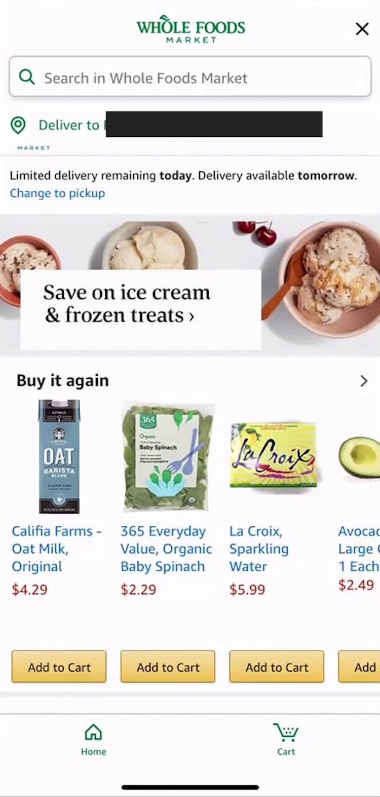
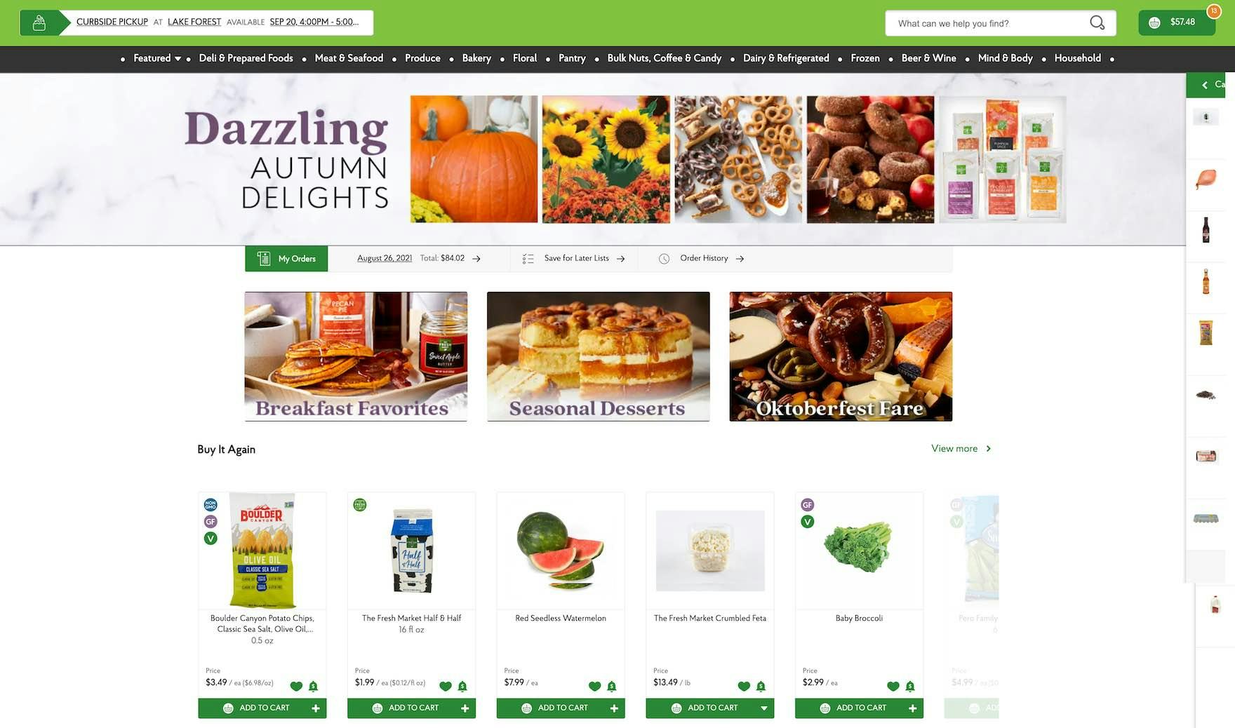
To provide the quickest and most efficient path for returning users, the homepage should prominently feature “Past Purchases”, making it easy to reorder these items without the need to navigate or search. As one user from testing shared, “I always go through the ‘Buy again’ [section] because it just makes it easier”.
Indeed, in industries with high levels of repurchasing, such as grocery and restaurant orders, offering the ability to easily reorder from the homepage is among most useful and relevant ways to personalize the homepage for returning users.
In practice, a list of previously ordered items not only allows users to efficiently find specific items to reorder but also serves to “jog their memory” (e.g., a user exclaiming, “Oh! I need tomatoes too” after seeing them on the homepage), reminding them of common purchases they may not have thought to replenish.
Therefore, sites catering to returning users by featuring “Past Purchases” on the homepage can facilitate users adding additional items to their cart, in addition to the ones they had originally planned to purchase.
How to Display “Past Purchases” on the Homepage
On sites where orders often contain a high number of items, such as grocery sites, users will benefit from having access to a larger number and wider variety of “Past Purchases”.
In mobile UX testing, homepage carousels showcasing a number of items at once were well received by users, who were able to easily swipe horizontally to scroll through the options.
Importantly, carousels should have a clear indication that further content exists beyond the edge of the viewport, either with prominent arrow indicators or by visually cutting off the final item.
Such indications provide a cue to swipe to discover more items (and, as with any mobile homepage carousel, automatic advancement should be avoided).
The same general principles can likewise be applied to desktop sites, taking care to follow best practices regarding desktop homepage carousels.
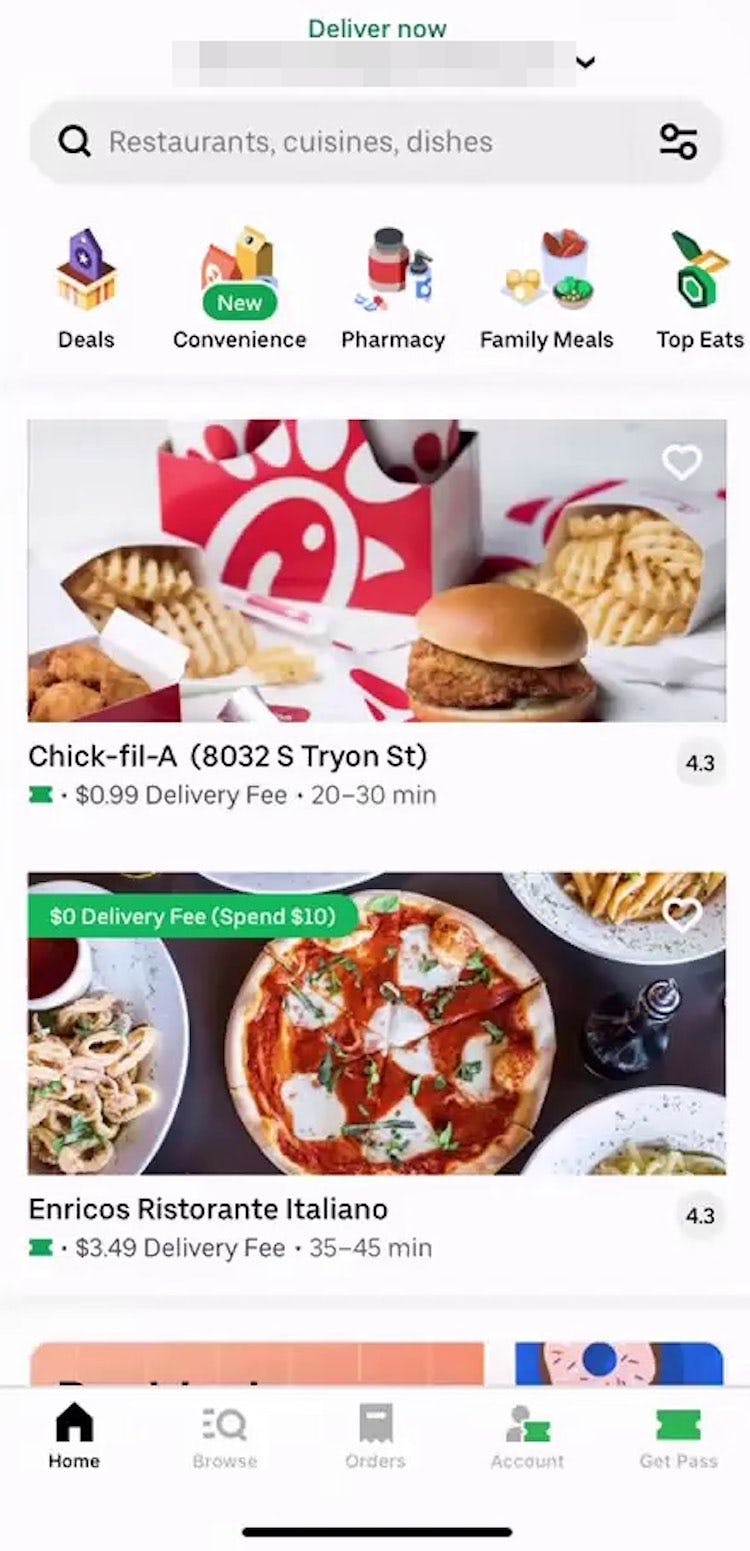
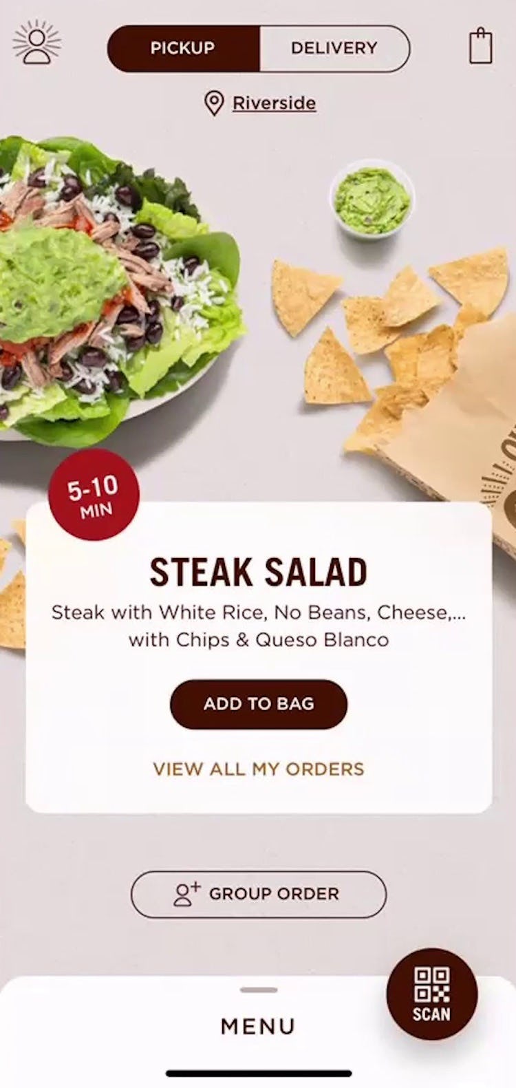
Meanwhile, for sites with smaller order sizes, such as restaurant takeout and delivery, featuring only one or a handful of past items and linking to the full order history can be an acceptable way to promote reordering.
Additionally, in order to be most valuable to returning users, “Past Purchases” must be prominently displayed on the homepage, ideally appearing within the initial visible viewport above the fold.
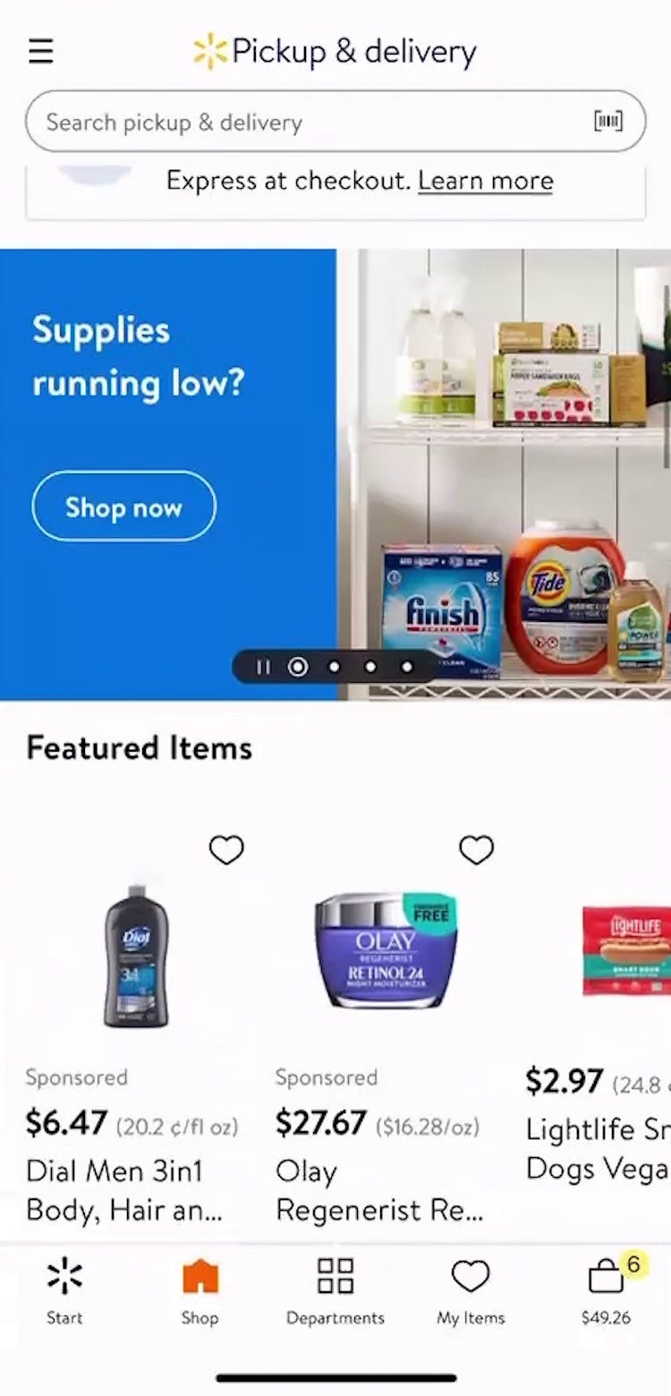
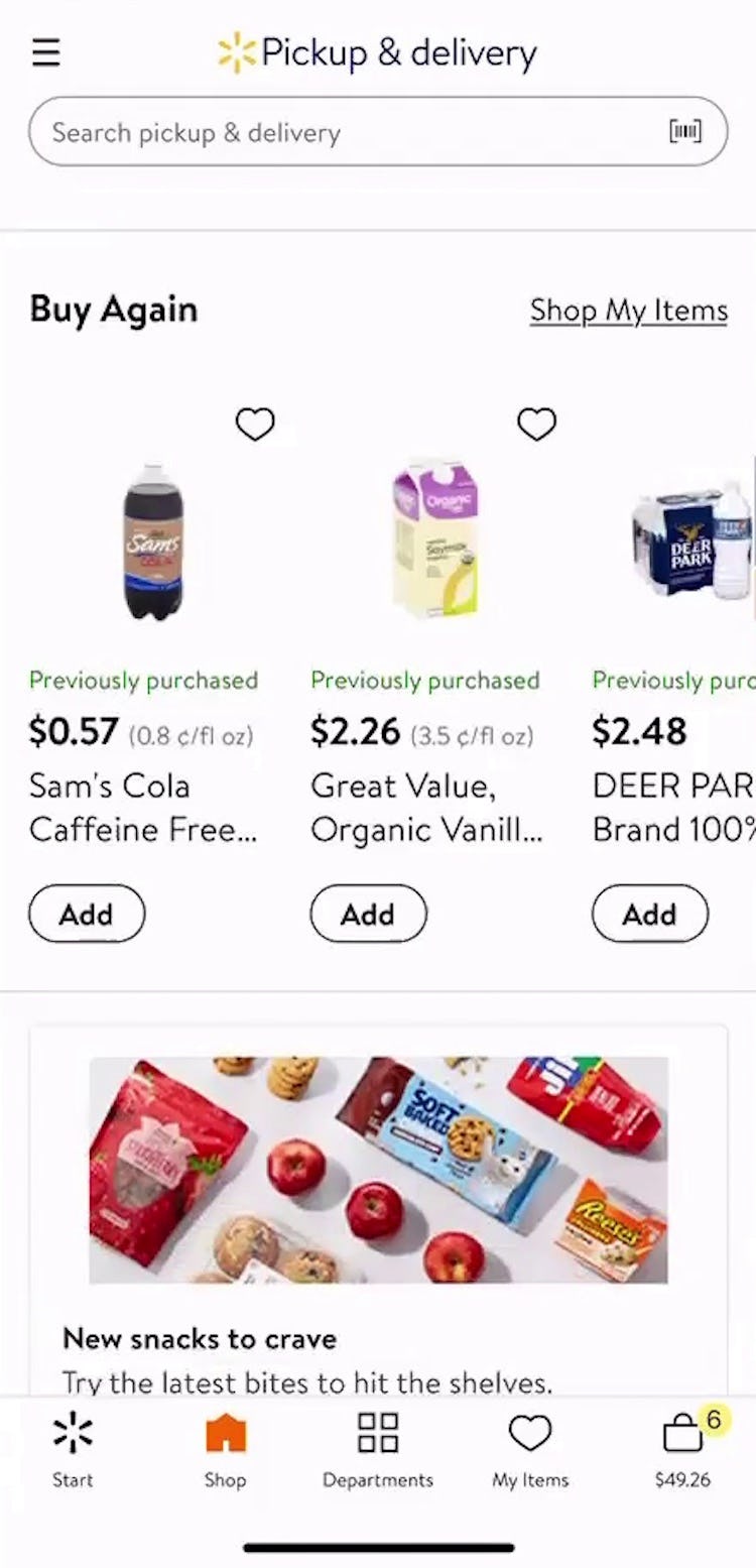
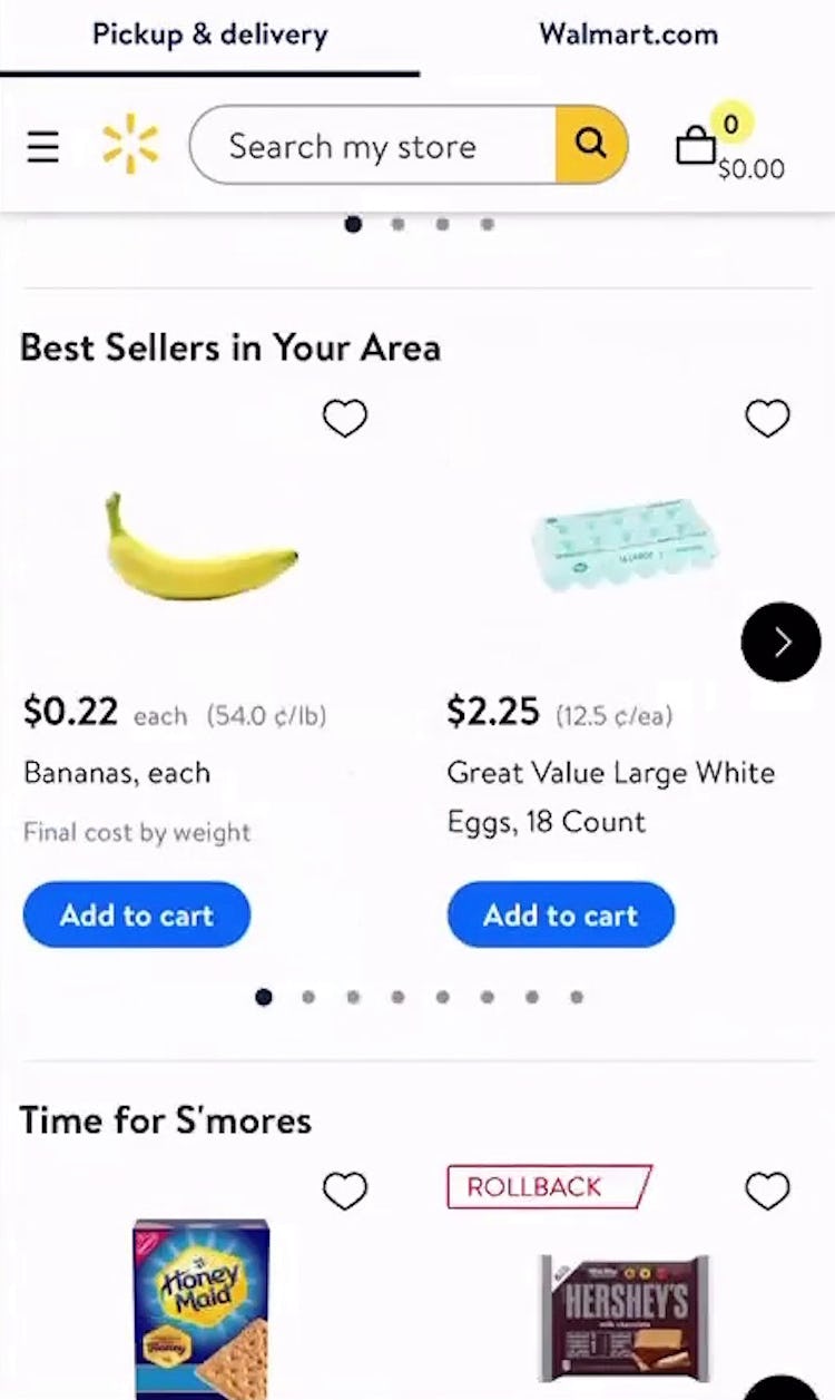
“Kind of a long way to scroll…I don’t need this banner, it’s just a waste of space. I wanna go to buy my items.” This user on Walmart only found the “Buy Again” feature on the homepage after scrolling through several screens’ worth of promotions and featured items, slowing his progress in locating items to repurchase.
For sites with a high rate of reordering, locating “Past Purchases” is likely to be of more value to users than an abundance of ads, promotions, and large visual elements, making it important that “Past Purchases” are one of the first elements they encounter when arriving on the site.
“Past Purchases” must also be clearly labeled to help returning users recognize the featured items.
In testing, labels such as “Buy it again” or “Order again” performed well for communicating to users the existence of this feature on the homepage. Likewise, labeling individual “Past Purchase” items with a similar label or badge further reinforces information scent.
However, relying solely on a label is typically insufficient: during testing of restaurant sites, users sometimes overlooked standalone links to “reorder”.
Therefore, in order to increase the prominence of “Past Purchases” consider including a thumbnail and brief description of the product or order in addition to a “reorder” link.
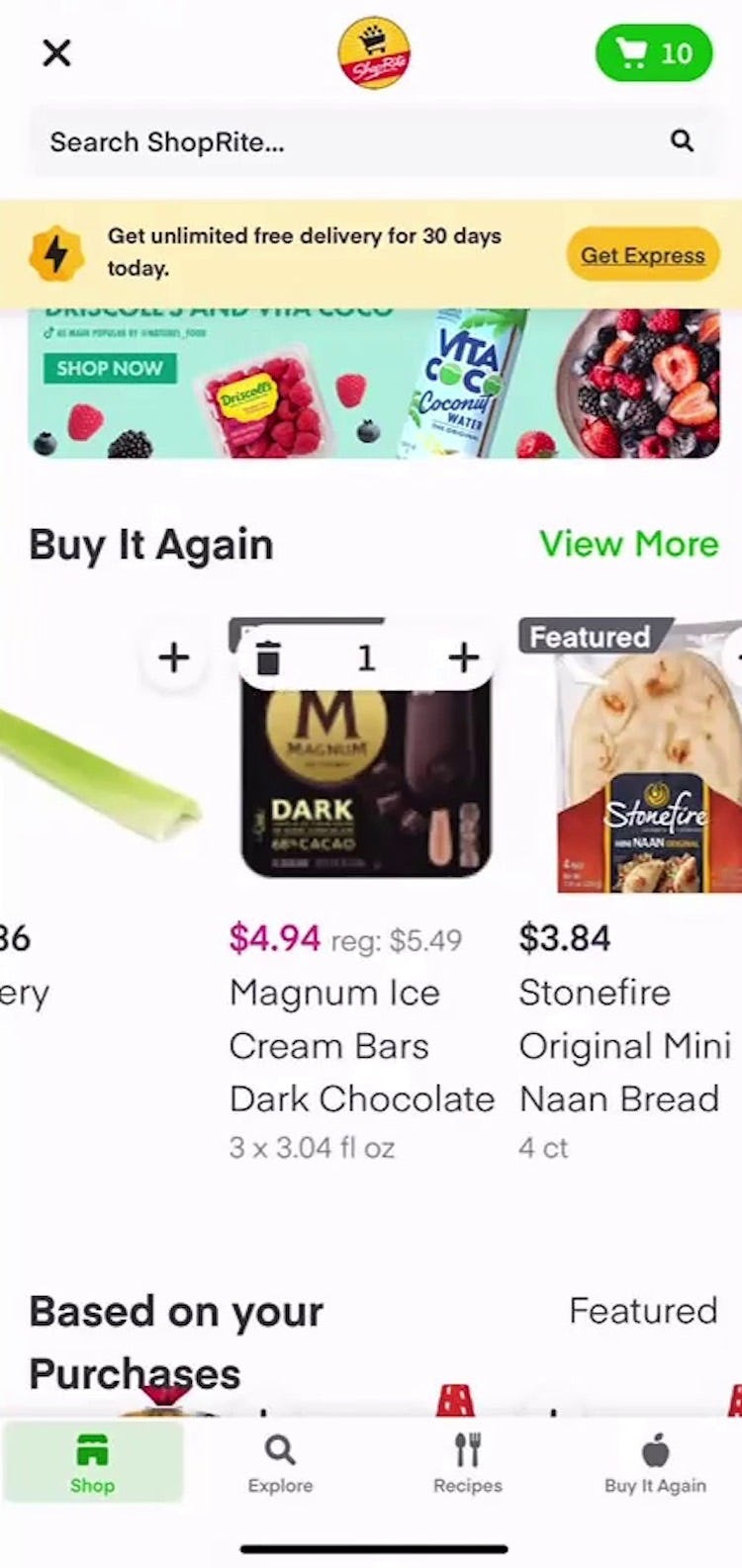
What’s more, users should be able to add “Past Purchases” to their cart directly from the homepage. This functionality provides the ultimate efficiency in helping users build a cart from featured “Past Purchases”, for which users are less likely to require the details provided by product pages.
Furthermore, providing the ability to adjust the quantity or package weight, as well as to remove the selected item, keeps users from needing to visit the product page or cart to change their selection.
Naturally, “Past Purchases” will only be available for logged in, returning users.
New users will benefit instead from prominent product and category links to showcase the breadth of the product catalog and enable them to begin shopping from the homepage.
Likewise, featured browsing paths for popular items or best sellers, “Sale” or “Deal” items, and thematic browsing paths can also provide inspiration and give new or non–logged in users a place to start browsing and adding items to the cart.
Help Users Quickly Fill Their Grocery and Food Delivery Orders
On Fresh Market, “Past Purchases” are featured on the homepage alongside seasonal “Thematic” browsing paths.
During testing, the homepage was not the only place where users benefited from highlighted “Past Purchases”.
In addition to the homepage, promoting previously purchased products in search results and, of course, within the user’s order history also benefited users seeking to repurchase items.
But having “Past Purchases” on the homepage is critical for grocery and food delivery users, as this is where most will first land and where most will first look for the feature.
Finally, to ensure the feature performs as well as it can, it’s important to prominently highlight “Past Purchases” — by including a thumbnail, reducing competing elements, and having a clear label.
Providing “Past Purchases” on the homepage, and making the feature highly visible, will support users’ task-oriented behavior while on grocery and food delivery and takeout sites, and help to ensure they can proceed with quickly finalizing their order.
Getting access: all 400+ grocery and food delivery and takeout e-commerce UX guidelines are available today via Baymard Premium access. (If you already have an account open the Groceries and Food Delivery & Takeout studies).


