Key Takeaways
- On grocery sites, users are often asked to select substitution preferences in case any items are unavailable at the store
- In practice, selecting substitutions can be time-consuming, especially when users must make selections item-by-item (e.g., “don’t replace any out of stock items”)
- Finding ways to make the process of selecting substitutions easier — from setting a single global preference for all items to preemptively asking users to select a substitution only for items at risk of being out of stock — helps keep users focused and minimizes unnecessary and time-consuming interactions
During our UX testing of online grocery sites, navigating grocery substitutions was among the most fraught scenarios, with 76% of users experiencing at least some difficulty.
One of the most common issues occurred when users were forced to select substitution options for each individual item in their cart, a tedious and time-consuming process that took upwards of 10 minutes for some to complete.
In reality, some users will decide it’s not worth the effort and abandon the site rather than risk getting undesired substitute items.
In this article, we’ll discuss some of the key test findings from our research on online grocery UX, including:
- Why the demanding process for selecting grocery substitutions is necessary to begin with
- How sites can streamline the process of selecting substitutions by providing a single shortcut link
- An additional way sites can reconsider the need to ask for comprehensive substitution preferences
Selecting Substitutions Is a Necessary — but Often Demanding — Part of Placing Online Grocery Orders
For standard retail orders, users can often safely order items that are currently unavailable for future delivery with a lengthened delivery timeframe, which is good out of stock UX — effectively “preordering” the item for fulfillment once the product is back in stock.
However, this increased time frame for delivery doesn’t work for online grocery orders, where users require often-perishable items fulfilled quickly — as soon as immediately — from their local store. In practice, many users will want any unavailable items to be replaced with a close substitute rather than be left without necessary grocery staples.
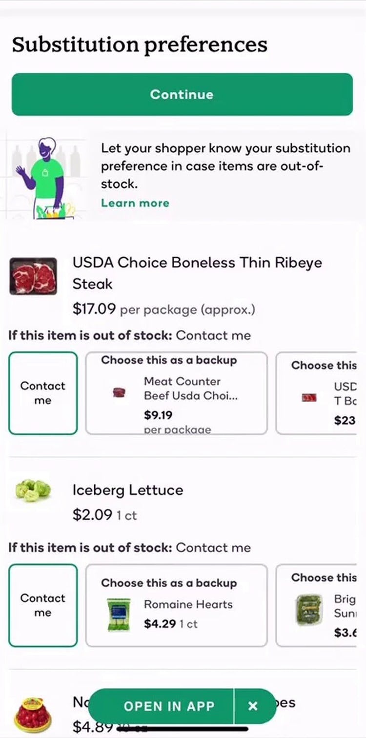
At the same time, users often require additional control over the specific substitutions for out of stock items, whether due to allergies and food sensitivities, or simply personal preferences, and in testing online grocery sites often resorted to elaborate interfaces allowing users to select substitutions on an item-by-item basis.
“I’m not going to go through every item here cause this site is pretty slow…It makes me feel like I would either have to go through every single item or just not order from there.” This user on Instacart’s mobile site had strong preferences for her selected grocery items and didn’t want any substitutions, but the site’s default behavior was to replace items with the “best match”. In practice, the need to select “Preferences” for each item in the cart (first image) and then “Don’t replace this item” on a subpage (second image), exacerbated by poor site performance, led her to abandon her order. Time-consuming and tedious substitution selections can be a deal breaker for some users.
However, despite offering users more control, the process for selecting substitutions often resulted in frustration and difficulty for users, who were often overwhelmed at the prospect of “shopping all over again” for substitutions.
In reality, many users are interested in either substituting all items or not substituting any items — some users will be less picky about their items, and thus be willing to accept a substitute, while others will not want any item they didn’t select themselves.
Practically, selecting substitution preferences quickly becomes unwieldy when users are forced to select, for example, “do not substitute” (or consider individual substitution suggestions), for each individual item in their cart.
While users may be willing to set preferences for individual grocery items for small grocery orders (e.g., less than 10 products), this quickly becomes more and more tedious as the size of the order grows.
Indeed, whether presented in the cart or later in the checkout process, users in testing were often daunted at the prospect of selecting substitutions on an item-by-item basis.
In practice, users who have navigated to the cart or begun the checkout process have likely already mentally “moved on” from the product-exploration phase and are instead more focused on completing the checkout process. Requiring them to reorient themselves from checkout details — delivery or pickup information, billing and payment — back to considering product details will for many users feel like they’re being forced to “tell the site twice”.
Consider Asking Users to Select Substitutions Only When Items Are Truly at Risk of Being Unavailable — or Actually are Unavailable
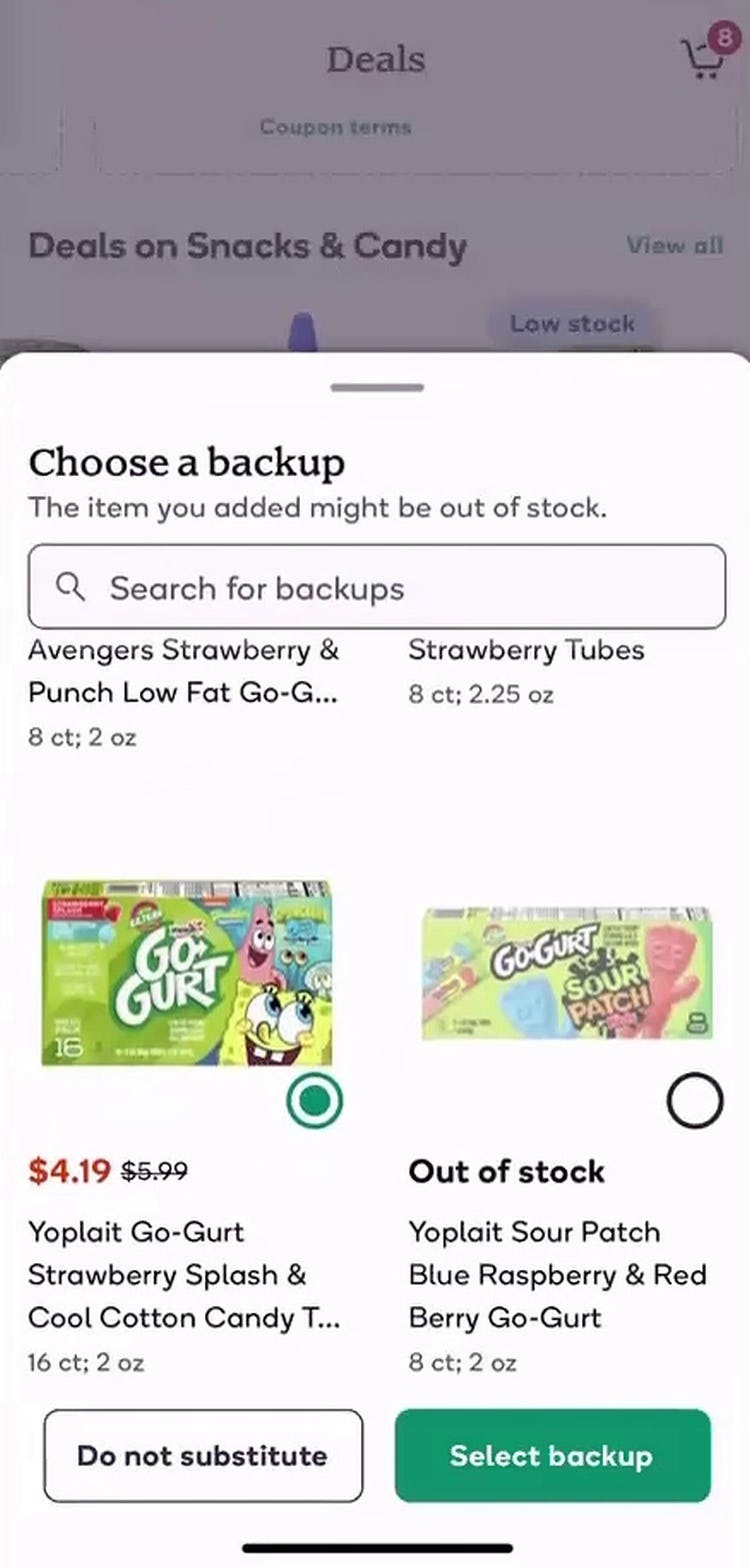
Considering the time and effort it takes users to consider grocery substitutions, it’s worth reassessing the value in asking users for their preferred substitute for every item in their cart.
As another user from testing stated, “I make enough decisions in my life. I don’t need to make 17 hypothetical grocery decisions when I don’t know [if they’re out of stock]”.
Naturally, this input only becomes valuable when the user’s original item turns out to be unavailable — in the more likely scenario that it is, in fact, in stock, this information will go unused, making its entry an unnecessary requirement.
In practice, grocery sites can consider alternatives that require this information of users only when truly necessary.
For instance, before users get to the cart in preparation of finalizing their order, sites can ask users if they’d like to substitute for an item while they’re shopping — but only when the item is known to be low in stock at the user’s selected location.
In doing so, sites can prevent users from becoming overburdened when they get to the cart to finalize their order.
Of course, this solution requires integrating real-time (or near real-time) store stock updates with the site’s online ordering system, which can be a sizable investment.
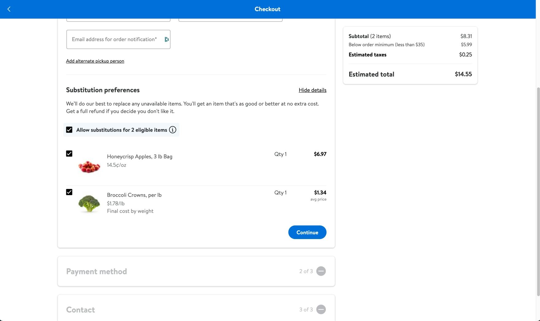
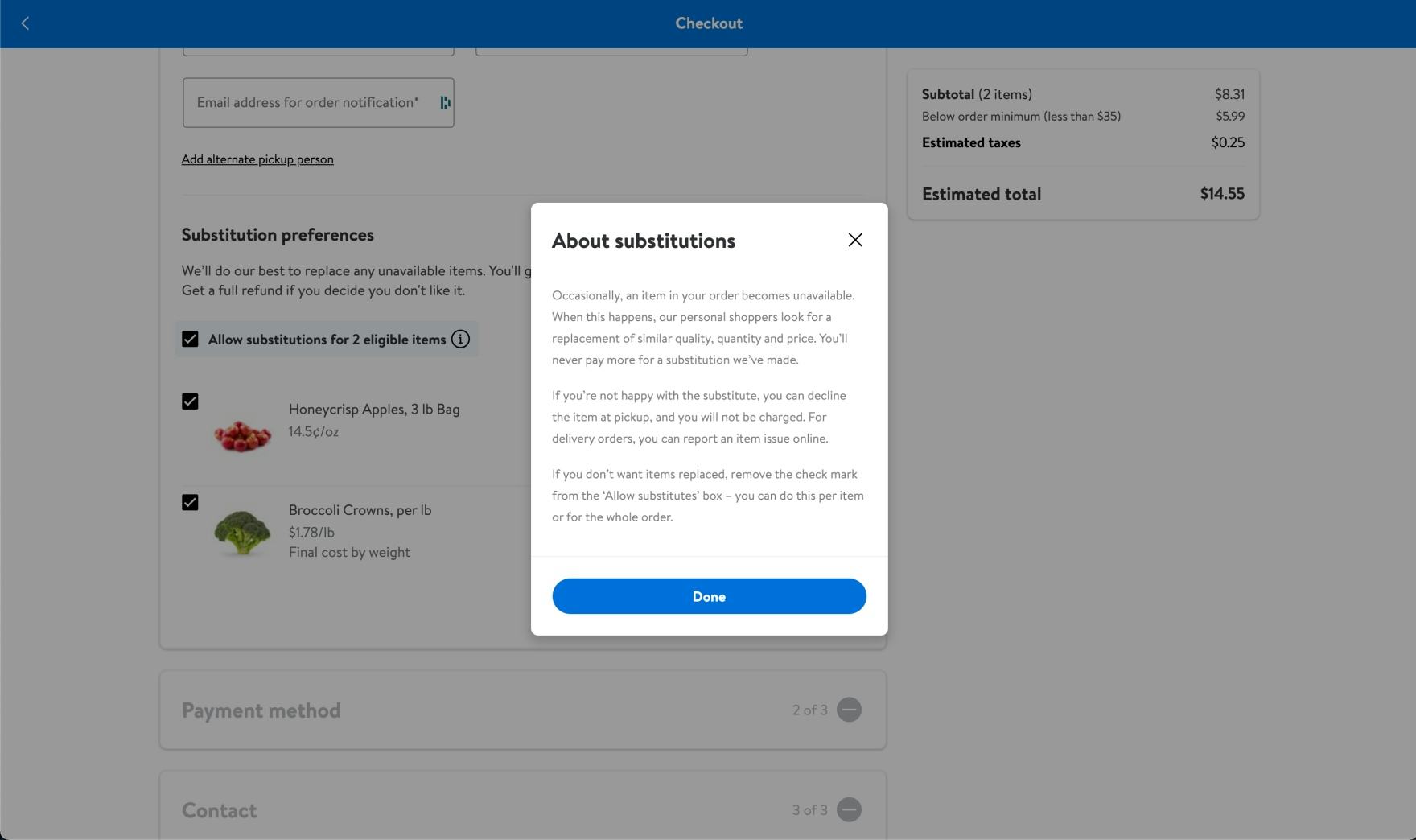
Following user testing, Walmart’s updated substitutions flow no longer allows users to select specific substitutions, instead allowing users to opt into or out of substitutions (first image). If users are not happy with the substitute items, they can refuse them or accept a refund (second image).
Another possible solution is to only integrate the substitution approval postcheckout, corresponding with users if their items turn out to be unavailable while their order is being fulfilled.
While not verified in testing, many users volunteered a preference for this option when it was presented alongside others.
For instance, one shared her past experience with another grocery delivery service: “When they’re out of [an item] they call me when my pickup is ready, and then they tell me what they’re out of, and I can just tell them what I need them to substitute.”
Postponing the decision of selecting an individual substitution prevents users from getting sidetracked during checkout and only requires their input when it is truly required.
Streamline Grocery Substitutions by Allowing Users to Set a Global Preference
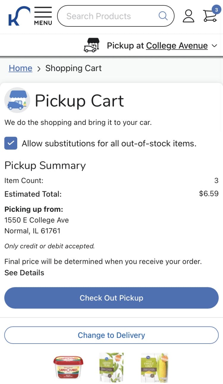
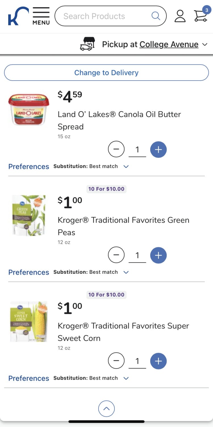
Within the cart on Kroger’s mobile site, the default substitution preference is to replace with the “best match”. Users can opt out of substitutions for all items with a single tap (first image) or decide on an item-by-item basis (second image). For users who don’t want any substitutions, the ability to change this preference for the entire cart saves a huge amount of time and effort.
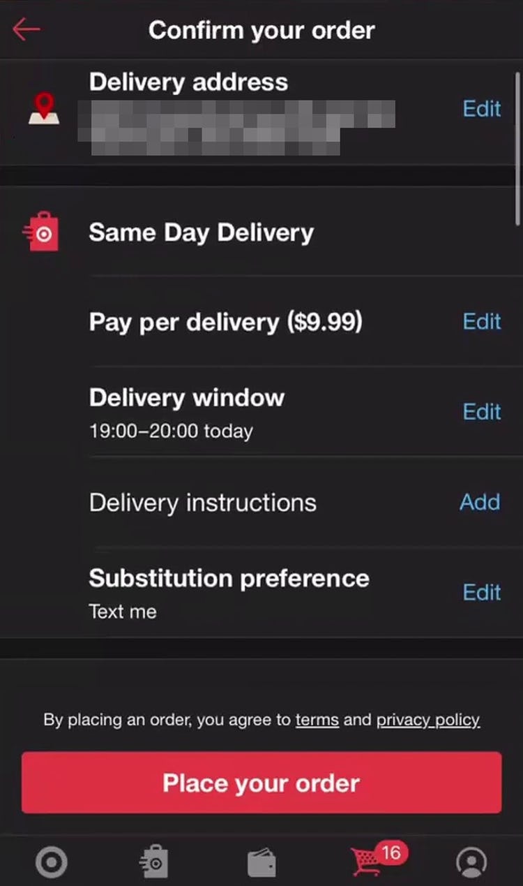
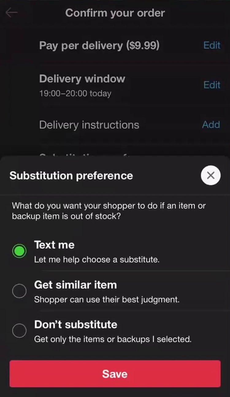
“Oh, that’s cool that you can change how to get a substitution preference…So it’s you can choose, shopper can choose, or just don’t substitute at all. That’s nice. I feel like I haven’t really seen that.” This user shopping on Target’s mobile app appreciated the ability to control how substitutions were handled for her order, which appeared at the very end of the checkout process (first image). Users who want control over particular substitutions are able to do so, including postcheckout via text message (second image). However, having the global substitution preference at the very end of checkout would mean that users who look for this option in the cart may not be aware of it.
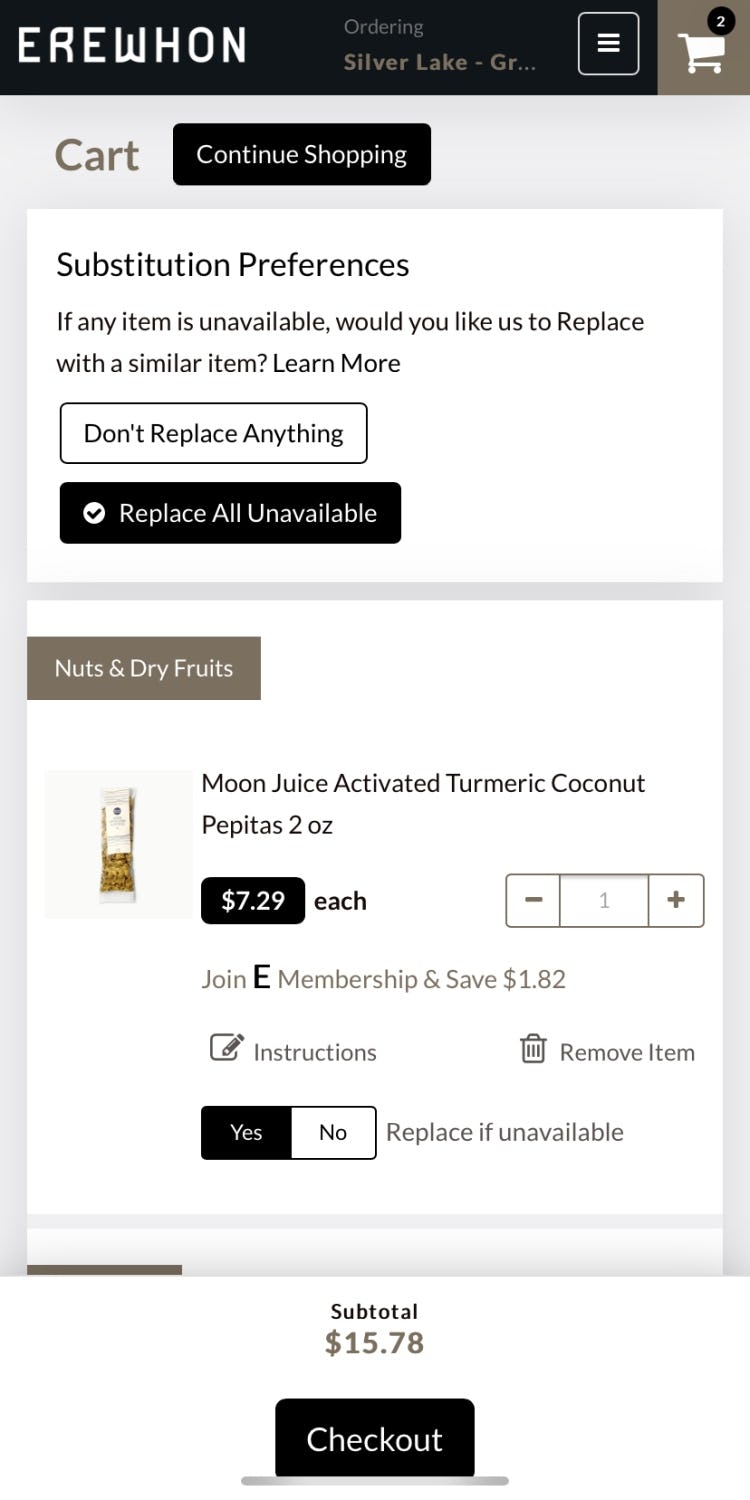
Another solution to save users the effort of making the same selection for each individual item, sites can allow users to make a single global selection to apply to all items in their cart (e.g., “do not substitute anything out of stock”), along with allowing users to choose substitution preferences on an item-by-item basis.
This addition allows users maximum flexibility in selecting substitutions, whether they want them only for certain items or for all (or none) of the items in their cart.
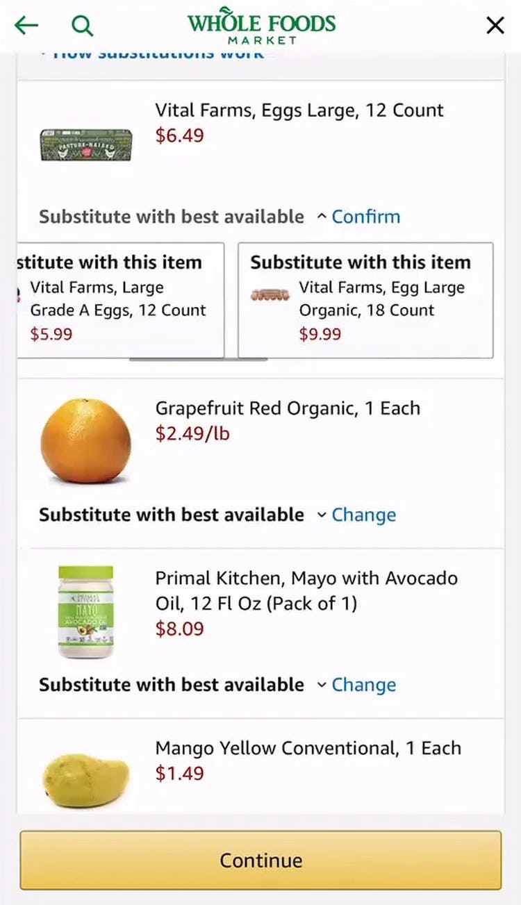
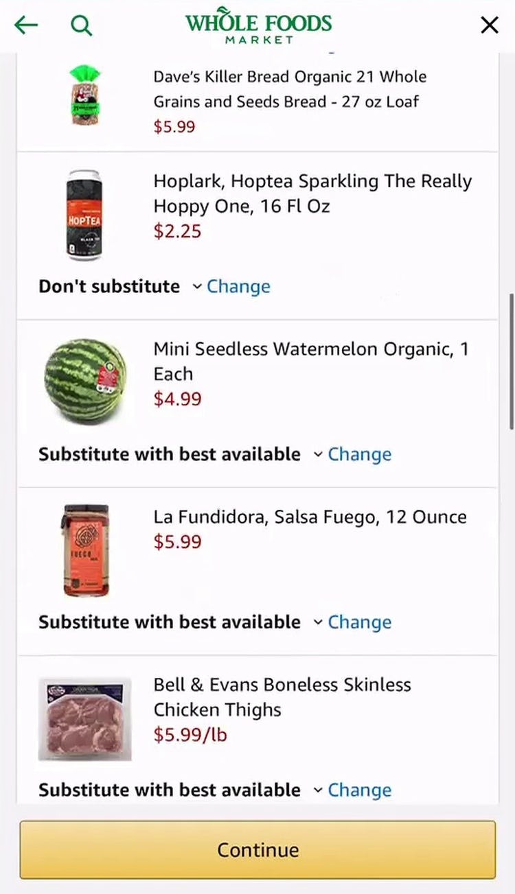
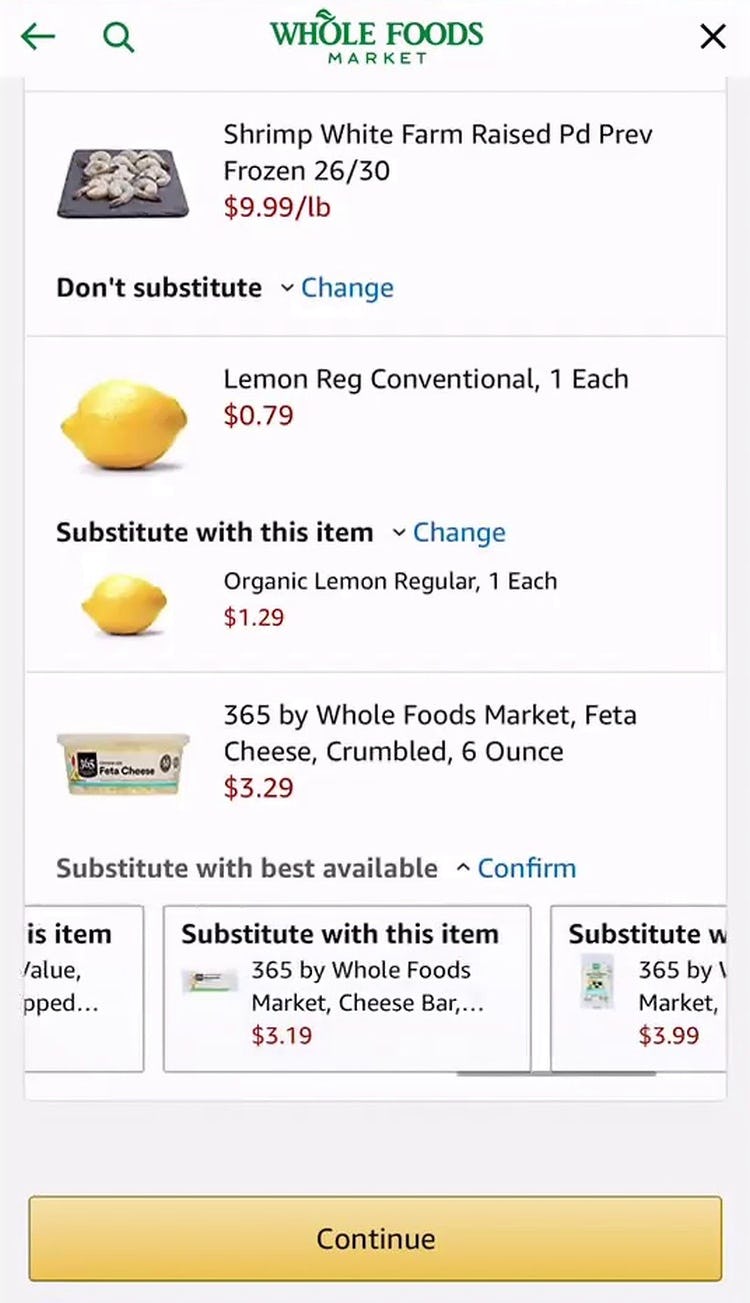
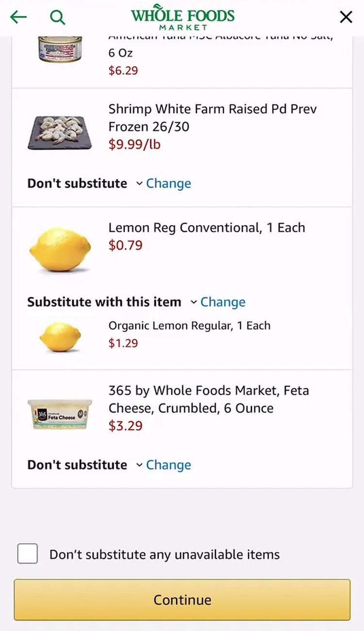
“‘Don’t substitute any unavailable items.’…Oh, I wish that they just made that at the top. I just went through this whole thing, I just went through every item and all of a sudden, this box appeared at the bottom and said, ‘Don’t substitute any unavailable items’. That should have been the first option, I would’ve just clicked that. That’s really annoying…It’s really frustrating. That just popped up.” Another user on Amazon Whole Foods’s mobile site spent more than 10 minutes selecting specific substitution preferences for her entire cart, only to see the “Don’t substitute any unavailable items” checkbox appear at the very bottom of the page. Frustrated, she lamented she would have used this option if it had been available at the outset, “The default is ‘Substitute with the best option’, and my preference would be, if you do not have it, just delete it from my cart. Instead, I did not have that option so I went through one at a time reshopping for substitutes, and then at the bottom it was like, ‘Actually, did you want us to just not give it to you if we don’t have it?’ Yeah, I would love that”.
Additionally, while some sites during testing provided an option for making a global selection, it wasn’t easy to find — in fact, on Amazon Whole Foods the global substitution checkbox only became available at the bottom of the page after users selected “Don’t substitute” for at least one item.
In practice, most users only noticed the checkbox after it was too late and they had already made item-by-item changes. Such a frustrating experience — hiding a desired option that would save much time and effort — will for many users be enough for them to reconsider using the site to place the order, or will negatively influence their perception of the site.
Therefore, this option should be immediately visible by default rather than, for example, appearing only after changing one or several items from the default, or being placed in an inconspicuous location that will be easy for users to overlook.
Selecting Grocery Substitutions Doesn’t Need to Be a Burden
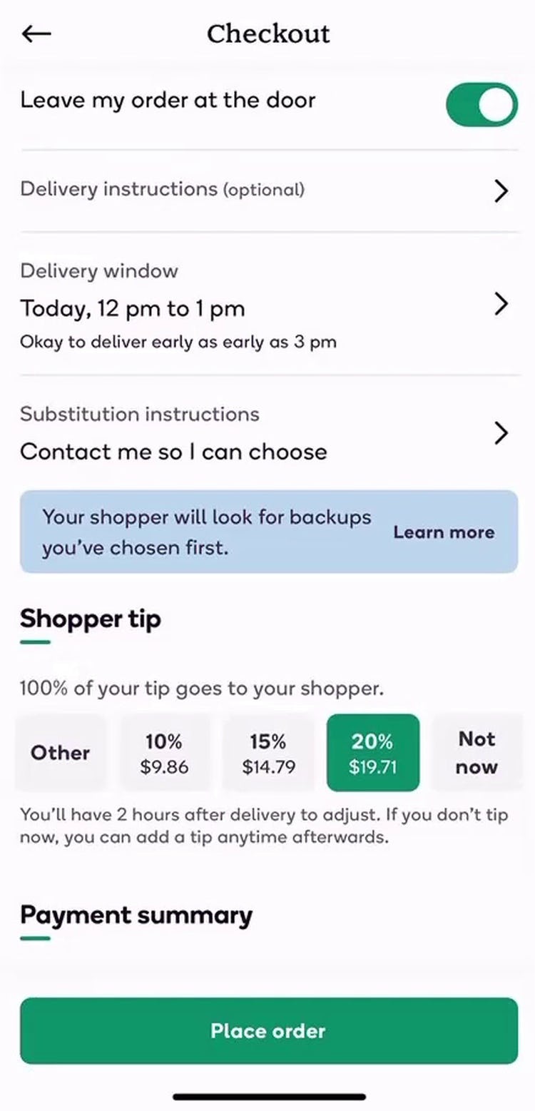
“Oh, this is helpful to tell me how a sub works.” Another user completing checkout on Shipt’s mobile app (first image) found the ability to select a single option to apply to her entire cart extremely convenient, saving her from needing to select this option for each individual item (second image). (However, similar to Target above, having this option only at the end of checkout will fail to meet the expectations of some users.)
Despite being a unique and potentially fraught part of ordering groceries online, sites have significant opportunities to streamline the process of selecting grocery substitutions.
To begin, grocery sites should evaluate how often substitution preferences are actually used and consider ways to ask for this information only when it will likely be needed — such as when a product is known to be at risk of being unavailable, or even contacting users during the physical shopping process if a product turns out to be unavailable.
For users who prefer the same selection for their entire cart — or simply don’t want to consider each individual substitution option — sites should always allow users to select a single global selection for substitution preferences (e.g., “don’t substitute any unavailable items”), and present this option prominently presented in the cart.
By streamlining this tricky aspect of online grocery shopping, sites can keep users from getting bogged down in minute decision-making and help them get through checkout more quickly and easily.
For inspiration on other sites’ implementations and to see how they perform UX-wise, head to the publicly available part of the Grocery benchmark. Here you can browse the Grocery implementations of 5 benchmarked sites.
Getting access: all 383 Grocery UX guidelines are available today via Baymard Premium access. (If you already have an account open the Grocery Study.)

