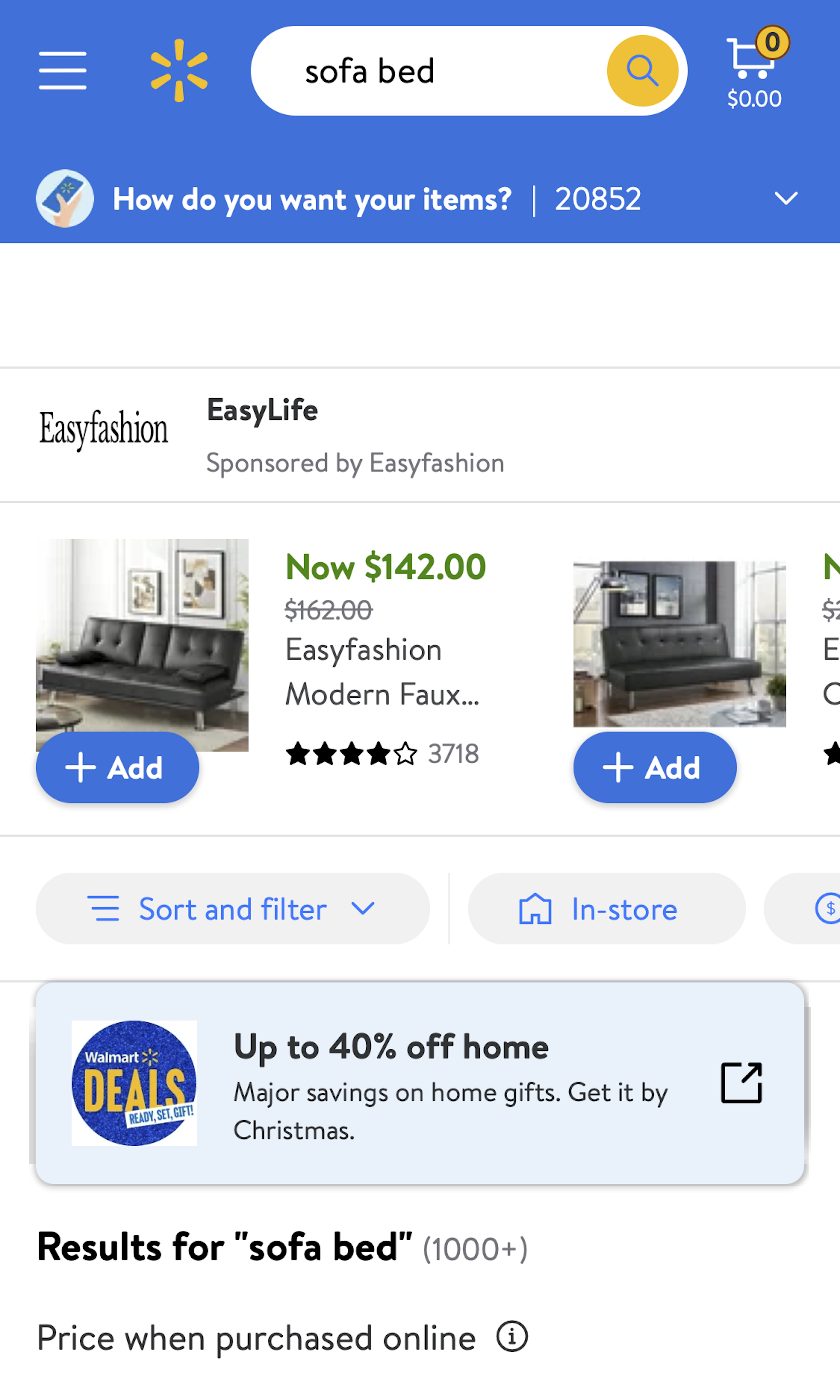
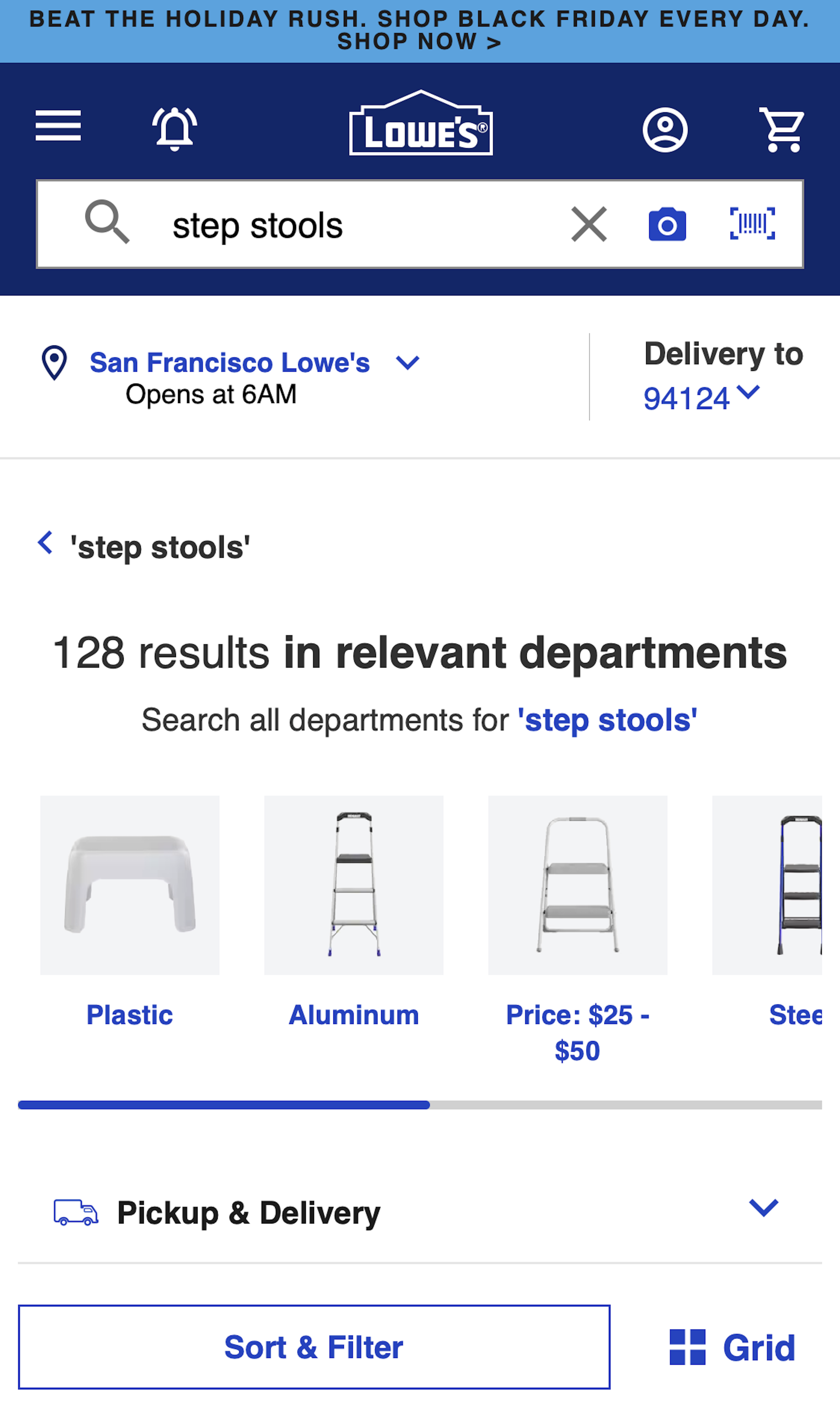
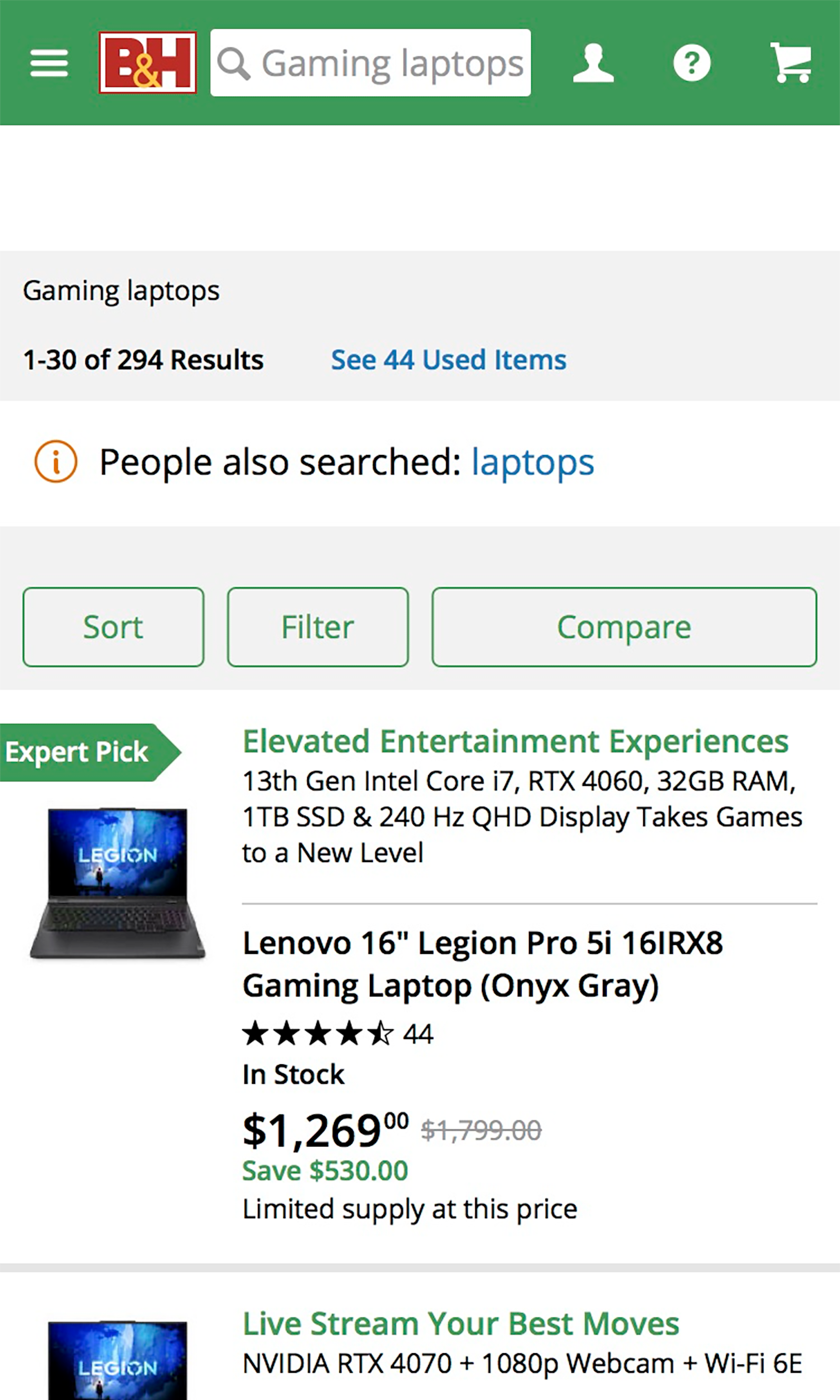
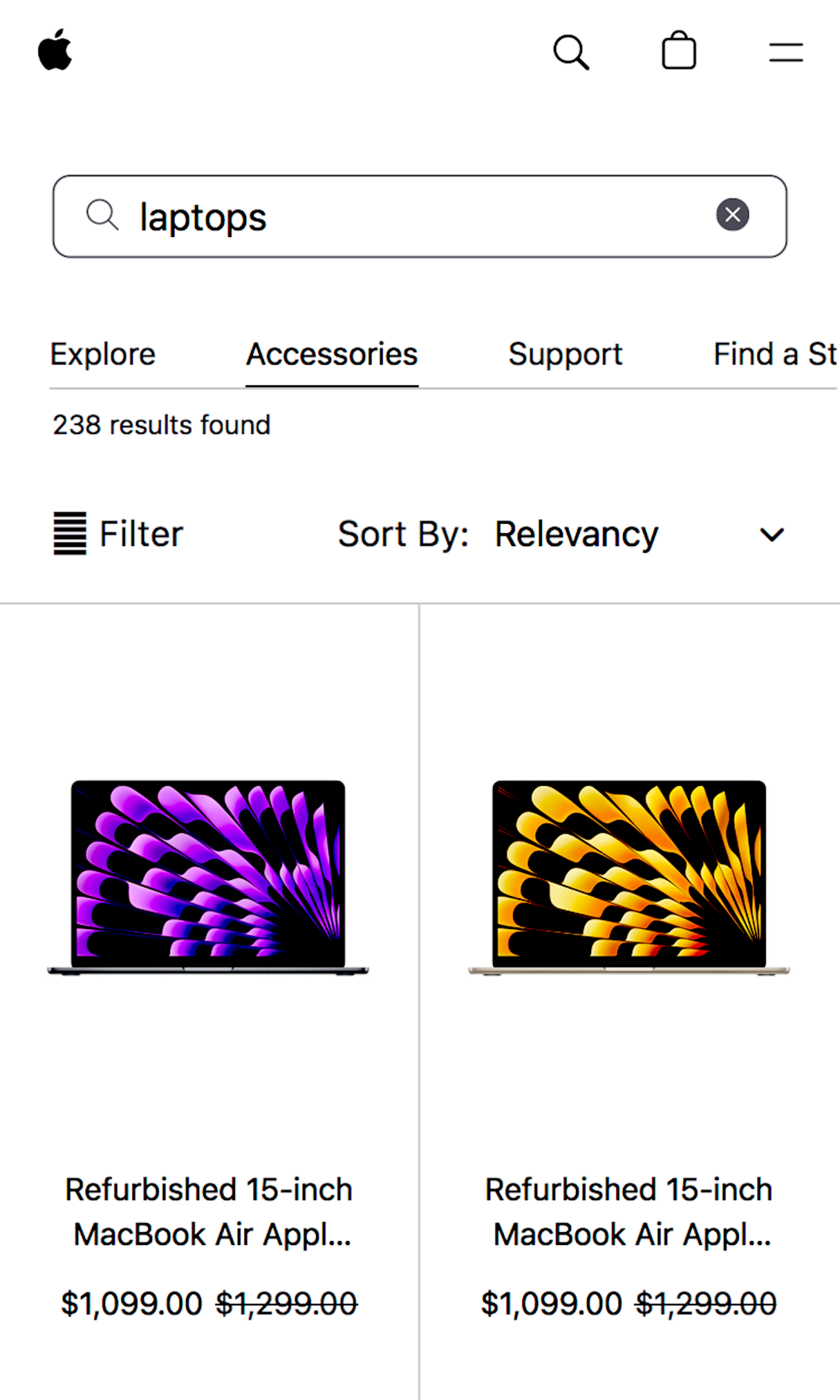
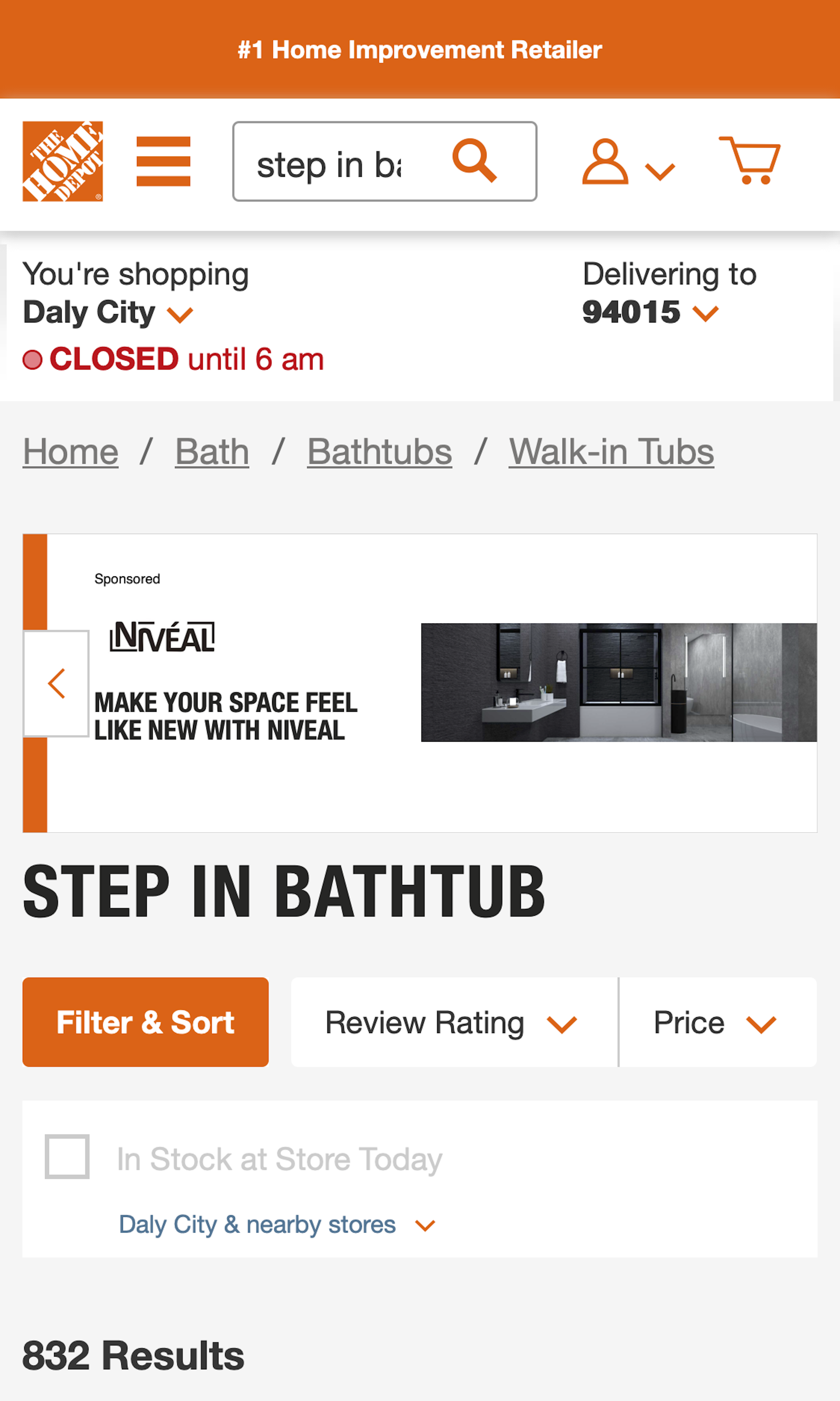
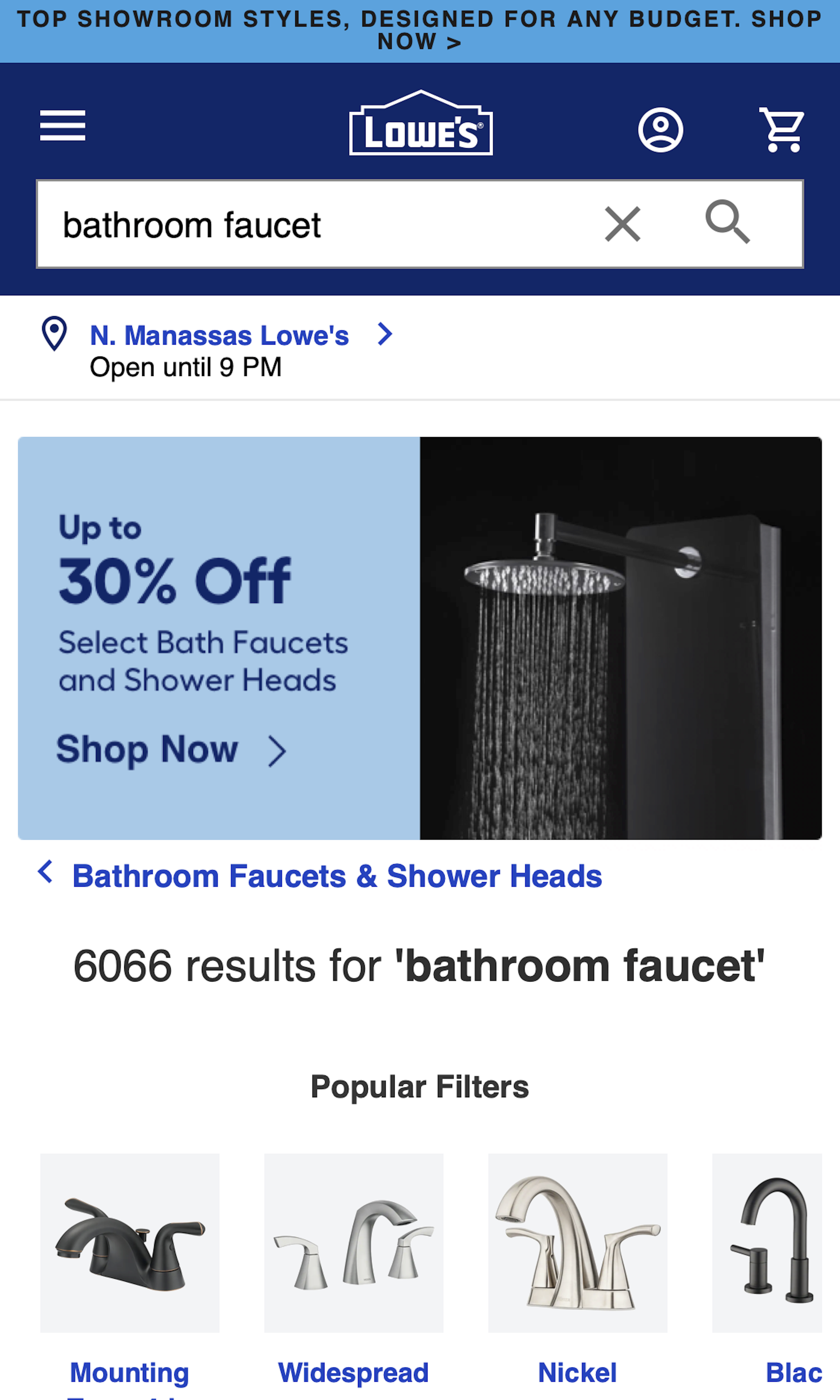
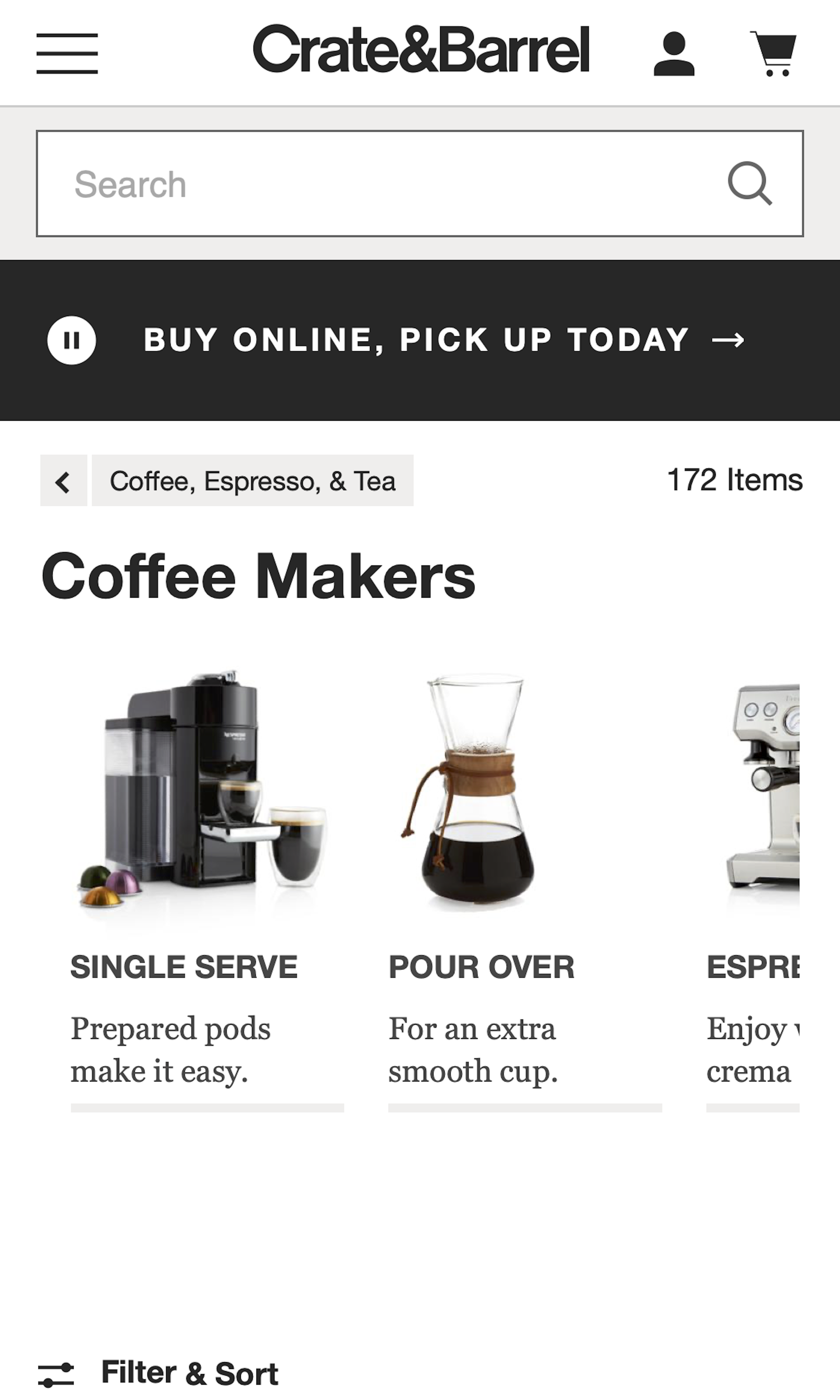
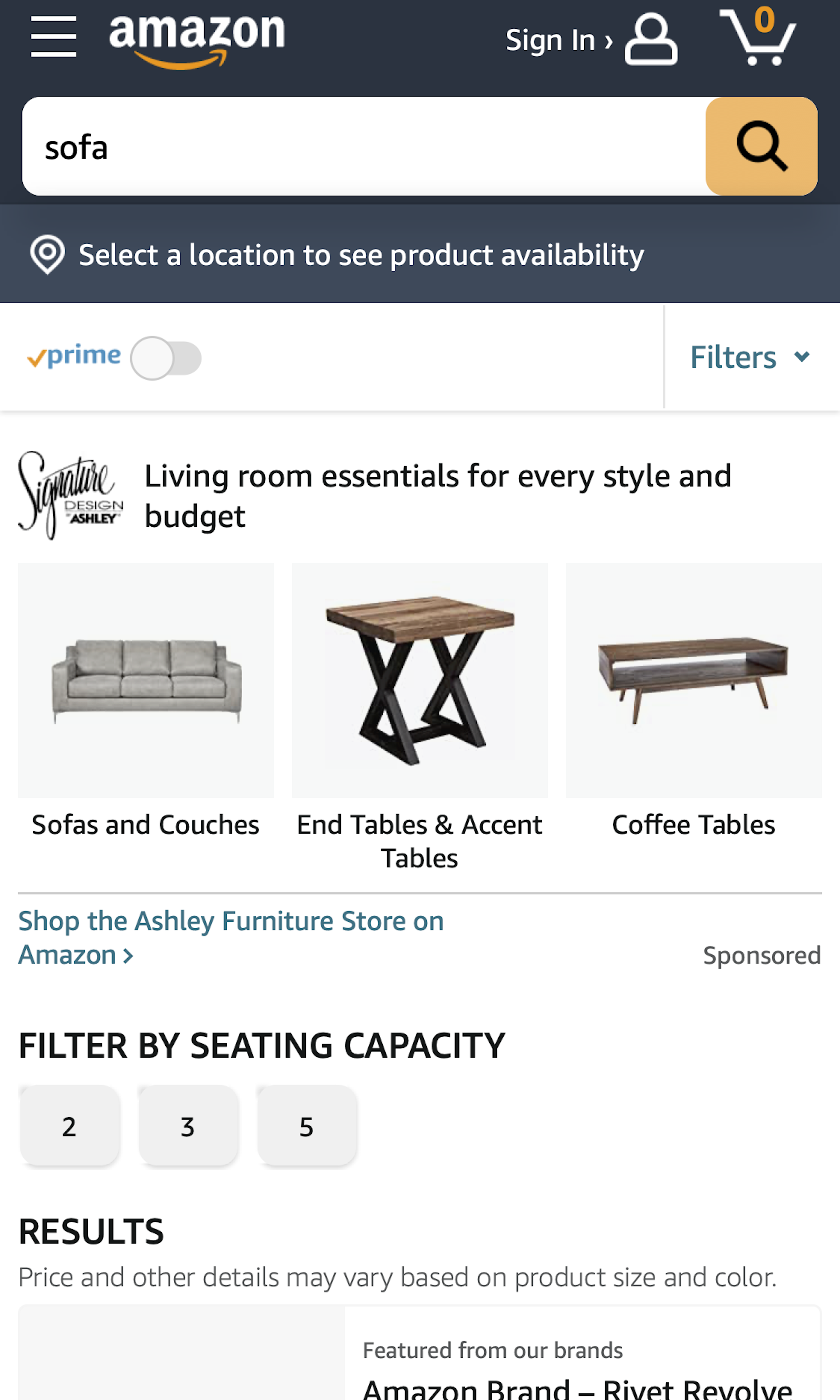
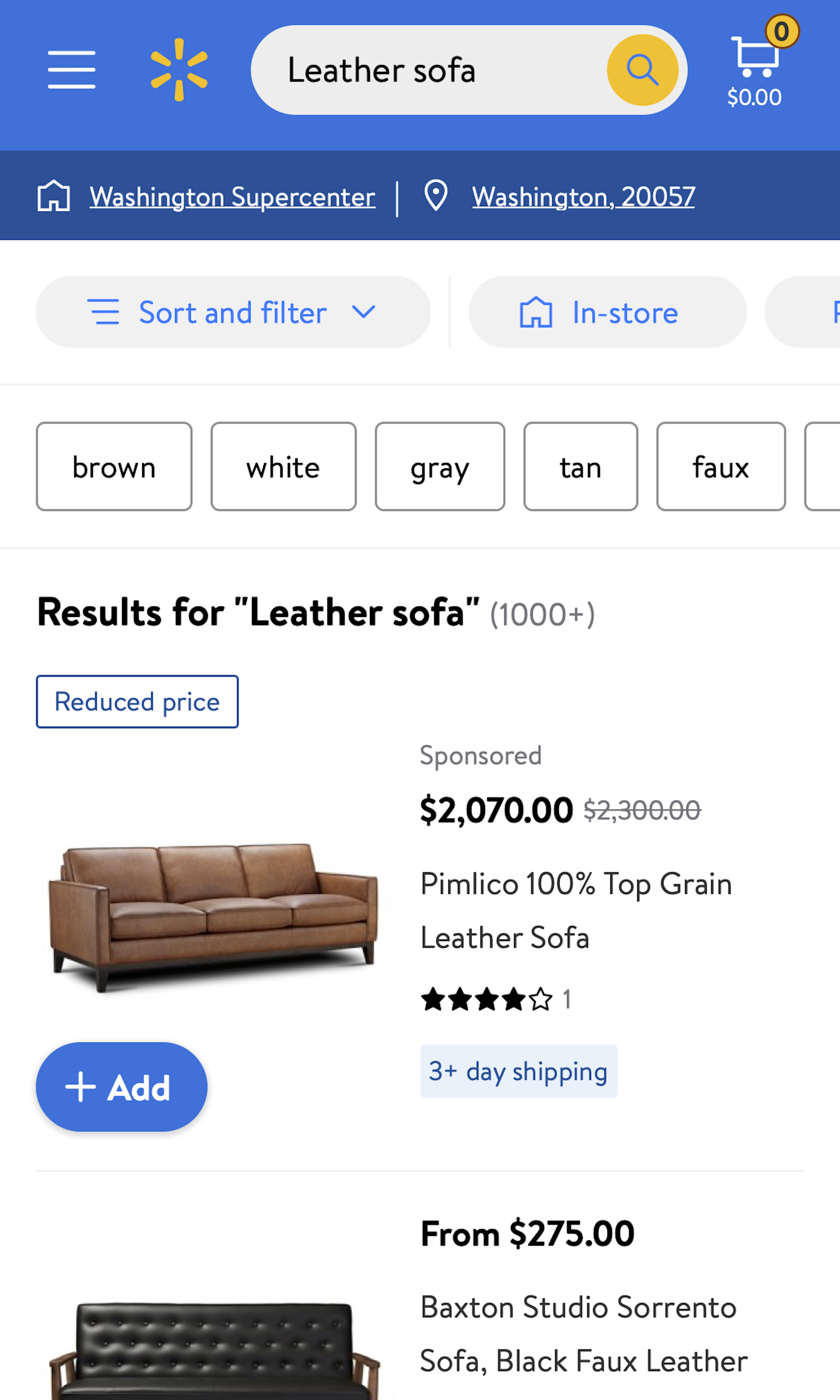
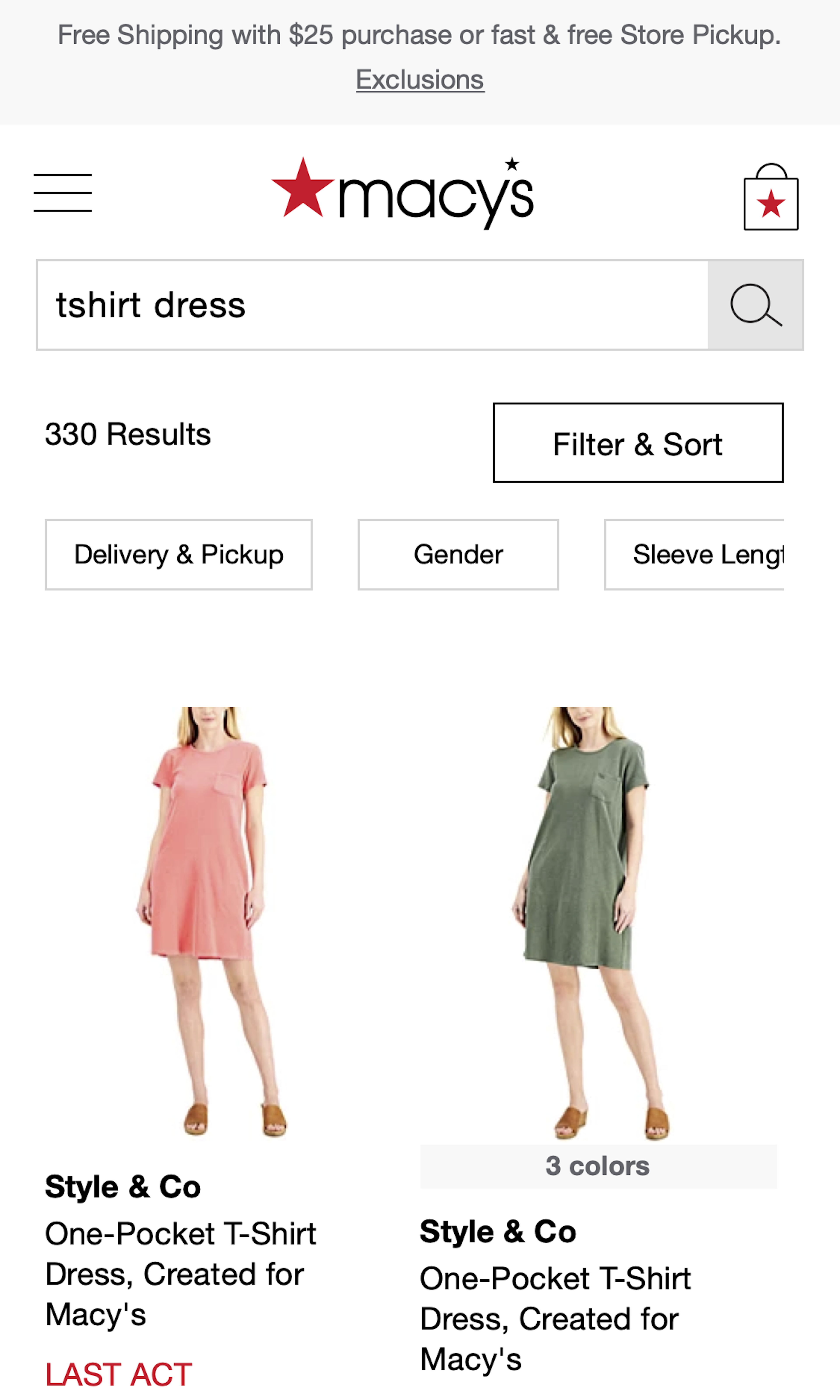
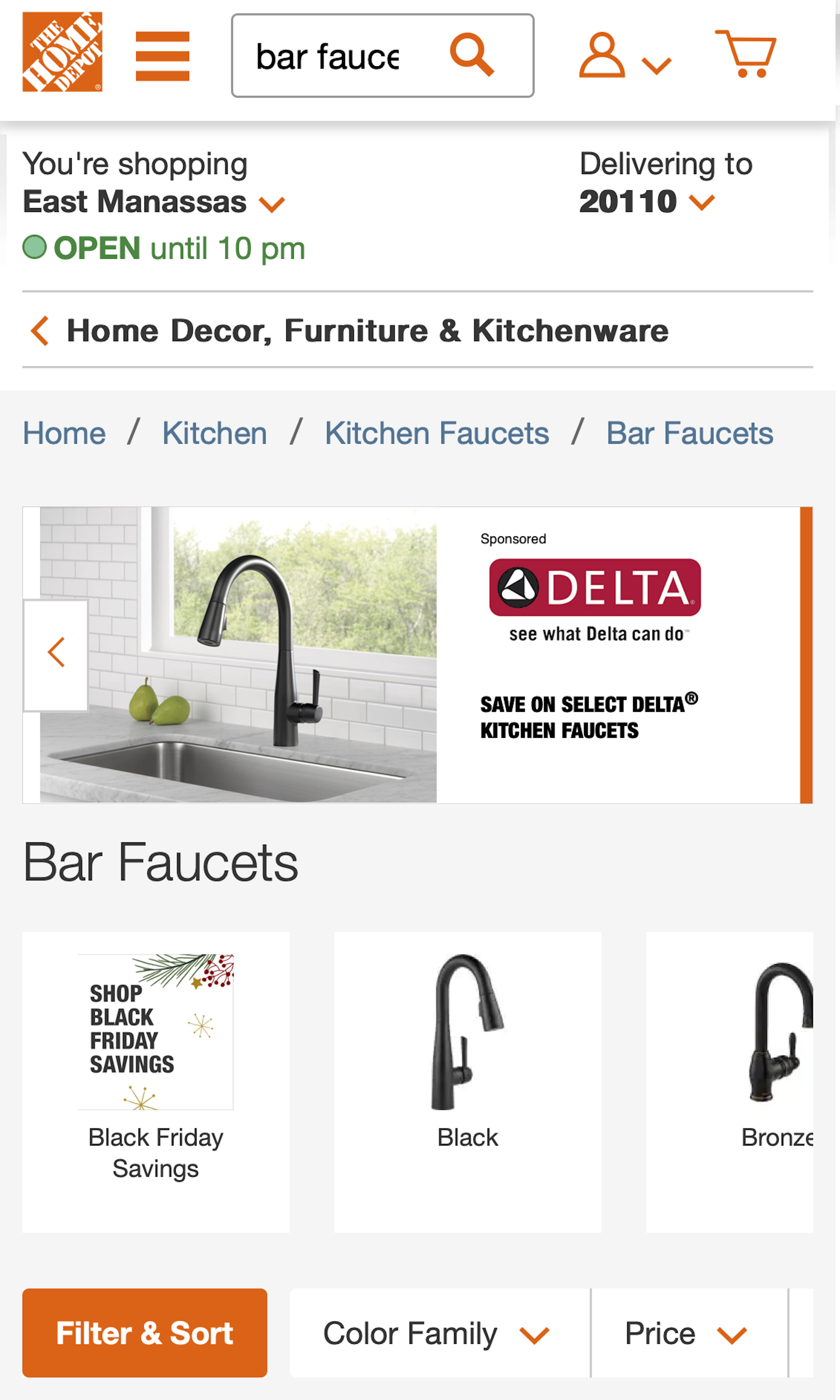
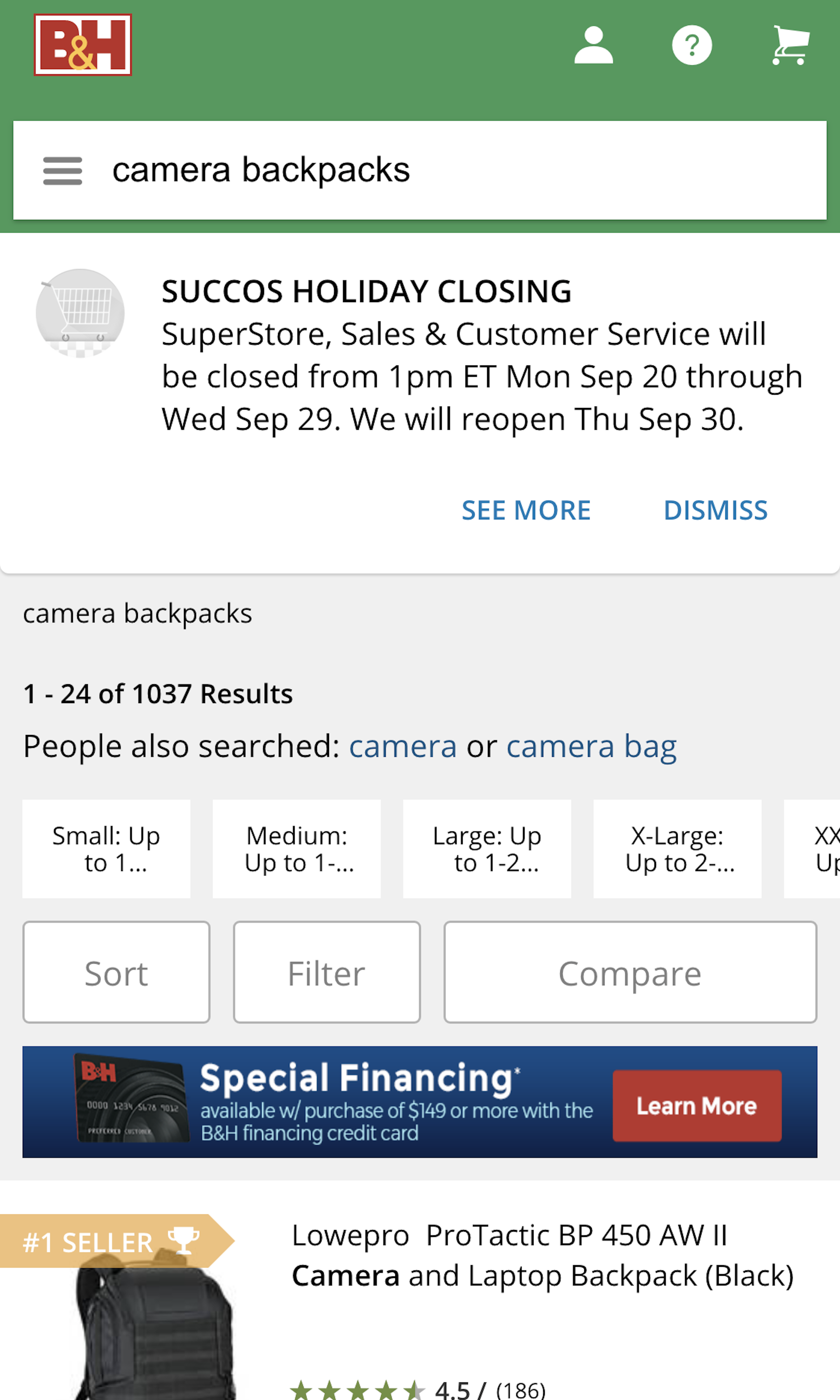
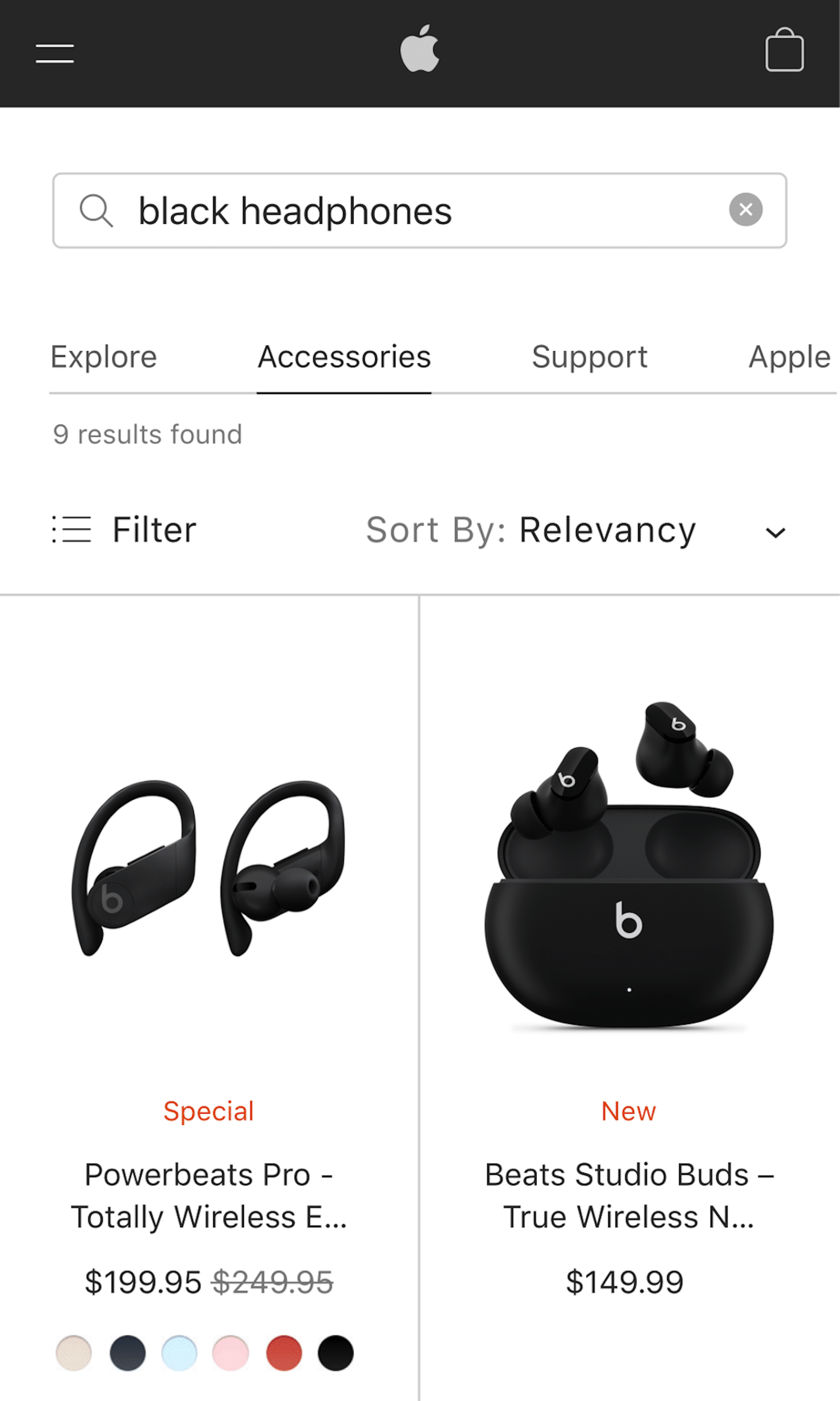
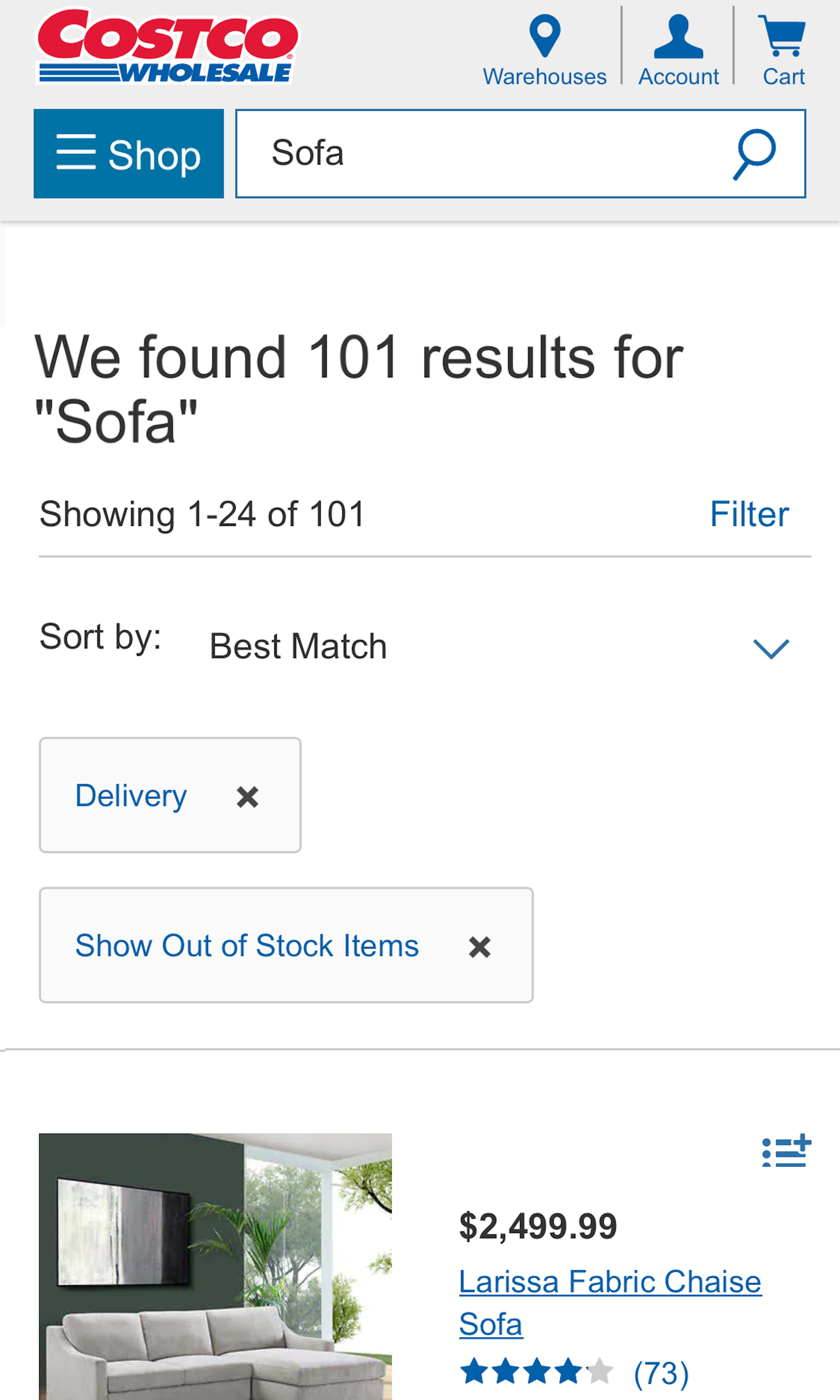
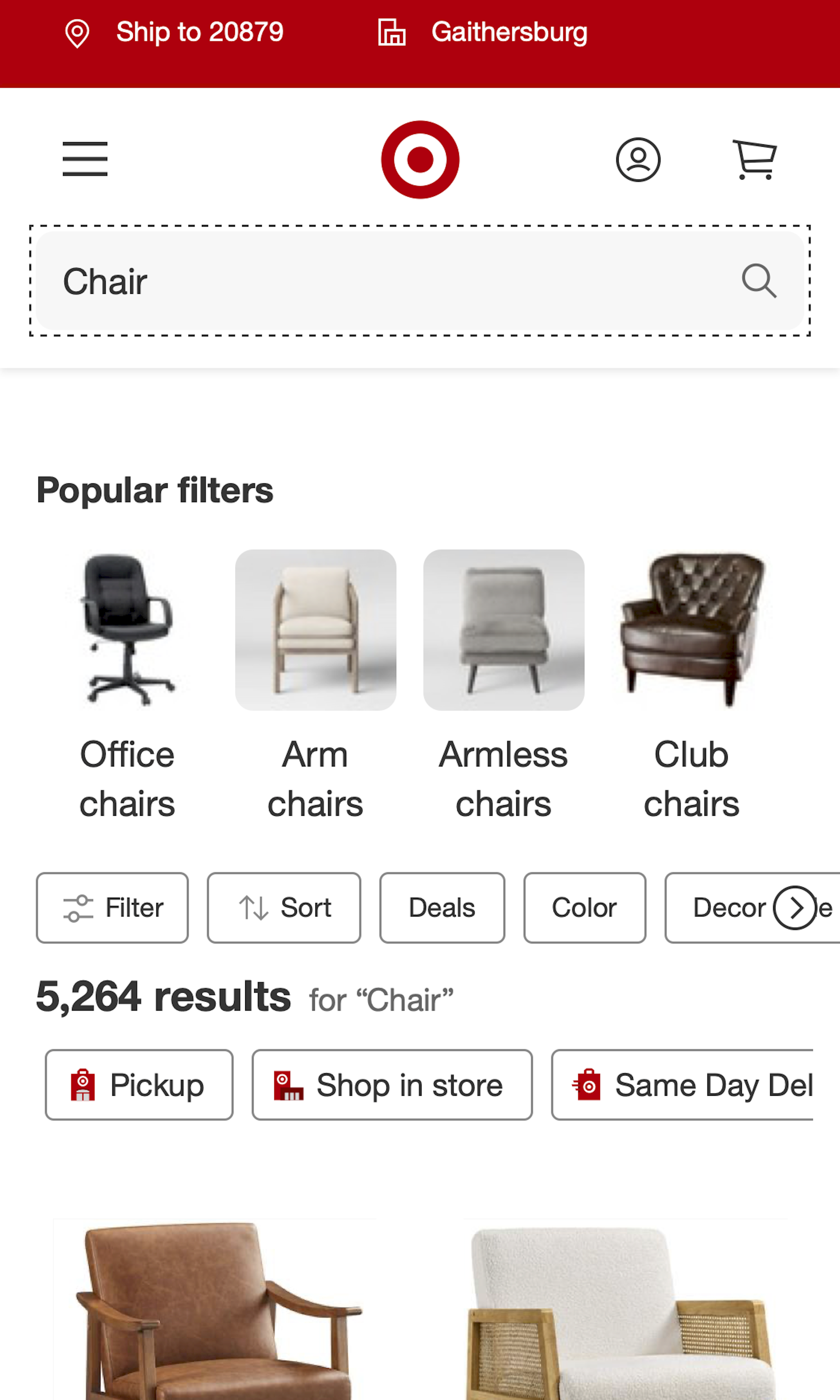
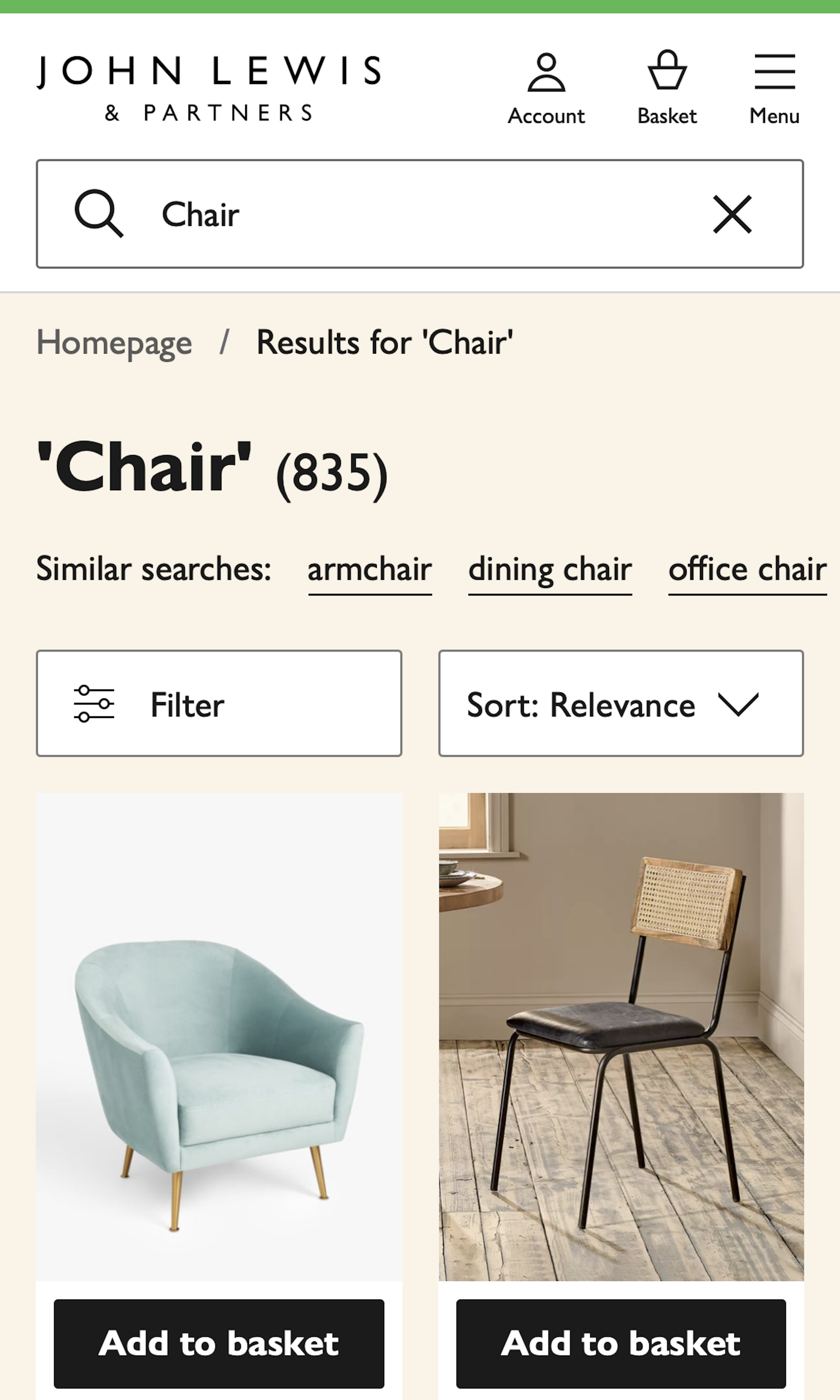
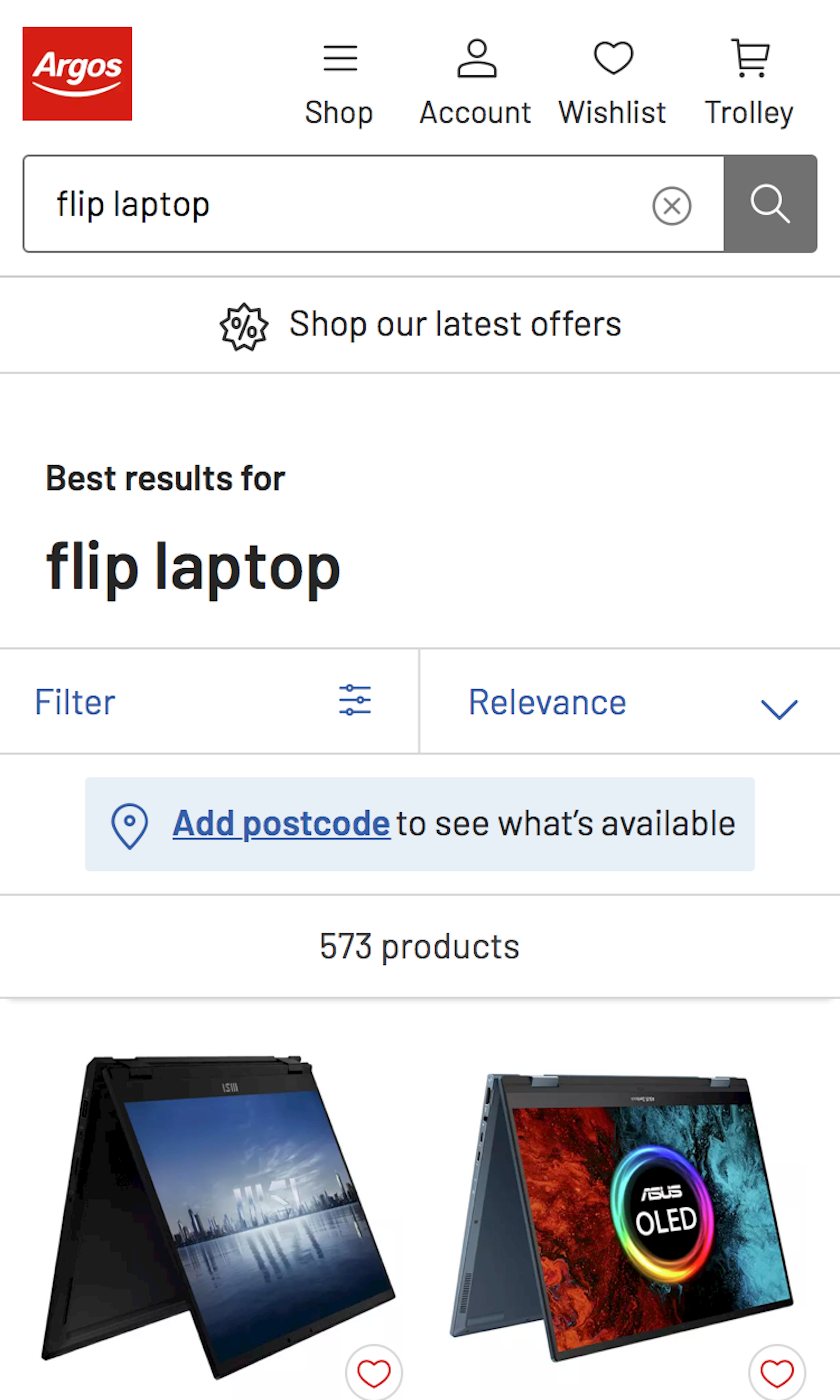
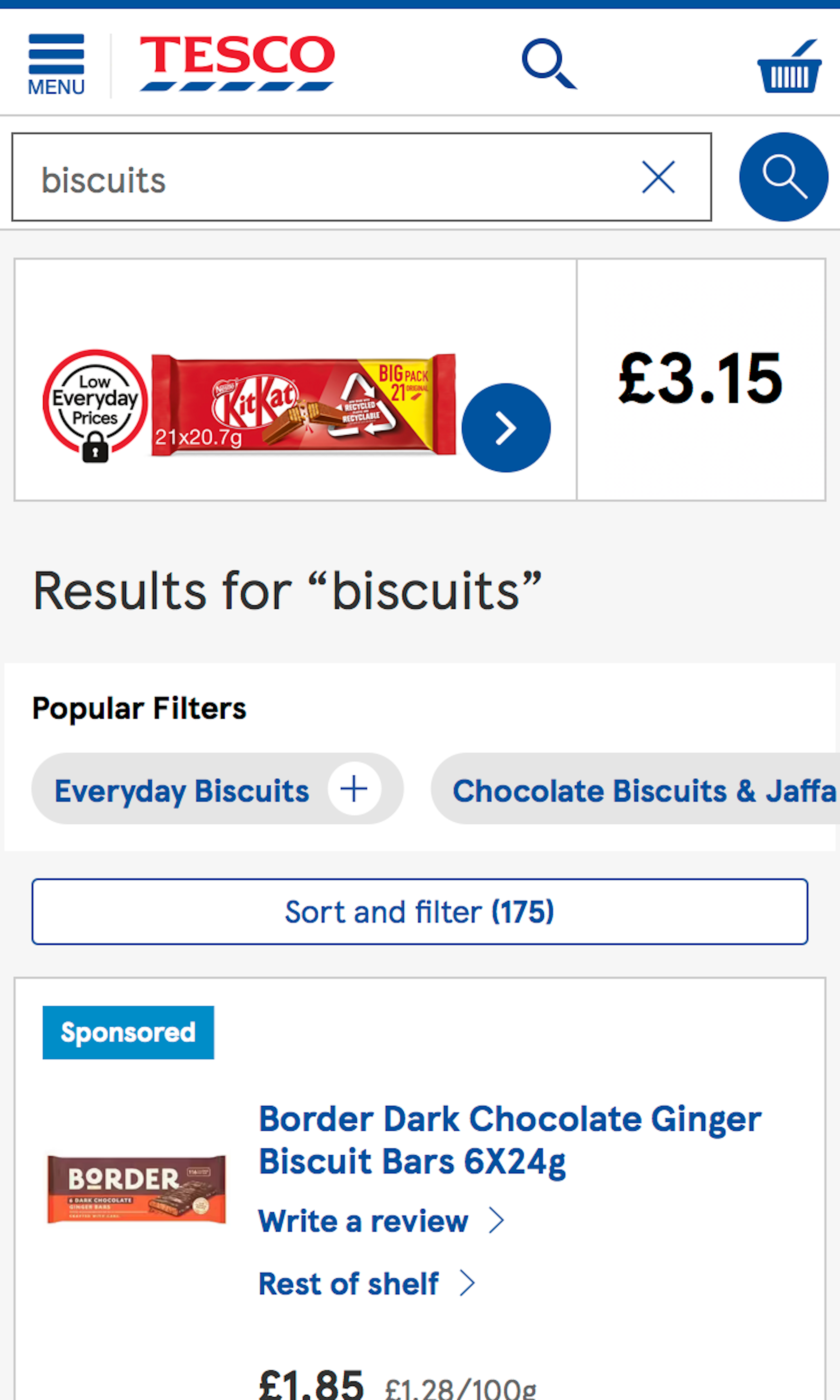
What’s this? Here you’ll find 374 “Mobile: Search Results” full-page screenshots annotated with research-based UX insights, sourced from Baymard’s UX benchmark of 93 ecommerce sites. (Note: this is less than 1% of the full research catalog.)
The mobile Search Results page differs significantly from the desktop results page. In usability testing we see that some of the mobile simplifications often cause issues for users. It’s particularly difficult to achieve the right balance for the product list item design on mobile; on the one hand, ensuring enough information and large thumbnails so users avoid opening irrelevant products, while on the other hand keeping them condensed enough to allow users to establish an overview.
More ‘Search Results’ Insights
-
Desktop Examples: Besides the mobile examples below, we also have 165+ desktop examples of Search Results Page implementations.
-
Learn More: Besides exploring the 92 mobile “Search Results” design examples below, you may also want to read our related article “The State of Mobile Ecommerce Search and Category Navigation”.
-
Get Full Access: To see all of Baymard’s 351 mobile research findings you’ll need Baymard Premium access. (Premium also provides you full access to 150,000+ hours of UX research findings, 650+ ecommerce UX guidelines, and 275,000+ UX performance scores.))
User Experience Research, Delivered Weekly
Join 60,000+ UX professionals and get a new UX article every week.

User Experience Research, Delivered Weekly
Join 60,000+ UX professionals and get a new UX article every week.

Explore Other Research Content

300+ free UX articles based on large-scale research.

257 top sites ranked by UX performance.

Code samples, demos, and key stats for usability.


