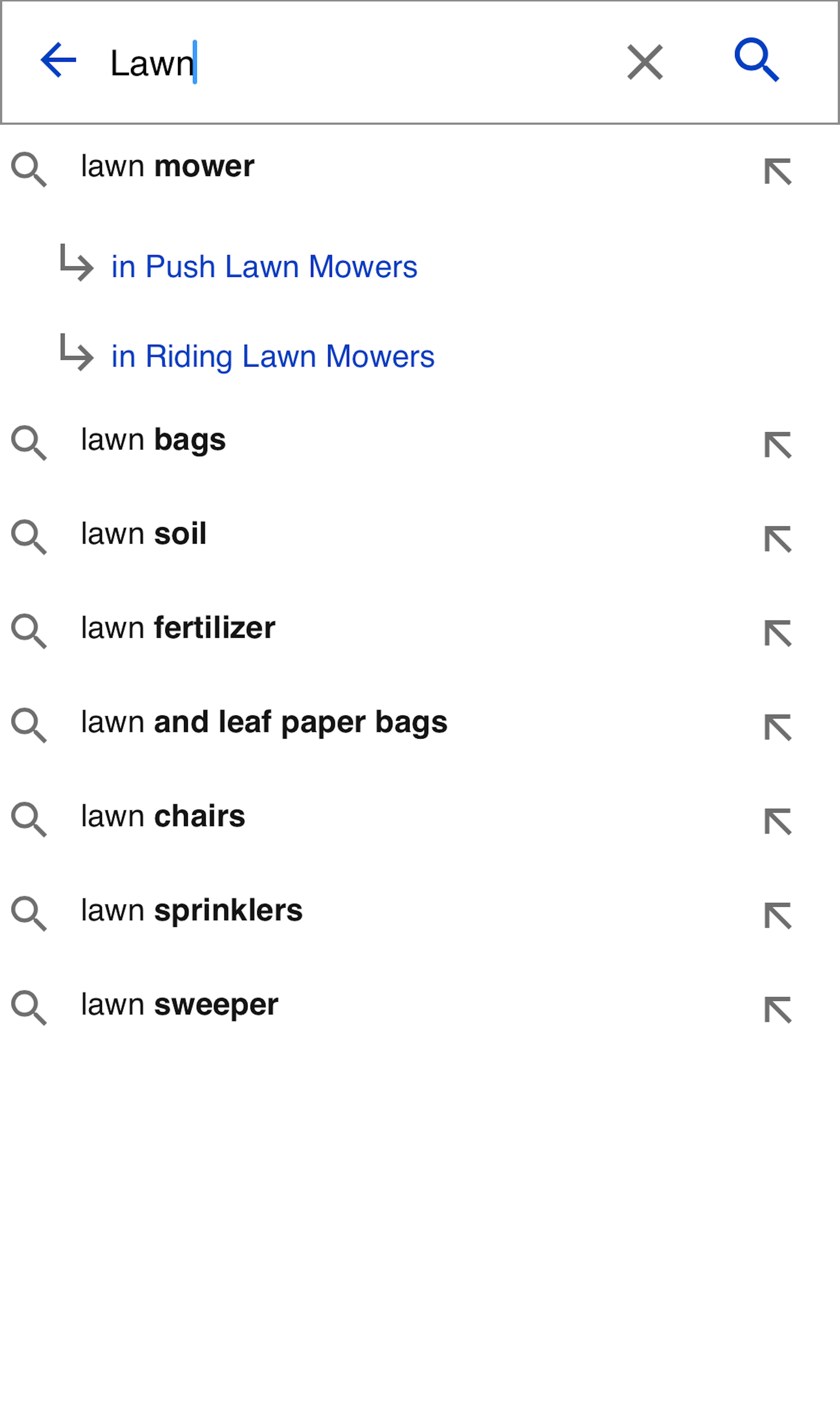
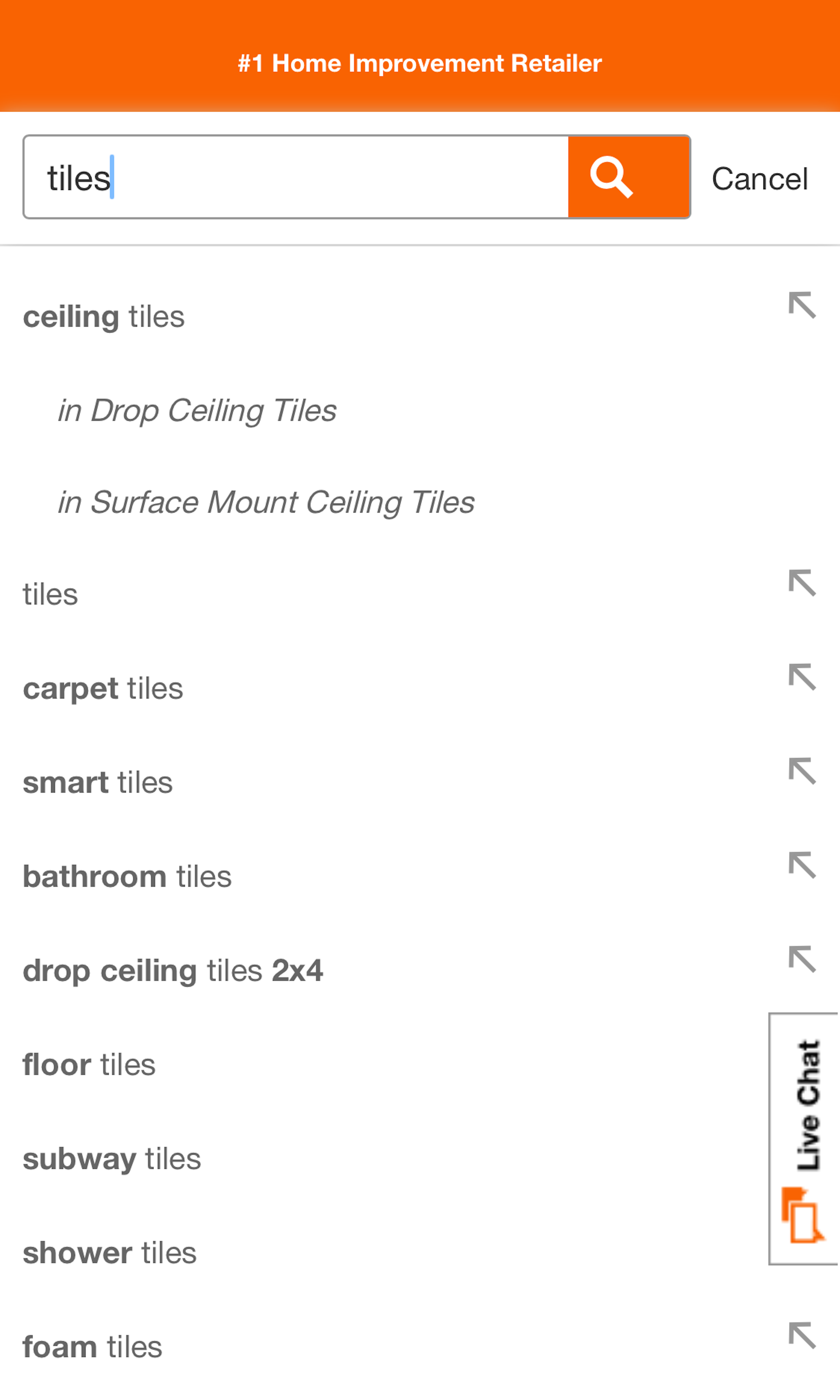
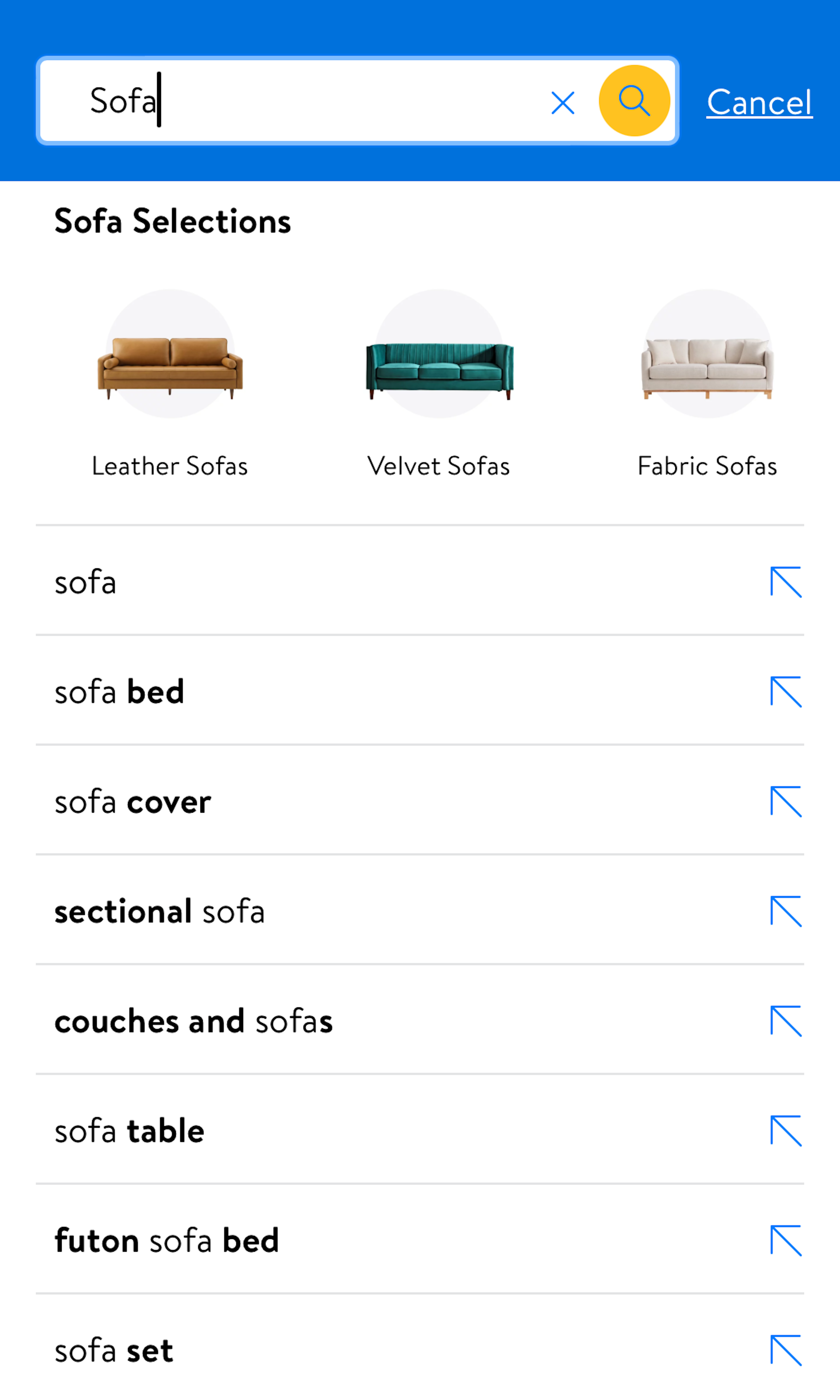
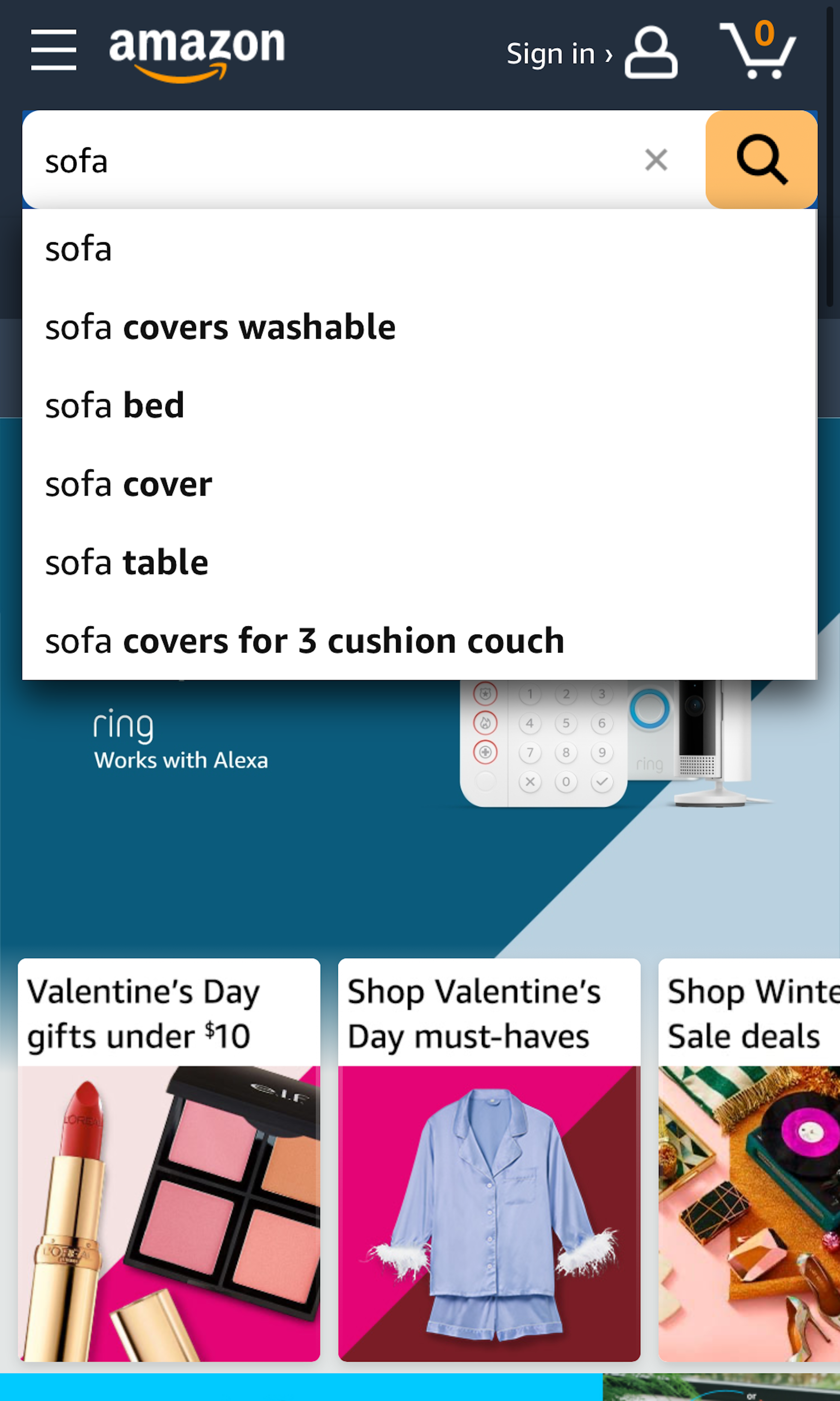
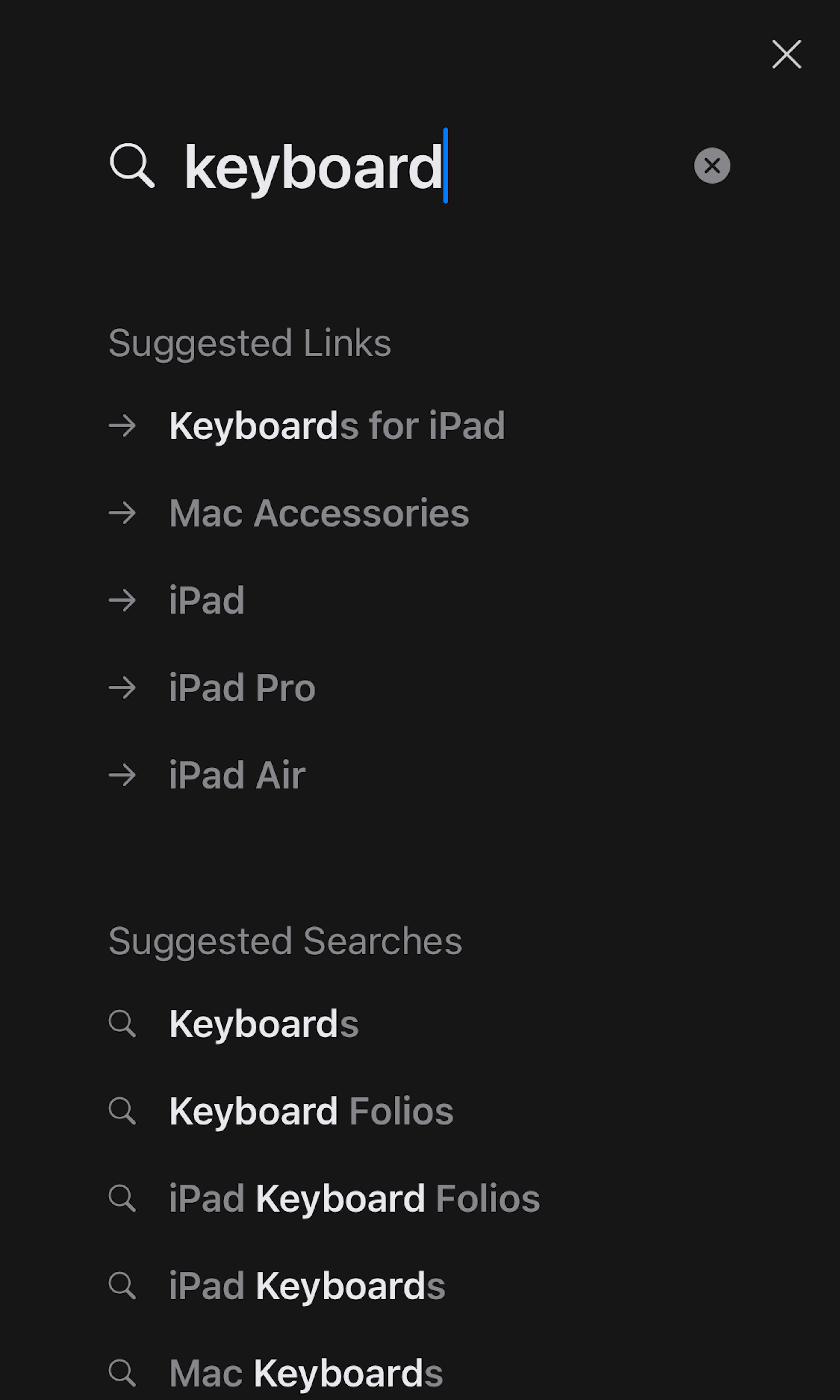
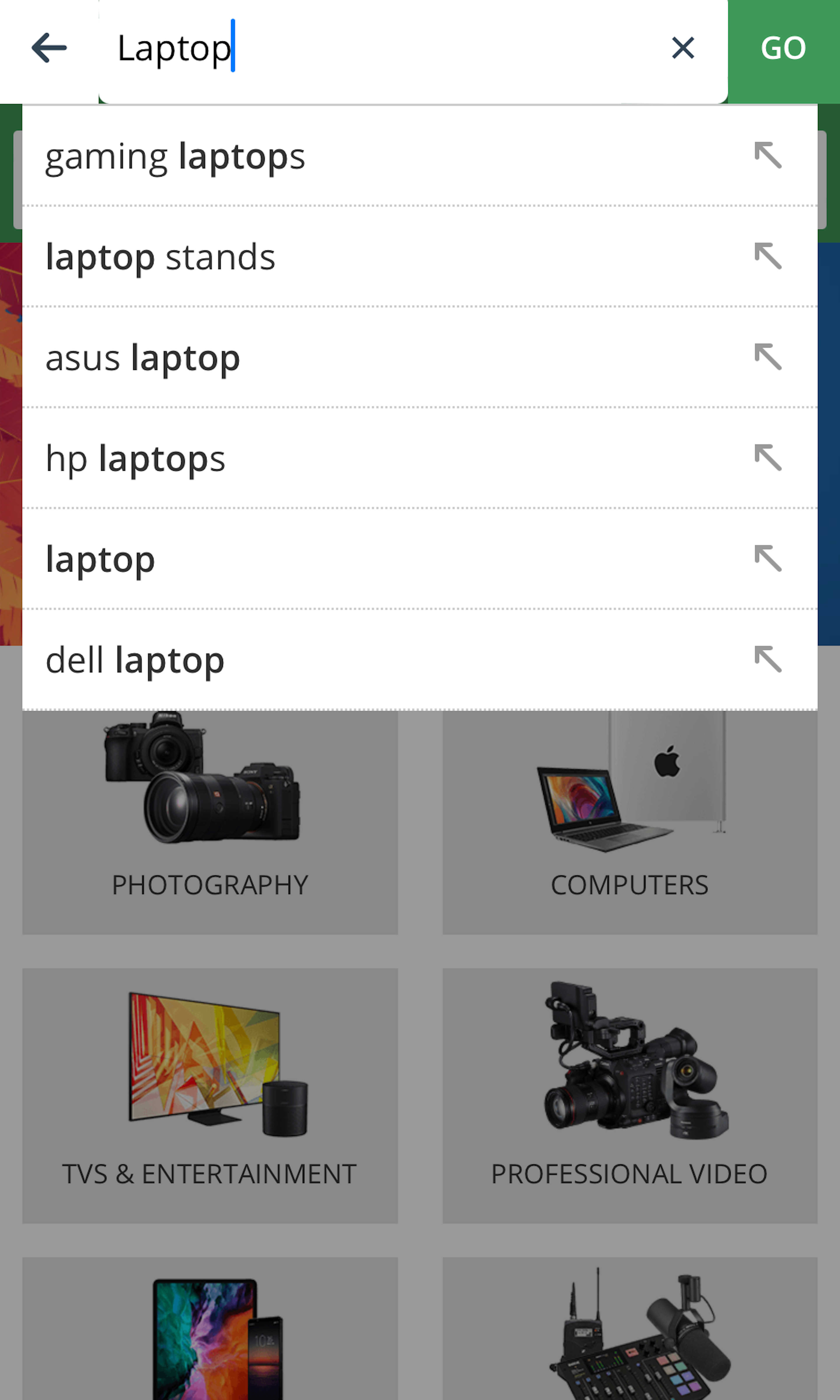
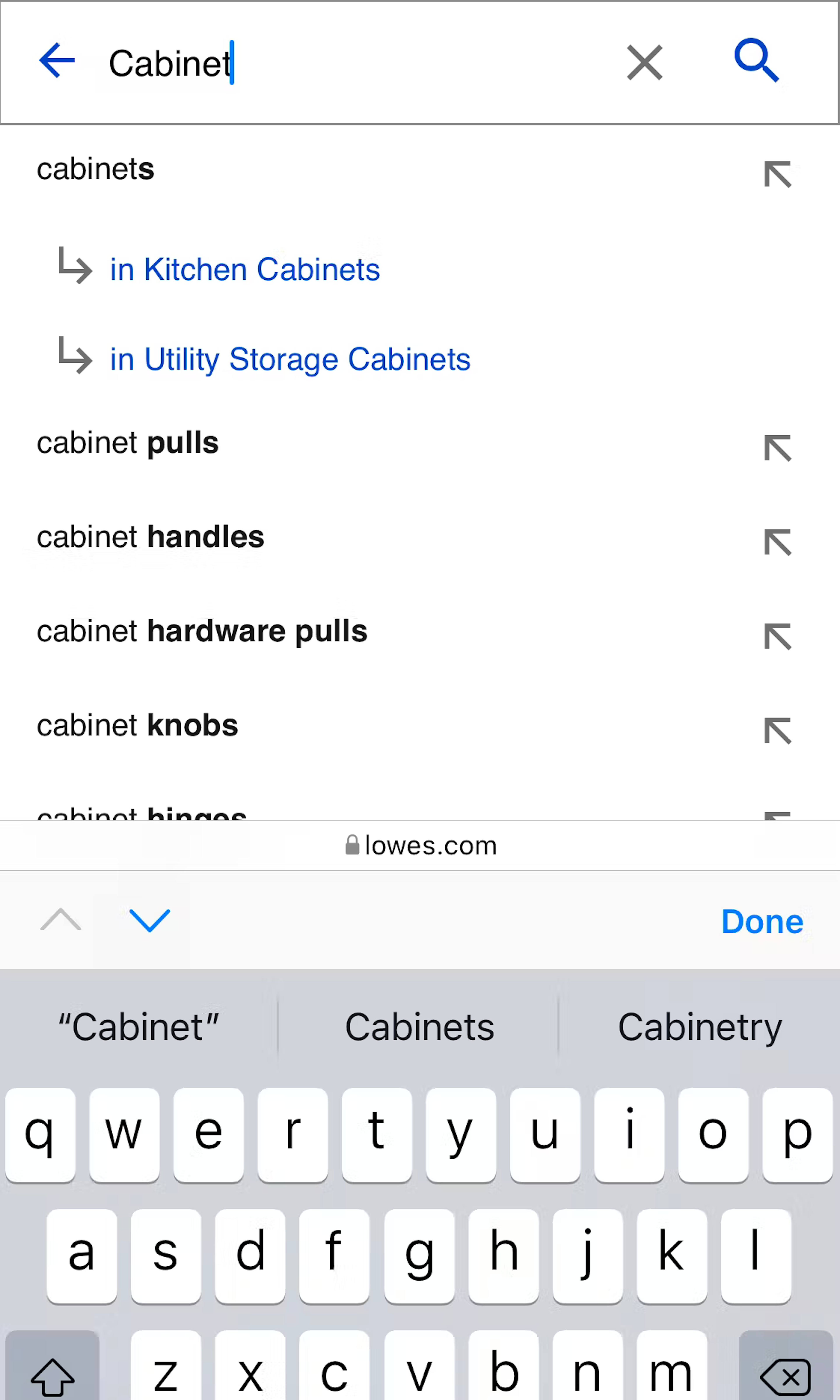
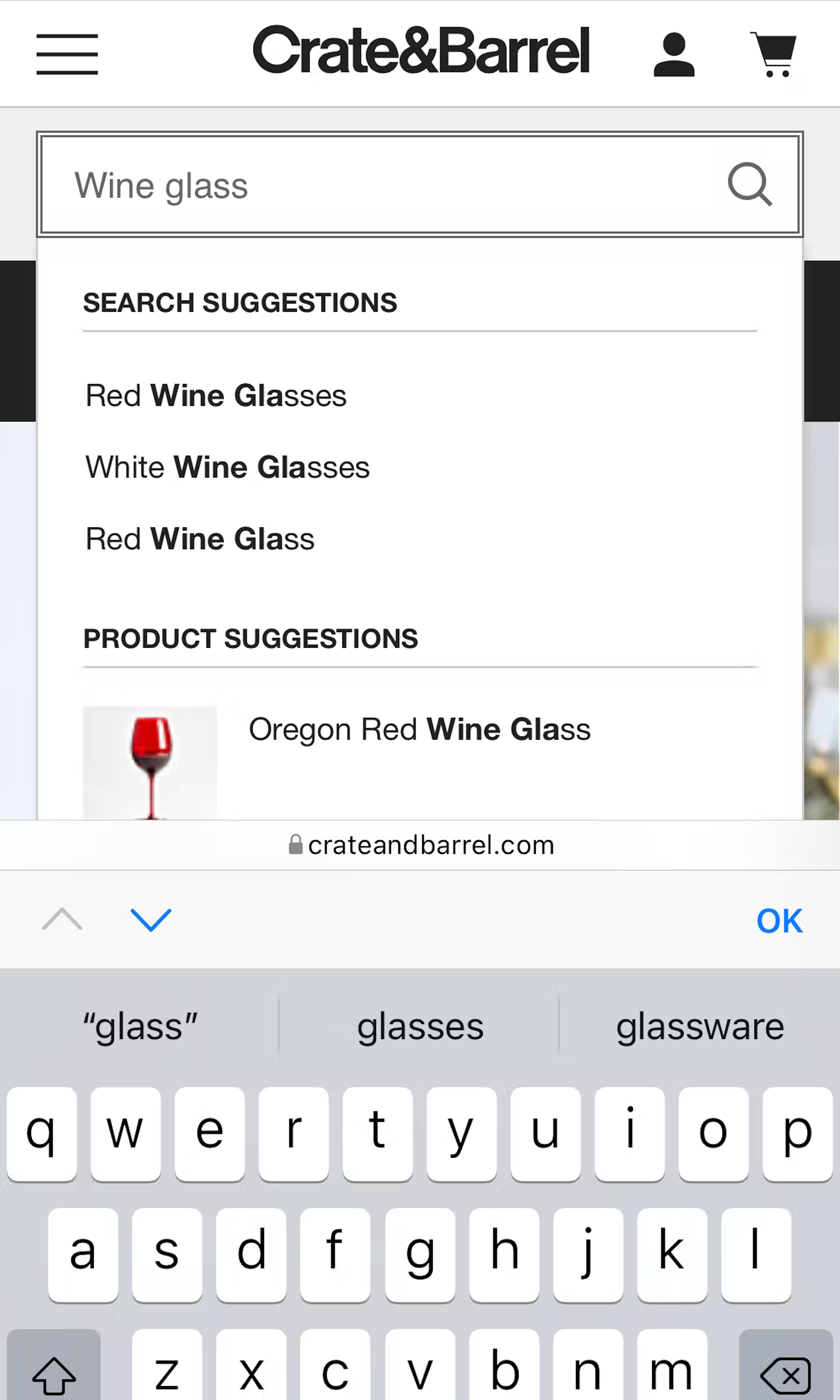
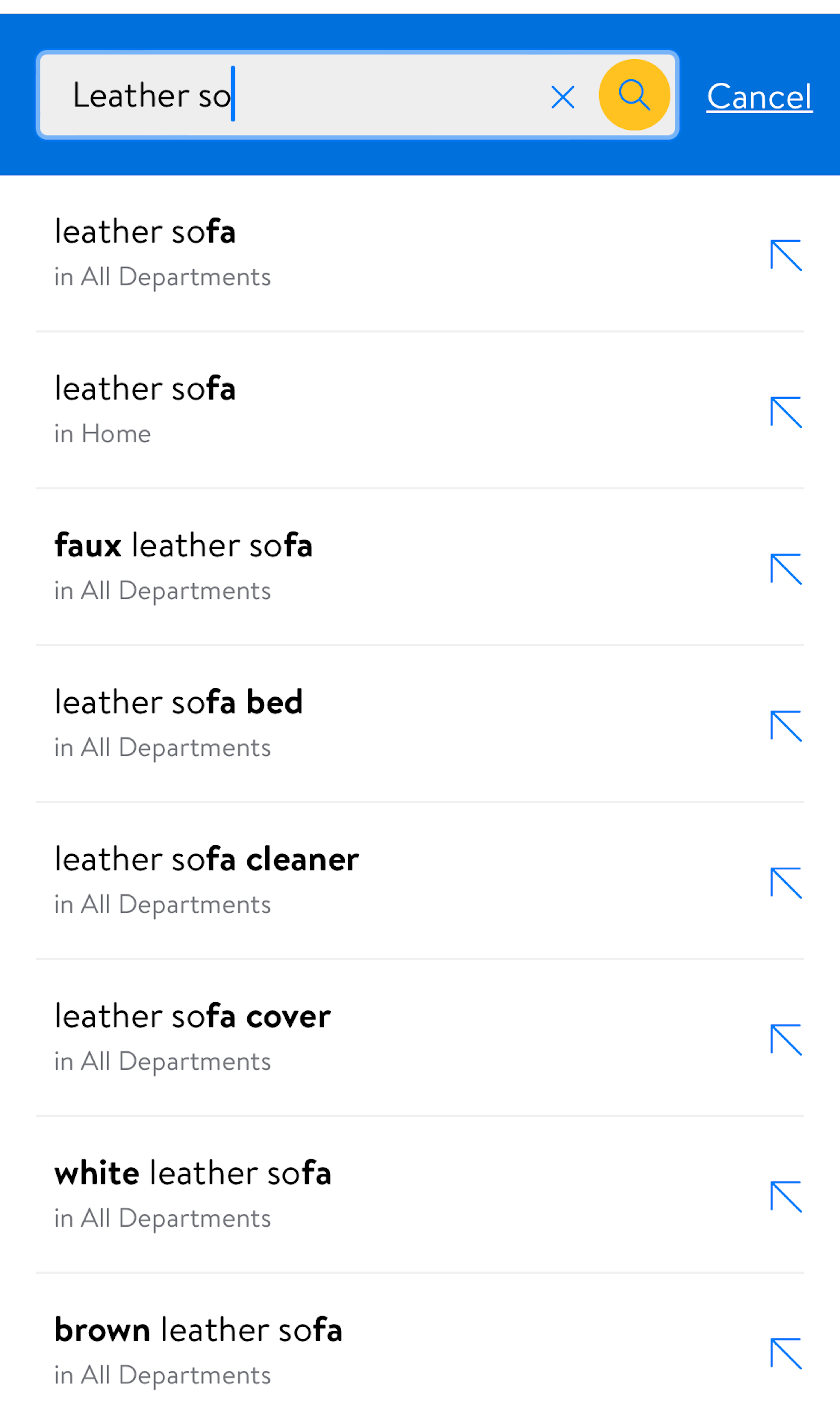
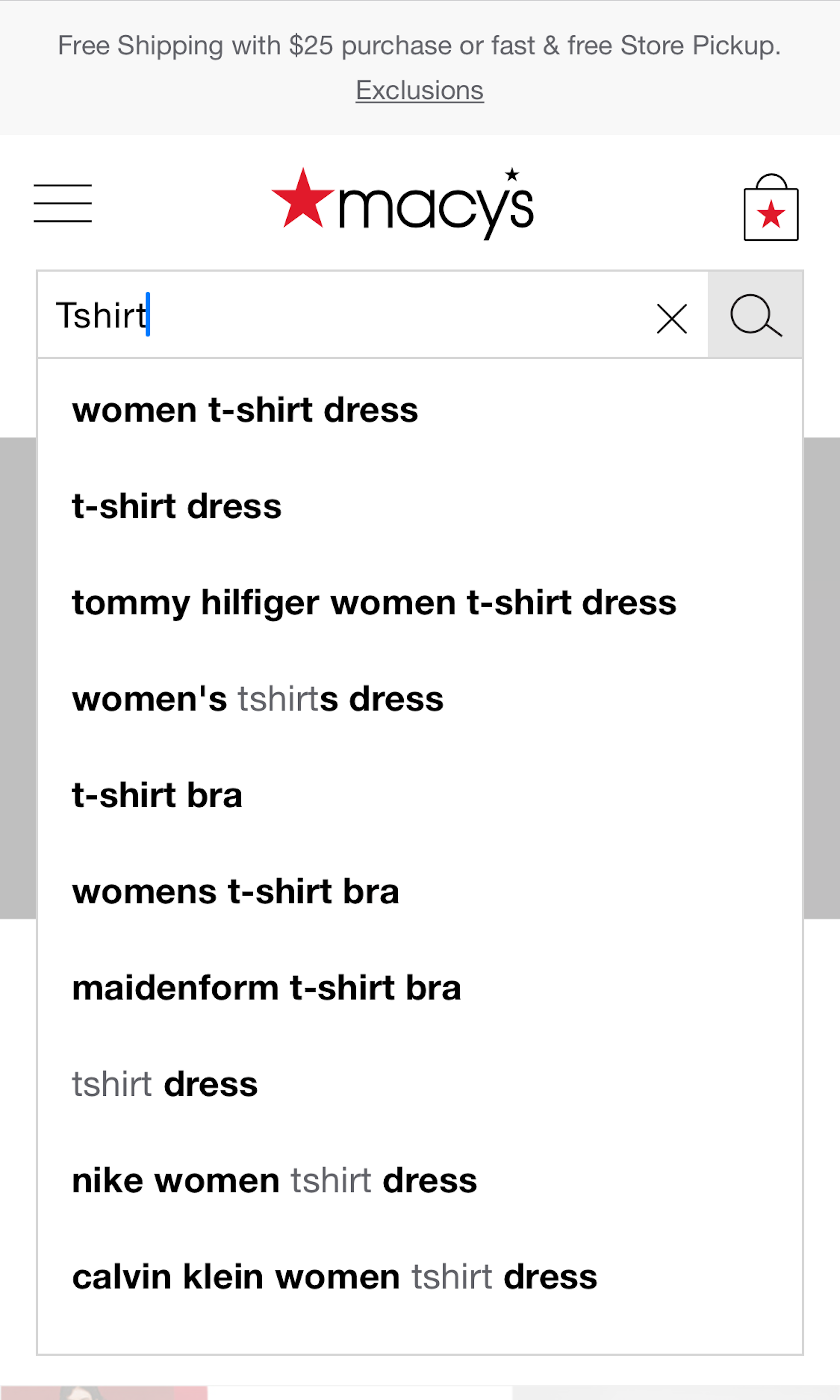
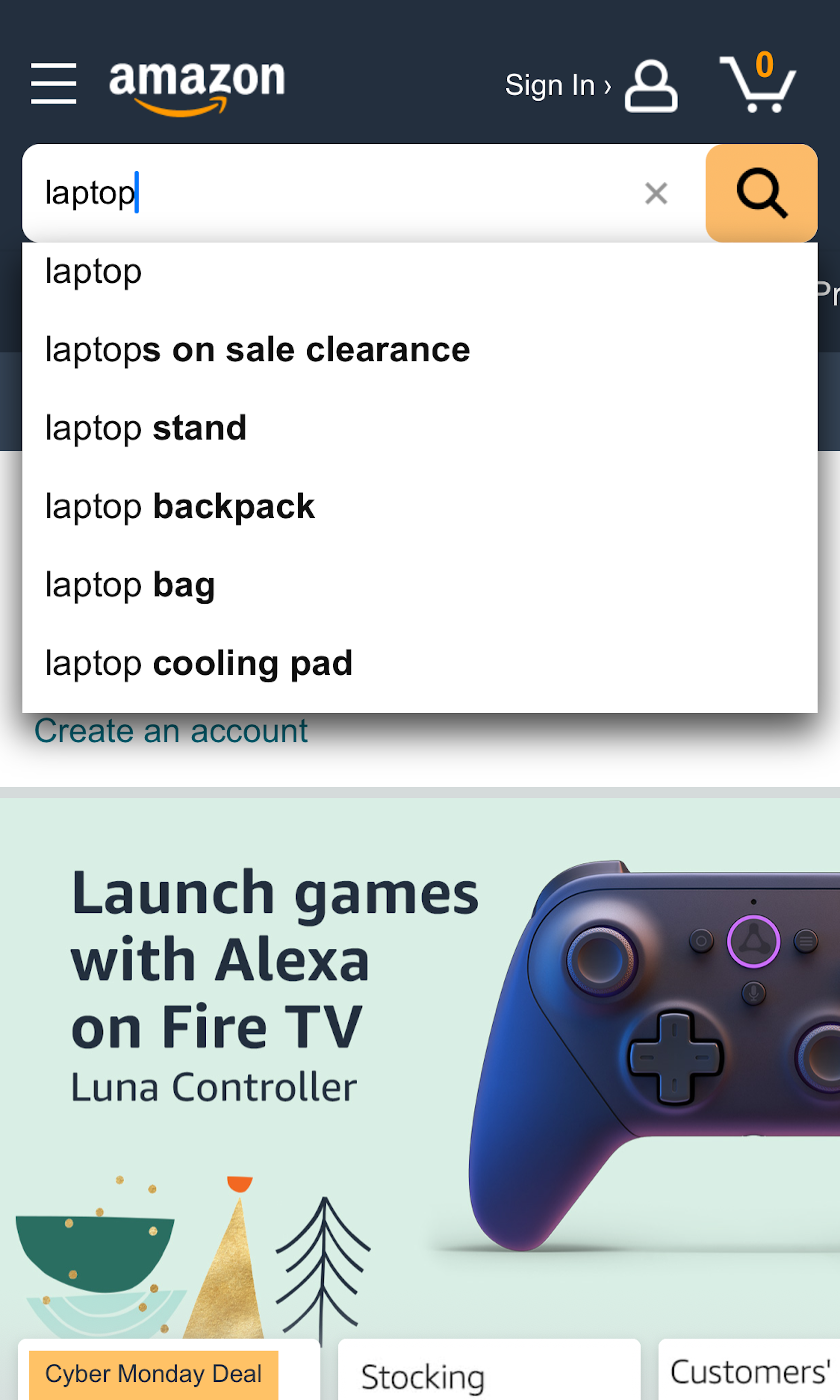
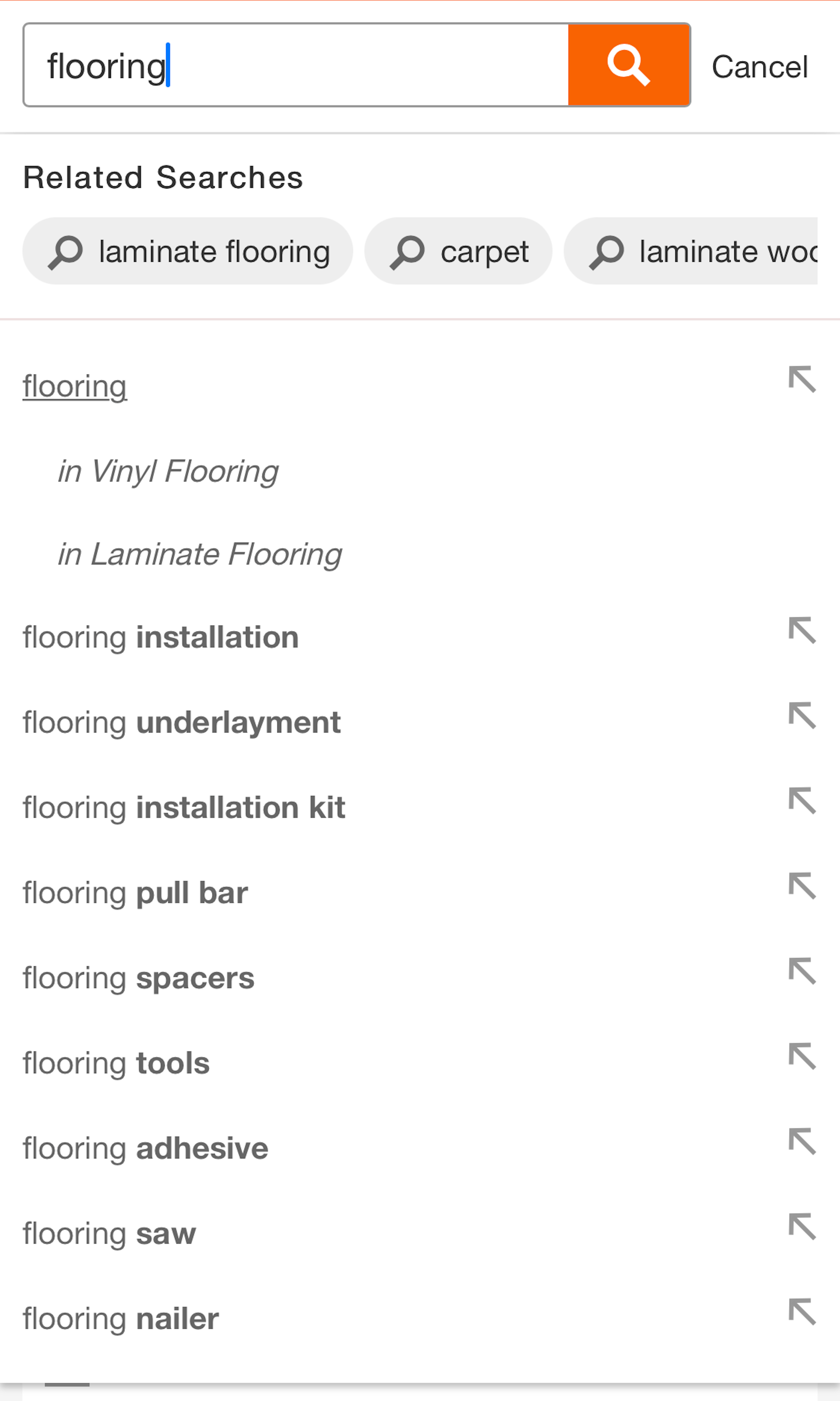
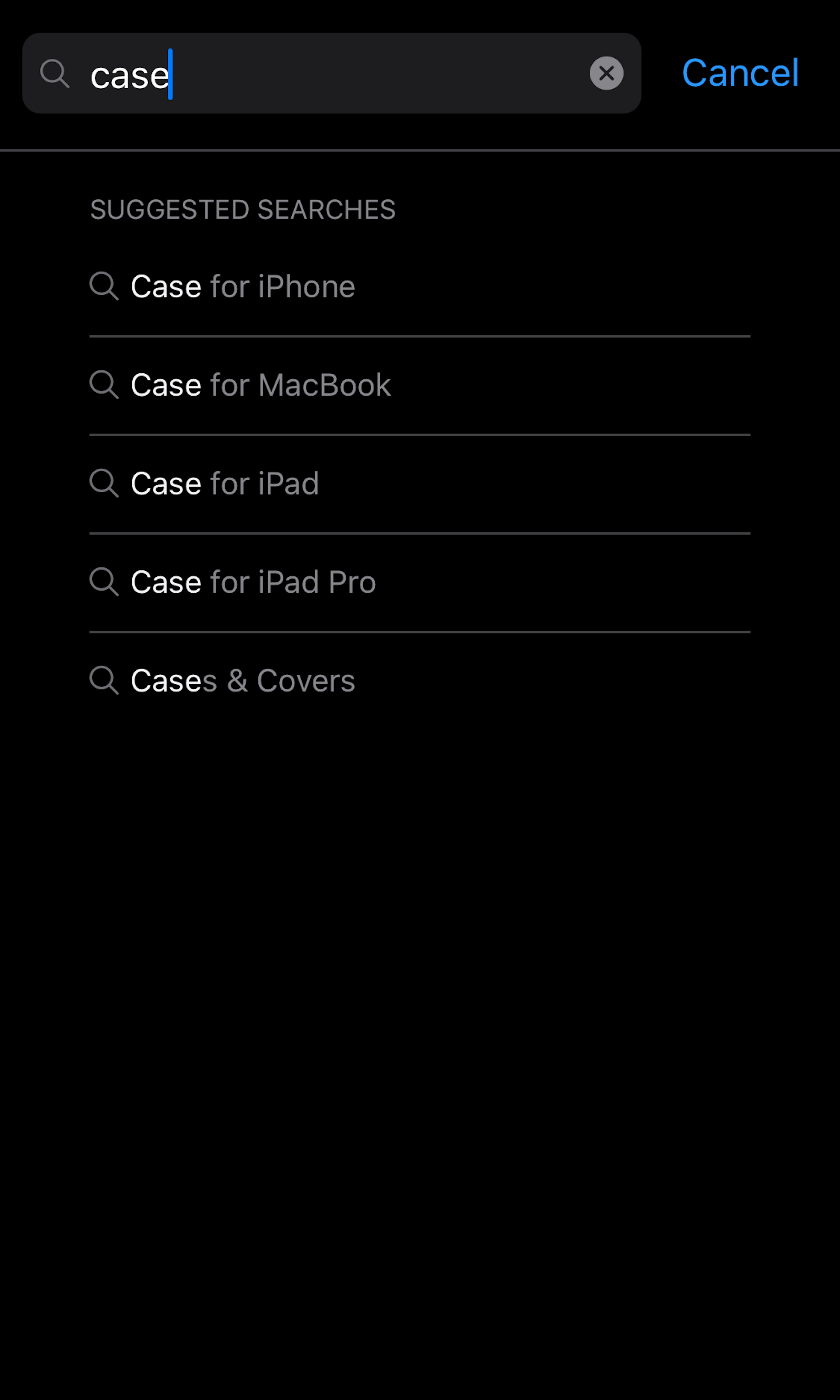
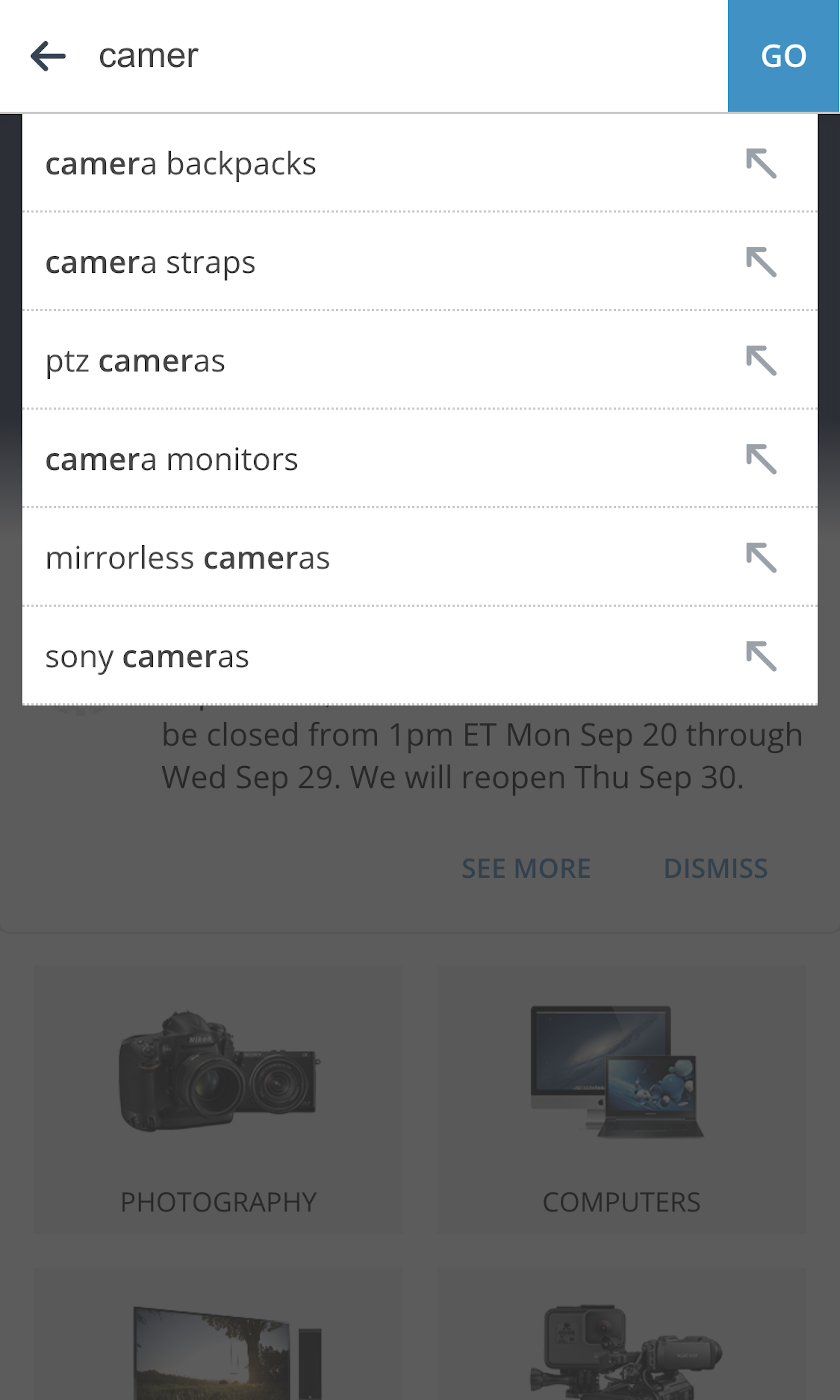
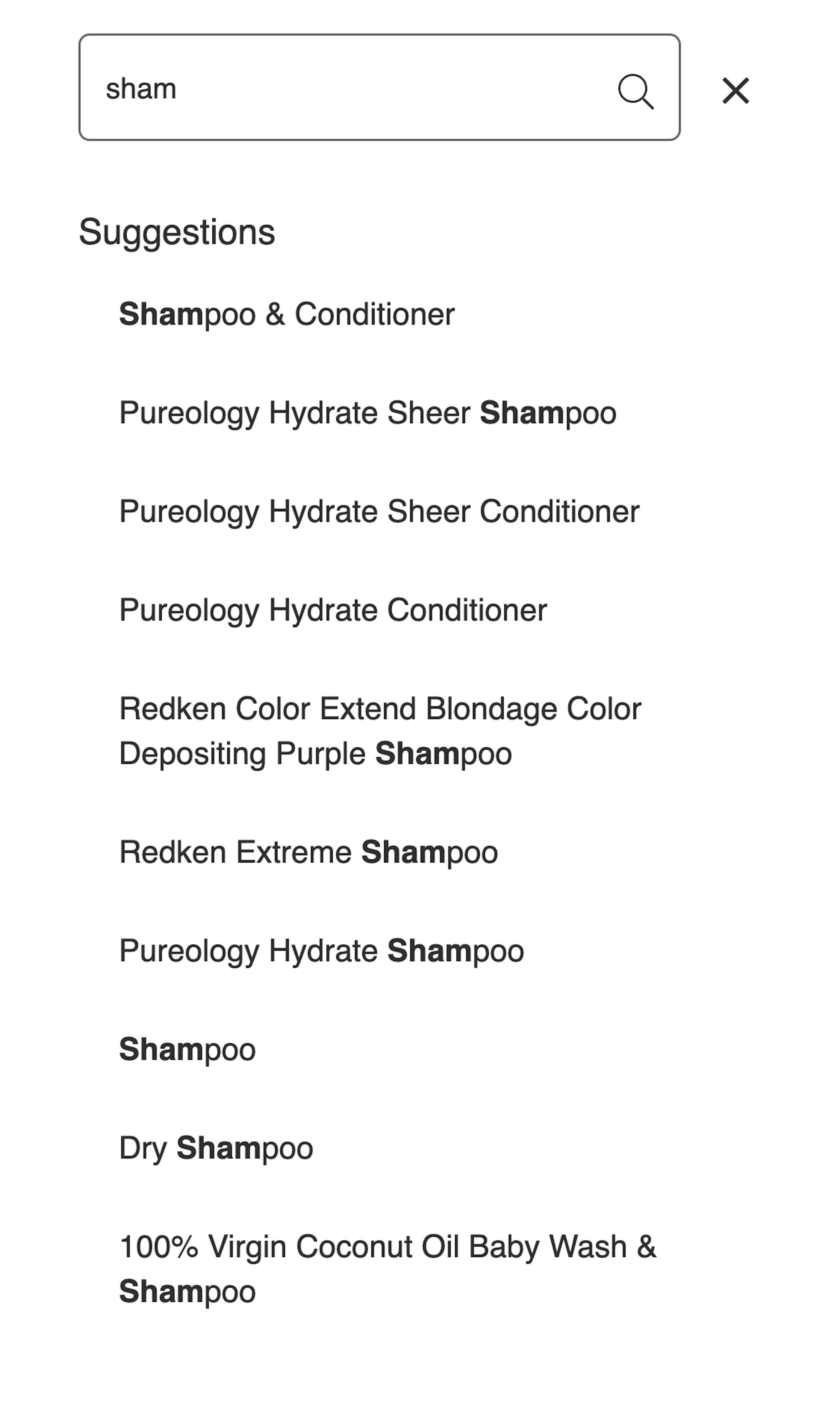
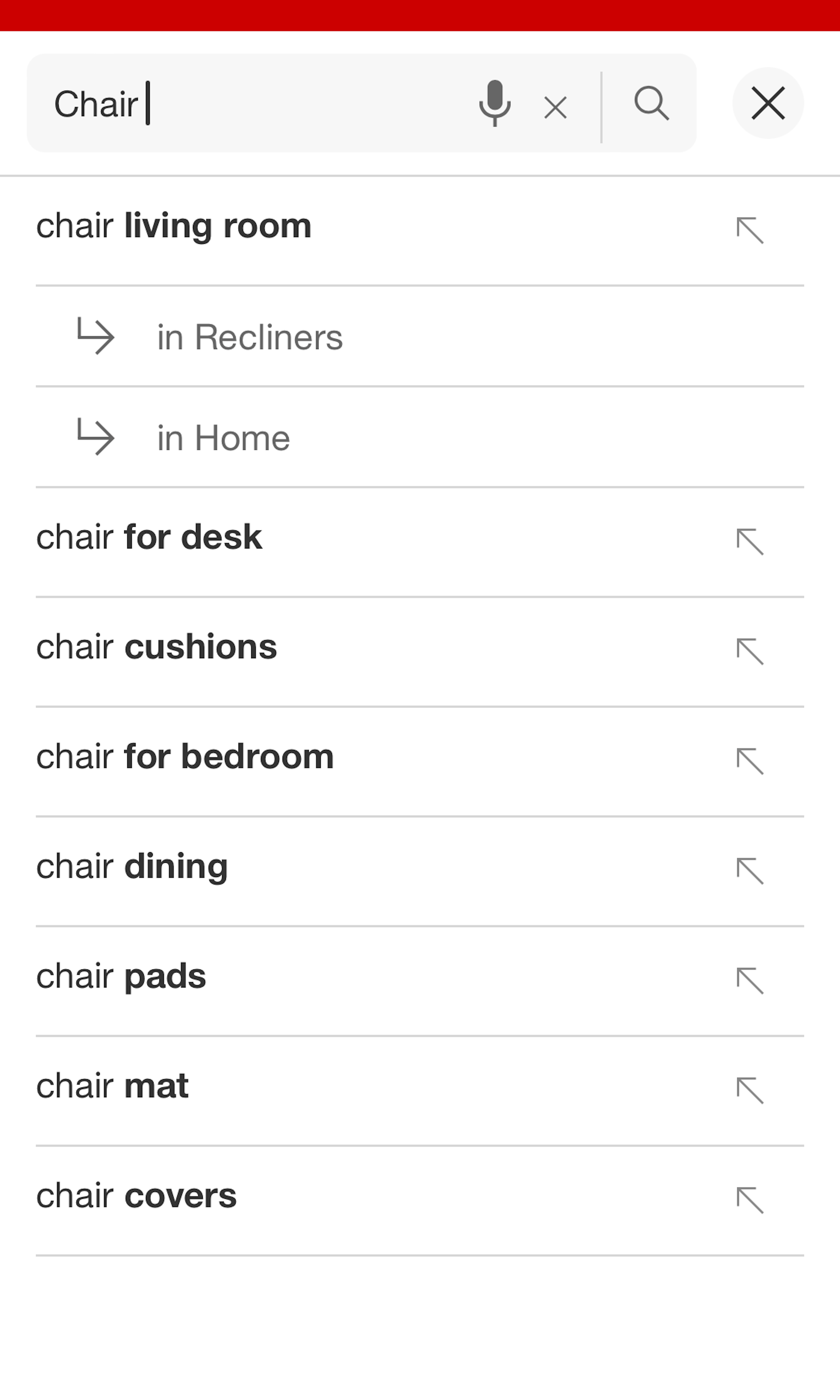
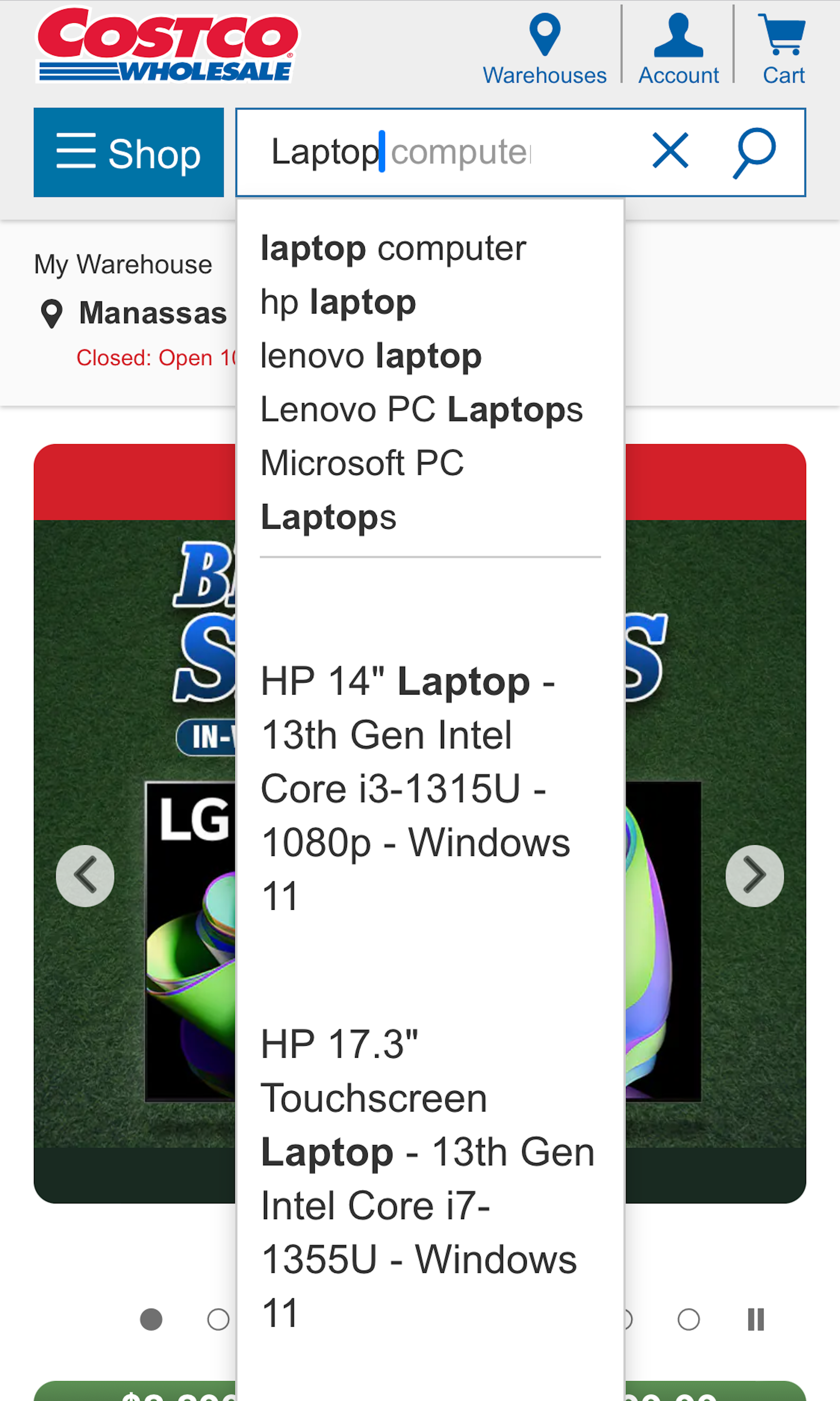
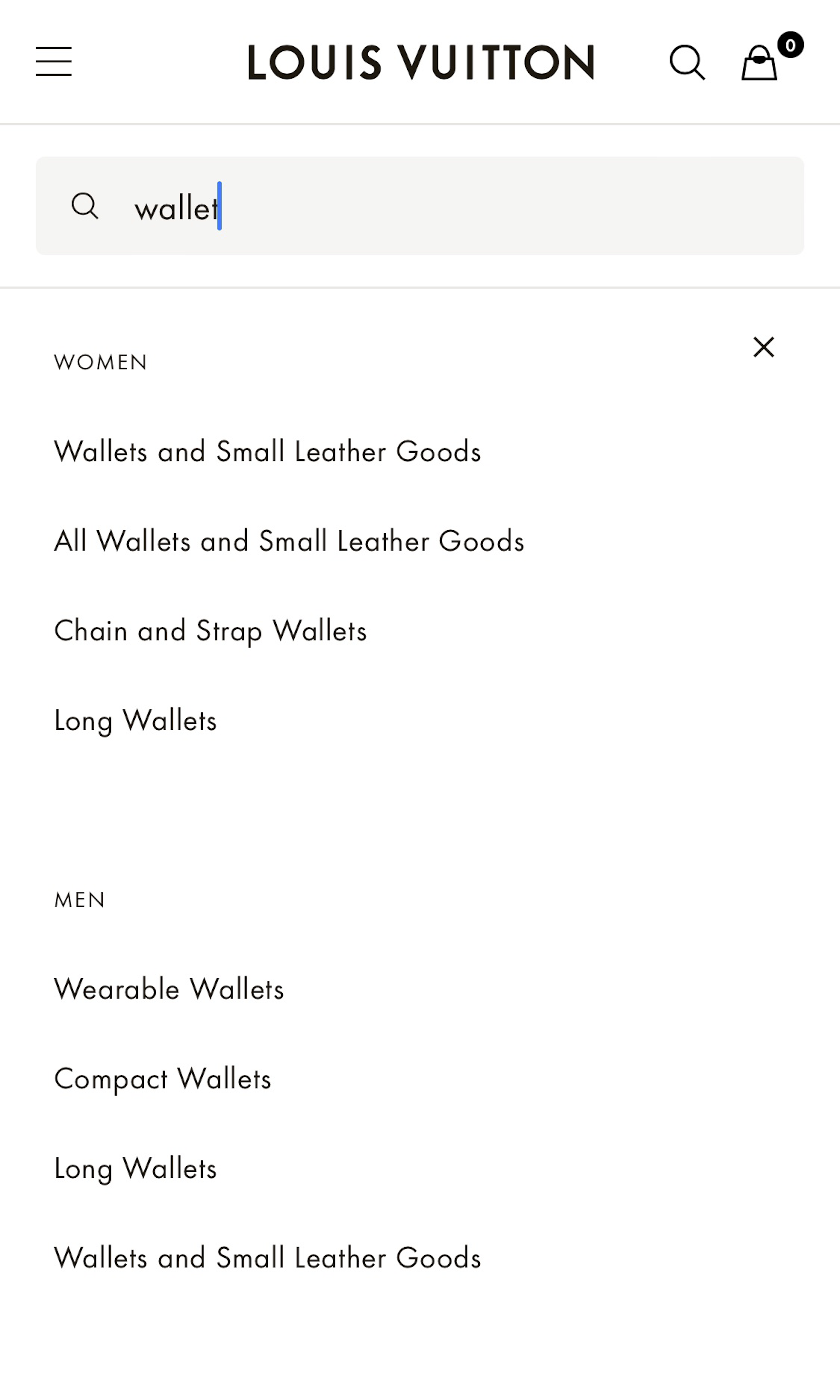
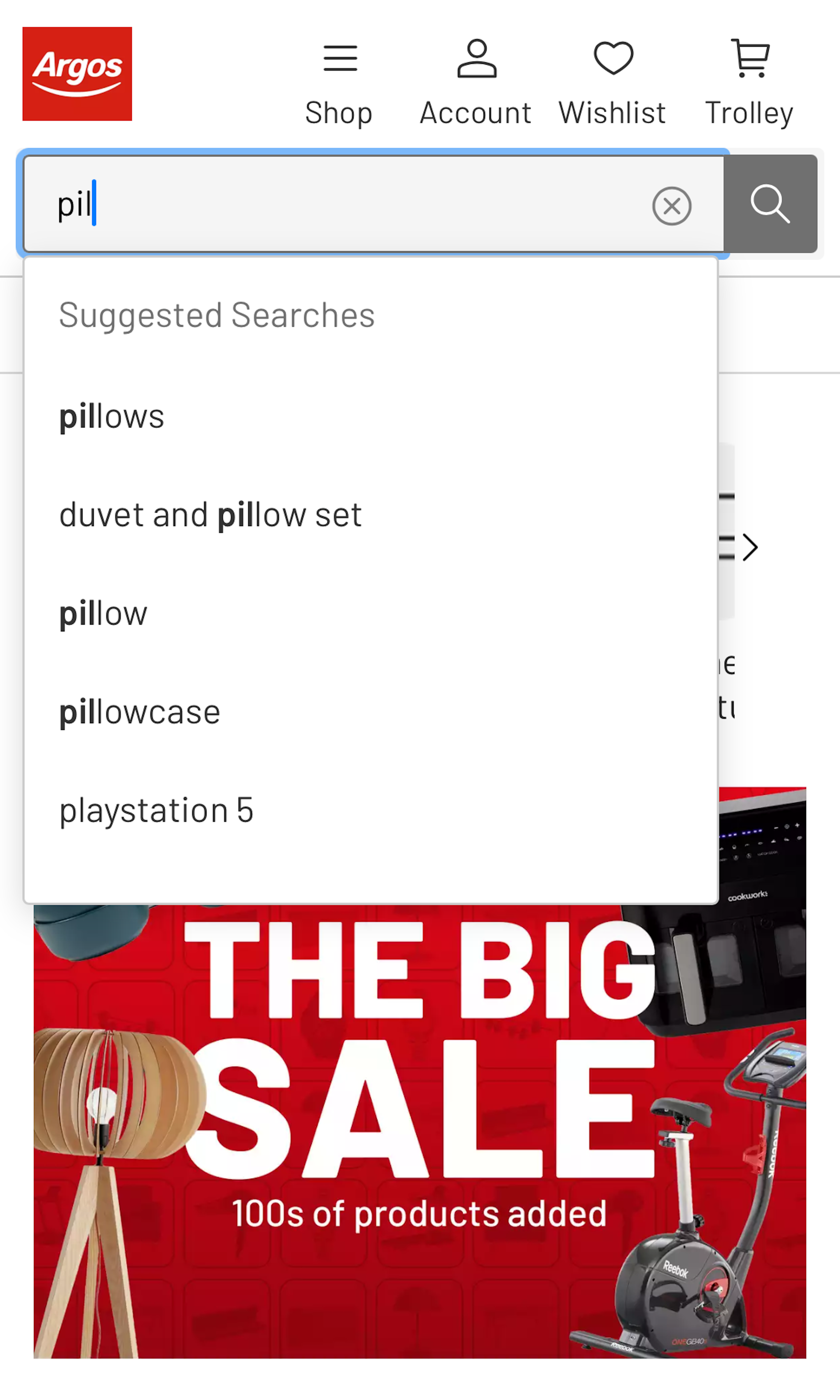
What’s this? Here you’ll find 340 “Mobile: Search Autocomplete” full-page screenshots annotated with research-based UX insights, sourced from Baymard’s UX benchmark of 93 ecommerce sites. (Note: this is less than 1% of the full research catalog.)
In usability testing we observe that the search autocomplete guides users on what to search for. This makes the autocomplete logic critical as it actively will alter what users end up searching for. In practice we observe several autocompletes that end up doing more harm than good, as they mislead users into performing futile searches. The mobile autocomplete is particular difficult to get right as the user interface suffers from an already small screen on mobile, combined with the user’s touch keyboard being shown at the same time (taking almost 50% of the screen).
More ‘Search Autocomplete’ Insights
-
Desktop Examples: Besides the mobile examples below, we also have 150+ desktop examples of Search Autocomplete implementations.
-
Learn More: Besides exploring the 87 mobile “Autocomplete” design examples below, you may also want to read our related articles “Allow Mobile Users to ‘Search Within’ Their Current Category - 94% Don’t” and “8 Design Patterns for Autocomplete Suggestions”.
-
Get Full Access: To see all of Baymard’s 351 mobile research findings you’ll need Baymard Premium access. (Premium also provides you full access to 150,000+ hours of UX research findings, 650+ ecommerce UX guidelines, and 275,000+ UX performance scores.))
User Experience Research, Delivered Weekly
Join 60,000+ UX professionals and get a new UX article every week.

User Experience Research, Delivered Weekly
Join 60,000+ UX professionals and get a new UX article every week.

Explore Other Research Content

300+ free UX articles based on large-scale research.

257 top sites ranked by UX performance.

Code samples, demos, and key stats for usability.


