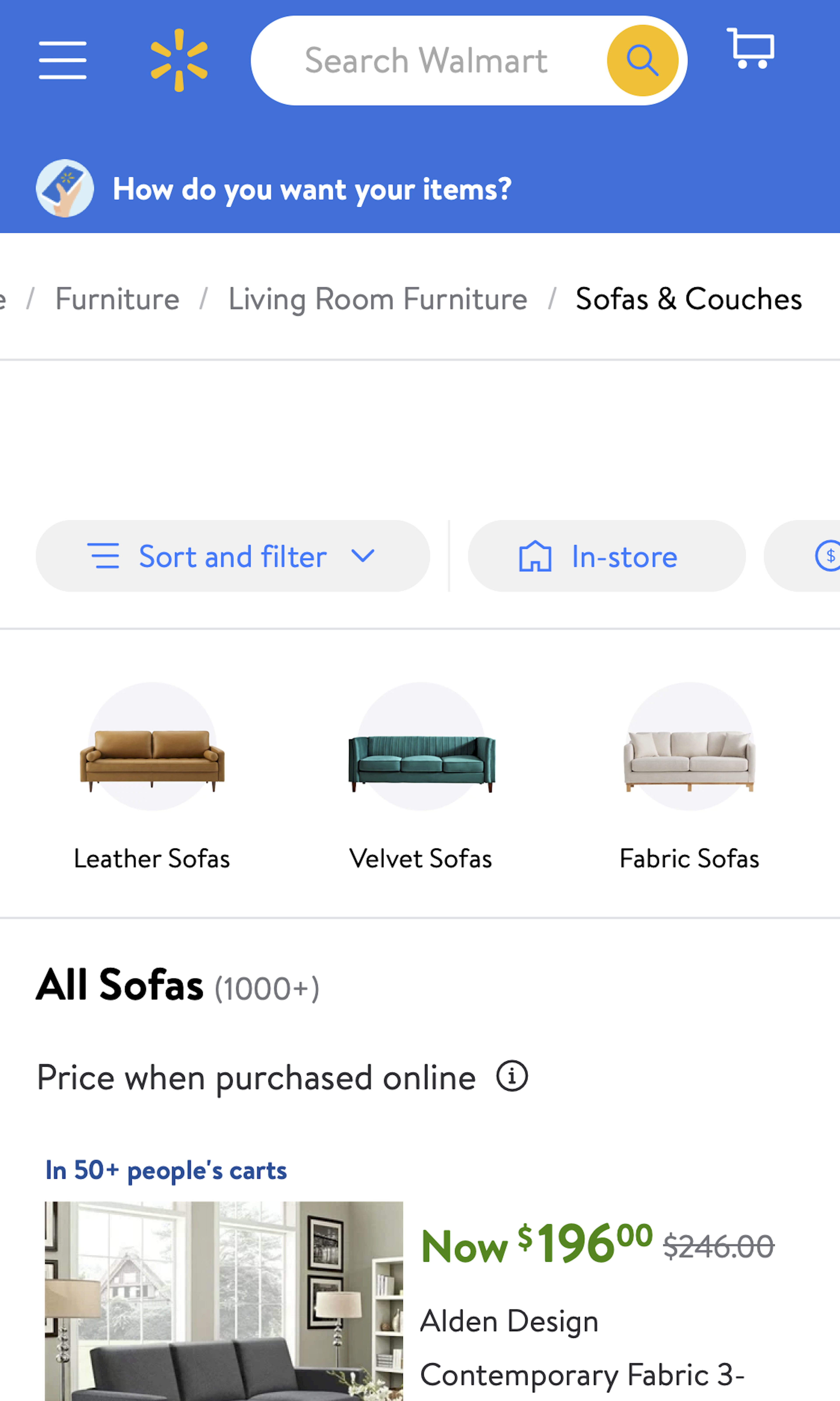
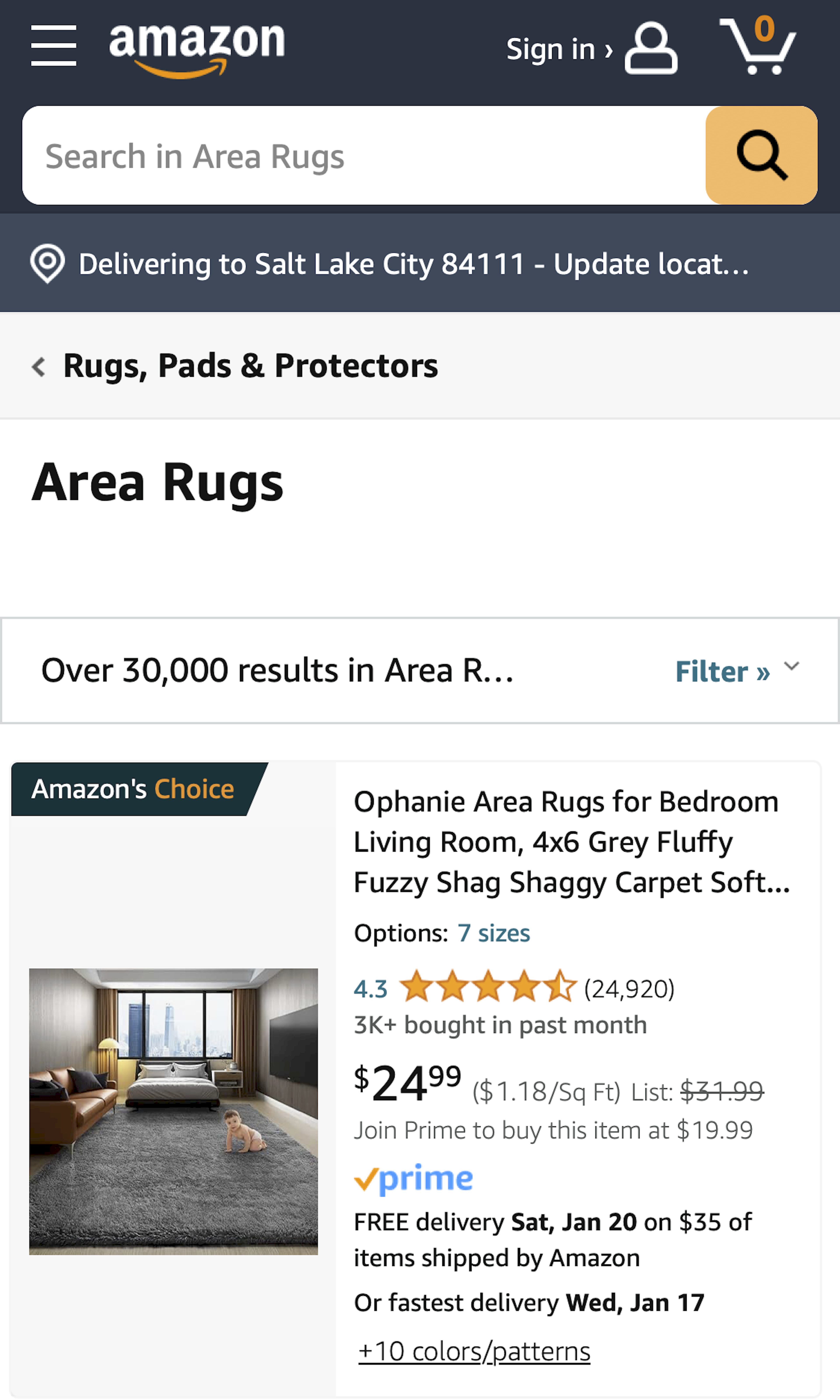
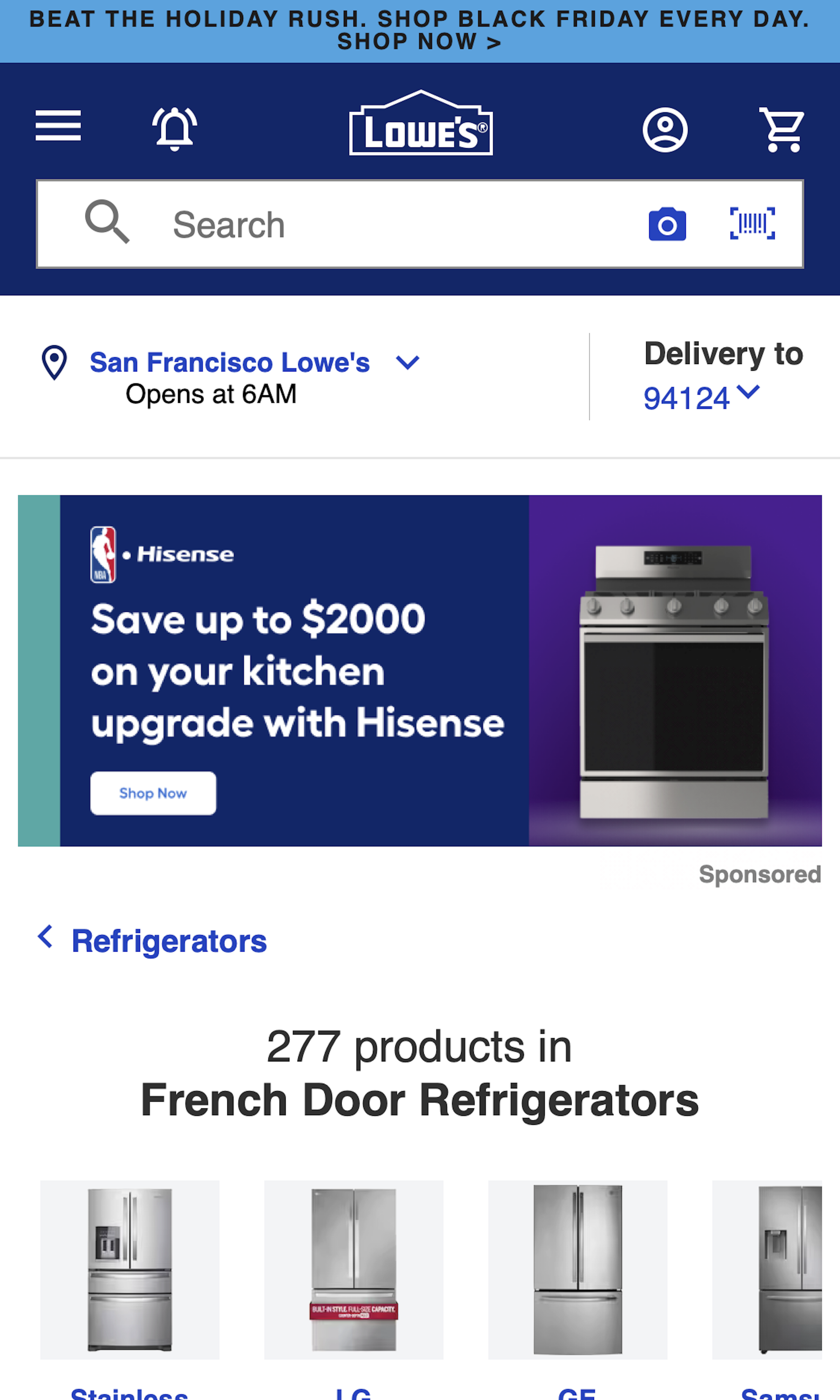
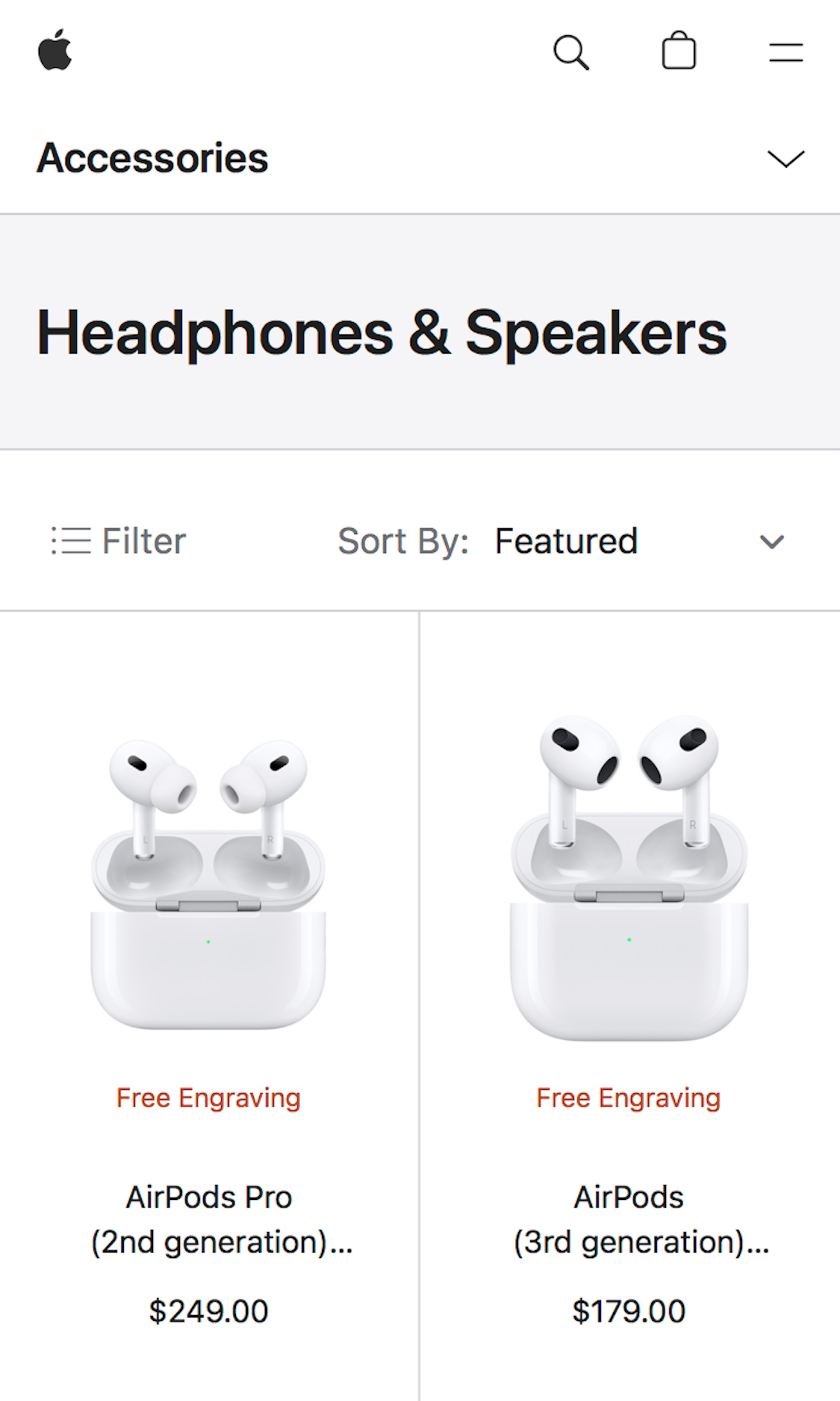
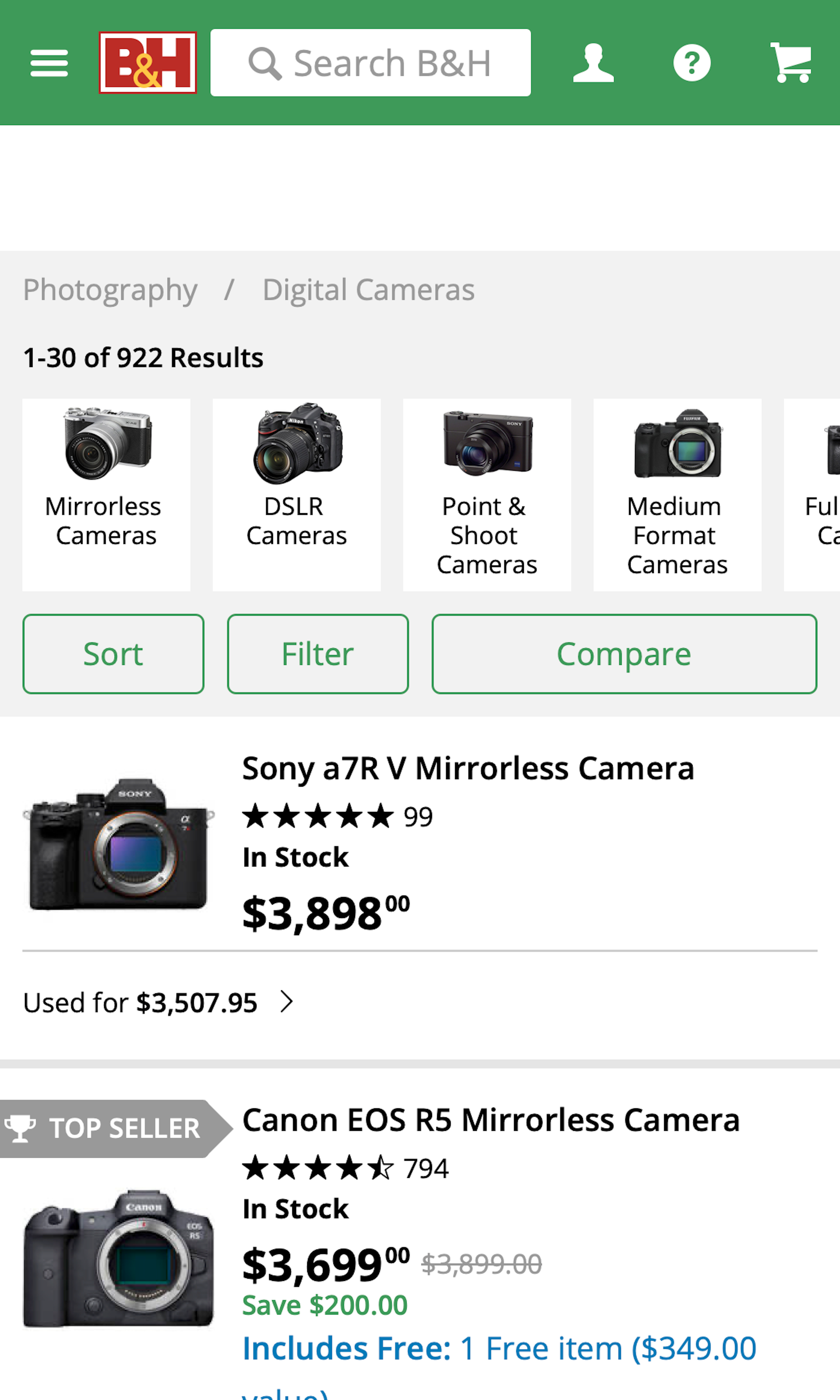
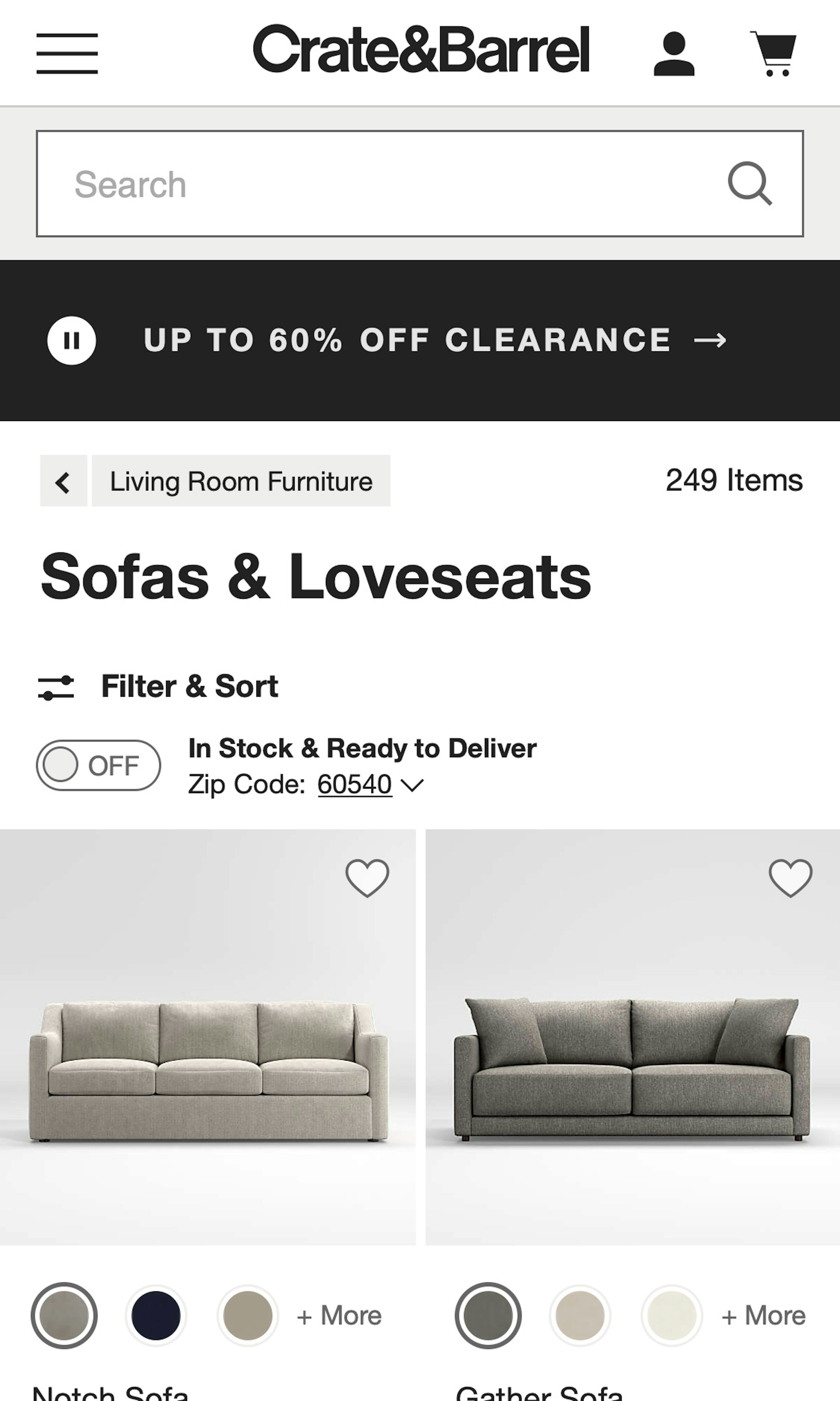
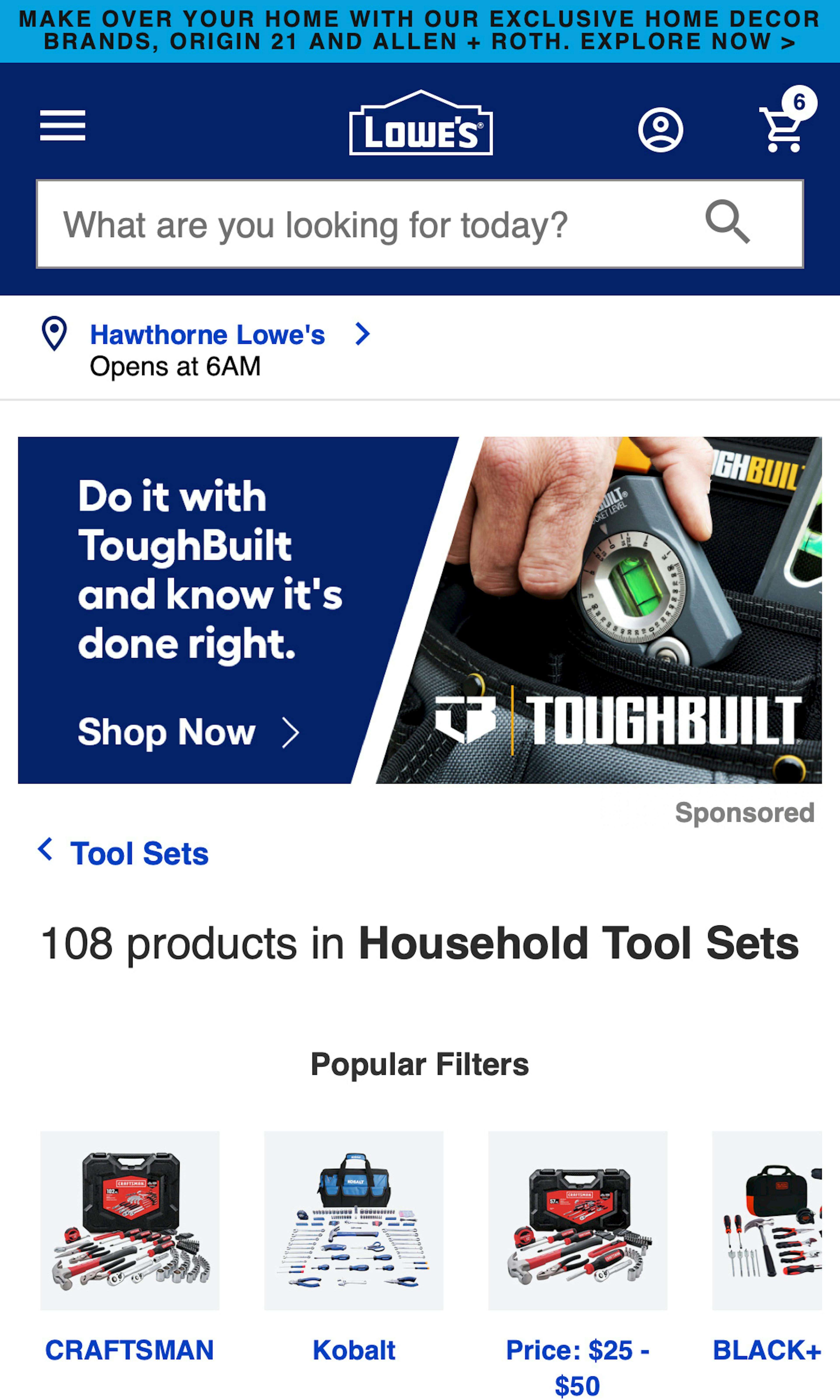
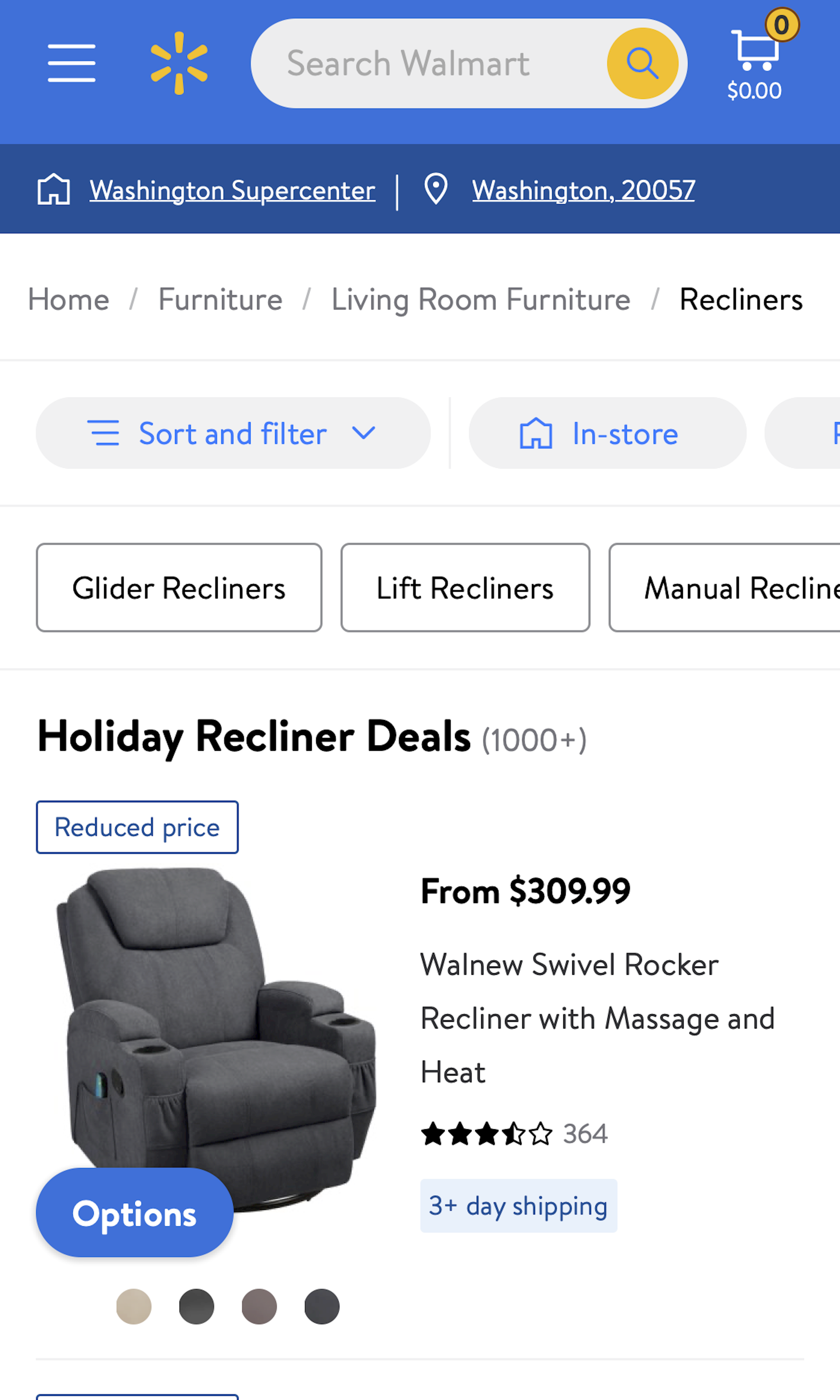
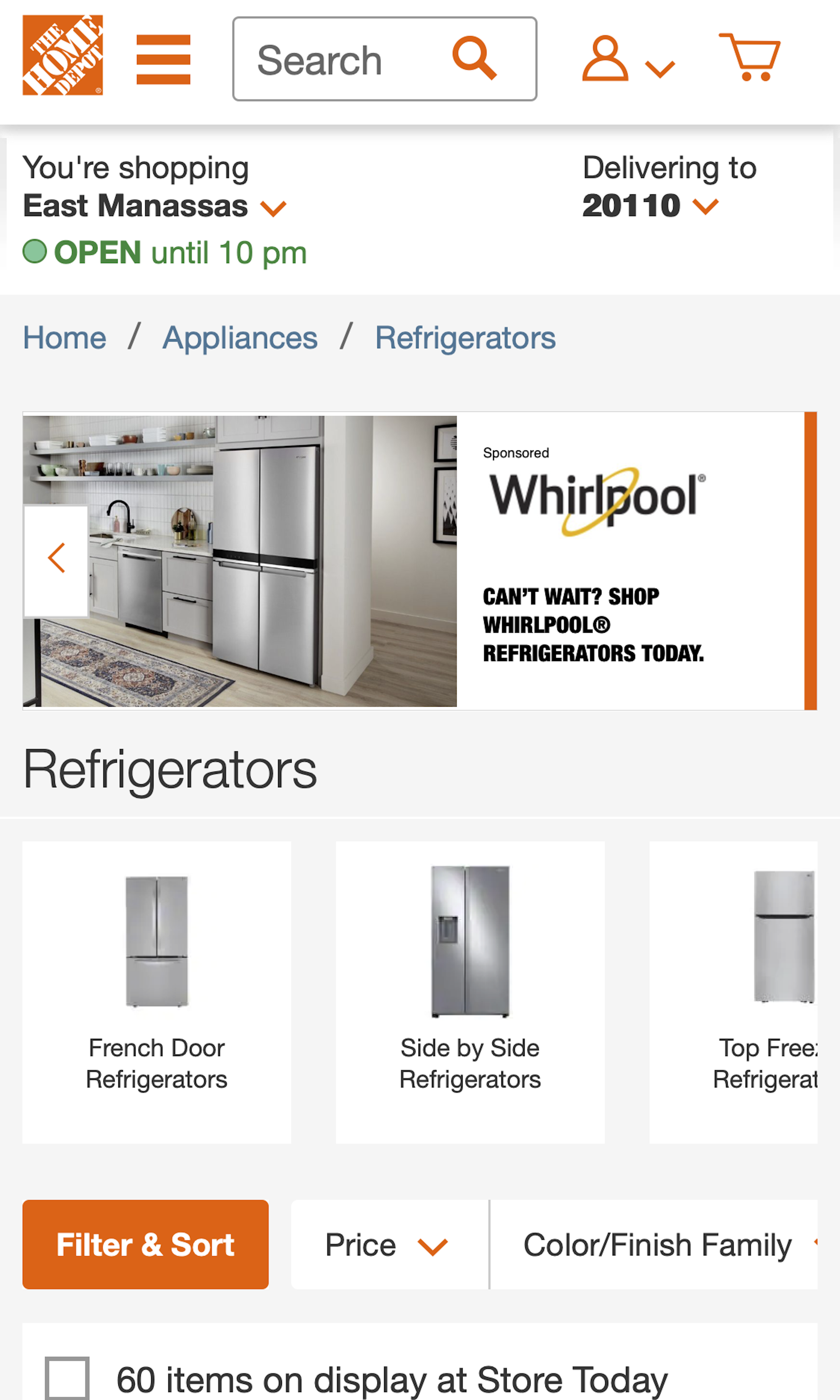
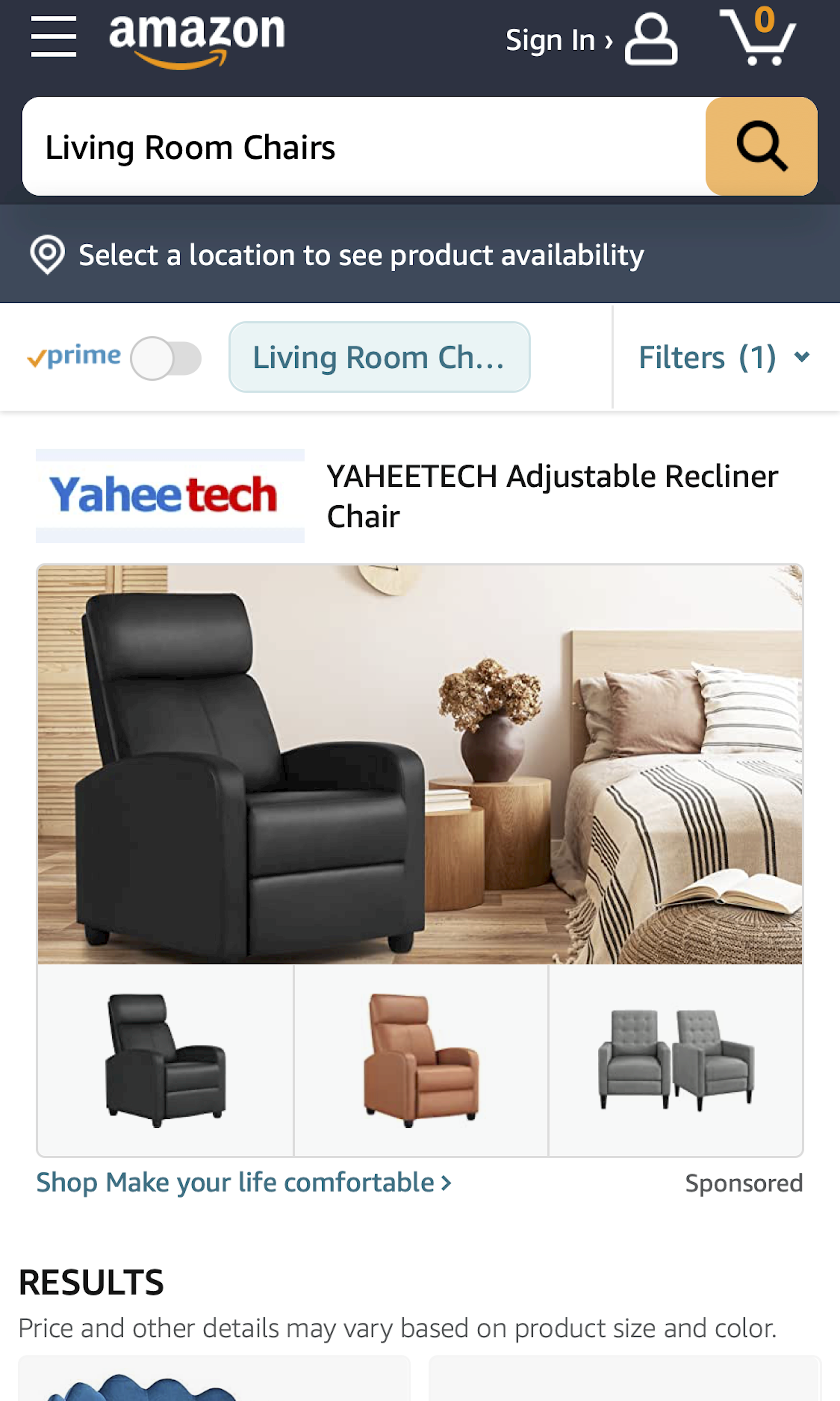
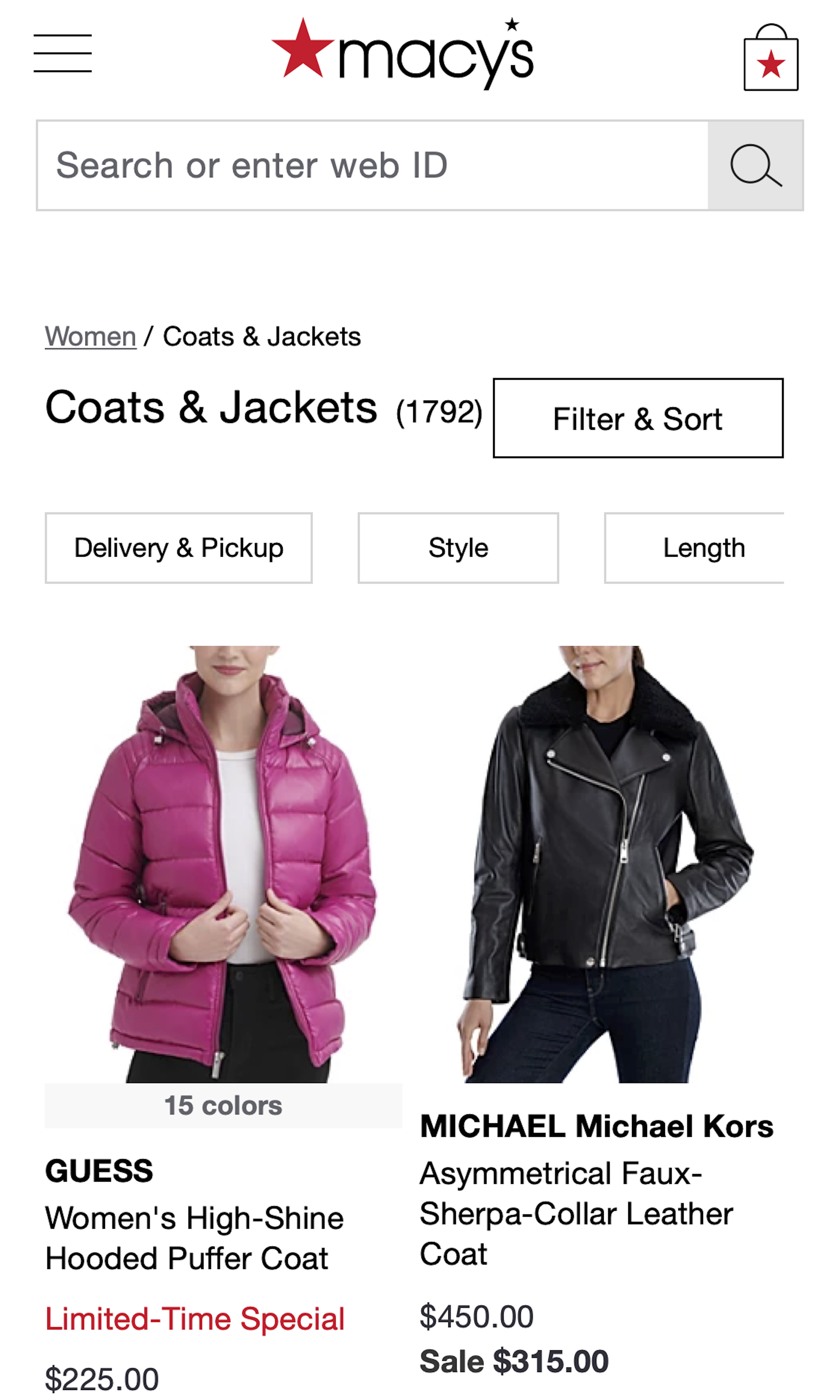
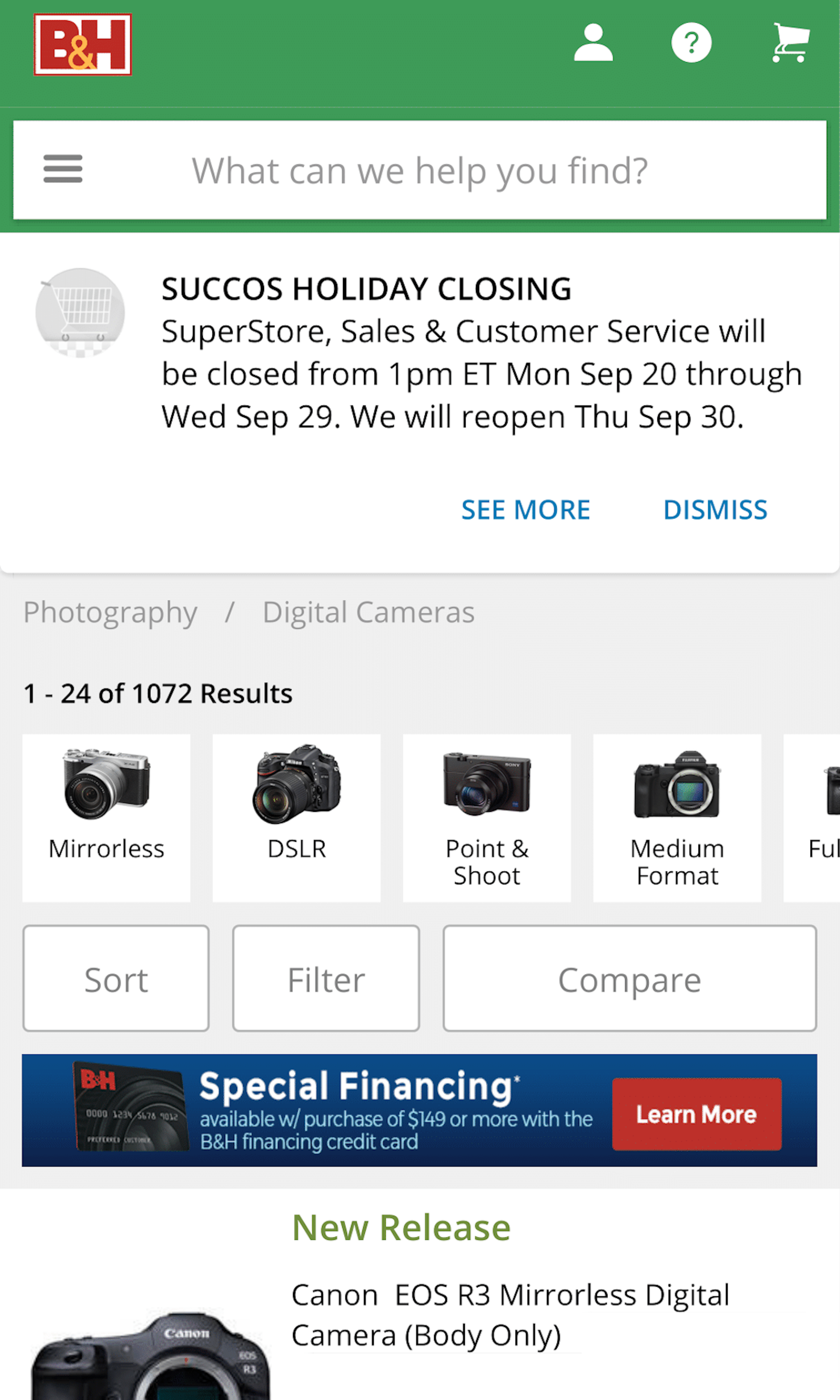
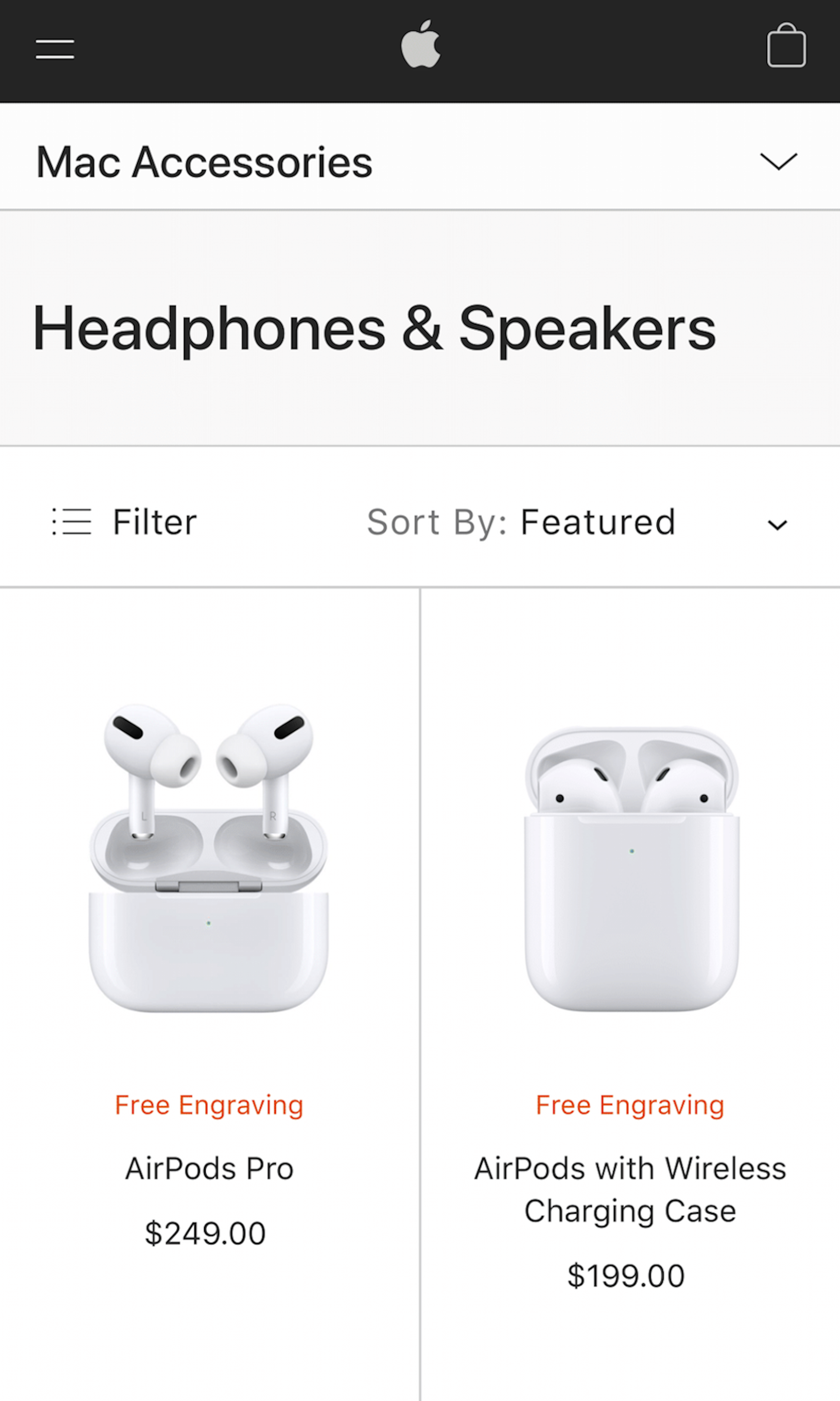
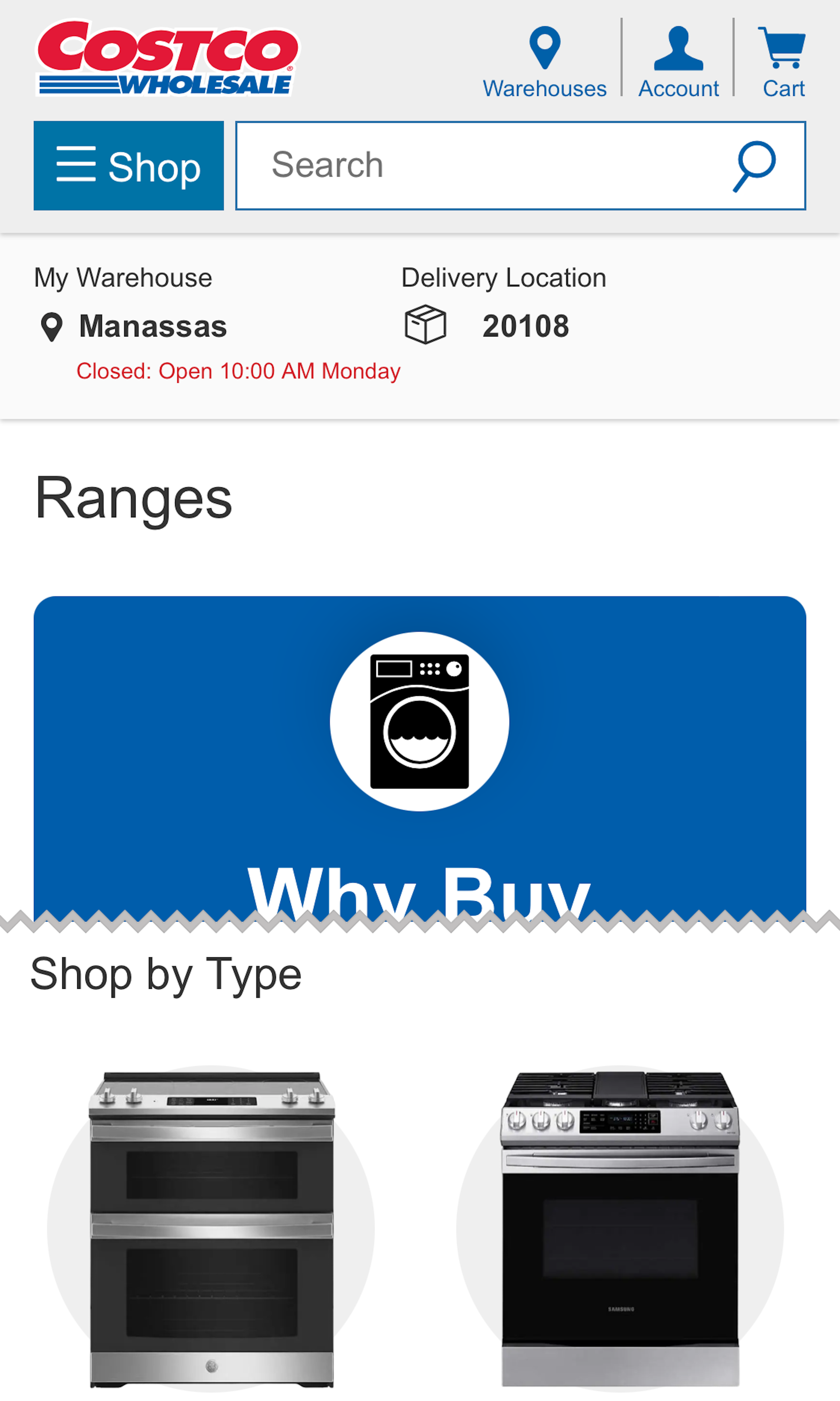
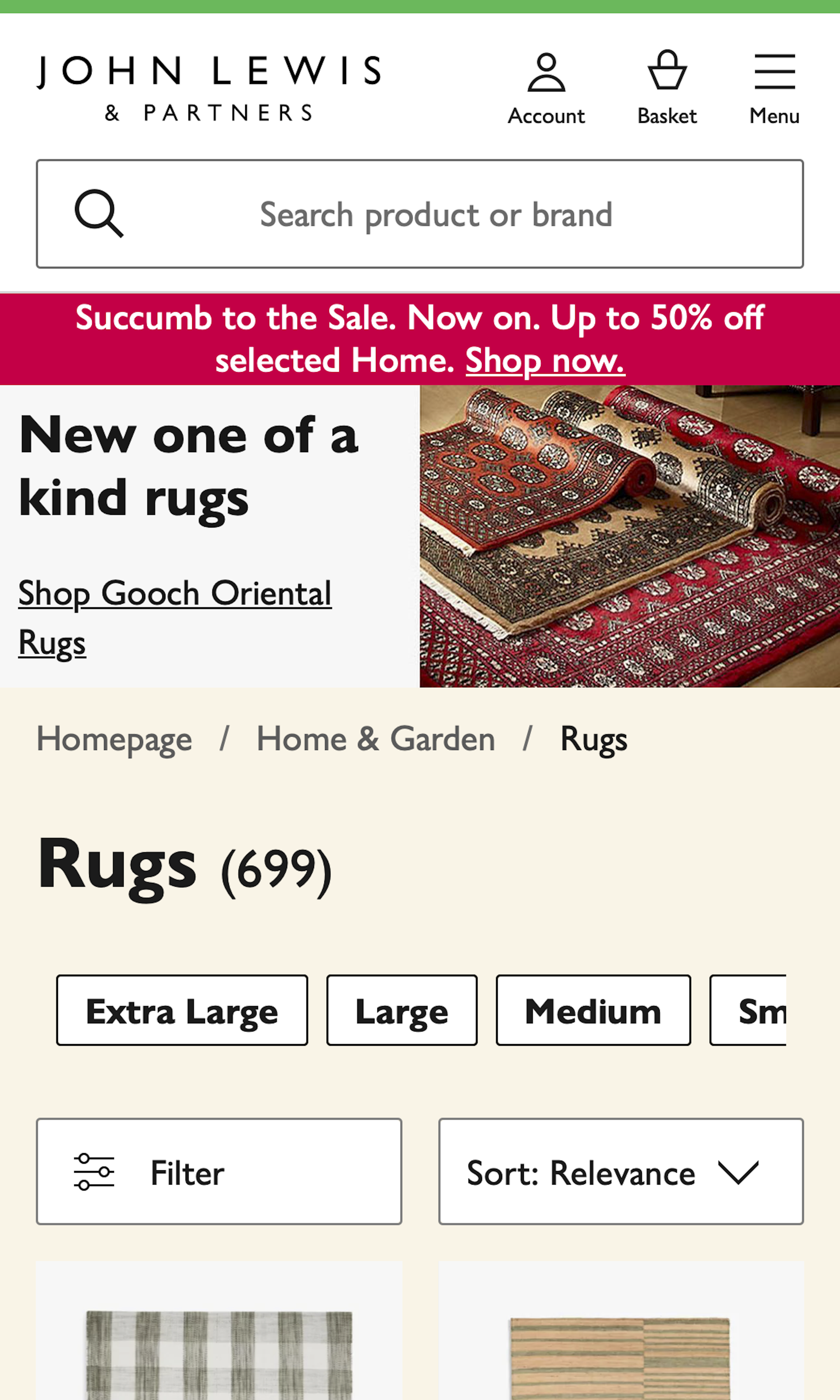
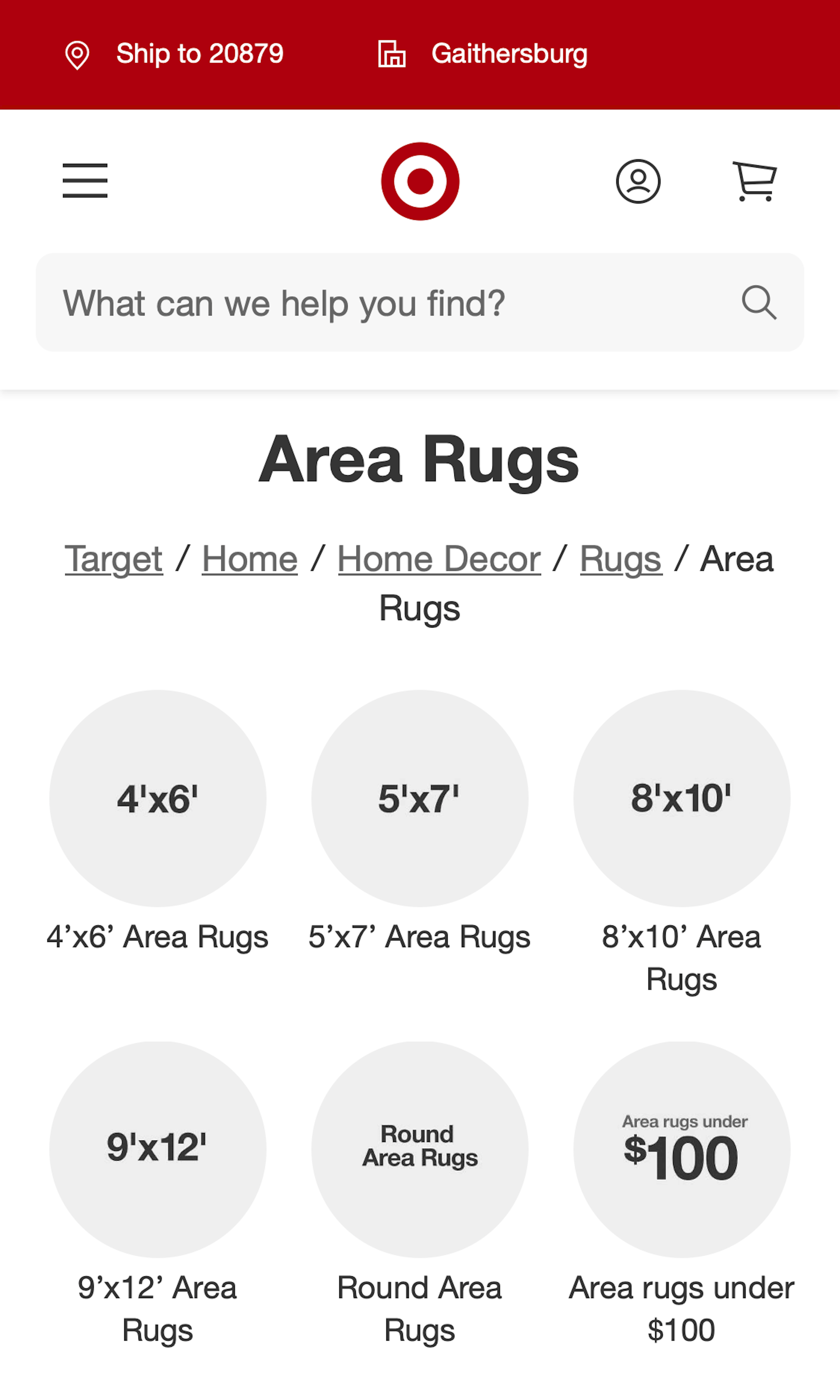
What’s this? Here you’ll find 383 “Mobile: Product Lists” full-page screenshots annotated with research-based UX insights, sourced from Baymard’s UX benchmark of 93 ecommerce sites. (Note: this is less than 1% of the full research catalog.)
Product lists on mobile sites are a balancing act. On one hand users need a considerable amount of product information in the product list to avoid needless visits to irrelevant product pages (which is generally more burdensome on mobile than on desktop). On the other hand, the limited screen size makes comparing list items challenging and even relatively short product lists are difficult to get an overview of.
More ‘Product List’ Insights
-
Desktop Examples: Besides the mobile examples below, we also have 105+ desktop examples of Product List implementations.
-
Learn More: Besides exploring the 92 mobile “Product Listing” design examples below, you may also want to read our related articles “Display “Applied Filters” in an Overview (32% Don’t)”, “3 Pitfalls to Avoid if Implementing “Quick Views”” and “When & How to Implement Interactive Swatches on Mobile Product Listing Pages”.
-
Get Full Access: To see all of Baymard’s 351 mobile research findings you’ll need Baymard Premium access. (Premium also provides you full access to 150,000+ hours of UX research findings, 650+ ecommerce UX guidelines, and 275,000+ UX performance scores.))
User Experience Research, Delivered Weekly
Join 60,000+ UX professionals and get a new UX article every week.

User Experience Research, Delivered Weekly
Join 60,000+ UX professionals and get a new UX article every week.

Explore Other Research Content

300+ free UX articles based on large-scale research.

257 top sites ranked by UX performance.

Code samples, demos, and key stats for usability.


