What’s this? Here you’ll find 703 “Mobile: Navigation Menu” full-page screenshots annotated with research-based UX insights, sourced from Baymard’s UX benchmark of 93 ecommerce sites. (Note: this is less than 1% of the full research catalog.)
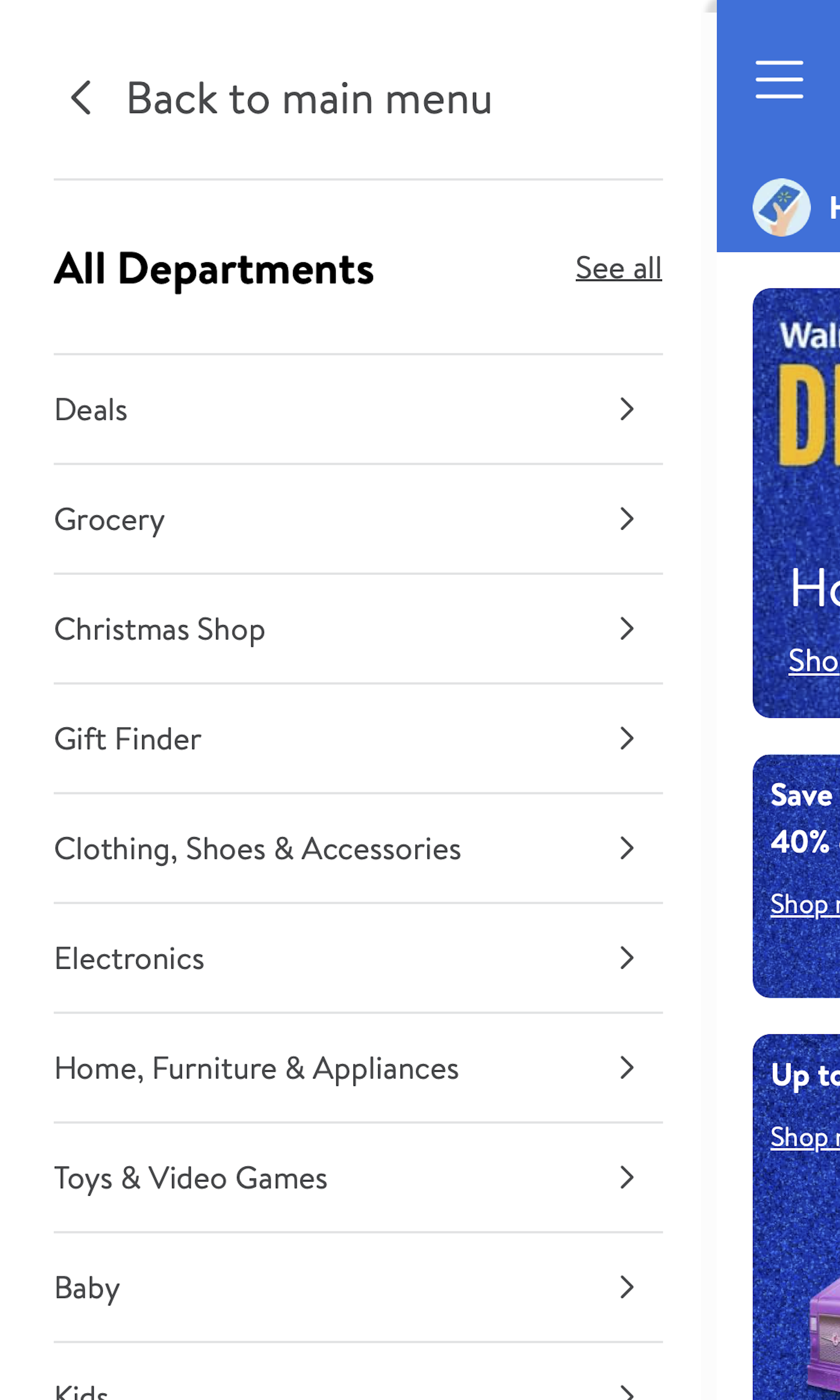
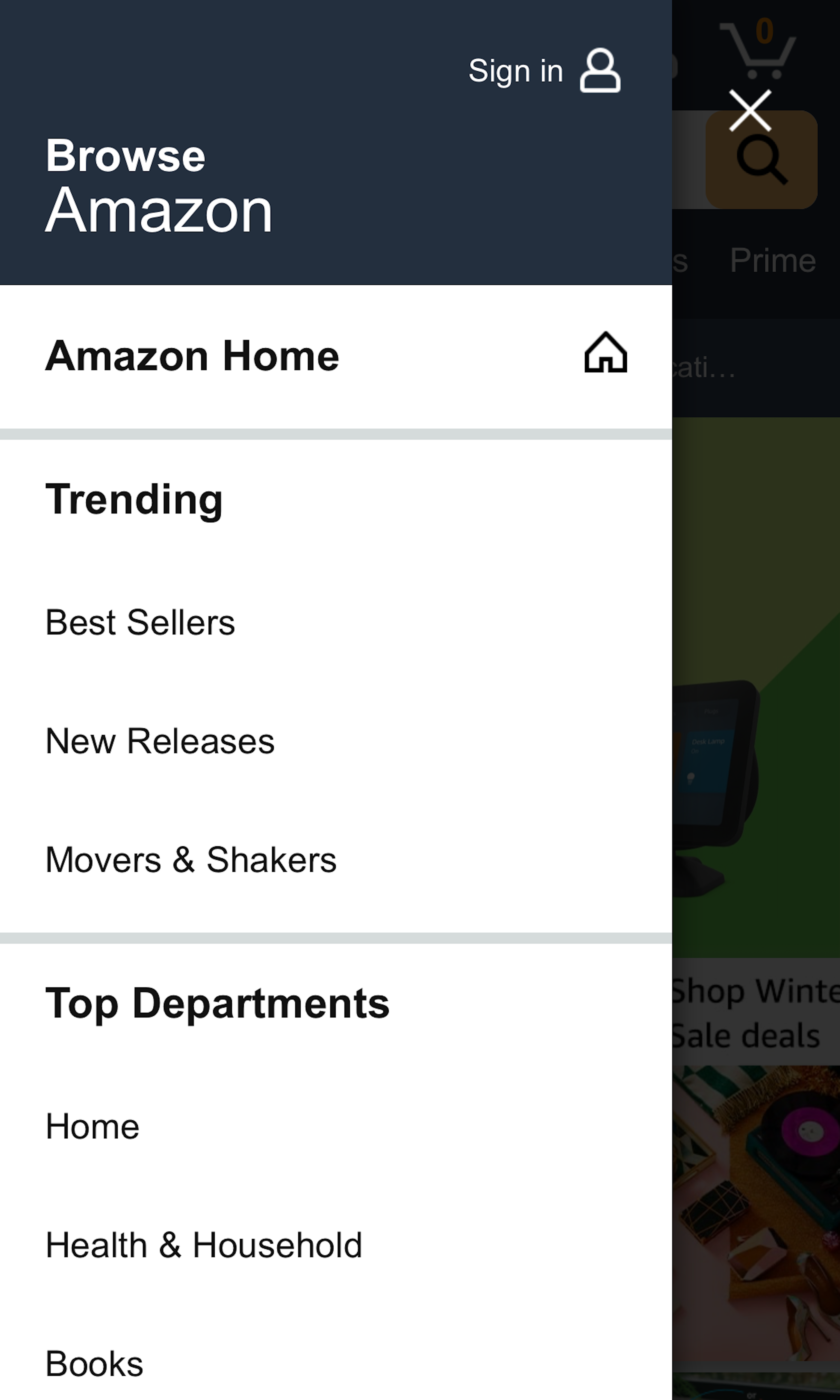
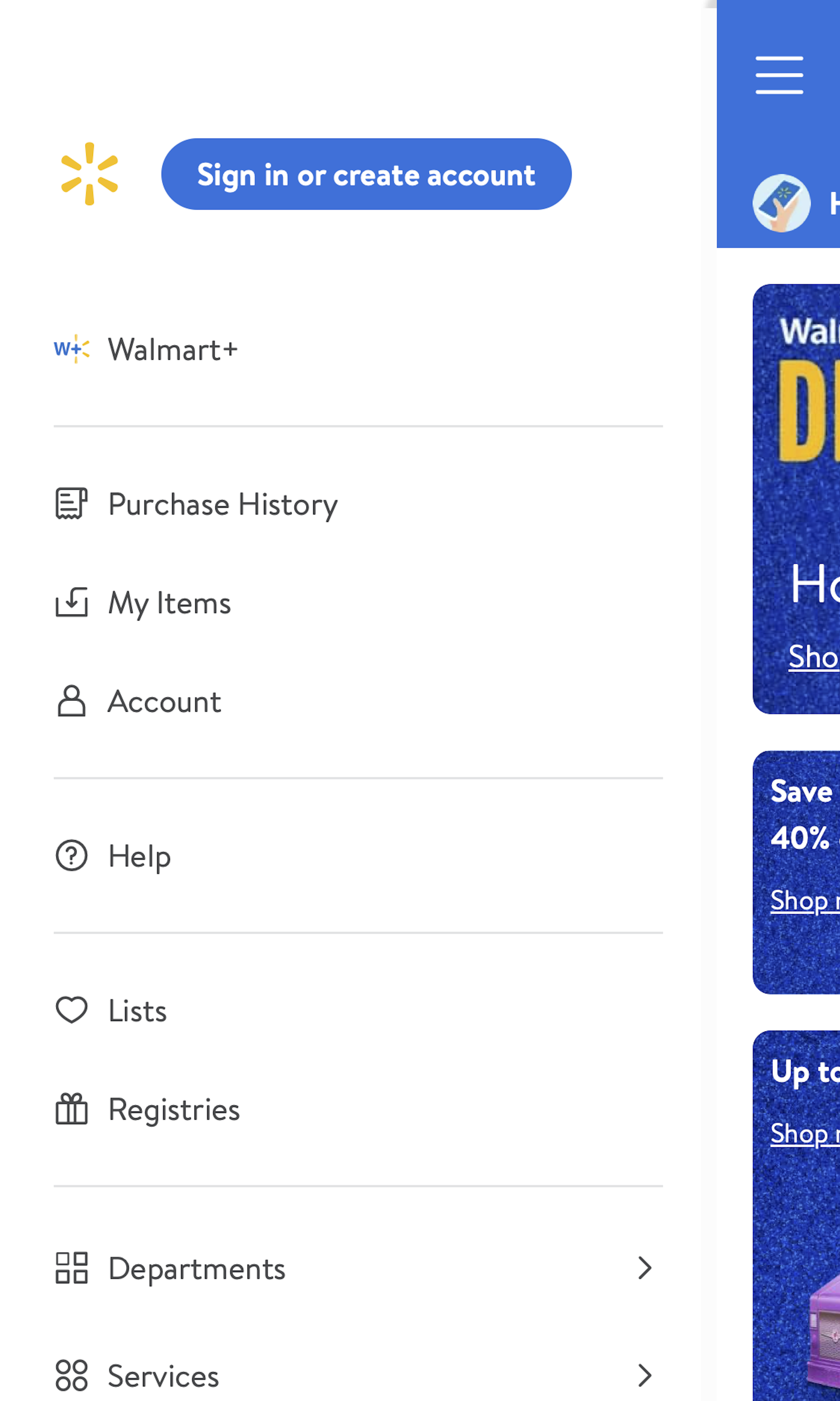
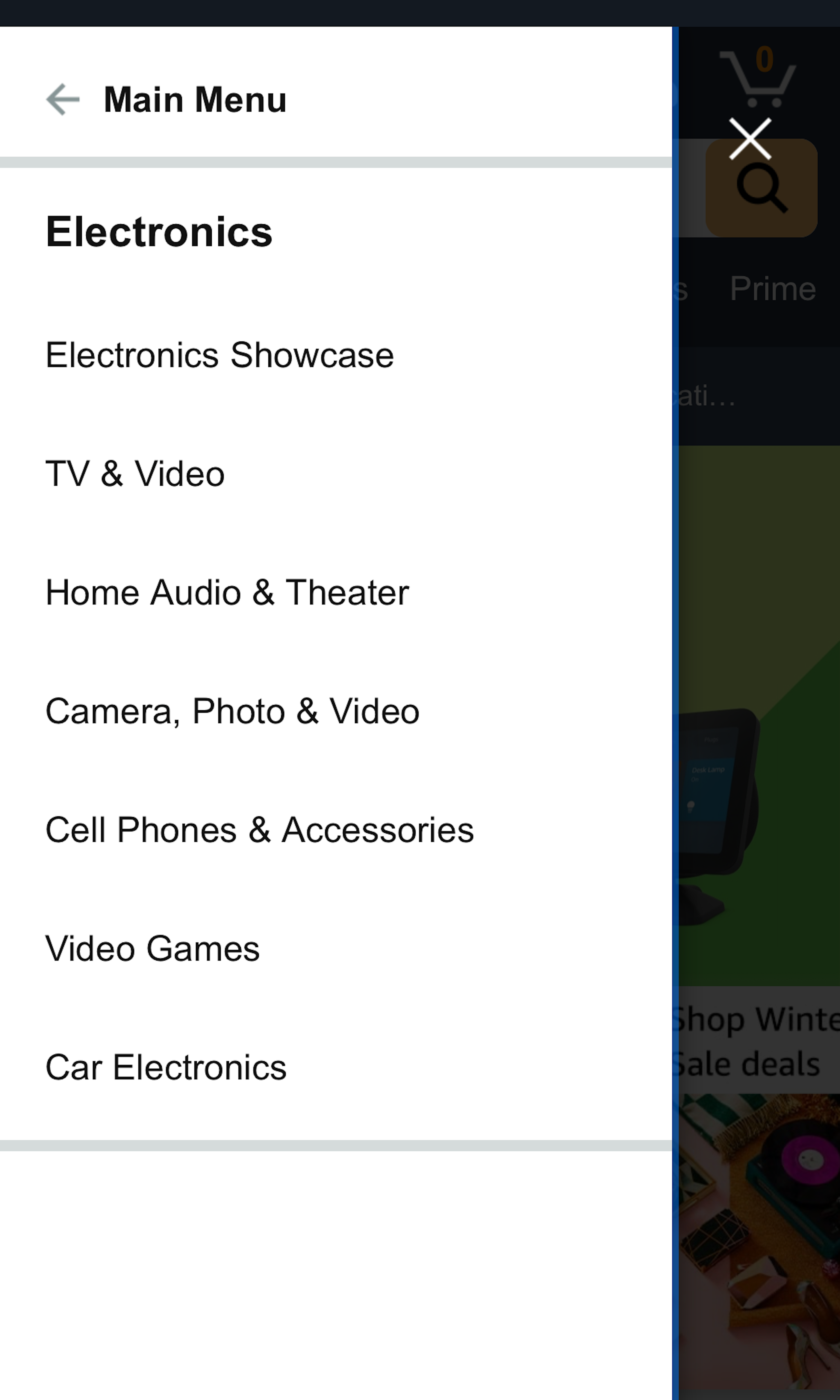
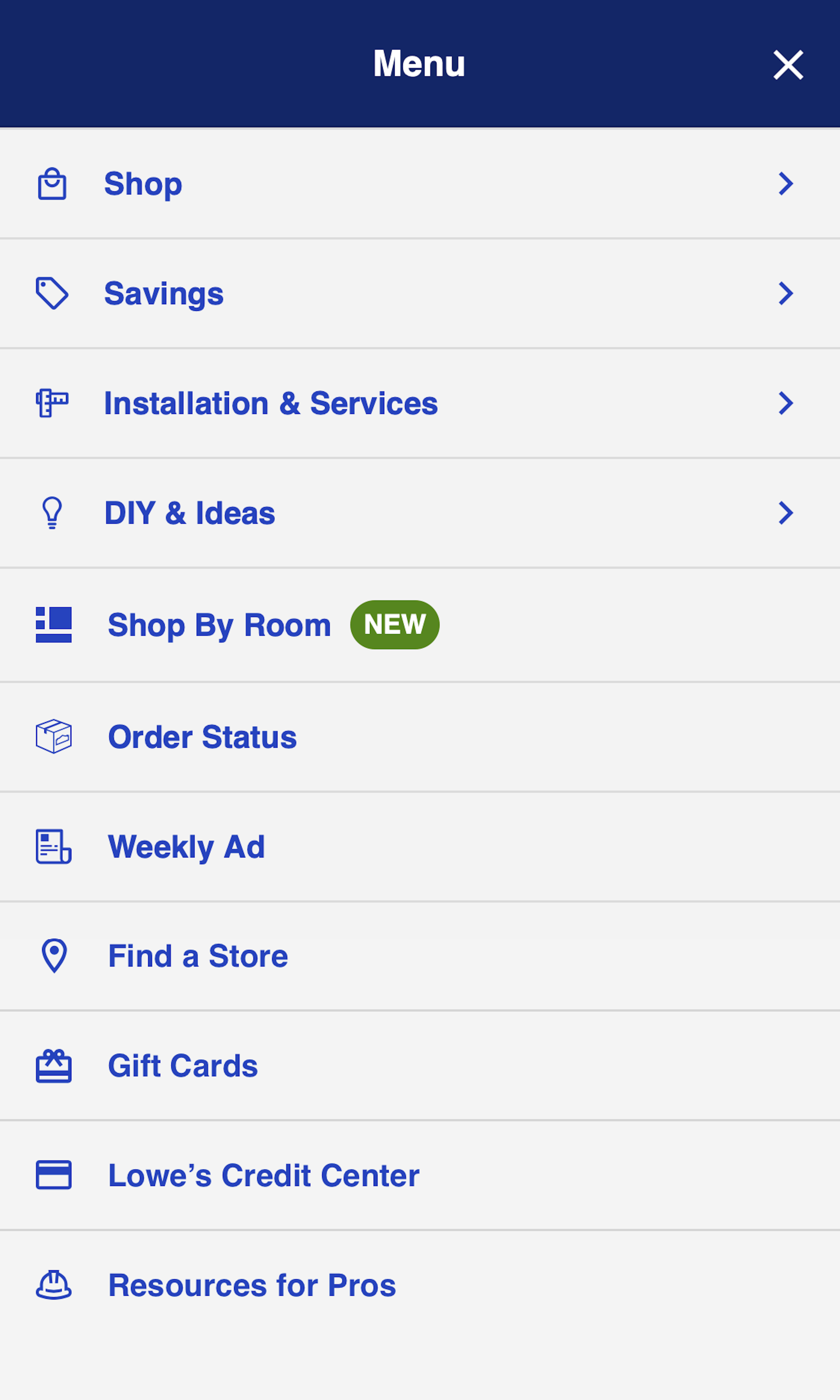
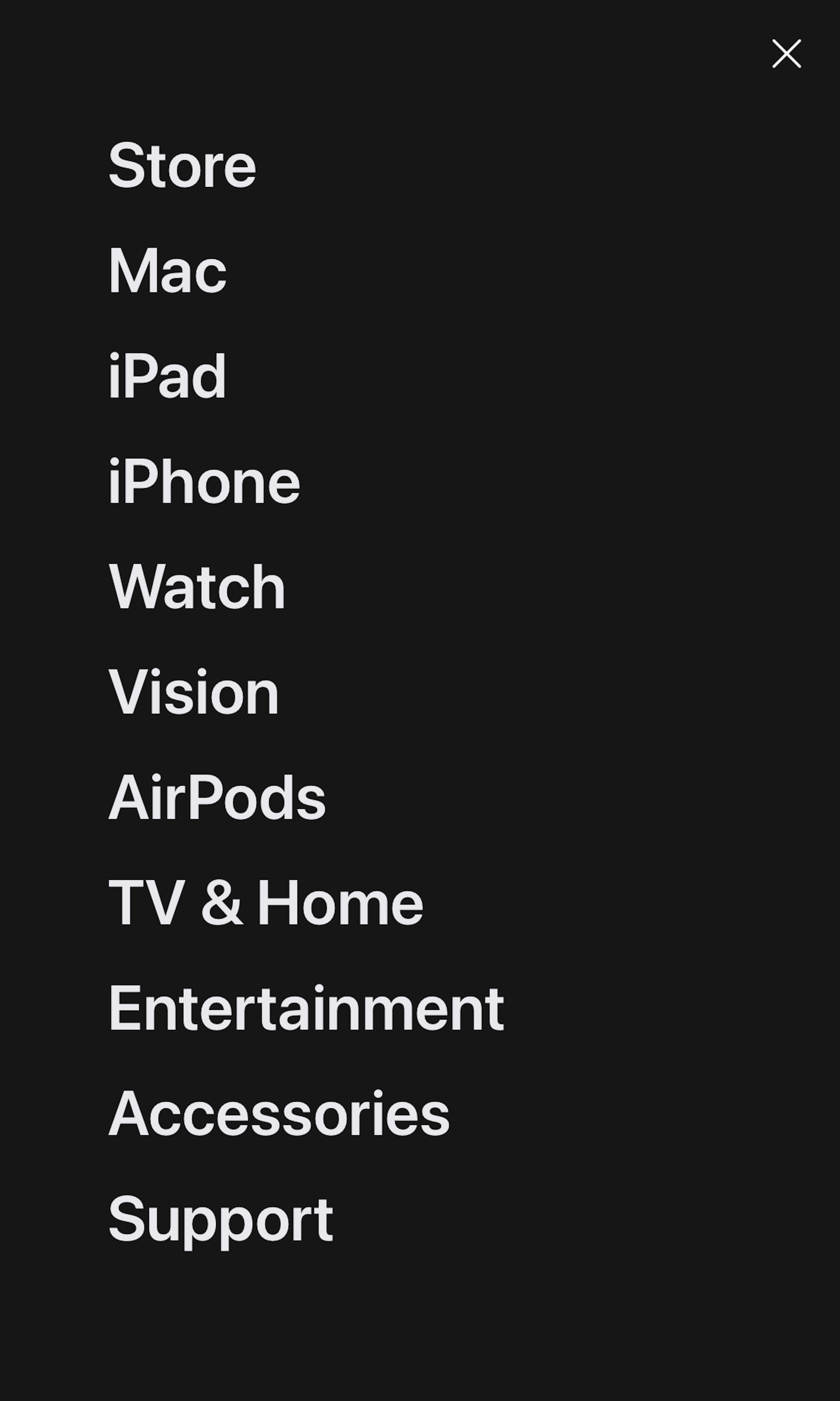
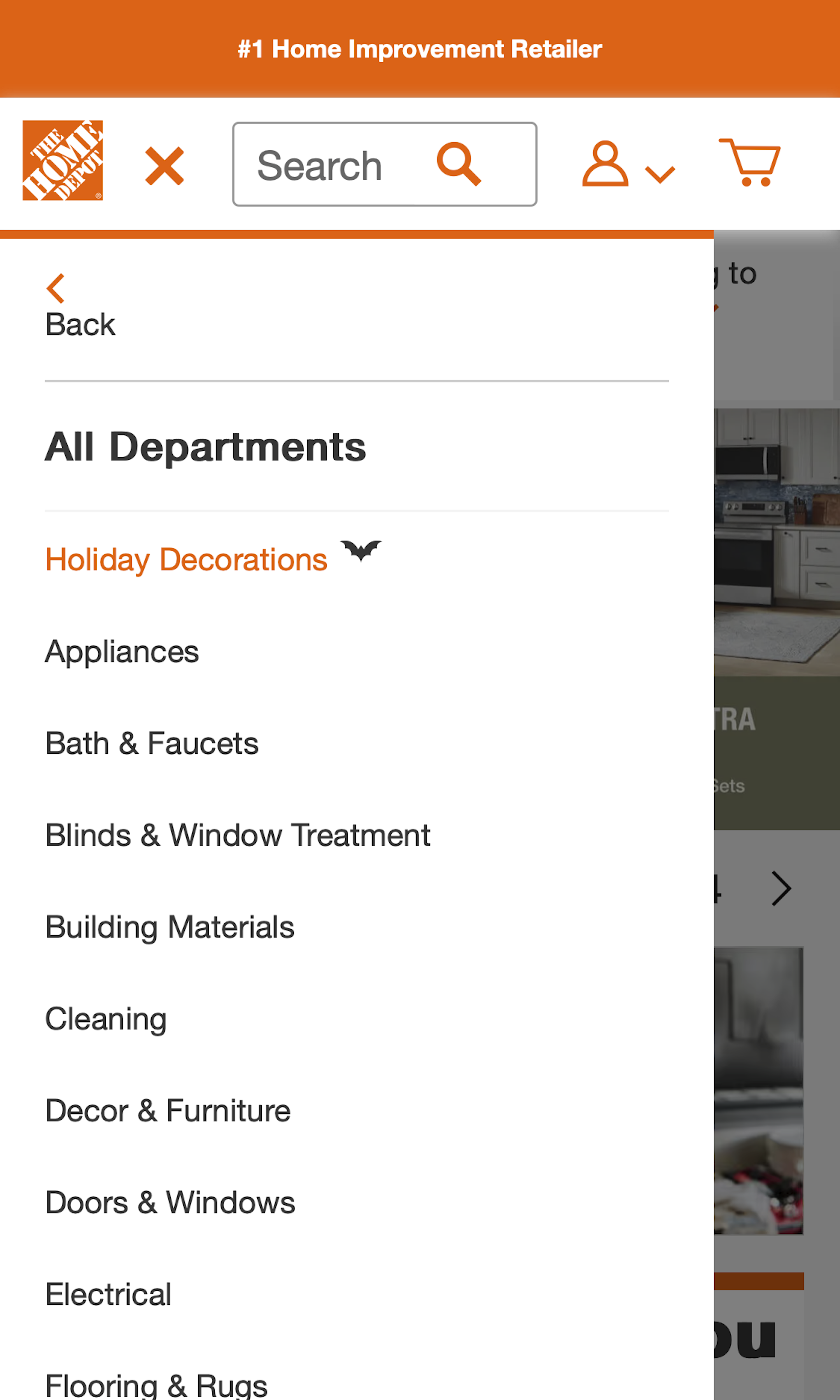
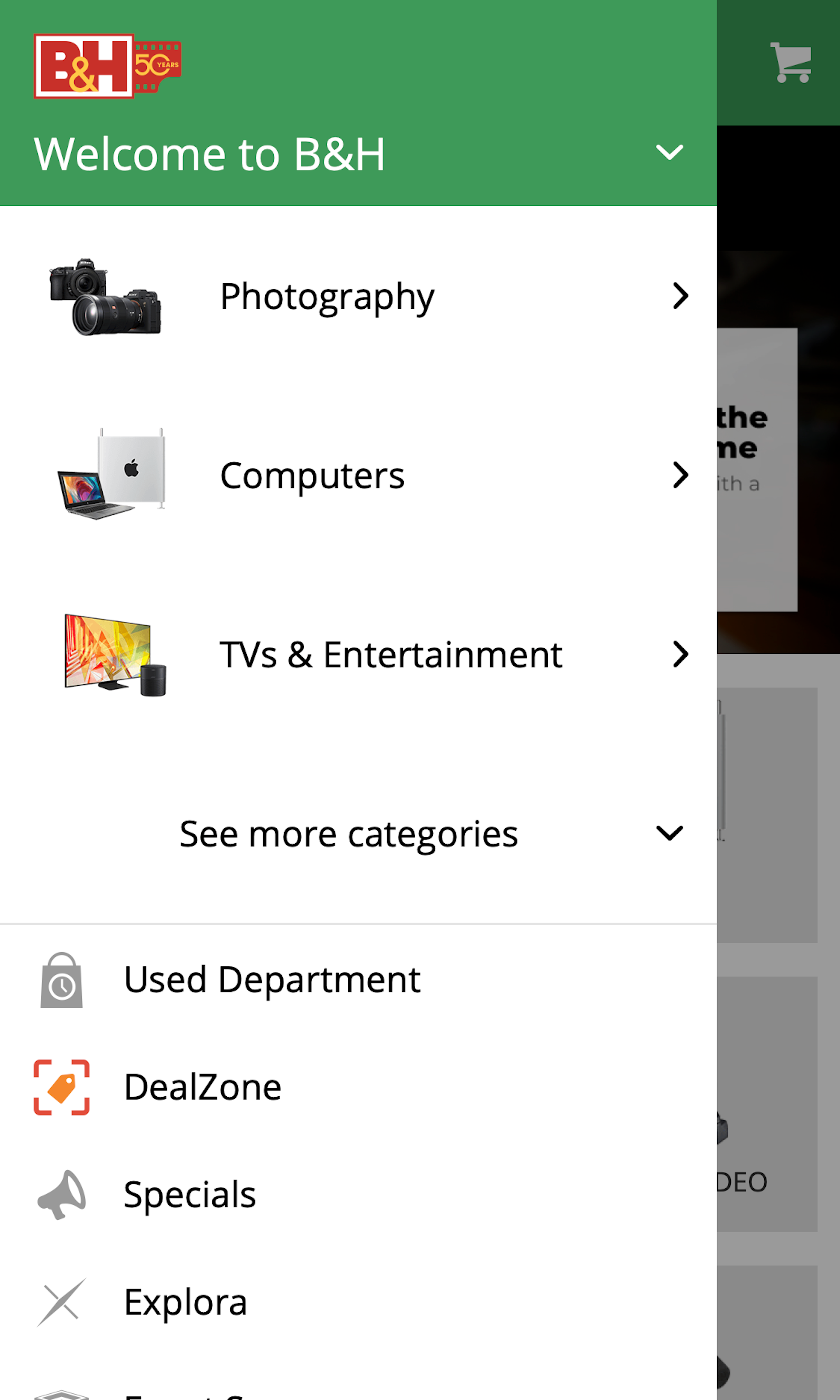
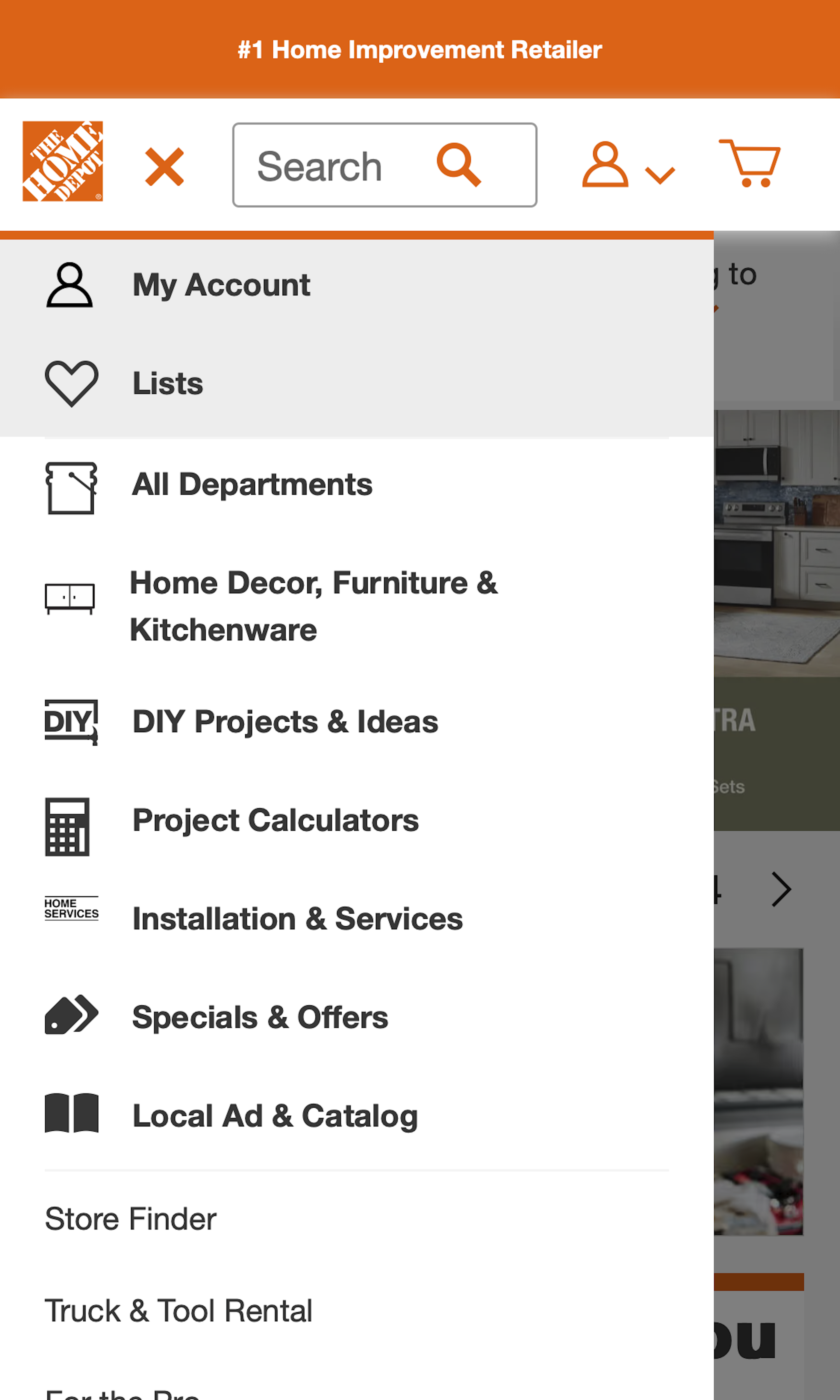
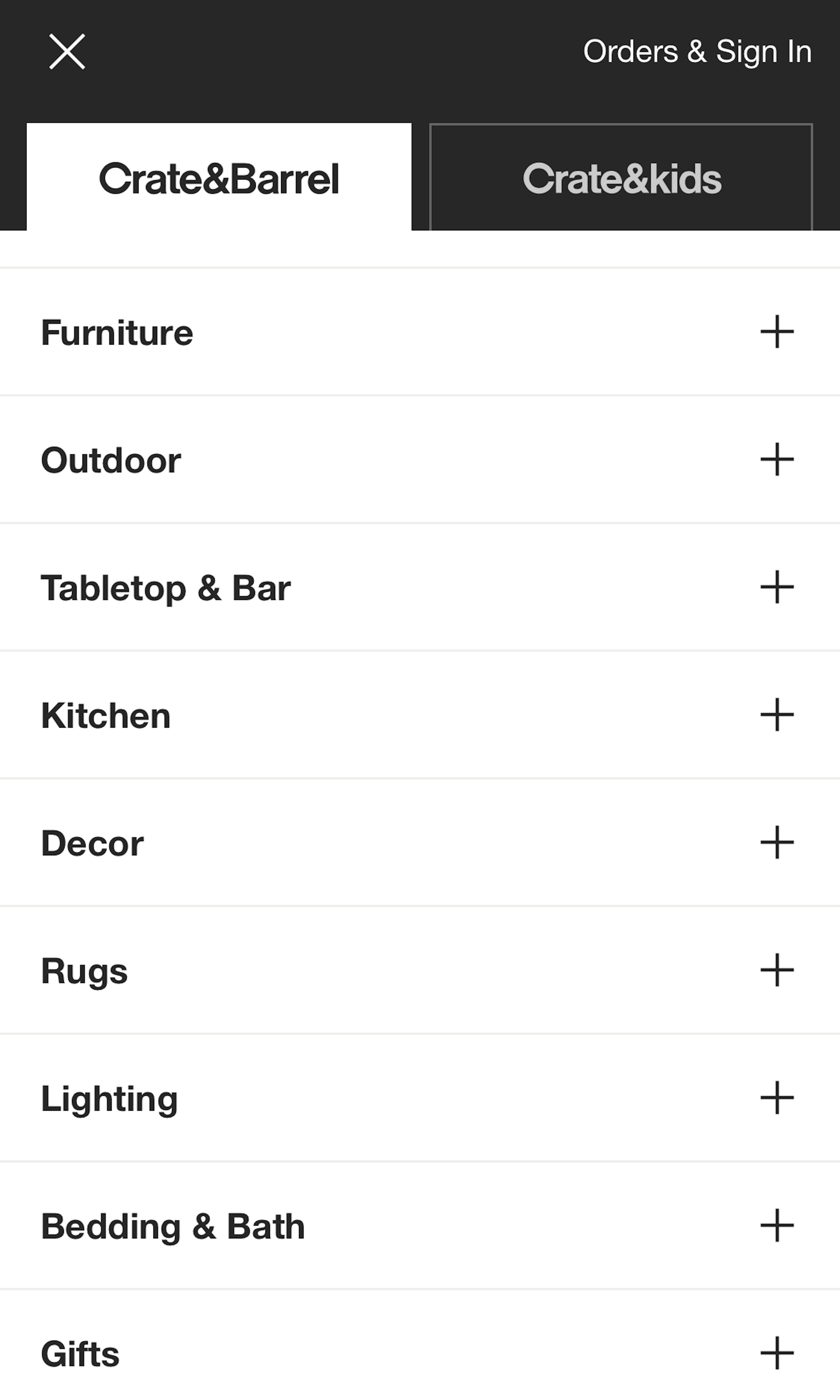
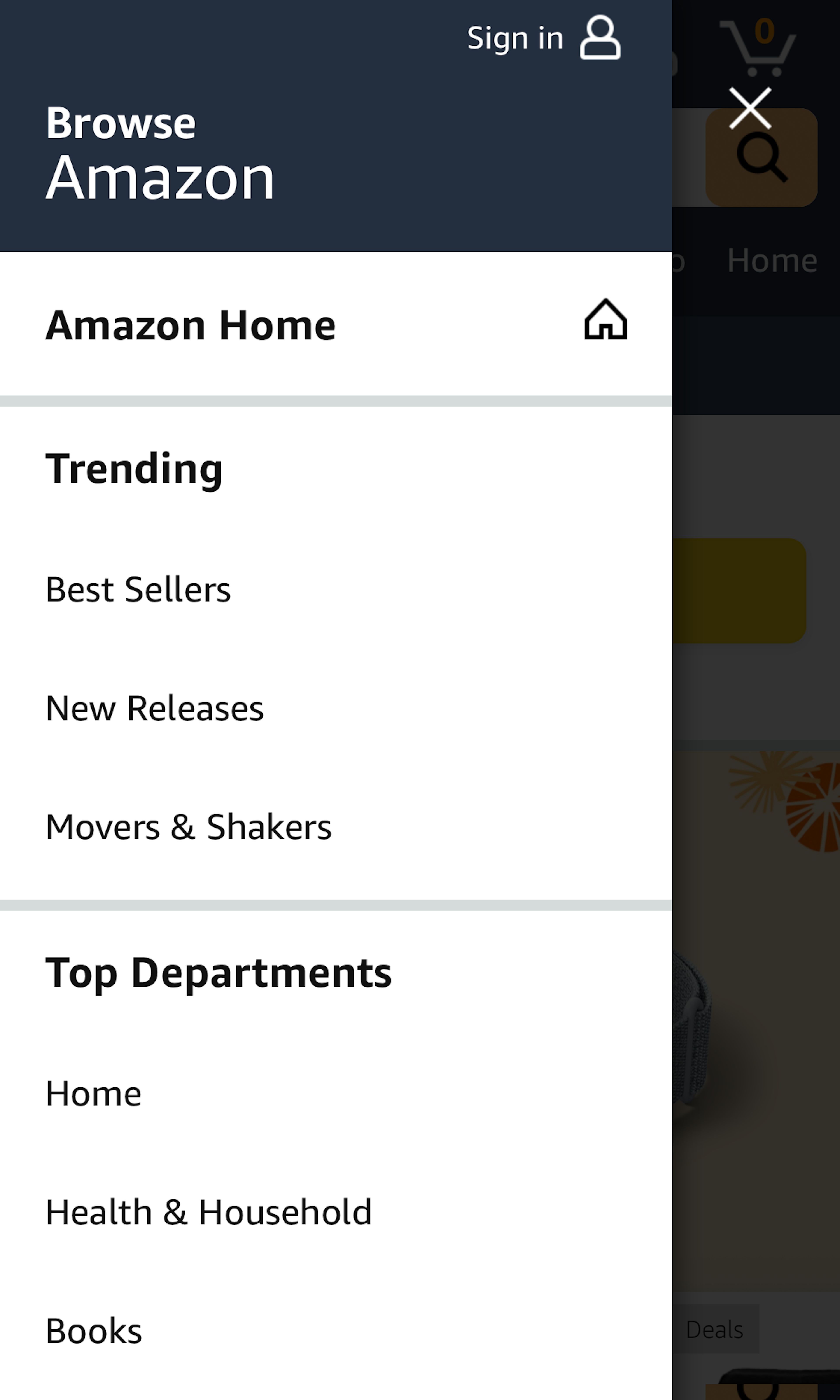
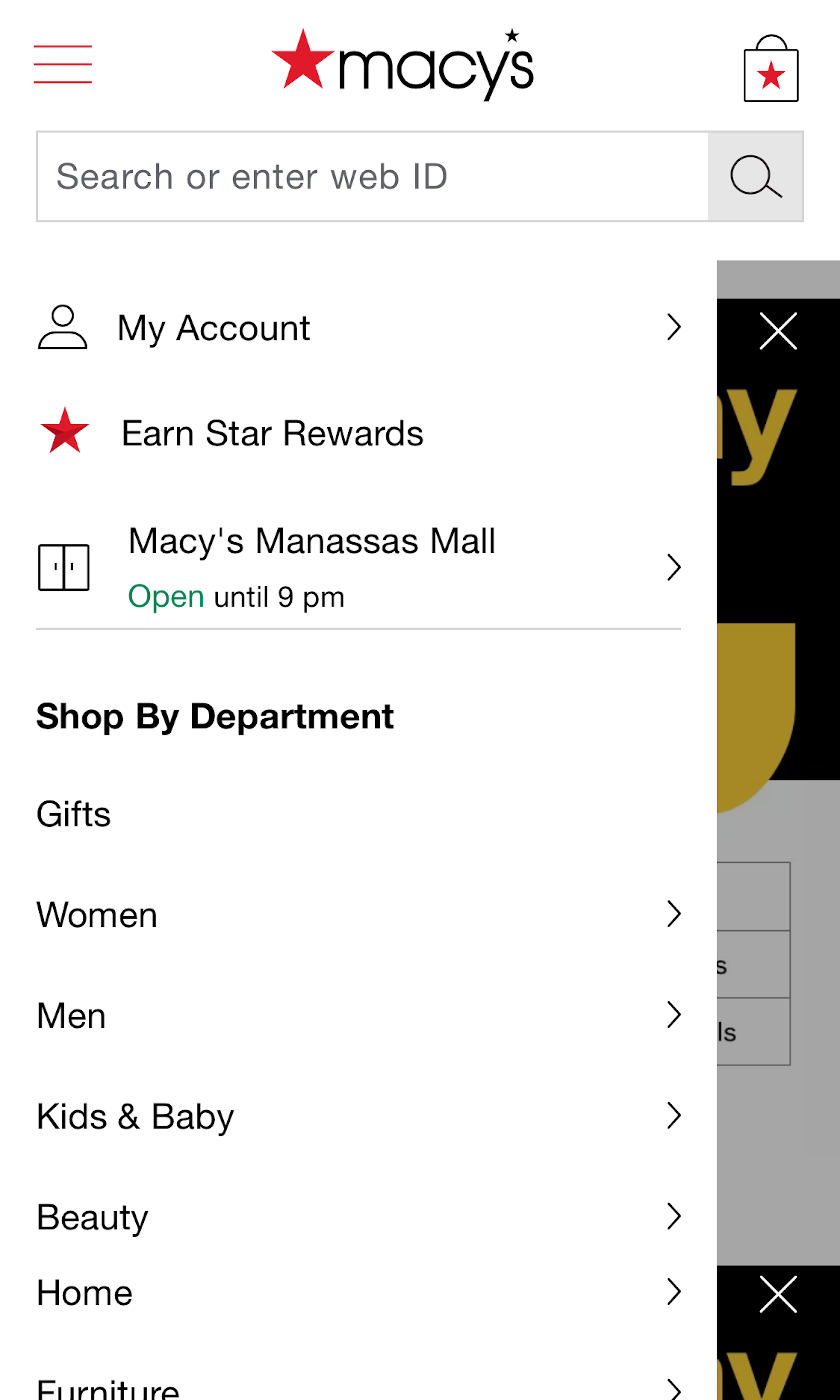
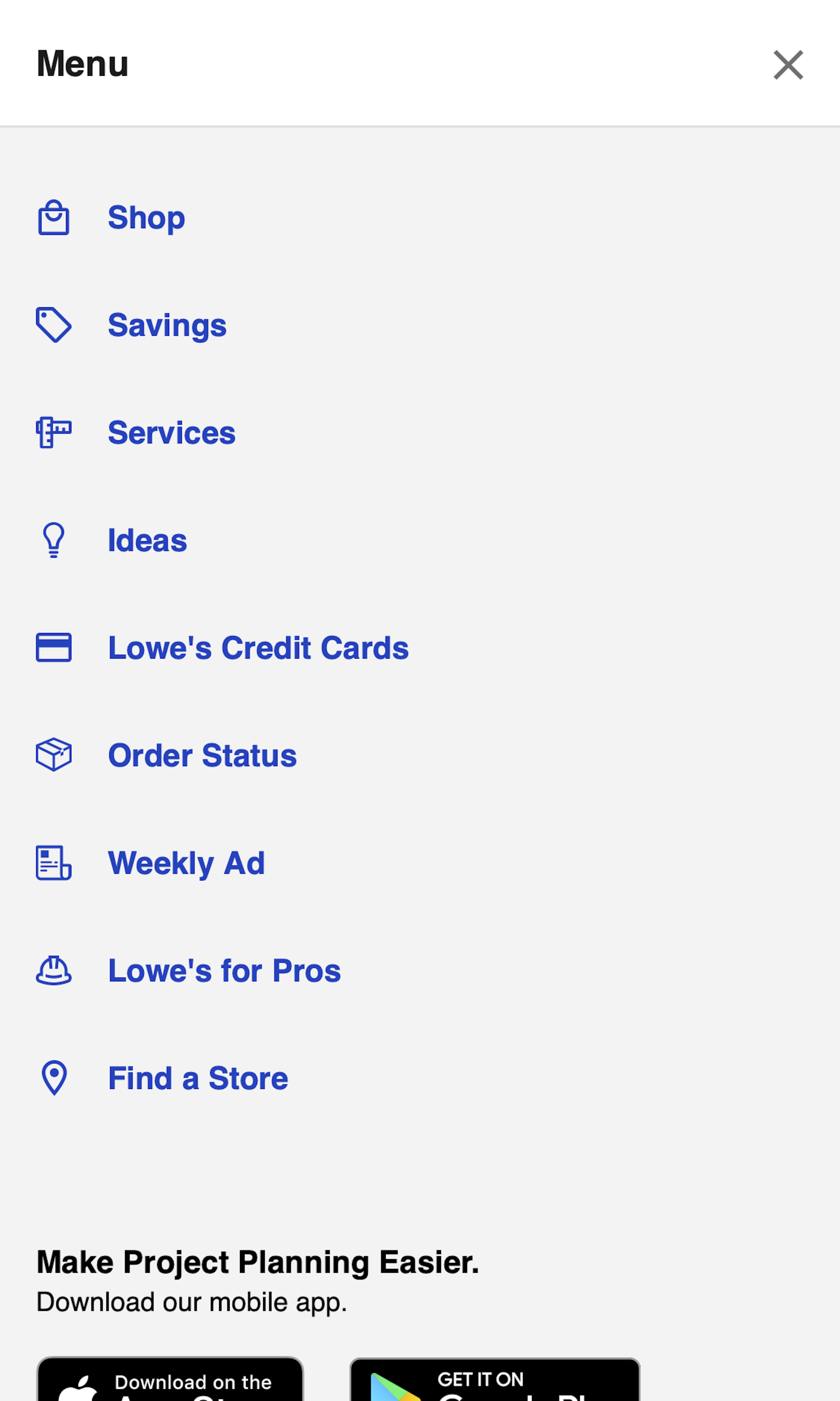
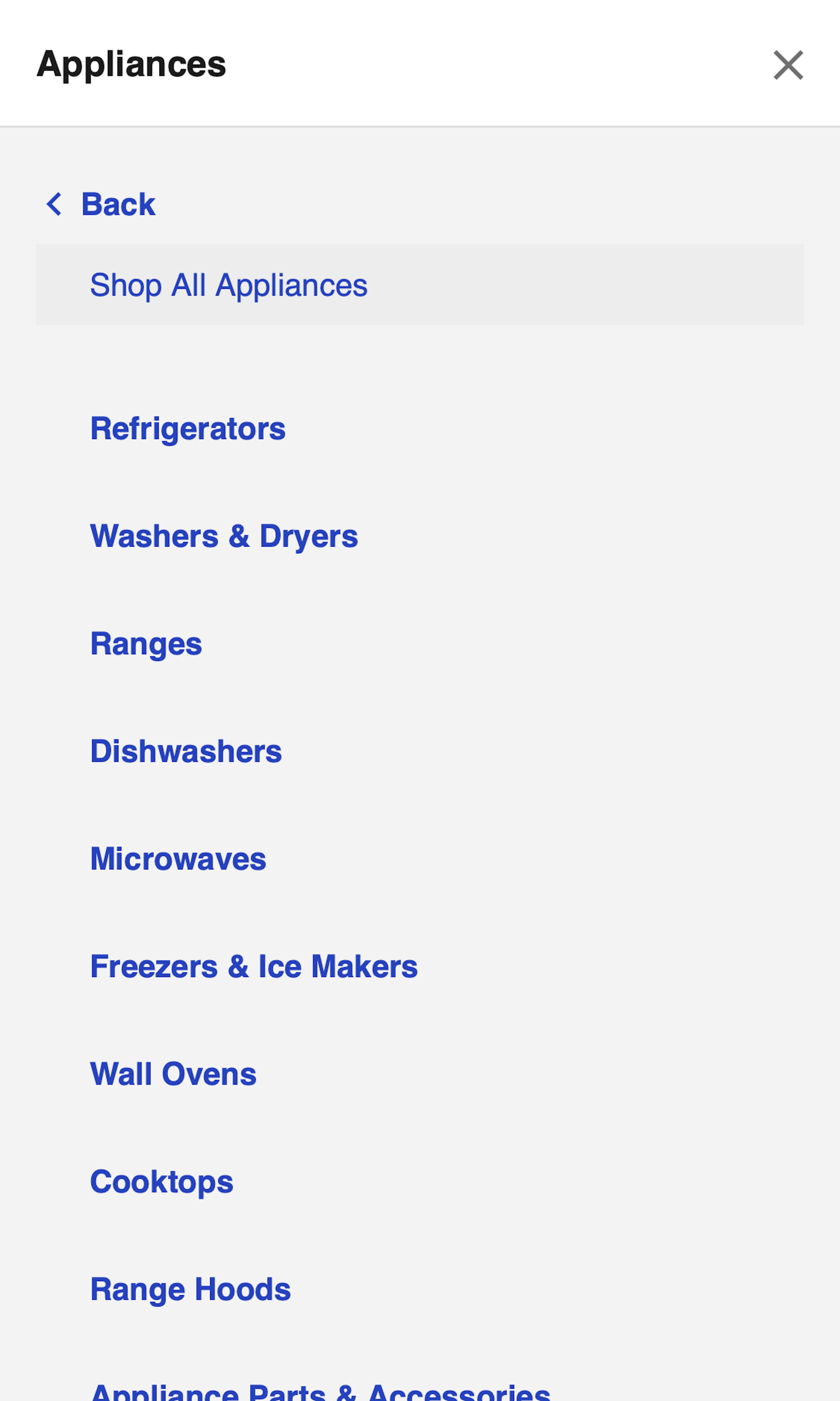
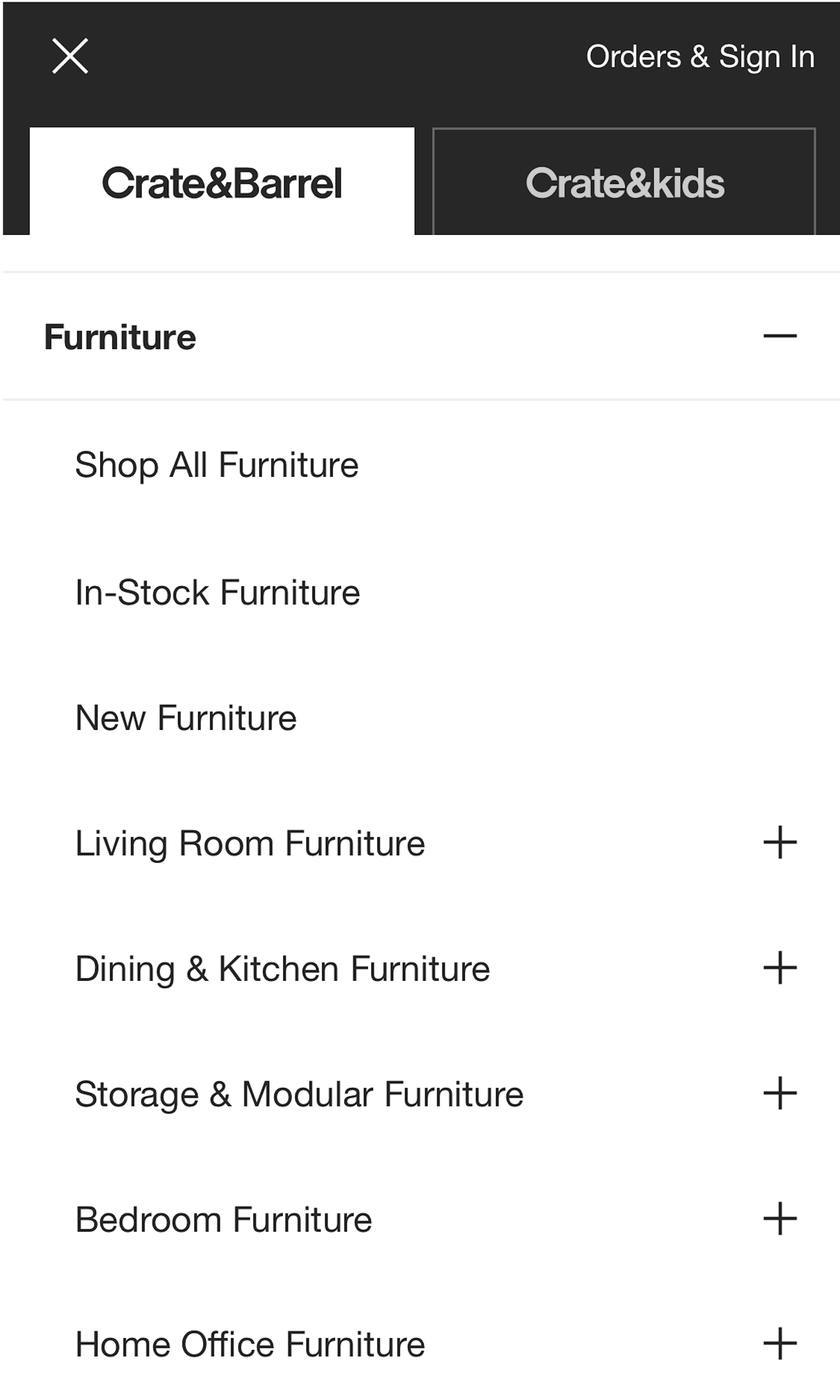
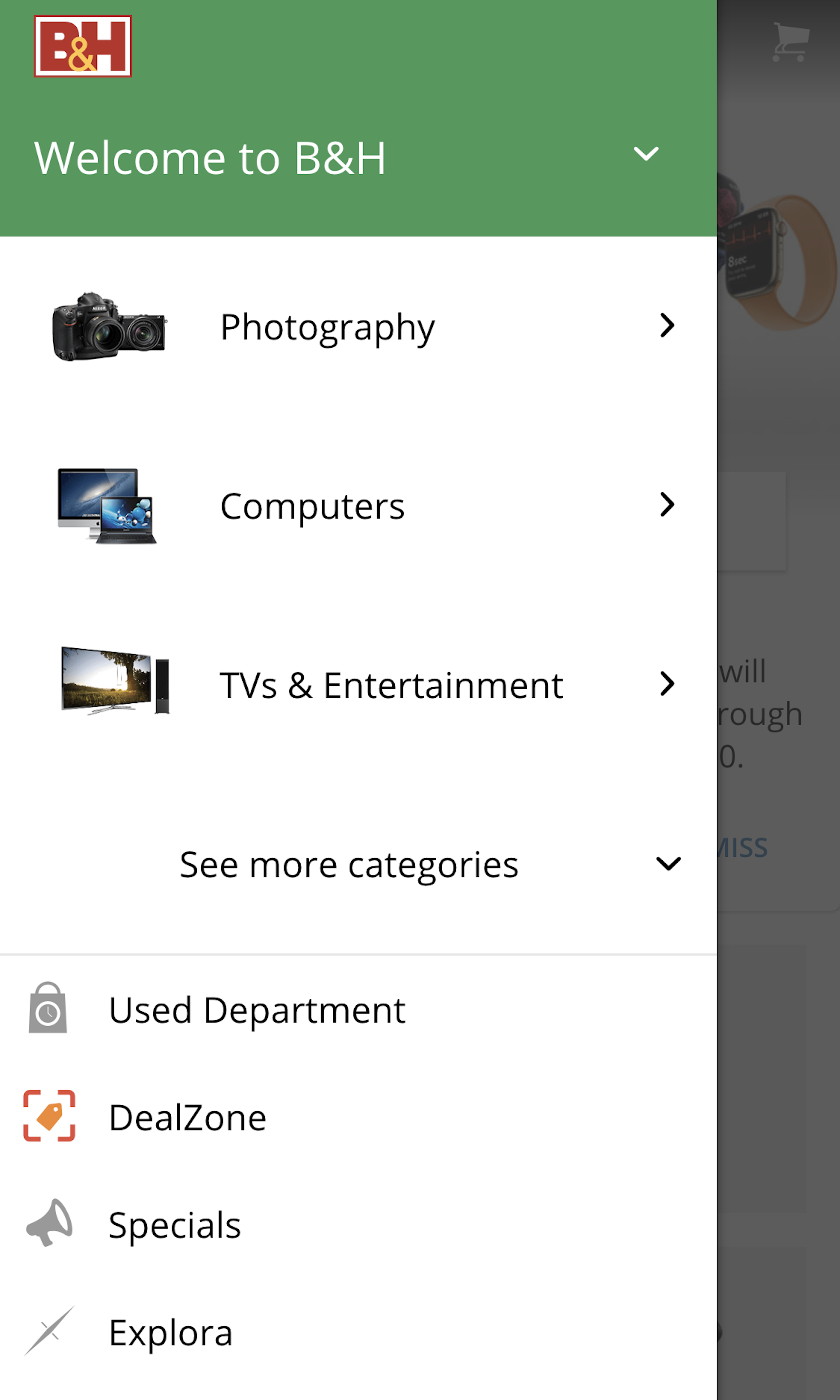
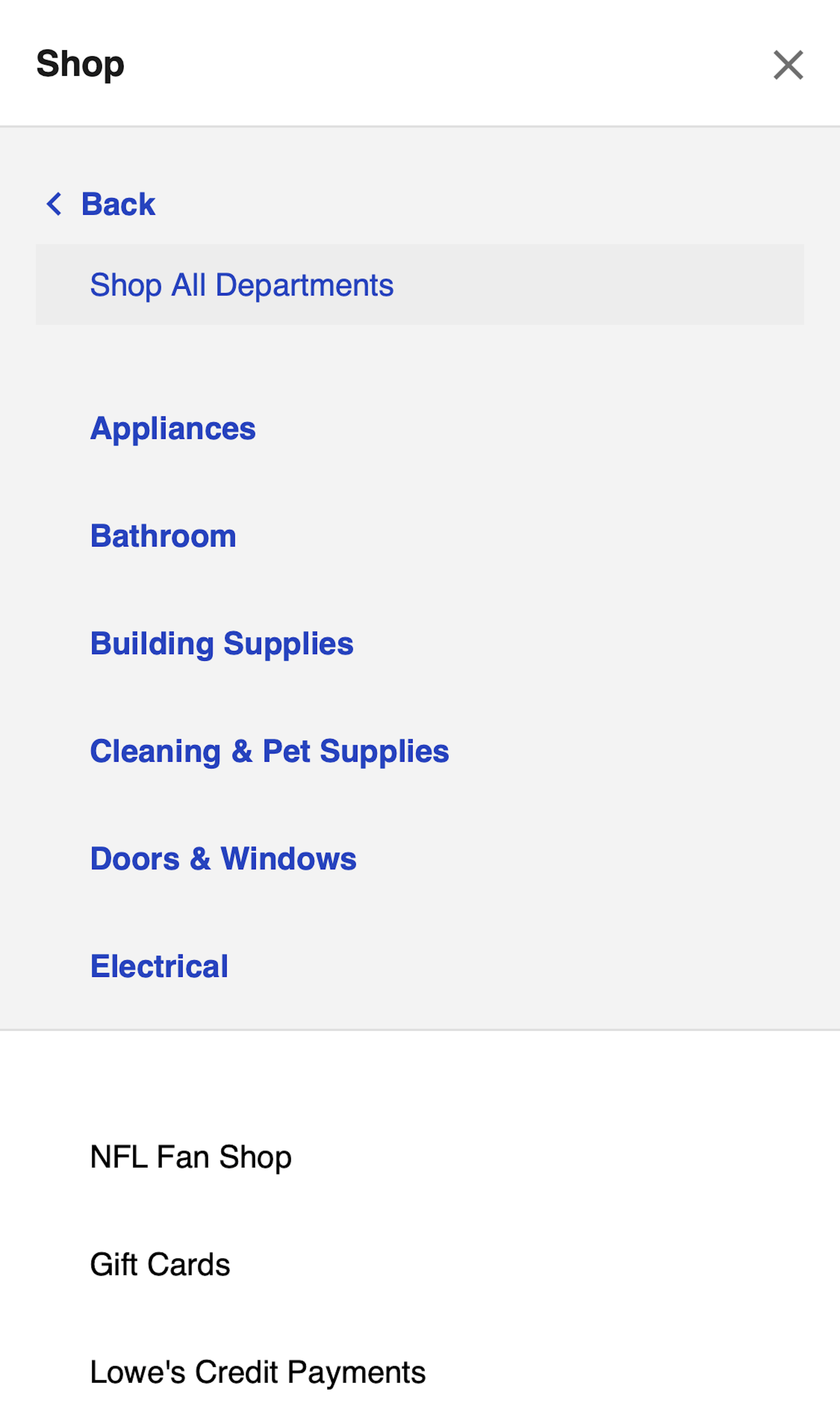
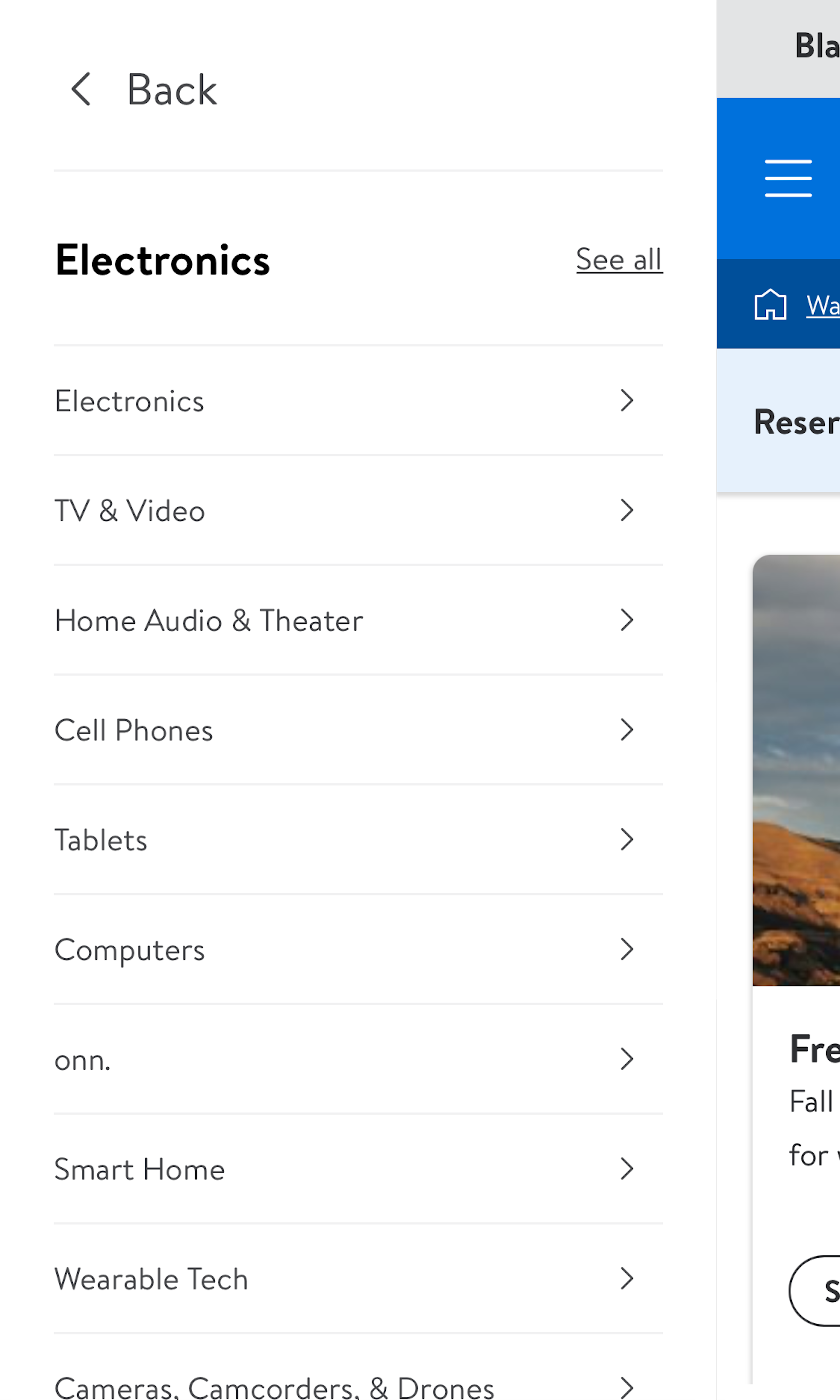
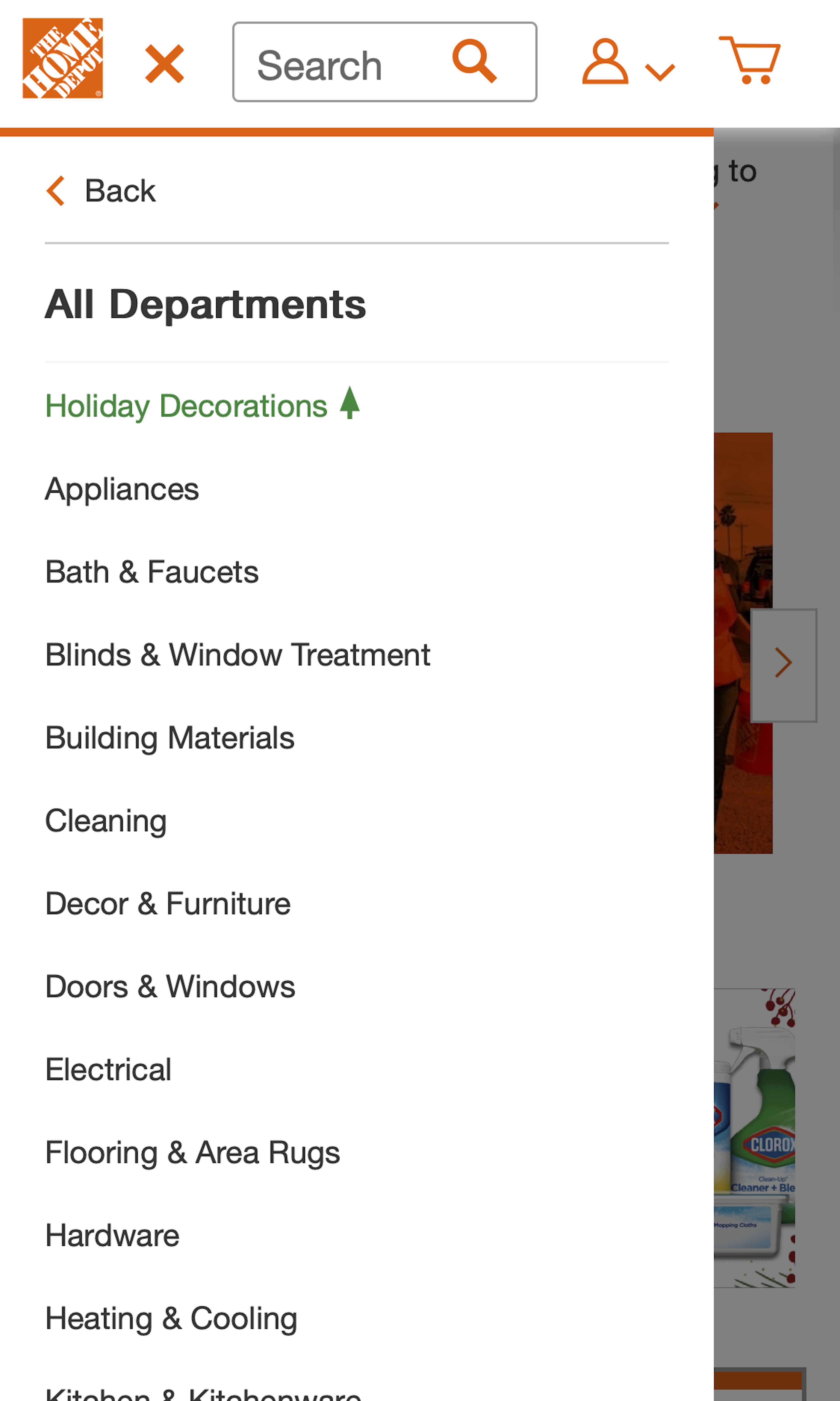
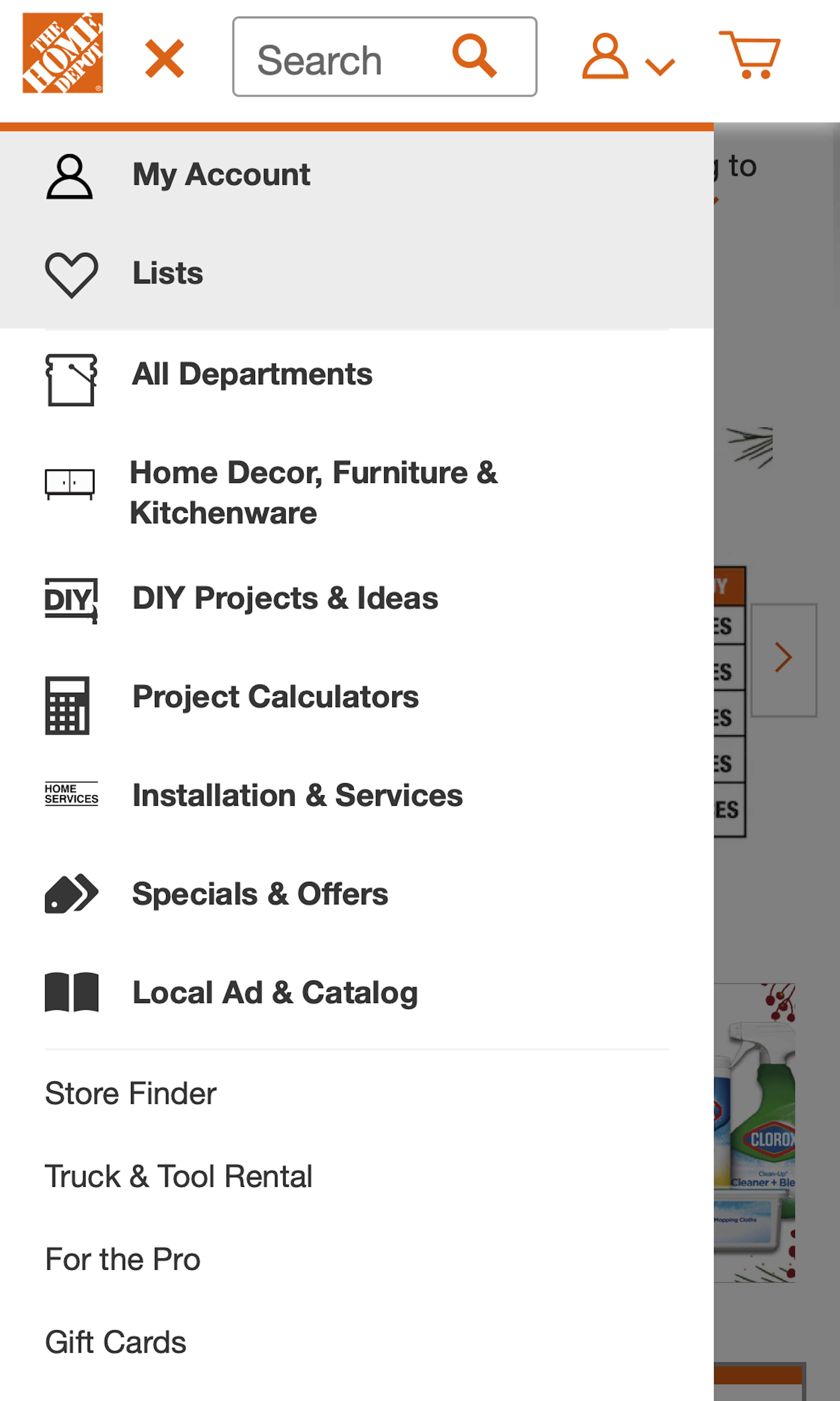
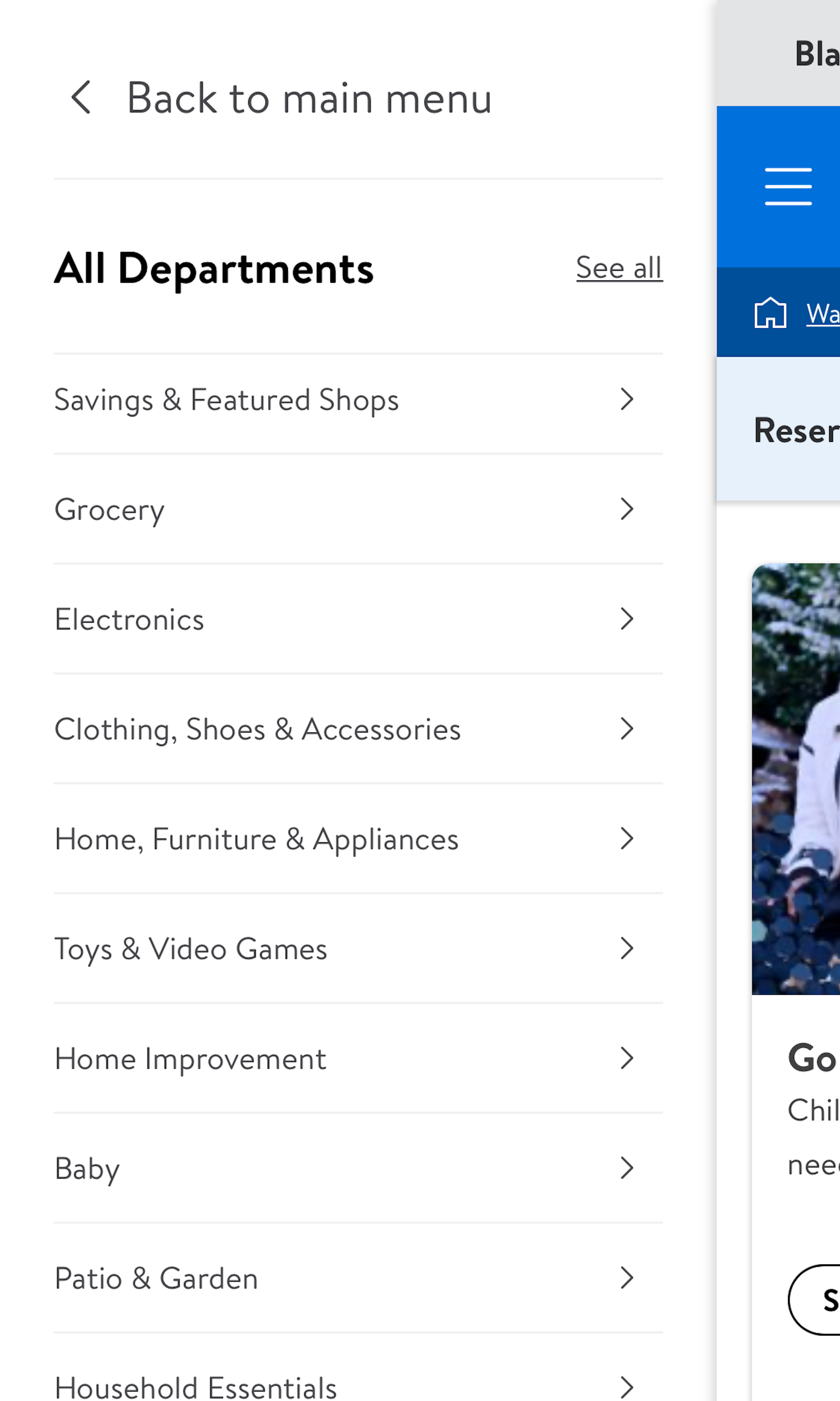
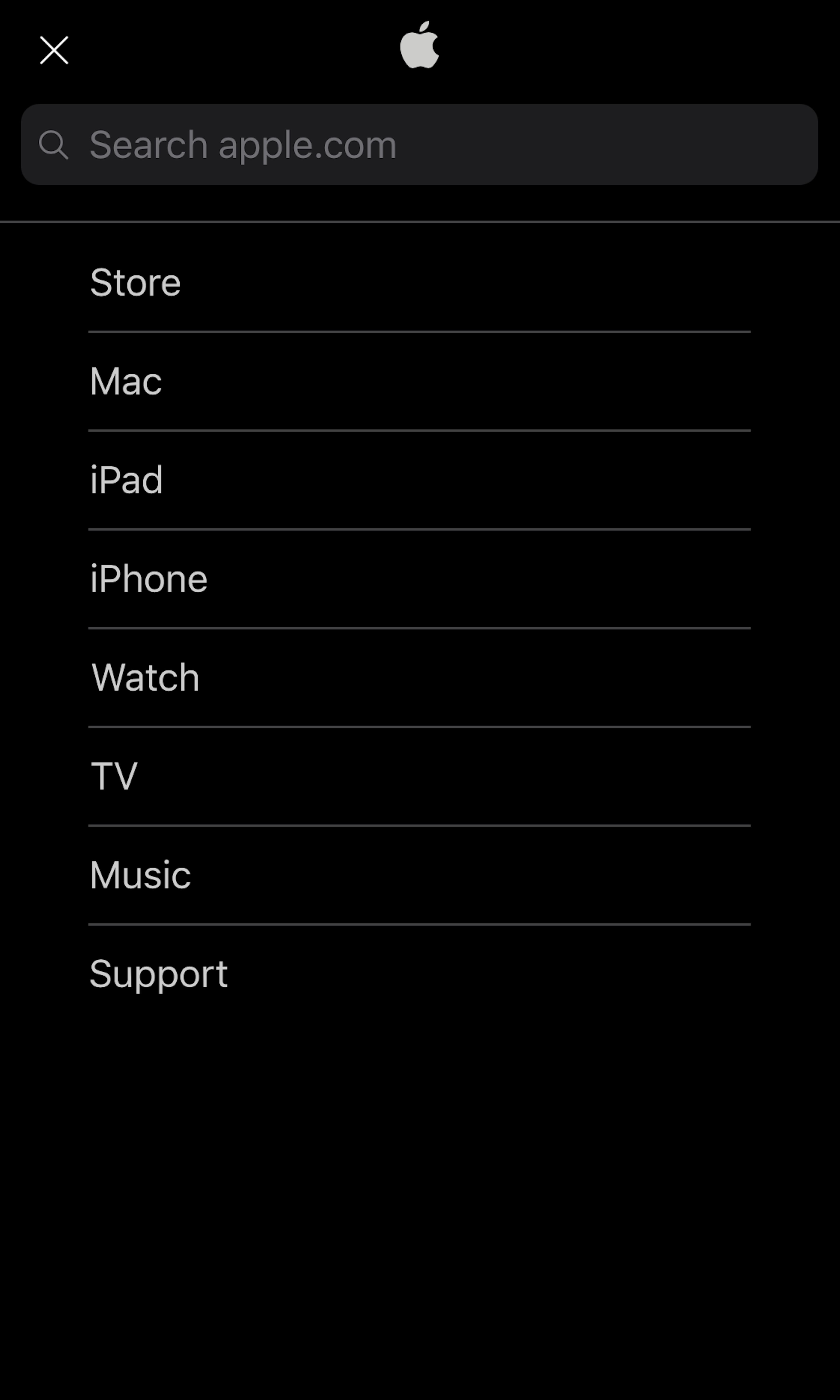
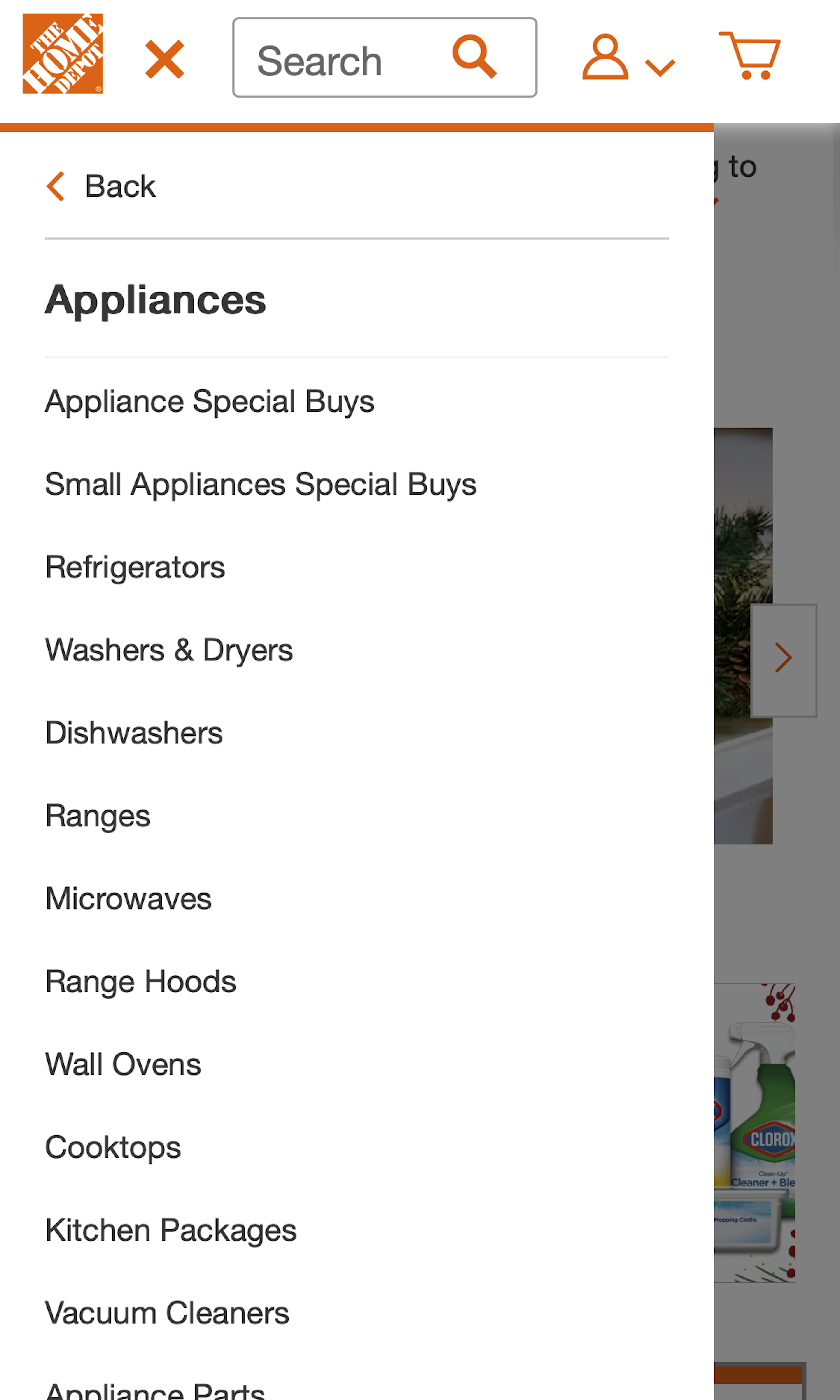
During usability testing we consistently observe that mobile navigation is particularly difficult for users. When designing a mobile navigation it will often have to deviate significantly from the desktop mega drop-down. Most often the mobile menu is by default collapsed and hidden behind a ‘3-bars’ ‘hamburger’ icon. One particular pitfall most sites struggle with is a mobile menu design that can both allow users to access the broad parent category pages while also allowing users to go deep into the sub-subcategory levels.
More ‘Navigation Menu’ Insights
-
Desktop Examples: Besides the mobile examples below, we also have 145+ desktop examples of Drop-Down Menu implementations, and 155+ desktop examples of Top-Level Navigation implementations.
-
Learn More: Besides exploring the 189 mobile “Navigation Menu” design examples below, you may also want to read our related article “The State of Mobile Ecommerce Search and Category Navigation”.
-
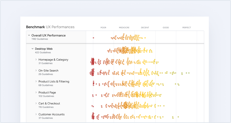
Get Full Access: To see all of Baymard’s 351 mobile research findings you’ll need Baymard Premium access. (Premium also provides you full access to 150,000+ hours of UX research findings, 650+ ecommerce UX guidelines, and 275,000+ UX performance scores.))


User Experience Research, Delivered Weekly
Join 60,000+ UX professionals and get a new UX article every week.

User Experience Research, Delivered Weekly
Join 60,000+ UX professionals and get a new UX article every week.
Explore Other Research Content
300+ free UX articles based on large-scale research.

257 top sites ranked by UX performance.

Code samples, demos, and key stats for usability.