Key Takeaways
- Images and other graphics (e.g., review stars) must contain an HTML
altattribute to be accessible to users aided by assistive technologies (such as screen readers) - “Informational” image
alttext must accurately describe the informational content contained within the image or graphic object (such as an icon) (55% of e-com sites don’t) - Avoid embedding text in images as it won’t be read by screen readers and does not scale on mobile devices (64% of sites get this wrong)
In e-commerce, images are heavily used to communicate information about products and services — and thus are often crucial to users’ ability to evaluate products and services.
So-called “Informational” images are principally designed to convey information of some kind to users — for example, an image displaying an assortment of different tools for the “Hardware” category or an illustration or diagram breaking down a complex product feature — and are often key to navigating a site.
Yet our rating of 33 top-grossing sites, conducted during our research on Accessibility in e-commerce, reveals that 55% of e-commerce sites fail to meet basic accessibility requirements when it comes to “Informational” images — resulting in a subgroup of users being unable to obtain the information that’s being communicated visually by the images.
Given the general importance of images, this can quickly lead to users abandoning the site.
In this article we’ll discuss 1 basic requirement for making images accessible to users aided by screen readers and other assistive technologies:
- Use ‘ALT’ text to communicate the core contents of an image (55% of sites don’t)
Additionally, we’ll discuss 2 specific pitfalls to avoid when attempting to provide images that are accessible to all users:
- Avoid embedding text in images (64% don’t)
- Avoid relying on images to communicate complex information (9% don’t)
(Note: the Web Content Accessibility Guidelines (WCAG) identify two more types of images, “Decorative” and “Functional”, which we’ll cover in a subsequent article.)
Use 'ALT' Text to Communicate the Core Contents of an Image (55% of Sites Don't)
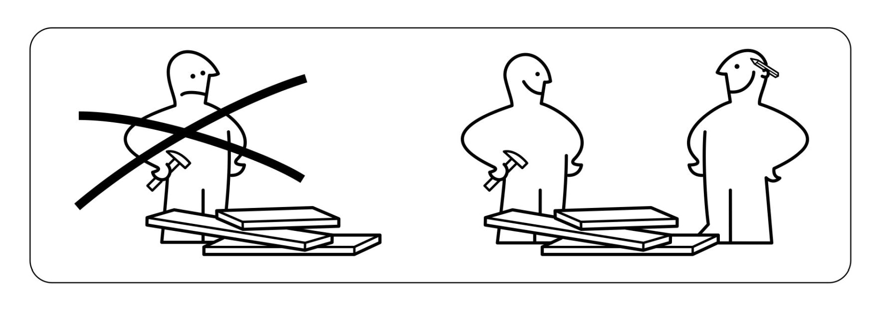
This simple diagram, originally used by IKEA to transcend language barriers in their instruction manuals, includes an alt text tag (alt="Picture of recommending to work with more than one person") to ensure that the meaning of the image is still communicated to users with visual impairments.
The foundation for making “Informational” images (or other visually based content, such as icons) accessible to screen readers is “alternative text”.
At Lowes, an image is presented which contains an alt text tag: alt="A Craftsman circular saw, Kobalt cordless impact driver and Dewalt cordless drill.".
“Alternative text” is provided by the HTML alt attribute, which must be included within the HTML element container of the image.
When an image with properly implemented alt text is encountered by screen readers, any text content following the tag will be read aloud to users. Therefore, proper alt text content should effectively communicate any relevant visual information that would be seen by sighted users, along with any additional functions of the image (such as an image acting as a link to a category page).
If the alt tag is not included, screen readers are likely to announce unnecessary or irrelevant content to the user — such as the image’s lengthy alphanumeric filename (see video at the end of this article for an example) — unnecessarily wasting users’ time.
Moreover, users with visual impairments will still be left guessing as to the meaning of the image after listening to this useless information.
Therefore, “Informational” images typically always need descriptive alt text to be accessibility compliant.
That said, alt text for “Informational” images doesn’t need to be an exhaustive textual reproduction of every visual detail of the image.
For example, in the IKEA example it is not necessary to inform users with visual impairments that the image has “One person holding a hammer and frowning…etc.”; rather, the essential meaning behind the image is that “It is recommended to build the product with more than one person”.
Therefore, the baseline requirement for making an “Informational” image accessible to users with visual impairments is only that the core meaning or message of the image is conveyed.
Additionally, as disabilities can present together (e.g., visual impairment may come along with or as a result of cognitive impairments), economizing alt text information can make the site easier to understand and navigate for those with cognitive, as well as visual, impairments.
At Lowes, most of the visual elements on this product page have alt tags. For example, there is the primary alt text for the product image (DEWALT Power Tool Combo Kits #DCK283D2 Product Image #3), then there is an additional alt tag for the badge at the top (new lower price), and finally there is an alt tag for the review stars (5.0 out of 5 stars with 305 reviews). Together these tags convey all the necessary nontext information visible on the page. Note, there is no separate alt tag for the thumbnail image.
Furthermore, note that if an image contains multiple, semi-independent visual components, then an alt text tag for each component is necessary (as long as those components are not for decorative purposes).
Code Examples from Lowes
Product Image & Thumbnails
<img data-name="image" class="styles_ListImage" alt="DEWALT Power Tool Combo Kits #DCK283D2 Product Image #3" src="http://productimage.jpg">
Image Badge
<img alt="new lower price" src="https://www.badge.svg">
Review Stars
<div class="styles__RatingDiv" aria-label="5.0 out of 5 stars with 310 reviews">…</div>
At Lowes, for example, even though the product image appears to sighted users to include a badge declaring that the product has a “New Lower Price”, the badge is an independent HTML element — which can be added or removed from the product image — and will therefore be read separately by screen readers.
While this may seem like an unnecessarily added implementation detail, separating the badge’s alt text from the product image’s alt text allows for more flexibility — as the same badge image can be swapped out and used across several products.
However, if the information presented in an image is also presented nearby or with accompanying text — such as a nearby caption — the image can simply be treated as “Decorative” and therefore only requires an empty alt tag.
Avoid Text Embedded in Images (64% of Sites Don't)
Providing alt text for all relevant “Informational” images is the first step toward making a site’s images more accessible.
Yet there are also specific implementations of “Informational” images that require additional accessibility considerations.
In particular, images with embedded text can be particularly problematic.
The core issue from an accessibility standpoint is that text that is embedded within an image is essentially “frozen” in the image.
For users using screen readers, the embedded text won’t be read by the screen reader, unless the text is reproduced in alt text.
Yet it can be difficult to always reproduce embedded text in alt text — and any omission of the embedded text from the alt text means users using screen readers won’t be aware of the embedded text at all.
Additionally, for users with milder visual impairments (which don’t necessitate using a screen reader), embedded text often doesn’t scale appropriately when viewed on mobile devices (which sighted users will notice as well, and often chalk up to being a “design bug”).
Consequently, if an image with embedded text is designed for a desktop viewport, but is then viewed on a mobile device, the text will likely be too small to read.
Additionally, users with visual impairments can also run into problems when the text embedded in images doesn’t have sufficient contrast (at least a 3:1 contrast ratio) against the background image.
Therefore, in the vast majority of cases, text embedded in images should be avoided.
When images with embedded text can’t be avoided, or would be too difficult to switch out, including an alt text tag summarizing the embedded text content can avoid this difficulty for users aided by screen readers.
However, users aided by other types of assistive technology — such as text magnifiers — may still struggle with the “frozen” text.
Implement Complex Images as Tables Using HTML (9% Of Sites Don't)
Another specific implementation for “Informational” images to be aware of are complex images.
For example, size charts on apparel sites, instruction manuals (as you would find for assembling a product at IKEA), or image-based spec sheets.
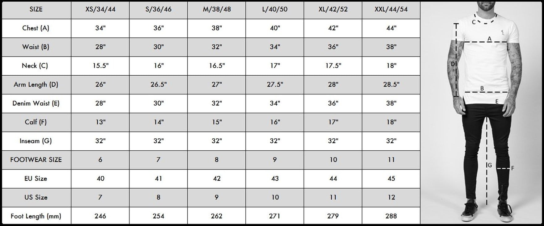
This size guide at True Religion is presented only as an image with alt="Men's Size Guide" announcing the purpose of the image, but not any of the information contained therein — which is what a visually impaired user would need if they visited this image. Complex images such as size guides need to be carefully presented — typically as a table — to make them accessible to users with visual impairments.
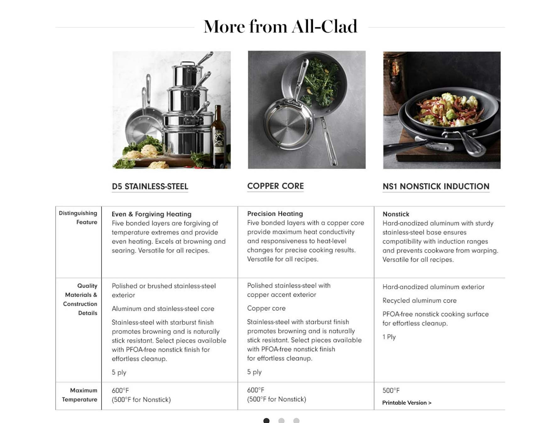
At Williams-Sonoma, detailed product information in the “More from All-Clad” section is visually given in a table format, which is easy for sighted users to read. Unfortunately for users aided by screen readers, the product detail tables are implemented as images with unhelpful alt text (alt="desktop-allclad-compchart-1"), meaning users with visual impairments will not be able to have access to the same information as sighted users — which is required for maintaining accessibility.
While the informational content in most images is simple enough to be communicated via an alt text tag, complex images — such as a size chart or product spec sheet — contain such a depth of information that communicating that information via an alt tag would be almost impossible.
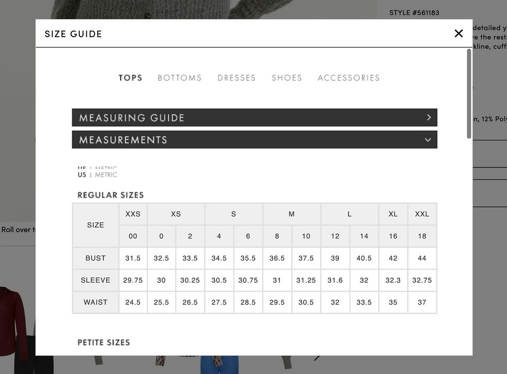
At Ann Taylor, the size chart is presented as a table, which, if implemented correctly, is easily accessible to assistive technologies like screen readers.
To avoid this issue, complex information shouldn’t be conveyed in an image but rather be presented to users via an HTML table or other text format accessible to users aided by screen readers.
If a complex image must be used, a short alt text description can be provided which identifies the purpose of the image (e.g., “Size Chart”) and describes the location of further information.
Ensure “Informational” Images Are Accessible to All Users
With many sites leaning heavily on images to communicate key information, it’s critical to ensure that “Informational” images are accessible to users using screen readers or text magnifiers, as well as users who have other accessibility needs.
Yet 55% of sites fail to provide descriptive alt tags for “Informational” images — making the information conveyed by the images inaccessible to a subgroup of users.
Additionally, 64% of sites use embedded text in images, which isn’t read by screen readers and can be hard to read for visually impaired users.
Moreover, 9% of sites use an image for presenting complex information, which, for a subgroup of users, is as bad as not having the information presented at all.
On the other hand, by ensuring that “Informational” images have descriptive alt tags, and avoiding the two specific pitfalls described above, sites can help users with accessibility needs similarly benefit from the often crucial information that’s being presented by “Informational” images.
All e-commerce accessibility guidelines are available today via Baymard Premium access. (If you already have an account, open the Accessibility study.) See our E-Commerce Accessibility Audit service if you might be interested in getting Baymard to audit your site.


